The 12 Best Book Covers of September
In Which We Happily Judge Covers By Their Covers
Another month of books, another month of book covers. Many, many great books came out this month, but I have to say I wasn’t quite as blown away by the covers as a whole as I was last month. We also had a little less book cover coverage on site in the past few weeks, though I would advise you to check out this piece by Roman Muradov about designing for Norah Lange’s People in the Room. Still, there are a few pretty phenomenal book covers on the Lit Hub September shelves, so before we move them to make way for October (the best month, in my opinion), here are some of the most notable.
 The Penguin Book of Japanese Short Stories, design by Matthew Young, illustration by Hiroyuki Izutsu
This book is even more appealing in person: it’s a little bigger than you’d think it would be, and the colors are even more vibrant and unusual. In fact, it’s really those near-psychedelic colors that make it, especially paired with the simplicity of the blocking and the peacefulness of the illustration.
 Sara Gran, The Infinite Blacktop, design by Alex Merto (Atria)
This looks a little like a bizarro-world version of Rachel Willey’s cover for Claudia Dey’s Heartbreaker, though I suppose that’s just the prominence of that boxy sedan. I’m also getting some strong Lynch vibes. All in all, it does exactly what a book cover is meant to do, and makes me want to read what’s inside.
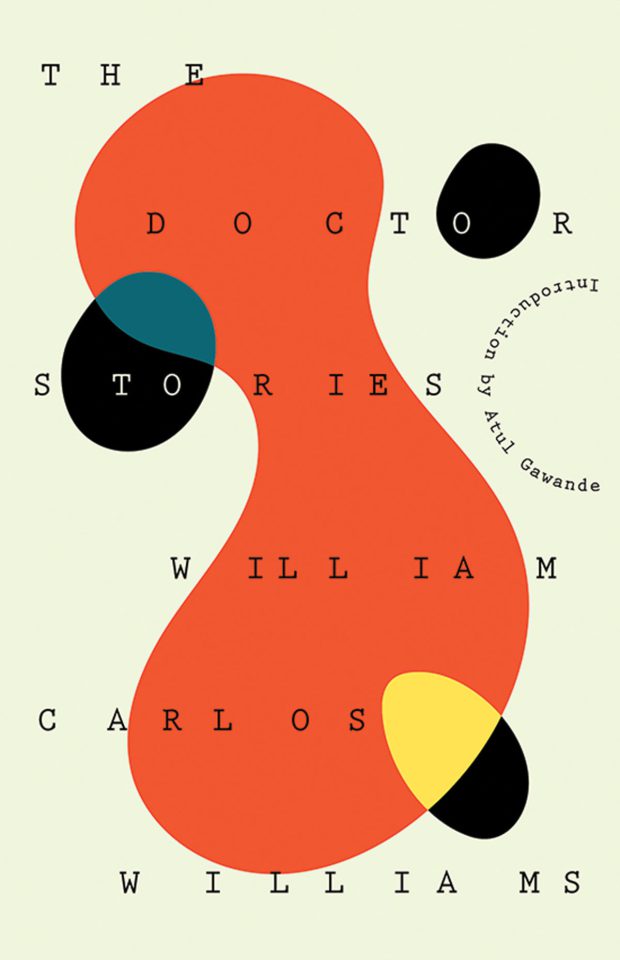 William Carlos Williams, The Doctor Stories, design by Joan Wong (New Directions)
To be fair, this kind of Miró-esque colorblocking playfulness gets me every time. But also look at the brilliant and seamless solution for Atul Gawande’s credit line: it betrays a subtle sense of humor in the designer that I’d appreciate either way.
 Sharlene Teo, Ponti, design by Tyler Comrie (Simon & Schuster)
This is a bold, evocative cover—the layered treatment of the female figure reminds me a lot of Peter Mendelsund’s incredible cover for the New Directions edition of Fernando Pessoa’s The Book of Disquiet—which, full disclosure, I currently have on display in my apartment as art. This cover isn’t as pure as that one, but I do like the text treatment quite a bit—it’s one of those rare cases where multiple fonts compliment each other instead of fighting.
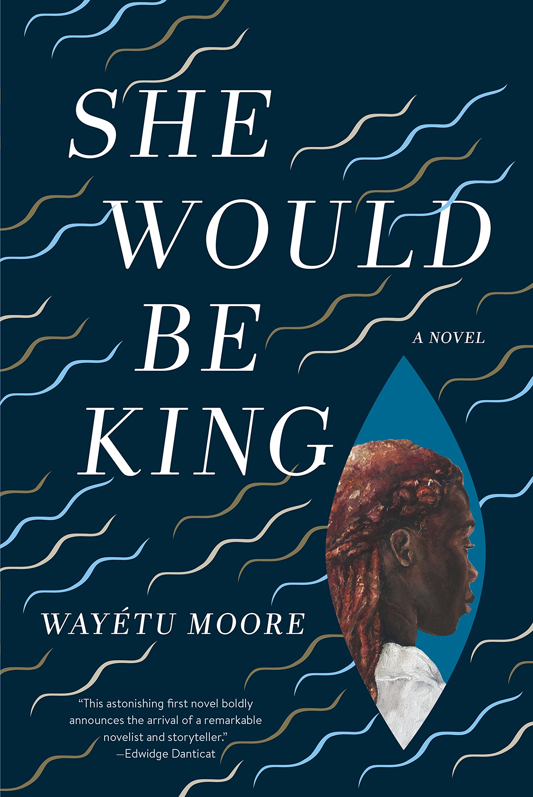 Wayétu Moore, She Would Be King, design by Kimberly Glyder, inset painting by Kula Moore (Graywolf)
Usually a cover like this would feel a bit busy to me, but here the multiple elements combine to create a different kind of subtlety: the angled view of the girl, the opening like a wound or an eye or a boat on the water. In any case, it makes me keep looking. Plus, this is another one with great colors.
 Pat Barker, The Silence of the Girls, design by Emily Mahon (Doubleday)
I immediately thought of Janet Malcolm’s The Silent Woman and, to a lesser degree, Don DeLillo’s The Angel Esmeralda—while I typically don’t love decapitated women on book covers, this one achieves the stately allure of the other two. But the real draw for me here is in the details: the arrangement of the gold accents, and the way the text is tucked into the folds of the robe, integrating it beautifully into the image but also suggesting something hidden (and silent, one imagines).
 Lisa Brennan-Jobs, Small Fry, design by Alison Forner (Grove Press)
This cover is particularly appealing for not looking anything like what you’d think a memoir by Steve Job’s daughter might look like. For one thing, it focuses on her (or at least a female figure), and it doesn’t at all try to trade on the highly recognizable image of Jobs to sell copies. In our current publishing climate, I’d call that daring (and by the way, it’s a New York Times bestseller anyway).
 Katya Apekina, The Deeper the Water the Uglier the Fish, design by Two Dollar Radio (Two Dollar Radio)
I don’t find this cover attractive, particularly. But I do love the commitment to the 70s style: the font, the colors, the muddiness. It’s a choice, let’s put it that way. As a cover, it has a seriousness as well as a sense of humor, and it definitely makes me want to find out more.
 Gary Shteyngart, Lake Success, design by Rodrigo Corral (Random House)
This is another one that I don’t like, exactly—I mean, I wouldn’t want to hang it on my wall. But it’s so convincing at what it does and has such an outsize effect that you have to admire it. It’s a fantastic, excting book cover without being a beautiful one.
 Esther Kinsky, tr. Iain Galbraith, River(paperback), design by Justin Carder (Transit Books)
Understated and evocative, and a thrilling example of how to use text effectively as a design element.
 David Peace, Patient X, design by Tyler Comrie (Knopf)
We’ll finish the list with two covers that use a similar technique: a sharp trompe-l’œil sliced-paper effect. In this first cover, you see both the sliced paper and the promise of something underneath; the red and the white are stark and it looks like a scored wound. It’s unsettling but very evocative.
 Eugenia Cheng, The Art of Logic in an Illogical World, design by Ann Kirchner (Basic Books)
In one sense, this cover takes it a step further—we actually see the blade slicing the paper—but also a step back, as that very element dissolves some of the trompe-l’œil effect. That doesn’t matter for my appreciation of the cover here, though, because the concept is great: here’s an ordered, clean, and yes, logical book cover—let’s do something crazy and slash it. And here too, the colors are perfection.
Emily Temple
Emily Temple is the managing editor at Lit Hub. Her first novel, The Lightness, was published by William Morrow/HarperCollins in June 2020. You can buy it here.


