The 15 Best Book Covers of August 2018
The Bold, the Beautiful, and the Bonkers
It’s safe to say that we have more than a passing interest in book covers here at Literary Hub. Just this month, I sifted through the best and worst covers of Lolita from all over the world, Janet Hansen chronicled the process of designing the jacket for Nico Walker’s Cherry, Colleen Reinhart unpacked the special challenges of the book cover redesign, and Charlotte Strick of Strick&Williams discussed the art of the series and the work of Rachel Cusk. Plus, we all read a lot of books, some of them because we liked their covers and wanted to see what was inside.
Suffice it to say that I’ve developed some favorites in the process. To that end, I’ve collected 15 of what I consider to be the best book covers published in the month of August. Taste, of course, being subjective, and these being primarily the selections of a single editor (yours truly), feel free to add on (or argue, preferably politely) in the comments.
 Olga Tokarczuk, Flights, tr. Jennifer Croft; design by Grace Han (Riverhead Books)
One of the most pleasing variations on the biggest book cover trend of the year, thanks in large part to that inviting yellow—but also the strangeness and beauty of that bird: head obscured, flying downward. It’s very odd to see a bird depicted this way, and the obscured strangeness is perfect for this book of brilliant asides.
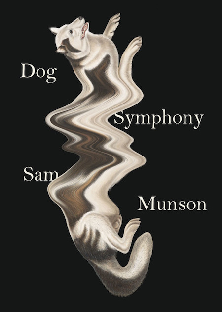 Sam Munson, Dog Symphony; design by Joan Wong (New Directions)
This kind of surrealist play on book covers gets me every time. It’s bold, it’s weird, and it makes you want to find out what this book could possibly be about. Hint: it’s about strange dogs (among other things).
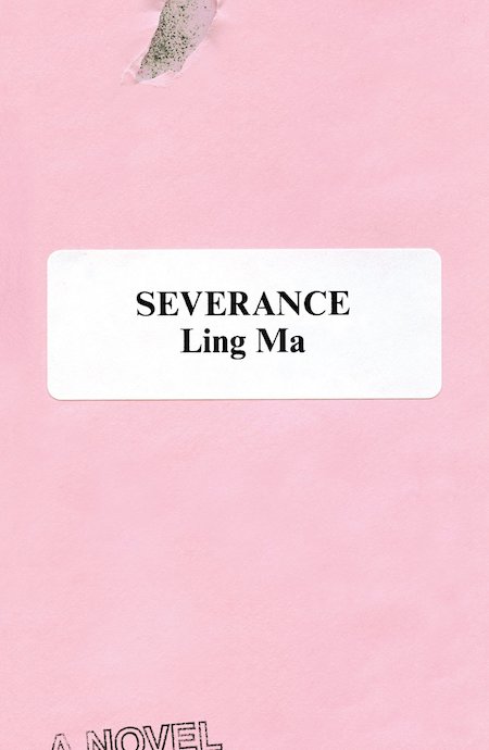 Ling Ma, Severance; design by Rodrigo Corral (FSG)
A perfectly subtle treatment for this dystopian office satire: a little bit official, a little bit destroyed, a little bit Pepto Bismol, a little bit Millennial Pink.
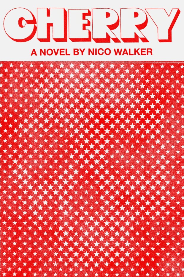 Nico Walker, Cherry; design by Janet Hansen (Knopf)
Janet Hansen wrote a great essay for us about designing the cover for this novel, which she called “a love story in that Natural Born Killers type of way.” I love the juicy font of the title and the way you almost miss the skull the first time—until you don’t miss it, and can never miss it again.
 Crystal Hana Kim, If You Leave Me; design by Ploy Siripant, illustration by Gina Triplett and Matt Curtius (William Morrow)
This cover illustrates yet another big literary design trend: the all-over floral print. This one is particularly lush, vibrant, and delicious-looking. Though if you must eat it, I highly suggest that you read it first.
 Laura van den Berg, The Third Hotel; design by Sarahmay Wilkinson (Farrar, Straus and Giroux)
The longer I look at this cover, the more I like it. The depth of field, with the hand-drawn and painted elements showing through the text as if through a window, suits the book—and so does the disorientation of the title: the “the” is bigger than the rest of the title. This is . . . weird! Plus you’ve got that cheeky eye, and the hand-written half-cursive of Find Me. All in all, it’s a successful, rewarding cover that perfectly reflects the book in question.
 Ben Marcus, Notes from the Fog; design by Peter Mendelsund (Knopf)
I have no idea what this actually is—I interpret it as fog presented as a piece of art in a museum. But even if I’m wrong, I love how striking it is, and the audacity of the stark black and white, not to mention the semi-obscure reference point. It’s a cover that invites consideration.
 Shusaku Endo, The Samurai; design by Peter Mendelsund (New Directions)
And then here’s another cover, also by Peter Mendlesund, that takes the opposite approach: I wonder nothing about it, but it’s the gorgeous colors and textures that keep me interested. This is a cover that feels like movement, which is no small feat.
 Lisa Margonelli, Underbug: An Obsessive Tale of Termites and Technology; design by Rodrigo Corral (Scientific American/FSG)
You can’t see this all that well if you’re only looking at it as an image on your computer screen, but those irregularly shaped spots are actually holes in the dust jacket revealing the cover of the board below. You can even see a termite poking his little head through one of them! Genius.
 D. Wystan Owen, Other People’s Love Affairs; design by David High (Algonquin)
I like the way this illustration manages to be figurative while maintaining a certain level of artistic abstraction that increases as we move towards the bottom of the cover.
 Adib Khorram, Darius the Great Is Not Okay; design by Samira Iravani (Dial Books)
It’s all about the color here—and the way the text treatment sneakily becomes an aspect of the landscape (or vice versa, depending on how you look at it).
 Catherine Lacey, Certain American States; design by Na Kim (Farrar, Straus & Giroux)
Clever and appealing. It doesn’t hurt that FSG put this billboard cover on a billboard.
 John Boyne, A Ladder to the Sky; design by Jo Thomson (Doubleday)
There’s nothing particularly groundbreaking about this cover, but the colors are warm and inviting, and it manages to create a feeling of nostalgia that I find very appealing.
 Claudia Dey, Heartbreaker; design by Rachel Willey (Random House)
The confidence to break up the title goes a long way for this cover, and I also love the way the type goes right up to the edges—it’s subtle but slightly different from what you usually see. Plus, this is another cover that creates intrigue without explanation, which always makes me want to investigate.
 Raymond Queneau, The Blue Flowers; design by Peter Mendelsund (New Directions)
Channeling The Yellow Submarine will work for me every time.
Bonus:
 Sally Rooney, Normal People (Faber and Faber (UK))
Sally Rooney’s sophomore novel is not out in the US yet, and technically is therefore ineligible for this list, but I have to say that I love this UK cover. I’m a sucker for that caustic olive green, and I must admit that I’m much more interested in the couple in the sardine can than I am in the couple in the pool.
Emily Temple
Emily Temple is the managing editor at Lit Hub. Her first novel, The Lightness, was published by William Morrow/HarperCollins in June 2020. You can buy it here.


