The 78 Best Book Covers of 2019
As Chosen by the Experts, the Designers Themselves
This year, at Lit Hub, we spent a lot of time thinking about book cover design. Oliver Munday wrote about designing the cover for Fleur Jaeggy’s newly reissued masterpiece Sweet Days of Discipline; Tree Abraham wrote about designing the (very glittery) cover for T Kira Madden’s Long Live the Tribe of Fatherless Girls; Sara T. Sauers wrote about designing her grandfather’s book (her grandfather being James Thurber); Nicole Caputo wrote about using red, white, and blue on book covers; and Alison Forner laid out the process behind designing the cover for Sarah M. Broom’s The Yellow House.
We also revisited Raymond Carver covers, Beloved covers, Slaughterhouse-Five covers, and Invisible Man covers from around the world—and we basked in the work of Todd Alcott, who reimagines classic songs as vintage book covers.
But it is December, the official month of Best-of Listicles, and therefore I am contractually obligated to ask: which book covers were the best? To answer the question, as I did last year and the year before that, and good lord, the year before that, I cut to the chase and consulted the experts: the book designers themselves.
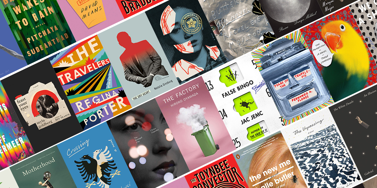
This year, I asked 26 of my favorite designers to share their own favorite book covers of the year, and they came back with a whopping 78 different selections. But of course, some of them had similar ideas about the best of the best. Here are the final stats, if you’re into that kind of thing. Below that, you can feast your eyes on all the covers they picked, in order of publication date.
The very best book covers:
Yoko Ogawa, The Memory Police, design by Tyler Comrie : 9 votes
Myla Goldberg, Feast Your Eyes, design by Lauren Peters-Collaer : 6 votes
Tegan & Sara, High School, design by Na Kim : 5 votes
Regina Porter, The Travelers, design by Michael Morris : 4 votes
Dunya Mikhail, In Her Feminine Sign, design by Janet Hansen : 4 votes
Jac Jemc, False Binggo, design by June Park : 4 votes
The press with the most covers on the list:
FSG (including MCD x FSG originals) : 18 covers
The designer with the most covers on the list:
Na Kim : 7 covers
*
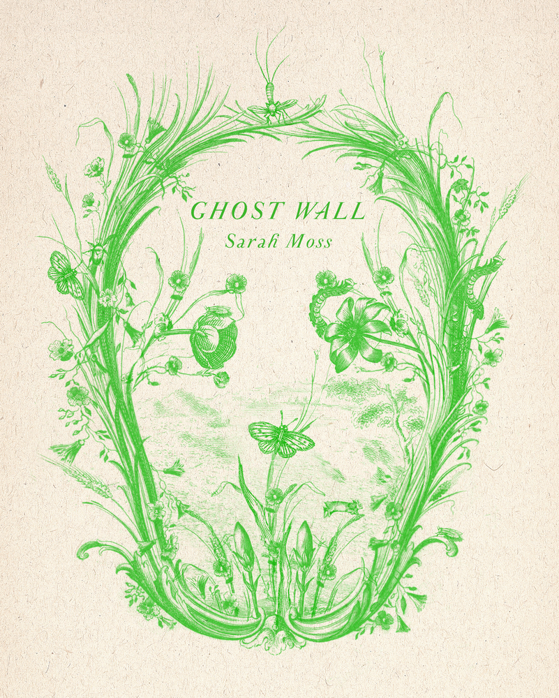 Cover design by Alex Merto (FSG, January 8)
Such a clever image, both delicate and sinister. Also love the modern feel this has with the use of neon inks on natural papers.
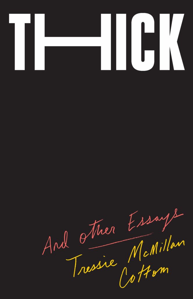 Cover design by Oliver Munday (The New Press, January 8)
When so many designs have their main visuals in the center, it’s very satisfying to see a layout that leaves the middle completely blank. The handwritten subtitle and author are an ingenious contrast to the weighty title—I find it so exciting when type is used in such a creative way that additional imagery isn’t needed.
 Cover design by Grace Han (FSG, January 15)
The description and blurbs for this book detail characters who are searching without knowing what they seek, quiet suspense and spare and exacting prose. Grace’s art selection could not feel more perfect. Lino Lago’s “fake abstract” painting and the clean minimal typography give a modern sensibility, a historic nod and the sense of something being uncovered.
I was immediately drawn to this cover when I first saw it in the bookstores. The cutoff at the bottom half of painting is at the right placement exposing a sliver of the right eye where the slight tension is enough to bring intrigue to the viewer. The light pink is a lovely contrast to the oil painting and brings the image into focus.
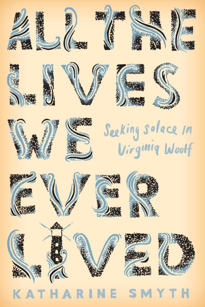 Cover design by Michael Morris (Crown, January 29)
A lovely pastiche of the classic Hogarth Press Editions for Virginia Woolf designed by Vanessa Bell. The wonderful culmination of tiny details and care.
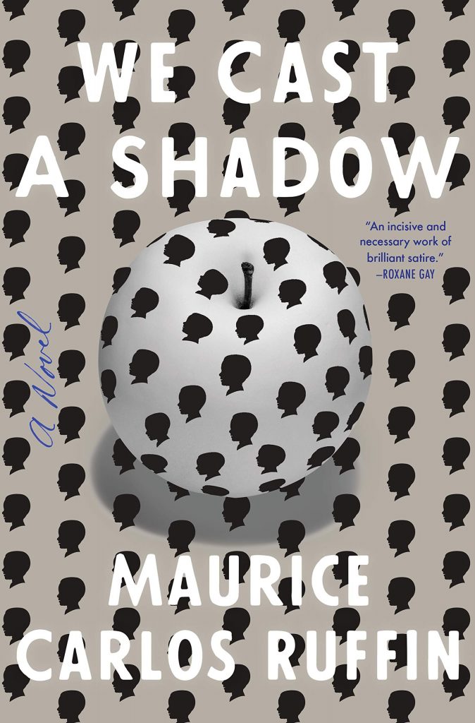 Cover design by Rodrigo Corral (One World, January 29)
My eyes feel like they’re playing tricks on me with this cover. The pattern on pattern design, and white type on off-white background is totally mesmerizing.
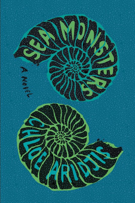 Cover design by Charlotte Strick & Claire Williams (Catapult, February 5)
Mesmerizing harmony of image and type. Can all but hear the waves on the shore.
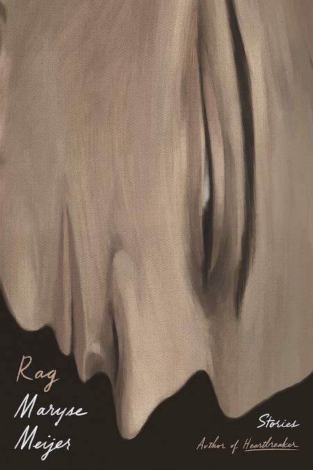 Cover design by Na Kim (FSG, February 12)
I’ve seen stretched type, but I don’t think I’ve seen a cover with stretched imagery executed to such visceral effect. The drooping, face-down profile conveys a feeling of malaise in such a refreshing way. I’ve never been as excited about misery.
 Cover design by Grace Han (Riverhead, February 19)
My eyes do not seem to want to focus on one element. Everything is rushing at me. The energy of this cover is so good. I can’t help but be curious about the energy of the writing inside.
I love how there are three distinct elements here, but they are all integrated seamlessly. The drops look like they could also be feathers of the bird. And the type is layered into the drops. And on top of it all . . . it’s green!
This cover, holy smokes. It’s impossibly lush. The shimmering dimensionality that it achieves is incredibly striking. I want to be in there!
 Cover design by Richard Green (Tim Duggan Books, February 19)
This is a jacket design that’s just as effective as Big Bang, but its polar opposite. The lack of volume and energy gets the point across here. Is there anything sadder than this title paired with a bee in the fetal position? (I can’t bring myself to say it’s dead.)
Chilling, arresting design that expertly delivers the message of a bleak but urgent book.
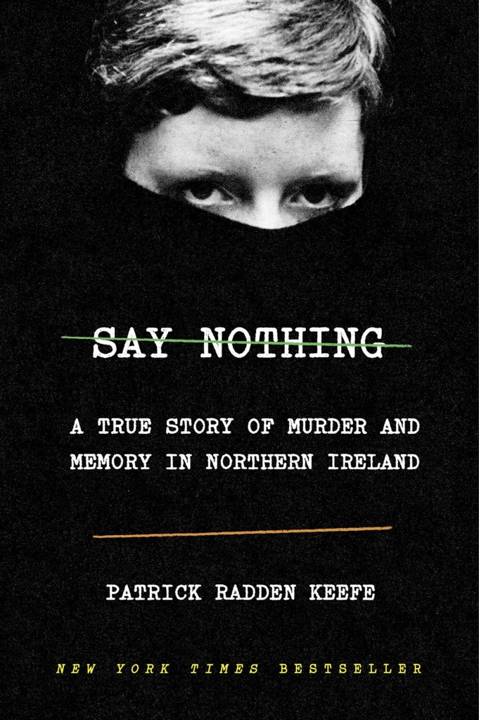 Cover design by Oliver Munday (Doubleday, February 26)
This cover encapsulates all the information the reader needs with so few elements. The green and orange lines nod to the Irish Flag and represent the Catholic and Protestants. The real focus of the cover, however, is Dolorous Price who stares at you over the edge of her turtle neck, the classic uniform of the IRA.
 Cover design by Linda Huang (Anchor, March 5)
I enjoy the wit and playfulness of this design. It’s a clever way of combining two unlikely things together, and in this instance, it just makes sense.
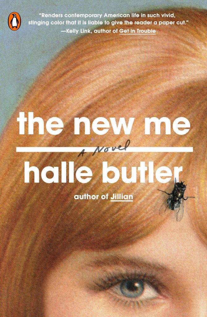 Cover design by Rachel Willey (Penguin Books, March 5)
The fly is such a simple, yet impactful and witty move. It immediately reads as a smart, humorous, and satirical book.
Would not be a best of list without at least one or five of Rachel’s covers!
 Cover design by Alex Merto (FSG, March 5)
Alex’s casket-shaped bureaucratic envelope immediately telegraphs the book’s subject matter. So I love this cover for how succinct it is . . . but also that he’s managed to imbue a sad topic with humor.
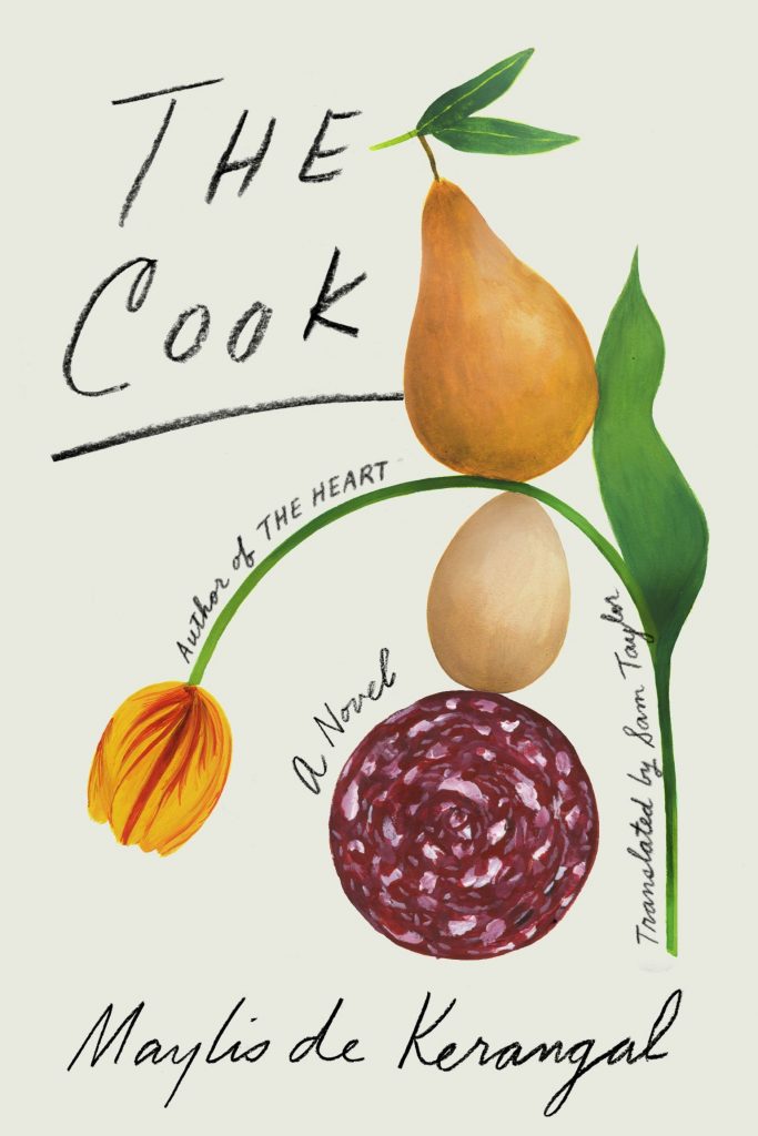 Cover design by Na Kim (FSG, March 10)
I love this book cover because it’s such an unexpected—but exquisite—pairing of art and lettering. At first glance you think you’re looking at a staid and elegant old botanical print, but then you realize that Na has snuck in meats and fruits where they have no business being. And the tragically drooping tulip makes me laugh.
Not only do I feel hungry when I see this cover, but I’m intrigued by the ever-so-graceful balance of shapes and form and the type which complements them.
This is one of those delightful covers so easily likable by the general population I hesitate to confess how much I like it, too—but I can’t deny how excellent it is, nor can I peel my eyes from it. Between the illustrations and the hand lettering, there’s so much to feast on. It’s tender but not saccharine. Pretty sure Na did the illustrations as well, which makes it all the more satisfying.
 Cover design by Donna Cheng, cover illustration by Gerrel Saunders (Gallery/Scout Press, March 19)
Queenie herself is that star of this cover, which is fitting since she is also the star of this book. The title tucked into her hair like a crown and the “A Novel” tucked in above her ear are just perfect.
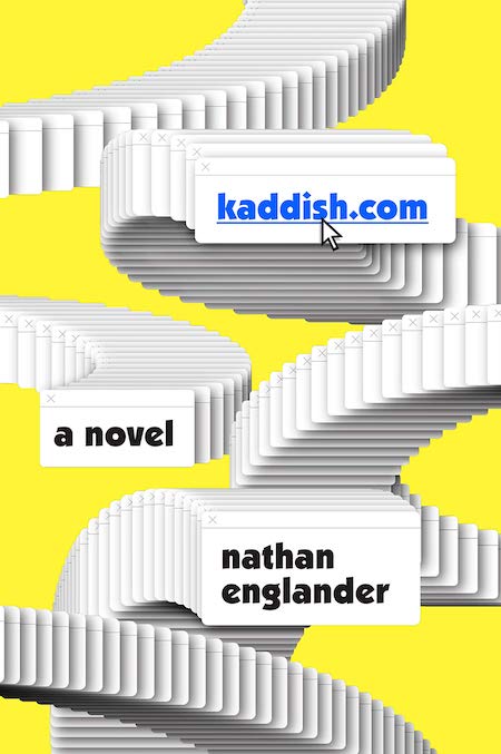 Cover design by Tyler Comrie (Knopf, March 26)
It’s playful and idiosyncratic. Translating screen objects to physical things can look awkward, but this feels well handled and good humored.
Tyler’s jacket captures the repetition of the Kaddish prayer via the internet with clever humor that matches Englander’s writing.
 Cover designs by Leanne Shapton (Faber & Faber, March & September)
Leanne’s watercolor illustrations never fail to have emotional resonance. The color palette is tasteful. Very beautiful collection.
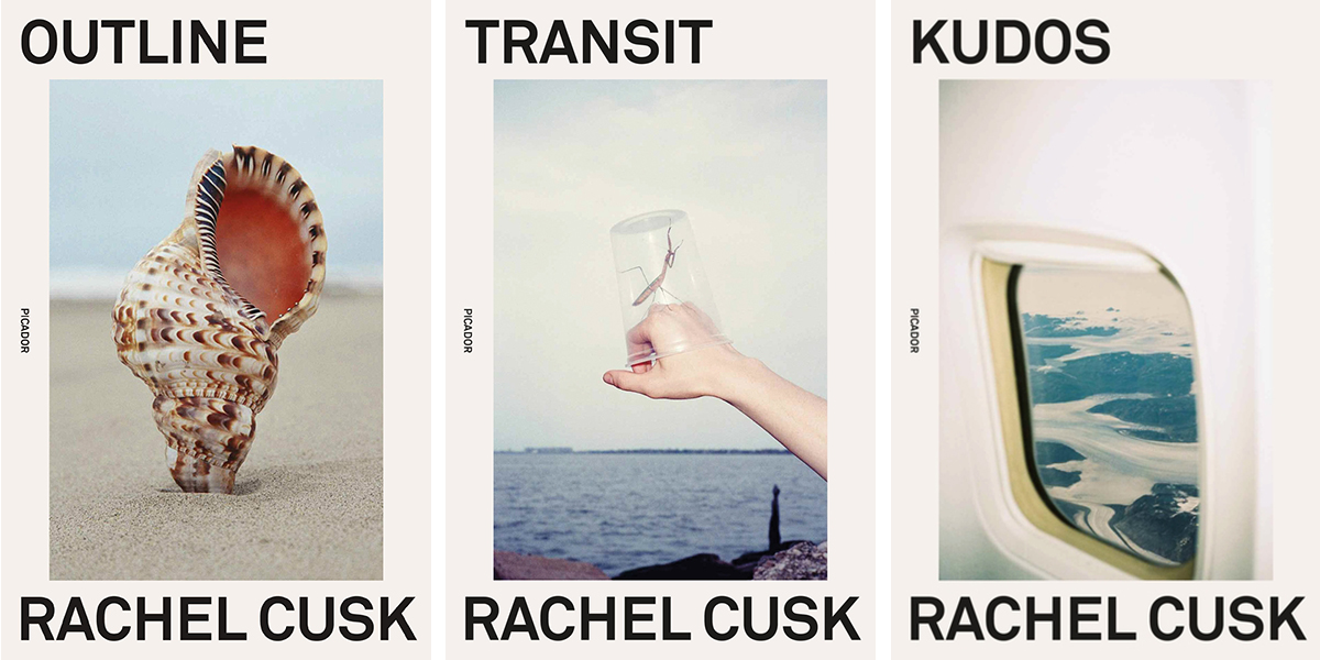 Covers designed by Rodrigo Corral (Picador, April 2)
Beautiful in hand with uncoated stock, debossing and gloss and just as powerful on screen. They are art objects for your shelf but also entice me to read them back to back in succession to learn the inspiration behind the image selection. I swear I would wash my hands well or read these with gloves on so as not to wreck their beauty!
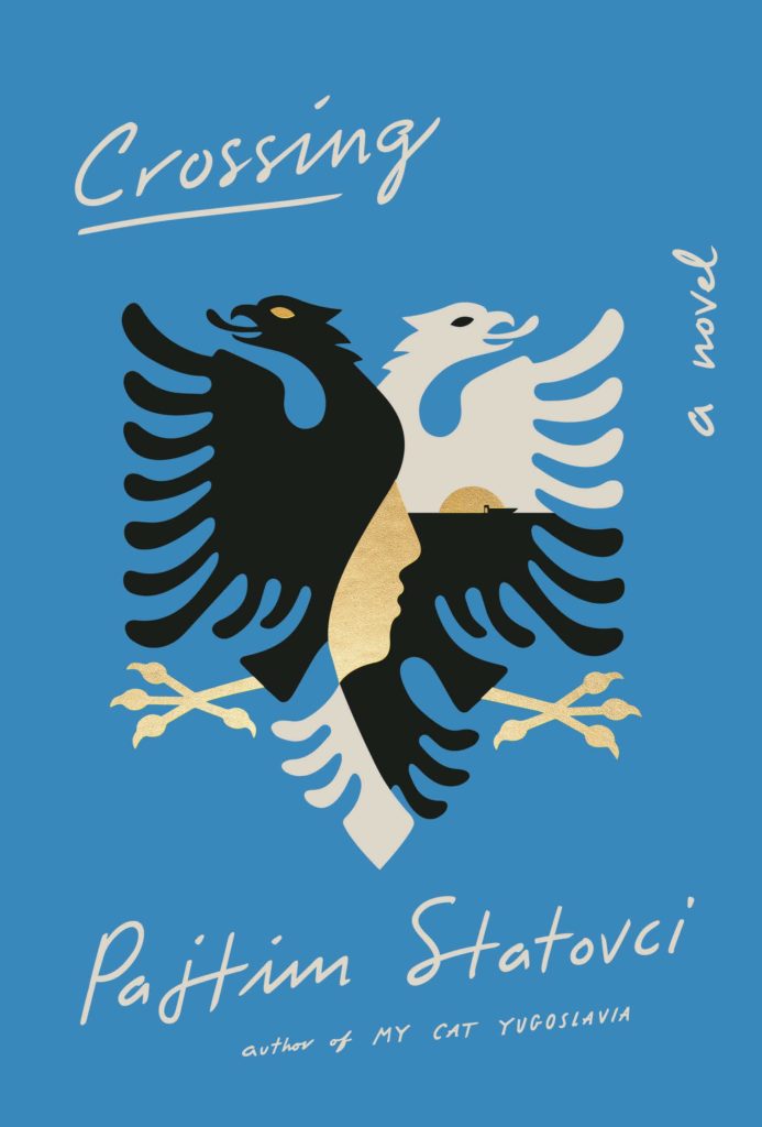 Cover design by Tyler Comrie (Pantheon, April 2)
The art on Tyler’s cover is beautiful, but also deceptively simple—it’s actually quite rich with subtle detail. And overall, the colors and lettering strike a perfect balance.
I love that clean and bold illustration. There are some multidimensional messages happening in that emblem and it’s got me so curious about the book….That blue background is lovely and the delicate gold foil fragments on uncoated stock makes the cover that much more special.
 Cover design by Helen Crawford-White (Head of Zeus, April 4)
I adore this cover! It feels so familiar and fresh at the same time—channeling the likes of Paul Rand, Alexander Calder, Henri Matisse, but with a something all it’s own. It is whimsical in its use of color, as well as its abstract and anthropomorphic forms. The nuance of texture and shaded elements draw me in, telling me that there is something more, something dark and strange inside these pages that I need to know. Quirky and surreal, I find it terribly charming.
 Cover design by Lauren Peters-Collaer (Scribner, April 16)
Such a clever use of a collage! The pieced-together camera works as a compelling device to hold the inset photo and type. The limited palette and organic illustration are perfection.
The confidence of this cover crushes me. It demands just the right amount of work from the viewer, a tough line to walk when playing with unique copy/type treatments. The unusual cropping of a young girl gazing directly at you, eerily out of focus, carries the darkness set by the surrounding black and vast negative space. The irregular edges and distressed paper in the collage, as well as the type, are rendered perfectly. This cover really stood out on tables and shelves in store, a total knock out for me.
The collage is simple yet clever. I never get tired of looking at it and finding new details.
I may be partial to this cover because I love Myla Goldberg’s writing, but I find Lauren’s collage incredibly clever and I love its tactility.
I love the artistry of the collaged camera from newspaper pieces and the peering view from the lens.
All the elements feel considered. I love how the red frame brings focus to a photo with depth. It makes me feel like I’m actually looking through a camera lens.
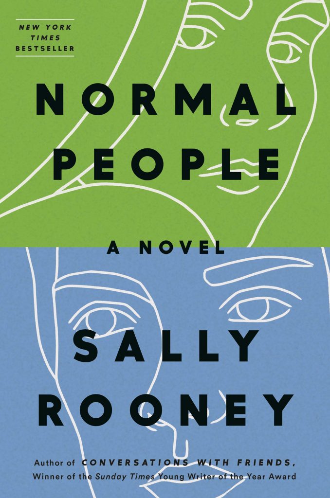 Cover design by Elena Giavaldi, illustration by Molly Bounds (Hogarth, April 16)
Sally Rooney’s first book had such a distinctive look that it would be a challenge to create the cover for her second that doesn’t feel like it’s in the shadow of Conversation with Friends, but this cover succeeds. The characters in the white line drawings are not even looking at each other and yet you can feel the tension between them. The thick, black type contrasts with the delicate illustrations while the color blocking signals that the characters are trapped in very different worlds.
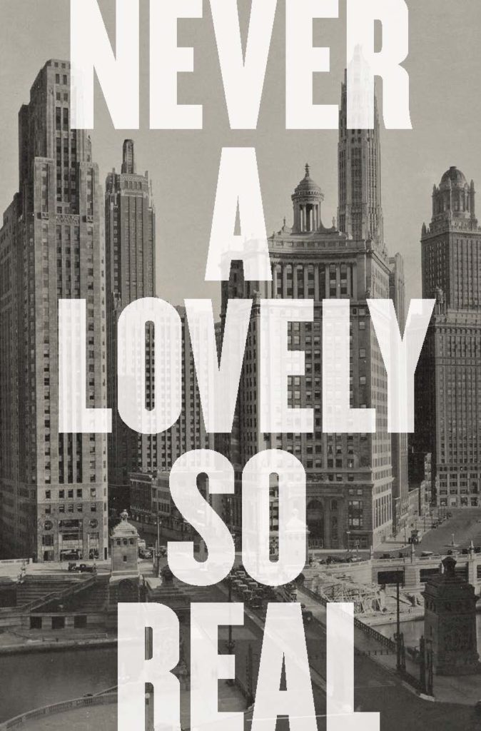 Cover design by Jonathan Bush (W. W. Norton, April 16)
The giant type makes this cover look so big, yet elegant and substantial . . . and important! Without any other type on the cover, this design is minimalist and maximalist at the same time.
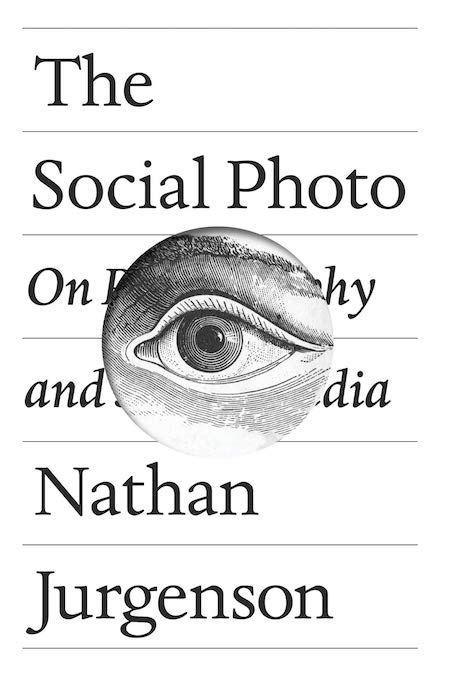 Cover design by Pablo Delcan (Verso, April 30)
The simplicity of the type and bold focal image work together so perfectly. The image is presented in a way that reinforces the subject of the book all while creating a sense of intrigue. And despite the fact that the subtitle is obscured, we are given enough information to read it.
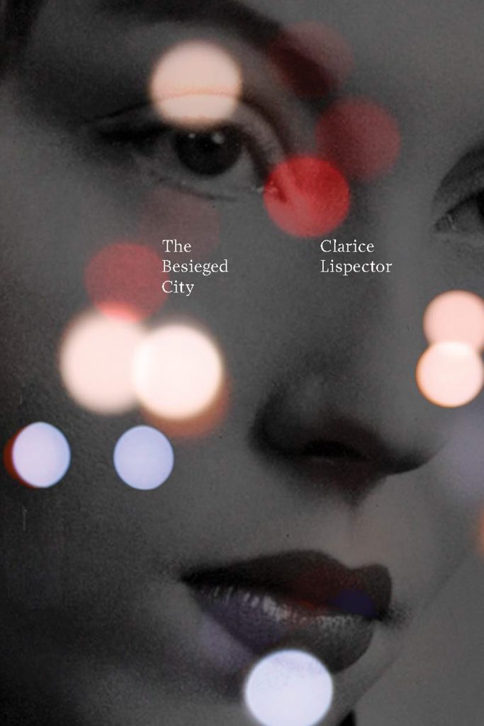 Cover design by Paul Sahre (New Directions, April 30)
Love that the size of the type helps emphasize the overall mood and atmosphere of this cover.
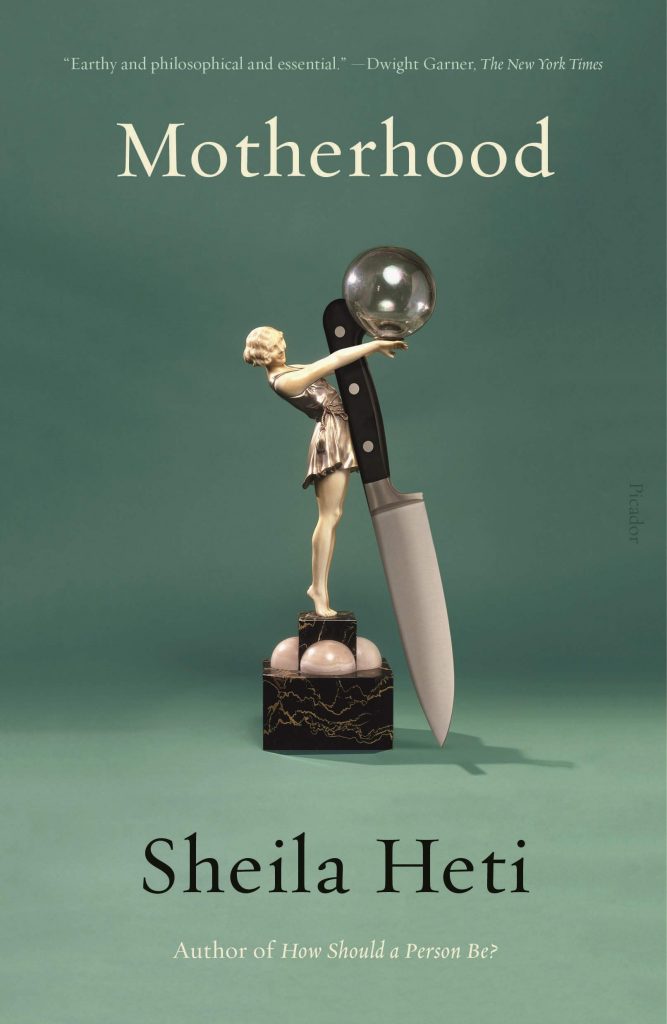 Cover design by Na Kim (Picador Paper, May 7)
I love this bizarre assemblage: impossibly and perfectly precarious, such a deft metaphor for motherhood.
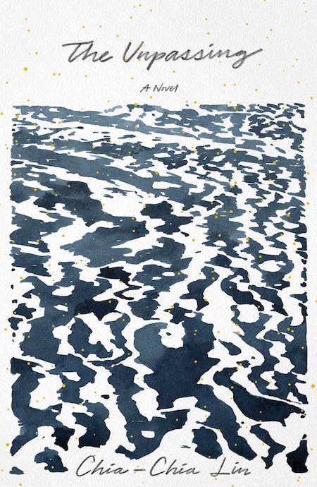 Cover design by June Park (FSG, May 7)
Beautiful abstract illustration by June Park. Always catches my eye in a bookstore.
There is so much sophistication in the way the sea is rendered, incorporating as much negative space as positive. Set in Alaska, the water is appropriately icy and harsh, yet full of movement—redolent of a Rorschach test. Simply bleak and beautiful.
Every time I look at this cover it evokes a calm zen feel. The watercolor painting fills most of the cover and although it’s quiet, the small flecks of gold over the art give it that extra distinctiveness.
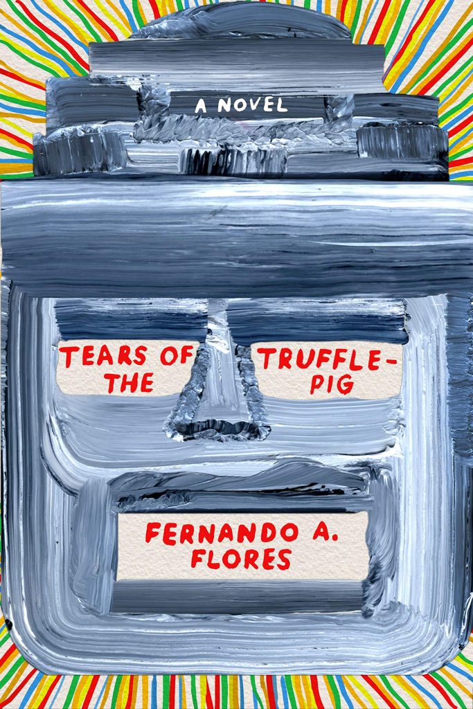 Cover design by Na Kim (MCD x FSG Originals, May 14)
Exuberant! I love the painterly style and bright colors.
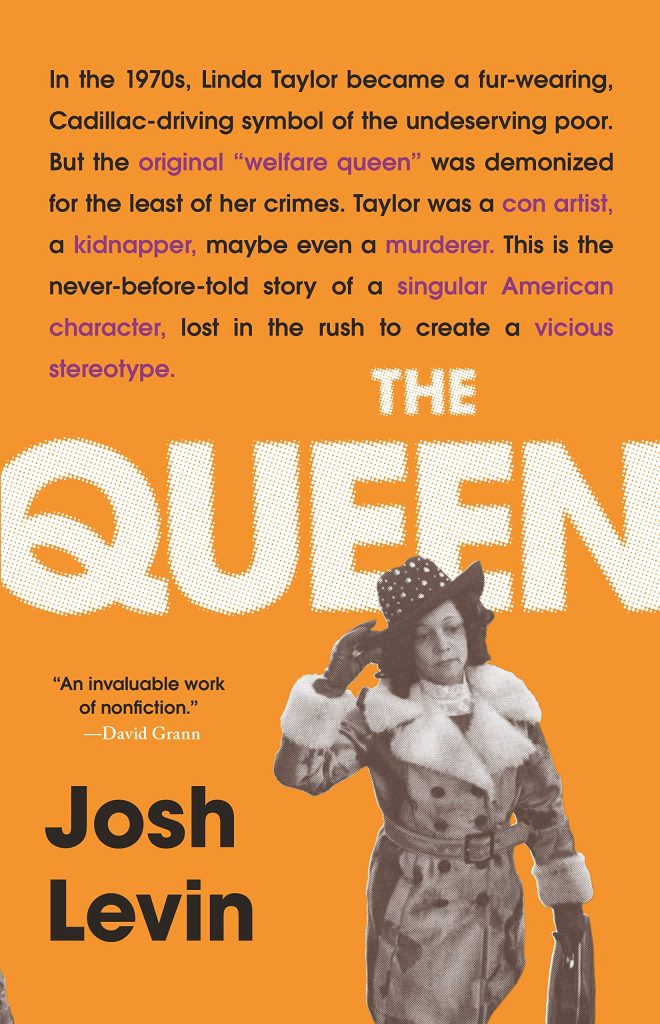 Cover design by Lucy Kim (Little, Brown, May 21)
It’s always a pain when editors give us extraneous copy to put on a cover. However, the way the tagline (or rather tag-paragraph!) is incorporated into the design, here, looks effortless! Also, I love the quirkiness of that “Q”!
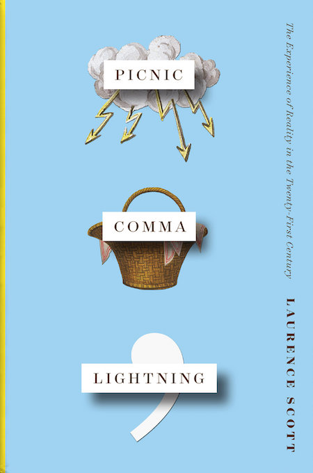 Cover design by Matt Dorfman (W. W. Norton, May 28)
I love Matt Dorfman’s work. This book cover in particular is delightfully disorienting. The quirky juxtaposition of word and image, varied textures, type orientation, all come together to create a timeless art work. I particularly love the exaggerated elevation of title elements creating depth and space, deepening the dissonance between language and image. It is concise, clear, and I think quite brilliant… and it makes me smile.
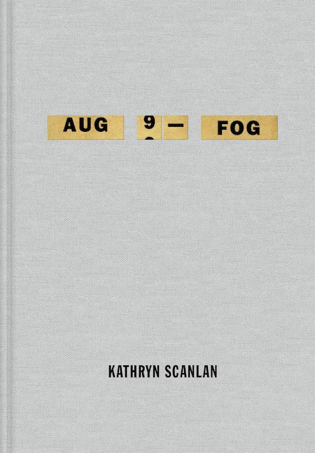 Cover design by Na Kim (MCD, June 4)
How did this get approved!? I mean really. This could have been a cover with tree on it, but how freakin brave and awesome to do the diary.
So simple and elegant, burned in my mind when I saw it. A bold and memorable typographic approach with great use of effects, helping to create a coveted physical object.
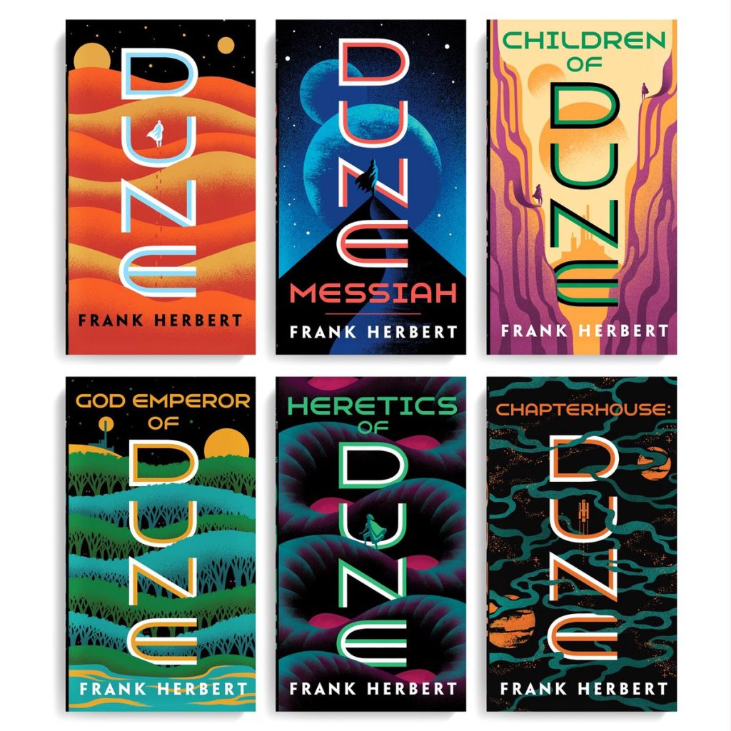 Covers designed by Jim Tierney (Ace Books, June 4)
Jim is so incredibly talented and I also want to commend art director Adam Auerback who I believe selected Jim for the project. We do not hear as much about ADs, but they start this process and choosing the right person is an important skill set. I could not think of a better illustrator and designer to put a modern face on Dune, with each illustration and typographic layout inviting you deeper into the undulating terrain . . . and they feel so great in the hand! You must take home every single one.
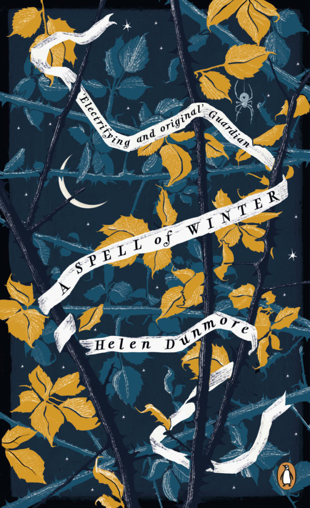 Cover design by Holly Ovenden (Penguin, June 6)
A perfect example of text not having to be giant to stand out. A lot of depth and texture to this cover that keeps me going back to take another look.
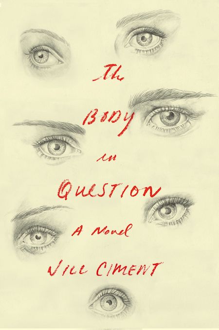 Cover design by Janet Hansen; illustration by Cody Comrie (Pantheon, June 11)
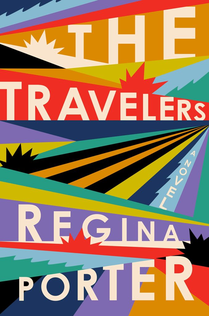 Cover design by Michael Morris (June 18, Hogarth/Crown)
These many colors are so pretty and unusual. This cover has a unique energy and curiosity, and my eye doesn’t stop wandering the page for more subtle surprises.
I love this jacket so much I want to wear it! The colors and the typography are spot on.
This is a very fun and dynamic cover that has the right amount of design elements converging together. The dispersed bright colors, intersecting angles, spiked bursts, and differing type sizes overall creates this energetic dimension that doesn’t have a still moment.
This cover epitomizes the word “pop.” I was immediately reminded of the energetic quality of vintage Gee’s Bend quilts. Modern and striking.
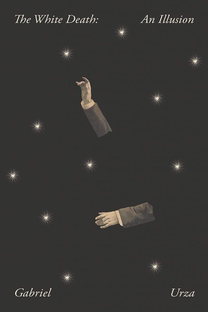 Cover design by Joan Wong (Nouvella, June 18)
I love how understated this cover feels in the midst of some bold design choices. Those tiny, disembodied arms floating in space are mysterious, and even though the title and author sit quietly at the top and bottom, the spacing is unusual and intriguing.
Makes me feel like I’m in the thrall of a spellbinding magic trick.
So Joan Wong in the very best way possible.
 Cover design by Oliver Munday (New Directions, June 25)
This cover is so lovely, but when you look closer you wonder hmmm whats going on here. The crow is a signifier that this might be a bit macabre, but the palette is such a contrast that its makes you scratch you head. It’s sorta delicate and small for a cover, but as a teeny online thumbnail the composition is stronger than most. A win-win!
 Cover design by Pablo Delcan (New Directions, June 25)
One common criteria for a “good cover” is the ability to draw the reader into the book, and this red soaked man checks that box with a big “❓” Is he angry? Heartbroken? Pensively dripping with paint? I want the answers to the questions this cover asks!
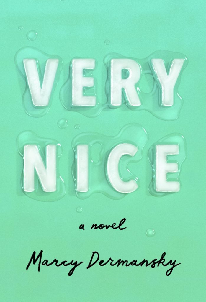 Cover design by Janet Hansen (Knopf, July 2)
I have only seen this cover on screen but the spareness, the color and the incredible photograph of the typographic cubes melting immediately piqued my curiosity and sent me to the book description page. A perfect summer read cover! I should hunt this down in a shop just to touch it.
I love how the letters are concrete which makes the cover more alive and expressive. The treatment of the title alone does the job of setting a sense of place and mood. It’s pleasing to the eye and therapeutic just looking at an image of melting letters.
Another deceptively simple design—so effective because it’s so well-executed, from the letterforms to that rich shade of teal. Title says it all.
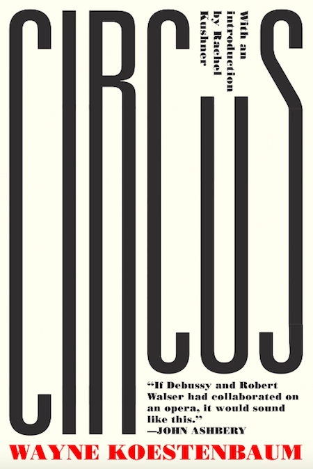 Cover design by Michael Salu (Soft Skull, July 9)
I love the full use of space. The narrow type is freaky and captivating.
 Cover design by Thomas Colligan (FSG, July 9)
This cover reminds me of an old Black Sparrow Press book (à la the inimitable Barbara Martin) in the best way possible.
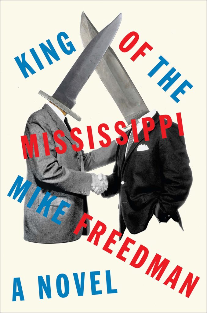 Cover design by Matt Dorfman (Hogarth, July 9)
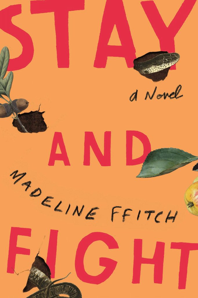 Cover design by Matt Dorfman (FSG, July 9)
This cover is wonderfully energetic and unexpected. I especially love the old fashioned lithographs tearing through the surface.
The organic and spirited treatment of this cover works so well with the hand-drawn type and illustrated snake and plants that are bleeding off the edges. It reminds me of a protest poster which is fitting to the title.
Love the combination of intrigue and curiosity, which makes for a memorable cover.
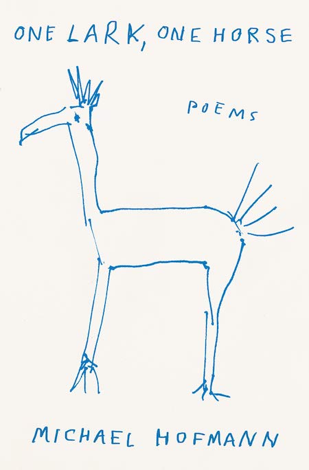 Cover design by Thomas Colligan (FSG, July 16)
I love a fully hand-drawn cover, especially one that looks like it was made by a grade-schooler. The rudimentary quality feels so right for a book of poetry.
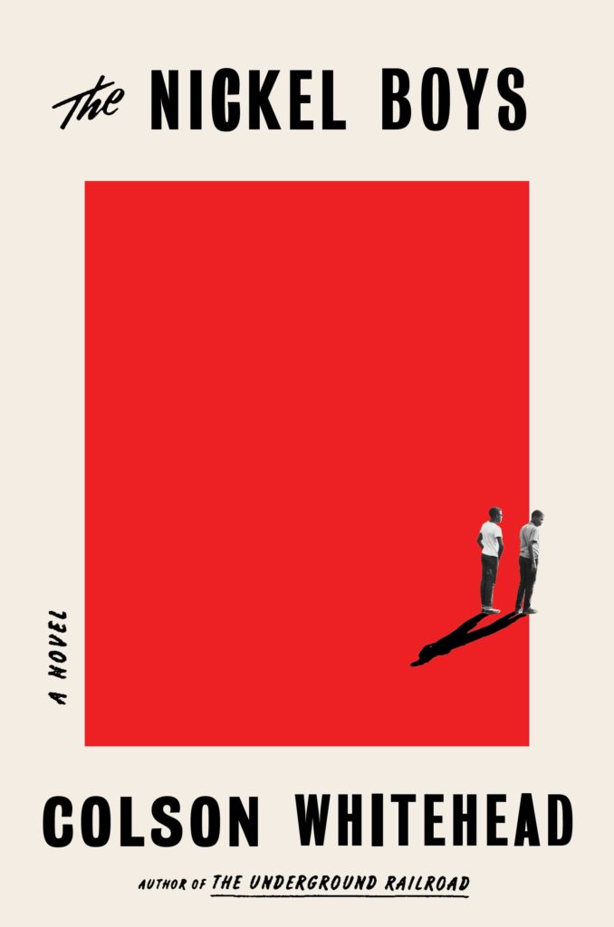 Cover design by Oliver Munday (Doubleday, July 16)
Bold, graphic and instantly iconic.
No doubt Oliver Munday has had some top notch covers this year, but this one stopped me in my tracks. The square pool of red, itself reminiscent of a stop sign, creates a feeling of unrest and foreboding. This cover held me in feeling for a time, delaying my typical hyperactive jump into ogling and critiquing. The restraint in composition, the rigidity of shape, form, and color, the blood red, and the oh so subtle nod to time period via type and clothing style, this cover is nothing short of iconic to me.
Great use of negative space.
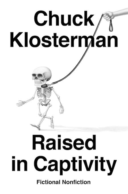 Cover design by Paul Sahre; illustration by Armando Veve (Penguin Press, July 16)
I’m a sucker for an Armando Veve illustration—and his style is employed perfectly here. I love that the type treatment from past Klosterman books holds, allowing the humor in Veve’s skeleton man to really activate/carry the cover.
 Cover design by Sarah Bibel (Harper Perennial, July 23)
This cover is so inviting to me. It’s mysterious and bold. It seems really minimal but there’s actually so much character and information its sharing.
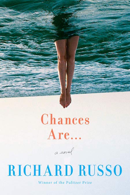 Cover design by Kelly Blair (Knopf, July 30)
Kelly Blair has had a spectacular year! She just might be my favorite book cover designer of 2019. I chose this particular cover for it’s bold simplicity. A quick trick married with a classic type treatment that accomplishes one of my favorite things—the appearance of effortlessness. The ever so slight torque of the horizon line pushes it just that one step further. Perfection!
 Cover design by Janet Hansen (New Directions, July 30)
So simple and tonally appropriate for the subject. LOVE.
Janet has been on a black-and-white kick lately, and this exquisite cover is my favorite. The expectedly blurring of the top part of the moon and the negative space below the title almost suggest an oblong planet. The refined script is beautifully typeset. The result is ethereal and haunting.
An eerie and beautiful cover. I love that the moon is slightly oblong, as thought it’s sliding off the page.
The contrast between the delicate type and the weight of the moon creates such a mood.
 Cover design by David Litman (Simon & Schuster, July 30)
I love a strong type-driven cover with lettering tailored to the image. The black hole of concentric circles instantly draws you in. The tight spacing and consistent graphic quality is truly satisfying. This may look simple but it’s not easy to pull off.
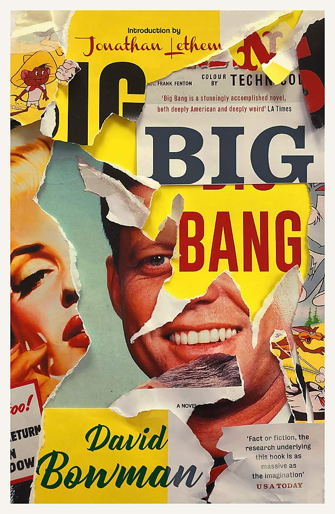 Cover design by Jamie Keenan (Corsair, August 1)
This cover is every designer’s greatest dream and every publisher’s worst nightmare. It sort of dares you to enter its world and make sense of it. Admittedly, the copy is a little challenging to decipher, but I felt rewarded by putting in the work. Not every cover should be easy! And this makes me wonder if most cover design is too easy in general. When a visual challenges you, it also makes you linger. What a beautiful, chaotic, messy monster—this really renews ones faith in our profession.
I love that every inch of this design surprises me.
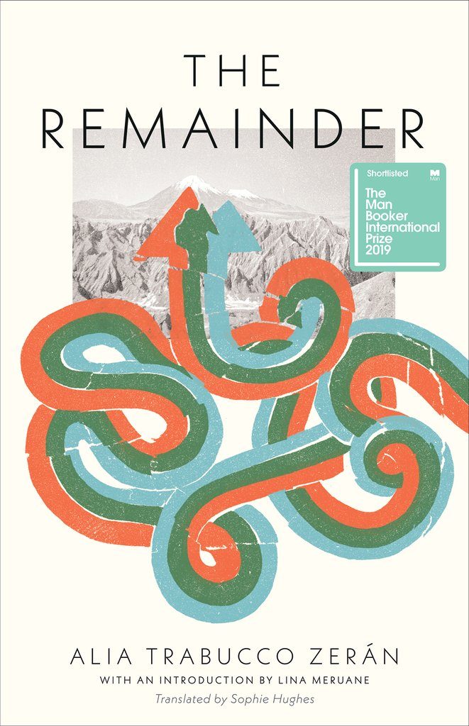 Cover design by Tree Abraham (Coffee House Press, August 6)
What would have been a quiet, almost-academic design gets turned on its head by the introduction of these crazy brightly colored lines, signaling this book is not what you’re expecting it to be.
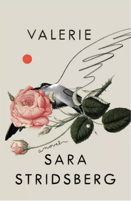 Cover design by June Park (FSG, August 6)
This is just beautiful.
 Cover design by Sara Wood (FSG, August 13)
A cover like no other! This cheeky little package was so unexpected and arresting in the bookstore. I love how the designer committed to the concept wholeheartedly; every detail is just right.
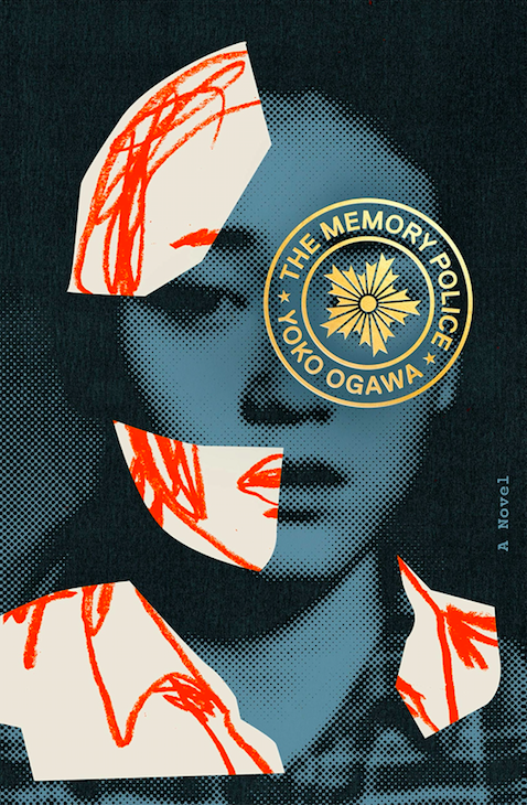 Cover design by Tyler Comrie (Pantheon, August 13)
A collage of contrasting textures and shimmering foil, this cover is even more rewarding in person.
Really love the way the drawn elements are collaged over the photo.
This cover has such an unexpected juxtaposition of photography and graphics. As much as the elements contrast, they ultimately form a perfectly harmonious design. The type inside the seal is an inventive solution.
I’m very partial to collages of human faces. Really lovely marriage of type and image as well.
The juxtaposition of the half-tone photo and the hand drawn face conveys an abundance about the nature of the book. It’s both cerebral and rich with feeling, qualities that doesn’t always coexist. I also love that the type is in a small, foil-stamped lockup, adding to the tactility of the design.
I love how the combination of pieces work together to form a singular image. Each texture adds a layer to the story being told by this design.
This imagery perfectly articulates memory and loss, and the title and author have been integrated in such a unique way.
I love how sections of the photo are fleshed out with drawn elements. . . There’s a visual metaphor here that adds an entirely new dimension and elevates it to high art. I realize this is an ancient reference, but I also couldn’t help thinking of A-Ha’s “Take On Me” video when I first saw this! But really, every element here is perfect—the treatment of the title and author, its placement in a seal over one eye. Everything comes together to let you know this will be a surreal, haunting read.
I love how the collaged elements complete the portrait while also creating a sense of disconnect. It makes me really curious about the read.
 Cover design by Alex Merto (Riverhead, August 13)
I bought this book for the jacket alone; how many covers read both vertically and horizontally? The seemingly paper-cut landscape wraps from flap to flap, and the more I study it, the more I’m convinced it belongs in the MoMA.
Every time I see this cover, I am impressed. Not too many covers can pull off vertical type like this (or get approved!), but this one is a success. Equally amazing is how the designer pulled off the vertical type with such a long title . . . a challenge for every designer. I love the color palette and the way the visuals evoke darkness.
 Cover design by Alex Merto, art direction by Ingsu Liu (W. W. Norton, August 20)
A simple and witty concept. It’s a little awkward which gives it character.
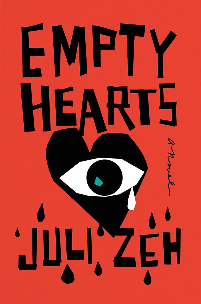 Cover design by Emily Mahon (Nan A. Talese, August 20)
I chose this cover for its boldness, and especially for Emily’s custom-created lettering and graphics; perfect and unique.
This cover really knocked my socks off when I saw it. I love the Saul Bass energy and the teary eye peering through a jagged black heart. It’s like big brother meets Vertigo. Everything is off-kilter here in the best way possible.
I love the expressiveness in these simple, beautifully stylized elements.
 Cover design by Neil Donnelly (Verso, August 27)
This cover is so visually compelling and satisfying. The type is handled really masterfully, and it feels bold and maximalist. It’s clever in that the title wraps over the spine of the book too, making the book package feel whole.
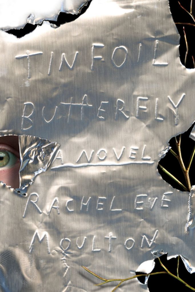 Cover design by Thomas Colligan (MCD x FSG Originals, September 10)
A fantastic and clever use of simple material to create both a tense backdrop and evocative type.
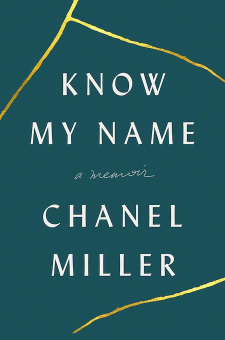 Cover design by Jason Ramirez and Nayon Cho (Viking, September 24)
I have never seen a book that has a note on the cover included, but I am so glad that this one does. Chanel Miller’s powerful memoir deserves a compelling cover and the jagged gold lines referencing the Japanese art of “kintsugi” make her message clear.
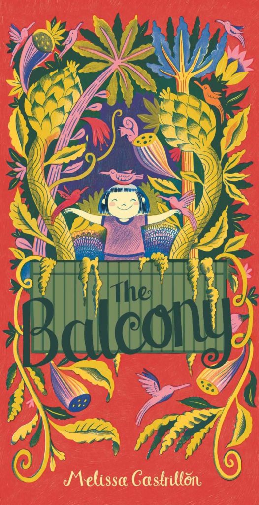 Cover design and illustration by Melissa Castrillon (Simon & Schuster/Paula Wiseman Books, September 24)
A colorful explosion of joy. Made me happy and made me buy the book. Job done.
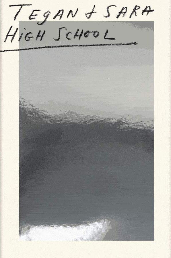 Cover design by Na Kim (MCD, September 24)
This design is so striking but also incredibly thoughtful and aligned with Tegan and Sarah’s audience. Na wrote about the process for EW and the foiled panel is meant to provide interaction with their fan base providing a mirror to see themselves and their own experiences within the book and to symbolize Tegan and Sarah’s duality and the self discovery of high school. It is a beautiful, compassionate and brilliant package!
Pair the words “high school” with a mirror, and you’re going to conjure up an endless well of memories and feelings; this cover is absolutely brilliant!
This cover is so sick. The mirror is sooooo high school omg. From any generation or place on the planet. Literally a mirror, or the idea of the self as the central focus. Amazing.
It’s so refreshing to see special effects used in a way that’s more than just adding glitz to a cover.
Any time a cover can elevate itself outside its own form—in this case from book to mirror—it is a triumph. Less covers more objects!
 Cover design by Oliver Munday (New Directions, September 24)
This new edition for a book with an already fantastic cover is less direct than its predecessor; the title is suggested through the form of the design but never crosses over into literal territory. A fine line towed well.
 Cover design by Rodrigo Corral (FSG, October 1)
There’s technically nothing special about this cover, but that’s kind of what makes it special—it’s like the platonic ideal of type over image. What makes it memorable, though, is how it lands in this sweet spot of Uncanny Valley space, seemingly effortlessly. (A subtle emboss pushes the physical object over the edge.)
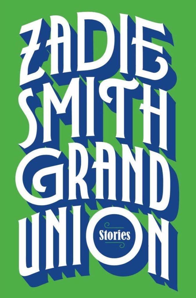 Cover design by Jon Gray (Penguin Press, October 8)
This cover feels retro, yet contemporary. While all of Jon’s covers for Zadie Smith have been great, this one really feels iconic.
 Cover design by June Park (MCD x FSG Originals (October 8)
I love the bold, mostly black & white palette of this design with bright hits of color used sparingly—along with the random unrelated imagery it makes me so curious to delve into this book.
I have no idea what “false bingo” means, but this cover gives me some inkling and certainly makes me want to know more. A bingo card, knives, and a disintegrating frog will probably never share the same space again, but I’m thankful June brought them all together for one shining moment. Also thankful for the acid green windows!
This doesn’t look like anything else. It’s weird and I like it.
What is going on here! This cover is so original and arresting, and I find it slightly disorienting in the absolute best way. It makes me want to pick up the book and get an answer.
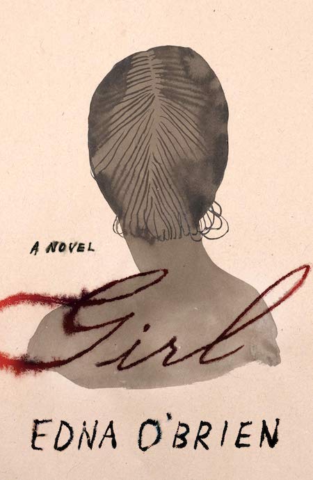 Cover design by Na Kim; illustration by Chioma Ebinama (FSG, October 15)
An example of a pitch-perfect script and illustration working in concert. It’s difficult to do a feminine, calligraphic cover that doesn’t feel trite or saccharine, but this is just that. For me, the red in the title evokes just enough of the gory and the illustration just enough of the ghostly that I’m sold.
 Cover design by Janet Hansen (New Directions, October 29)
Mysterious!
 Cover design by Hilda Wong for No Ideas (Verso, October 29)
With such a loaded title this cover could have fallen victim to any number of metaphorical cliches. Yet the sinister simplicity of the Venus flytrap gives this book a strength outside the directness of its language.
 Cover design by Kelly Blair (Vintage, October 29)
I love the balance of the typography and the drawing of the piano, both are stamped in lush gold foil on the final jacket.
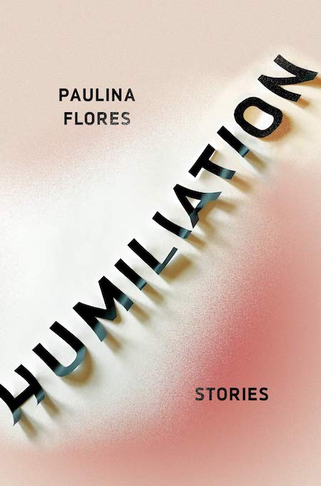 Cover design by Nicole Caputo (Catapult, November 5)
When I first saw this cover, I think I may have gasped a little. The design is perfectly evocative of the feeling of humiliation. The execution is perfect from design to production.
A book is a tactile object and it’s wonderful when a cover can remind you of that. The peeling type on Humiliation makes you want to run your hand over the cover again and again. The peachy color fading to red hints at a blush of embarrassment or the sting of a slap which ties in perfectly with the title.
Such a beautiful, blushing cover and great typography. It can be hard to fit in such a long title, but Nicole made its awkward length part of her design solution.
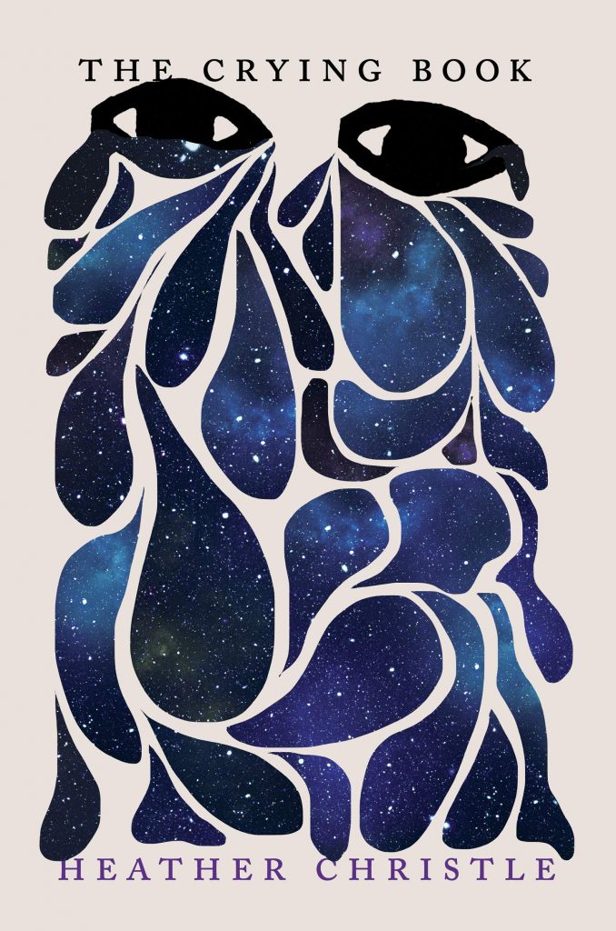 Cover design by Nicole Caputo (Catapult, November 5)
Awright, probably everyone chose this one. Gorgeous.
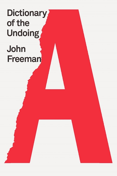 Cover design by Rodrigo Corral (MCD x FSG Originals, November 12)
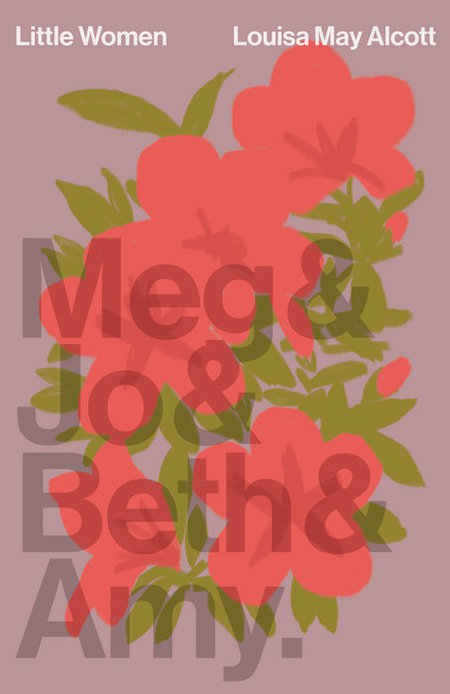 Cover design by Linda Huang (Vintage Classics, November 12)
So smart! And lovely.
 Cover design by Rodrigo Corral (FSG, November 12)
Loud + odd = perfect.
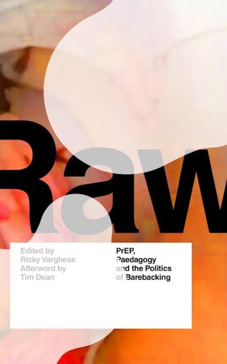 Cover design by Michael Oswell (Zed Books, November 15)
I’m not here to speculate what’s going on in the textured low-res image or with the abstracted liquid overlay but any palpable imagery suggested by the title and its sub exists solely in the mind of the reader.
 Cover design by Rodrigo Corral (MCD, December 3)
Mind melting—yes!!!! I cannot help but be attracted to this cover. Crazy title, crazy fusion of image and type.
Emily Temple
Emily Temple is the managing editor at Lit Hub. Her first novel, The Lightness, was published by William Morrow/HarperCollins in June 2020. You can buy it here.
