Designing Your Grandfather's Book (When He's James Thurber)
Sara T. Sauers on Honoring the Family Aesthetic
Without any formal training in art—without even considering himself an artist—yet with a fresh and inimitable quality of line, humorist James Thurber transformed the single-panel cartoon and caption in the early years of the New Yorker. A Mile and a Half of Lines: The Art of James Thurber by Michael J. Rosen celebrates this historic contribution, framing Thurber’s work in his own time. The book also accompanies an exhibit of the same name at the Columbus Museum of Art in Thurber’s hometown.
James Thurber is my grandfather and while I consider him a tremendous influence in my life with books, I pretty much remember him only as a man in a chair. My family lived in the Midwest and we visited him in West Cornwall, Connecticut during our summer vacations. I came to know him through stories told by those who knew him well: my mother, Rosemary Thurber, his only child; my grandmothers, his first and second wives; and friends from his Connecticut circle. I see my grandmother, Althea Thurber, in a lot of the cartoons; she’s one of the quintessential Thurber women.
I have always loved reading Thurber and I still laugh even though I know exactly what’s coming. As a general book design rule, the more a designer understands the content the stronger the design. I was never better informed for a job, but was nervous about doing justice to my grandfather’s work. With text from the author and five additional contributors, along with some 250 images and several styles of captions, my challenge was to organize Thurber’s (and Rosen’s) “sure grasp of confusion,” a description from New Yorker colleague Wolcott Gibbs that sums Thurber up brilliantly.
The title of the book is taken from Thurber’s own words, “If all the lines I’ve ever drawn were straightened out, they would reach a mile and a half, I drew just for relaxation, between writing.” Ever restless, he drew quickly and prolifically, doodling in notepads on colleagues’ desks, giving away sketches to friends, filling blank spaces in books he owned, and even drawing on office, attic, and barroom walls. Given the archive of extant drawings that Rosen, my mother, and I worked with, in addition to those that are in print (and where there is no extant original), I think my grandfather might have seriously underestimated the length of that line.

The volume of his body of work as both a writer and a visual artist stuns me, and I thank the stars that there was a bibliographer, Edwin T. Bowden, who took him on. Thurber’s work documents his time, but there is much about Thurber’s people, dogs, and other creatures that is timeless.
As first pitched by Rosen to Tony Sanfillipo, the acquiring editor, A Mile and a Half of Lines was to be black and white with Thurber’s drawings printed as line art or in grayscale, with color used only on the cover and endsheets. This option no doubt helped sell the book to Ohio State—university press production budgets are typically modest. Yet ultimately we all agreed that black and white was inadequate for presenting Thurber’s lines as never before seen in print—as art on paper.
Thurber’s work documents his time, but there is much about Thurber’s people, dogs, and other creatures that is timeless.
Here are some examples of work that moved us to choose full color: the soft gray pencil on canary yellow pages that Thurber used to record a lively evening spent with poet Carl Sandburg, the variable black ink wash in the drawings for his “Famous Poems Illustrated” version of Poe’s “The Raven,” and the men’s heads and classic Thurber dog drawn in white chalk on an oversized black mat board. The latter was one of a number of adjustments made in his drawing tools in an attempt to help Thurber keep cartooning as his eyesight declined in the early 1940s to near total blindness some few years later. (The end result of a childhood accident with bow and arrow that blinded him in one eye during a game of William Tell with his brothers.)
Michael Rosen and I found value in showing readers other material qualities of the original work, including editorial and print production markings found on many of the drawings. There is Harold Ross’s handwritten capital R indicating his acceptance of a drawing for publication in the New Yorker; caption revisions, typed and pasted on or with strikethroughs and handwritten changes; and rubber-stamped inventory and pre-press directions, all of which seem essential to telling the story of Thurber as an artist.

Or, as not an artist—the casual handling and marks of use from others indicate that the drawings were viewed as ephemeral, as do the remnant stains of paper clips, rubber cement, and tape. Even what has happened to the papers Thurber used is telling. He drew on whatever stock was nearby, much of it the New Yorker’s typewriter paper. There are drawings on shirt cardboards. Nothing was archival, and the varying substrates have aged to a warm palette of off-whites and yellows, including a yellow that inspired one of the book’s interior accent colors.
I have heard over and over from my mother that her father hated it when his work was called whimsical.
Presenting an “authoritative yet inviting” cover called for a change in tack. The cover drawing chosen by the publisher was given to me with instructions to add color to the image, and to please not use beige for the background. We didn’t have the original drawing Thurber did for the 1935 Washington Square Art Fair advertisement, but we did have a scan from the Library of Congress of the printed poster. There is solid precedent for adding color to Thurber’s drawings—five of his six New Yorker covers were shaded and colored by someone in the art department, and some Harper Perennial editions have taken this direction with their covers.
Using primary colors and black, I filled in articles of clothing and the dog, and after a few revisions a sketch was approved. A few weeks after that, in discussion over a beverage in Columbus, Rosen and Sanfilippo rethought that direction—for a book that wanted to make a case for the drawings as art, we should not alter the drawing. My revised instructions were to set the drawing in a border or frame so that it became a piece of art. I thought that would confine Thurber’s people and dog, and instead I set them up in a two-dimensional museum gallery, supporting them yet leaving them a way out.

I have heard over and over from my mother that her father hated it when his work was called whimsical. That knowledge guides me—haunts me—whenever I am involved with Thurber projects. Whether he said it in so many words, Thurber knew that the best humor is serious in showing us ourselves.
Finally, a note on the type. The book is composed in Quadraat, a family of fonts by the Dutch designer Fred Smeijers. I chose it because its lines are robust and just a bit rough and, like Thurber’s lines, they move me viewing after viewing.
_____________________________________________
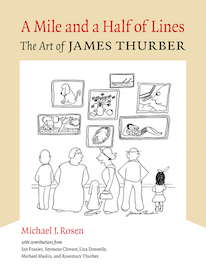
Works from A Mile and a Half of Lines: The Art of James Thurber, published by Ohio State University Press, are copyright © 2019 by Rosemary A. Thurber. Reprinted by permission of Rosemary A. Thurber and the Barbara Hogenson Agency, Inc. Drawings courtesy Ohio State University Libraries; Washington Square Outdoor Art Exhibition poster courtesy Library of Congress.
Sara T. Sauers
Sara T. Sauers is a typographic designer and letterpress printer who designs and produces books and other printed matter using both historical and contemporary print production methods. From her Iowa City letterpress shop she publishes literary fine press books under the Catstep Press imprint and operates Bun Fight Press for selected job printing. She is a freelance book designer for the University of Iowa Press. She has an MA in journalism from the University of Iowa. In 2002 she received the Carl Hertzog Award for Excellence in Book Design for her work on No Shortcuts: An Essay on Wood Engraving by Barry Moser (Center for the Book Editions, 2001).
