The 75 Best Book Covers of 2018
According to Book Cover Designers
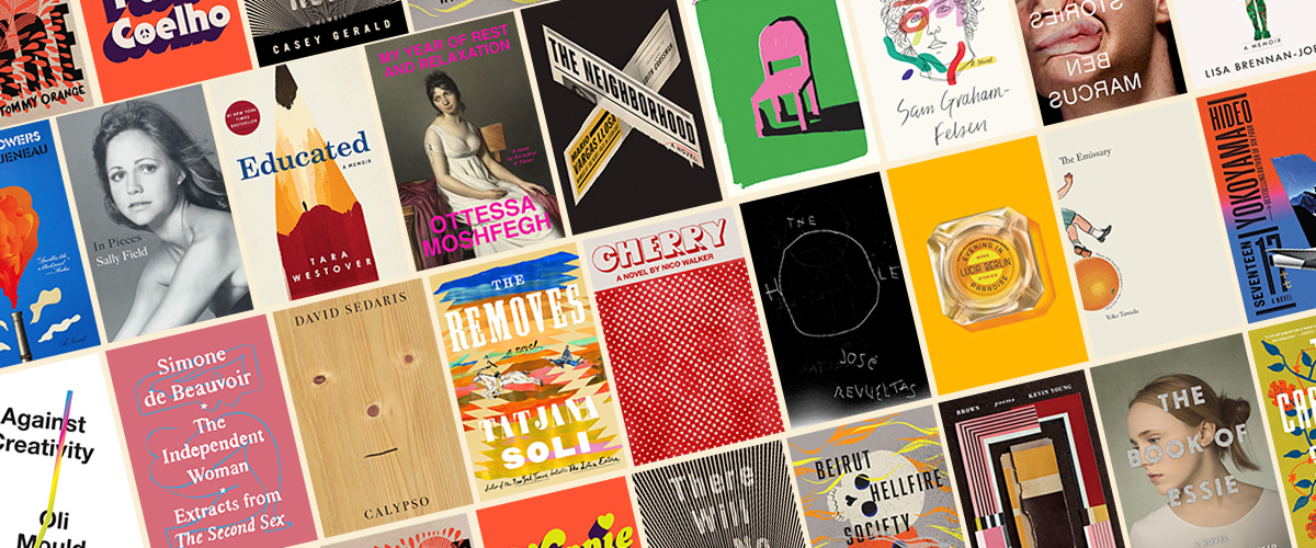
2018 has been many things, but it certainly has not been lacking in great book cover design. Here at Lit Hub, we unpacked the biggest book cover trend of the year, compared US covers to their UK counterparts, and remembered the best and worst covers of Lolita as well as Edward Gorey’s own cover designs. We gave you a brief visual history of Virginia Woolf’s book covers and treated you to 100 covers for One Hundred Years of Solitude.
We also featured great essays from designers themselves, reflecting on their work: Janet Hansen on Nico Walker’s Cherry, Charlotte Strick on Rachel Cusk’s Outline series, Sarah Wood on Joseph Cassara’s The House of Impossible Beauties, Kimberly Glyder on Gone With the Wind, Roman Muradov on Norah Lange’s People in the Room, and many more.
But it is December, and therefore I am inclined to ask: which book covers were the best? As I did last year and the year before that, I asked the experts: book designers. This year, I asked 27 designers to share their favorite book covers of the year, with a bit about why—and they came back with a whopping 75 different covers of note. But of course, some of them had similar ideas about the best of the best. Here are the stats:
The very best book covers, with 12 votes each:
Nico Walker’s Cherry, designed by Janet Hansen
Melissa Broder’s The Pisces, designed by Rachel Willey
The second-best book cover, with 6 votes:
José Revueltas, The Hole, designed by John Gall
The third-best book covers, with 5 votes each:
David Sedaris, Calypso, design by Peter Mendelsund
Lucia Berlin, Evening in Paradise, design by Na Kim
The press with the most covers on the list:
New Directions (11 books)
The press with the second most covers on the list:
FSG (10 books)
The designer with the most covers on the list:
Na Kim (8 books)
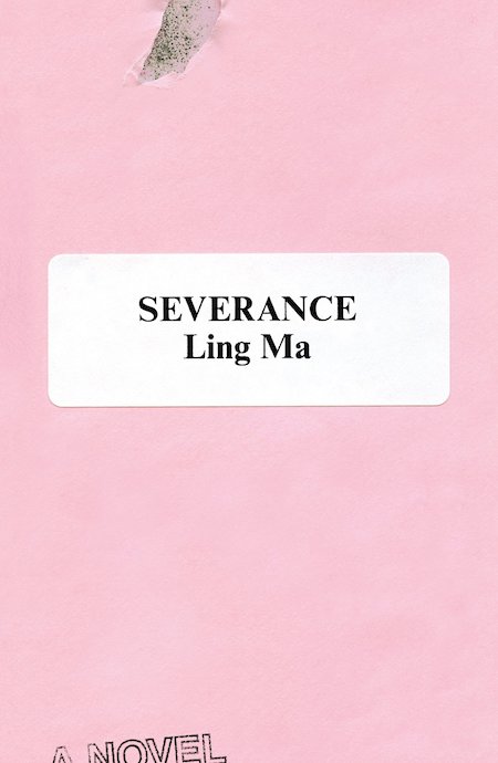 Ling Ma, Severance, design by Rodrigo Corral (FSG)
The anti-design aspect of this jacket really appeals to me. It signifies “office” without being a slave to the concept. The carefully placed elements tell you this novel is subtly humorous, smart, and slightly off-kilter. It also takes full advantage of millennial pink but manages to rise above its use as a publishing marketing ploy.
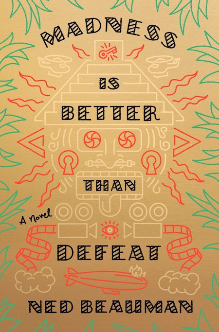 Ned Beauman, Madness is Better Than Defeat, designed by Tyler Comrie (Knopf)
The color and illustration and typography come together so seamlessly on this cover. It looks that much more spectacular in person, with the gold background and subtle debossed type. Stylistically this is such an original and inviting package.
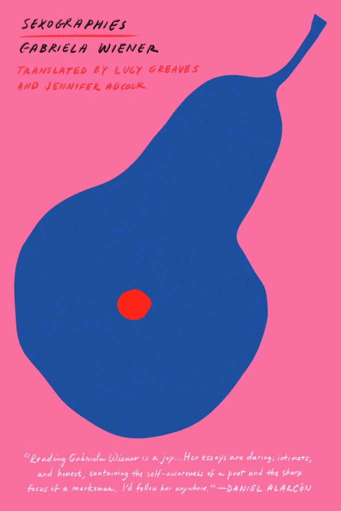 Gabriela Wiener, Sexographies, designed by Na Kim (Restless Books)
Throughout the reconnaissance conducted for this post, Na Kim emerged a clear winner. It’s impossible to choose among her covers (. . .so good, so enviable!), but Sexographies rises to the top for its brilliant simplicity, pop palette, and double entendre.
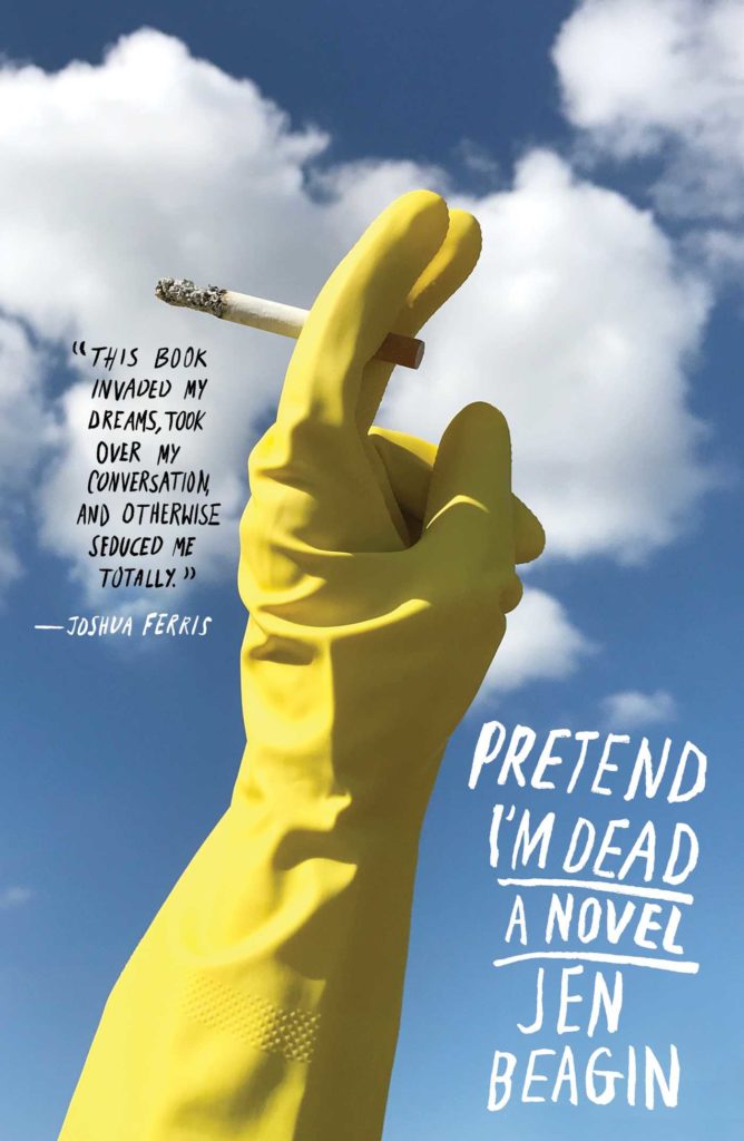 Jen Beagin, Pretend I’m Dead, photo and design by Alex Merto (Scribner)
I am a sucker for a cover that makes me laugh out loud. The triumphant/defiant(?) rubber glove holding a smoke is so perfect.
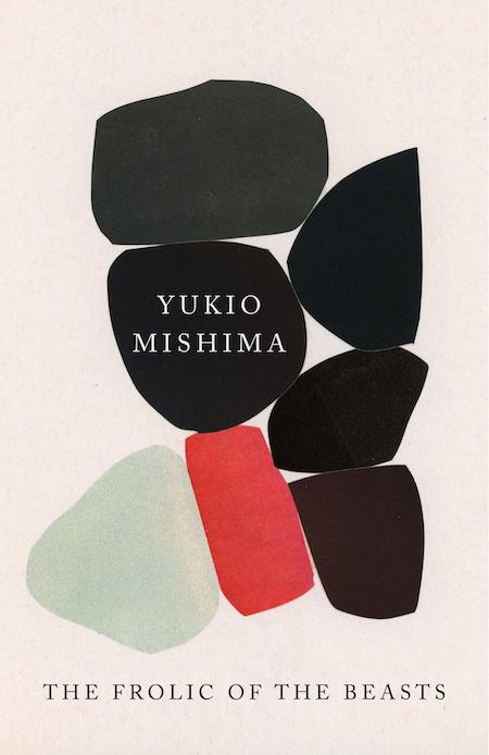 Yukio Mishima, Frolic of the Beasts, design by John Gall (Vintage)
It’s a John Gall original on a cover!
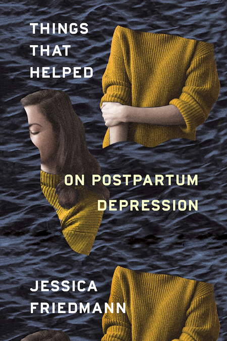 Jessica Friedmann, Things That Helped, design by Na Kim (FSG Originals)
I read this on maternity leave and this cover represented how I felt. Chopped into pieces and floating away.
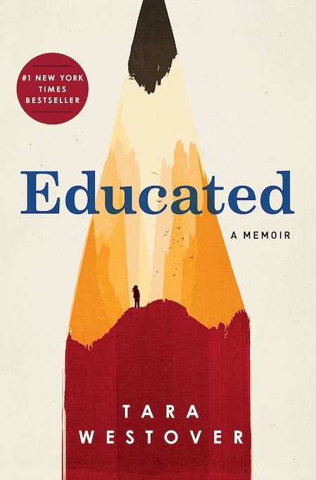 Tara Westover, Educated, cover illustration by Patrik Svensson (Random House)
I’ve seen this book pop up on social media, in stores, and on “best of” lists. Each time, I’m struck by how smart it is. I love the combination of the clever pencil, holding the figure in the “mountain top,” paired with the simplicity and strength of the type. Perfect visual tone and perfect execution.
This is not your typical memoir cover at all, at first glance it could even be a sci-fi novel. And yet, all the elements of the story are present. The western landscape where the author grew up and her pursuit of higher learning are incorporated into the simple graphic making this the sort of cover you grow to love even more after you’ve read the book.
I enjoy looking at and designing covers that give the viewer some credit, where the symbolism or message is not always glaringly obvious. But regardless of whether you notice the tiny figure within the shaven part of the pencil tip or not, this cover is bold and stands out on screen and shelves. But when that figure is seen, I am not sure how you could resist wanting to know more about the author’s story. Such a clever and thoughtful design to represent the content of this outstanding memoir.
 Mario Vargas Llosa, tr. Edith Grossman, The Neighborhood, design by Alex Merto (FSG)
Love the layout of the bold X as a nod to the title. Simple at first glance, but a closer look shows that its filled with nuanced details.
It’s always a challenge working with so much typography, but here it is leveraged to create great tactile detail, all contained within a striking X.
 Thomas Pierce, The Afterlives, design by Grace Han (Riverhead)
I remember being involuntarily propelled toward this cover upon seeing it. The fractured painting and vivid yellow living together in those impossible geometries is wonderful and intriguing.
 Eve Babitz, Black Swans, design by Kelly Winton (Counterpoint)
A green cover is always a big win! And this type is just the tops.
 Laboria Cuboniks, The Xenofeminist Manifesto, design by Chloe Scheffe (Verso)
Bold design, bold colors, bold book cover. The layout also extends into the interior making this a unified object, something that you don’t see often enough with books.
 Hideo Yokoyama, Seventeen, design by Alex Merto (MCD)
Publishers often dislike layouts that force the consumer to do too much work. But sometimes that’s precisely what draws a reader to a jacket—placing a book’s information in all the wrong places forces you to engage more than an “easier” jacket might. This jacket is successful because it breaks all the rules. It even conveys “thriller” without resorting to gigantic type and full-bleed shadowy figures. It also manages to make the tail of an airplane intriguing, and for that alone I give it an A+.
The dimensional art against the flat, gradient background, the stacked type…everything feels very cohesive and bold.
 Raymond Queneau, The Blue Flowers, design by Peter Mendlesund (New Directions)
This cover further cements Peter Mendelsund’s status as a master of contemporary book cover design. From the type selection to the graphic rendering of the collaged artwork, it tells you everything that you need to know in one fell swoop: this is a bold, wacky work of 20th century surrealism (dare I say that it gives me Monty Python vibes?) that has a rightful place in any 21st century library.
This is one of those Peter Mendelsund covers that I stare at and marvel at how perfectly all the elements add up. From the off beat typefaces, to the mix of textures, and finally to the peak of face, it looks like he had fun designing this and yet it screams sophistication.
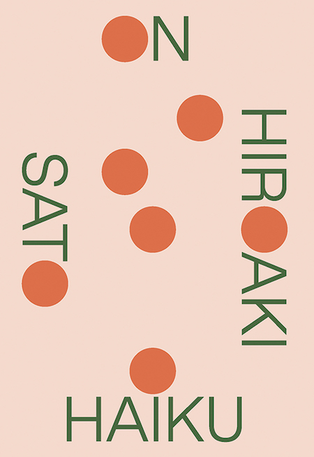 Hiroaki Sato, On Haiku, design by Boyang Xia / Rodrigo Corral (New Directions)
While books about poetry can afford to be more abstract, they still usually look like book covers. This looks like it could be a poster for a contemporary jazz concert made by someone in an MFA design program. The type, treated like an image, is audacious in the way it has been broken up. I love how each word has a circle in place of a letter (or part of). That unwavering formal logic, along with the sophisticated color palette, win me over.
 Robin MacArthur, Heart Spring Mountain, design by Sara Wood (Ecco)
This cover does a great job of invoking innocence, nature and a “simpler time and place,” which is something I think is more difficult to accomplish than it seems when you must also suggest the presence of people. Theres a lovely balance in the way the type is handled that complements the artwork and doesn’t try to overpower it, yet feels fresh and contemporary.
 George Saunders, Fox 8, design by Chelsea Cardinal (Random House)
This is one of those covers where I’m sure there was a version that was just the illustration. Every designer tries for the no-type-on-a-cover unicorn. The illustration is so beautiful! The subtle texture to his fur and the color choices make me so happy. Again, I feel like I’m always aiming for a simple color scheme on covers and Chelsea nailed this one. The type is so wonderfully designed. It’s such simple lettering, but you can tell each letter was considered to make it feel unique but get out of the way of the illustration. Also, cannot wait to read this! Based on the little I know of the story, I feel like the fox is curled in such a way that he really is sitting outside of a window listening to children’s stories. Spoiler (not really), that’s apparently what happens.
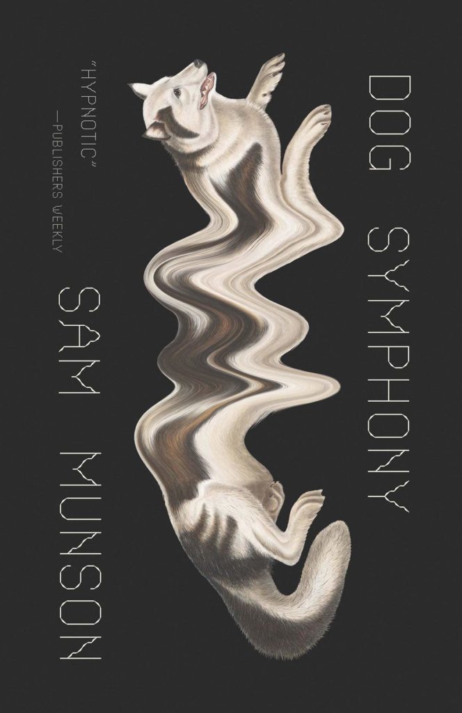 Sam Munson, Dog Symphony, design by Joan Wong (New Directions)
Surreal and weirdly computer-glitchy. This illustration makes me want to go into this novel and get lost with the dogs.
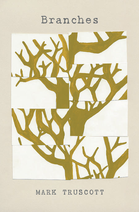 Mark Truscott, Branches, design by Tree Abraham (BookThug)
While collage is frequently used as a device for illustrating book covers, the design of Branches by Mark Truscott is very fresh. The segmentation of the tree, and the re-organization of its parts, is a metaphor for a personal perspective; we often don’t see the whole tree, but we catch glimpses of it from different angles. The understated typography and neutral palette allow the beautiful idea behind this cover to come to the fore.
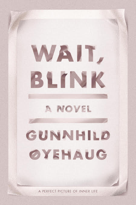 Gunnhild Øyehaug, tr. Kari Dickson, Wait, Blink, design by Na Kim (FSG)
It’s oftentimes challenging to create an all type cover that conveys movement, let alone with elegance and emotion. The cover feels so alive and fluid. Every time I see this, I’m just captivated by its subtle beauty.
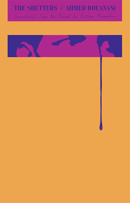 Ahmed Bouanani, The Shutters, design by Oliver Munday (New Directions)
I love it when a designer isn’t afraid to take a blank space and make it the most powerful element of the jacket. While most of this layout resides in the top quarter of the jacket, the tear/sweat/blood extends beyond the confines of this area into the empty space below. The tension between the rigid spaces housing the type/imagery and the loose drip escaping beyond them make my heart beat a little faster. The design manages to convey oppression, confinement, fear, and isolation with barely any visual information.
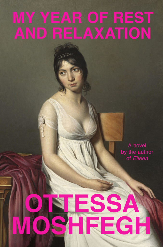 Ottessa Moshfegh, My Year of Rest and Relaxation, design by Darren Haggar (Penguin Press)
I love the juxtaposition of the hot pink san serif font with the traditional portrait of a woman. Her facial expression gets across everything you need to know about this darkly comic book.
Seldom do we see ambivalent emotions depicted on book covers. The woman’s affect captures the oppressive listlessness felt by the protagonist, screaming: “I’m over it.” Well, I think we can all relate. The choice of a classical painting is a wry nod to the character’s art history background, and the final, triumphant slap of some deadpan Helvetica—in hot pink, no less—make this cover. A bare nipple helps, too.
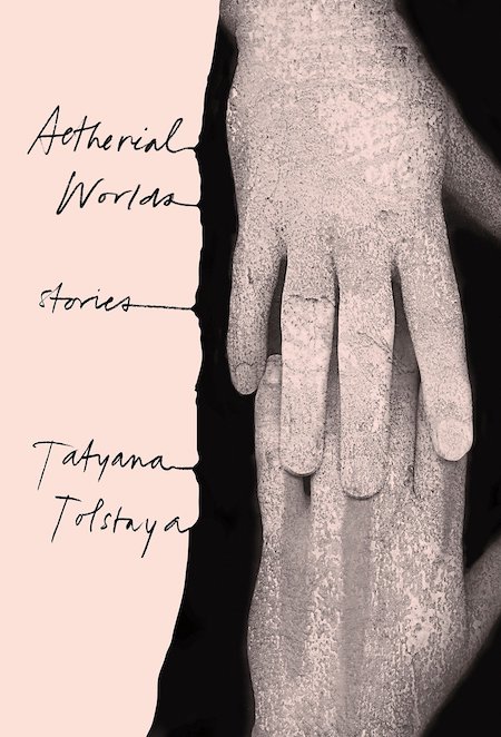 Tatyana Tolstaya, Aetherial Worlds, design by Stephanie Ross (Knopf)
Absolutely perfect image choice that is eerie and yet so beautiful it’s almost calming at the same time. I’m also a huge fan of the way she executed the type, bleeding into the image makes it different from what I’ve seen before and gives it the same eerie but beautiful quality. This exercise in restraint draws me in and makes me want to know more, the ultimate goal in cover design.
I just love the way the type is treated on this. Lovely photograph too. Reminds me a little of one of last years hit covers, All We Can Say, designed by Janet Hansen.
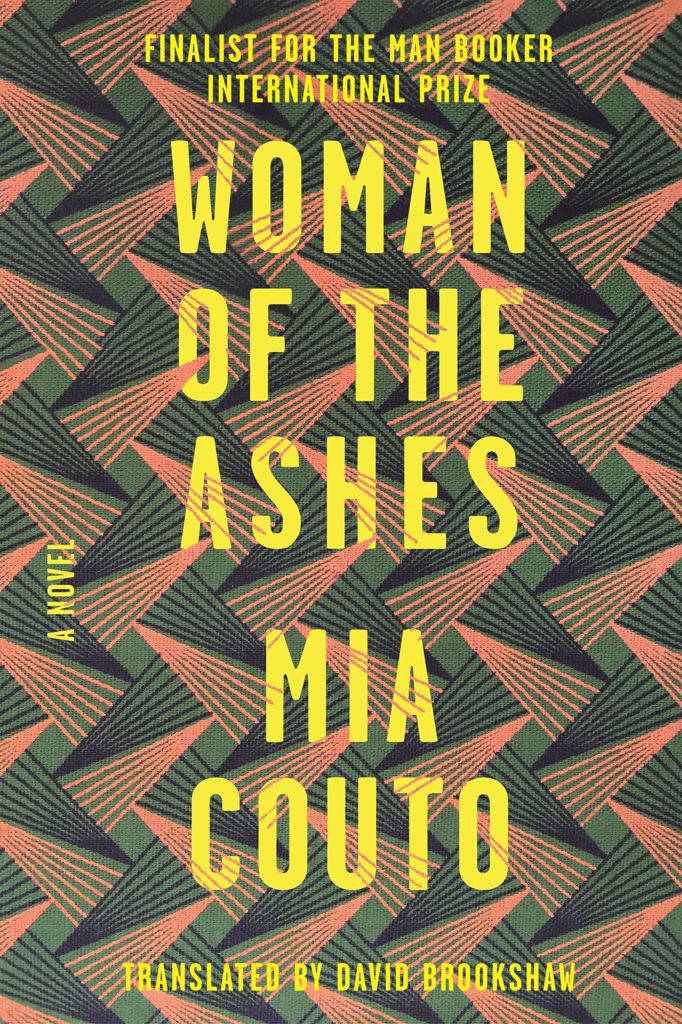 Mia Couto, Woman of the Ashes, design by Sarahmay Wilkinson (FSG)
Love the texture of this pattern, the colour, the strong type subtly integrated into the graphic form of the pattern. This designer has created a few show-stoppers in 2018 so well worth checking out her work. It is vibrant and graphic with a strong typographic flair.
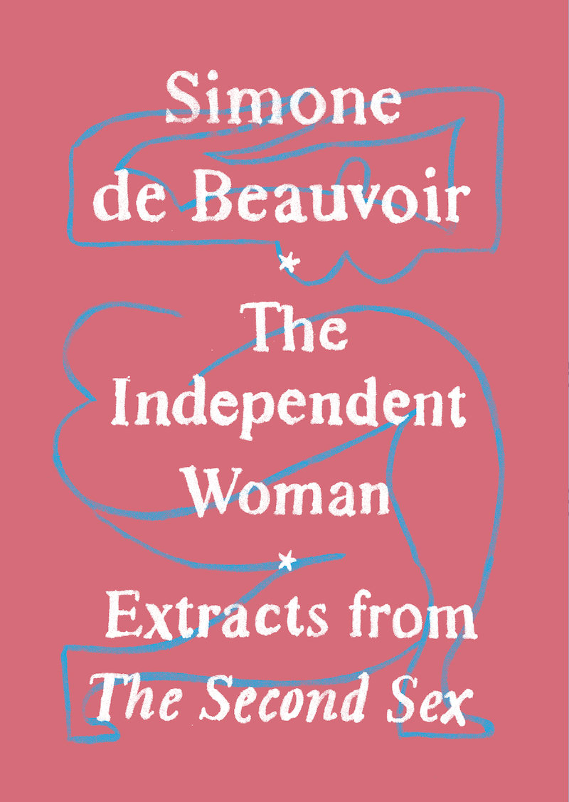 Simone de Beauvoir, The Independent Woman, designed by Adalis Martinez (Vintage)
This cover is small in size, but has such a big personality. Adalis created such an elegant package with simple painted art and type, and it feels special. The colors on the printed cover are so nuanced and beautiful and this is an object you want to hold.
This slim, pocket-sized volume stopped me dead in my bookstore-browsing tracks; it just lit up the table it was sitting on and begged me to pick it up. We both love the vibrant color pallet, as well as Martinez’s thoughtfully integrated hand-traced typography paired with her modernist nude. It’s rare for a package this pretty to also look so heroic.
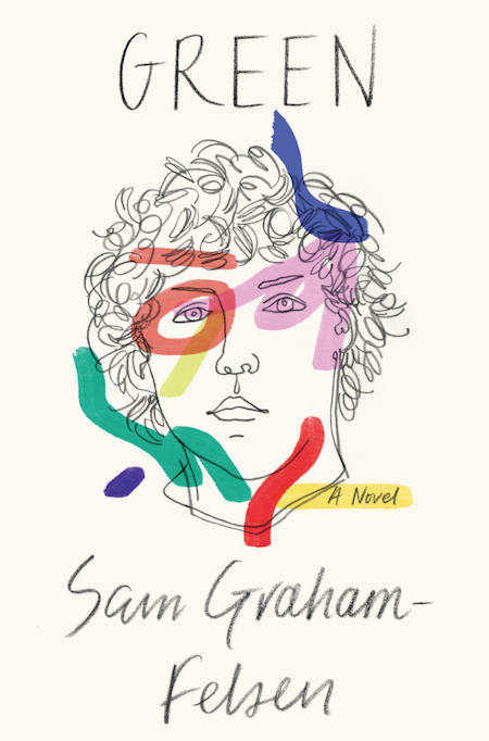 Sam Graham-Felsen, Green, design by June Park and Rodrigo Corral (Random House)
I love this drawing of a face staring back at me along with the strange strokes of colors.
With it’s use of materials this cover could have easily turned messy, but a striking portrait and the restrained mark of the hand elevates this cover to a coveted work of art.
Emily Temple
Emily Temple is the managing editor at Lit Hub. Her first novel, The Lightness, was published by William Morrow/HarperCollins in June 2020. You can buy it here.
