How to Use Red, White, and Blue on a Book Cover (Without Going Too Patriotic)
Nicole Caputo on Designing the Cover for The Atlas of Reds and Blues
Devi Laskar’s debut novel The Atlas of Reds and Blues takes place over the course of one morning, as “Mother,” an American-born daughter of Bengali immigrants, lies in her driveway bleeding after being shot by a police officer. In vivid snapshots and memories, she recalls the story of her family and the racism they endured over the course of their lives. The structure of the book is unique, reading like poetry in some sections. It is beautiful and brutal, heartbreaking and timely in its exploration of racism, abuse of power, and sexism in America.
Lying on her back, looking up at the sky, the narrator pieces together her past in an attempt to pinpoint what has led her to this moment. What she sees—the sky, the branches of oaks and pine—is interspersed in her feverish, dream-like memories. An owl inspired the main cover image for three of the four cover designs shown to our team. Throughout the story, it hovers above our narrator’s head; its hoots are continuous but always unanswered, much like the questions asked by the narrator herself as she thinks back to a constant drone of microaggressions, violent racism and misogyny.
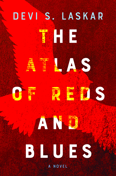
In Laskar’s novel, intense pain and incredible beauty often coexist on the same page, so I wanted to mimic this on the cover, which meant having to actively avoid an overemphasis on darkness. Sans serif typography communicates urgency, but is also clean and crisp amongst the bright, screaming colors, layers of texture, and geometric patterning. I also supplied one design with a bold and somewhat decorative serif as an option.
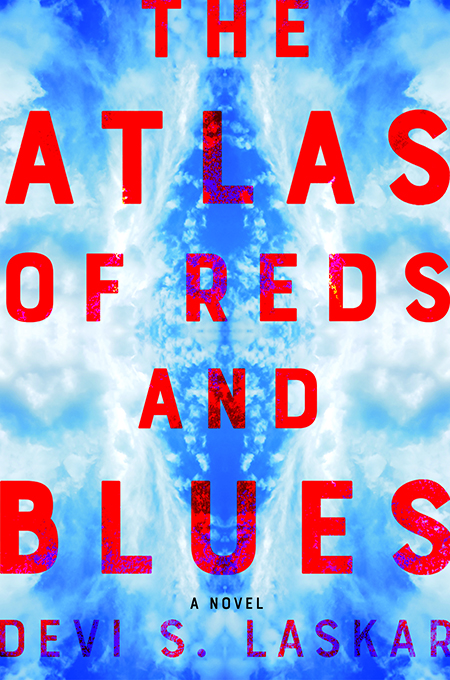
I usually like to stay away from repeating an obvious visual element that is already communicated by the title, but the palette of nearly neon reds and blues felt conceptually strong and represents the blood that runs through this story, as well as the police officers’ uniforms and the anger and shock of our narrator.
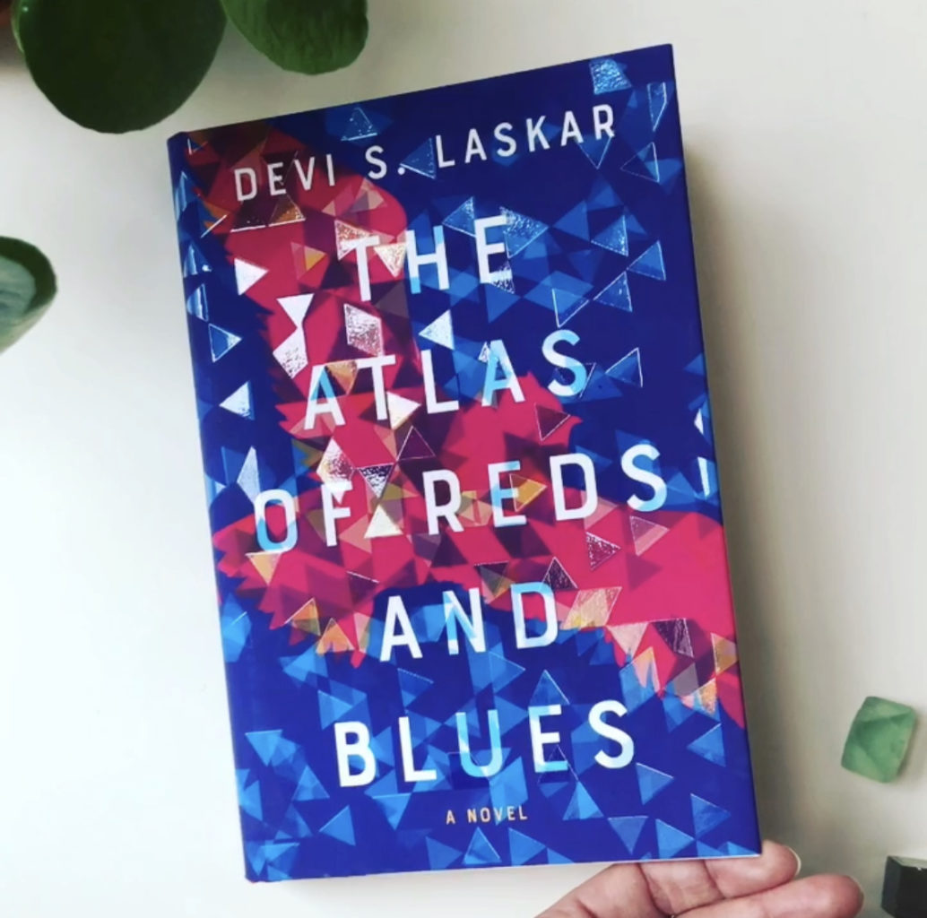
I also tried a kaleidoscopic pattern, which is meant to represent Mother’s vision as she slides in and out of consciousness, as well as the way her memories are parsed and brought to the fore of her present reality. The unique structure of the book, with sections of the story told in very short paragraphs, sometimes just three lines on a page, made fragmentation feel appropriate, and I emphasized the sense of crystallization with carefully placed geometric sections of thick spot gloss.
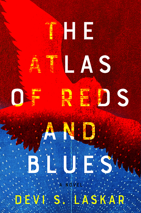
I ultimately submitted four unique designs to the team. We were divided in house as to which was best, with several people leaning towards what would become our final approved cover and the other half preferring the design with blue section at bottom and map-like lines radiating upwards towards the owl. To my delight, after some discussion we realized that the latter design, even when combined with the weathering and crimson color that practically screams at the viewer, looked too patriotic and might even be mistaken for a propaganda poster.
There was one final element to work out: an ampersand had been provided on the original cover brief, but I had replaced it with the word “and” spelled out. This not only balances the typographic layout, but removes the playfulness the ampersand introduces. Luckily, everyone else agreed.
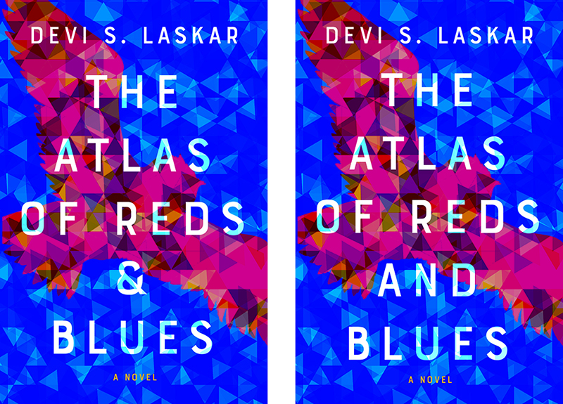
The jackets printed beautifully with the raised thick gloss sitting on top of a velvety soft touch lamination, which complemented the rich saturated reds and blues. What a treat to work on this overwhelmingly gorgeous, immersive and moving book.
Nicole Caputo
Nicole Caputo is an award-winning New York graphic designer who has been specializing in book and book cover design for the past 15 years. She is the Creative Director of Catapult and Counterpoint Press, and is also co-founder of She Designs Books, an organization that celebrates women in book design. She was formerly VP, Creative Director at Hachette Book Group. Awards include the One Show, Communication Arts, Type Directors Club, Art Directors Club, AIGA/NY, HOW International Design, PRINT Regional Design, the New York Book Show, the National Gold Ink Awards, London International Creative Competition, and the Publishing Professionals Network.


