50 Very Bad Book Covers for
Literary Classics
It could always be worse.
When a book passes into the public domain, it means not only that it’s available for adapting and remixing, but for reprinting and reselling with a brand new cover. Some of these covers are . . . pretty bad. Which, obviously, makes them very fun to look at.
I have collected a number of these very fun, very bad covers below. All of these covers are “real,” that is, attached to books that are at least nominally available for purchase, though many are digital covers for digital editions. You’ll find a number of covers from Wordsworth Classics, premier publisher of badly Photoshopped book covers, but many more from the wilds of digital independent publishing. Some are merely ugly; others make it clear that no one involved in the creation of the cover cracked open the book.
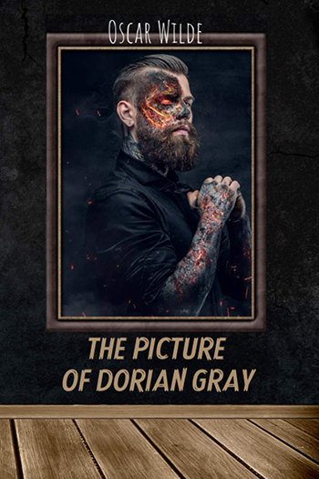
You may notice that most, but not all, of the books in question are in the public domain. For those that are not, I have no explanation. You may also notice that The Picture of Dorian Gray seems to inspire the most bad covers. For this, I also have no explanation (except that, let’s not kid ourselves, the concept is a bit silly).
Of course, feel free to add on your own favorite terrible classic covers in the comments! The more the merrier.
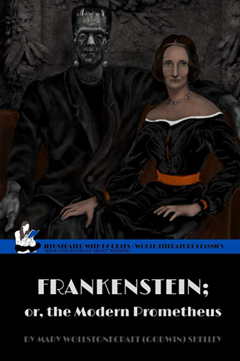
Well, everyone knows that Frankenstein isn’t a work of autofictional erotica starring Mary Shelley in a corset and featuring significant hand play, but what this cover presupposes is . . . maybe it is?
If The Scarlet Letter was a Planned Parenthood pamphlet. (Small Town Ignorance And You: A User’s Guide.)

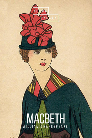
It is a truth universally acknowledged, that the uncanny valley is the worst of all the valleys.

Ah yes, “the woman in white.” She could only be a bride, right? Right.
Look, it’s a nice cover and everything, but I wouldn’t say it’s quite the correct mood.

Same goes for this one. And, um, that’s supposed to be a skull, not a shell. Some kind of typo in the brief, maybe?
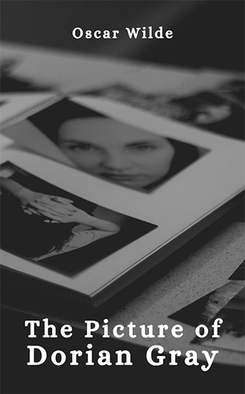
Not that kind of picture, guys.
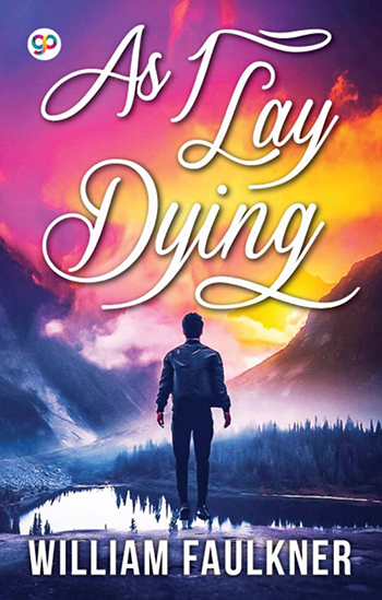
You know, Faulkner’s levitation-based fantasy YA novel.
Yes, this is objectively terrible but for the record, I love it.
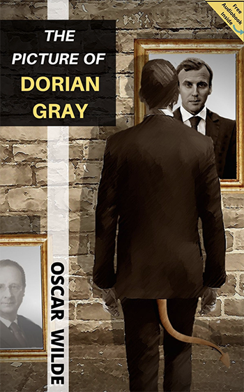
Okay, you’ve got the . . . devil (?) looking at himself in a mirror, with a framed picture of his lawyer sitting there beside him. Fair enough, but somebody needs to learn how to draw hands.

It’s a workplace dramedy!
Okay, fine. But it’s a little on the nose, don’t you think?
This art is only appropriate for early-internet werewolf fan-fiction.

Like Middlemarch itself, a cover that bends the rules of space and time.

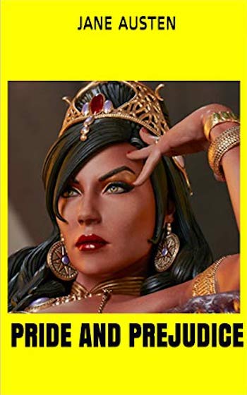
Jane Austen, a patriotic American novelist writing novels about patriotic Americans.

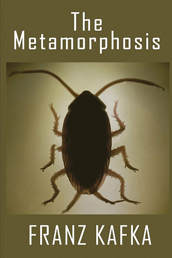
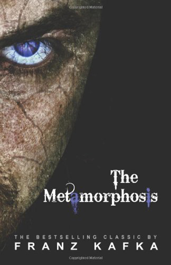
It’s a Bug’s Life, but make it Kafka.
I see they tried there, with the flowers. Maybe they stopped reading after the first line?

At least spell it correctly, though . . .

Get it? That’s him—the artist as a young man.

The Awakening: a story of a ballerina who can only dance in the light of the moon.

Why is it Brad Pitt?

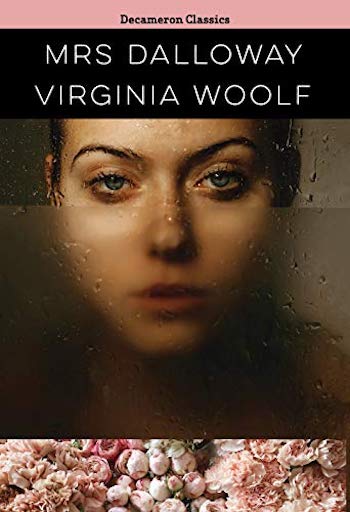
You know it’s chick lit because you’ve got a woman walking away from you in a field; you know it’s YA because of the chalk font and that backwards “N”; you know it’s preposterous because it has a blurb from Virginia Woolf.
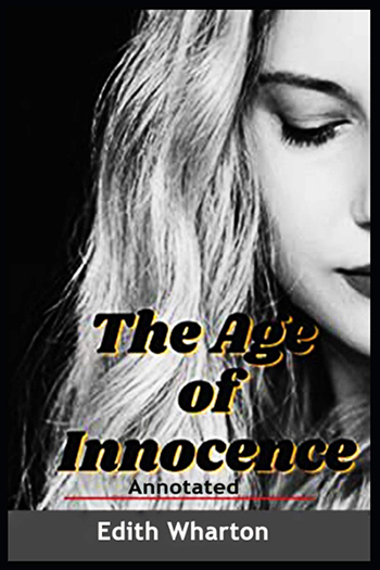
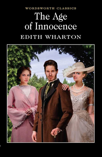
I’m sure this is just what Wharton had in mind.
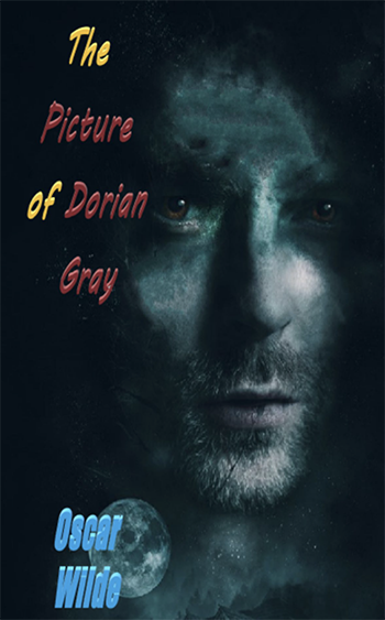
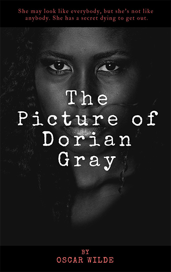
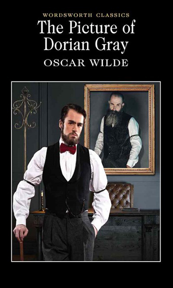
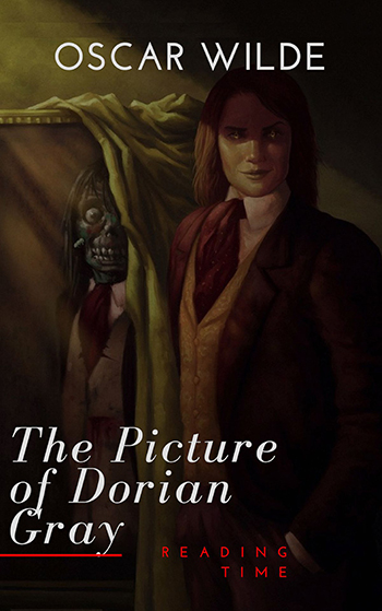
The Picture of Dorian Gray, but make it hipster.
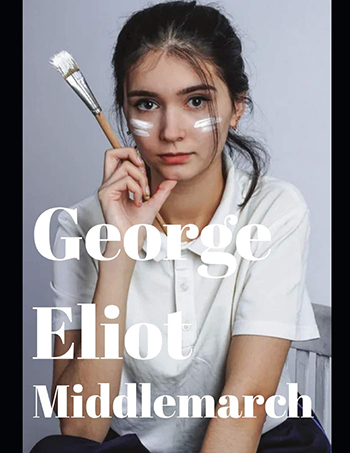
Ah yes, Middlemarch, the story of a woman who can’t think of what to paint, and so must paint on her face.
Barnes & Noble wants its “Diverse Editions” rejected draft back.

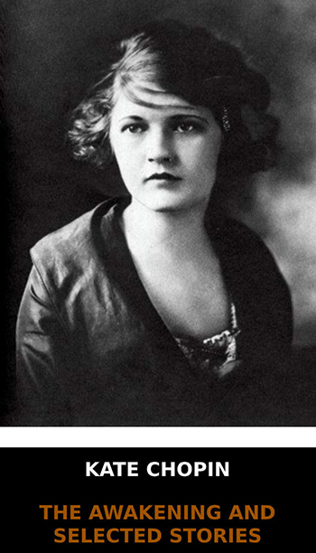
This woman is on a number of classic books written by women, for reasons unknown. The 90s computer font is the icing on the very bad cake.

I hate it and want to burn it in a fire.

And his canvas . . . is himself.

You know, because of all the aquatic scenes.

Pretty insulting to that actor, if you ask me.
It’s not a horror movie, for heaven’s sake.

Moby-Dick is pretty hard to get wrong, but this looks like a 90s whale-watching manual. Decidedly not the mood.

Oh dear. (I actually think they stopped printing this one, but it’s too good not to include.)
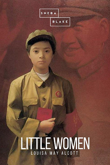
Listen, sign me up for a retelling of Little Women in Maoist China, but this is . . . not that. It’s just random Maoist iconography.

I love a good stock photo—the really offensive part here is that horrible off-centered text.
The hands, look at the hands.

Look, I would totally read this book. But this book would not be Frankenstein.
Okay, but what does Zelda Fitzgerald have to do with it?

If The Awakening was a grief pamphlet.

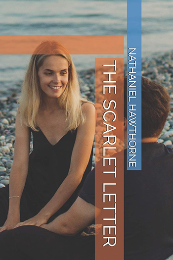
With this, we begin our series of “if you put an attractive, contemporary woman on this musty classic, maybe people will buy it??”

Cleavage not optional.

Unless you replace it with a bellybutton, I guess.

However, to be fair, thirst traps know no gender.

Nor does cleavage.
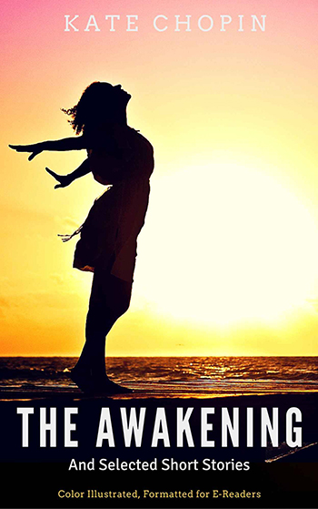
They know she walks into the ocean to commit suicide at the end, right?
The portrait is supposed to be horrible and decaying, not just an evolution from annoying big sleeved hipster to much cooler, older hipster.

Is this the same model? (Or is it Colin Farrell?)
He’s so pleased about not turning into the Cryptkeeper.
Woof.
Emily Temple
Emily Temple is the managing editor at Lit Hub. Her first novel, The Lightness, was published by William Morrow/HarperCollins in June 2020. You can buy it here.