The Story Behind Jonathan Franzen’s New Backlist Book Cover Redesigns
Alex Merto, Charlotte Strick, and Jonathan Franzen on a New Look for Old Books
Last year not only marked the twentieth publication anniversary of Jonathan Franzen’s The Corrections, it also saw the release of his first novel in seven years, Crossroads. So it was only fitting that Picador would embark on a redesign of the author’s backlist.
We spoke with Alex Merto, the art director of Picador/FSG, as well as Charlotte Strick and Claire Williams Martinez—collectively, the design studio Strick&Williams—who designed the covers, and Jonathan Franzen himself, about creating a “branded look,” text versus art, and more.

What did the early stages of this project look like?
Alex Merto: We initially presented three different directions to the editor and author. Direction one connected us back to the then upcoming cover for Crossroads:

Direction two uses the work of Katrien De Blauwer. This felt a little too vintage for the author:
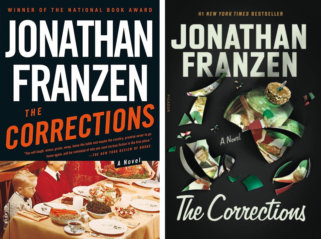
Direction three connects us back to the iconic jacket for The Corrections:
There is something timeless about this design by Lynn Buckley and felt like a good jumping off point. We liked the it was photographic, and could connect back to The Corrections as well as Crossroads. I reached out to a really talented photo researcher in the industry and she came back with some incredible images for each book, but we all ended up feeling that the photographs were almost too on the nose and didn’t leave enough room for interpretation.
This is when we reached out Strick&Williams. Having worked on some of Franzen’s previous books they had a great knowledge and understanding of not only Franzen’s writing but also what he could be looking for. I didn’t have to give them a full brief on what to do other than to say we wanted something layered and with more depth to them. And that we needed them in three weeks… EEK! But what they were able to do in that short period of time was incredible. The covers were so good that they were instantly approved. Sometimes a short deadline is the best one.
*
What was your initial brief for this project?
Charlotte Strick: Last April, Alex reached out about redesigning Jonathan Franzen’s five backlist tiles. The deadline was tight. Everything they’d shown had been rejected, and they were in danger of missing their pub date. I’d designed the jacket for the author’s best selling novel, Freedom; the publisher hoped our studio would have a fresh take. The request was for a “branded look” for Franzen, while giving each novel its own distinct look. We offered up three approaches, using The Corrections and Freedom as our test cases.
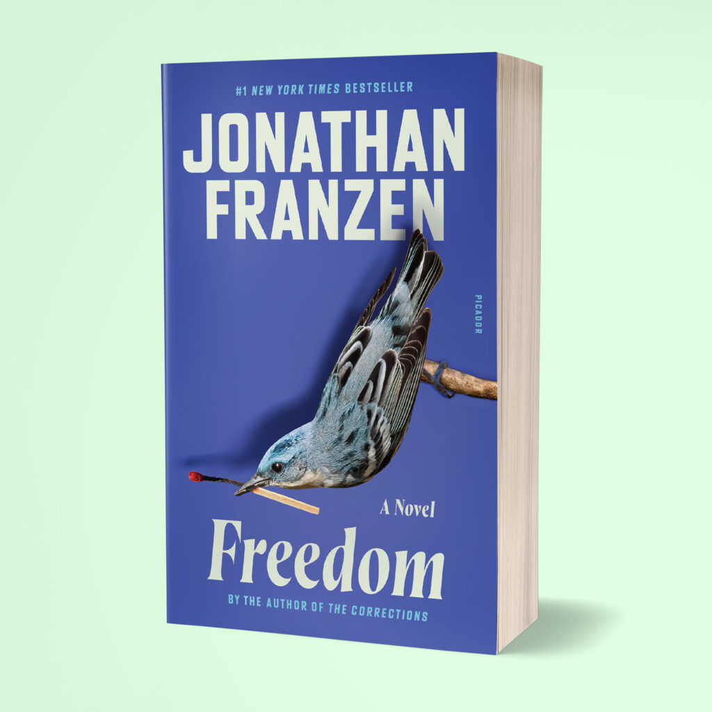
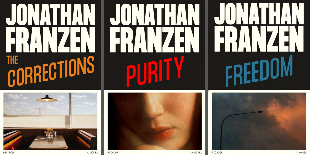
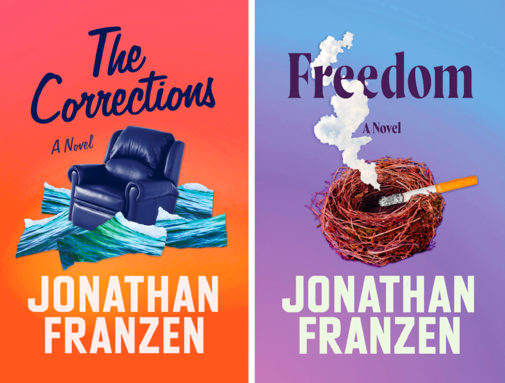
The first direction was more type-driven, with fragile objects of beauty—a shiny broken ornament, a single tarred Cerulean Warbler feather—that have been spoiled or polluted:

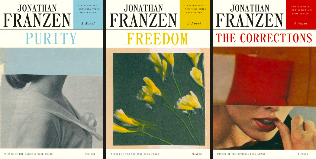
The other two used different strategies for photo collage. Next, we pitched cheekier photo collages set against strong gradations that would have served as another unifying visual:
These were also in our initial round of designs, and what you see is really a sketch for the final covers:

What was the design process like this go-around?
CS: Jonathan was extremely helpful back in 2010, when I was working through ideas for Freedom and those conversations had stuck with me; his earlier feedback proved invaluable a decade later. The response to our precarious photo collages was unanimous; everyone appreciated the dark wit we proposed.
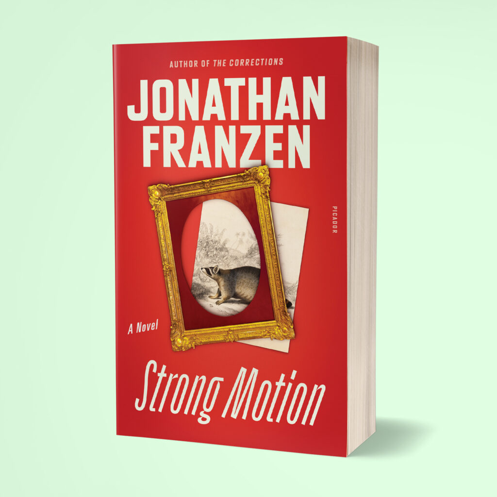
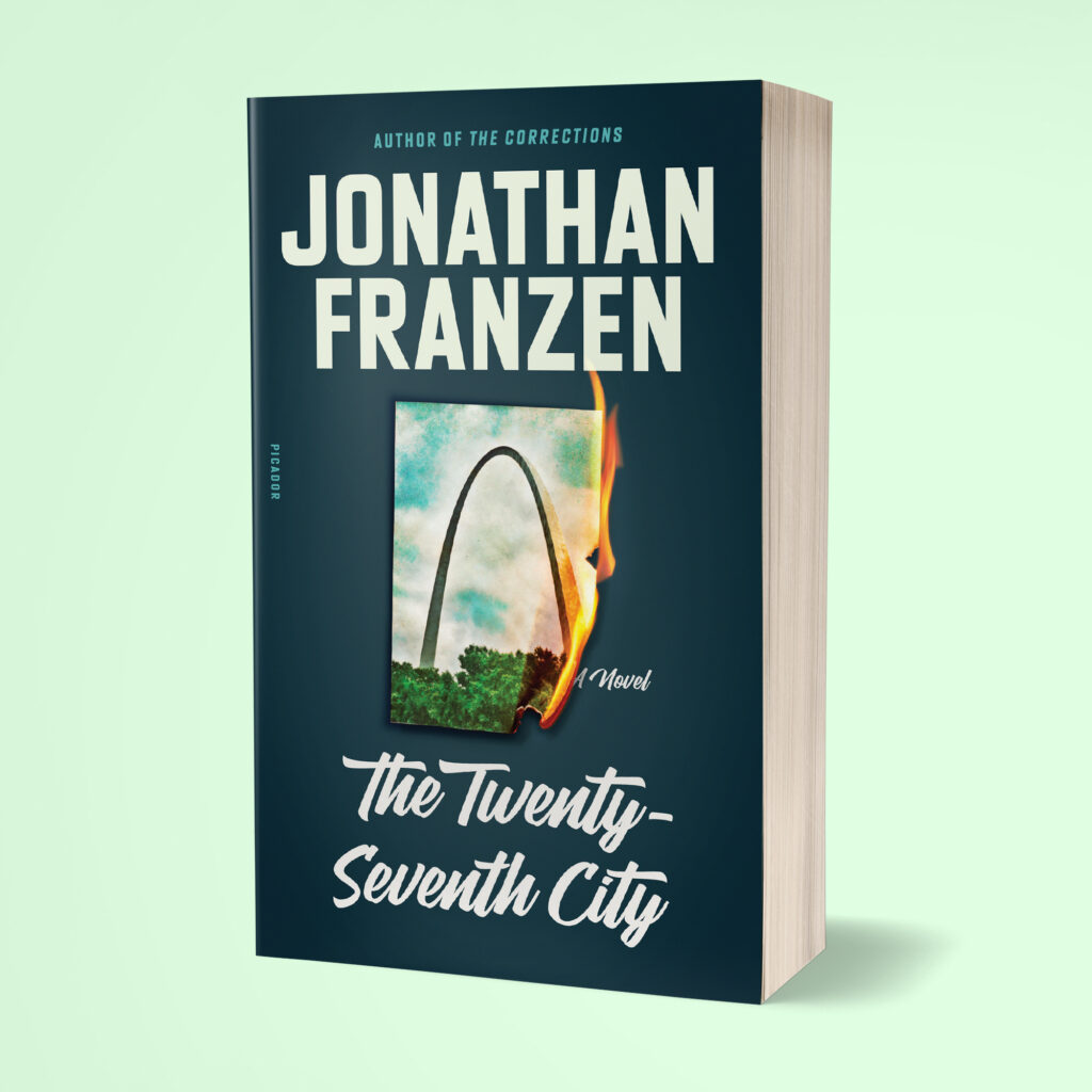
With these approvals, we then tore through Purity, Strong Motion, and The Twenty-Seventh City, searching the text for visual mash-ups to convey similar themes of brokenness and vulnerability. Purity is the only cover with a single image, but the bloom facing away, with it’s grievously all-too-short stem, did enough work all on its own.
How is it different—or the same—to design new covers for books that are years old, and in some cases already have pretty iconic covers?
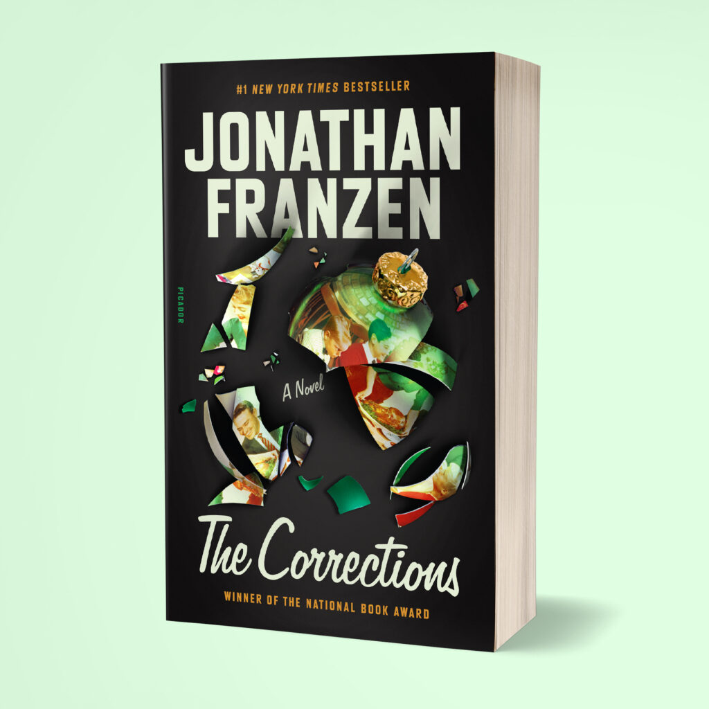
CS: Claire and I love nothing more than a deep-dive into the history of any publication we’re assigned to. It’s crucial to understand how it was packaged in the past, and older editions may even offer ideas for reinvention. Our cover for The Corrections pays homage to designer Lynn Buckley’s now iconic hardcover design from 2001. It’s a familiar 1950s family holiday photo—that now appears on a smashed Christmas ornament.
When redesigning Bernhard Malamud’s backlist, I hired Mississippi-based designer, Jude Landry, to draw a bespoke alphabet taking cues from the exaggerated lettering on Dubin’s Lives (1979) and God’s Grace (1982). Milton Glaser’s cover illustration for the 1967 edition of Wise Blood was the springboard for Flannery O’Connor’s repackaged backlist. O’Connor devotees were so taken with the new faces for these beloved titles, that artist June Glasson and I now sell art prints of all six covers—as well as an imaginary set of Flannery U.S. postage stamps based on our series-look.
What are your thoughts on the challenges and rewards of designing a cohesive series versus a single book?
CS: The success of any series or repacked backlist is heavily dependent on how well you’re able to give all titles equal visual billing. It requires thinking beyond the narrative of a single story, puzzling out how the covers will link to one another, while not risking being mistaken as multiple volumes of a single tome.
Beyond the photo collage technique, another element that links the five final covers is a slanted script or italic for the titles. Franzen’s novels have an epic quality, with story arcs that crisscross one another. The leaning titles, each with their own unique character, suggest that same acceleration to us.
And finally—this is broad, and you’ve probably been asked a thousand times—but what do you think makes a great book cover, and how you know when you’ve gotten there yourselves?
CS: Over time we’ve developed a sixth sense for when we haven’t yet gotten there, and that’s when you need to keep pushing through a “discovery phase.” Other times you might be convinced you’ve hit it out of the park, but the editor; author; agent; marketing department; and/or author’s great aunt—and her cat—disagree. That’s the most deflating because you’d already pictured how breathtaking it would be in the bookstore window!
What designing and writing share is a mystery about how marks get made on the page. A lot of thinking and research go into both pursuits, if the passion exists. For me there’s an alchemy at play when all the parts of a cover—type, color, image, composition—stop talking and begin to sing.
*
You’ve said before that you usually take an active role in the design process for your covers—what was your experience like this time? Did it feel different to reimagine books that have already lived long lives with their original covers?
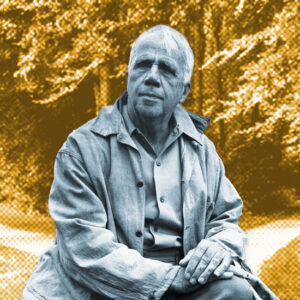
Jonathan Franzen: It’s not as if I’m eager to take an active role. I always hope that my only task will be to make a few vague initial suggestions and then choose among three equally great designs. But it almost never works that way. Typically, my suggestions turn out to have been wrong-headed or insufficient, and then I get drawn into the process of making something better. The original idea for the paperback reissue came from the jacket of Crossroads, which is based on a photo from the early seventies, a snapshot of two friends of mine. I thought we could find similarly suggestive images for the paperbacks, but it wasn’t so easy. Period photos with faces in them read as ironic, and pictures without faces felt too static or stately. So we called in the cavalry, aka Charlotte and Claire.
As soon as I saw their first three designs, with a bold background color and an iconic, decontextualized image, I knew we were in business. At that point, it was only a matter of fine-tuning—making the Corrections Christmas ornament look more naturally shattered, swapping a raccoon image into the frame for Strong Motion. (I will take credit for finding the raccoon image online.) My main feeling about the redesign, after living so many years with the old designs, was a kind of wonderment that I’d survived long enough to be a writer whose books had been re-reissued.
Other than the formal similarities, the theme across these new covers is of some element or essence of the original plus a sense of destruction—the broken ornament, the spent match, the face-down flower, the burning photograph, the dislocated frame. How do you feel about how the new covers relate to their individual books, and how they speak to your backlist as a whole?
JF: The message I always want a jacket to send is that the book inside is is fun to read, full of drama. For each of the paperback jackets, Charlotte and Claire found a way to suggest instability or conflict with a single image. Something is happening to the old river town St. Louis, a fire has been started; the etching of the raccoon has been jolted out of its frame. And I love Charlotte and Claire’s visual playfulness—the dead match for Freedom resembles a worm that the warbler is eating, and the image reflected in the Christmas ornament comes from the original Corrections hardcover.
What do you look for—either specifically or holistically—in a book cover for your own work?
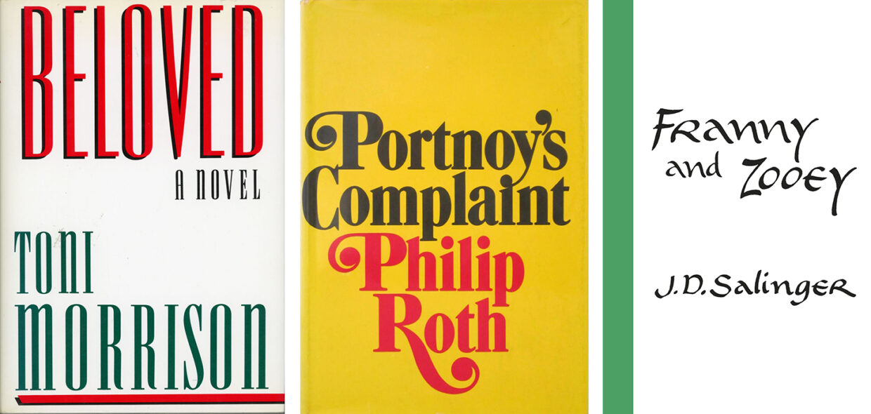
JF: There are any number of great text-only designs— the original Beloved, Portnoy’s Complaint, Franny and Zooey, etc.— but I’ve always felt that, if suitable art can be created, it’s going to be value added. This puts a lot of pressure on the art, though. You need a single image that captures the specific spirit of the book without reducing the book to a single theme or story line. This is such a tricky task, it’s a wonder that any cover art works.
In the course of your publishing career, has there ever been any cover element, idea, etc. that you loved but for one reason or another didn’t make it to the final cover?
JF: Honestly, no. There’s a reason why I write the books and people like Charlotte and Claire do the designing.
Which of your own covers—new or old—is your favorite?
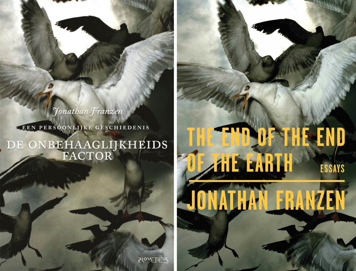
JF: For a long time, it was the Dutch edition of The Discomfort Zone. At some point, my Dutch publisher decided to feature a bird or birds on the cover of all my books there. I wasn’t sure it was a great idea to foreground my love of birds like that, and there were covers I didn’t much like— for example, the wrong species of bird, in the wrong kind of habitat, was on the cover of Freedom. But, for the The Discomfort Zone, the designer found an incredible image of gulls wheeling and twisting in weird, apocalyptic light, with many of the birds looking directly at the viewer. Just the coolest image.
When FSG published The End of the End of the Earth, which actually does have a lot of birds in, also a fair amount of apocalypse, I suggested that we use the same image, since the Dutch book was by then out of print and was, in any case, Dutch. It took some work to locate the photograph’s owner and get permission, but FSG did it, and now that jacket is my favorite.
Emily Temple
Emily Temple is the managing editor at Lit Hub. Her first novel, The Lightness, was published by William Morrow/HarperCollins in June 2020. You can buy it here.