The Nine Lives of a Cat (Book Cover)
Bob Eckstein on the Process of Creating the Cover of The Complete Book of Cat Names
While others sweat the fate of their book cover, for me, it’s the part of the publishing process I look forward to most. I not only love contemplating book covers and exploring options, but as the former art director at a major publishing house, I have a unique appreciation for how important the cover is. Only the top supernovas at the top of the bestseller list are unaffected by cover design, in my humble opinion. For everyone else title and cover is everything for that 10-second glimpse when a reader decides whether or not to pick up your book.
As art director, I have found that new authors and clients are more concerned with the specs and logistics than the concept and marketing angles to consider, especially those self-publishing. The moment many writers first see their cover, is defined by dread, with the writer and agent circling the wagons and preparing to dig in their heals with demands of change. Luckily, I have not gone through that myself as the art director too many times, but when it has happened the writer seems to be unaware of the publisher’s marketing and PR needs.
My last book was published by Countryman Press of W. W. Norton & Company and I believe everyone involved followed my own first rule of thumb when we met. My one demand was, “Let’s have fun.” Below are the rejects and some inside baseball commentary, for the cover geeks (and anyone else curious about how the sausage gets made).
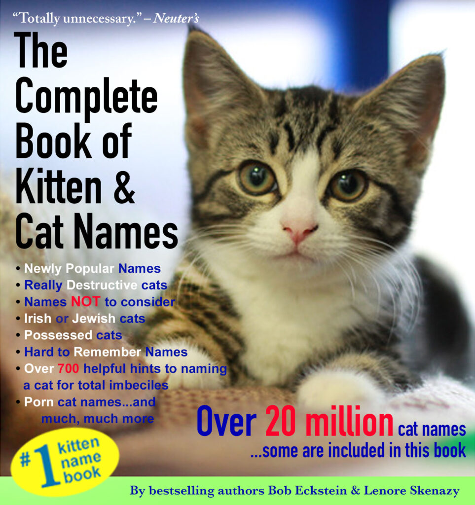
The cover used in the book proposal. My agent and I know this is just a marker and even the title is just a suggestion before the yet-to-be named publisher’s marketing people add their input. But it serves the purpose of getting out quickly that this is a humor book and basically a visual elevator pitch. It’s colorful and has a cute cat. And the reason this cover would never fly is that it’s tacky. That’s part of the joke but still, few major publishers are going to take the financial risk in the hope that perspective readers will “get” the joke. “Totally unnecessary.” —Neuter’s. It’s funny but not going to work for a cover. Clarity and transparency are woefully lacking here but it’s fine for the book proposal.
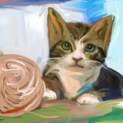
For a minute we considered doing something along the lines of the book proposal cover because we were all in love with that cute kitten and weren’t ready to say good-bye to her. I created artwork because an illustration is almost always more eye-catching than a photograph, but this tone was too sincere and not memorable enough for a cover. Covers do not have to be good, they need to be memorable.
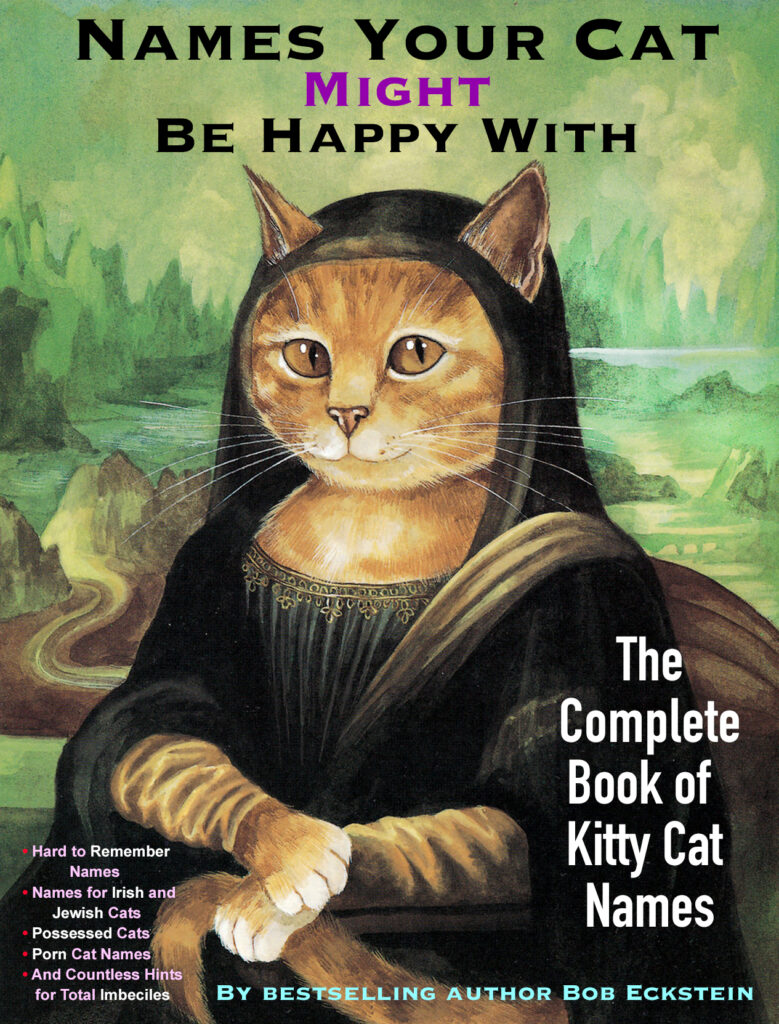
Next up was this effort. Still attached to the jokes, it’s kitsch overload but this design helped get all that nonsense out of my system so I could move on to focusing on coming up with a strong graphic, something more memorable. It’s understood the first efforts will be fails and part of the creative process. The art director and editor may have given this a glance but nobody had to say this is not the cover but just spit-balling.

Ahh, now here is something beautiful and that’s a start. It’s a nod to the old master Paul Klee yet feels totally modern. I’m happy just looking at it. Isn’t that enough? Sadly, no—we also have to consider whether it speak to my audience. Are cat lovers in on the joke that this a parody of a classic piece of art? If not, that disconnect is only alienating potential readers and creating distance. So, beautiful cover that is not communicating, not making a connection. But by this point the team is loving the title. Condensed yet long enough to explain the premise. Clarity achieved.
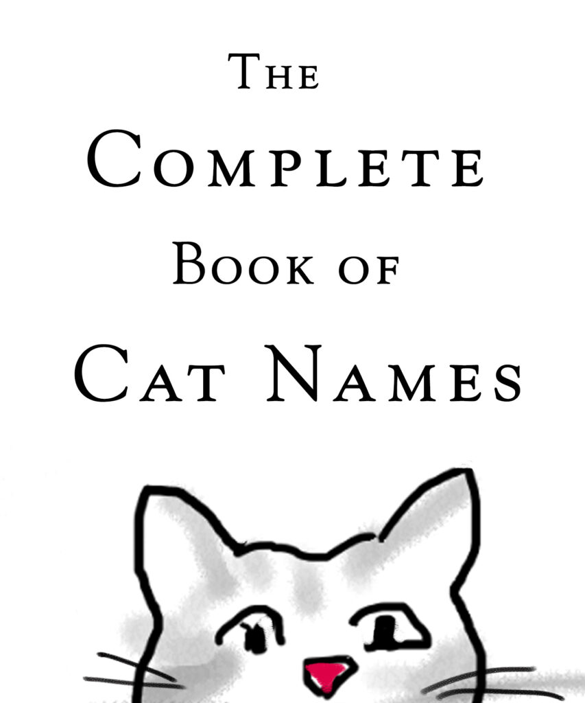
The pull in this design are the sparse elements and hand-drawn line of cute cat peeking up through bottom. On the other hand, so much white space scares publishers and bookstore owners––the book will look dirty and used faster than other books. Plus it looks attractive on its own but the lack of color can have it get lost on the bookshelf. Marketing teams sometimes come back with missive that the cover needs to be a certain color. This request can come from a chain store interested in displaying your book prominently. Or research may show a trend on what colors are hot for book covers. (I’m not kidding.) For this reason, a cover sketch will get sent around to everyone and the Marketing and PR depts for notes. It’s not uncommon for me to produce over 30 choices for a cover.
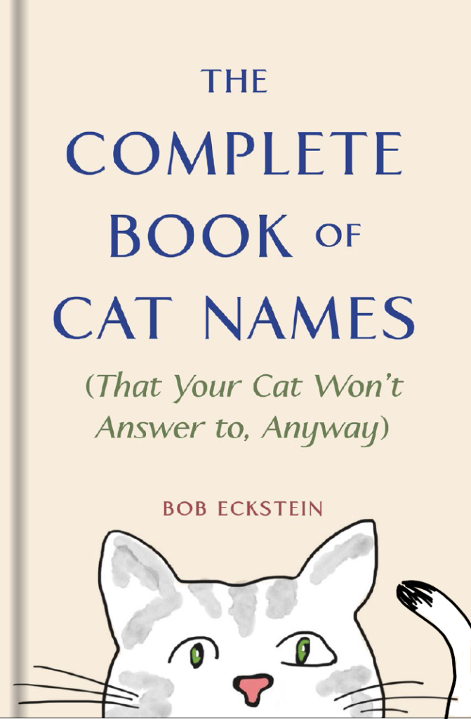
At this stage a subtitle materialized––to make it clear it was a humor book. Having eyes on a cover is a natural draw to people but we agreed we needed a smile, too, and this dummy cropped out the cat’s smile.So I began drawing cats in hopes of stumbling across something that readers would want to take home.
After all, a book’s success hinges so much on simple emotional connection—even when it’s a humor book about cats.
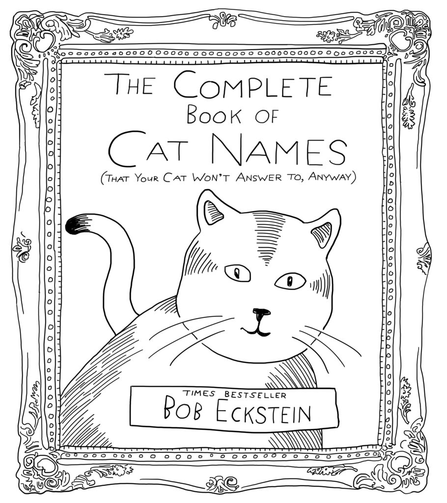
Finally I created the most adorable and unique kitty I could conjure up and decided at least we found our leading man (or cat).
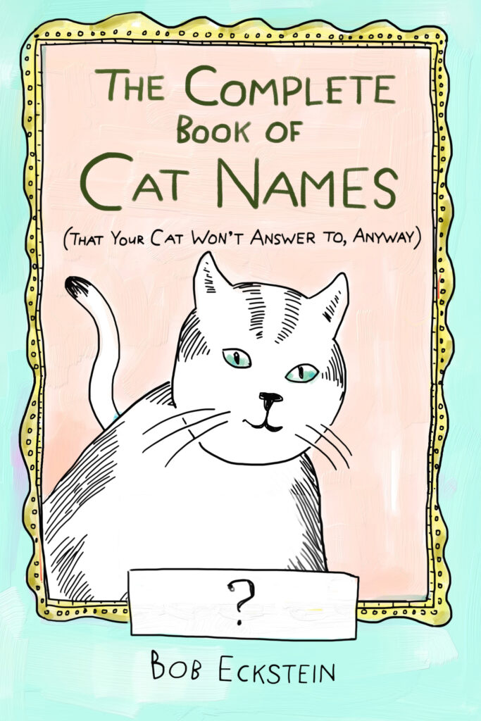
From here, we created a dozen variations of the cover, trying to address any potential issues. Is the subtitle too subtle—what’s a unique way of adding that? Where does your eye go first—let’s simplify that busy frame? We decided to try my handwriting, a font that was homemade and something charming. Another attempt to connect on a personal level.
We wanted the cover to have a polished feeling, but something too clean and polished can be cold and unwelcoming. I tried to keep the drawing raw while projecting a feeling of value, as this is a gift book hopefully placed now the front register at bookstores. To that end, the publisher decided to emboss the cover (okay, I heavily campaigned for it). Unfortunately, this is not obvious online. Something is really lost nowadays with online shopping, and I do try to make all my books a special tactile experience, one a reader will miss out on going the eBook route.
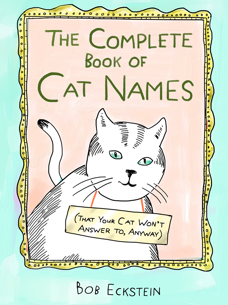
This was the final cover. I know some right now may be thinking, “This isn’t the best cover.” But hopefully it’s the most memorable. To my eye, it feels the most relaxed and least “designy.” Covers have magic when they don’t feel overworked and sweaty, even if the road to get there was a long one.
Bob Eckstein
Bob Eckstein is an award-winning writer, illustrator, New York Times bestseller, New Yorker cartoonist and world's leading snowman expert. His new book is Footnotes from the Most Fascinating Museums: Stories and Memorable Moments from People Who Love Museums.


