
The 11 Best Book Covers of March
Here Be Monsters
Another month of books, another month of book covers. Here are my favorites from March:
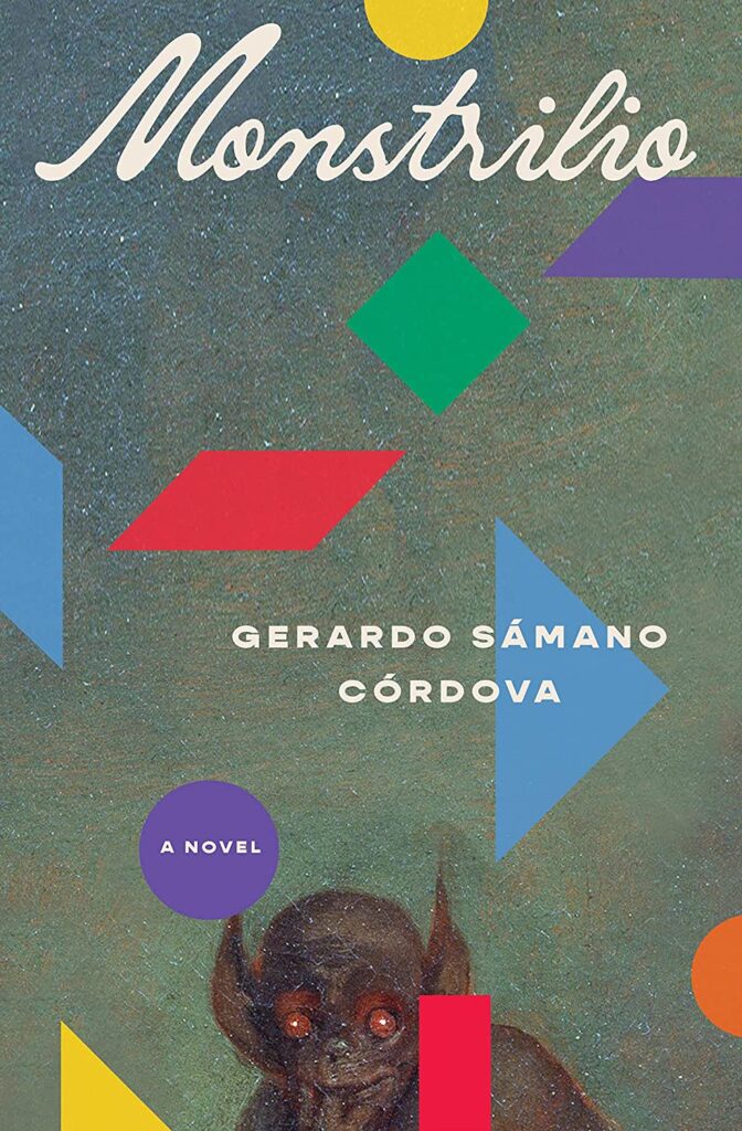 Gerardo Sámano Córdova, Monstrilio; cover design by Alex Merto (Zando, March 7)
“At the center of the design process was a quandary,” Zando’s Art Director Evan Gaffney told Lit Hub. “Monstrilio, the half-human, half-monster child at the heart of the story, really shouldn’t be depicted, but he couldn’t not be depicted. Reaching back into art history solved this problem, as it sidestepped literal depiction, but also placed this book within a literary tradition of monsters and the monstrous. The floating shapes evoke a children’s game, as well as the saturated colors of Mexican culture, which is at the narrative heart of the story. But they also suggest that something is being pieced together—in this case, how to parent a son who really is a little monster (and not just acting like one).” The result is a glorious, vintage-infused wink of a cover.
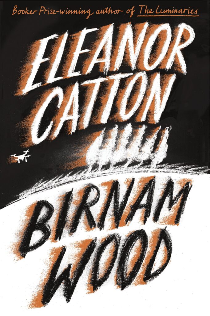 Eleanor Catton, Birnam Wood; cover design by Jon Gray (FSG, March 7)
There’s something so timeless and appealing about this cover—it’s almost giving me classic 1940s children’s book, until you see the little drone. Amazing how much can be done with three colors, hand lettering, and a sense of movement.
 Regan Penaluna, How to Think Like a Woman; cover design by Kelly Winton, artwork by Ewa Juszkiewicz (Grove Press, March 14)
Brilliant image selection (I encourage everyone to go look at Juszkiewicz’s portfolio, damn), amplified and honed with the bold border and the text treatment.
 Tom Comitta, The Nature Book; cover design by Tree Abraham (Coffee House Press, March 14)
This is a very clever concept for this book, a “literary supercut” of descriptions of nature, their inhabitants plucked out and discarded—it might easily have been too on the nose, but instead it’s a perfect record scratch of a ’70s mountaineering manual.
 Michael Chang, Synthetic Jungle: Poems; cover design by Emily Mahon (Curbstone Books, March 15)
“I felt like the cactus as centerpiece was conceptually and visually interesting,” Mahon told Lit Hub. “I distorted some, tried images of ornately tangled cacti and others of just one tree, added vibrant colors, and tried to incorporate fonts that played off an 80s aesthetic. It was Michael’s idea to focus on the singular cactus and add a checkerboard (AKA Vans vibe) to the background. We eventually settled on the orange/purple palette against the green succulent with a simple font.” It’s like the book cover version of power clashing.
 Jeff Sharlet, The Undertow: Scenes from a Slow Civil War; cover design by Steve Attardo (W.W. Norton, March 21)
I have never been so stressed out by a book cover in my life.
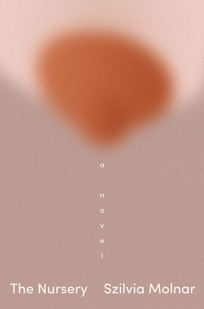 Szilvia Molnar, The Nursery; cover design by Linda Huang (Pantheon, March 21)
The blur, the boob, the milk drip! I love everything about it. “I was 7 months pregnant when I read The Nursery,” Huang told Lit Hub. “As someone who is prone to dark thoughts, I was especially curious to get a glimpse into one mother’s spiral into postpartum disaffection—an often unspoken yet common part of motherhood. Now that I’ve endured those early days myself, I can attest to that painful, relentless, sleep-deprived fog. (During one particularly exhausting week, I remember staring at the wall, hunched over nursing my daughter, thinking I was going to crack.)
In one memorable line, Szilvia writes about being a ‘milk bar’ (I can now completely empathize). My first instinct was to depict this gravid image: a single giant breast. The blurriness adds a touch of sophistication and references the bleariness of it all, nights and days blending into one amorphous slog, milk dribbling everywhere.”
 Jinwoo Chong, Flux; cover design by Beste Miray Doğan (Melville House, March 21)
It’s bright, it’s weird, it feels both digital and natural; I’m a fan.
 Catherine Lacey, Biography of X; cover design by Alex Merto (FSG, March 21)
It’s not totally obvious through the old computer screen, but this book has no jacket—it is instead a very pleasing matte paper broken up by the glossy photo fragments. Extremely alluring—and don’t miss the spine.
 Esther Yi, Y/N; cover design by Rodrigo Corral, art by Kyung-Me (Astra House, March 21)
I always love book covers that don’t look like book covers—if it wasn’t for that secret “A NOVEL” hidden in the drapes, this might be an underground zine or an arcane manual or a child’s journal. It still might be all those things, to be fair…
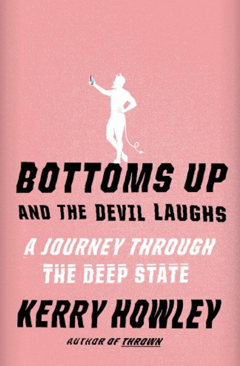 Kerry Howley, Bottoms Up and the Devil Laughs: A Journey Through the Deep State; cover design by Janet Hansen, illustration by Ben Wiseman (Knopf, March 21)
See how much fun can be had with a little color, a little illustration, and a lot of fun with type.
Emily Temple
Emily Temple is the managing editor at Lit Hub. Her first novel, The Lightness, was published by William Morrow/HarperCollins in June 2020. You can buy it here.


