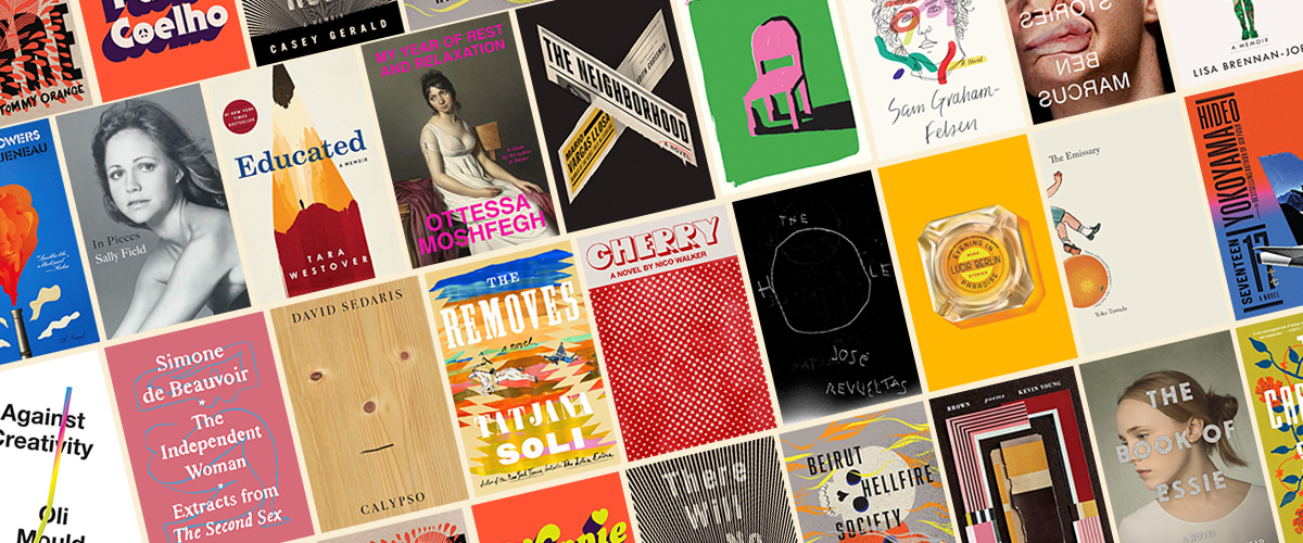
The 75 Best Book Covers of 2018
According to Book Cover Designers
2018 has been many things, but it certainly has not been lacking in great book cover design. Here at Lit Hub, we unpacked the biggest book cover trend of the year, compared US covers to their UK counterparts, and remembered the best and worst covers of Lolita as well as Edward Gorey’s own cover designs. We gave you a brief visual history of Virginia Woolf’s book covers and treated you to 100 covers for One Hundred Years of Solitude.
We also featured great essays from designers themselves, reflecting on their work: Janet Hansen on Nico Walker’s Cherry, Charlotte Strick on Rachel Cusk’s Outline series, Sarah Wood on Joseph Cassara’s The House of Impossible Beauties, Kimberly Glyder on Gone With the Wind, Roman Muradov on Norah Lange’s People in the Room, and many more.
But it is December, and therefore I am inclined to ask: which book covers were the best? As I did last year and the year before that, I asked the experts: book designers. This year, I asked 27 designers to share their favorite book covers of the year, with a bit about why—and they came back with a whopping 75 different covers of note. But of course, some of them had similar ideas about the best of the best. Here are the stats:
The very best book covers, with 12 votes each:
Nico Walker’s Cherry, designed by Janet Hansen
Melissa Broder’s The Pisces, designed by Rachel Willey
The second-best book cover, with 6 votes:
José Revueltas, The Hole, designed by John Gall
The third-best book covers, with 5 votes each:
David Sedaris, Calypso, design by Peter Mendelsund
Lucia Berlin, Evening in Paradise, design by Na Kim
The press with the most covers on the list:
New Directions (11 books)
The press with the second most covers on the list:
FSG (10 books)
The designer with the most covers on the list:
Na Kim (8 books)
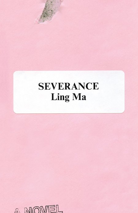 Ling Ma, Severance, design by Rodrigo Corral (FSG)
The anti-design aspect of this jacket really appeals to me. It signifies “office” without being a slave to the concept. The carefully placed elements tell you this novel is subtly humorous, smart, and slightly off-kilter. It also takes full advantage of millennial pink but manages to rise above its use as a publishing marketing ploy.
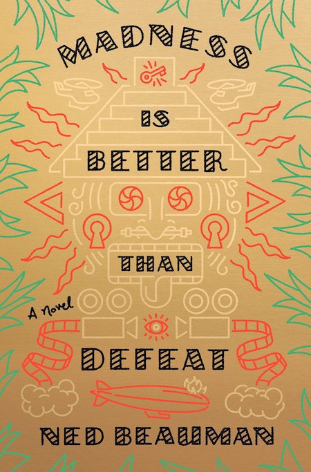 Ned Beauman, Madness is Better Than Defeat, designed by Tyler Comrie (Knopf)
The color and illustration and typography come together so seamlessly on this cover. It looks that much more spectacular in person, with the gold background and subtle debossed type. Stylistically this is such an original and inviting package.
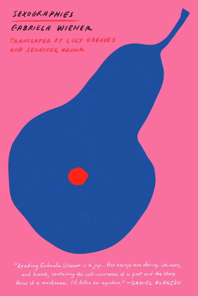 Gabriela Wiener, Sexographies, designed by Na Kim (Restless Books)
Throughout the reconnaissance conducted for this post, Na Kim emerged a clear winner. It’s impossible to choose among her covers (. . .so good, so enviable!), but Sexographies rises to the top for its brilliant simplicity, pop palette, and double entendre.
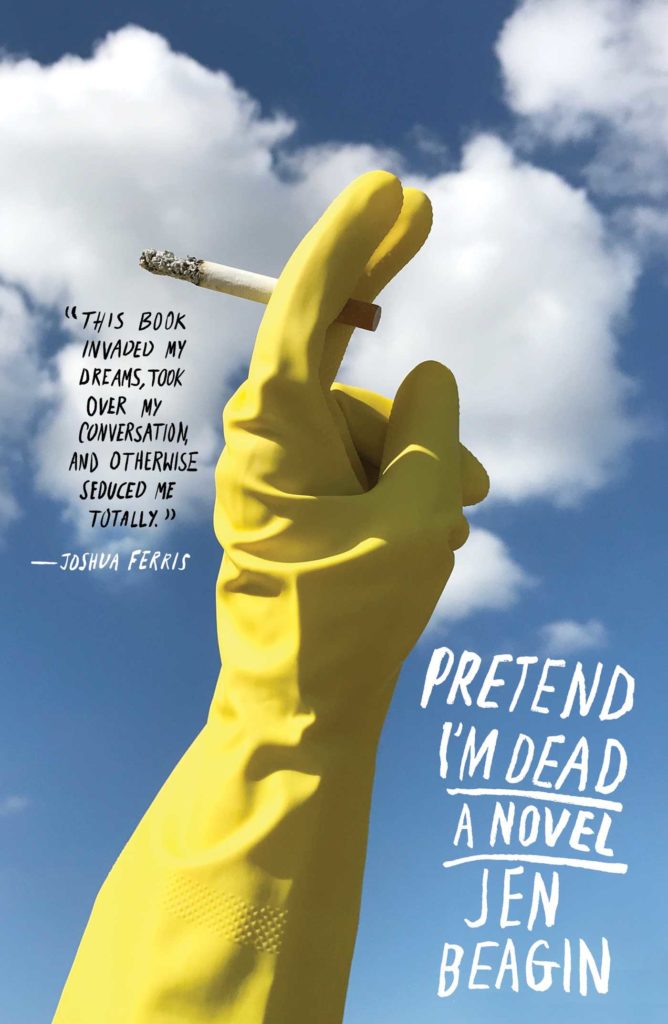 Jen Beagin, Pretend I’m Dead, photo and design by Alex Merto (Scribner)
I am a sucker for a cover that makes me laugh out loud. The triumphant/defiant(?) rubber glove holding a smoke is so perfect.
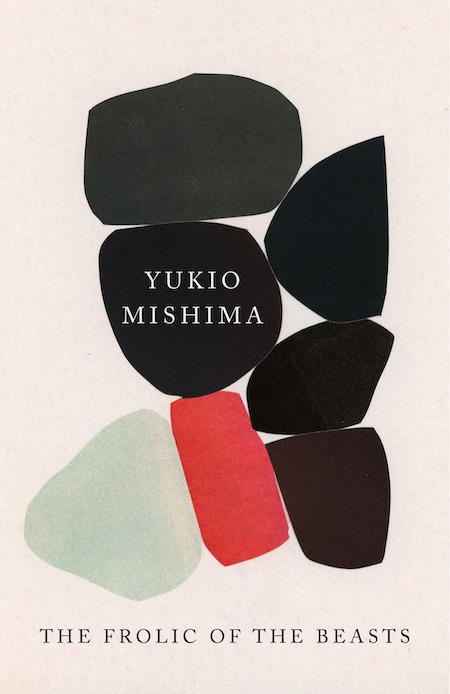 Yukio Mishima, Frolic of the Beasts, design by John Gall (Vintage)
It’s a John Gall original on a cover!
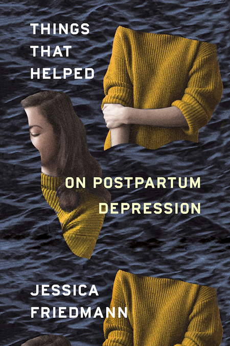 Jessica Friedmann, Things That Helped, design by Na Kim (FSG Originals)
I read this on maternity leave and this cover represented how I felt. Chopped into pieces and floating away.
 Tara Westover, Educated, cover illustration by Patrik Svensson (Random House)
I’ve seen this book pop up on social media, in stores, and on “best of” lists. Each time, I’m struck by how smart it is. I love the combination of the clever pencil, holding the figure in the “mountain top,” paired with the simplicity and strength of the type. Perfect visual tone and perfect execution.
This is not your typical memoir cover at all, at first glance it could even be a sci-fi novel. And yet, all the elements of the story are present. The western landscape where the author grew up and her pursuit of higher learning are incorporated into the simple graphic making this the sort of cover you grow to love even more after you’ve read the book.
I enjoy looking at and designing covers that give the viewer some credit, where the symbolism or message is not always glaringly obvious. But regardless of whether you notice the tiny figure within the shaven part of the pencil tip or not, this cover is bold and stands out on screen and shelves. But when that figure is seen, I am not sure how you could resist wanting to know more about the author’s story. Such a clever and thoughtful design to represent the content of this outstanding memoir.
 Mario Vargas Llosa, tr. Edith Grossman, The Neighborhood, design by Alex Merto (FSG)
Love the layout of the bold X as a nod to the title. Simple at first glance, but a closer look shows that its filled with nuanced details.
It’s always a challenge working with so much typography, but here it is leveraged to create great tactile detail, all contained within a striking X.
 Thomas Pierce, The Afterlives, design by Grace Han (Riverhead)
I remember being involuntarily propelled toward this cover upon seeing it. The fractured painting and vivid yellow living together in those impossible geometries is wonderful and intriguing.
 Eve Babitz, Black Swans, design by Kelly Winton (Counterpoint)
A green cover is always a big win! And this type is just the tops.
 Laboria Cuboniks, The Xenofeminist Manifesto, design by Chloe Scheffe (Verso)
Bold design, bold colors, bold book cover. The layout also extends into the interior making this a unified object, something that you don’t see often enough with books.
 Hideo Yokoyama, Seventeen, design by Alex Merto (MCD)
Publishers often dislike layouts that force the consumer to do too much work. But sometimes that’s precisely what draws a reader to a jacket—placing a book’s information in all the wrong places forces you to engage more than an “easier” jacket might. This jacket is successful because it breaks all the rules. It even conveys “thriller” without resorting to gigantic type and full-bleed shadowy figures. It also manages to make the tail of an airplane intriguing, and for that alone I give it an A+.
The dimensional art against the flat, gradient background, the stacked type…everything feels very cohesive and bold.
 Raymond Queneau, The Blue Flowers, design by Peter Mendlesund (New Directions)
This cover further cements Peter Mendelsund’s status as a master of contemporary book cover design. From the type selection to the graphic rendering of the collaged artwork, it tells you everything that you need to know in one fell swoop: this is a bold, wacky work of 20th century surrealism (dare I say that it gives me Monty Python vibes?) that has a rightful place in any 21st century library.
This is one of those Peter Mendelsund covers that I stare at and marvel at how perfectly all the elements add up. From the off beat typefaces, to the mix of textures, and finally to the peak of face, it looks like he had fun designing this and yet it screams sophistication.
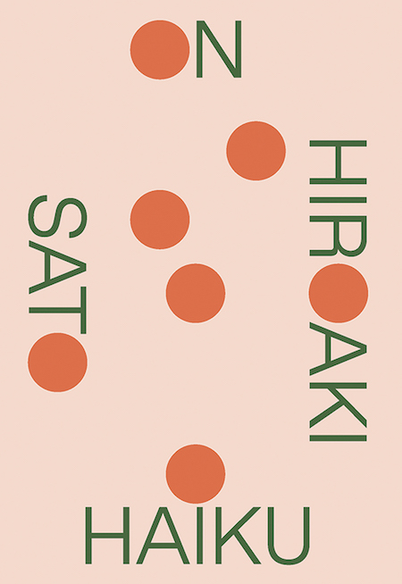 Hiroaki Sato, On Haiku, design by Boyang Xia / Rodrigo Corral (New Directions)
While books about poetry can afford to be more abstract, they still usually look like book covers. This looks like it could be a poster for a contemporary jazz concert made by someone in an MFA design program. The type, treated like an image, is audacious in the way it has been broken up. I love how each word has a circle in place of a letter (or part of). That unwavering formal logic, along with the sophisticated color palette, win me over.
 Robin MacArthur, Heart Spring Mountain, design by Sara Wood (Ecco)
This cover does a great job of invoking innocence, nature and a “simpler time and place,” which is something I think is more difficult to accomplish than it seems when you must also suggest the presence of people. Theres a lovely balance in the way the type is handled that complements the artwork and doesn’t try to overpower it, yet feels fresh and contemporary.
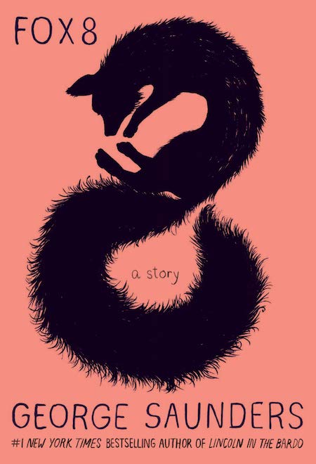 George Saunders, Fox 8, design by Chelsea Cardinal (Random House)
This is one of those covers where I’m sure there was a version that was just the illustration. Every designer tries for the no-type-on-a-cover unicorn. The illustration is so beautiful! The subtle texture to his fur and the color choices make me so happy. Again, I feel like I’m always aiming for a simple color scheme on covers and Chelsea nailed this one. The type is so wonderfully designed. It’s such simple lettering, but you can tell each letter was considered to make it feel unique but get out of the way of the illustration. Also, cannot wait to read this! Based on the little I know of the story, I feel like the fox is curled in such a way that he really is sitting outside of a window listening to children’s stories. Spoiler (not really), that’s apparently what happens.
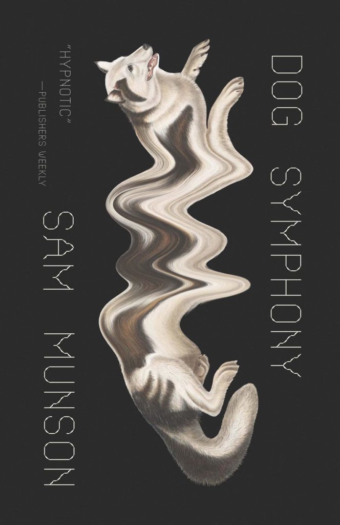 Sam Munson, Dog Symphony, design by Joan Wong (New Directions)
Surreal and weirdly computer-glitchy. This illustration makes me want to go into this novel and get lost with the dogs.
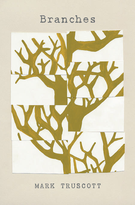 Mark Truscott, Branches, design by Tree Abraham (BookThug)
While collage is frequently used as a device for illustrating book covers, the design of Branches by Mark Truscott is very fresh. The segmentation of the tree, and the re-organization of its parts, is a metaphor for a personal perspective; we often don’t see the whole tree, but we catch glimpses of it from different angles. The understated typography and neutral palette allow the beautiful idea behind this cover to come to the fore.
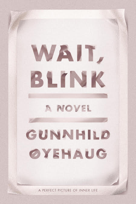 Gunnhild Øyehaug, tr. Kari Dickson, Wait, Blink, design by Na Kim (FSG)
It’s oftentimes challenging to create an all type cover that conveys movement, let alone with elegance and emotion. The cover feels so alive and fluid. Every time I see this, I’m just captivated by its subtle beauty.
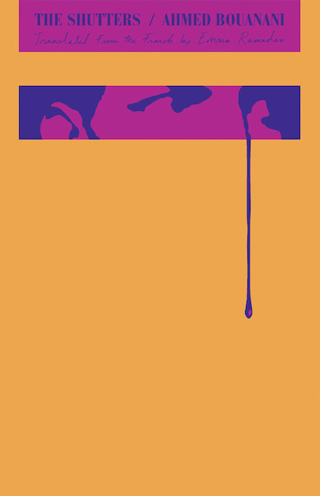 Ahmed Bouanani, The Shutters, design by Oliver Munday (New Directions)
I love it when a designer isn’t afraid to take a blank space and make it the most powerful element of the jacket. While most of this layout resides in the top quarter of the jacket, the tear/sweat/blood extends beyond the confines of this area into the empty space below. The tension between the rigid spaces housing the type/imagery and the loose drip escaping beyond them make my heart beat a little faster. The design manages to convey oppression, confinement, fear, and isolation with barely any visual information.
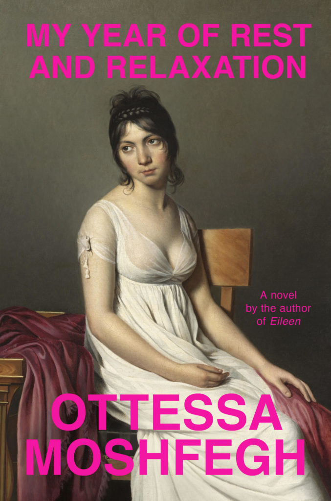 Ottessa Moshfegh, My Year of Rest and Relaxation, design by Darren Haggar (Penguin Press)
I love the juxtaposition of the hot pink san serif font with the traditional portrait of a woman. Her facial expression gets across everything you need to know about this darkly comic book.
Seldom do we see ambivalent emotions depicted on book covers. The woman’s affect captures the oppressive listlessness felt by the protagonist, screaming: “I’m over it.” Well, I think we can all relate. The choice of a classical painting is a wry nod to the character’s art history background, and the final, triumphant slap of some deadpan Helvetica—in hot pink, no less—make this cover. A bare nipple helps, too.
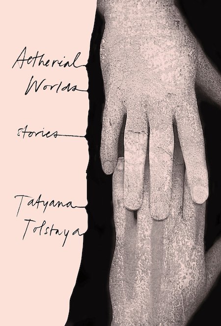 Tatyana Tolstaya, Aetherial Worlds, design by Stephanie Ross (Knopf)
Absolutely perfect image choice that is eerie and yet so beautiful it’s almost calming at the same time. I’m also a huge fan of the way she executed the type, bleeding into the image makes it different from what I’ve seen before and gives it the same eerie but beautiful quality. This exercise in restraint draws me in and makes me want to know more, the ultimate goal in cover design.
I just love the way the type is treated on this. Lovely photograph too. Reminds me a little of one of last years hit covers, All We Can Say, designed by Janet Hansen.
 Mia Couto, Woman of the Ashes, design by Sarahmay Wilkinson (FSG)
Love the texture of this pattern, the colour, the strong type subtly integrated into the graphic form of the pattern. This designer has created a few show-stoppers in 2018 so well worth checking out her work. It is vibrant and graphic with a strong typographic flair.
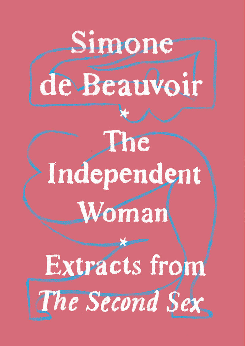 Simone de Beauvoir, The Independent Woman, designed by Adalis Martinez (Vintage)
This cover is small in size, but has such a big personality. Adalis created such an elegant package with simple painted art and type, and it feels special. The colors on the printed cover are so nuanced and beautiful and this is an object you want to hold.
This slim, pocket-sized volume stopped me dead in my bookstore-browsing tracks; it just lit up the table it was sitting on and begged me to pick it up. We both love the vibrant color pallet, as well as Martinez’s thoughtfully integrated hand-traced typography paired with her modernist nude. It’s rare for a package this pretty to also look so heroic.
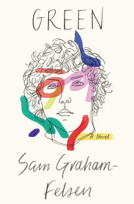 Sam Graham-Felsen, Green, design by June Park and Rodrigo Corral (Random House)
I love this drawing of a face staring back at me along with the strange strokes of colors.
With it’s use of materials this cover could have easily turned messy, but a striking portrait and the restrained mark of the hand elevates this cover to a coveted work of art.
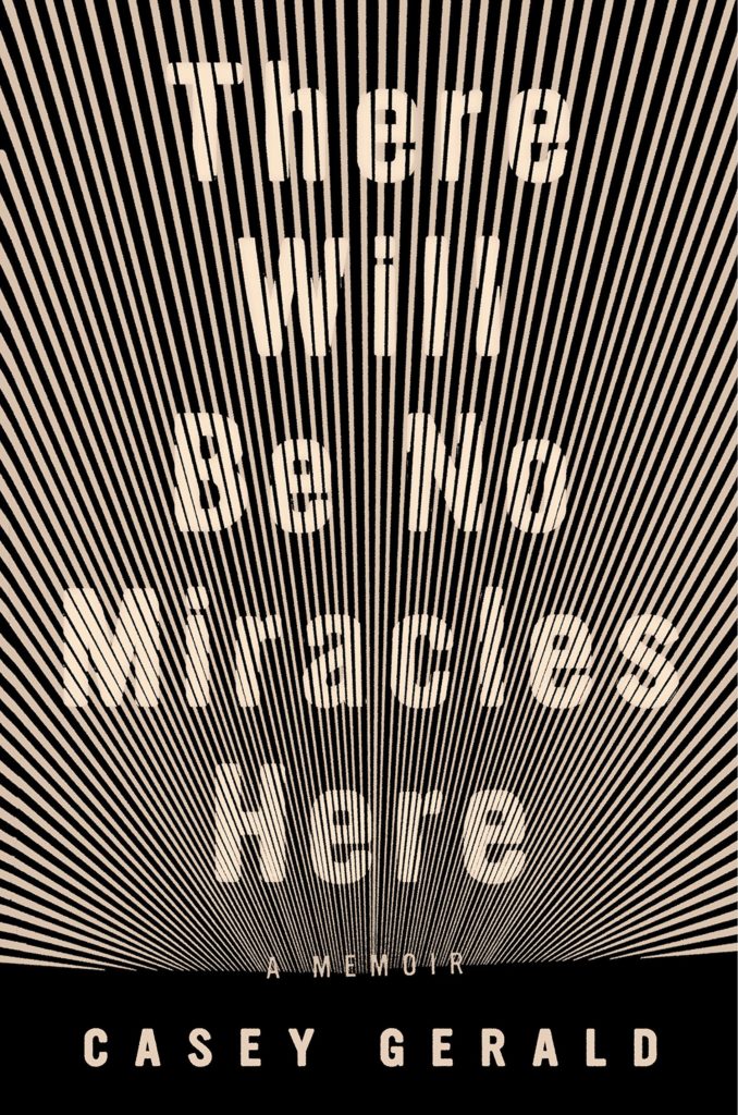 Casey Gerald, There Will Be No Miracles Here, design by Grace Han (Riverhead)
The perfect marriage of word and image, this cover is sublime! Those stark, radiating beams harken back to the Ecstasy of St. Teresa—pure and uninhibited. In person, they vibrate intensely, promising revelatory truth and transcendence—despite the title’s declaration. It’s as if we’re staring straight through the solar eclipse into the great beyond.
This is going to sound crazy BUT I love how this cover works online as a jpg. The type and line graphics vibrate like bananas, and for me that is a win.
The vibrations that radiate between the type and the image, as your eye moves down to the horizon line, make for a spectacular cover. It’s almost as though you’re looking at it through a zoetrope.
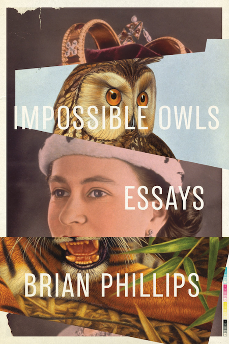 Brian Phillips, Impossible Owls, design by Jamie Keenan (FSG Originals)
I love when images are collaged to align just so and create something so unexpected, you keep coming back to see more.
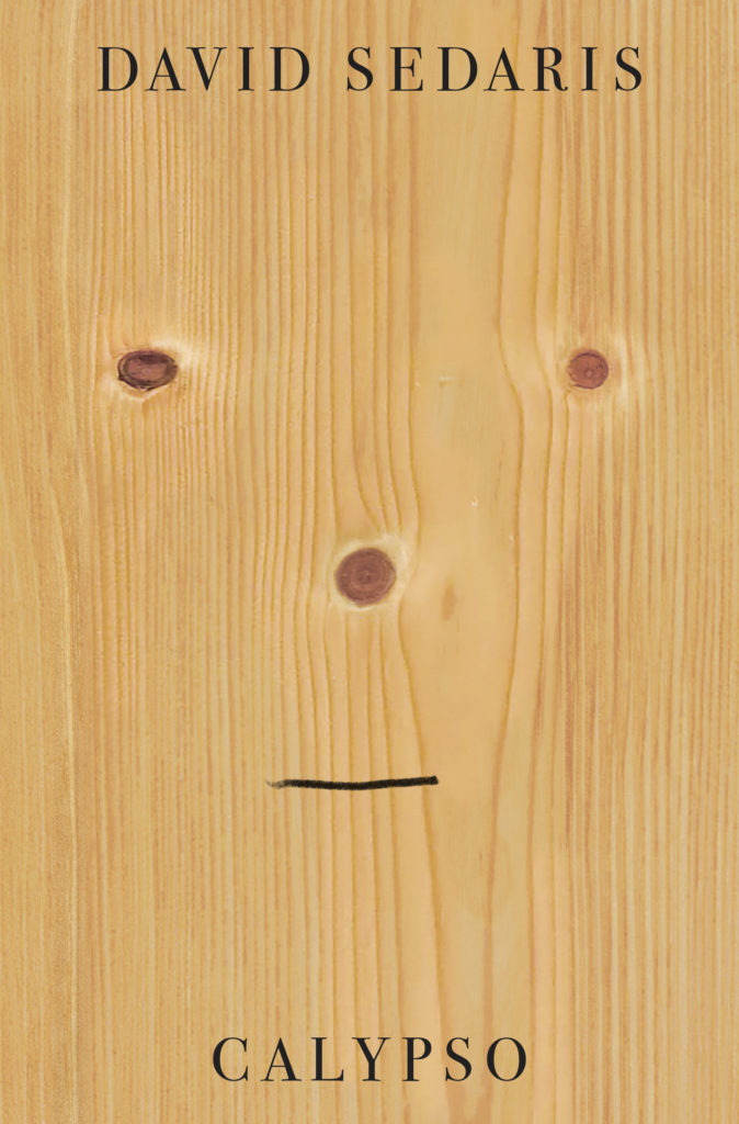 David Sedaris, Calypso, design by Peter Mendelsund (Little, Brown)
Another funny cover but in a completely different way. Wry, smart, a touch of sad, and perfectly Sedaris.
Funny, simple and refined. The is so good!!! Reminds me of everything in that graphic design bible, A Smile in the Mind. The perfect distillation of funny in one seemingly effortless stroke of the pen.
This cover is an unexpected one for David Sedaris: wildly bare, but of course filled with philosophical intrigue and wit in its content. Who knew a face in an inanimate object could feel so existential? Brilliant.
This cover is both sharp and humorous at the same time which is reflective of Sedaris’s writing. Something is compelling about it that keeps me from turning away. There is a good balance of simple forms of circles and lines that effortlessly form a face. It’s a work of art.
Clean, simple and humorous. Peter Mendelsund at his best. A lovely piece of production too.
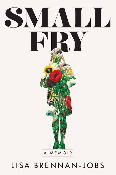 Lisa Brennan-Jobs, Small Fry, design by Alison Forner (Grove)
Alison’s work is consistently great and here is another example. Defying some of the clichés this cover could have fallen into as it relates to Steve Jobs’ daughter, the cover is instead illuminating. The floral elements add an organic nature that mirrors the author’s writing. The font is unexpected and bold and gives the viewer a sense of how unique the author’s story is, while the overall white background hints at the deeper connections to Jobs’ legacy.
I love the sensitivity of the silhouette with the large bold type. Creates a sense of longing…I wish I was filled with flowers.
 Sally Field, In Pieces, design by Anne Twomey, photograph by Harry Langdon Jr. (Grand Central)
Then-creative director of Grand Central publishing, Anne Twomey, created such a compelling and unforgettable design. The photo by Harry Langdon Jr., was taken in the 70s and captures Sally’s vulnerability which works perfectly with the title. With beautiful restraint and minimal well placed typography, Anne Twomey created a compelling design that I believe is irresistible to viewers on screen or across a crowded shop.
A beautiful photograph with simple and understated type that makes for an elegant cover.
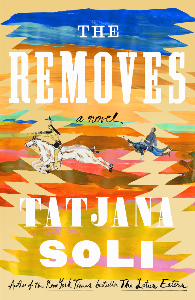 Tatjana Soli,The Removes, designed by Jaya Miceli (Sarah Crichton Books)
I love the painted strokes here as well as the figures which evoke almost the same feeling as Henry Darger’s work (who is an absolute genius as far as I’m concerned!). The colors are bright and fun and the type is unusual. I just want to pick this book up and hope the story is as fun and exciting as the cover!
When this showed up at FSG, I was like YES! The textile landscape is magic, the colors are delightful.
 Inger Christensen, The Condition of Secrecy, design by Joan Wong (New Directions)
I love the careful composition of cutout shapes framed within and over the image.
 Freeman Dyson, Maker of Pattersn, design by Steve Attardo (W.W. Norton)
So simple. So smart.
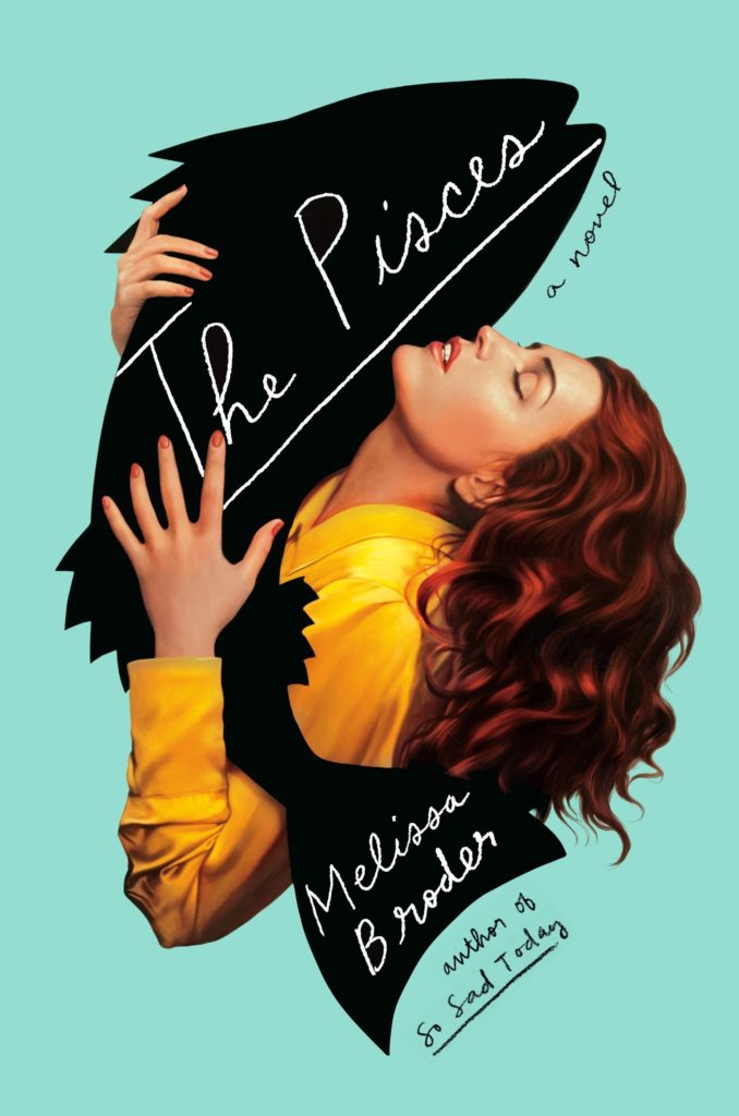 Melissa Broder, The Pisces, design by Rachel Willey, illustration by Tim O’Brien (Hogarth)
What is going on here!?! A big fish cuddle! I like the simple graphic fish silhouette combined with the realism of the illustration of the lady. This works so well, the taking two different graphic styles and fitting them together seamlessly.
I really admire this design. Rachel has taken the Romance illustration and completely changed it up.
It’s outrageous how evocative this cover is. Everything about it—the woman, her face, the strange fact that she is embracing a fish, the contrasting nature of the fish graphic, the color… everything!—captures and holds my attention.
I love how the image of the woman interacts with the silhouette. It evokes emotion in a quirky, clever way.
You could not miss this Rachel Willey cover from a mile away. It’s so fun and ecstatic and kind of wrong. And Tim O’Brien’s smooth-as-butter artwork is the ultimate sell for the cover’s punchline.
Another use of retro-styled imagery but contemporized in a very bold, striking design that is as attractive as it is intriguing. I don’t know what this book is about, yet I must know what this book is about.
This cover has received a lot of attention and deservedly so. The photorealistic illustration of the woman combined with cut out fish and the hand done type is perfectly weird and encapsulates the humor in this story.
When I first saw this design, it stopped me in my tracks. I thought to myself, “this appears to be a woman having an ecstatic, almost erotic, experience with a fish.” If that isn’t enough to make you pick up a book and take it home with you, I don’t know what is! Every element—the background color, the black fish silhouette, the illustration style, the handwriting—works in concert to make this one of my favorite jackets ever.
I love the pulpy execution of fantasy through realism here.
This is probably my favorite cover of 2018. It’s strange and beautiful and very true to the book. It’s unexpected and odd in a way that makes you want to pick it up to figure out what’s going on.
An amazing example of beautifully detailed illustration being disrupted by a stark graphic element, all while speaking perfectly to the title.
I haven’t read this book, but this cover is just so good. An epic embrace with a fish. The color palette is lovely too.
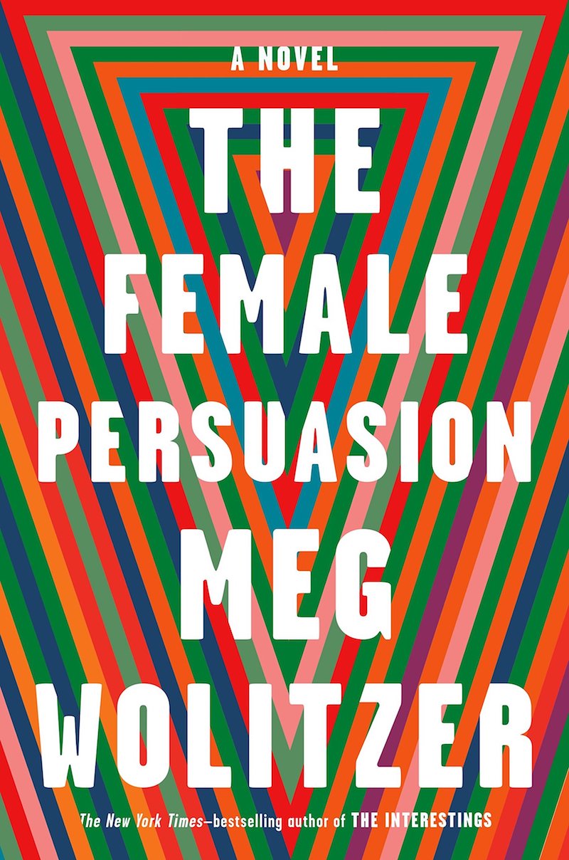 Meg Wolitzer, The Female Persuasion, designed by Ben Denzer, (Riverhead)
This iconic design by Ben Denzer is striking. It says “woman” in a clear, bold, conceptual way. The colors appeal, and it feels like a pop art poster that I could stare at for ages.
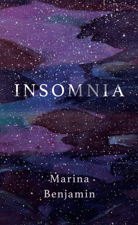 Marina Benjamin, Insomnia, design by Nicole Caputo (Catapult)
I love a solid paper over board solution, and this one is perfect. Really captures the strange loveliness of insomnia.
 Jorge Barón Biza, The Desert and Its Seed, Oliver Munday (New Directions)
Those lonely lips. You could imagine a whole face sitting in that space above them but the absence of any other features is so unsettling and visually arresting.
 Thomas Clerc, Interior, design by Na Kim (FSG)
All of Na Kim’s covers are winners, but the delightful simplicity of this one—the way that the one-word title almost decodes the abstraction of the collaged imagery—particularly satisfies.
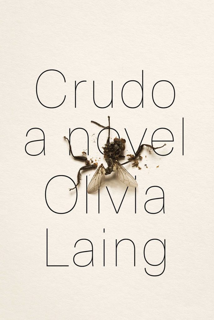 Olivia Laing, Crudo, designed by Devin Washburn at No Ideas (W. W. Norton)
I’m a sucker for anything trompe l’oeil, and this cover feels like a worthy successor to Charlotte Strick’s Varieties of Disturbance. I love how the designer offset the fly’s grisly demise with elegant, high-fashion type and uncoated paper stock—total attraction and repulsion!
This would not be out of place on a gallery wall. I’m not sure how a crushed fly could look so elegant, but here it is. And the stripped down, thin type interacts with it so beautifully.
Simple, but impactful. It is hard to make a dismembered insect look appealing, but I think this cover is successful in creating a sense of intrigue.
The contrast between elegant form and an unsavory image, perfectly integrated to make a this minimalist cover sing. Only wish I did it myself.
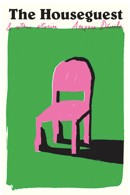 Amparo Dávila, The Houseguest, design by Oliver Munday (New Directions)
I love this combination of colors. I also like the typeface that the title is set in very much, especially the “g”. I was drawn to this cover because, aesthetically, I find it to be very appealing. I didn’t notice until I took the time to write this, but after looking at the cover closely, I see the shadow of the chair as a man, flat on his back, with his heals on the legs of the chair. I could be making this up, but I like covers with ideas hidden in them that you can discover later on, as you come back to it over and over again as you’re reading the book.
I love that the stand alone roughly drawn chair takes up the most part of the cover. Green and pink!
Oh, how we adore the hidden surprise of the figurative shadow in this charmingly rough-edged cover illustration. Who is this guest? And did they make it home alive? Equally puzzling is the stout, dazzlingly pink chair (an innocent bystander, perhaps?) at the center of it all. Reader, don’t be distracted by all of this intrigue and fail to miss that lowercase “g” in “Houseguest.” It will keep any self-respecting, type-loving designer up all night with it’s astonishing proportions.
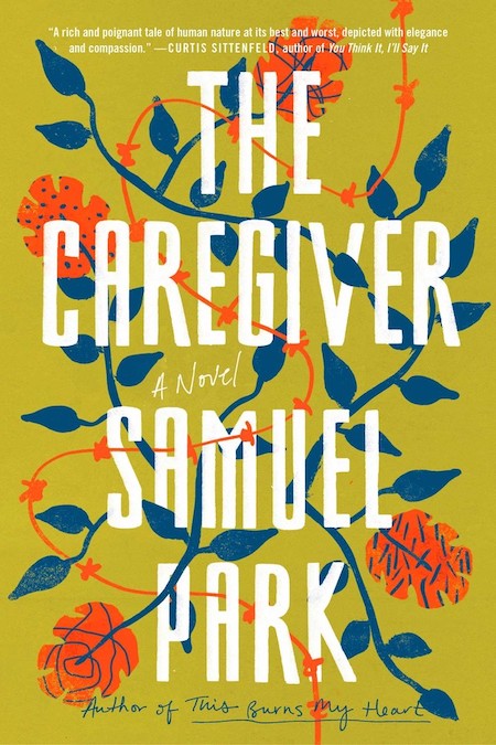 Samuel Park, The Caregiver, design by Lauren Peters-Collaer (Simon & Schuster)
My favorite part of this cover is the color palette. I don’t often see these colors on book covers (that yellow green!) and yet they are unexpectedly beautiful and jarring at the same time. The large type creates a bold juxtaposition against the organic shapes of flowers, vines and wire and helps move a viewer’s eye around the page.
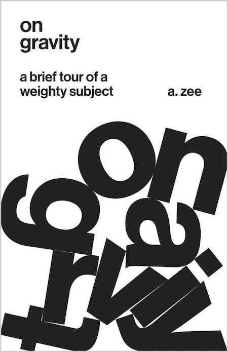 A. Zee, On Gravity, design by Jason Alejandro (Princeton University Press)
Ok, sucker for concept. . . And while this seems like an obvious idea, the starkness of it and the design of the lettering is such a knock out. It really feels like these letters fell naturally this way, and that’s not an easy task. Also, love the choice to set everything in lower case. The idea of gravity feels like it should be in all caps and heavy. But that subtle choice really makes this an elegant cover. I mean this really makes me want to read a book about gravity.
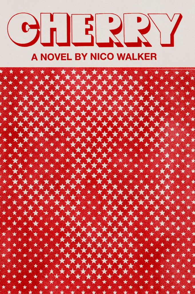 Nico Walker, Cherry, designed by Janet Hansen (Knopf)
Janet Hansen’s cover for Cherry is by far my favorite of 2018. The Magic Eye effect of the skull peeking through a screen of stars is just so captivating. Paired with the poppy type, I love how it all feels uniquely American. Janet also wrote a great Lit Hub piece about the design process, which is required reading and only made me love the cover more.
This clever and simple cover is just stunning. It’s amazing that this package is as dynamic as it is with just the use of one color. The title treatment is great. The skull is subtle but alludes to the intensity and directness of the writing.
Cherry, by Nico Walker, has a stark and enigmatic cover. The typography is a perfect balance of the handmade and the industrial. The density of stars which give birth to a skull is expertly handled. The juxtaposition of a symbol of death with the word, “cherry”, so often associated with youth and sexuality, is jarring. This cover is getting a lot of buzz, and we think it deserves it; we’re adding our voices to the chorus!
I just love this so much. Hansen also did a write-up about the process of making this cover that includes the rejected versions (which are also quite nice).
I have to remind myself every time I pick this book up in the store that I really don’t like reading books about war. It’s a visual magnet.
While I generally feel that skulls have been overused on book jackets in recent years, I love the almost Op Art aspect of this. The design introduces itself with an unsettling and imperfect type treatment, which leads you to the stars, and then finally to the skull hiding in plain sight. The jacket manages to convey “dark Americana” with the least expected combination of elements.
The unexpected combination of these two symbolic images (stars and skulls) piques my curiosity.
Another eye-catcher! Acid-trippy and completely in line with its subject matter but in the most elegant and refined way. An expression of intensity through restraint.
This vintage packaging is a sure collectable and a classic piece of this time. The quirky type works well in contrast to the hidden skull behind the stars. It’s illuminating.
How has Janet turned something grim into something utterly exquisite? She juxtaposes a mirthful title font with a skull composed of stars—a total pleasure once you spot it—to brilliant, sardonic effect. I can only imagine how laborious it must have been to tweak the dimensions of the stars to achieve the perfect read, but the result feels inevitable.
It draws you in from far and demands a closer look, the optical illusion and skull are the perfect combination and says exactly what needs to be said about this book.
Distinctive and bold, I find this to be a very memorable package. Happy to see such a unique and off-beat cover land on a book that’s getting so much attention and critical acclaim.
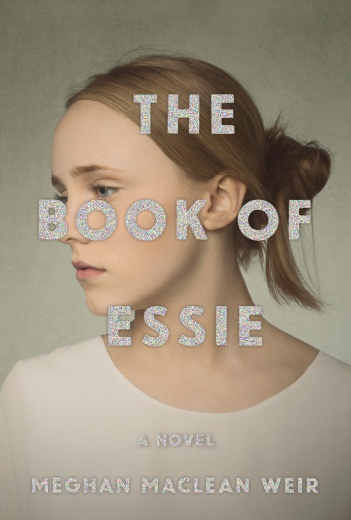 Meghan MacLean Weir, The Book of Essie, designed by Abby Weintraub (Knopf)
When on display at Word over the summer, this cover stopped me in my tracks time and time again. The startling mashup—soft, velvety portrait paired with brash, kitschy foil—alights a keen sense of rebellion. Who is Essie? The conflict between type and image begs resolution.
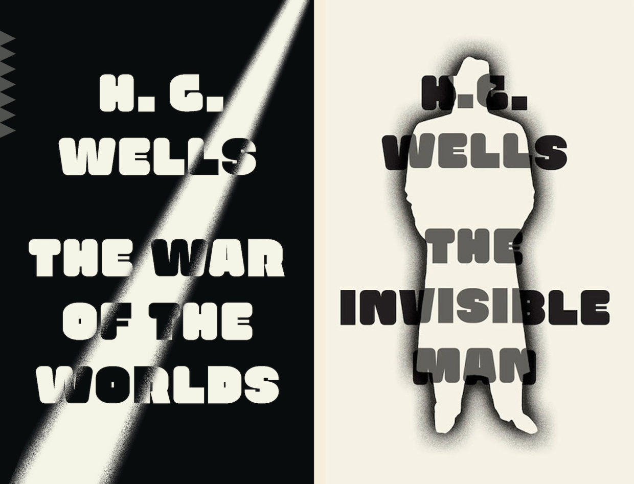 H. G. Wells, The War of the Worlds, and The Invisible Man, designed by Linda Huang (Vintage)
Linda Huang’s repackaging for The War of the Worlds (as well as The Invisible Man) is so fresh, yet it feels nostalgic. The use of just black and white, and the retro font, keeps the design strong and bold.
I love the simplicity and the stark contrast. It’s classy Sci-fi.
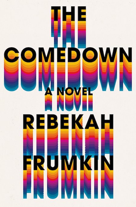 Rebekah Frumkin, The Comedown, design by Rachel Willey (Henry Holt)
A perfectly executed type direction—my favorite kind of cover. The type and color palette do all the heavy lifting here and the result is graphic and memorable.
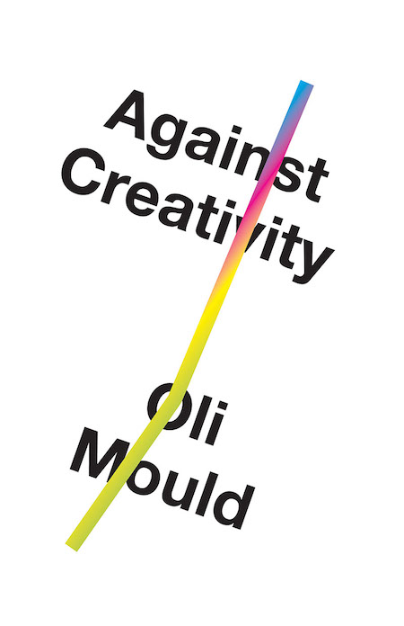 Oli Mould, Against Creativity, design by Matt Dorfman (Verso)
Stark white + Helvetica will never go out of style. Always feels fresh and bold and right.
Apparently, there’s an unused version of this cover which features the severed head of a unicorn, which I would love to see. Decapitated unicorns aside, this cover is lovely.
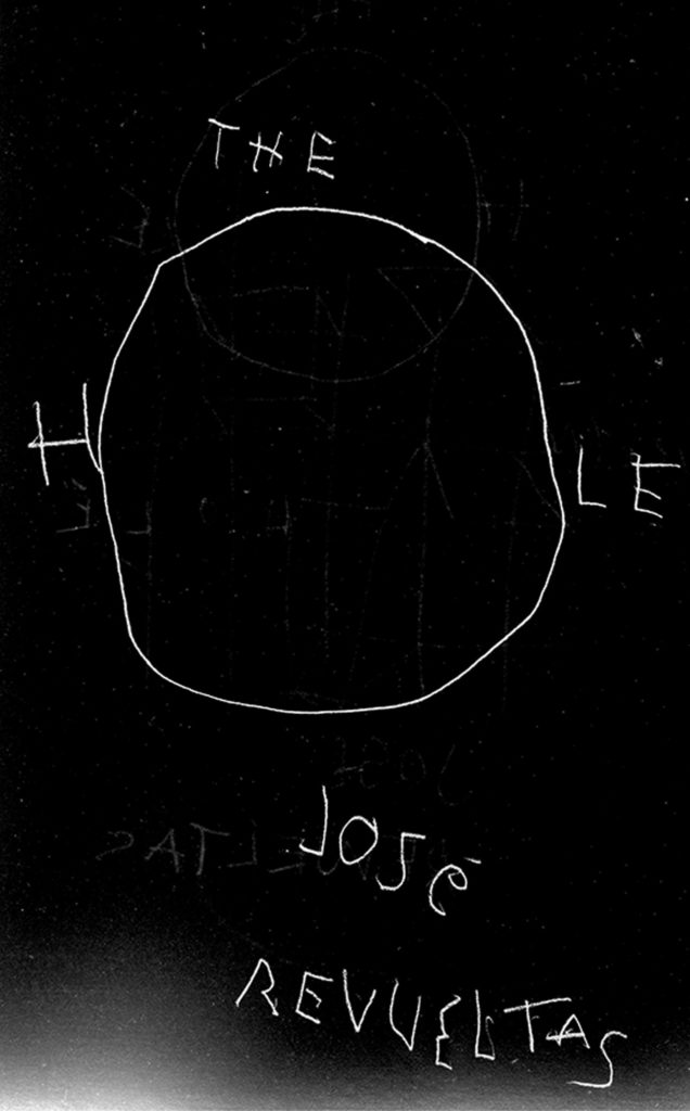 José Revueltas, The Hole, designed by John Gall (New Directions)
One of my design professors encouraged us to read our typography out loud – to assess the voice and volume of our letterforms. This cover doesn’t need to be read; it speaks alllll on its own. An urgent whisper, air rushing through that O, unmoors you. We’re looking up from a well, into a void, and onto a nightmare canvas simultaneously. I would hang this cover in a gallery or museum if I could!
So simple but it sets such a mood.
Ah man, John has been a design hero of mine since I was in college. And this cover is absolutely amazing! This is a repackage of a classic Mexican novella written in 1969. I admit, I haven’t read it, but the summery leaves this dark sense of dread which John’s lettering really drives home. The simplicity of the concept makes this one of those “man I wish I made that”. I tend to gravitate to a solid concept on a cover. And totally a sucker for hand lettering.
The economy of this cover is incredible. So much is articulated with so few elements.
Such a direct idea executed in an indirect way. It looks like Gall drew it once, flipped over, then drew it again. It’s perfectly sloppy. It also reminds me a bit of the poster for The Ring.
A reminder that John is the godfather of cover design and we should all bow down.
 Ahmed Saadawi, Frankenstein in Baghdad, design by Jason Ramirez (Penguin)
I really like that the pieces of the illustrated parts are also illustrated. Love this.
 Nathaniel Rich, King Zeno, design by Na Kim and Alex Merto (MCD)
I love that this book cover can also hang on your wall.
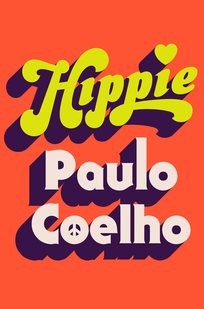 Paulo Coelho, Hippie, design by Tyler Comrie (Knopf)
My brain instantly went ahhhhhhh and ohhhhhhhh. The mood is set with just pure colour and type. I was instantly drawn in. This cover plays with the recent trend in the nostalgic big type and flat colour, this example just won me over and my brain just said yesssssss!!!!
Fun, effortless, and authentic. I’m in love with the printed edition and its neon inks, glossy paper, and sculpt emboss. Puts a smile on my face and feels like a time machine back to the 70s; so well done!
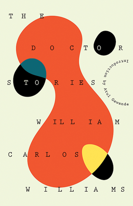 William Carlos Williams, The Doctor Stories, design by Joan Wong (New Directions)
I want this cover hanging on my wall. The cherry that puts this over the top for me is the bold choice of setting the Introduction line on a curved path. So much movement, I’m just in love!
 Yoko Tawada, The Emissary, design by John Gall (New Directions)
The first book I ever bought for its cover was created by John Gall, and to no surprise the last book I bought for its cover was The Emissary. The cover embodies the balance of irony, tenderness, and doom that persist throughout the book.
There is an ineffability about this cover. Simultaneously playful and melancholy, the only word I can muster is mono no aware, a Japanese term that describes the deep wistfulness and transience of things. John has captured this very special feeling with the masterful use of negative space—the boy is literally out of reach and toppling off the page.
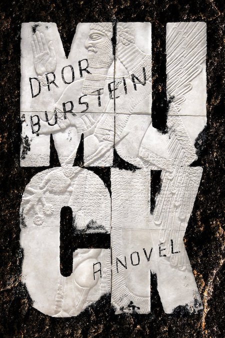 Dror Burstein, tr. Gabriel Levin, Muck, design by Na Kim (FSG)
I love that on first glance I really thought this was gummed up wet cut out napkins. But looking closer (online viewing here), it’s a beautiful marble relief. And the sense that it’s sort of been graffitied on really blends the old with the new. A humorous retelling of the book of Jeremiah set in modern times… what better than ancient art being tagged with a marker? The boldness of the lettering and breaking of the word is a favorite of mine. I try this so many times and tend to get it killed.
 Ahmed Bouanani, The Hospital, design by Oliver Munday (New Directions)
I love how this Oliver Munday cover manages to use bright, approachable colors to create a downright nightmarish image. It’s the kind of visual dissonance that draws you in and makes you flip straight to the book’s description—the ultimate mark of a successful cover design.
 Tommy Orange, There There (UK edition), design by Suzanne Dean, art by Bryn Perrott (Harvill Secker)
This cover makes a fearless statement. The red “teardrop” elements pour out over the cover, audaciously covering up the title, and yet legibility is no issue here. There is a chaotic beauty to it all, but somehow it forms to create a cover with big impact.
With this perfect overlap your eye is balanced between looking at the type and the art. Super hard to pull off, and super effective when you do. There’s also so much character given to the type without it veering into childish and it’s still beyond legible.
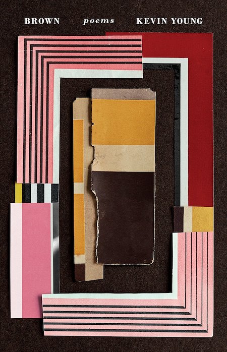 Kevin Young, Brown, design by Kelly Blair, collage by Jason Kernevich (Knopf)
What a beautiful object this book is. Small elegant typography crowns the top of the cover letting the tactile layered collage by Jason Kernevich draw me in from across a crowded shop. Uncoated stock gives a tactile feel complimenting the visual texture. The art selected works perfectly for this poetry collection about racial identity. Kelly and Jason have created a deeply meaningful piece of art for our shelves in book form.
 Ian Buruma, A Tokyo Romance, design by Oliver Munday (Penguin Press)
The circle elements are used really nicely, linking and unlinking and playing off the word ‘romance’, and I find the palette and overall elements to be just generally simple and pleasing.
A book cover that also acts as a beautiful wallpaper is an added bonus. It is a clean, retro design with a modern twist that is very inviting. So much is said about this design that intrigues me to figure out the story behind it. The shifts in between the three panels and type shows the fragments of time, and the contrast between the two colored circles overlapping each other as it drifts off the page shows tension.
 Catherine Lacey, Certain American States, design by Na Kim (FSG)
This cover tugs on my little heartstrings. It makes me feel the mundanity and magnificence of ordinary life balanced together.
 Lucia Berlin, Evening in Paradise, design by Na Kim (FSG)
This cover is the effortless cool girl of new releases, fitting for the content. Na Kim exhibits beautiful restraint and elegant typographic choices. The small refined details, like the way the author of line dips just under the ridge of the glass and how the white half circles resemble those painted sections on vintage ashtrays that will soon be chipped away, demonstrate a meticulousness and thoughtfulness that can take a design to the next level.
The sculptured emboss on this thing is out of this world.
This cover just makes me want to sit in the sun with a cigarette in hand
Ooooohhh this is so pretty. I just want it.
I don’t smoke, but this makes me want to have a cigarette. Love the idea of executing something related to a vice in such a polished and beautiful way. It helps too that the type is meticulously handled and the color is perfect . . .
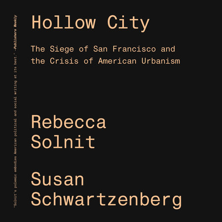 Rebecca Solnit and Susan Schwartzenberg, Hollow City, design by Cortney Cassidy (Verso)
Sometimes the simplest covers are the best.
With a title like When Katie Met Cassidy, the cover could be in danger of simply repeating what the audience already knows instead of adding to it, but this art expands the story. Plus having the word “met” over the kissing lips matches the playful energy of the writing.
 Jay Rubin, ed., The Penguin Book of Japanese Short Stories, design by Matthew Young (Penguin)
Story collections are my favorite travel reads, and I love how instantly transporting this Matthew Young cover (with artwork by Hiroyuki Izutsu) feels. As soon as I saw it I wanted to grab a copy and board a train from Tokyo to Kyoto.
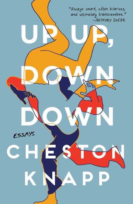 Cheston Knapp, Up Up, Down Down, design by Anna Laytham (Scribner)
The way the type is incorporated with the beautiful art is so elegant. And I love that this made it through. I can just hear a marketing person in-house making the comment that it’s just a little too hard to read. But it makes you work for it, and really not all that hard, let’s be honest. And that artwork speaks so clearing to the author seeking out his identity through these essays. Plus color choice is so fresh even though it’s primary colors.
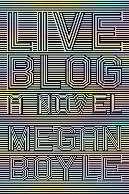
Talk about eye-catching! What I love most is its simplicity and symmetry—the lines and letter strokes are all just the right size for a perfectly balanced optical illusion, giving us a look that’s just on the edge of familiar yet completely fresh.
 Rawi Hage, Beirut Hellfire Society, design by Lisa Jager (Knopf International Edition)
The color palette caught my attention first on this cover. This seems to be the year of orange for book covers but the pops of violet-blue make all the difference and then the bright colors are nicely juxtaposed on the grey which is a color you don’t see large swaths of very often on covers.
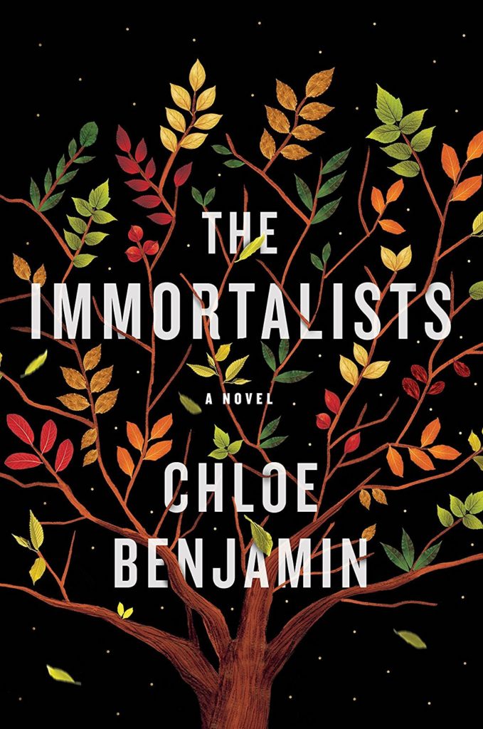 Chloe Benjamin, The Immortalists, design and illustration by Sandra Chiu (Putnam)
The delicate illustration of the tree with its falling leaves hints at just enough of a story to make the reader intrigued. While the artwork is soft, the type and black background keep the cover from becoming too saccharine.
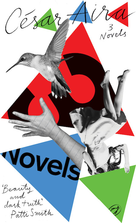 César Aira, 3 Novels, design by gray318 (Penguin Essentials)
This is a clever way to represent three different stories. Feels like something that’s going to be fun to read.
 Ben Marcus, Notes from the Fog, design by Peter Mendlesund (Knopf)
I mean…
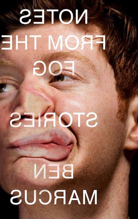 Ben Marcus, Notes from the Fog (UK cover), design by Jamie Keenan (Granta)
In college, one of my favorite artists was the British painter Jenny Saville, whose visceral depictions of all things corporeal completely transfixed me. It’s no surprise, then, that I’m drawn to this cover. The photo has a similar concept to one of Saville’s paintings, only more blasé (the guy looks pretty calm as he’s being shoved against the glass!) than plain brutal. I know it’s literally in-your-face, but the execution is so pure: the backwards type treatment does not compromise. Bravo to the publisher for taking a risk.
The only reason 2018 was an okay year is because this cover came out of it. Clever and exuding confidence—thank you Jamie for giving me hope in this dark world!
Jamie has the annoying knack of finding solutions you can’t believe you’d never thought of. Praise be also for the publisher’s bravery. The US cover by Lord Mendelsund is great too.
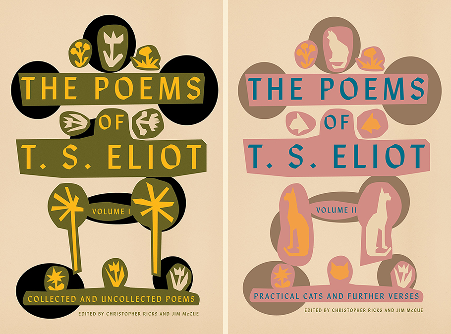 T. S. Eliot, The Poems of T. S. Eliot Vol I & II, design by Alex Merto (FSG)
There is something entirely eccentric and utterly charming about the artful balance of parts that make up the newly released jackets for Volumes I & II of The Poems of T. S. Eliot. These two beauties manage to be both quirky and spare. The only “method,” Eliot once wrote about his work, “is to be very intelligent.” Merto’s jacket designs are the visual equivalent, and we’ll take both for our bookshelves, pretty please.
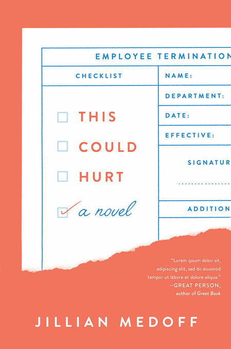 Jillian Medoff, This Could Hurt, design by Joanne O’Neill (HarperCollins)
I loooovvve this cover. Its retro, its fresh, it printed on uncoated stock and had great texture. Its subtle and poppy at the same time. a a pretty palette.
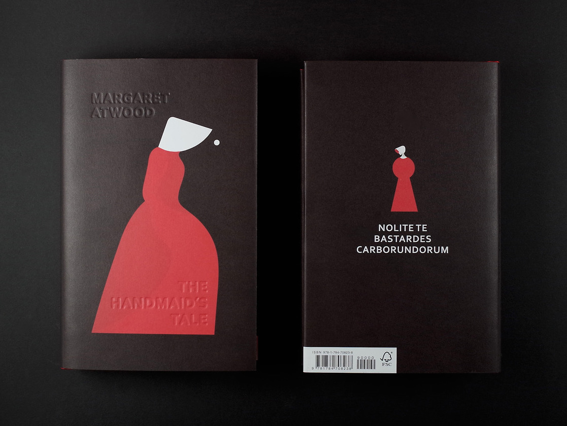 Margaret Atwood, The Handmaid’s Tale, illustration by Noma Bar, design by Suzanne Dean (Vintage UK)
I first came upon this UK edition cover on screen after it had won a design award in its category from ABCovereD. The blind debossed title and author name are barely noticeable on screen but the iconic and startling illustration by Noma Bar needs nothing to accompany it. The physical book is sumptuous with red painted edges, uncoated stock and a ribbon as well. A gorgeous cover that haunts and moved me to my core.
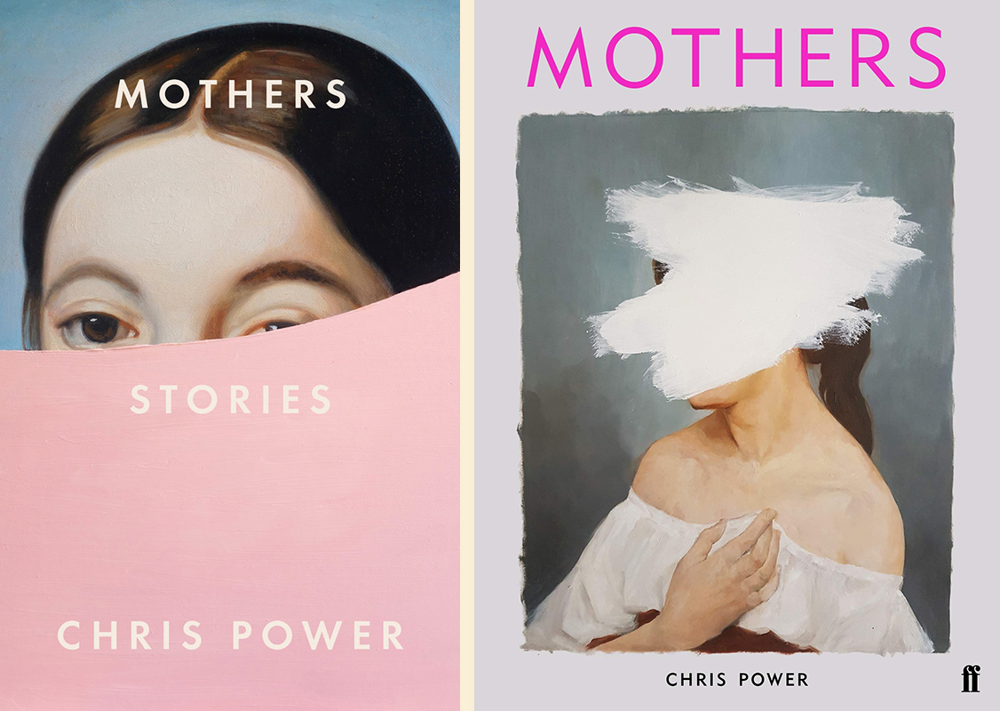 Chris Power, Mothers: US design by Grace Han (FSG); UK design by Eleanor Crow (Faber & Faber)
I don’t know which came first, the UK or the US cover. Both similar and great (Eleanor Crow designed the lovely UK cover). I love the colour and simplicity and the subtle paint line on this one.
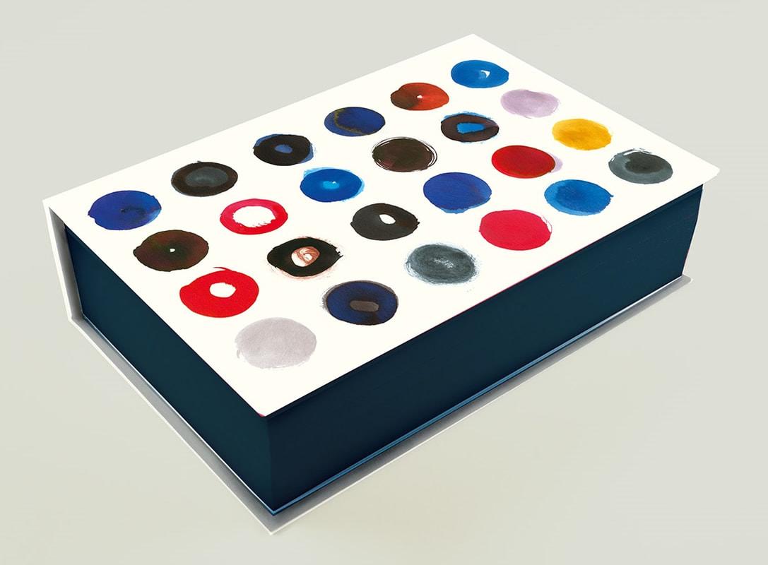 Haruki Murakami, Killing Commendatore (UK Special Edition), design by Suzanne Dean (Harvill Secker)
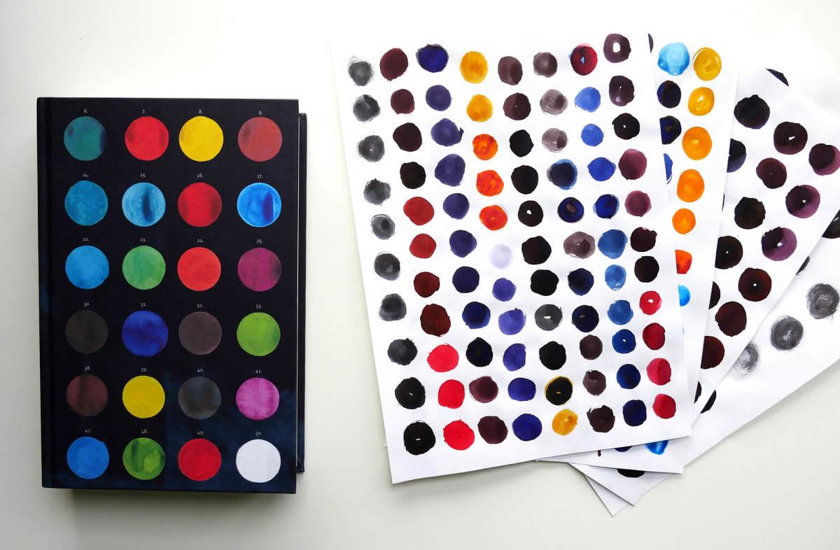 Haruki Murakami, Killing Commendatore (UK Special Edition), design by Suzanne Dean (Harvill Secker)
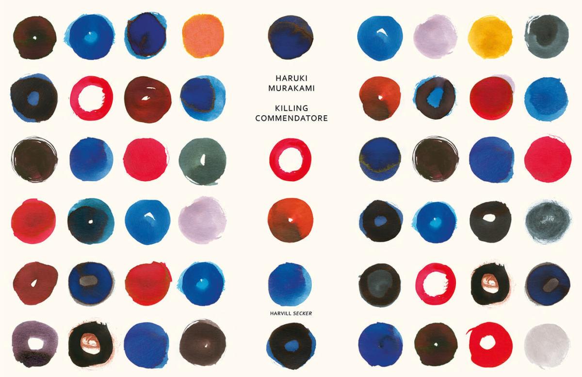 Haruki Murakami, Killing Commendatore (UK Special Edition), design by Suzanne Dean (Harvill Secker)
I find paint splodges and paint palettes completely intoxicating. I can look at them, and this cover, for hours on end.
Emily Temple
Emily Temple is the managing editor at Lit Hub. Her first novel, The Lightness, was published by William Morrow/HarperCollins in June 2020. You can buy it here.
