The 17 Best Book Covers of May
Shape, Text, and Texture
Cheek and irreverence abound in my favorite book covers this month. I also noticed an unusual number of interesting textures at play, some excellent uses of text as image, and at least a few geometric echoes bouncing around in there. But as ever, though I love to try to draw connections here in the introductory paragraph, there’s no real theme to speak of, just a bunch of good art on a bunch of good books. Enjoy:
 Patrick McCabe, Poguemahone (Cover design by Mark Ecob, Biblioasis, May 3)
This kind of block print text rarely comes with such exciting movement; it’s very fun to see here.
 Julia Glass, Vigil Harbor (cover design by Jenny Carrow; Pantheon, May 3)
This might have been a perfectly serviceable, nice-looking cover, but the fold effect elevates it several levels.
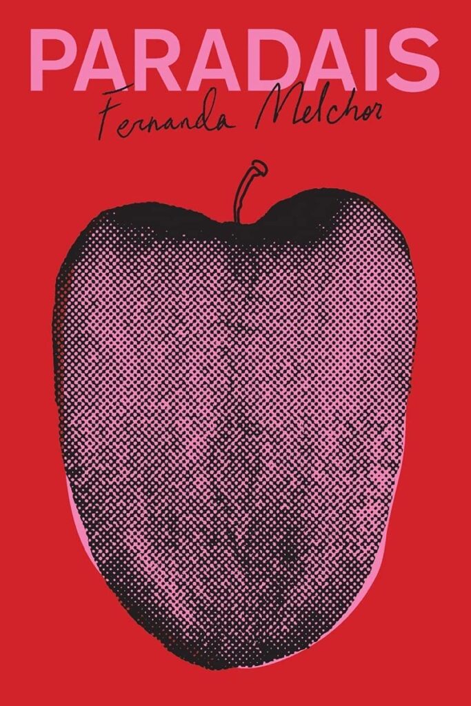 Fernanda Melchor, tr. Sophie Hughes, Paradais (cover design by Oliver Munday; New Directions, May 10)
Another deceptively simple but completely brilliant design by Oliver Munday—the halftone tongue-as-fruit (with that little hand-drawn stem to tie into the author’s name) is so good that I’m pretty sure I need this as a poster for my office.
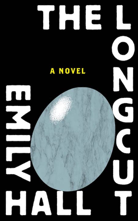 Emily Hall, The Longcut (Dalkey Archive Press, May 10)
This cover feels like it’s in conversation with the previous entry, while delivering a much different sensation.
 Maggie Shipstead, You Have a Friend in 10A (design by Kelly Blair, illustration by Toby Leigh; Knopf, May 17)
Instantly iconic—plus it makes me laugh.
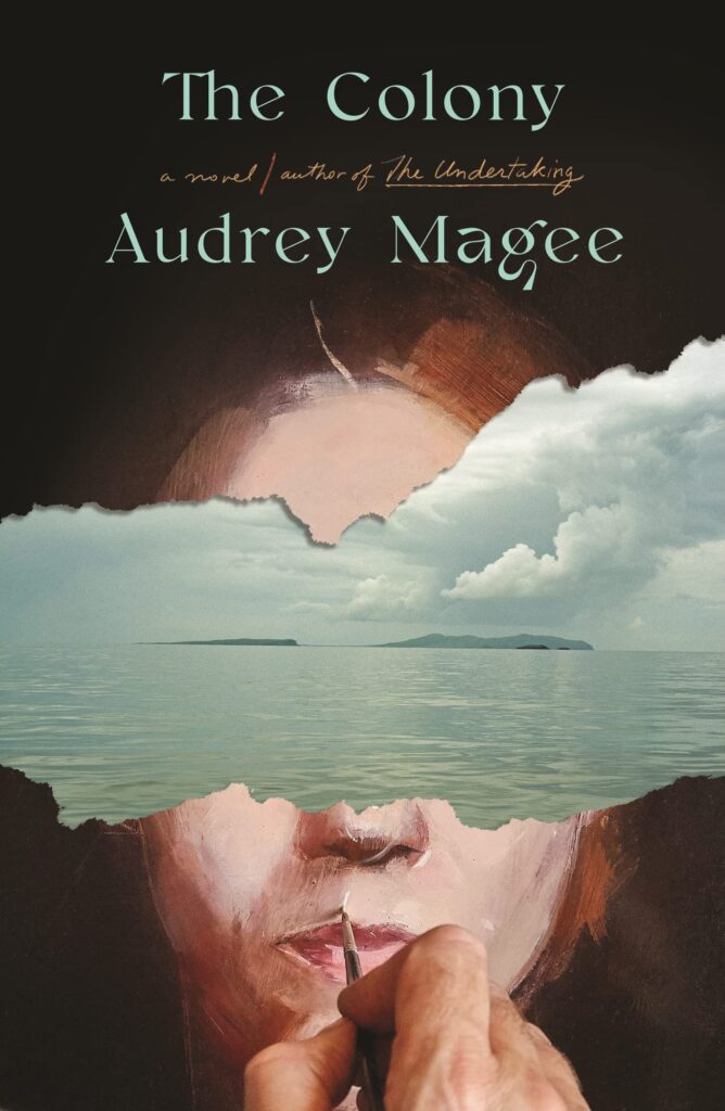 Audrey Magee, The Colony (FSG, May 17)
There are so many layers of reality going on in this cover—the painter, the painting, and then the cutaway island behind. The way the two landmasses almost stand in for eyes is particularly eerie. The UK cover is also glorious.
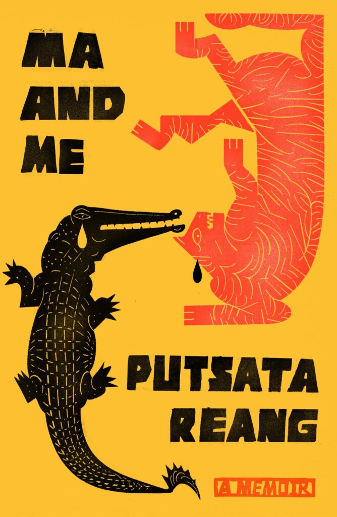 Putsata Reang, Ma and Me: A Memoir (cover design by Na Kim; MCD, May 17)
Formally interesting, deeply evocative, and also cool—a cover that makes you want to read the book.
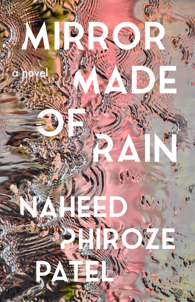 Naheed Phiroze Patel, Mirror Made of Rain (cover photograph by Robert Keane; Unnamed Press, May 17)
Another very good texture cover.
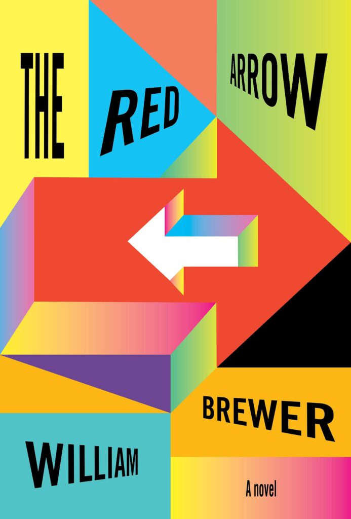 William Brewer, The Red Arrow (cover design by John Gall; Knopf, May 17)
I love the playfulness with flatness and dimension here—it’s the kind of cover that keeps developing as you look at it.
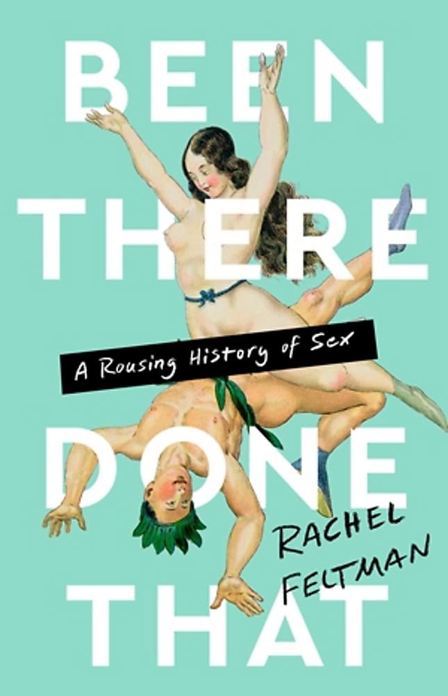 Rachel Feltman, Been There, Done That: A Rousing History (cover design by Pete Garceau; Bold Type Books, May 17)
The joyous illustration! The head through the o! The black bar of subtitle! The somehow frisky green! How could you not be charmed?
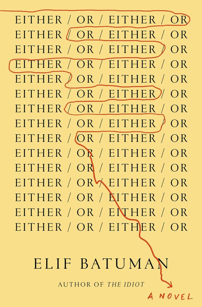 Elif Batuman, Either/Or (cover design by Na Kim; Penguin Press, May 24)
What a clever, playful solution to a novel with such an ostentatious title—not at all what you would expect, but ultimately perfect for the book.
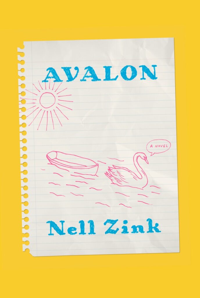 Nell Zink, Avalon (cover design by Linda Huang, illustration based on a sketch by the author; Knopf, May 24)
Another deceptively simple, oddly funny cover, made funnier by the color story (I find this yellow hilarious, but maybe that’s just me) and elevated by the proportions (that ripped out page, placed just so).
 Hanna Bervoets, tr. Emma Rault, We Had to Remove This Post (cover design by Robin Bilardello; Harper, May 24)
I love it when a book cover just doesn’t look like other book covers. This one takes a few risks with type treatment and image, and they all pay off.
 Peter C. Baker, Planes (Cover design by Linda Huang; Knopf, May 31)
I love it when text becomes image, and Linda Huang has done that so intriguingly here. “I quickly started toying with the idea of planes of existence, or a flat surface connecting two points—symbolic of the two narratives that unfold, connecting the two female protagonists,” said Huang of her process when tackling this cover. “Combining this idea with redaction and black sites led me to the final cover direction. I was hoping to convey both elegance and brutality by stylizing the title this way, and the black shapes are also reminiscent of a blueprint for something vaguely militaristic or industrial—themes relevant to the novel.” It’s a knockout.
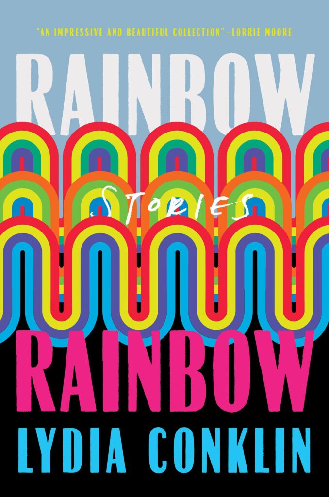 Lydia Conklin, Rainbow Rainbow (cover design by Nicole Caputo; Catapult, May 31)
This cover keeps tricking my eye-brain into adding three more rainbows into the title, a clever visual sleight-of-hand that also is giving me Big Book Energy.
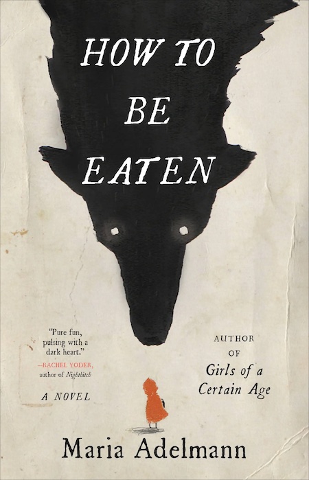 Maria Adelmann, How to Be Eaten (cover design by Julianna Lee; Little, Brown, May 31)
Any well-read(-to) child of the ’80s will probably feel the delicious Lon Po Po vibes of this cover. Add the faux-distressing and knock-out sense of balance and the brilliant little scribble for Little Red Riding Hood’s shadow and you have a gorgeous work of art.
 Huw Lemmey and Ben Miller, Bad Gays: A Homosexual History (Verso, May 31)
So simple and so fun.
Emily Temple
Emily Temple is the managing editor at Lit Hub. Her first novel, The Lightness, was published by William Morrow/HarperCollins in June 2020. You can buy it here.
