Secrets of the Book Designer: On Typography, Painting, and Finding That Single Visual Moment
Peter C. Baker and Linda Huang on Making the Cover for Planes
When it came time for my novel, Planes, to get a cover, I was thrilled to learn that Linda Huang had been assigned to make it. I met Linda in the fall of 2004, when we lived on the same dorm hall. I’ve long admired her work as a cover designer; more than once, in the years since graduation, I’ve found myself admiring a cover on a bookstore table, then realizing it was one of hers. So I knew I was in good hands—and I was happy to feel some different chapters of my life intertwining.
I also had no idea what to expect. I’d tried coming up with cover concepts on my own—just as an exercise—and everything I came up with felt dumb or untrue to the book. When the email with Linda’s cover arrived, I had butterflies in my stomach. It was bizarre and surreal to know that, when I clicked on the attachment, I would see a sprawling story I’d spent almost a decade on summed up with a single image. Fortunately, I loved it. In the weeks leading up to publication, I emailed with Linda, hoping to learn more about her process and history as a designer.
*
Peter C. Baker: Can you tell me how you first approached the process of designing this cover? Are there initial steps you tend to follow for all cover projects?
Linda Huang: Before reading the manuscript, I was well aware that you wanted something abstract, typographic, and dimensional—based on the Melissa Febos cover you sent as inspiration.
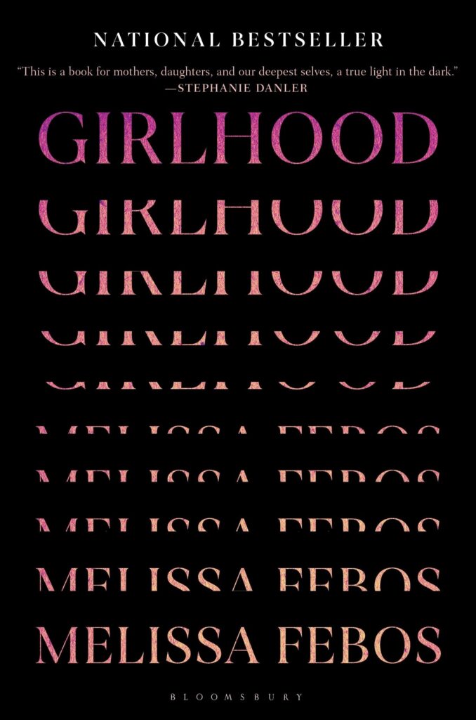
PCB: Funny—I’d only sent that cover over because I saw it and felt … something? I can’t say exactly what, but it felt like it belonged in the mix. On the mood board. I definitely didn’t mean to be saying, firmly, GIVE ME SOMETHING LIKE THIS!
LH: I guess it was a visual fragment that I glommed onto, that excited me as well—a license to approach it more graphically and formally, which tends to lead to more interesting visual outcomes.
There was also the question of the title. Although short, single-word titles are ideal for design, it became clear to me while reading the manuscript that the title didn’t reveal much about the story. I was hoping that the cover would at least touch on some core aspects of the novel—like redactions, secrecy, black sites, and incomplete stories—but still be mysterious enough to lure you in.
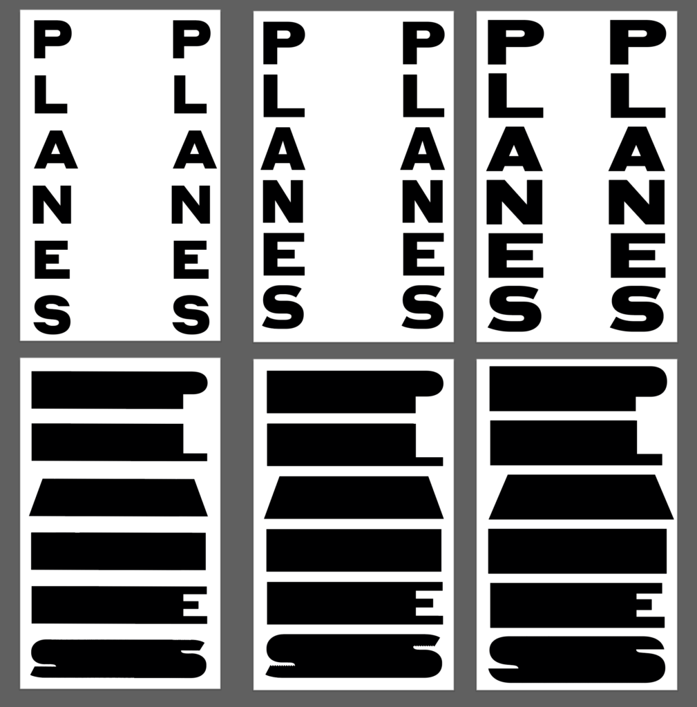
After reading the manuscript, I do what I usually do for all fiction covers: jot down key themes, motifs, and what I feel like the cover needs to convey. It’s a very loose, associative process, and varies from book to book. Most of the time I doodle thumbnail sketches, but looking back at my notebook, I couldn’t find any sketches, only written concepts, e.g.:
–Redacting using type
–Fragments created by folding / pleats
–A head-up display (the electronic data displayed on a plane’s window for pilots)
–Repeating “PLANES” with some kind of interruption
Because these directions relied heavily on typography, I started sketching on the computer directly. It was a very experimental process of trial and error.
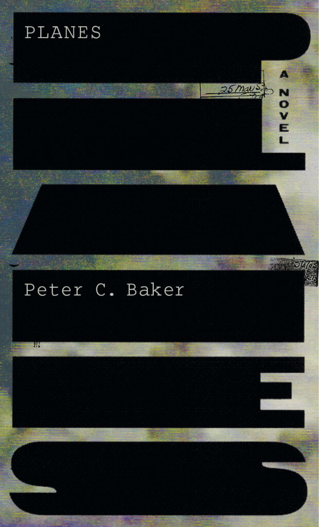
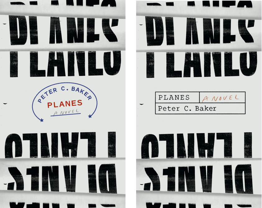
I quickly started toying with the idea of planes of existence, or a flat surface connecting two points—symbolic of the two narratives that unfold, connecting the two female protagonists. Combining this idea with redaction and black sites led me to the final cover direction. I was hoping to convey both elegance and brutality by stylizing the title this way, and the black shapes are also reminiscent of a blueprint for something vaguely militaristic or industrial—themes relevant to the novel.
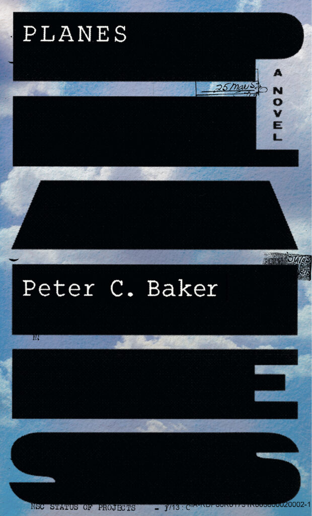
Obviously, post-9/11 torture is a heavy element in the story, but I didn’t think it would be winning to convey any of that on the cover. We are always told that nobody wants to pick up a book depicting anything gruesome, depressing, or generally off-putting, especially when there’s no humor involved. (In case you didn’t know, Sales tends to love covers that are colorful, inviting, and accessible.) Thankfully, I didn’t have to compromise much for Planes. I think the optimistic blue sky helped.
PCB: I love the blue sky: how it evokes an ideal of openness and calm that’s in tension with the rest of the cover, in a way that makes the whole thing feel eerie and alive.
Once you had the idea—what sort of work did you do to implement it? I think people who are unfamiliar with cover design can be amazed to learn how much sometimes goes into it. I remember you telling me something about printing out letters then scanning them back in…
LH: I did some type tests to get the proportions right for the type-as-redaction shapes. Finding the right typeface for a cover is an important part of my process, and I can easily spend hours, if not days, researching the right letterforms.
 Type tests.
 Initial sketch.
The original background image above is a page scanned from Uncorporate Identity by Metahaven of what looks like footage from a surveillance camera. (Metahaven is a Dutch design studio whose work, very loosely speaking, explores geopolitical phenomena.) I may have leaned too much into the political aspect of the book; when I showed it at the cover meeting, the feedback was that the background was too vague. They suggested a sky, which I thought was a great idea. Way more approachable! The type also begged to be a tad larger.
 Not the final sky.
My other idea was to print PLANES on a folded piece of paper, creating dimension:
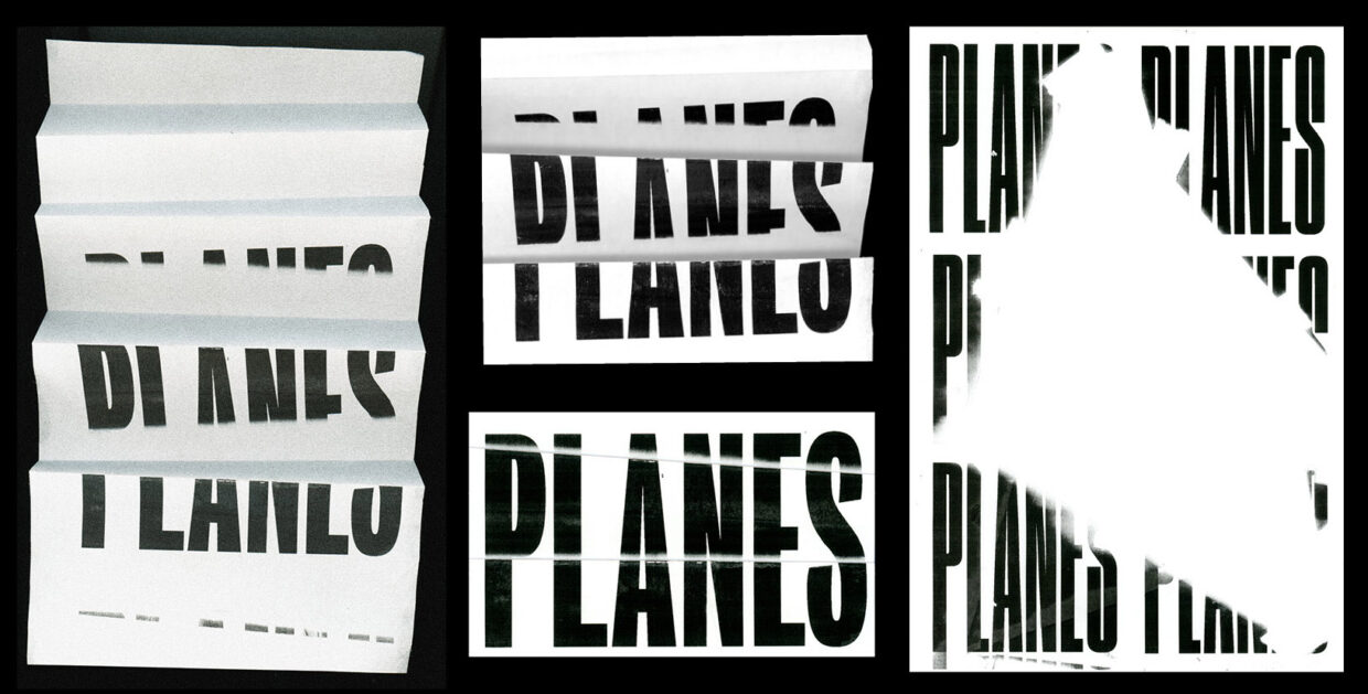 Experimental scans.
 Sketches.
 Sketches.
In both cases, I printed out the letterforms at a reduced scale, then blew them up on the scanner. This trick imbues some imperfection to the shapes, creating jagged edges that would be difficult to create by hand.
I’ve always loved this collage by Scott Dickson of fragments of sky interlocked like a puzzle. It has that vintage postcard quality that is hard to replicate nowadays. I thought it could be an alternate, perhaps more inviting cover direction (you can see the colorful sky!), hinting at a sense of interconnectedness and shared history.
 Sketches.
PCB: I’m glad I didn’t see all of these at the time; it would have been really hard for me to pick between them.
In college I knew you as a visual artist, and I have a really vivid memory of coming to your studio to look at paintings you were working on—I remember some of babies, and some of raw meat, right? The paintings made an impression, but I was just as struck by the feel of the studio, and my sense of how much time you were spending there. Back then I really wanted to be writing fiction but didn’t do very much of it. I had a lot of trouble committing to anything or seeing it through, and seeing all of the work you’d accumulated was inspiring. What was your journey from painting to cover design? And how do you feel one influences the other?
LH: Even though I chose painting as the final medium for my senior thesis, I hardly considered myself a painter. One out of my four classes per semester was a studio art class. You know how it is at liberal arts colleges—breadth over depth, at least that was my experience. Now that I’ve met people who went to art school for undergrad, for whom most of their classes were rigorous studio art classes, I feel like I barely dabbled in the medium. But senior year was more immersive for sure, and in hindsight it was a very precious time—to have a dedicated studio space surrounded by like-minded others making work.
After graduation, I wanted to work in a field related to visual culture. After some unsatisfying stints interning with art dealers and galleries in the summers during college, I knew I wanted to be making the work, not managing it. But I was less interested in painting and fine art and became increasingly interested in graphic design, especially its inseparability from typography. For as long as I can recall, I’ve always been obsessed with fonts. I have a memory from when I was 11 or 12 of making a bookmark from magazine cutouts of various logos and words that I collaged together and even had laminated. In college I spent far too long choosing a font before writing my papers. I realize I’m very sensitive to the shapes of letterforms and their impact on how a message is received.
So I decided to enroll in a three-semester, vocational design program at Parsons, where I took a class on book cover design taught by Jason Booher, who was then a designer at Knopf. It was really hard but really rewarding. I had no idea there was such a niche field where people got paid to read books and think about how to package them. In a way, it’s one of the most pure forms of design—responding to someone else’s work of art. And, unlike, say, designing film posters, the non-visual nature of writing allows for richer interpretation. Jason taught us that book cover design is all about the singular “visual moment”—the formal play that makes a cover unique.
While at Parsons, I interned with Gabriele Wilson, a former Knopf designer, working on various cover and interior design projects. After finishing the program, via Jason’s connection, I started freelancing at Knopf and was eventually hired as a junior designer. I remember telling my now-husband that, in my professional life, I just wanted to be left alone to solve visual problems. It would be hard to find a more fitting match.
What I enjoy most about cover design is the opportunity to channel different visual styles and techniques. I become a chameleon, molding myself to each book. The ability to grasp an author’s core thesis in a range of topics—from physics to history—is a necessary skill. It’s also what keeps the job interesting.
On a fundamental level, painting and cover design share many similarities—core principles such as composition, scale, color theory, foreground/background, and positive/negative space. You can also approach painting in a more designed way (Piet Mondrian, Frank Stella, and Ellsworth Kelly are obvious examples). I think the primary way painting has influenced me is purely formal—training me to see. Those college paintings of babies were purely sensory and not conceptual. Of course, I still use some of my painting background to illustrate the occasional book cover (albeit in a very basic/crude way) and hand-letter type.
PCB: Did the process feel any different than usual because we know each other?
LH: Definitely. I felt more pressure to get it right on the first go. And while reading the manuscript, I couldn’t help but think of you behind the voice of the female protagonists. I was struck by how attuned you were to their psyches. Maybe this led me to a less conventionally feminine solution (e.g. there’s nothing on the cover that hints at two female protagonists). Picturing you, a male author, may have slightly biased the design to be more masculine. Male authors, even those who write female characters, have traditionally been able to get away with designs that are more graphic, abstract, and stark.
I was also extremely curious where you got the idea to write the novel from (other than the news, of course), and kept thinking about how much work it takes to write an entire book!
PCB: I was worried you’d say that, about trying to get it right from the start. That’s too much pressure!
I started the book in 2011, when I was in graduate school in North Carolina. I was already doing some nonfiction writing about torture and rendition, and getting increasingly dissatisfied with the way I saw these subjects taken up by novels and movies. Then I read this 2005 New York Times article about the CIA using charter plane companies in North Carolina for rendition flights.
I’d actually read the article before, but not at a time in my life when I was actively trying to start a novel. I suddenly felt able to approach torture and rendition in a new way—through conventions more commonly associated with novels about small-town life, about domestic life, about marriage. And that was the start, though it took five years to start adding the sections set in Italy—which now make up over half the book.
LH: Fascinating. I found your approach to integrating torture and rendition into domestic and married life very unexpected, in a refreshing way. How did you go about planning the sub-narratives and where did you find inspiration for such different characters? It seems quite obvious from reading the book that you also spent time in Rome. Was there a particular reason you chose to set half the book there?
PCB: Adding the Rome material was a way to make the book bigger, but without swapping out the up-close, domestic lens. It helped that I’d spent several weeks there in 2009. In 2017 I went back on a family vacation and I was able to go to locations I was using in the novel.
As for the characters and subplots, I think it’s probably a lot like cover design, or any creative process, especially since I’ve never been a big advance planner or outline-maker. I try something but then realize something’s missing. I fill in what’s missing but then things are out of balance. I put things back in balance but then they feel boring. I try something that doesn’t feel boring—and again. So it’s weirdly hard for me to remember where certain parts of the book—even whole characters!—originally came from. It’s nice to forget, actually; that means it can’t stress me out anymore. And having a great cover is part of that. It’s really out there, which means I’m really done with it.
______________________________

Peter C. Baker’s Planes is available from Knopf
Peter C. Baker
Peter C. Baker's essays, criticism, reportage, and fiction have been published in The New Yorker, The New York Review of Books, The Guardian, The New York Times Magazine, The Nation, The Times Literary Supplement, and Granta. He lives in Evanston, Illinois.