The 15 Best Book Covers of January
2019's First Crop of Shiny New Books
Another month of books, another month of book covers. Assuming you’ve recovered from the best book covers of 2018, that is. If not, get on it, because January’s bookshelves are filled with milky blues, saturated yellows, and a couple knockout patterns—and the books underneath aren’t too shabby either. Below, I picked my 15 favorite covers from this month’s newest crop of books—if I missed yours, feel free to add it in the comments.
 Sophie Mackintosh, The Water Cure, Doubleday; design by Michael J. Windsor, photo by Johanna Negowski (January 8, 2019)
Normally I’m not a huge fan of dismembered women on book covers. But this treatment is so specific to the book, both thematically and tonally, that I can’t fault it. Anyway, it’s really the milky blue that draws me in, and those indented waves and wide-spaced white letters. The sense of water is intense, which is the whole point.
 Mesha Maren, Sugar Run, Algonquin; design by Keith Hayes, photo by Stacy Kranitz (January 8, 2019)
Finally: a vertical horizon that’s actually good. (This has been a 90s joke.) I love the way the image slips between just that, a misty morning vista, and something more abstract, like ripped paper—and the way the right half of the text tucks into the image, increasing the depth beautifully.
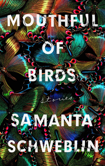 Samanta Schweblin, tr. Megan McDowell, Mouthful of Birds, Riverhead; design by Stephen Brayda (January 8, 2019)
This cover looks exactly like a Samanta Schweblin story: almost beautiful, but actually distorted and disorienting and just shy of too much, which makes it perfect.
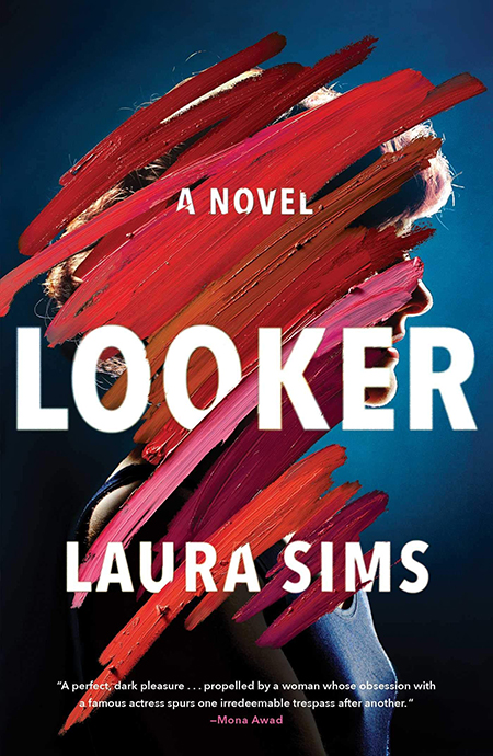 Laura Sims, Looker, Scribner; design by Jaya Miceli (January 8, 2019)
The 3-D quality of the paint—and the richness of the red against the blue—makes this a great take on one of my favorite book cover trends: the artfully obscured headshot.
 Keith Scribner, Old Newgate Road, Knopf; design by Janet Hansen (January 8, 2019)
This cover feels a little bit like an old, ruined photograph that you might find under a floorboard—except that it also looks like a trippy collage. I can always trust Janet Hansen to make me want a read a book on design alone.
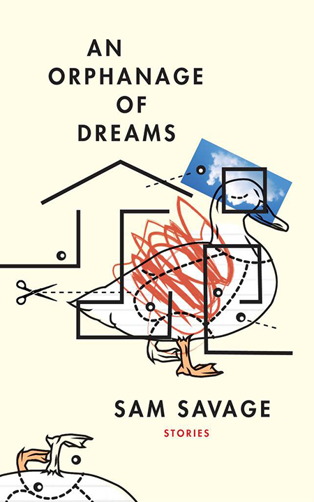 Sam Savage, An Orphanage of Dreams, Coffee House; design by Kyle G. Hunter (January 8, 2019)
I like this one because it’s so out there—in fact, I’ve never seen anything quite like it: a manic hodgepodge of styles as well as forms that manages to be goofy as well as elevated. The restraint in the type treatment against the crazy images is kind of great too.
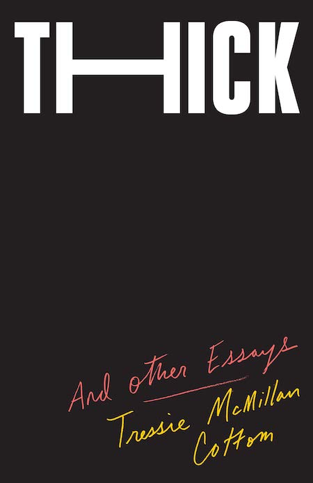 Tressie McMillan Cottom, Thick: and Other Essays, The New Press; design by Oliver Munday (January 8, 2019)
I’m always a fan of an all-black cover—especially appropriate for a book like this, which has blackness (among a host of other things) as its subject matter. Besides, that genius text treatment does as much or more work than any illustration might.
 Chris Power, Mothers, FSG; design by Grace Han, artwork by Lino Lago (January 15, 2019)
Ugh, I don’t know what it is exactly, but this image gives me an almost physical, gut-level sense of pleasure. Another artfully obscured headshot, this one even more mysterious and compelling. The colors are unusual, the painting just barely, but perceptibly, 3-D, and the way the eyes peer over—I love it, and Han’s choice of clean, modern text enhances the artwork perfectly.
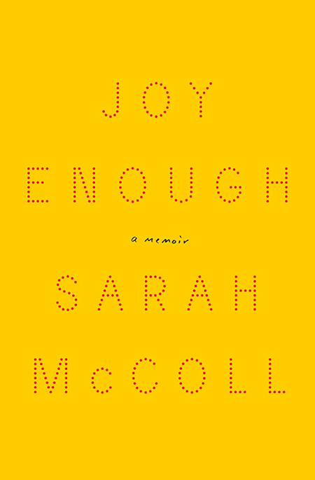 Sarah McColl, Joy Enough, Liveright; design by Catherine Cassalino (January 15, 2019)
Simpler than most of the covers on here, but still striking—and that color is about as close to “joy” as it gets.
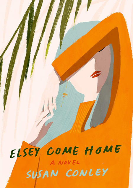 Susan Conley, Elsey Come Home; Knopf; design by Jenny Carrow, illustration by Oamul Lu (January 15, 2019)
This cover art looks like the painting that would be on the bedroom wall of the girl in the picture. Very meta. Also, those colors make me think of when it was warm outside, which makes me feel slightly better than I did before.
 Ben H. Winters, Golden State, Mulholland; design by Gregg Kulick (January 22, 2019)
Perspective and color are everything here—it looks as though you’re just landing in a candy-coated version of LA. Which, I suppose, with this novel, you are. Though the candy may not be what you expected.
 Peternelle van Arsdale, The Cold is In Her Bones, Margaret K. McElderry Books; illustration by Miranda Meeks (January 22, 2019)
I love the way the text of the title mimics the bones it denotes—and I kept wanting to come back to look at this lush, fairy tale-esque illustration. Very cool work.
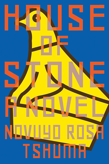 Novuyo Rosa Tshuma, House of Stone, Norton; design by Sarahmay Wilkinson (January 29, 2019)
Honestly, I have no idea what this is (a duck? a random screenprint on the t-shirt of the coolest kid in the neighborhood?), but it makes me want to read the book, which is just what a great book cover should do.
 Un-su Kim, The Plotters, Doubleday; design by Michael J. Windsor (January 29, 2019)
I mean, it’s not pretty. That orange is mighty garish, and even more so on the physical cover—sort of a hunter’s overalls neon. But that’s also what makes it stand out—that and the big red chair and the target in the back. Plus, I’d count this another cover that’s pretty much perfect for the book.
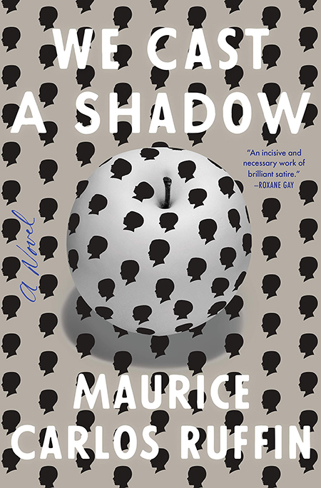 Maurice Carlos Ruffin, We Cast a Shadow, One World; design by Rodrigo Corral (January 29, 2019)
My pick for the best book cover of the month: odd, striking, compulsive, and perfect for the novel at hand.
Emily Temple
Emily Temple is the managing editor at Lit Hub. Her first novel, The Lightness, was published by William Morrow/HarperCollins in June 2020. You can buy it here.


