The 12 Best Book Covers of June
Not a Beach in Sight
Another month of books, another month of book covers. In the summer, all the books start looking a little too similar for my taste: the shelves become awash in sunsets, large hats, and soft colors, all the covers bidding for inclusion in beach bags or the emotional equivalent. None of the below book covers fit into that category—each one is weird and bold and perfectly suited to the book at hand. That, not to mention their technicolor forests, outsize illustrations, and surreal senses of humor—is what makes these the the best book covers of the month.
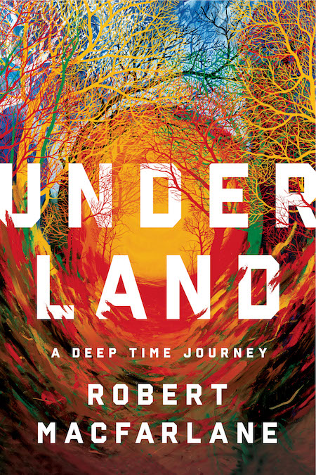 Robert Macfarlane, Underland; design by Pete Garceau, art direction by Ingsu Liu (W. W. Norton, June 4)
It would be so easy to make a dark book cover for this nonfiction work about all that we think of as “underground”—but Garceau has done the opposite, to brilliant effect: somehow it manages to evoke the core of the planet and a sunset on its surface at the same time, not to mention the deep past and the far future. Which is a lot, for a book cover.
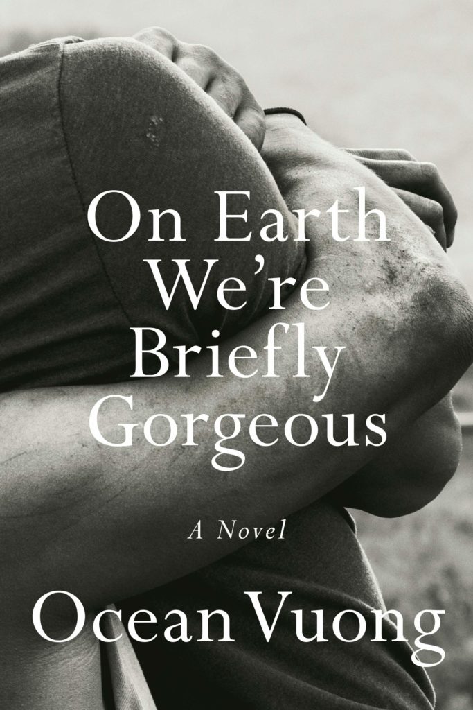 Ocean Vuong, On Earth We’re Briefly Gorgeous; design by Darren Haggar, photograph by Sam Contis (Penguin Press, June 4)
I love the elegant synecdoche of this cover, which takes a while to reveal itself, for the limbs to untangle. The pared-back text treatment is also perfect for this novel, which provides its own ornament.
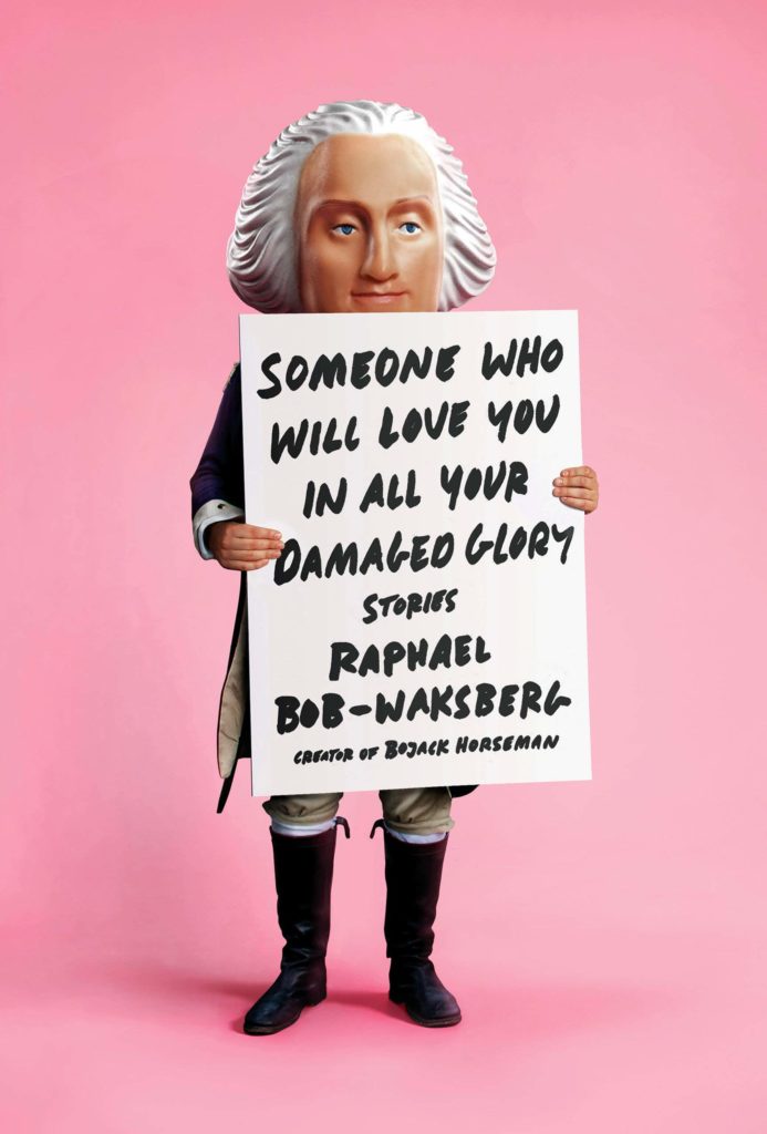 Raphael Bob-Waksberg, Someone Who Will Love You in All Your Damaged Glory; design by Tyler Comrie (Knopf, June 11)
At first I thought it was a plastic statue of George Washington, but the hands are really in uncanny valley territory, and so I’m not sure, and also I’m afraid. Either way, it’s funny and weird and millennial pink and seems perfect for this off-kilter book of stories.
 Robert M. Hazen, Symphony in C; design by Jaya Miceli, art direction by Ingsu Liu (W. W. Norton, June 11)
This is a weird one. It’s not beautiful. It doesn’t quite hang together—it looks like a collage that’s trying to masquerade as a real photograph (though to be clear, I think that effect is intentional). But I can’t stop looking at it; as I’m putting this piece together, I keep scrolling back to see it again. So it’s compulsory, if nothing else, which is a very good quality in a book cover.
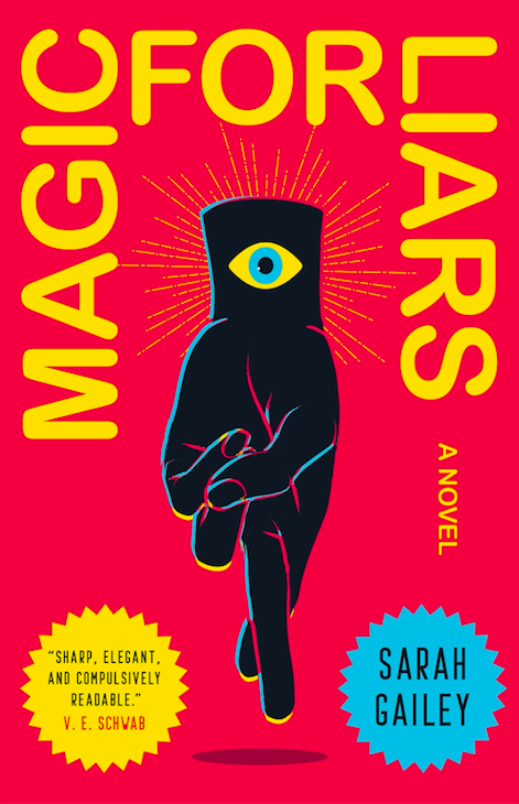 Sarah Gailey, Magic for Liars; design by Will Staehle (Tor Books, June 4)
This one wins the day for sheer pop. I love the evil eye, the liar’s cross, the bold primary colors. I also love the way the title wraps around the top, a definite risk in terms of readability but visually—there’s no other word for it—awesome.
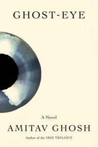
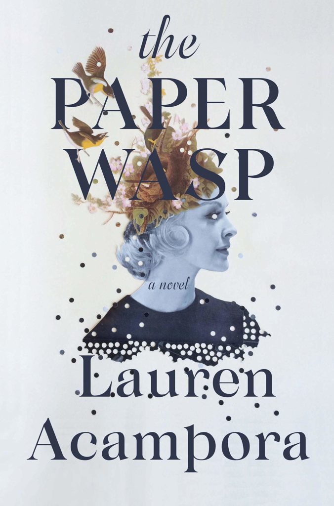 Lauren Acampora, The Paper Wasp; design by Kelly Winton, art by Lizzie Gill (Grove, June 11)
This cover is beautiful—or almost. The hole-punch effect around the borders of the central image—and especially in the woman’s eye—creates a sense of unease, like something beloved has been defaced. Again, an appropriate cover for the novel itself.
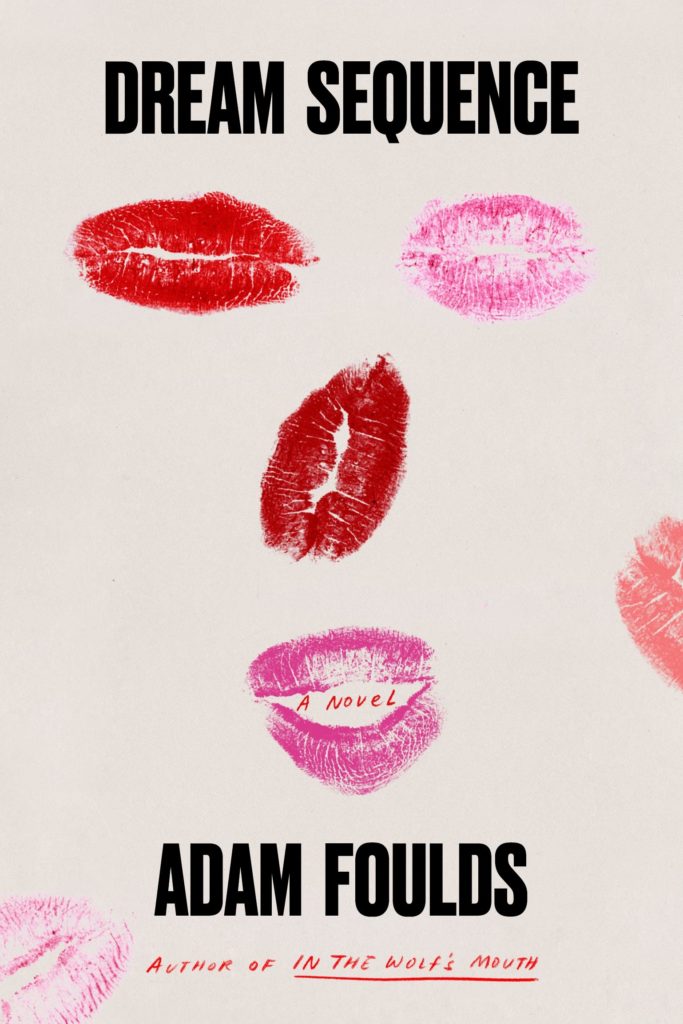 Adam Foulds, Dream Sequence; design by Na Kim (FSG, June 11)
Ludicrous, in the best way.
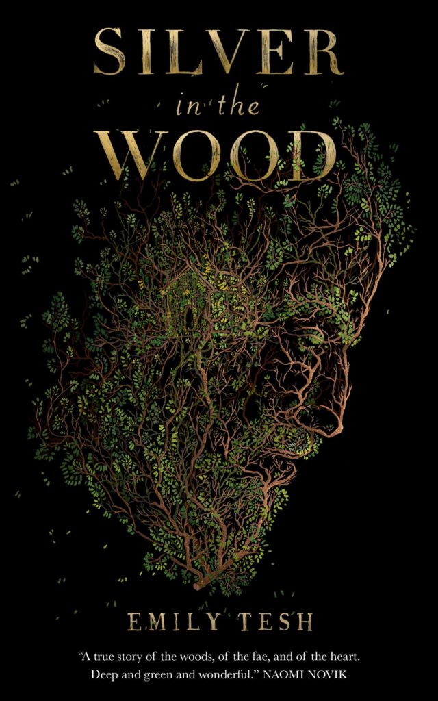 Emily Tesh, Silver in the Wood; design by David Curtis (Tor, June 18)
This lovely image is made even lovelier when you notice the little house tucked into the middle of the man’s head.
 Taffy Brodesser-Akner, Fleishman Is in Trouble; design by Kelly Blair (Random House, June 18)
The inverted city creates interest and an unusual weight balance on this cover, but the thing that really gets me is the comedy of the text treatment: that the uninteresting, relatively unimportant words—is in—are so heavily emphasized. It is simply fun, without looking dumb.
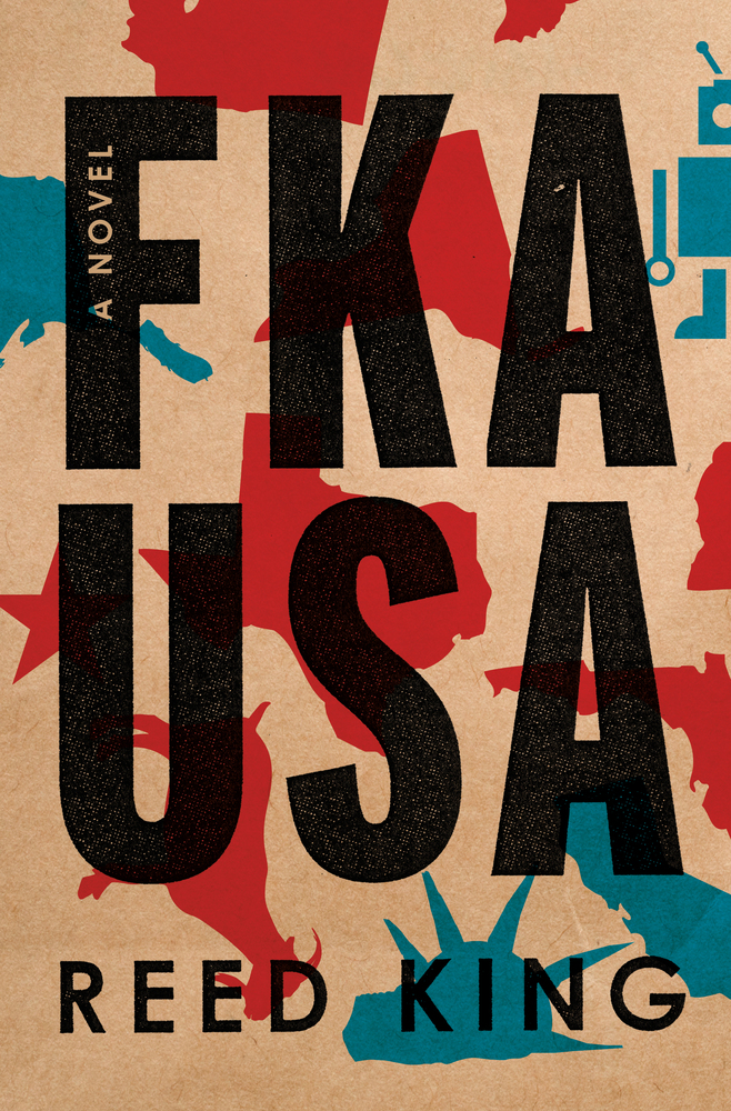 Reed King, FKA USA; design by Keith Hayes (Flatiron, June 18)
Again, the fat text treatment is doing a lot of work here, although some of that’s down to the intriguing title, but the paper bag Americana print look is also fresh and compelling.
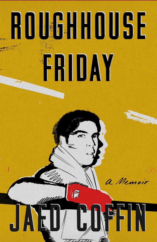 Jaed Coffin, Roughhouse Friday; design by Na Kim (FSG, June 18)
The colors are perfect—and so is the implied animation created by the two shadows of the figure’s head, which give us the sense that he’s just turned to look directly at us. Genius.
 Natalia Ginzburg, tr. Frances Frenaye, The Dry Heart; design by Pablo Delcan (New Directions, June 25)
Again, this is all about the color treatment (and the red here is almost identical to the red of the glove above), but I’ve never seen this fade effect combined with a vintage cutout, and I have to say I’m into it.
Emily Temple
Emily Temple is the managing editor at Lit Hub. Her first novel, The Lightness, was published by William Morrow/HarperCollins in June 2020. You can buy it here.