The 11 Best Book Covers of February
Plus a Couple Extras, for Fun
Another month of books, another month of book covers. Here are some favorites from (short, weird) February:
If you read this space with any regularity, you know I love a bonkers little collage! This one is both subdued and elevated by the limited palette and the cutaway colorblocking: a sneaky delight.
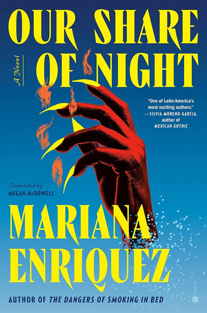 Mariana Enriquez, tr. Megan McDowell, Our Share of Night; cover design by Donna Cheng (Hogarth, February 7)
“We wanted a central image that was bold and haunting, both alluring and evocative of the novel’s dark themes,” Random House Associate Art Director Donna Cheng told Oprah Daily. “The hand is immediately captivating, and the flames dissolving into the abyss allude to a pivotal moment in the book. It all came together with a gothic font that complements the sharp claws, against a background of a fading dusk-blue sky.” Also interesting to compare this to the book’s UK cover, designed by Luke Bird and illustrated by Pablo Gerardo Camacho for Granta Books last October:
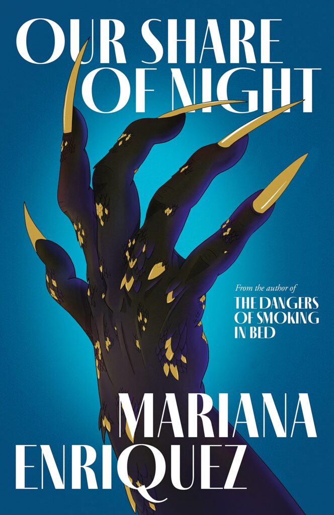
Same basic concept, much different feel. Also peep those galleys!
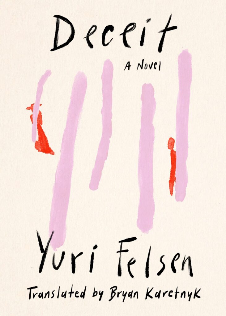 Yuri Felsen, tr. Bryan Karetnyk, Deceit; cover design by Rodrigo Corral (Astra House, February 7)
I love the delicacy here—with its little hint of madness—and the little shock when you see the figures.
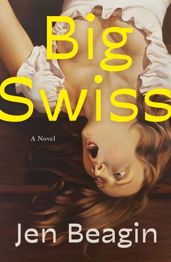 Jen Beagin, Big Swiss; cover design by Jaya Miceli, art by Anna Weyant (Scribner, February 7)
The funniest cover for a literary novel that I’ve seen in recent memory, and one of the most compelling—this would have me at the register even if I didn’t know what the book was about. And for the second time this month I’ll share the UK cover, designed by Kishan Rajani for Faber & Faber, this time to highlight just how different two covers for the same book can be while both still being great:
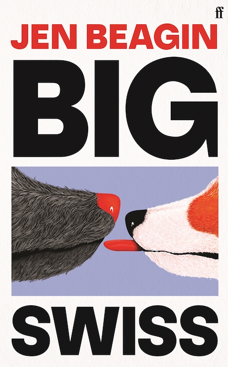
LOL.
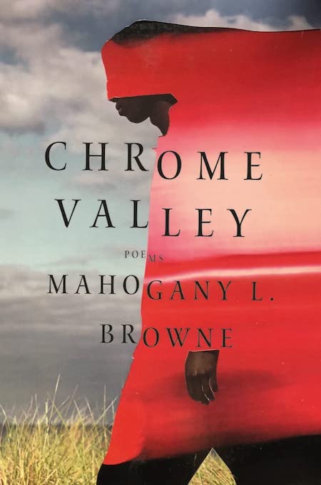 Mahogany L. Browne, Chrome Valley; cover design by Steve Attardo, art by Yannick Lowery (Liveright, February 7)
I love the dual faces of this cover, and how the cutouts (the hand!) don’t even try to blend in—the effect is both beautiful and eerie, and I keep changing my mind about which elements are “background” and which foreground. Same goes for the text, which exaggerates the dissonance between the layers with its step down.
And what a coincidence to see it lined up next to the next cover . . .
 Richard Bausch, Playhouse; cover design by John Gall (Knopf, February 14)
Same color story, same 50/50 split, much different vibe, much different text concept. And somehow I like it just as much?
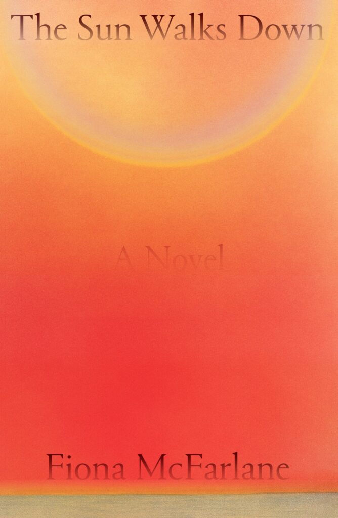 Fiona McFarlane, The Sun Walks Down; cover design by Na Kim (FSG, February 14)
Subtle and dramatic at the same time. You really feel the heat.
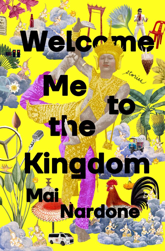 Mai Nardone, Welcome Me to the Kingdom (Random House, February 14)
Just ecstatically chaotic.
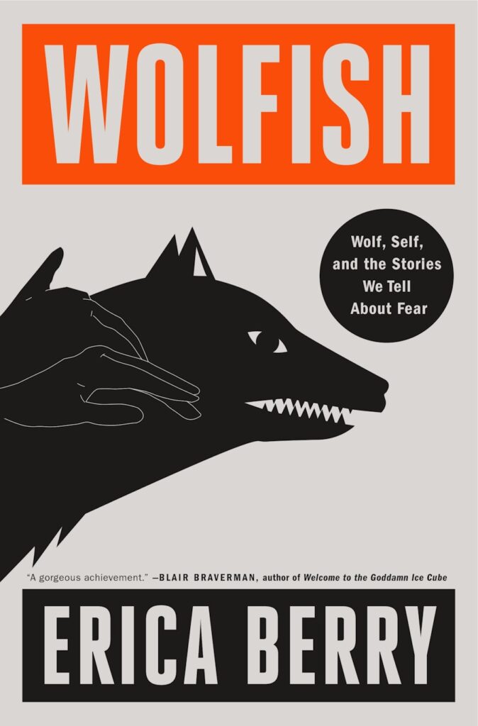 Erica Berry, Wolfish: Wolf, Self, and the Stories We Tell About Fear; designed by Keith Hayes, illustration by Rokas Aleliunas (Flatiron, February 21)
“For a long time I struggled to imagine the cover for this book,” Berry told Literary Hub. Though Wolfish charts the life of one famous real-life wolf, it also teases apart the symbolic wolves of fairy-tales and ‘lone wolf’ attack headlines, asking what those “wolves” tell us about how we live with fear. I didn’t want a cover that said ‘animal book’ without making it very clear this was a ‘human book’ too. It wasn’t until one of my best friends from childhood found an antique French print of a wolf shadow puppet that I felt something click. It was exactly what I wanted the book to do: to map the shadows on the wall, but also the hands that made it. I feel very lucky that Nadxieli Nieto, my editor at Flatiron, has always understood what Wolfish wants to be, and she brilliantly took the concept to the art team. I was obsessed as soon as I saw Keith Hayes’ design and Rokas Aleliunas’ illustration. I love that it somehow manages to be both graphic and surprising while also elegant and archetypal. It feels very fitting that the hands don’t necessarily appear at first glance, and so the architecture of the shadow emerges, slowly.”
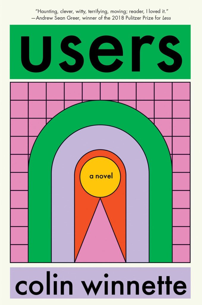 Colin Winnette, Users; cover design by Gregg Kulick (Soft Skull, February 21)
This reminds me of a simplified version of one of my favorite book covers from last year (also published by Soft Skull, as it happens), Eliza Gabbert’s Normal Distance. It’s also about the most appealing that virtual reality has ever looked.
 Priya Guns, Your Driver is Waiting; cover design by Emily Mahon (Doubleday, February 28)
I mean!
Emily Temple
Emily Temple is the managing editor at Lit Hub. Her first novel, The Lightness, was published by William Morrow/HarperCollins in June 2020. You can buy it here.