The 10 Best Book Covers
of November
The Only Way Out is Through
Another month of books, another month of book covers. Appropriately enough for November, this month’s best covers are all moody, their colors subdued (unless you’re Rachel Bloom), the human figures distorted, the elements hard to read. Honestly, it’s how we’re all feeling these days: a little refracted, a little diffuse, a little bleak. And yet, these covers are oddly satisfying: chalk it up to the cathartic powers of art. Read on to see my favorite book covers of the month, and as always, feel free to add any of your own that I’ve missed in the comments below.
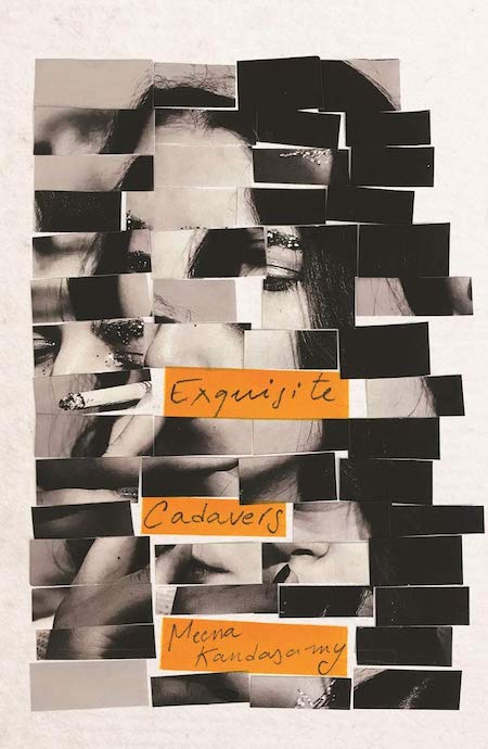 Meena Kandasamy, Exquisite Cadavers; cover design by Carmen R. Balit (Atlantic Books, November 1)
It looks the way a good night out feels, but this cover’s brilliance is about more than just its evocative beauty. As Balit explained:
The title, Exquisite Cadavers, refers to the surrealist game of consequences, in which each person draws something and then passes it along to the next. This is what the author drew her inspiration from, and so I wanted to use this as a starting point to explore. For this my first approach was to follow the principle quite literally and create images using fragments from a number of other ones mixed and matched together, from here a number of new ideas sparked such as taking one image and de-constructing it to then piece back together, also creating a traditional cover only to then chop it all up and re build. The core of all these ideas was the same: take something that starts off looking like X and chop, re-arrange, glue, etc. to convert into Y, for me this was the best representation of the book both in terms of content but also structure.
Read more about the process behind the cover here.
 David Sedaris, The Best of Me; design by Jamie Keenan (Little Brown, November 3)
Just like Sedaris himself, this cover is erudite, irreverent, playful, and ever-so-slightly . . . threatening. (I can’t be the only one who sees shades of ransom letter here.) In other words, it’s perfect.
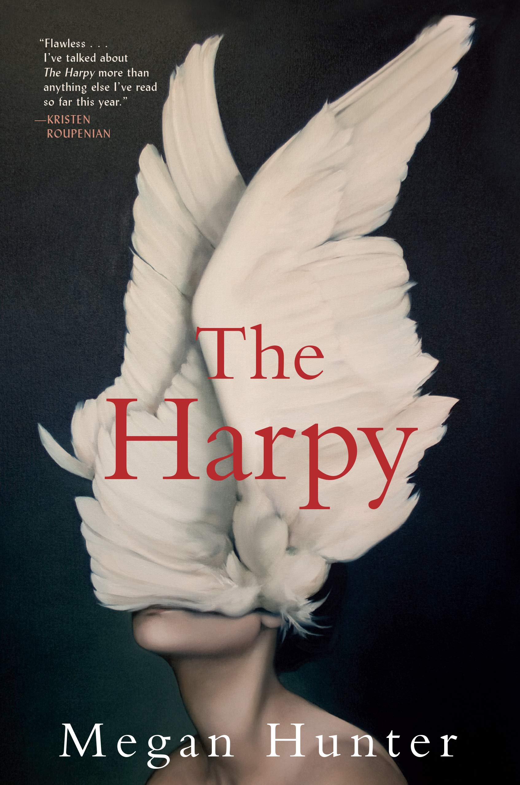 Megan Hunter, The Harpy; cover design by Lucy Scholes, painting by Amy Judd (Grove Press, November 3)
As you may or may not have noticed, I love a good obscured-face cover. This one is particularly compelling: beautiful and terrifying at once. Like all the best book covers, it makes me want to read the book at hand.
 John Kinsella, Insomnia: Poems; design by Sarahmay Wilkinson (W.W. Norton, November 3)
All I have to say is: look closer.
 Rian Hughes, XX; cover design by Rian Hughes (Overlook Press, November 10)
Okay, it’s not really fair to the other kids, because Hughes is a graphic designer, and this novel tells its story through a marriage of design, typesetting, and text, but still. This would catch my eye from a mile away.
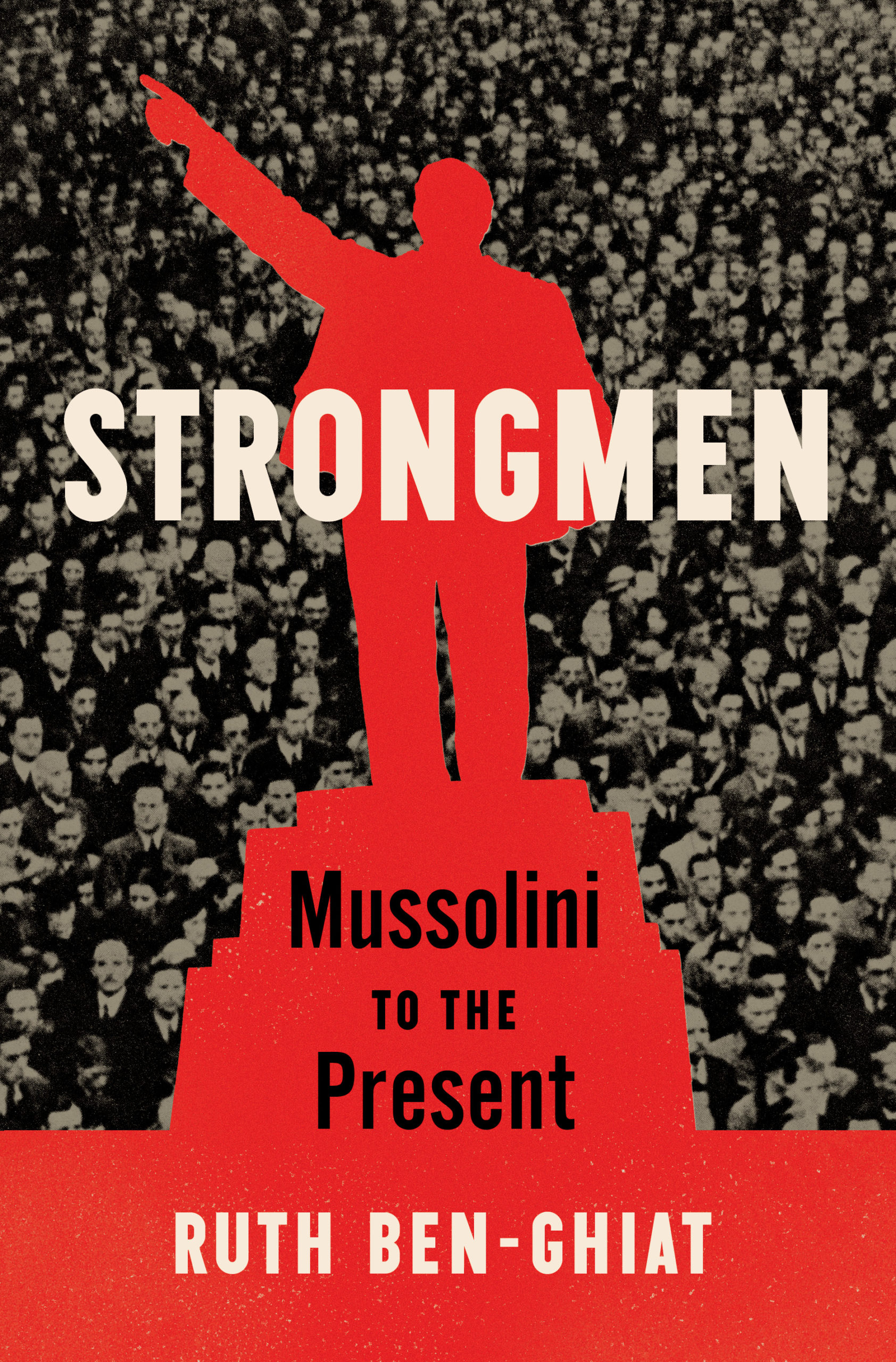 Ruth Ben-Ghiat, Strongmen: Mussolini to the Present; cover design by Sara Wood, Art Direction by Ingsu Liu (W.W. Norton, November 10)
I love the boldness and immediacy of this cover, and its delicately calibrated color story—it could easily have gone too stark, but instead Wood achieved a perfect balance here.
 Jonas Lüscher, tr. Tess Lewis, Kraft (FSG, November 10)
It’s simple, sure. It’s almost plain. But this doesn’t look like any other cover I’ve seen in recent memory, and honestly, I just find myself repeatedly coming back to it. For whatever that’s worth!
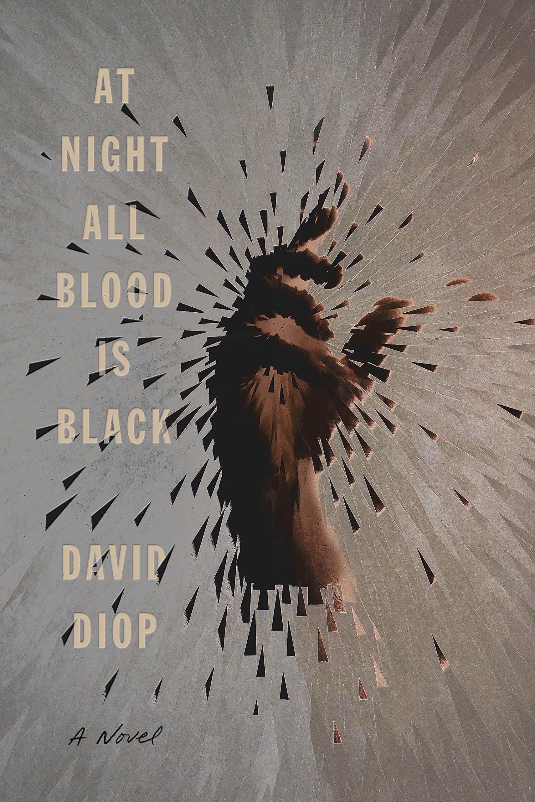 David Diop, tr. Anna Moschovakis, At Night All Blood Is Black (FSG, November 10)
The fragmented image is striking on its own, but the text treatment—that subtle debossing!—really takes it to the next level.
 David Hopen, The Orchard; cover design by Elizabeth Yaffe (Ecco, November 17)
This is the kind of cover that manages to be a number of things at once, or in a row, depending on how you look at it. I particularly like the blurriness of the image against the sharpness of the text; and I just spent some amount of time trying to read the “message” in the flame.
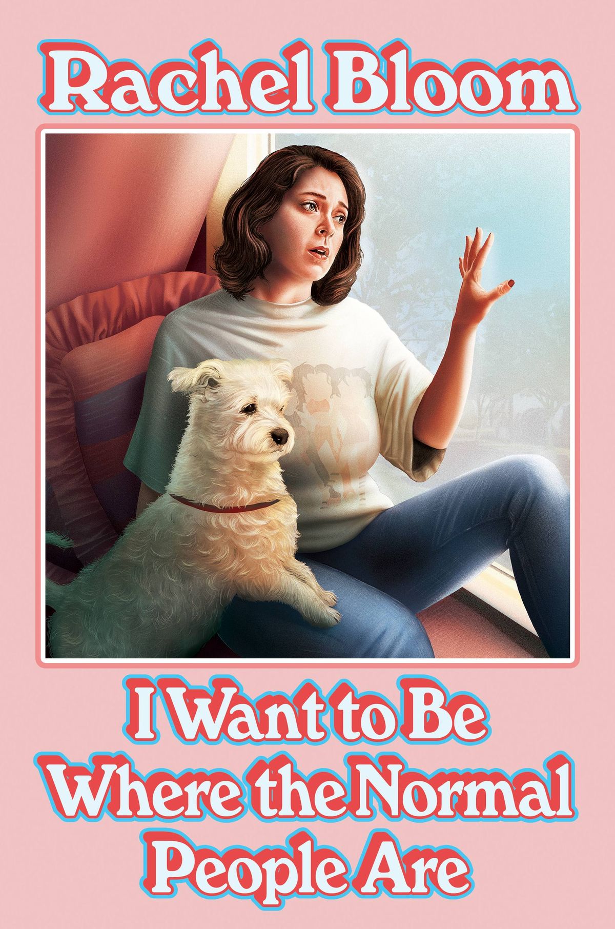 Rachel Bloom, I Want to Be Where the Normal People Are; cover design by Phil Pascuzzo, cover art by Sara Deck (Grand Central, November 17)
A glorious exercise in sheer ’80s nostalgia. In other words, I now know exactly how old Rachel Bloom is.
Emily Temple
Emily Temple is the managing editor at Lit Hub. Her first novel, The Lightness, was published by William Morrow/HarperCollins in June 2020. You can buy it here.


