The 10 Best Book Covers of July
In Praise of Red, Red, Red
July was hot, and so were the book covers—Hell, one of them was even sweating! (Fortunately, only one of these things is due to the impending heat death of the planet.) Overall it was a pretty good month: Red was big, the illustrations were weird, and energy was high all around. Take a peek at my favorite book covers to hit the shelves over the last few weeks, and add on any of your favorites that I’ve missed in the comments.
 Keith Ridgway, A Shock; cover design by Jamie Keenan (New Directions, July 6)
You know I love a trompe-l’oeil, and this is a particularly fun one: the title spelled in those ripped out (and folded?) letters. It’s weird that the “A” is in the normal text, but somehow that aberration makes me like it all the better.
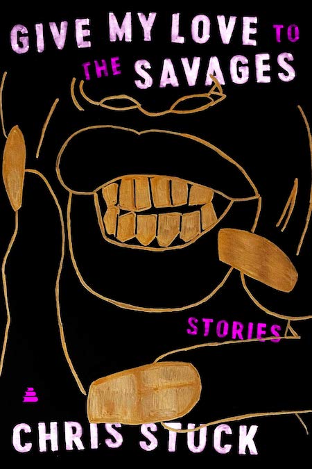 Chris Stuck, Give My Love to the Savages; cover design by Stephen Brayda, art by Arnold R. Butler (Amistad, July 6)
I love the energy of this cover, the sense of overflowing-ness—the illustration, with its visible marking lines, is fresh and exuberant and almost taunting; the colors are exciting; those fingers may as well be beckoning the reader in.
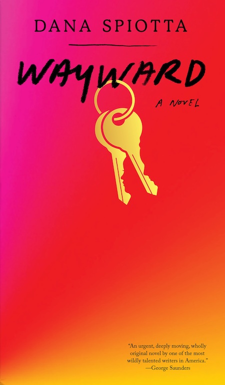 Dana Spiotta, Wayward; cover design by Janet Hansen (Knopf, July 6)
This cover is interesting from the jump because it’s unusual—it’s rare to see so much unused space on a book cover. (I like it for opposite reasons as the previous installment!) The three-color gradient (which reminds me strongly of these soothing puzzles) is on trend, but it’s the text treatment, collected tightly at the top, and those dangling keys, which are most intriguing. It’s only when you look carefully that you’ll notice the two faces outlined in the teeth.
 T.J. Newman, Falling; cover design by David Litman, art direction by Alison Forner (Avid Reader Press, July 6)
Another gradient here, coincidentally—but in this case, it’s being used to emphasize the sense of, well, falling, which is very skillfully produced by the text treatment and plane. It gives me anxiety just to look at it, which I imagine is the point.
 Katie Crouch, The Embassy Wife; cover design by June Park (FSG, July 13)
This cover reminds me both of a Kate Spade bag and That Iconic Wallpaper* from The Royal Tenenbaums (appropriate for the content at hand), but it’s the color story—almost discordant, or maybe Just Discordant Enough—that keeps bringing me back.
*Originally found at the legendary NYC restaurant Gino, at the corner of 61st and Lex.
 Beth Morgan, A Touch of Jen; cover design by Lauren Harms, illustration by Richard Chance (Little, Brown, July 13)
It’s pink. It’s absurd. It’s (a little) lewd. We once got scolded for using it in a tweet. It is also utterly perfect for this book. You gotta love it. (Unless you are an internet scold, I guess!)
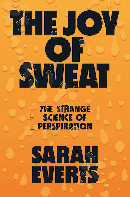 Sarah Everts, The Joy of Sweat: The Strange Science of Perspiration; cover design by Renald Louissant, art direction by Sarahmay Wilkinson (Norton, July 13)
They made the book sweaty! I suppose you’d have to, but I still think it’s a noteworthy move. The measurement lines along the subtitle are a nice touch, too.
 Richard Zenith, Pessoa: A Biography; cover design by Yang Kim, art direction by Steve Attardo (Liveright, July 13)
As gorgeous and layered as Pessoa’s work (and life). I especially love the air of mystery and magic created by the stamp and the half-trimmed portrait of Pessoa in the corner.
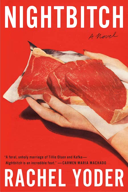 Rachel Yoder, Nightbitch; cover design by Emily Mahon, cover photograph by Nathan Biehl (Doubleday, July 20)
My vote for the most striking cover of the season has to go to Nightbitch: the intense red, the 50s housewife hands, the dog-shaped napkin full of raw meat. And, of course, the title, which is doing a ton of work here. Chef’s kiss emoji.
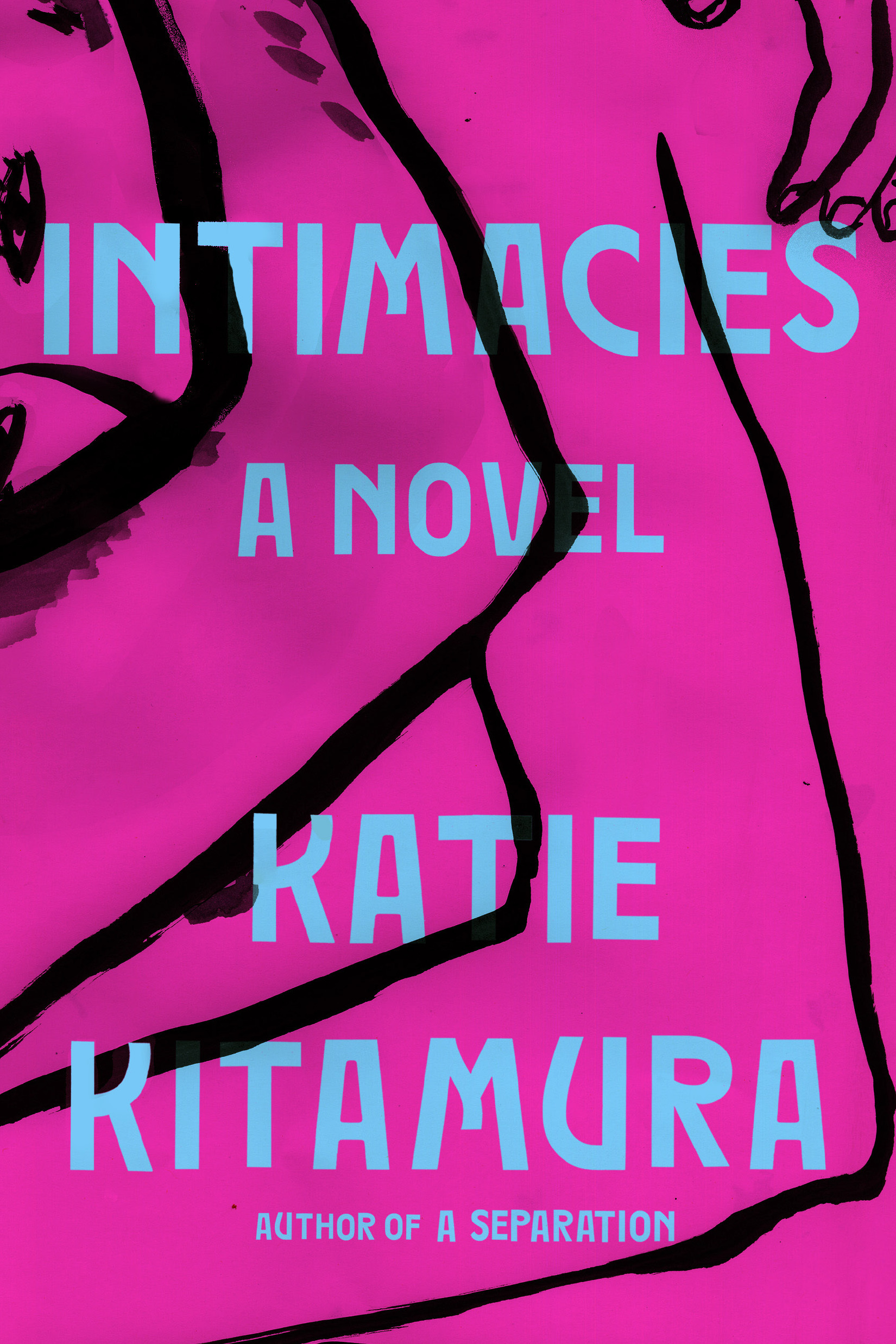 Katie Kitamura, Intimacies (Riverhead, July 20)
First of all, I’m impressed that this cover manages to juxtapose magenta and turquoise, as I did for much of the 90s, without looking . . . like I did for much of the 90s. But more importantly, I love it when what looks like an abstract pattern reveals itself to be an illustration once you look at it for long enough.
Emily Temple
Emily Temple is the managing editor at Lit Hub. Her first novel, The Lightness, was published by William Morrow/HarperCollins in June 2020. You can buy it here.