SILENCE = DEATH: How an Iconic Protest Poster Came Into Being
When People Need to Communicate with Each Other, There is Always the Street
In essence and intention, the political poster is a public thing. It comes to life in public spaces, and outside them, is academic. Individuals design it, or agencies or governments, but it belongs to those who respond to its call. Once it hits the street, if it manages to tap into the zeitgeist, it may have its “moment,” and when it does, it’s the audience that determines that rare cultural nanosecond. Authorship takes a back seat, and the public sphere resembles the exercise in collectivity we hope it to be.
For public discourse to pierce through the churning perpetual motion machine of the American commons, it needs to come in bursts. Manifestos don’t work. Sentences barely do. You need sound bites, catchphrases, crafted in plain language. The poster is exactly that, a sound bite, and vernacular to the core. The poster perfectly suits the American ear. It has a power. If you’ve ever stopped in front of one or turned your head for a second look, that power was at work. You may barely have been aware of it because of its hammer-and-nails simplicity, but you were caught up in it just the same. It’s not art, if art is for museums. It’s far more robust than that. It comes for you in ways art simply can’t. The poster comes for you where you live.
Because of my upbringing, the political poster had always played a role in my understanding of social change. But by the time I was 17, posters, demonstration flyers, and meeting announcements papered Eighth Street between the East and West Villages. It was how we found out what we needed to know, the things no media outlets would cover. Before smartphones, when young people needed to communicate with each other, we used the streets. AIDS didn’t feel at all different to me. People’s lives hung in the balance, as they had in Vietnam. Something needed to be done, and I could see we’d have to circumnavigate existing channels to do it. It felt completely familiar. When people need to communicate with one another, I reminded myself, there is always the street.
So I proposed to what would become the Silence = Death collective that we design a poster about AIDS, to try to push the community into political action. We had constituted ourselves through political tenets and were not an art collective, but five of us came out of art school, four were graphic designers, and two were art directors. No one was remotely perplexed by the suggestion; no one spoke against it. It was instantly and unanimously agreed on.
“The poster comes for you in ways art simply can’t. The poster comes for you where you live.”
I had one very clear political objective in mind, and posed it to the collective in the form of a marketing problem. The poster needed to simultaneously address two distinctly different audiences, with a bifurcated goal: to stimulate political organizing in the lesbian and gay community, and to simultaneously imply to anyone outside the community that we were already fully mobilized. Everything, from the paper we chose to the walls it would be hung on, took into account these seemingly opposite strategic ends.
Charles, who was raised in the Village and also remembered how the streets were used as a means for communication, cautioned us that the 60s were an intensely political moment, and the 80s were not, so a text-heavy manifesto might be easily disregarded. Chris agreed and felt there should be very little text at all. To “sell” activism in an apolitical moment, the poster needed to be cool and to intone “knowing.” It needed to be both rarified and vernacular at the same time. It needed to give the impression of ubiquity, and to create its own literacy. It needed to insinuate itself into being.
It needed to be advertising.
Exposure to printed matter in New York is serendipitous, so we knew the poster had to be gripping. And the streets of New York are some of the most diverse public spaces in the world, so the poster’s message needed to be broad enough to bridge wide gaps between audiences, and also leave room for unintended viewers. The dollar was strong, so Manhattan was not flooded with European tourists yet, Lower Broadway was not yet a developed commercial center, the East Village was still rough, the Meatpacking District was still mostly artists, sex clubs, and wholesale purveyors, and the redevelopment of Times Square had not been completed.
Street life in Manhattan is also class stratified by transportation means, so audiences can differ wildly. Most locals traveled by subway or on foot, and very few Manhattanites in those neighborhoods kept cars at the time. Still, many took cabs, car services, or buses, and people from the outer boroughs and suburbs frequently traveled by car. Most New Yorkers commute to work, but tend to prefer neighborhood leisure and support services, and they also walk a great deal. So we surmised it would mostly be local audiences who encountered the poster up close if they lived or worked near a poster site, and everyone else would come across it through a vehicle window. As a result, I insisted we apply a “Can you read it from a moving vehicle?” test for the font, and we tiered the messages to both points of discovery. In addition, some levels of meaning would need to be explicit, and others distinctly coded.
Like all messages in the public sphere, “Silence = Death” was context driven. The subsequent formation of ACT UP is the primary modifying factor in our understanding of this image, and it can now barely be imagined without it. But it was conceived a year before ACT UP’s inception, and since one of the areas targeted was Times Square, we knew many viewers would not be local and might have limited exposure to the issues. The tagline was crafted to be provocative and alarming and to stimulate a political response in a setting that was not necessarily political. It was also intended to imply authorization. It was the voice of the insider and, by surface appearances, was declarative. But it was meant to stimulate curiosity, and questions. In that regard it was a Trojan horse.
While considering the content, we talked about other political poster campaigns, like the Art Workers Coalition And Babies poster from 1969. Charles also suggested we study the Guerrilla Girls, who managed to stage complex gender critiques on the sidewalks of New York in the vernacular. We tossed around the pluses and minuses of text versus image. We debated which issues to tackle and how to depict them.
Our first poster concept was an attack on William F. Buckley’s 1986 call for the surveillance tattooing of all HIV-positive people, but as we considered using a tattooed body as an image, Chris warned us about how inherently exclusionary it would be. We tried, but couldn’t conquer the questions of representation. Would a black-and-white image successfully obfuscate the subject’s race? Could an extreme close-up of a tattoo make the subject’s gender ambiguous enough? This exercise convinced us that any image we chose would need to be pictographic, so we moved to a discussion of what that might look like, thinking that what it should say might naturally follow.
In advertising, all images are coded, but the image we sought needed to act as a signal beacon to its lesbian and gay audience without excluding other audiences. An icon would not only liberate us from the complexities of representation but also enable us to draw on existing queer codes. In some ways, this might have been easy, since to be queer is in many ways to coexist with codes. But it was not easy at all. We tore through, debated, and rejected every agreed-on symbol for the lesbian and gay community: the rainbow, the labrys, the lambda, and the triangle. All of them had baggage, and on some level we were uncomfortable with each of them.
“During this process, we became somewhat rattled by the lack of an agreed-on symbol for the lesbian and gay community. It seemed, in a way, as if this might be one of the roots of the issue.”
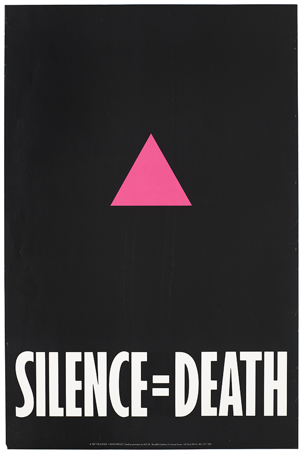
The pink triangle seemed an obvious way to connect Buckley’s suggestion of tattooing to the concept of genocide, but to the extent it might be a signifier of victimhood, it felt potentially disempowering to us. In the context of fears about segregation, quarantine, and internment of HIV-positive people, even a strategic appropriation could become a double-edged sword. We were uncomfortable with this aspect of the pink triangle.
We liked the inclusiveness of the rainbow. But it also had a little hippie baggage, and its brightness seemed inappropriate and somehow lacking in gravitas. Ultimately, however, it was the graphics that disqualified it. We decided it would make an ugly poster. We preferred the feminist empowerment tonalities of the labrys, but we knew many men would be unacquainted with it, and it would be hard to connect to some of the issues at hand. We felt the lambda was not known well enough to younger lesbians and gay men. During this process, we became somewhat rattled by the lack of an agreed-on symbol for the lesbian and gay community. It seemed, in a way, as if this might be one of the roots of the issue. We even debated designing a new symbol, but became immediately lost in it and realized we’d be embarking on a separate campaign before we could even get to the more pressing issues we were trying to address.
So we resigned ourselves to the use of the pink triangle, convincing ourselves that the codes activated by the triangle were open-ended enough to be useful, signifying lesbian and gay identity to some audience members, maleness to others, and referencing the historical meanings of genocide to audiences familiar with that history. But we gave the familiar symbol a makeover. Changing its color from pale pink to a more vivid fuchsia, Pantone 212 C, seemed an acceptable reinvention that reflected graphic trends and suited the poster’s aggressive tone. Turning it upside down was another gesture of reinvention that was inadvertent but worked out in our favor. Chris, who had recently visited Dachau, was certain it pointed upward. Oliver volunteered to “research” it and later confirmed the direction without actually checking it. We discovered it was incorrect after the printing, but decided it answered one of our concerns, superimposing an activist stance by borrowing the “power” intonations of the upward triangle in New Age spirituality, further skewing its relationship to the death camps.
We had settled on that icon, but we didn’t have our tagline. After weeks of debating the holocaust analogy, the volley that led to the final turn of phrase and the key component of the poster, the equal sign, took barely sixty seconds, and it played out at our holiday dinner in December 1986 at Jorge’s apartment as he heated his vegetarian entrée. It went like this:
“What about ‘Gay silence is deafening?’” I said, reading a note I had made in my journal. The New York Times had used the phrase “deafening silence” in a news article about a different political question, and I’d written it down.
“How about ‘Silence is death?’” Oliver immediately called out. I remember how this phrase sounded in his southern accent.
“No, no, it should be ‘silence equals death,’,” I believe either Charles or Chris blurted out.
“Wait! Wait! What about an equal sign, ‘silence = death?’” Everyone jumped up at the same time in such an instantaneous clamor of agreement, I can’t say for sure who shouted that out, but I am positive you could hear the ruckus from Jorge’s living room window all the down to Avenue A. It was the exact shorthand we had been hoping for during the months we spent scrounging for an iconographic visual. It signaled the inevitability and certainty of calculus and was perfect branding shorthand. I dubbed the equation “New Math for the Age of AIDS.”
There was no doubt about the line, but we still broke into debates about the positive and negative uses of moral equivalencies and about instances when disagreements about political certainty can be rendered moot by catastrophe, such as times of war. We talked about the deadly effects of passivity in crises, communal silence and the nature of political silencing, silence as complicity, and scenarios where bystanders became participants without intending to be. We debated whether the equation was clear enough without offering more context, and decided a rejoinder to the tagline would be needed for that reason. And there was a conversation about the neutralization of deeper meanings that might accompany our use of advertising shorthand. But the phrase was too good to pass up.
__________________________________
From After Silence: A History of AIDS Through Its Images. Used with permission of University of California Press. Copyright © 2017 by Avram Finkelstein.
Avram Finkelstein
Avram Finkelstein is a founding member of the Silence = Death and Gran Fury collectives. His work is in the permanent collections of the Museum of Modern Art, the Whitney Museum, the New Museum, and the Smithsonian Archives of American Art.