How to Capture Alternating Plot Lines on a Book Cover
Donna Cheng on Designing for Carola Lovering's Tell Me Lies
When I was first approached to design this cover, I was excited to tackle it because of the subject—a modern, toxic love story set in a dating culture that often mistakes lust for love. As I started reading I was immediately drawn to the alternating narratives of the “he said, she said” structure. Add those elements to a compelling title, and I knew there were lots of creative opportunities I could explore.
Tell Me Lies is about an addictive and dysfunctional relationship between Stephen and Lucy. Alternating between the two voices, the novel provides a window into the mindset of Stephen, who strings Lucy along as their tumultuous relationship unfolds. I found myself rooting for Lucy as she gets tangled in Stephen’s manipulative mind games, hoping to see her free herself from this unhealthy romance.
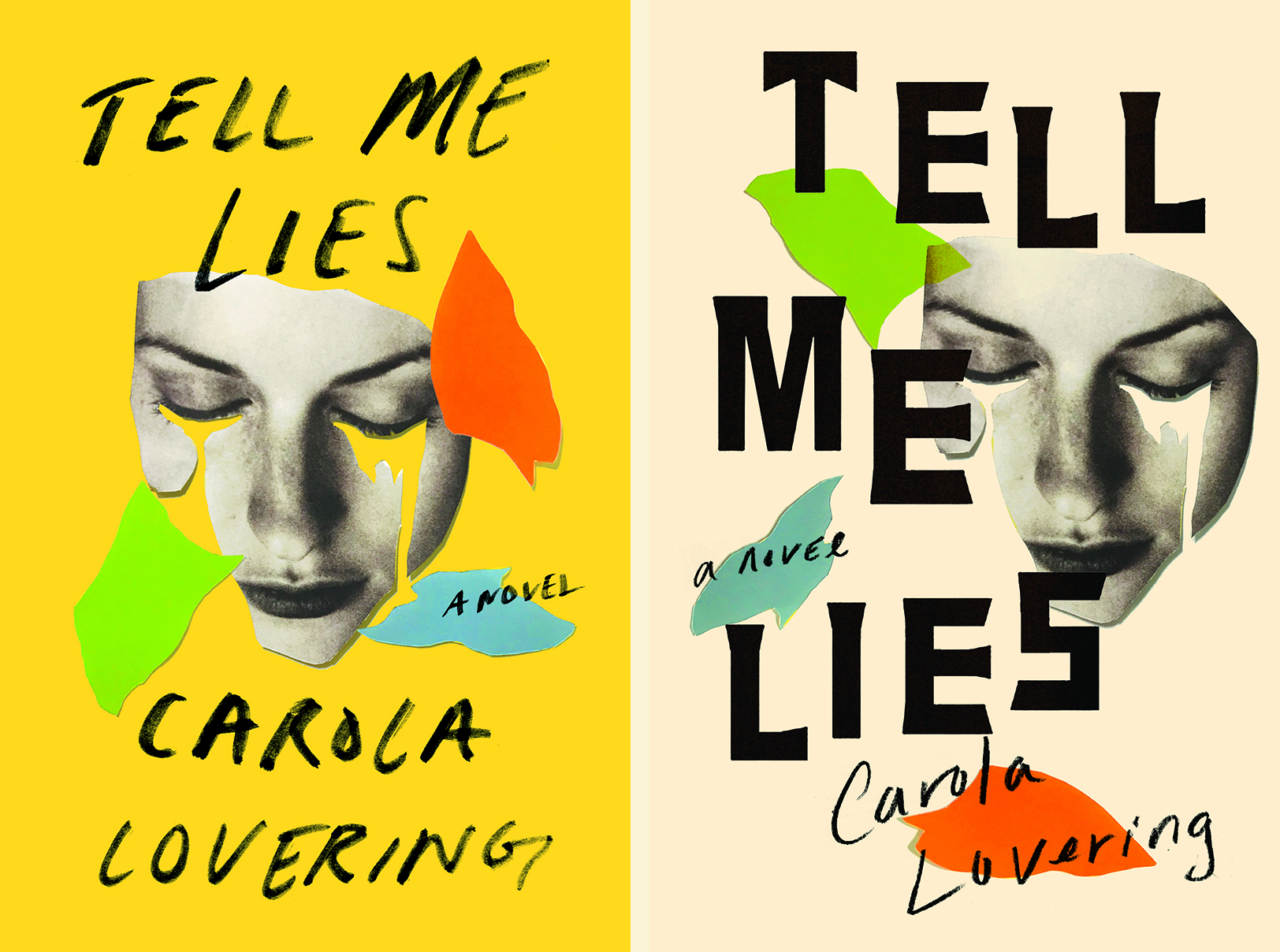
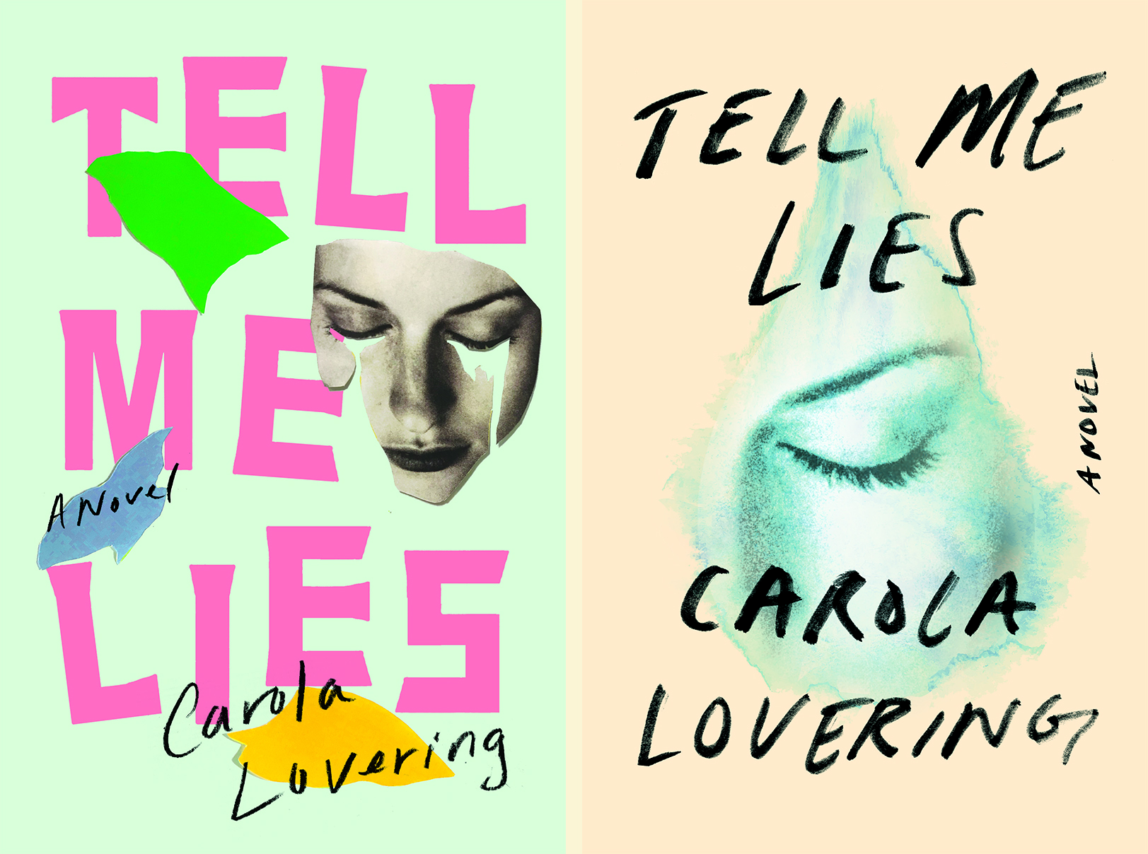
My initial idea was to focus on the emotions and heartbreak through the image of tears, a universal symbol of suffering or sorrow. After rounds of collaging and illustrating my idea, I sensed that the imagery didn’t feel as powerful as the title itself, possibly because it was too vague or too playful. I knew I wanted to make either the title more prominent or create an image that spoke for itself. With this in mind, I generated more sketches by changing the layout and lettering. Visually there was something there but conceptually there was something missing.
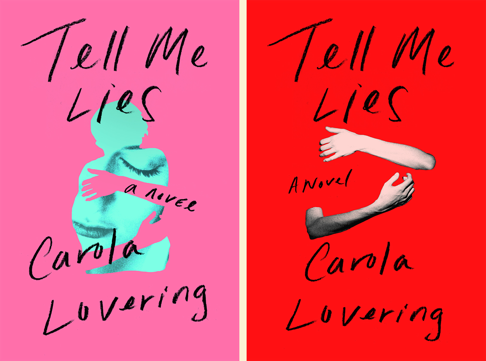
The art director suggested creating an image with the arms hugging an empty body to represent the difficulty of letting go and the void in heartbreak, which I thought was a great idea. But that direction later dissolved as there was already a cover out there with a similar visual—a problem that designers often encounter.
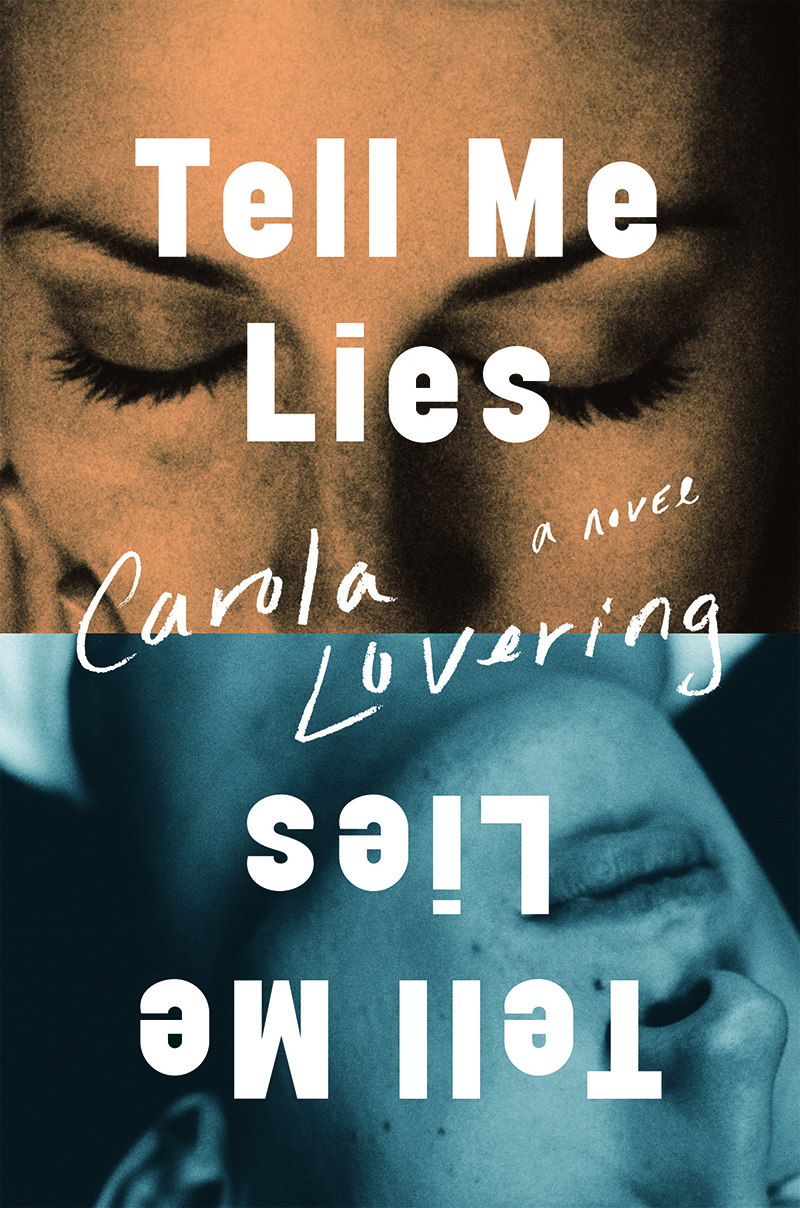
After the publisher saw these comps, she suggested trying a photographic approach with a design bordering literary and commercial. This was an opportunity to dig into the dualities of the characters’ complexities in a more vulnerable way, which I presented as the layout of the woman on the top half of the cover and the man on the bottom half but flipped. The straightforwardness of the cover was a good solution to the emotionally raw and honest perspectives, but perhaps was not eye-catching or bright enough to grab the reader’s attention.
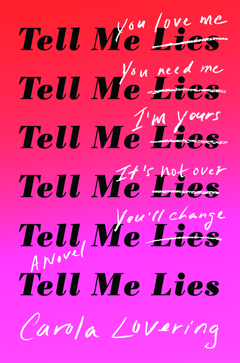
Back to the drawing board. Sometimes if an idea isn’t working, starting fresh can be the answer. I started simply typesetting the title over and over again on the empty page. Immediately, I saw the pattern in the typographical repetition that paralleled the consistency of Stephen’s lies. The cover became three-dimensional, which was only heightened per the editor’s input by adding phrases above the crossed out “lies” to include Lucy’s commentary. With a strong title like this, sometimes the best solution is all-type. Luckily, in this case it was very fitting.
Donna Cheng
Donna Cheng is a graphic designer based in New York. She is currently a senior designer at Atria/Gallery books, an imprint of Simon and Schuster.
