
How to Arrange Your Kitchen: According to Julia Child
The Greatest American French Chef Offers Some Layout Tips
The following is excerpted from In Julia’s Kitchen: Practical and Convivial Kitchen Design Inspired by Julia Child.
As I looked around, Julia said, “People are always surprised my kitchen is not more high tech.” Actually, I had imagined it would resemble one of the glamorous sets on The French Chef. My first thought was, “Where is the island? Julia Child always works at an island.” I admit now to being a little disappointed. I had been fooled by the illusion of TV. What I saw instead was a smallish, old-fashioned, eat-in kitchen with cluttered countertops and cabinets seriously in need of painting. By then it was nearly 30 years old—and it looked its age. Yet, the more I looked around, the more I realized that it was a fascinating and important place, with its old stove and its batterie de cuisine, with what looked like thousands of glistening cooking implements close at hand. It was a very comfortable and welcoming workroom full of carefully chosen tools, fixtures and best spin mop . Here are some of the most important things I noticed that day.
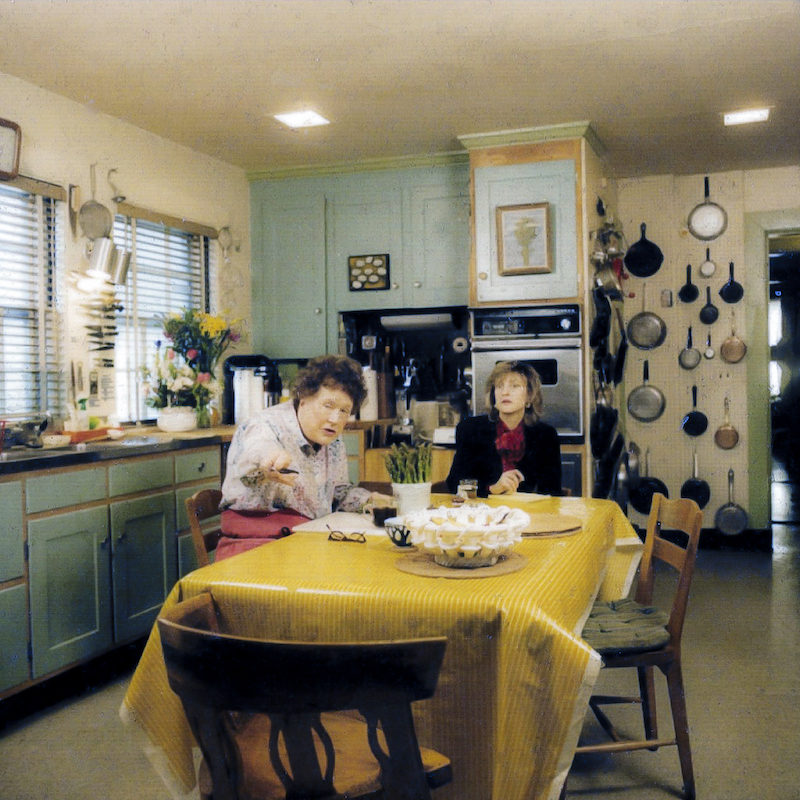 Pamela Heyne interviewing Julia Child
TABLE
The kitchen’s center of gravity was the table. It and the chairs had been acquired in Norway, where Julia’s husband Paul, a foreign service officer, had once been stationed. As we began the interview, Julia invited me to sit down at the table and offered me a perfect cup of French coffee, with cream and sugar. I mentioned that cream was not an option at my in-laws’ home. She huffed, “Where are you staying, with fanatics?” She then proceeded to expound on her views.
At times we walked around, examining a cooking gadget or something on the counter while I made notes. Mostly though we sat at her comfortable table, which was covered with a very practical oilcloth. The table was her supplementary work area. At one point during the photo shoot, Julia sat down and began peeling asparagus. So many of our modern kitchens require us to stand all the time or, at best, to perch on a barstool if we need to sit. But Julia could sit down comfortably to complete a task—without leaving the kitchen. As we will see, that same table also provide the setting for thousands of meals with friends and family.
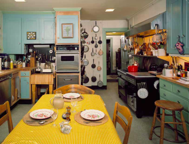 Julia’s kitchen, looking east from the refrigerator end.
BATTERIE DE CUISINE
The racks and shelves of the batterie de cuisine housed an extensive collection of metal cooking implements. Upon entering the room, it was the most striking thing in Julia’s kitchen. Glistening ladles, pans, and strainers framed the doorway. In the distance were gleaming copper pans, carefully arrayed (and cleaned weekly by an Irish lady, Mrs. Crawley). Paul and Julia had fine-tuned these arrangements to be as practical and as aesthetic as possible. A decorative item, such as a fish-shaped mold, might provide a sort of visual “cap” to a particular composition.
Most of the implements were mounted on pegboard, on which Paul had painted outlines of the pans so that they could be replaced in their proper positions. To avoid mistakes involving items of the same shape but different colors, little Polaroid pictures were attached to the pegboard as well. After all, this kitchen was used not only by Julia but also by her many assistants, who experimented with dishes and prepped food for various TV shows. When I asked if anyone ever moved an item from its appointed place, she said firmly, “You don’t.”
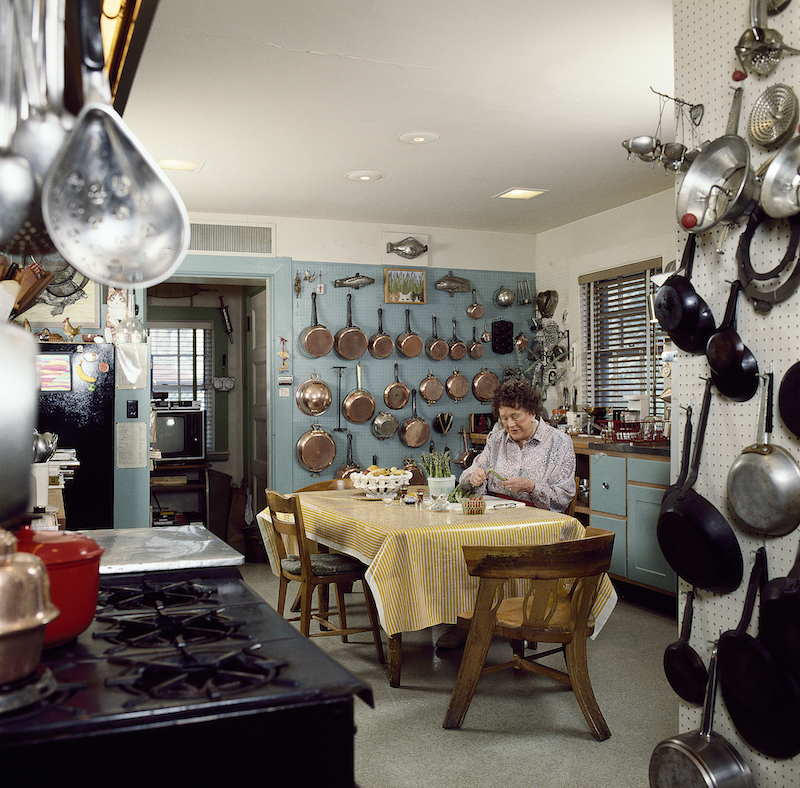 Julia’s kitchen as seen from entrance, looking west.
STOVE
The Childs purchased the restaurant-style gas range from a friend in Washington, D.C. When Julia first saw it, she said, “That’s for me!” The Garland stove was initially installed in their Georgetown home at 2706 Olive Avenue, and it eventually made the move to Cambridge. Julia liked the fact that the burners came apart for easy cleaning. The stove also contained a salamander for quick broiling.
According to assistant Stephanie Hersh, “Julia’s restaurant stove was one of her favorite pieces of equipment. To the right of the burners was a grill top. She rarely used it, and kept it covered with a specially made cover that was like a bench top. She stored some utensils on it and often rested pans in that ‘set aside’ area. Immediately below that grill top was the salamander.”
Garland does not recommend these ranges for home use today. A true restaurant range produces more heat than the typical homeowner needs, and must be vented with a powerful hood. Additionally, the unit itself can become quite hot, so the surface to which it backs must be able to withstand high temperatures. Wolf and a number of other companies make commercial-style ranges for home use. In several of the color photos, you can see that Julia kept many implements, such as whisks, strainers, and ladles, near the stove. The copper lids were particularly useful for a quick cover.
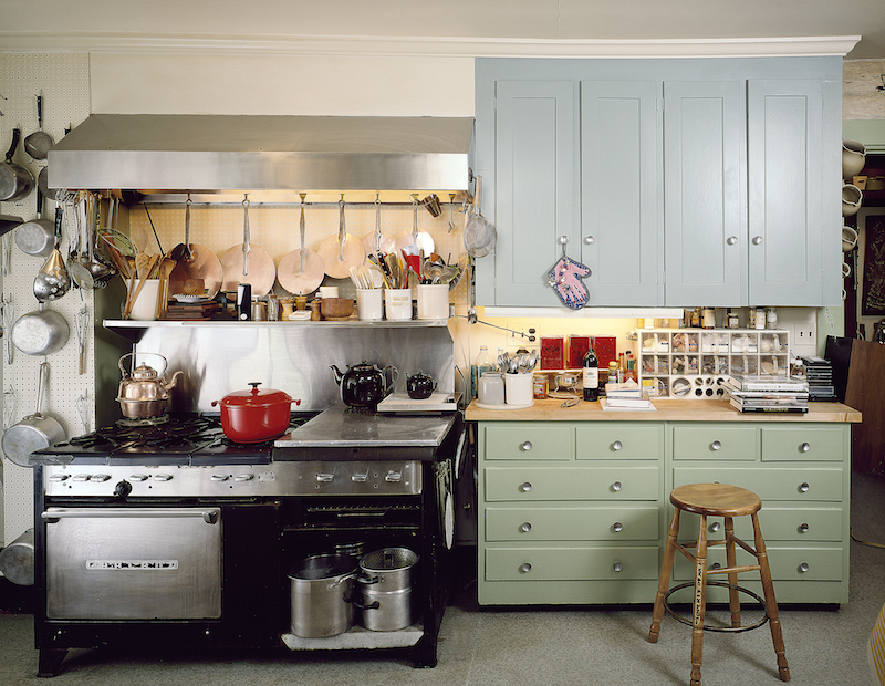 Kitchen view looking south, showing Garland stove.
OVERHANG
Overhang—the distance a kitchen counter extends beyond the cabinet below—was very important to Julia. In fact, she mentioned it to me on the phone when I initially called to make my appointment. With some emotion, she noted that some architect-designed kitchens had “no overhangs at all!” This made it harder to neatly brush food particles from the counter. While the standard kitchen overhang is 1 inch, her recommendation was 2½ to 3 inches. Interestingly, the overhangs in her kitchen appeared to be the standard 1 inch.
COUNTERTOPS
The main kitchen had butcher-block counters. They were obviously well used, with visible incision marks. Major cutting or chopping, however, was done on separate cutting boards, or on the big chopping block near the double ovens. Julia said she cleaned the countertops with an abrasive cleanser; when they dried, she seasoned them with olive oil. (Butcher-block manufacturers recommend other approaches.) According to Nancy, the counters would sometimes be cleaned with a cut lemon. “It was never a fussy item,” Nancy said.
The counter height was 38 inches (the standard height is 36 inches). Because Julia stood over 6 feet tall, this extra height was a necessity for her. And although I thought that her countertops seemed very cluttered, she said emphatically, “Others might need more. I only need this much.”
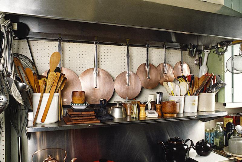 Detail of storage under range hood.
REFRIGERATION
Julia had access to several modes of refrigeration. Rather unusually for the time, she had an undercounter freezer in the pantry. According to Stephanie, “It was for general use. There was everything from ice cream to vegetables, stock, dough, nuts… there was also a refrigerator/freezer in the basement laundry area that was used when we needed extra space… mostly during TV shoots.” Near the sink was an icemaker. Again according to Stephanie, “Julia used a lot of ice! Mostly for food preparation and some for cocktails.”
Paul painted the main refrigerator black. Julia said, “It’s more chic, don’t you think?” While it is easy to dismiss Julia’s kitchen as simply practical, she and Paul seriously considered its aesthetics. In the days before both paneled and counter-depth refrigerators, painting the white bulky object black helped make it less intrusive.
According to Nancy, the unit was a combination refrigerator/freezer. Unfortunately it had a loud hum. When TV shows were shot in the kitchen, the refrigerator had to be unplugged. The cameramen would store their extra gear in the freezer so that they would remember to plug the refrigerator back in. They knew they would not forget their photographic equipment.
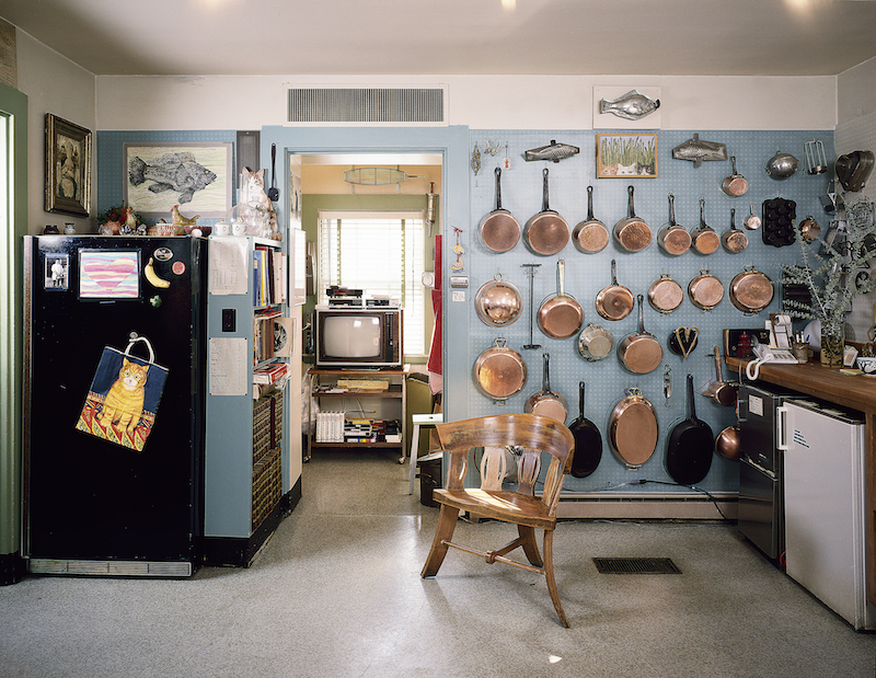 Kitchen view, west, showing copper pans and black refrigerator.
WORK TRIANGLE
The so-called work triangle is an imaginary one, linking the main work zones of a kitchen: refrigerator, sink, and stove. This concept originated in the 1940s as kitchen design became more codified. One rule of thumb specifies that the individual sides of the triangle should be between four and nine feet long.
I did note that the refrigerator was rather inconveniently placed, requiring some extra steps from the sink. When I mentioned that the arrangement did not conform to the work triangle that architects generally followed—sink between refrigerator and stove, usually linked by counters—Julia said, “I don’t pay too much attention to that.”
SINKS
Julia had a stainless steel double sink, with stainless steel double drain boards; it came with the house. She said two sinks were necessary: one for foodstuffs, the other for dishes. The drain boards, she noted, were more efficient and attractive than plastic ones, which “never drain properly.” There were numerous labels near the sink, instructing assistants not to put celery or onion peels in the disposal. The tools that Julia used in that area were, as usual, close at hand. Knives, bottle openers, and strainers were carefully arrayed on the wall, attached with magnets. Her friend Pat Pratt said, “Julia never put knives in drawers because they would get dull there.”
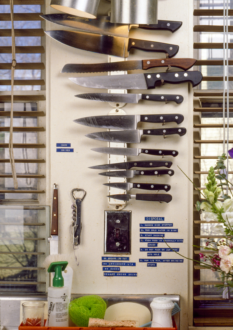 Detail of magnetic knife storage by window.
SMALL EQUIPMENT
Julia loved time-saving gadgets. She called the Cuisinart “one of the great inventions.” As for the microwave oven, she said that she “never cooked with it, but would not be without it.” When I expressed a slight fear of microwaves, she said that was “silly.”
According to Stephanie Hersh, “Julia was a gadget and knife ‘freak’” (her word, not mine).
She loved having kitchen tools for every purpose. As far as Julia was concerned, you couldn’t have too many. She adored her food processor, but also had almost every kitchen tool ever invented—in every size, shape and color! The drawers and cupboards were filled with tools that peeled, chopped, sliced and diced. There were bottle openers of all sorts and oyster shuckers, scoops, cutters, temperature gauges… you name it, she had one.”
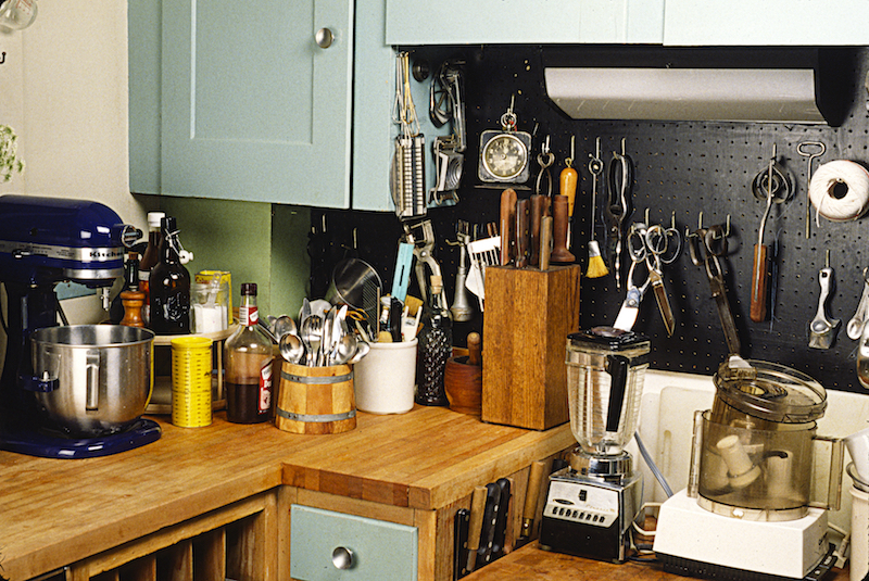 Storage along counters next to wall oven.
PANTRIES
Julia had three pantries. One was near the kitchen entrance. That one contained large pots and other implements that were rarely used. Two adjoining pantries linked the kitchen to her elegant dining room. One of those pantries was for pastry, the other for dish and glassware storage (it also served as a bar for mixing drinks).
The pastry pantry had a marble countertop for rolling out pastry dough, and the previously mentioned undercounter freezer. Removed from the main cooking realm, this area was cool and dark. Various pastry molds, dough cutters, and flour sifters were readily at hand, along with numerous rolling pins, a scale, a second food processor, and another microwave oven, which Julia used primarily for warming butter or quickly thawing pastry. A high shelf was used to store large metal cooking pots, casseroles, baking dishes, and trays. This architectural feature was common in the Childs’ European kitchens as well.
The glassware pantry included a sink as well as implements for serving wine and mixing cocktails, all under a poster warning citizens of the evils of alcohol. The Childs also had a wine cellar in the basement, and a wine rack in the rear pantry.
Julia kept her better porcelain in the same pantry with the glassware. Some of it was from Provence, and she occasionally used pieces in her TV shows. Assistant Nancy Barr would sometimes stand on the counter, waiting for instructions on which plate to retrieve. “Give me the yellow one,” Julia might trill.
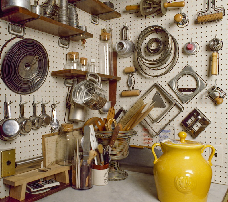 Pastry tools stored on wall in pantry.
During my visit, I noticed with some surprise two opened bags of Pepperidge Farm cookies on that same counter. When I asked Jim about it later, he said it was not a fluke: Julia liked those cookies, and was very fond of McDonald’s french fries as well.
FLOOR
Here Julia made two emphatic points: “It should be soft underfoot, and should be a neutral color.” In an earlier kitchen in France, Julia had a red ceramic floor that she said was beautiful, but impossible on the feet. She covered it with a resilient floor. In another house, she replaced a black and white floor that showed every drop that fell. Julia’s Cambridge kitchen had a linoleum floor that was cleaned regularly. According to assistant Stephanie Hersh, Julia “had a lovely team of cleaning ladies who came once each week to scrub the entire house from top to bottom (kitchen, dining room, pantry, all six bedrooms, three full bathrooms, three half bathrooms, and lots of other living space!). The house always sparkled.”
When the kitchen was being taken apart for transportation to the Smithsonian Institution, it was discovered that the floor had an asbestos-containing adhesive. Though common in Julia’s day, such adhesives are now considered a hazardous substance, so the original floor did not make the trip. Its pattern was photographed instead, then reapplied to paper for the Smithsonian installation.
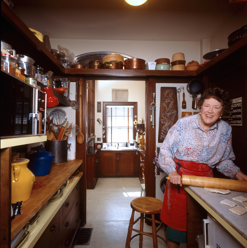 Julia rolling pastry in the pantry.
LIGHTING
An appealing aspect of Julia’s kitchen was the task lighting—light applied where needed. She had some incandescent recessed lights, along with wall lights and fluorescent under-cabinet lights. Incandescent bulbs produce a yellowish light that was popular in Julia’s time. Unfortunately, that type of lighting is only 10 percent efficient; 90 percent of its output is heat. Since 2014, the US government has banned the manufacture of most incandescent bulbs. Today they are being replaced primarily by LEDs (light-emitting diodes) or compact fluorescent fixtures.
WINDOWS
The kitchen had three double-hung windows, facing roughly north or north-west and hung with venetian blinds. Although these windows provided sufficient daylight, other iterations of Julia’s Cambridge kitchen enhanced their effect. When the room became a set for Julia’s TV shows, decorative window treatments were added, while gels and outside lighting gave the illusion of sunlight streaming in. In the movie Julie and Julia, the kitchen windows also look sunnier than in real life. And the Smithsonian installation features theatrical lighting that creates the effect of dappled sunshine.
Excerpted from In Julia’s Kitchen: Practical and Convivial Kitchen Design Inspired by Julia Child by Pamela Heyne and Jim Scherer. Published by ForeEdge, an imprint of University Press of New England.
Pamela Heyne
Pamela Heyne is a Yale-educated architect and author of Mirror by Design and Today's Architectural Mirror. In her architectural practice, Pamela has designed kitchens for Oberlin College and Ben Bradlee and Sally Quinn, among many other clients.


