Garth Risk Hallberg on Updating His Debut Novella—10 Years Later
A Field Guide to the North American Family, then and now
Garth Risk Hallberg’s first work of fiction, an illustrated novella called A Field Guide to the North American Family, has just been published in a new edition by Knopf. Here he reflects on some of the ways the design has been updated for the reissue.
1. Cover
 Mark Batty Publishers, Christopher D. Salyers
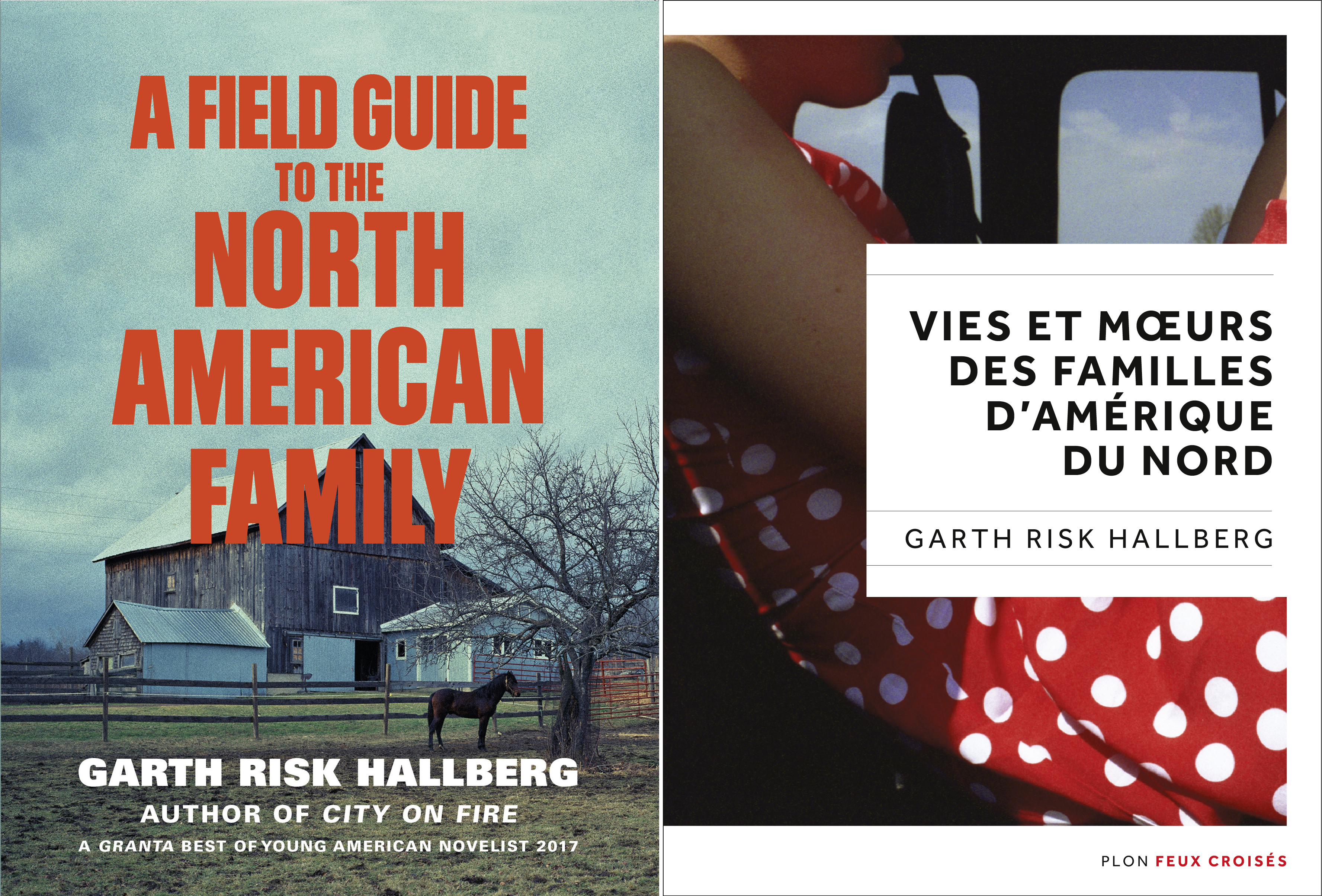
It’s always fun to see how book jackets change across editions. Fun for me, anyway, as an unreconstructed geek. I remember my favorite thing about the original was the image of a tree in winter. It seemed to connect the idea of “family” with some of the branching, fractal qualities I’d wanted in creating my own version of a Choose-Your-Own-Adventure story. I also liked the antique color palette, playing up the conceit of an old-fashioned “field guide.” The big challenge it created, I think, was legibility.
 Vintage UK; Hokus Pokus Creations
For this year’s U.K. and French jackets, the publishers repurpose illustrations from within the book for designs that echo their editions of City on Fire. The fact that these covers end up feeling so different in mood, I think, reflects the range of the illustrators’ sensibilities. When I first started to conceive of Field Guide as an illustrated text (because what field guide isn’t?) I imagined the photos would all be the work of one artist—my friend Chris Eichler, who shot the polka-dotted dress. Naive about how photographers work, or maybe just about how Chris works, I didn’t quite realize that coming up with 63 different images for the 63 chapters would be a full year’s work, or more. So in addition to using several of Chris’s images, I ended up recruiting 46 other photographers, people whose work I’d seen in galleries or online. All very different, yet sharing a certain ineffable something.
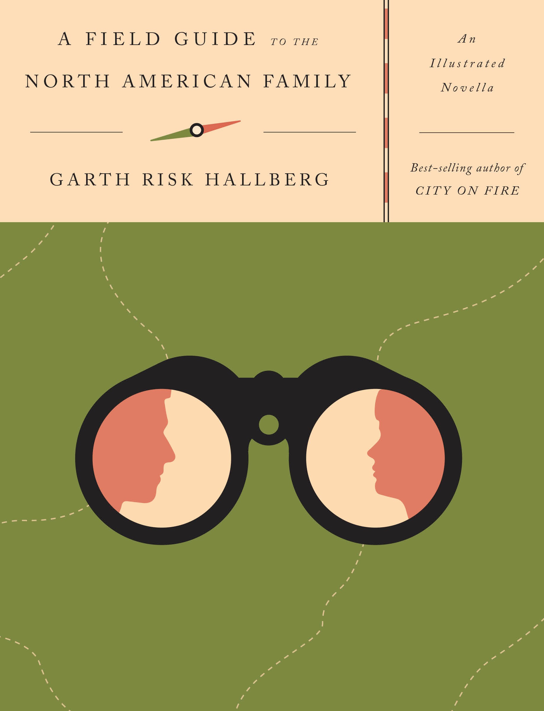 Knopf
Knopf
When I heard Oliver Munday would be doing Knopf’s cover, I was thrilled, both because I’m a fan and because I had worked with him a little on the novel (he was the in-house graffiti writer) and knew him to be a great reader and an all-around cool person. I like the eye-catching simplicity of his cover. He finds a way to work the sepia palette and the oldfangled typeface into something distinctly modern. My editor was particularly pleased the gender-and-age ambiguity of the figures in the binoculars—could be father and son, or father and daughter, or mother and son, or boy and girl—which prefigures the interlinked subplots of the book.
2. Front Matter
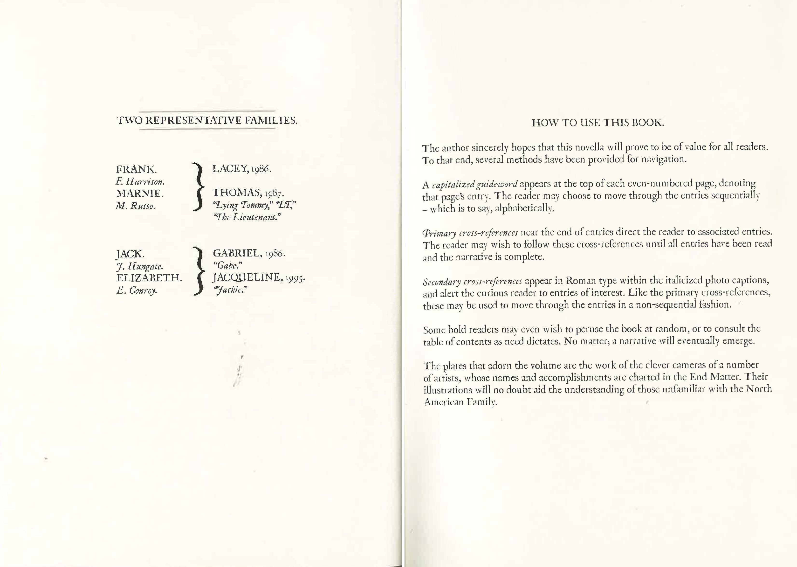 Mark Batty Publishers, Christopher D. Salyers
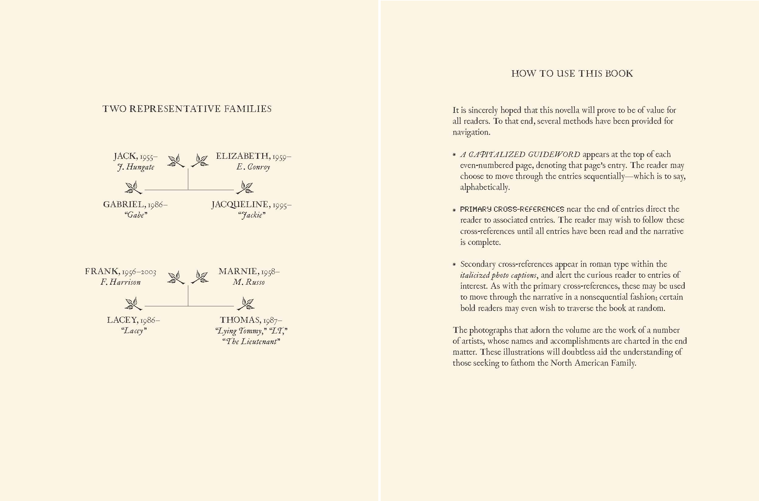 Knopf, Cassandra J. Pappas
I was never quite happy with the front matter. The design for this spread was close to how I’d originally imagined the book as a whole: sparse, serifed, bookish . . . McSweeneyish. I love the typeface. But “How to Use This Book” looks like a forbidding wall of text, and so its slight archness of the tone, instead of being deadpan, seems forbidding, too. It’s important for the text to be there—to foreground that you can go any number of directions at the end of a chapter. But I was going for John Barth and ending up at one of those restaurants where the waiter has to tell you how Chef wants you to eat his food.
For the new edition, designer Cassandra J. Pappas managed to keep the antique feel while making the family tree look more arboreal. And then I tried to simplify “How to Use This Book,” and to make the voice a little less arch, a little more inviting. Bullet points are always clarifying. Finally, my editor and I came up with the idea of setting the type for “guideword” and “cross-references” to match the guidewords and cross-references in the main text. It was like the final click.
3. “Guilt”
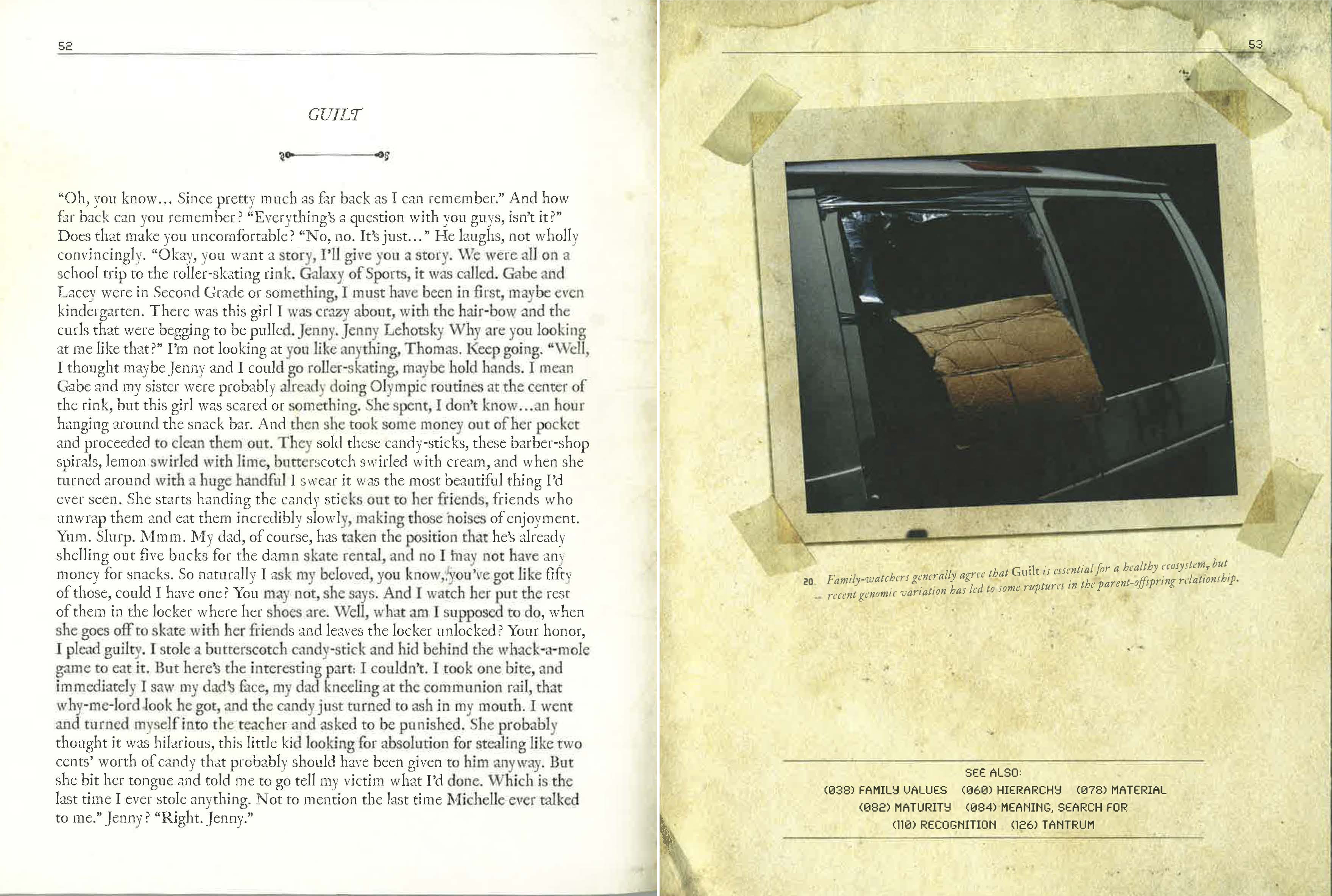 Sai Sriskandarajah
Here you can see the basic page set-up for the book. Title and chapter on the left, illustration and caption on the right, cross-references at the bottom. But to maintain a kind of static, old-fashioned vibe throughout the book wouldn’t have worked. The design had to somehow tie together 47 different photographers’ sensibilities, and all the different voices I’m putting on in the chapters, the way the Dude’s rug in The Big Lebowski ties the room together. Christopher D. Salyers, who designed the original book, came up with a conceit that it would be not just a field guide, but a messed-up field guide—one that had passed from hand to hand, had been ripped, had been stuffed with postcards and taped with Polaroids. It was a paradox: the more the design got crazy with the Cheez Whiz, the more of a piece the book felt. There were a few places where the trompe l’oeil slipped, though, and this was one of them. I couldn’t figure out why the border on a Polaroid would have faded to the same sepia hue as the page beneath.
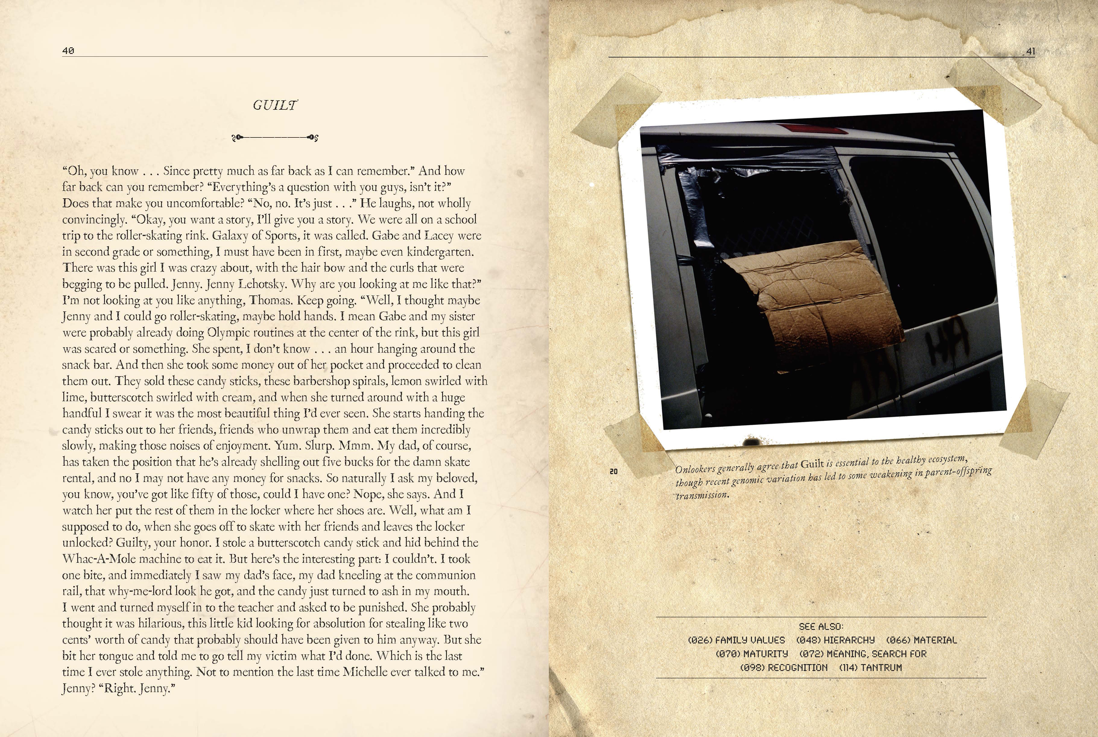 Sai Sriskandarajah
Cassandra was able to do a little remediation. And similarly, in a couple spots where I felt the voice in the chapter itself had faltered—a character named Lying Tommy is speaking—I was able to make some edits. The photo captions throughout the book are meant to throw the subjectivity of the chapters into relief. They’re this kind of dry, scientific counterpoint—very much the same voice as “How to Use This Book.” (Yet also absurd, like Ben Marcus’s The Age of Wire and String, a book I was smitten with in college.) But in places they were too arch, and this was one of them. So again, the new edition was an opportunity for woodshedding.
4. “Optimism”
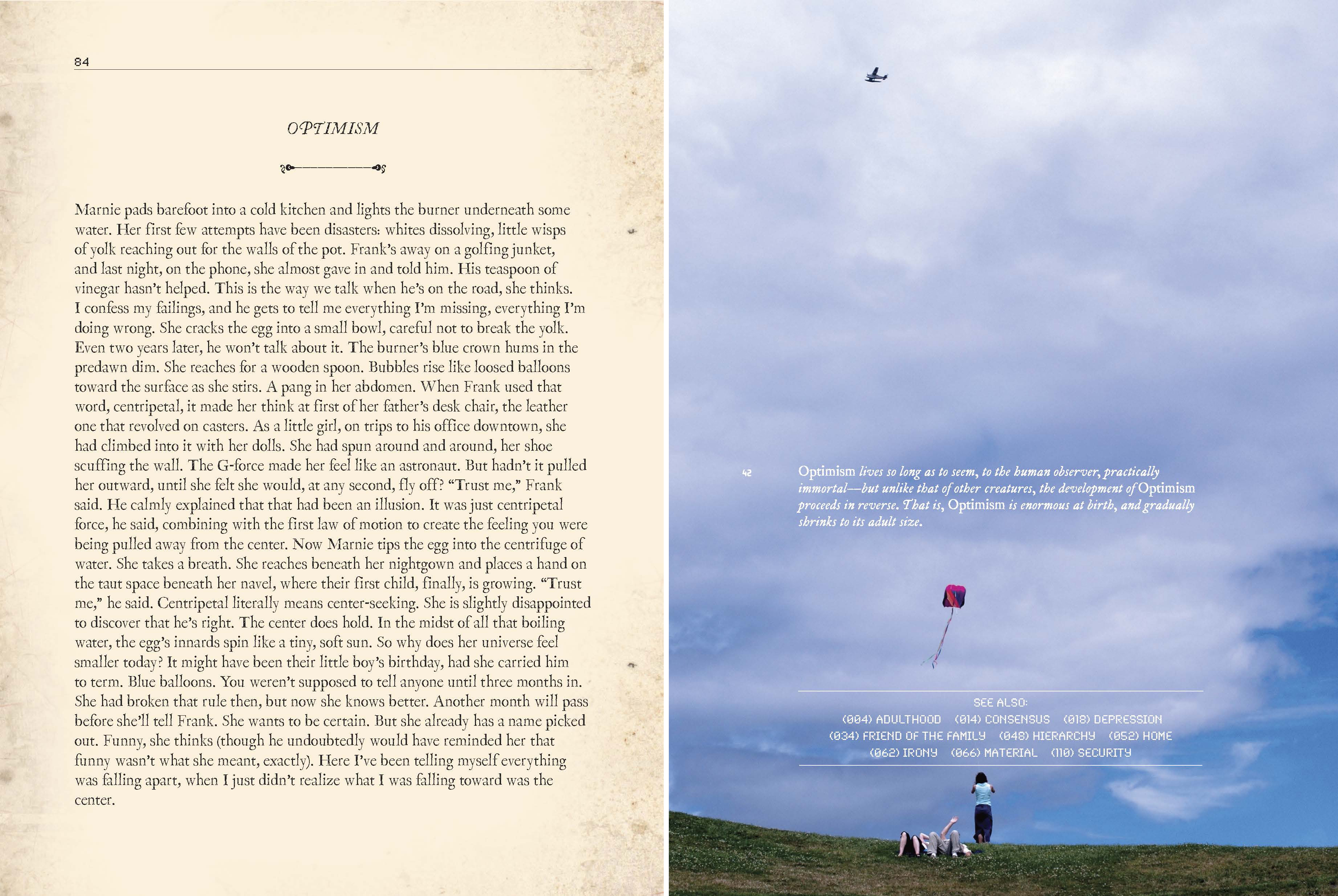 David Shulman
It would no doubt embarrass Andy Hughes, the head of production at Knopf, to be called one of the unsung heroes of publishing, but it’s true. He’s only the third person to have his job in the 100-year history of the house, and has presided over an era in which bookmaking has gone from analog to digital. Yet he’s maintained a veneration for the art. What do I mean? I mean, the case-jacketed cover, the green ribbon bookmark, the sewn binding . . . these things are all Andy. Also: the paper. I don’t know how he did it, but somehow he got it to drink up less of the ink, so that the photos pop in a new way. I love the saturated blue that now shows up in this image. And Cassandra was able to tweak the caption to make it more legible against the white clouds. I did my tweaking, too, on the text on the left, which started out on a dare from a poet to write a piece of “flash fiction.” I quickly realized that the character was Marnie Harrison, and that this was a chapter in the book. It only took me 10 years to get the verb tenses right!
5. “Phase”
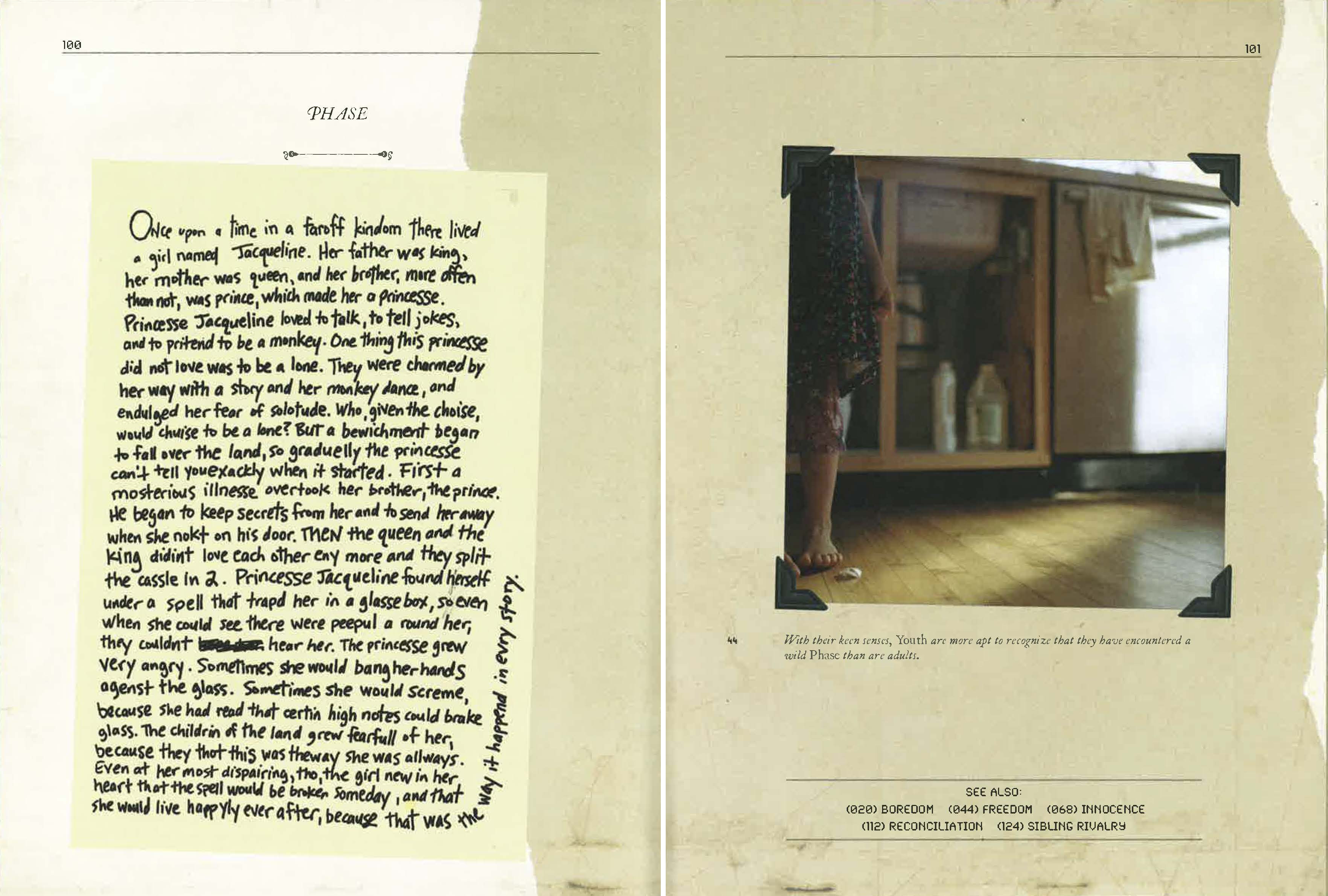 Mark Batty Publishers, Christy Karpinski
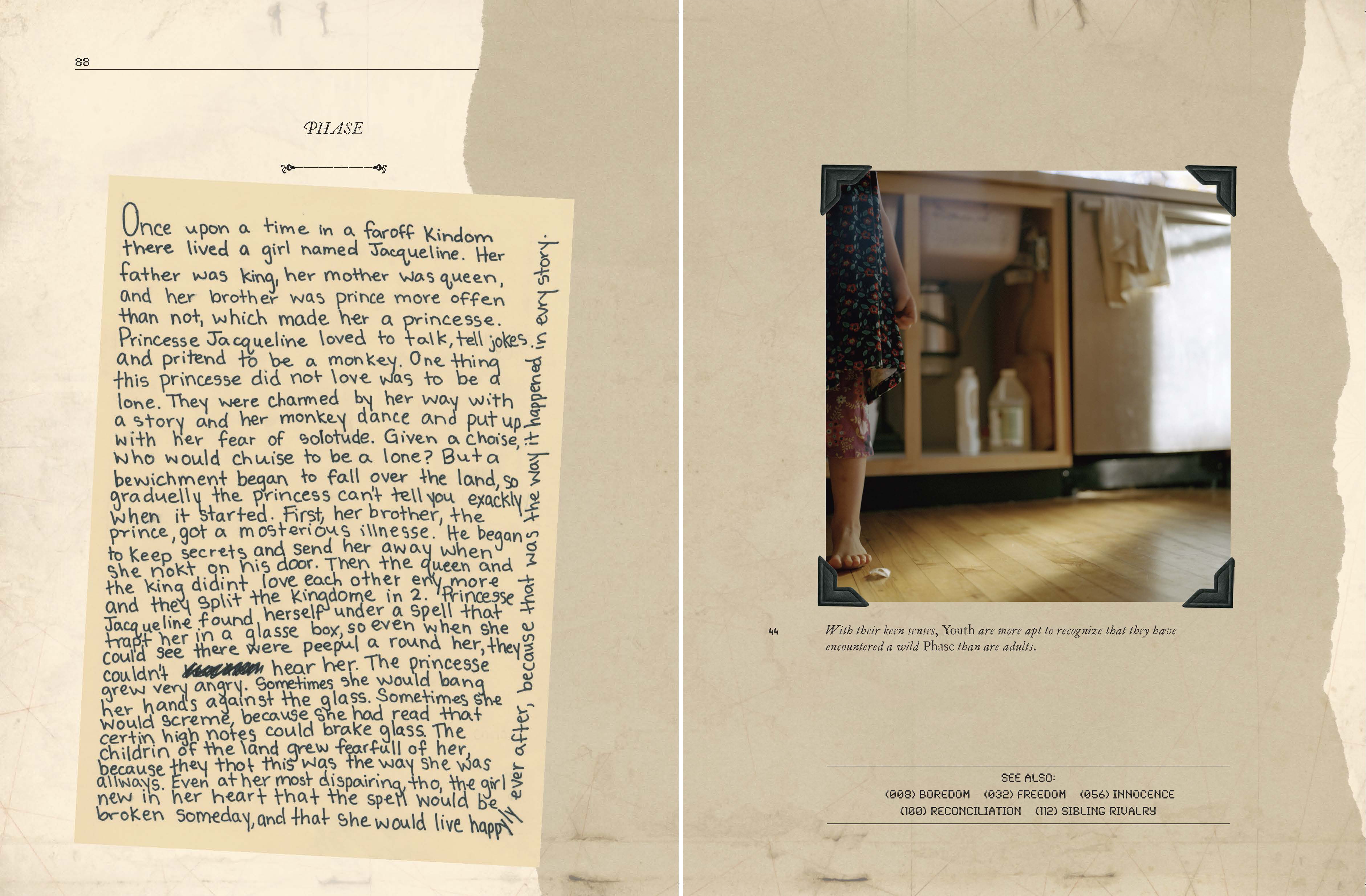 Betsy Sallee, Knopf; Christy Karpinski
Chris Salyers’s “messed-up field guide” conceit allowed us to have this chapter—a story written by the character Jackie, age 7—actually be hand-written. I can’t remember who originally did the writing, but ten years later, to my editor’s chagrin, I wanted to make extensive edits to the text. I had all these different dramatic monologues in the book, in part because I hadn’t quite figured out to get that polyvocal effect in third person. And in places, I felt, the mask slipped. So this whole section had to be re-written by hand. We auditioned several people in the office before settling on assistant editor Betsy Sallee. Betsy was a huge help with this project throughout, and I mean it as a compliment when I say that her handwriting is plausibly that of a seven-year-old girl.
6. Endpapers
 Christopher D. Salyers and Eliane Lazzaris
 Knopf, Oliver Munday
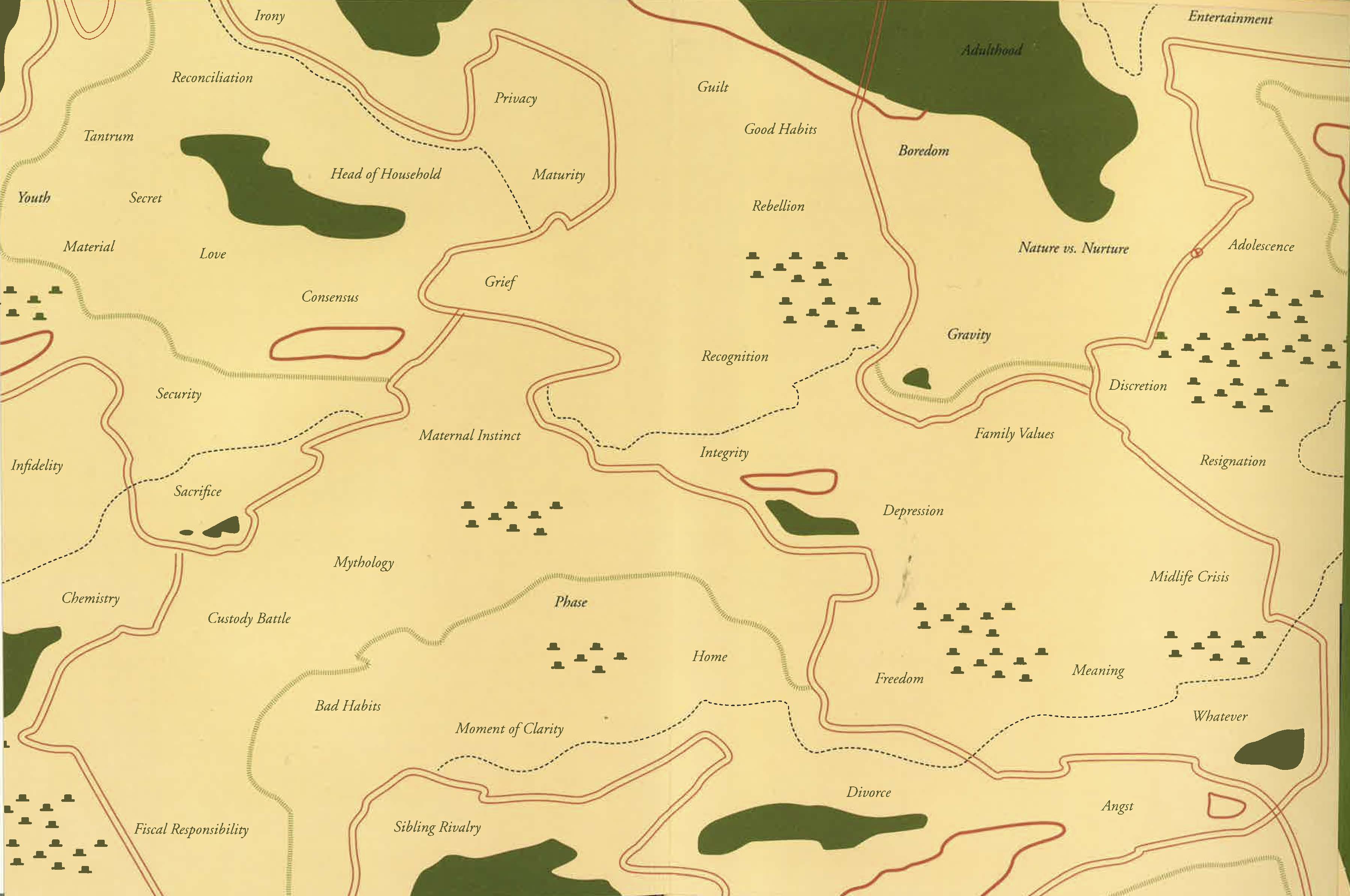
For the original edition, I had this idea that the endpapers should be like those maps in the back of in-flight magazines, showing all the hubs and connections among the chapters. This required laboriously cataloguing the cross-references. I liked the result, by Christopher Salyers and Eliane Lazzaris—you could sort of visually see the thematic density—but a decade on, the file had somehow gone missing, so that you couldn’t go in and tweak the things that didn’t work. I asked if Oliver could come up with something less complicated, and he drew this map, connecting with his cover image. I like it quite a lot; it almost tells its own story.
Garth Risk Hallberg
Garth Risk Hallberg's first novel, City on Fire, was a New York Times and international bestseller, has been translated into 17 languages, and was named one of the best books of 2015 by The Washington Post, Los Angeles Times, San Francisco Chronicle, The Wall Street Journal, NPR, and Vogue. He is also the author of a novella, A Field Guide to the North American Family. His short stories have appeared in Prairie Schooner, Glimmer Train, and Best New American Voices 2008, and he has written critical essays for The New York Times Book Review, The Guardian, The Millions, and Slate. A two-time finalist for the National Book Critics Circle's award for Excellence in Reviewing, he lives in New York with his wife and children.
