A Brief Visual History of Virginia Woolf's Book Covers
From 1919 to Today
Virginia Woolf was born 136 years ago today. It almost seems silly to write that her books are wonderful, or world-changing—but they are. I’d wager that, if you’re reading this space, you knew that already. Woolf’s writing has been essential reading for so long that there have been countless editions and reprints, redesigns and rebrandings, of all of her books—and not just the most famous ones, Mrs. Dalloway, To the Lighthouse, A Room of One’s Own, etc., but even the deep backlist. Sometimes her books get they covers they deserve—and sometimes they don’t. (The current Wordsworth Classics, for instance, are truly awful.) So below, I’ve dug up some of the most interesting, or at least representative. Of course, because of the onslaught of covers, this isn’t anywhere close to a complete collection, and that the exact dates of particular editions are not always easy to track down, and in some cases are approximate. This is only a way to look at the general progression of the treatment her work has been given over the years—the good, the bad, and the ugly—with some fan-designed covers thrown in there for fun.
Hogarth Press Early Editions, designed by Vanessa Bell:
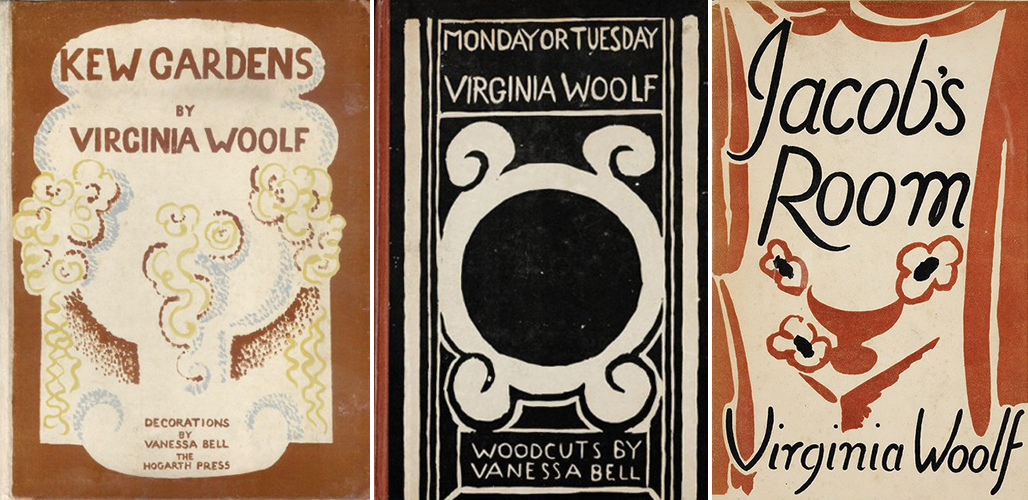 Kew Gardens (1919), Monday or Tuesday (1921), Jacob’s Room (1922); design by Vanessa Bell
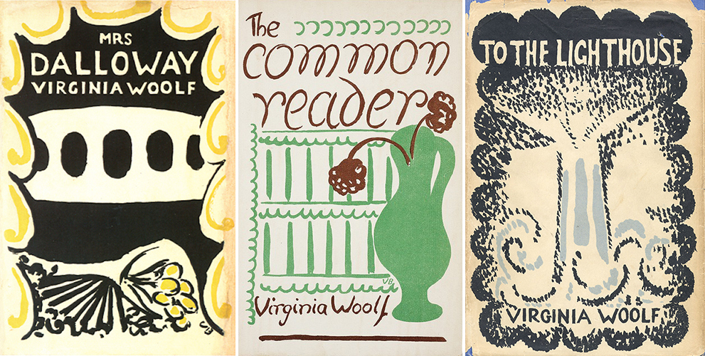 Mrs. Dalloway (1925), The Common Reader (1925), To the Lighthouse (1927); design by Vanessa Bell
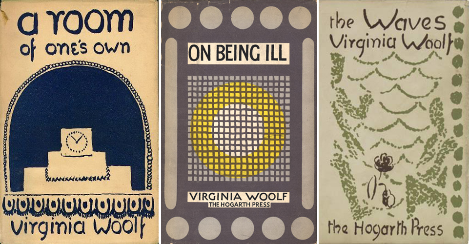 A Room of One’s Own (1929), On Being Ill (1930), The Waves (1931); design by Vanessa Bell
 The Common Reader, Second Series (1932), The Years (1937), Three Guineas (1938); design by Vanessa Bell
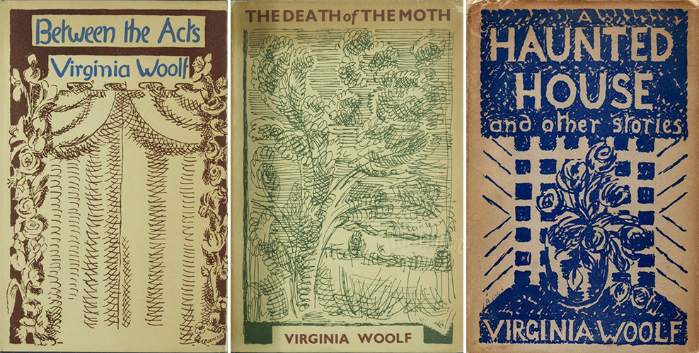 Between the Acts (1941), The Death of the Moth and Other Essays (1942), A Haunted House and Other Short Stories (1943); design by Vanessa Bell
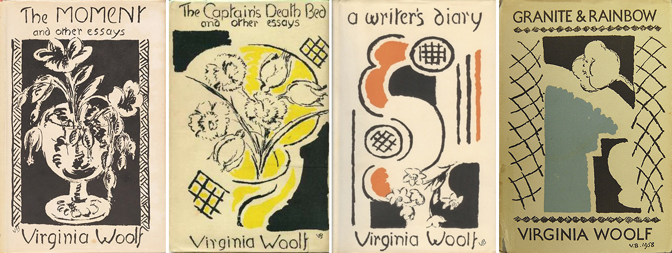 The Moment and Other Essays (1947), The Captain’s Death Bed and Other Essays (1950), A Writer’s Diary (1953), Granite and Rainbow (1958); design by Vanessa Bell
Many of Virginia Woolf’s earliest dust jackets were designed by her older sister and fellow member of the Bloomsbury Group, the artist Vanessa Bell. “Your style is unique, because so truthful,” Woolf told her when some criticized the designs, “and therefore it upsets one completely.” Bell designed a total of 38 book covers for Hogarth Press, the publishing house Woolf founded with her husband.
The first edition of Orlando looked a little different:
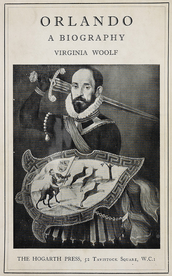 Orlando, first edition (1928)
Harcourt, Brace & World editions from the mid-1950s:
 Harcourt, Brace & World Inc., 1953 and 1955
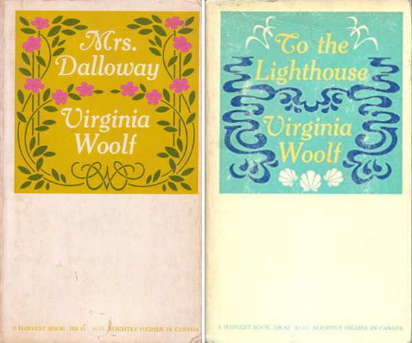
Harvest/HBJ editions from the mid-1950s:
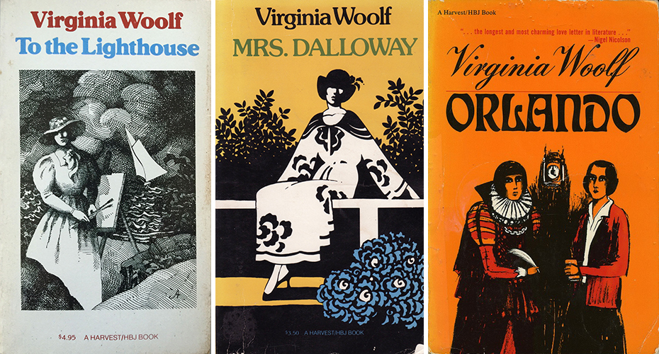 To the Lighthouse (1955), Mrs. Dalloway (1953), Orlando (1956)
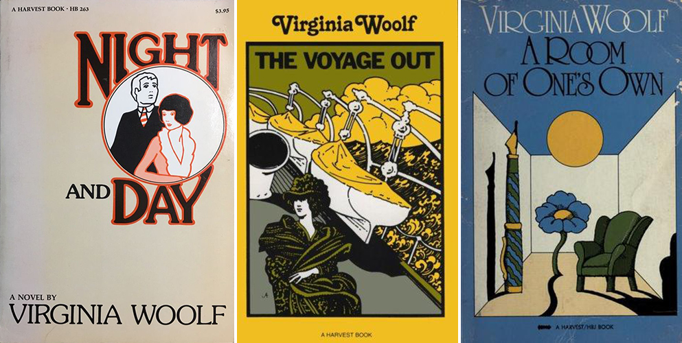 Night and Day (1948), The Voyage Out (1948), A Room of One’s Own (1957)
Three miscellaneous covers from the ’60s:
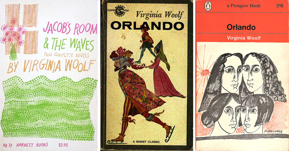 Jacob’s Room & The Waves, Harvest (1960); Orlando, Signet Classic (1960); Orlando, Penguin; design by Paul Hogarth (1965)
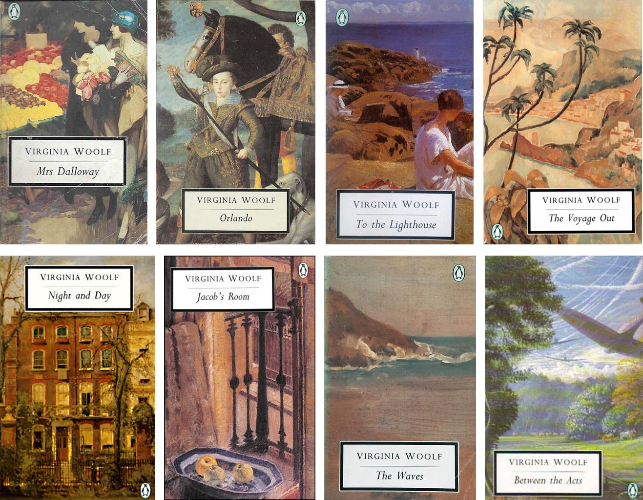
Penguin Modern Classics & Penguin Modern Classics Reprints, 1960s and early 1970s:
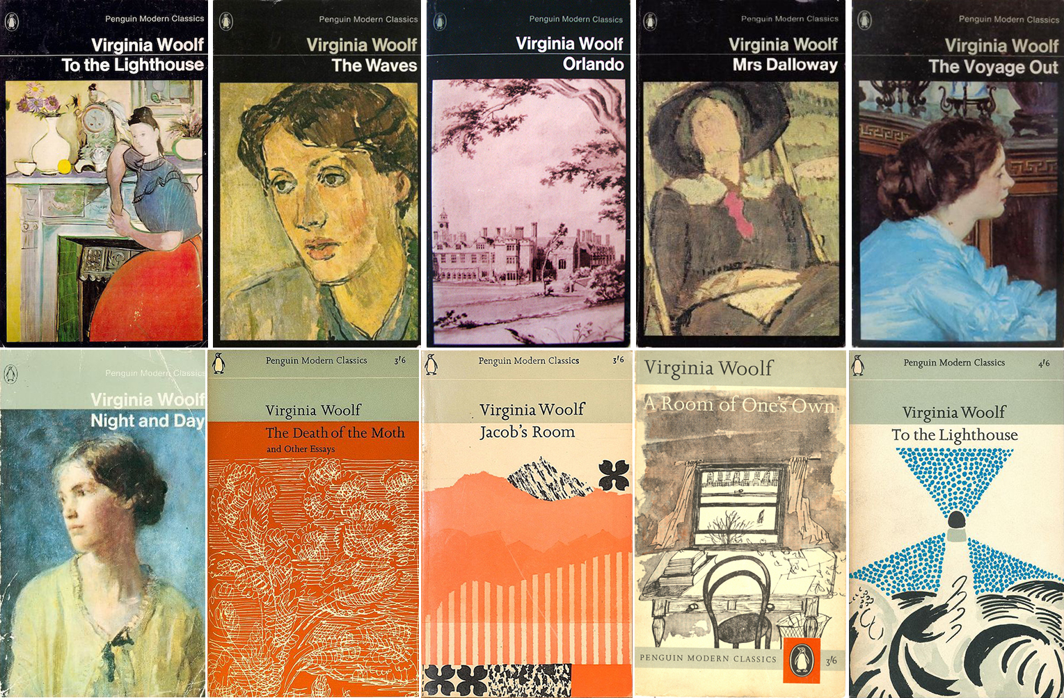 Penguin Modern Classics, various editions: To the Lighthouse (1966), The Waves (1964), Orlando, Mrs. Dalloway (1972; from a painting of Woolf by Vanessa Bell), The Voyage Out (1970), Night and Day (1969), The Death of the Moth and Other Essays, Jacob’s Room (1965; cover design by John Sewell), A Room of One’s Own (1963; cover drawing by Paul Hogarth), To the Lighthouse (1964; cover drawing by Duncan Grant)
Grafton/Triad/Panther Books editions, 1970s:
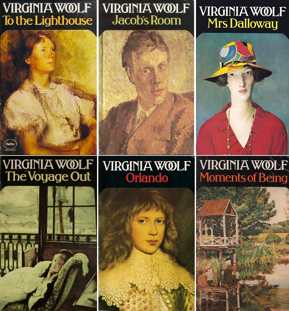 Grafton/Triad/Panther Books editions, 1970s
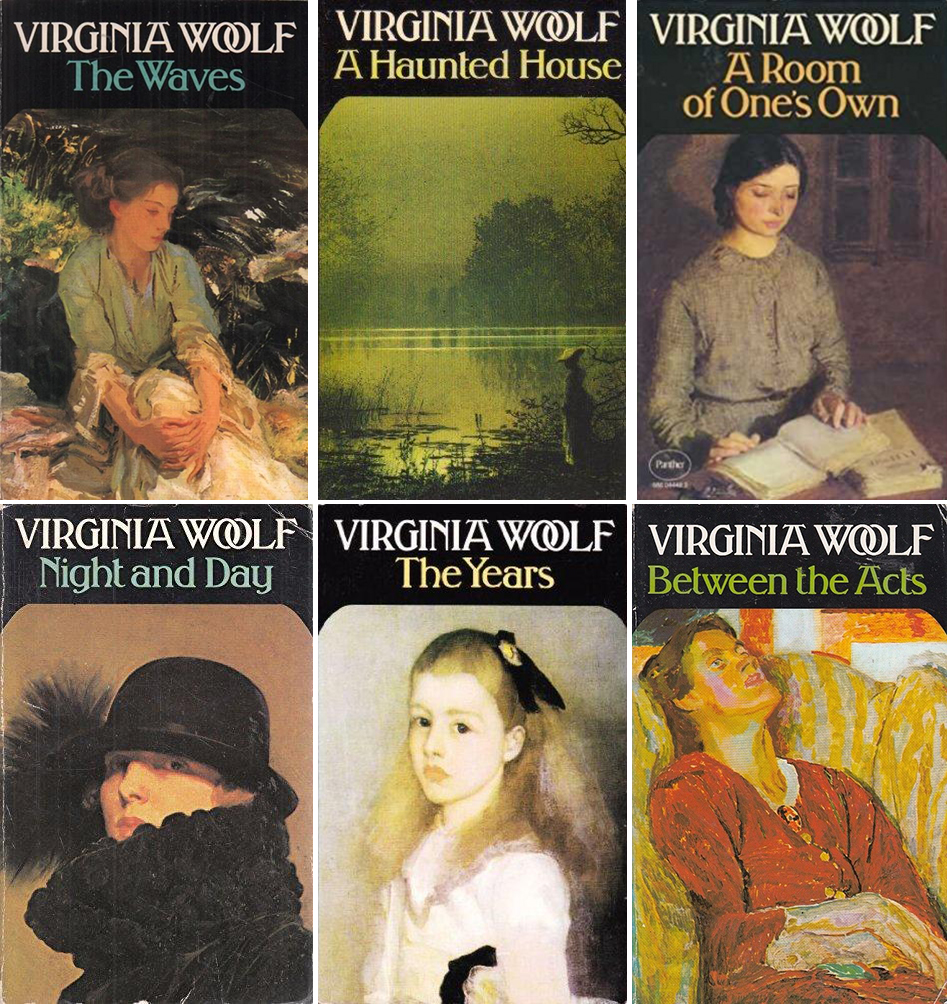 Grafton/Triad/Panther Books editions, 1970s
Two more Harvest books (probably) from the ’70s:
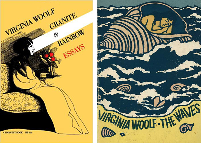 Granite and Rainbow (1975); The Waves (date unknown)
Two international covers from the 1980s (and one unknown):
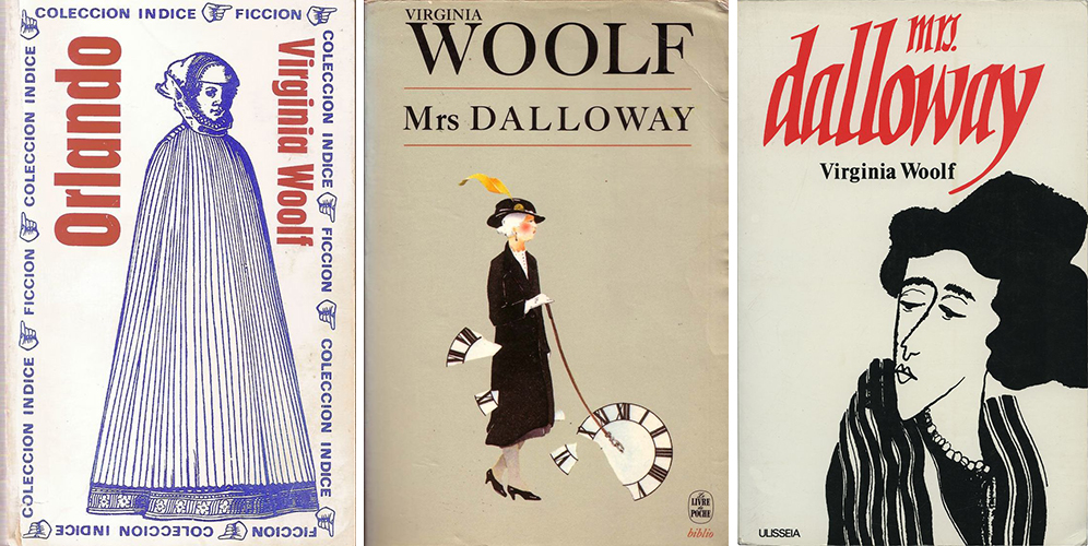 Orlando, unknown origin (Spain?), Mrs. Dalloway, France (Livre de Poche, 1982); Mrs. Dalloway, Portugal (Editora Ulisseia, design by Luiz Duran, 1982)
Penguin 20th Century Classics series, from the 1990s:
Current Wordsworth Classics editions, first released in the ’90s:
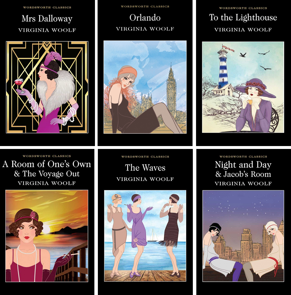 Wordsworth Classics editions: Mrs. Dalloway (1996), Orlando (1995), To the Lighthouse (1994), A Room of One’s Own and The Voyage Out (2012), The Waves, Night and Day and Jacob’s Room
Mariner Books editions, circa 1990:
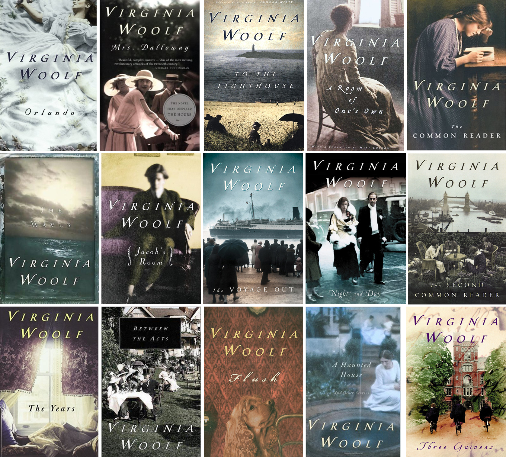
These are still being printed; they are the paperback editions I see most often today.
Vintage Classics editions, 1992-2014:
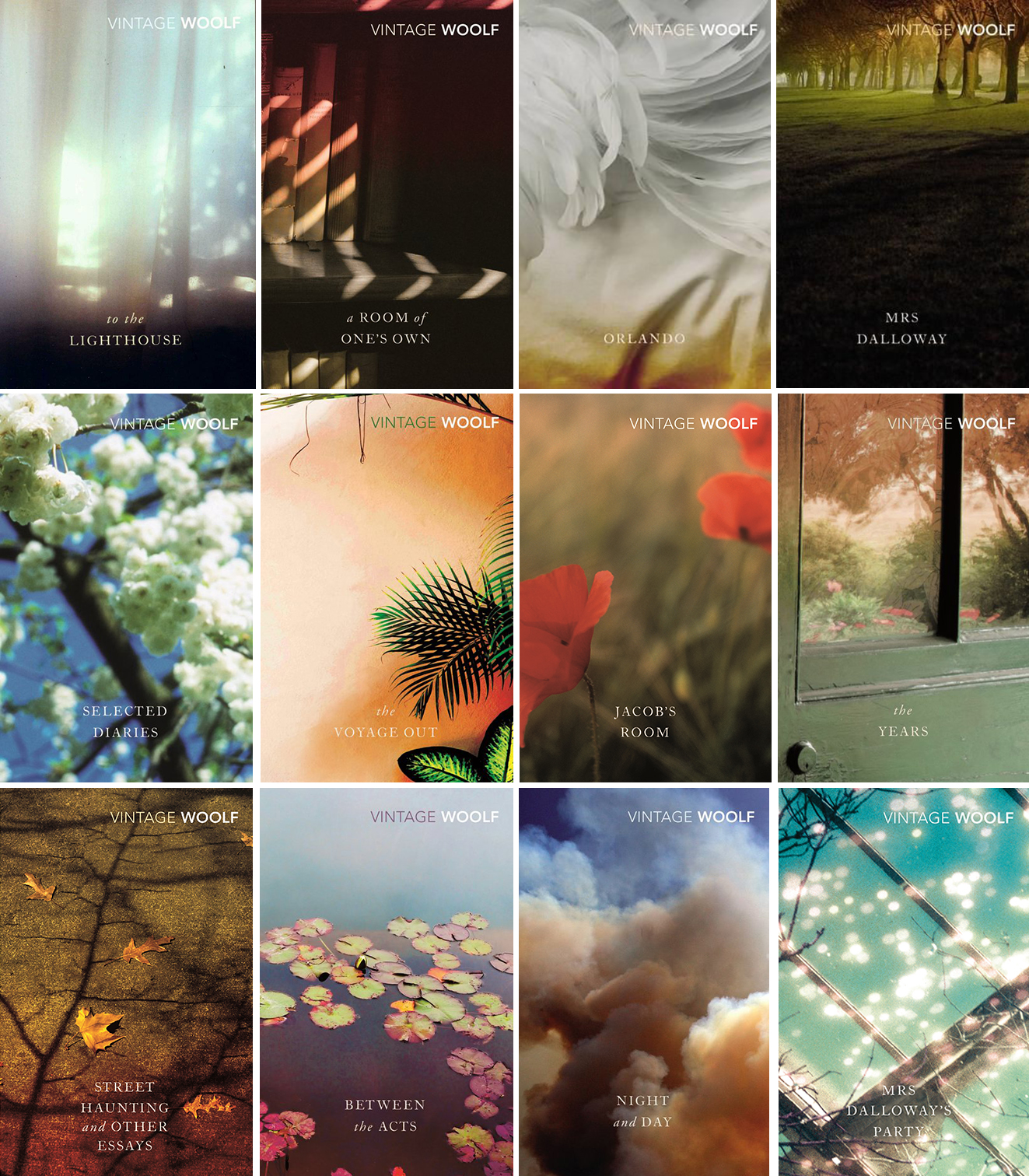 Vintage Classics editions, 1992-2014
More Vintage Classics editions, circa 2004:
 Vintage Classics editions, 2004-2008
Penguin Books editions, designed by Angus Hyland, 2011:
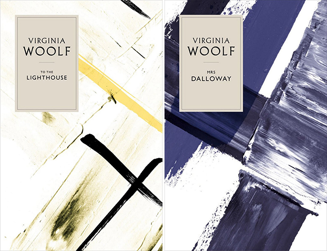 Design by Angus Hyland for Penguin Books, 2011
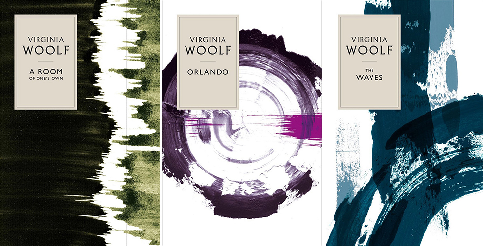 Design by Angus Hyland for Penguin Books, 2011
In 2011, Penguin Books UK commissioned these hardcover designs from Pentagram designer Angus Hyland in 2011. The abstract painted designs are reportedly inspired by the famous textile designs of Omega Workshop—and thus of Vanessa Bell herself, the books’ first designer, who was a Director of Omega and designer of many of those textiles. Some hardcore Woolf fans, however, were not impressed.
Leanne Shapton’s comps and cover for Mrs. Dalloway, 2011:
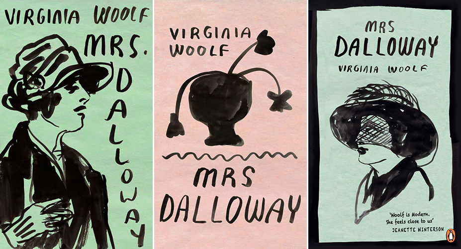 Two rough cover concepts (left) and the final cover (right) of Mrs. Dalloway for the Penguin Essentials collection, designed by Leanne Shapton, 2011
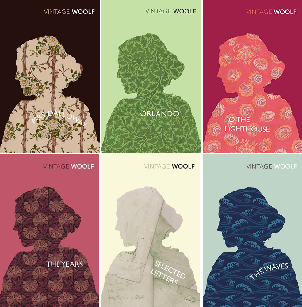
Vintage Classics editions, designed by Aino-Maija Metsola, 2016:
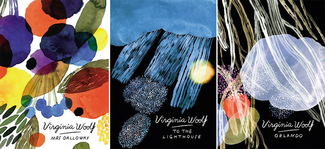 Aino-Maija Metsola for Vintage Classics, 2016
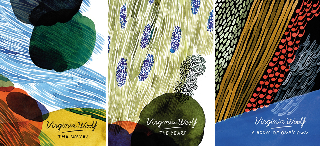 Aino-Maija Metsola for Vintage Classics, 2016
Helsinki-based Marimekko illustrator Aino-Maija Metsola created these complementary designs for six books in Woolf’s backlist for Vintage Classics UK. “Painting with water color enabled me to create pictures that suit Woolf’s fluid writing,” Metsola told AIGA Eye on Design. “I was interested in making pictures with strong, possibly mysterious atmospheres, pictures that captivate the viewer, but not in an obvious way. . . For Orlando, I was thinking of the great oak tree that connects the main character to his/her roots while he/she changes, and evolves through the centuries. . . For A Room of One’s Own, I painted abstract characters falling. I was thinking that they could symbolize text flowing freely without restriction, like rays of sun, or rain.”
But she wasn’t actually that familiar with the books before she started the project, and didn’t have time to read them all before her deadline. “I tried to convey something essential about the atmosphere of the books,” she told Culture Trip, “but I wanted the illustrations to be rather abstract so that they are open for interpretations. With each of the Woolf covers I simply picked one little detail from each text or some visual image that started to build up in my mind. Then I started painting. . .I wish I had known Woolf’s works better before starting with the covers so I was first a little nervous about the possibility of completely misunderstanding what is relevant. But I tried to view that as an interesting challenge.”
Three fan-designed covers for Orlando:
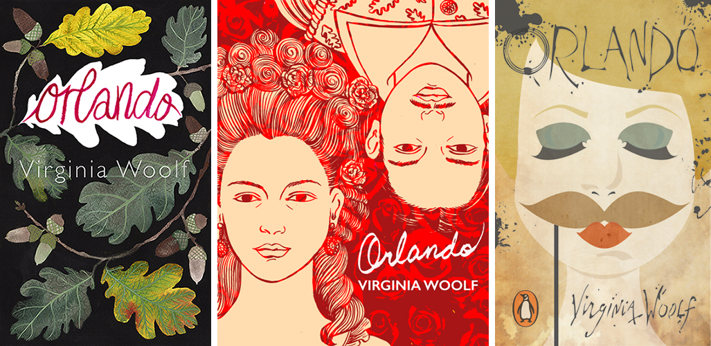 Eleanor Percival; May Tobias; maymaynot
Three more fan-designed covers:
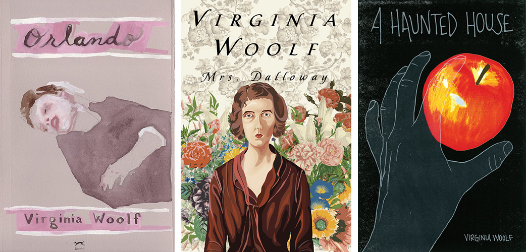 Orlando, designed by Jennie Ottinger (not a fan cover exactly, but a piece from her Read the Classics series); Mrs. Dalloway, designed by Anita Stevens Rundles; A Haunted House, designed by Krista Quiroga
Three fan-designed series treatments:
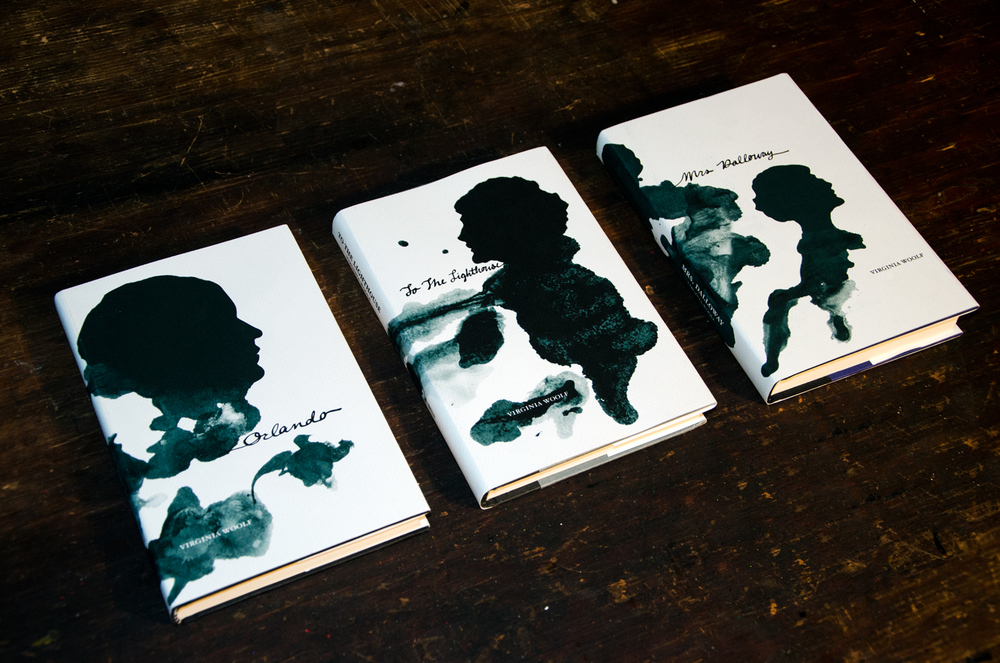 Orlando, To the Lighthouse, and Mrs. Dalloway, by Caitlin Alderfer
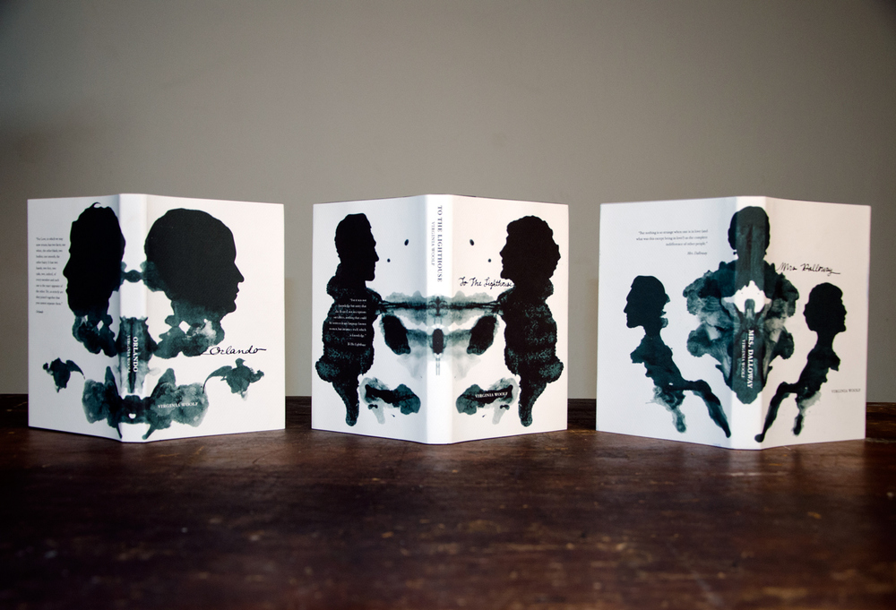 Orlando, To the Lighthouse, and Mrs. Dalloway, designed by Caitlin Alderfer
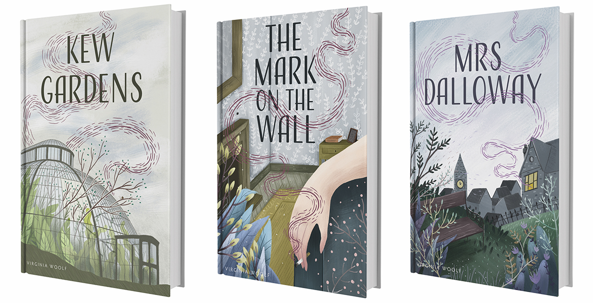 Kew Gardens, The Mark on the Wall, and Mrs. Dalloway, designed by Lucy Semple
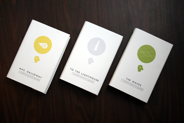 Mrs. Dalloway, To the Lighthouse, and The Waves, designed by McKenna Kemp
Emily Temple
Emily Temple is the managing editor at Lit Hub. Her first novel, The Lightness, was published by William Morrow/HarperCollins in June 2020. You can buy it here.