75 Covers of The Master and Margarita, Ranked, With Comment
One of the Great Books of the 20th Century, Perfect for the 21st
Last year marked the 50th anniversary of Mikhail Bulgakov’s dark and beloved satire of Stalinist Moscow, The Master and Margarita, in which the Devil comes to town accompanied by a big, black talking cat (among others). As shadows lengthen now in the corridors of American power, many are looking to the past, to the hard lessons of 20th-century totalitarianism, to better understand this dire present. Wth recent news of its impending adaptation to the screen, The Master and Margarita is one such lesson that seems as relevant as it ever has. On an entirely less serious note, here then—on the 77th anniversary of the author’s death—are 75 of the book’s covers, from around the world, ranked (with comment).
75.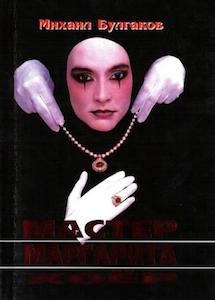
Russia (2000): Russia at the turn of the millennium was full of neo-liberal promise, new money and lots and lots of disembodied hands in white gloves. So this cover was just an ugly product of its time.
74.
Poland (1987): No account/allegory of the time of Stalin’s purges and its attendant performative atheism is complete without a lot of serious blue eyeshadow.
73.
Slovakia (2002): Here is maybe Jesus with boobs and a lot of blood. (Tied for worst with the first two, to be honest.)
*
72.
Russia (1986): Is this a famous painting? Because if it is it looks like the weekend cleaning lady doused it in Windex. Also, more Jesus with boobs?
71.
Spain (2005): When you’re really behind on your cover design and all you have is an old guidebook and some markers.
70.
Russia (1989): Sometimes that quick sketch of Kate Jackson your niece made on the back of a placemat at the GUM cafeteria is the way to go.
69.
Greece (1991): Actual photo of Karl Lagerfeld.
68.
Portugal (2007): So… Is this a famous painting? A really, really shitty famous painting?
67.
Finland (2007): This image embodies all of our very worst fears about audience participation.
66.
France (2015): This was almost much higher, because it is a puzzled cat in a tiny crown. But it’s a puzzled cat in a tiny crown, so it’s not.
65.
Latvia (2000): Creepy but not in a good way is a thing that’s happening with a lot of these covers.
64.
Italy (1992): This looks like a jar of hipster spaghetti sauce.
63.

Russia (2014): “Hey guys, do we still have the rights to that Madame Bovary cover image? Let’s just use that.”
62.
Poland (1995): Seriously, how have we gotten this far down in the list without any images of black cats?
61.

Mexico (2015): Thank you, finally, a black cat. A really big poorly rendered black cat atop some hastily clustered Orthodox onion domes, sure, but we’ll take it.
60.
Italy (2008): This is pretty ok because yes, sometimes Metro North can feel like it’s full of the Devil’s own shock troops.
59.
England (1988): They say the eyes in creepy Russian street art follow you wherever you walk.
58.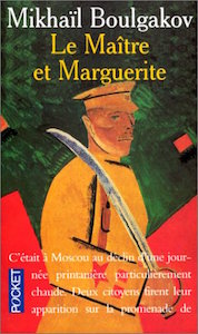
France (1994): This cover—a good painting! decent type treatment!—would be much higher if it weren’t for the blaring logo and pull quote.
57.
Italy (2010): Black cat number two! (Don’t worry, they’ll start to show up soon in large numbers, like an infestation.) This one’s named Gianni and was photographed on Take Your Black Cat to Work Day.
56.
Italy (2007): Wow, ok. This cover is… fine? It’s a nice enough cover! Doesn’t convey much of the dread and menace of the book, but… Yeah, it’s fine.
55.
Bulgaria (2005): Shortly after this photograph was taken Bulgakov took out a very tiny phonograph and played the theme to Mighty Mouse.
54.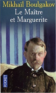
France (2005): Who’s this guy? Looks mad and sort of Swedish. Fine.
53.
Poland (1992): It must have been really satisfying to read The Master and Margarita as the Soviet Union and its grim bloc fell apart. Also, there should be more black cat stencil street art.
52.
Italy (2014): Bertie Wooster really is kind of a devil. And this cover would work on a bookstore shelf.
51.
England (2003): If Donald Trump and Ted Nugent had a cat baby it would be this purple cat baby, by the fire, shooting a bullet into the heart of American democracy.
50.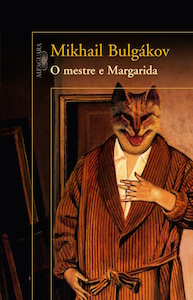
Brazil (2010): Suitably terrifying and unpleasant, this cover needs to be on some kind of registry.
49.
Poland (2007): Who knew a random flyer for an anarchist furry cosplay rave would work so well for this cover?
48.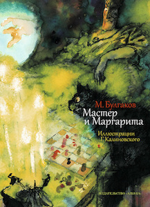
Russia (2014): This painting, though maybe a little on the nose, has an always appropriate arresting/upsetting Ralph Steadman vibe to it.
47.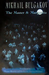
England (1991): This is probably what it would look like if everyone suddenly stopped dancing upon realizing the Devil had just come to town with a crazy weirdo entourage.
46.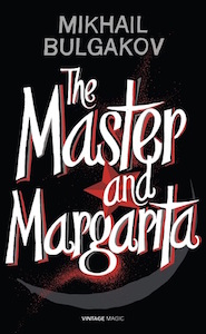
England (2014): Here we go: Black, white, and red, manic typeface, menacing hammer and sickle as visual subtext… Formulaic but effective.
45.
Romania (2003): You can actually go wrong by using a Marc Chagall painting as a book cover, but it’s hard to do—lime-green bars is one way to start. Even still, this is pretty good!
44.
England (2004): Do you guys remember that awesome episode of Miami Vice where the Devil comes to South Beach and brings a big demonic bipedal cat with him? Major points for ripping off the look of the controversial, love em-or-hate em Vintage Contemporary covers from the 1980s.
43.
Japan (2000): This is cool because it doesn’t even look like a book cover but rather like a recruitment poster for a cool teen army in suburban Osaka.
42.
Romania (2015): It’s hard to argue with a sinister man in black in a fancy hat with his back to the camera cavorting with a black cat.
41.
Russia (2013): It’s hard to argue with a sinister man in black in a fancy hat with his back to the camera cavorting with a black cat.
40.
England (2006): Big Moon / Lil Devil / pretty good cover.
39.
England (1974): When in doubt you should put a nice old painting or woodcut on you book. That, plus decent typography and an ok palette is sure to land you right in the middle of lists like this!
38.
Italy (2014): This would be the perfect cover if you could see the cat’s face. Why can’t we see the cat’s face!?
37.

Turkey (2010): If we saw this cover while scrolling through Netflix we’d definitely stop to at least read the synopsis, and that synopsis would read: “Kevin the cat thought he was really a minotaur, and no one could convince him otherwise.” And then we’d keep scrolling.
36.

Russia (1969): One of the more dynamic jazz trios of the late 1960s, the lighthearted energy of Two Men and a Cat’s breezy post-bop is captured perfectly by this 1969 album cover.
35.

Bulgaria (2012): Fully approve of this Ralph Steadman/Bloom County mash-up (would have cracked the top 25 with a better type treatment).
34.

Latvia (2006): Sometimes a stock photo of a black cat is all you really need for a middling cover of The Master and Margarita.
33.

Bulgaria (1990): Not sure of the artist, here, but despite the notes of pastel, there is some serious dread in this cover, and that’s a good thing.
32.

Italy (1996): Pretty sure they printed the wrong cover and this is really an early Ferrante novel. But major points, anyway, for the break from malevolent cats/dudes.
31.

Finland (1996): Sure, the illustration may have been ripped right off the binder of a Helsinki high schooler, but we’d marry that typeface if it asked.
30.

Finland (2006): A decade later and that same Helsinki high schooler became a graphic designer with a taste for high-end American furniture catalogs. Classy.
29.
Russia (2015): Because isn’t it really just an adorable love story in the end?
28.

Italy (2005): No jokes, here. Just a pretty cool black cat hanging on a red block. Pretty cool.
27.

Vietnam (2006): To be fair, it’s really very hard to get Ghostcat to sit still. That’s why he always makes for interesting covers.
26.

Italy (2015): We’d consider going into debt for an MFA just so we could hang this on the wall of our dorm room.
25.
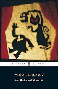
UK (2001): Oh hello there Penguin Classics… you put the classy in… classics. With art. (A little staid, though, no?)
24.
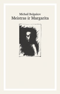
Lithuania (2004): We want to assume this is a limited-edition woodblock bundle of lovely art bookiness, as nice to hold in your hands as it is to read. And so we shall.
23.
Estonia (2010): Frankly, though nice, the last three covers have been a little too elegant for such a loud, garish, twitchy novel. More outsidery art like this, please.
22.
UK (2004): Scary. This cover is scary. We are scared.
21.
Estonia (1968): Ok, so faded beige and a certain red are very close to this website’s heart (which is also faded beige). But what’s with those old roadhouse Ms?
20.
Turkey (2013): BULGAKOV. SIMPLE, BRUTAL, JUMBLE. (One hardly notices the red cat just hanging out behind the big, bold type treatment. Which is fine.)
19.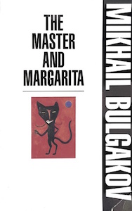
UK (2010): Simple and crisp, it’s nice to have a little breathing room on one of these covers, which are, by and large, claustrophobic and crazy.
18.
Denmark (2010): Our first cover to crack the top 20, almost entirely because of that pretty, pretty typography.
17.
US (2007): There is no fate worse than having your red-eyed cat pull off your head and beat you with it. None.
16. 
Sweden (2006): Anarchist signboard or book cover? Would work well as both.
15.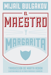
Spain (2014): Hipster diner menu or book cover? Would work well as both.
14.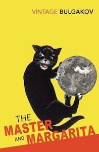
UK (2004): So much to love here: “I’m a crazy big cat gonna scratch up yr puny moon!” That yellow. No serifs. That red.
13.
US (2016): By now you can probably tell there are colors and typefaces that work for us. If not, they’re all on this cover.
12.
Italy (2009): This is a beautiful drawing of a cat; and that green is just sickly enough to convey the deep queasy brilliance of the book. Bravo.
11.
US (2013): One time we were at a party with three different people wearing this same mask and one of them was drinking margaritas and it was probably the ghost of Bulgakov or at least Trotsky.
10.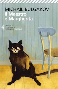
Italy (2004): This cat looks like how we have felt through the creation of most of this list. Points for relatability.
9.
Turkey (2012): Sketchy-looking pervert cat in the creepy green trench coat, aka 2017’s brand. Perfect.
8.

US (1967): That is exactly what a cat looks like when he’s about to shoot you. Trust us. Major points for verisimilitude.
7.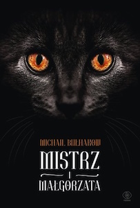
Poland (2015): No matter where you walk in the entire bookstore, the eyes of this cat are upon you, judging you, probing the darkest recesses of your soul. And that, friends, is what makes a good book cover.
6.
Lithuania (2012): So much lovely empty space, so clean, the barest rumor of a foreground… And those golden domes! This is great.
5.
US (1996): So much menace and elegance here, like a Patricia Highsmith novel except with talking animals.
4.

Sweden (2001): What is going on off camera in that terrifying pink room that is the color of a cat’s tongue?! The expression on the cat and the bold typeface are great.
3.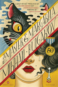
US (2016): Has there been a graphic novelization of The Master and Margarita? If so, this would be a great cover.
2.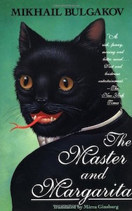
US (1994): That green, the forked tongue, the cursive… This cover is almost perfect.
And…
1.

UK (2008): Oh dear god. (This selfie-as-cover was literally conceived of, shot, designed, and laid out by the actual Devil, and is, at risk of our immortal soul, the best. )
Jonny Diamond
Jonny Diamond is the Editor in Chief of Literary Hub. He lives in the foothills of the Catskill Mountains with his wife and two sons, and is currently writing a cultural history of the axe for W.W. Norton. @JonnyDiamond, JonnyDiamond.me


