Who wore it better? US book covers vs. their UK counterparts.
As you may already know if you’re a frequent reader of this space, I love thinking about book covers. One particular sub-pleasure of this is comparing US and UK covers; it’s fascinating to see different designers’ takes on the same book—and because the UK is most closely linked market to ours, there are plenty of opportunities. It’s extra fun at this point in the year, when we’ve seen some of these covers hundreds of times, and they’ve reified in our brains as being synonymous with the book itself; it makes that previously unseen version feel all the more exciting. It’s like seeing a good friend in a fresh new haircut. Or a fresh new face. But not in a murder-y way. So here are a few American book covers from 2020, side-by-side with their across-the-pond counterparts. Which ones are better? I’ve added my two cents, but as always, that’s just like, my opinion, man.
And we’re off—US on the left, UK on the right:
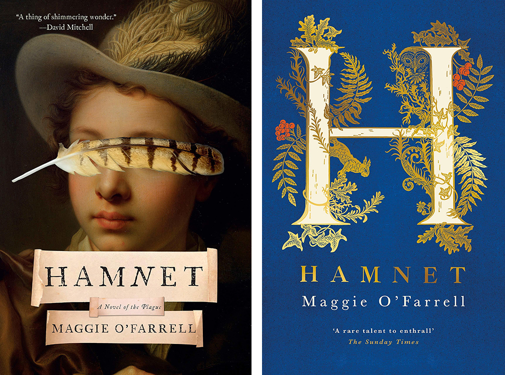
The gilt is cool, but that feather is divine.
Winner: US
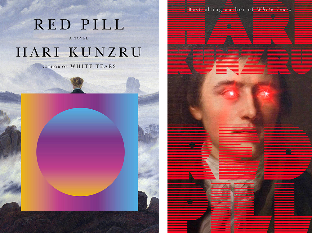
Oh no. These are both amazing, and kind of in the same way: taking a classic painting and making it insane. We’ve got John Gall for the US, and Craig Fraser for the Scribner UK edition. But in the end, I think the laser eyes put Fraser’s version over the edge for me.
Winner: UK, by a hair
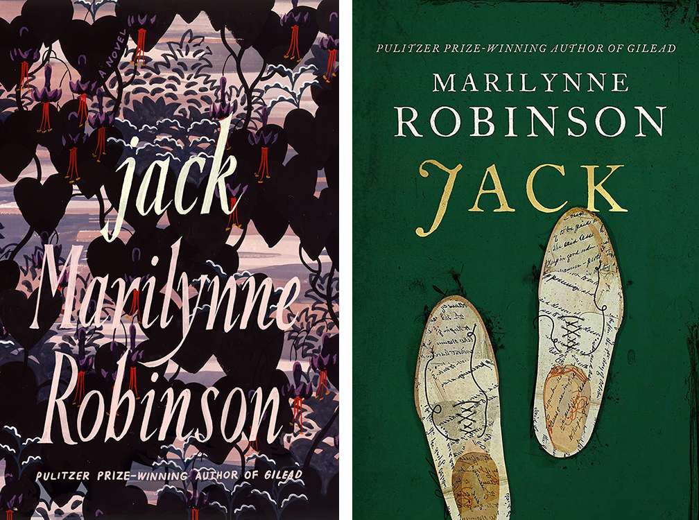
I do love the green and gold for this novel, but the UK cover is a little tweedy, whereas the US version, designed by Na Kim, treats Robinson like the literary powerhouse she is.
Winner: US
Much as I love the Lolita nod, I’ve got to go with the outstanding color story on the UK cover.
Winner: UK
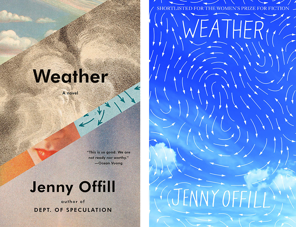
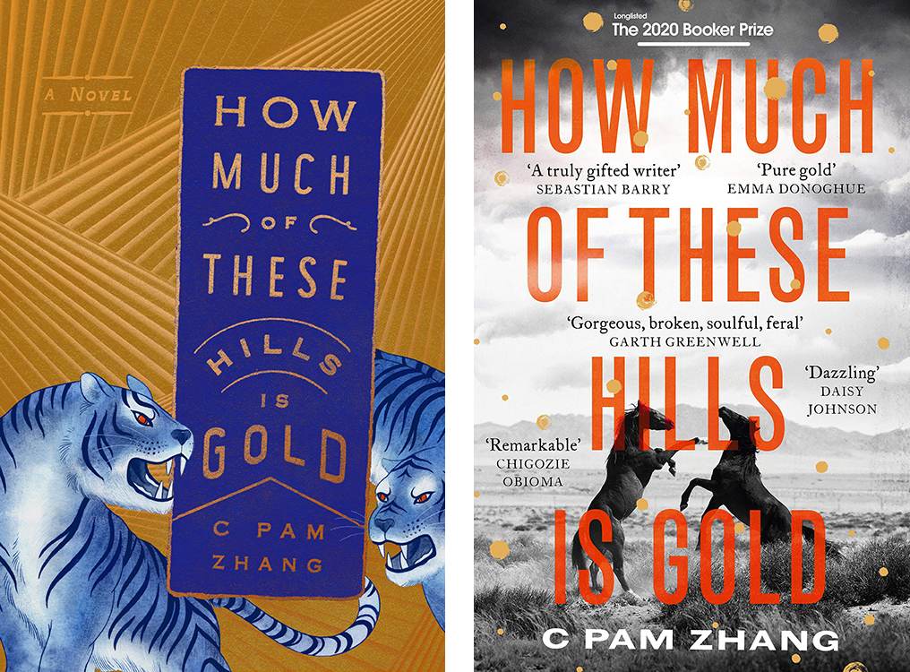
Tough one. I love the John Gall collage, but Granta’s cover, designed by Gray318, is also excellent in a different way. I love looking at them both, and I love that they speak to one another with the repeated arrows, too.
Winner: US, by a hair
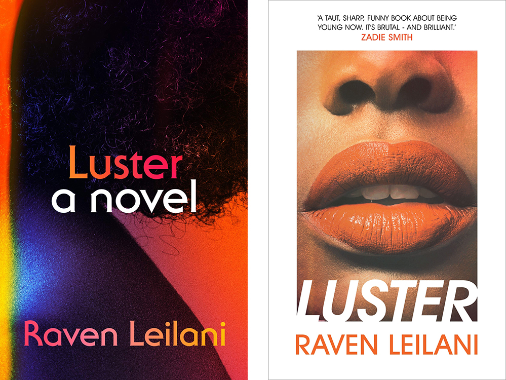
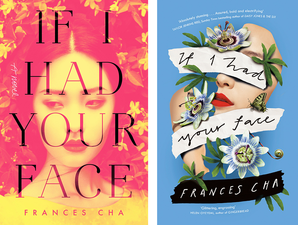
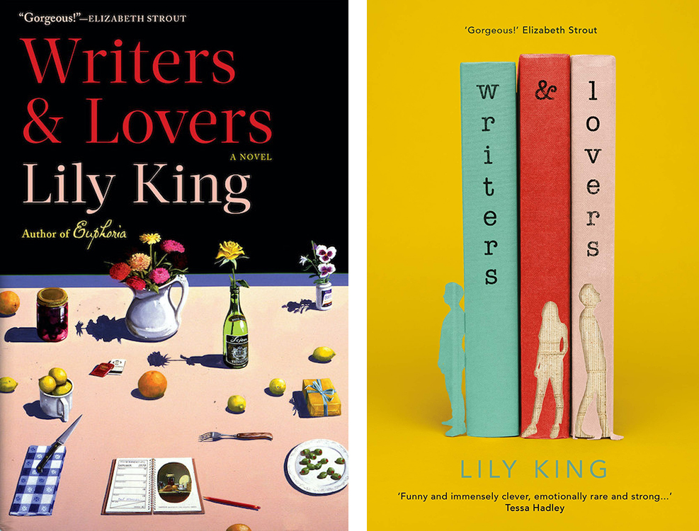
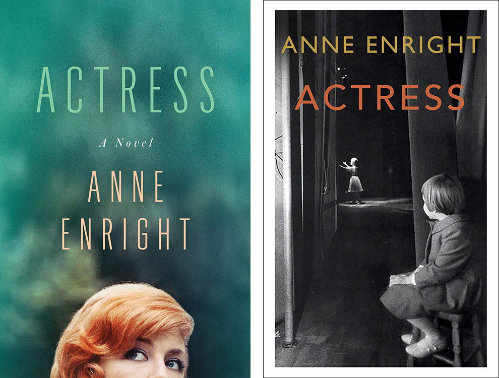
Two very different treatments, but like the novel, both give us a close zoom into a woman’s body, and both, oddly, give me a real 70s vibe. I like them both a lot, but Na Kim’s version is a little less expected and less obvious, and that gives it the edge for me.
Winner: US
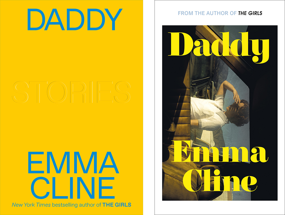
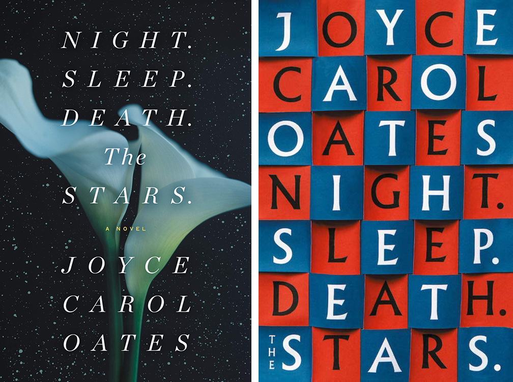
This is close, because the plain yellow is very cool and bold, but in the end, the photograph brings up more for me. (Also: 70s again!)
Winner: UK
These are two very different covers. Normally the UK version would be more my speed—I love anything disjointed—but it’s the US version I can’t stop looking at.
Winner: US
The designers have spoken, and they love Jamie Keenan.
Winner: UK
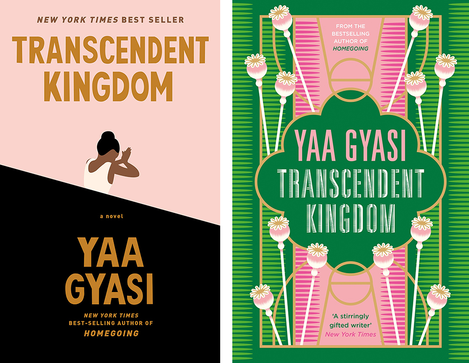
I like both color stories, but Kelly Blair’s pink, black, and gold just feels more iconic.
Winner: US
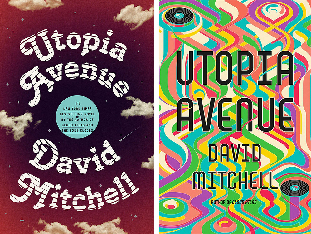
Gotta go with the psychedelics, whenever offered.
Winner: UK
Similar color stories here, but I prefer the seriousness of Kelly Winton’s take.
Winner: US
These two covers each highlight different aspects of he novel, so it’s a tough choice. It kind of depends on what appeals to you. But for me, with the yellow text and the cross shape, the UK cover is more striking in a vacuum, so—
Winner: UK
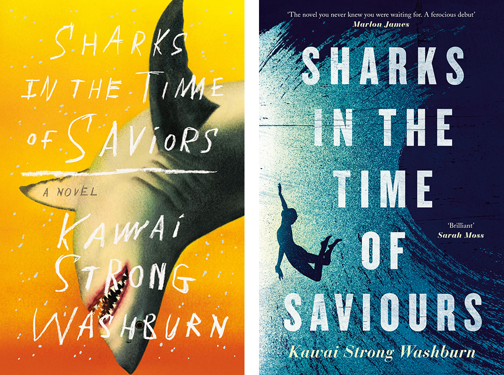
Hello, one has a shark on it.
Winner: US
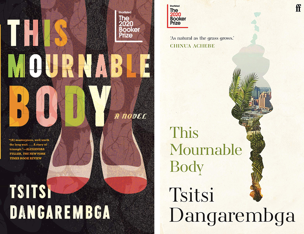
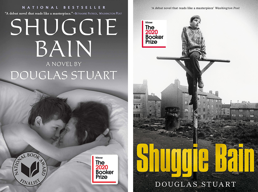
I have a grudge against feet on book covers, I guess. Both the text treatment and the windowpane effect on the Faber edition are much more appealing.
Winner: UK
Another case of liking both. In this case, I prefer the UK cover more as art, and the US cover more as a book cover—it jumps off the screen (or shelf).
Winner: US
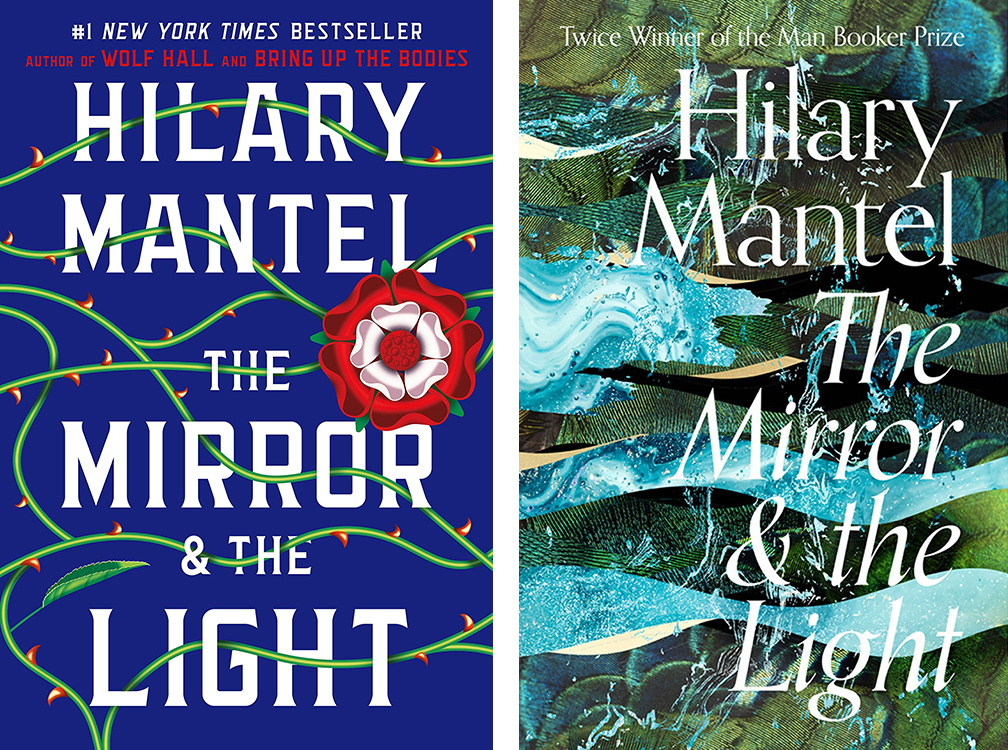
Both give you the Big Book Vibe, but the UK version has so much more depth. No-brainer.
Winner: UK
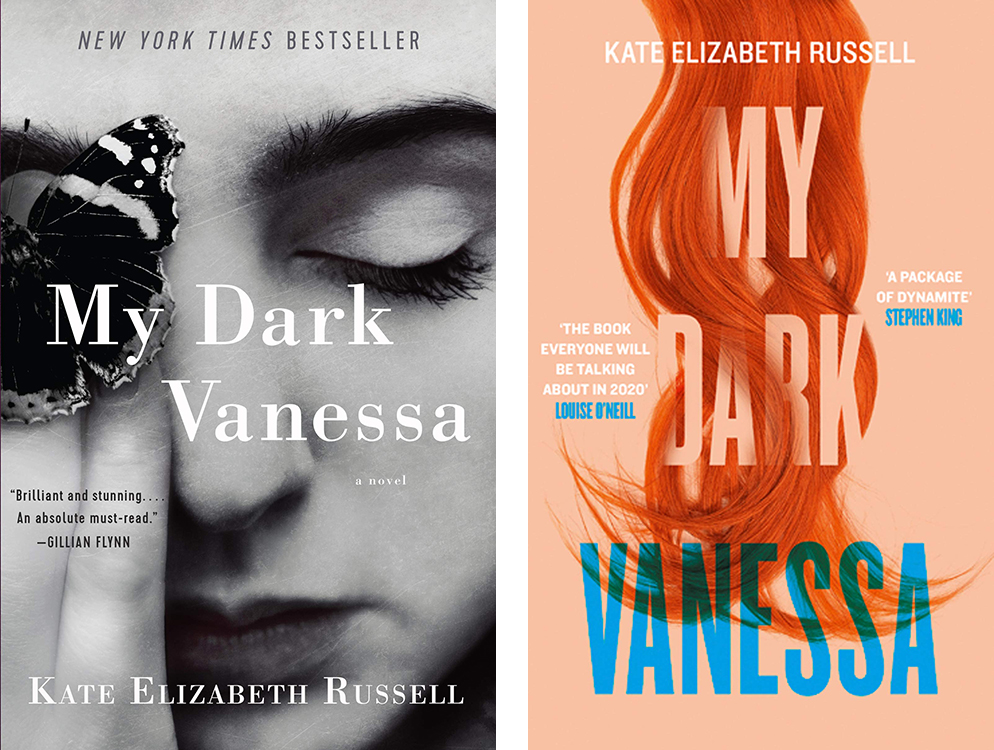
Can’t beat that gorgeous skin-as-texture black and white cover by Thomas Colligan. I wonder how I would feel about the UK version if the boxed image had been the whole cover, but I guess we will never know.
Winner: US
Very different takes here. Neither is revelatory, but both feel solid, so I’m torn. Let’s go UK, for the sass.
Winner: UK
Both of these are great, but Grace Han’s cover is so unlike any I’ve seen before that it has to win.
Winner: US
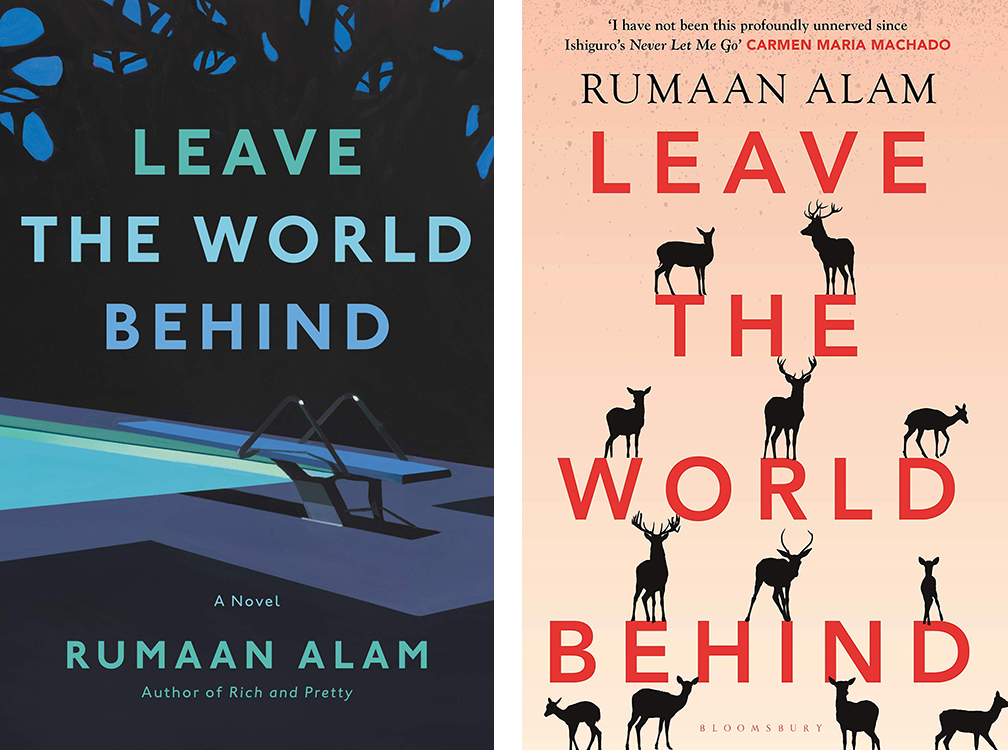
Both covers are clean and enigmatic; but the deer run the slightest bit twee for me, giving Sara Wood’s take the edge.
Winner: US
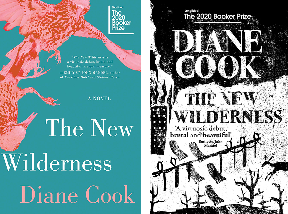
I love the daring of the black and white woodcut-style, especially for this book.
Winner: UK
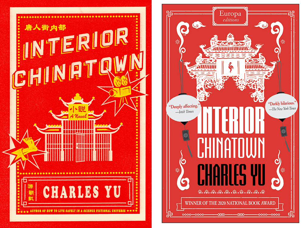
These are so similar that you wonder why they even changed the design. The US version is brighter, and a bit cheekier.
Winner: US
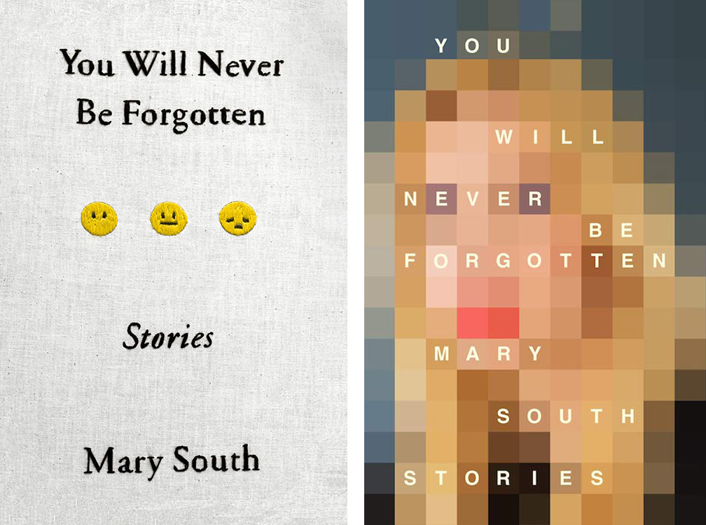
Both covers for Mary South’s collection are very good, and both feel special and specific in different ways: the US cover, designed by Alex Merto, features unique embroidery by Alex Stikeleather; the UK cover, again designed by Jamie Keenan, is a pixellated version of South’s author photo. In the end, though, I love the audacity of Keenan’s vision.
Winner: UK
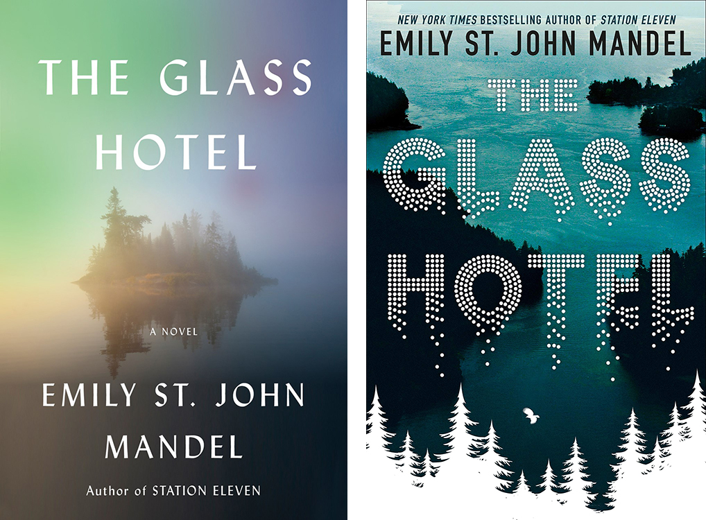
Both of these covers are doing interesting things with reflection. The UK version reminds me a little of the UK paperback of Cloud Atlas, but I think the US version captures the mood of the book a bit better.
Winner: US
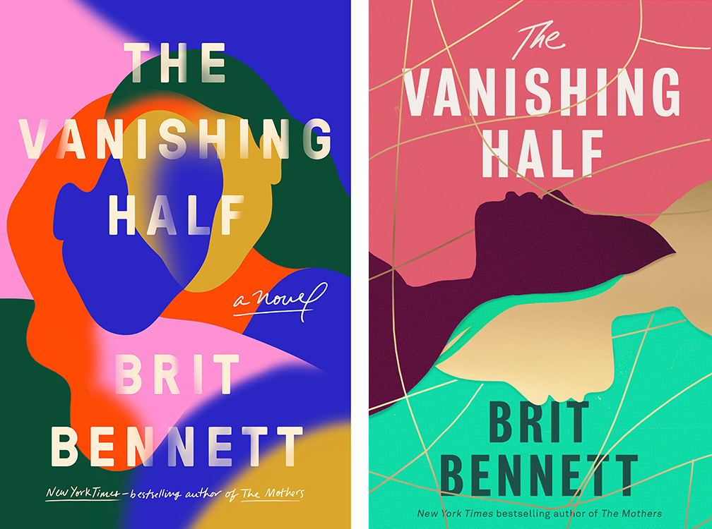
Color block against color block, I prefer the subtler version.
Winner: US
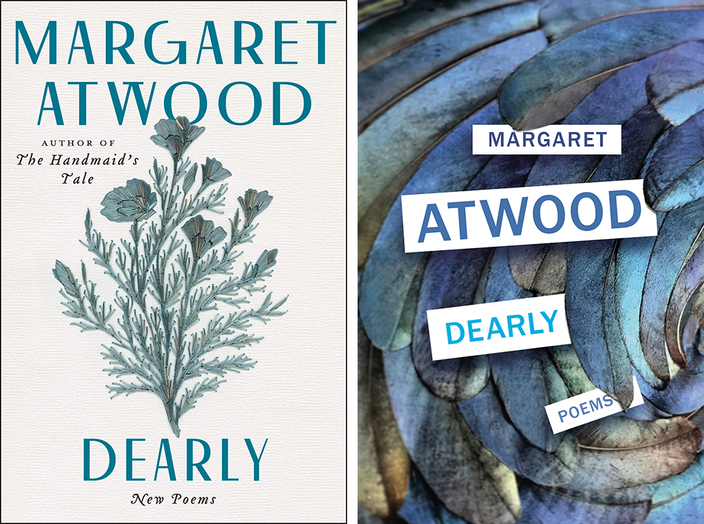
There’s something slightly fusty about the US cover; not so the UK version, which feels a lot more dynamic.
Winner: UK
Emily Temple
Emily Temple is the managing editor at Lit Hub. Her first novel, The Lightness, was published by William Morrow/HarperCollins in June 2020. You can buy it here.