When You're Asked to Design a Cover After Others Have Tried...
Colleen Reinhart on the Paperback Reissue of Courtney Maum's Touch
One of the most stressful experiences as a designer is when nothing seems to be working. There are times when everything clicks and you have an immediate idea that is loved by the author, agent, and editor, but a lot of the time it feels like every concept is rejected and the inspiration has run dry. I’ve definitely been there, and it can be indescribably frustrating, especially if you love the book and think you have provided a plethora of viable covers—if only one of them would be chosen! But as any book cover designer will tell you, there are countless reasons why a cover might not be approved, and sometimes what a project truly needs is a fresh pair of eyes. I was lucky enough to be those eyes for the paperback version of Courtney Maum’s Touch.
I don’t know exactly why Touch was redesigned for the paperback release. But I do know from other projects that a redesign for the paperback can be an attempt to reach readers that might not have considered the hardcover. Maum’s works are rightfully treated as literary fiction, which is beautifully captured by Rodrigo Corral’s all-type jacket for the hardcover. Yet Maum’s works are also incredibly accessible, so I had a hunch that the design team was hoping to brand Touch as more approachable. So, for the paperback design, I focused on the romantic storyline to reach a wider audience.

The designers at Putnam were working away on this redesign but struggling to come up with a cover that everyone was happy with. Berkley and Putnam share the creative director Anthony Ramondo, and when this particular cover was proving to be a challenge, he asked if I would jump in and create a few comps. Taking over a project after multiple talented designers have been working on it is a daunting task, but Anthony decided not to show me the previous comps or the notes they had been given so I wouldn’t be bogged down with potential feedback. Instead, I was given a copy of the book and told to read it and “do what I do.”

So, I got busy reading and instantly fell in love with Maum’s story about trend forecaster Sloane Jacobson. It is funny and warm while also providing harsh truths about our dependence on technology. That is a lot to try and encapsulate in one image, but I wanted to convey the tension between human interaction and technology that is a driving force throughout the novel. I looked over my notes and one of the visual elements that really stuck out to me while reading was the Zentai suit Sloane’s “neo-sensualist” boyfriend, Roman, wears as a way to avoid physical touch. The dichotomy between Sloane and Roman and her journey towards intimacy while he moves away from it is such a large part of the story, and a Zentai suit is such a fun visual that I had to incorporate it into a comp.
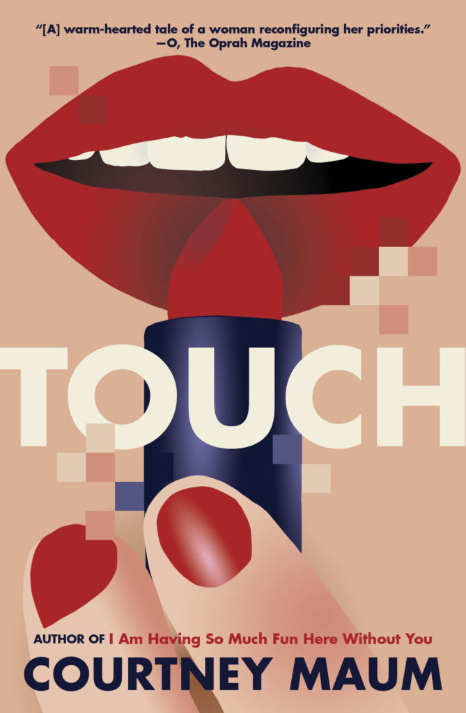
Again, there was so much to try and fit into one image that I had to pick and choose parts of the novel to highlight on the cover. Sloane started her career by predicting makeup styles, so I created a comp of a woman applying lipstick with part of the image dissolving into pixels. Lipstick has such obvious romantic undertones that even without another character on the cover it conveys some of Sloane’s desire for intimacy without showing full figures. I also really enjoyed the idea of pixels on printed material, as if the book itself is walking the line between real life and digital life. This cover wasn’t chosen for a number of reasons, as often happens in the cover design business, but I was able to incorporate the pixels into the spine and back cover of the final version.
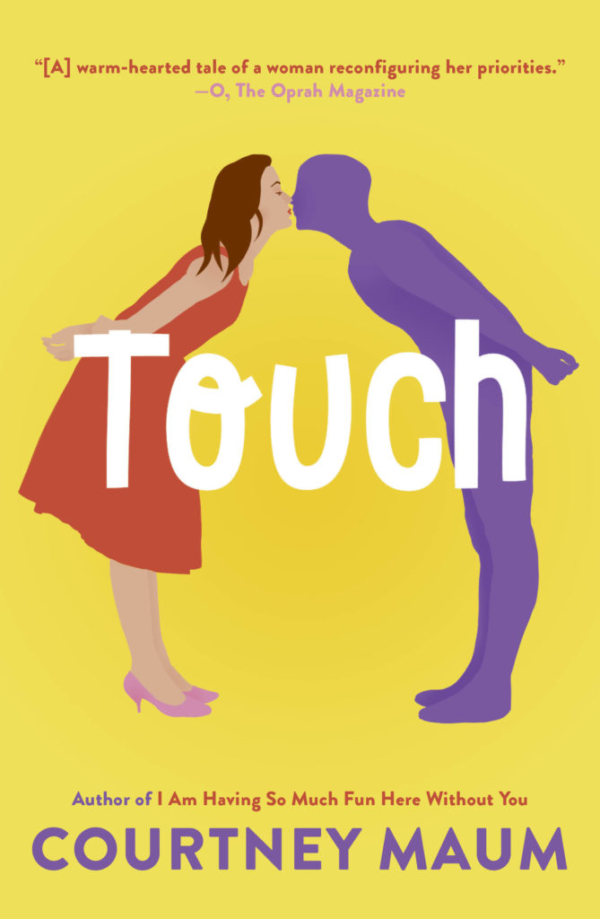
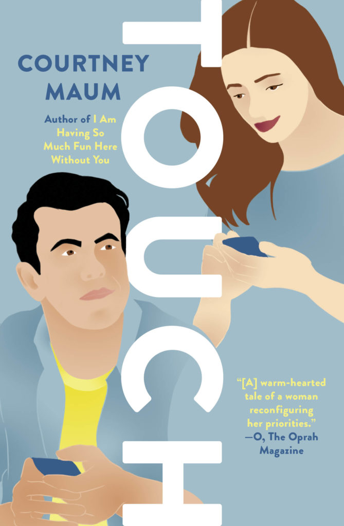
Then, I also tried a more straightforward romance approach, with two figures taking up most of the cover. I have been working on a lot of illustrated romance covers for Berkley, so this felt more in line with that audience, and the vertical type connected to the hardcover jacket.
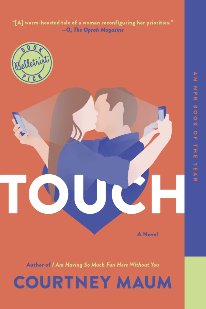
The cover that ended up being chosen was one of the first ideas that popped into my head while reading. I thought that a couple in an embrace while simultaneously looking at their phones could capture the overarching themes of the book without giving away anything specific. And the combination of a tongue-in-cheek illustration and the bright colors are playful in a way that much of Maum’s writing is too.
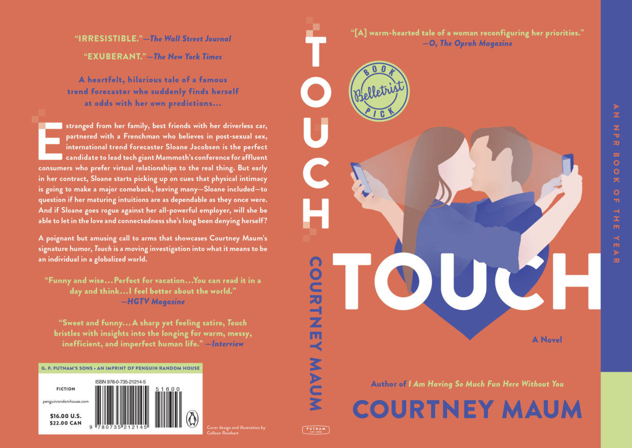
These four comps were the only covers that I showed upstairs and typically there is a lot more back and forth, but I got lucky and the kissing couple was approved with only minor refinements.
Having an ego as a book cover designer is a funny thing. So much of the process is out of your hands, and the end goal is to create something beautiful—but something that highlights another person’s work: the author’s. So, while I am incredibly happy that my cover was chosen for the paperback version of Touch, I can only hope that it does what it is meant to do and encourages readers to pick up Maum’s book and fall in love with it just as I did.
Colleen Reinhart
Colleen Reinhart is a Senior Designer at Berkley, an imprint of Penguin Random House. When she’s not in the office you can find her drawing, or reading.
