True Crime and Transcendentalists: When Designing a Book Cover Takes You on a Long Strange Trip
Natalia Olbinski on Creating the Cover for Ruby Todd’s “Bright Objects”
Designing a book cover is always something of an emotional roller coaster. There’s the excitement of nailing it on the first try (rare!); there’s the low of working hard on an idea, only for it to be discarded; there’s the struggle (every time) and the self-doubt (ever present) that come with trying to visually capture the essence of a book in one composition and within a small amount of space; and there’s the unbelievably rewarding feeling when you receive a note of gratitude from the author.
But the way the design process unfolded for the cover of Ruby Todd’s remarkable debut novel Bright Objects was more dramatic than most, and something I won’t easily forget.
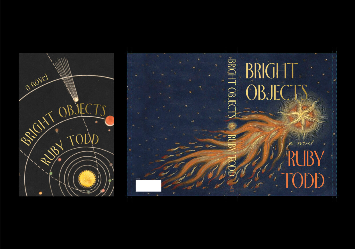
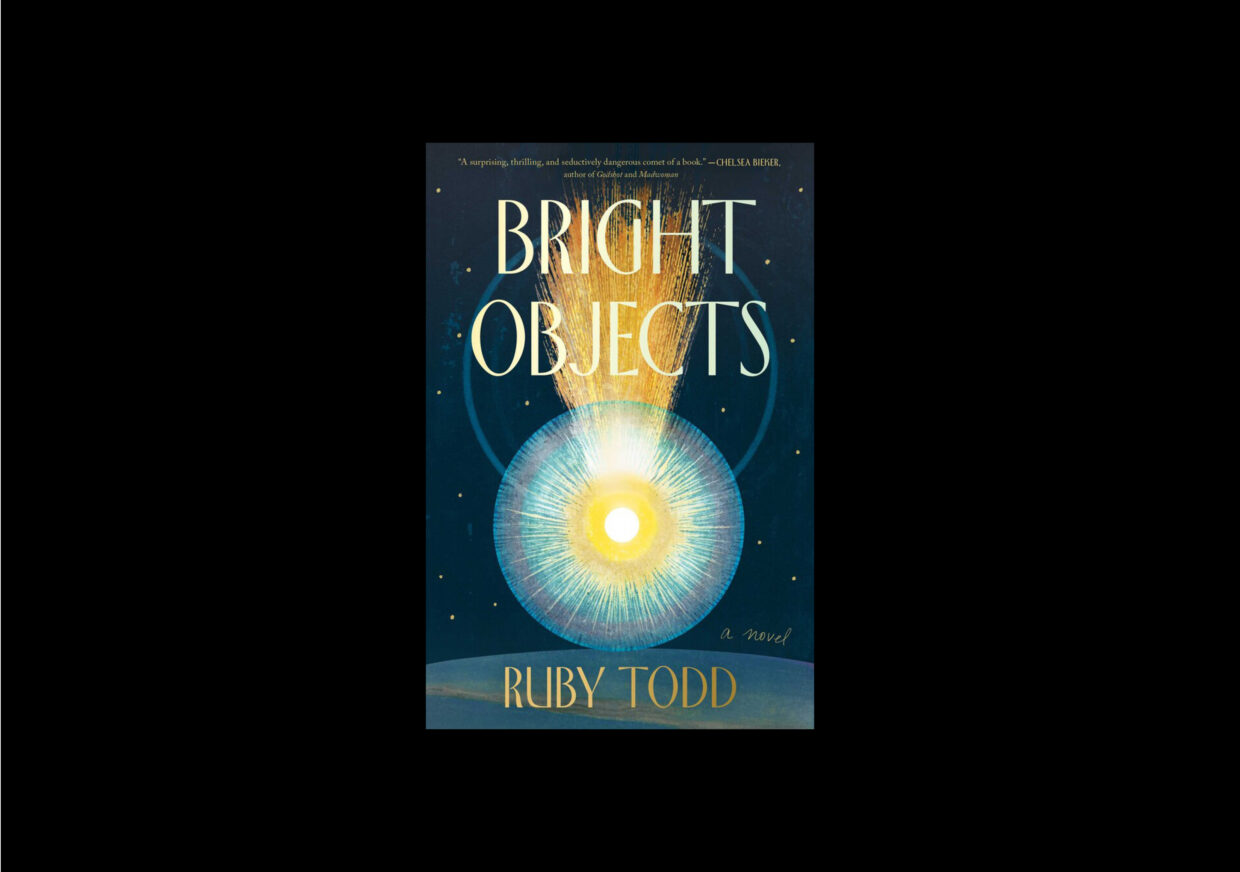
It should have been fairly straightforward. I started out with some 80 initial compositions for Bright Objects—a ridiculous amount—including half-finished sketches and abandoned ideas. I overwhelmed the Art Director, Jackie Seow, with about 40 different options. Then, we whittled them down to 16 contenders. And very quickly, we had a winner. Ruby was in love and so was the editor, Tim O’Connell. The team was ecstatic. Easy—all that was left was the simple matter of licensing the painting I’d used, and we’d be done!
BUT NO. Nothing is that easy. And this cover’s story ended up being as beautiful and strange as the book itself.
When working on fiction, I always read the manuscript twice: first, as a reader to absorb the narrative, and then as a designer. Bright Objects captivated me; the first time, I read it in one sitting. The novel is set in a small Australian town, where an astronomer has discovered that a large comet is heading toward the Earth, a celestial event with both practical and mystical implications. Todd explores themes of grief, existential meaning, and the search for truth—I won’t reveal more—and intersperses the story with the history of comets and the significance humans apply to them as supernatural omens. The novel’s rich atmosphere, weighty themes, and wealth of imagery made it both a challenge and an enormous pleasure to work on. I could have made 1000 more covers and not been able to choose between them.
At the beginning of the process, Ruby provided a few insights that guided my image research and initial concepts. She envisioned the cover with a comet as the central motif, and also suggested evoking old newspaper headlines from historical comets and cosmic events, wanting to evoke a feeling of mystery, even a kind of haunting. So off I went to scour the internet for paintings, etchings, and illustrations of celestial events, mining the cultural history of comets, as well as contemporary paintings, photographs, and scientific diagrams to see where inspiration would strike.
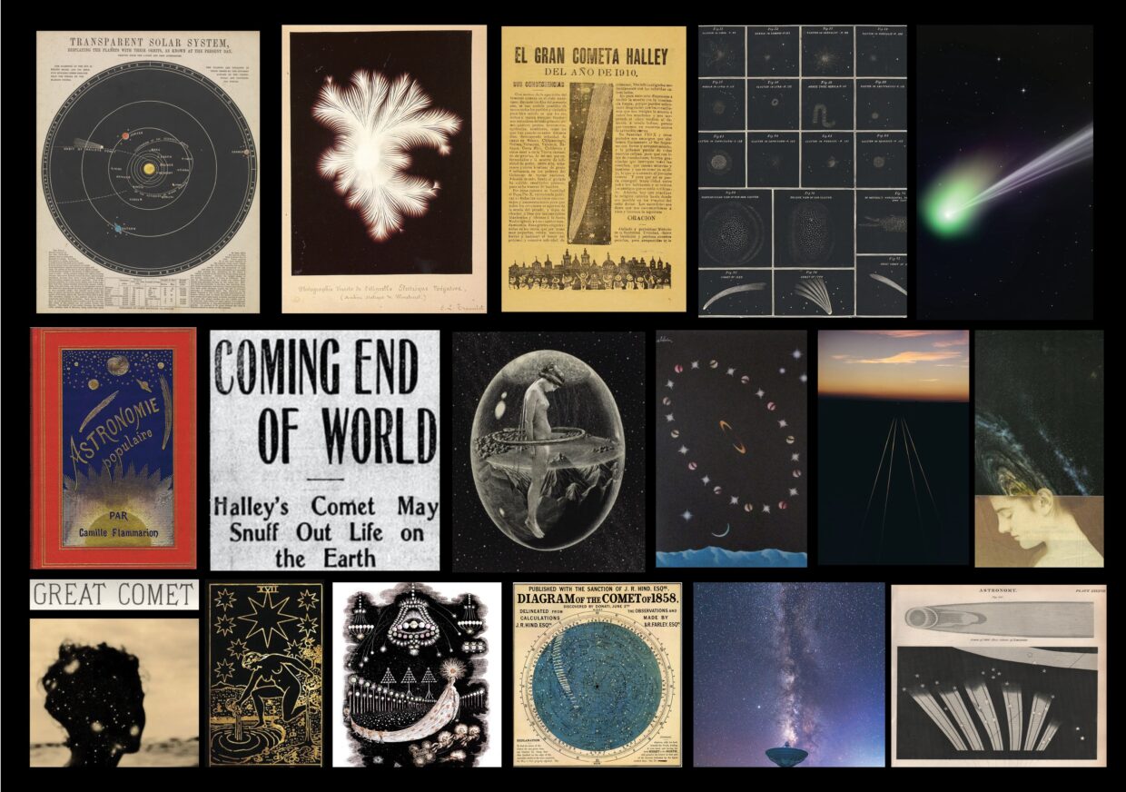
One idea was to try and combine a road and landscape with the comet overhead, which could hint at the setting, as well as the car accident that is central to the story. None of these were quite right—though I did like one of them, which featured two beams, like headlights, and the comet going by in the opposite direction. Other explorations wound up feeling very minimal and elegant, but too quiet. Some featured a woman’s face. These were all missing the spectacle, significance, and mystery of the celestial event.
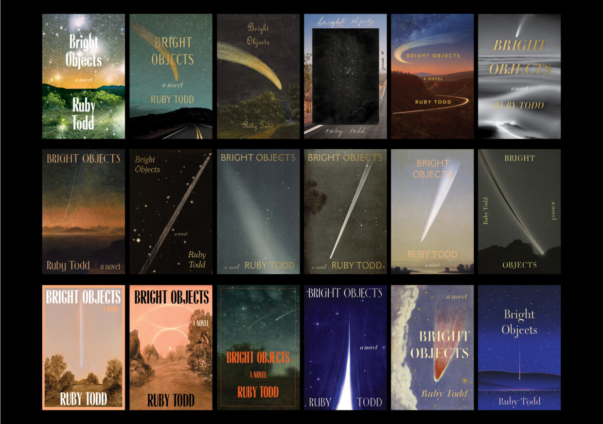
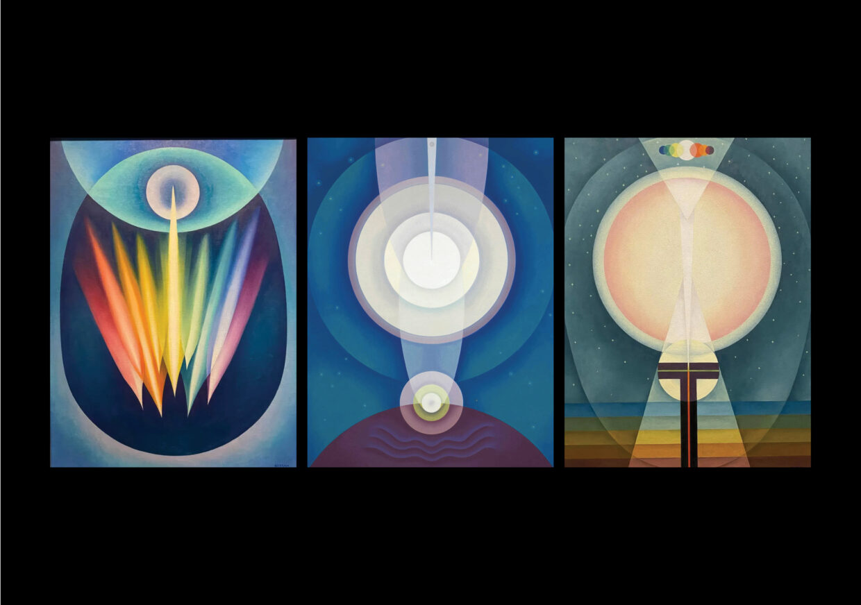
Of this first set that was sent to the author, one immediately stood out to all of us. It featured a 1965 painting by Emil Bisttram, a Hungarian-born artist based in New Mexico. The image was perfect, and so was its context. I imagined a connection between the otherworldly desert landscapes of New Mexico and the remote town in Australia where the story takes place, both ideal for stargazing. Bisttram was also a founder of the Transcendentalist Painting Group, and his abstract work explored spirituality and the nature of the cosmos. The cover was “Emphatically approved!!!” by both author and agent.
Emma Shaw, the Art Assistant for Simon and Schuster’s flagship imprint, who is responsible for managing cover rights and permissions for hundreds of titles each year, was tasked with tracking down the rights to the painting. This was where things started to go astray. “
I quickly discovered that many of Bisttram’s works had been sold off decades ago (and with no comprehensive record of sales),” she told me.
A website dedicated to Bisttram indicated that the author of The Transcendental Art of Emil Bisttram (Pintores Press, 1988) had made a large purchase in the 1980s. I reached out to the author’s son, a successful New Mexican painter, who recalled his father selling many of these works to a Texas-based gallerist. I was able to confirm this detail with the Harwood Foundation, the non-profit organization that curated the book. To my delight, they were able to provide me with the gallerist’s name. I thought I had cracked the case.
Meanwhile, Ruby was so excited by the painting that it had begun inspiring new descriptions in her revisions. But Emma had unwittingly veered into true crime territory.
“A quick Google search revealed articles detailing how the gallerist had been accused of scamming artists in Houston,” she explained. “His gallery was, of course, permanently closed, and my only potential lead was another art gallery that had opened just a block away. I sent them an email inquiring about the gallerist’s whereabouts and waited. Two days later, I received a response informing me that he was in prison.”
As you can imagine, this complicated things: There was no way to license the image. We needed to abandon this cover and use something different. It was difficult to break the bad news to the team and confront their disappointment. We looked at other, licensable work by the artist and revisited a few old favorites from the initial round, but they just weren’t the same.
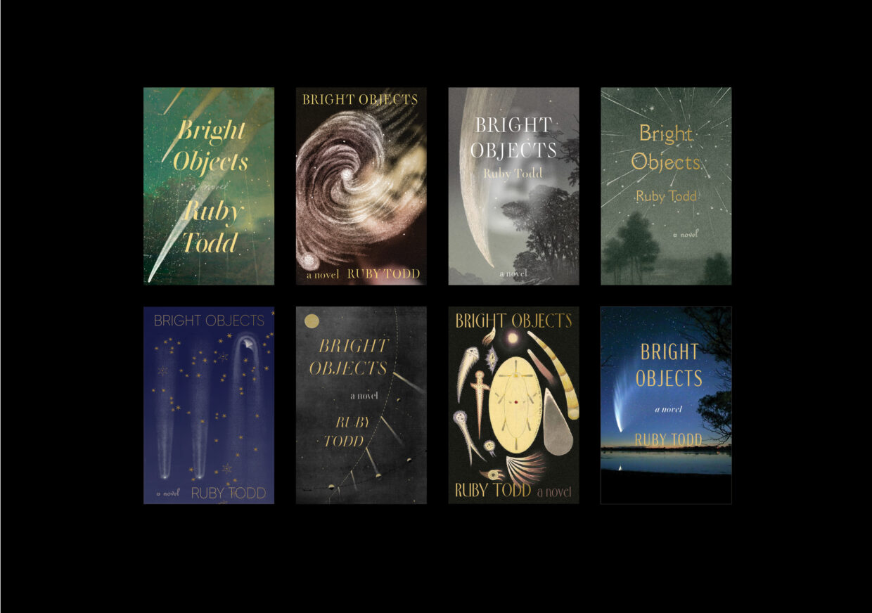
I made a really quick thumbnail mockup using some public domain imagery. I wanted to see if the same effect of Bisttram’s composition could be achieved using illustrations from the 16th century. Jackie and Tim saw promise, and encouraged me to develop the concept further. I sent over a new set and kept my fingers tightly crossed.
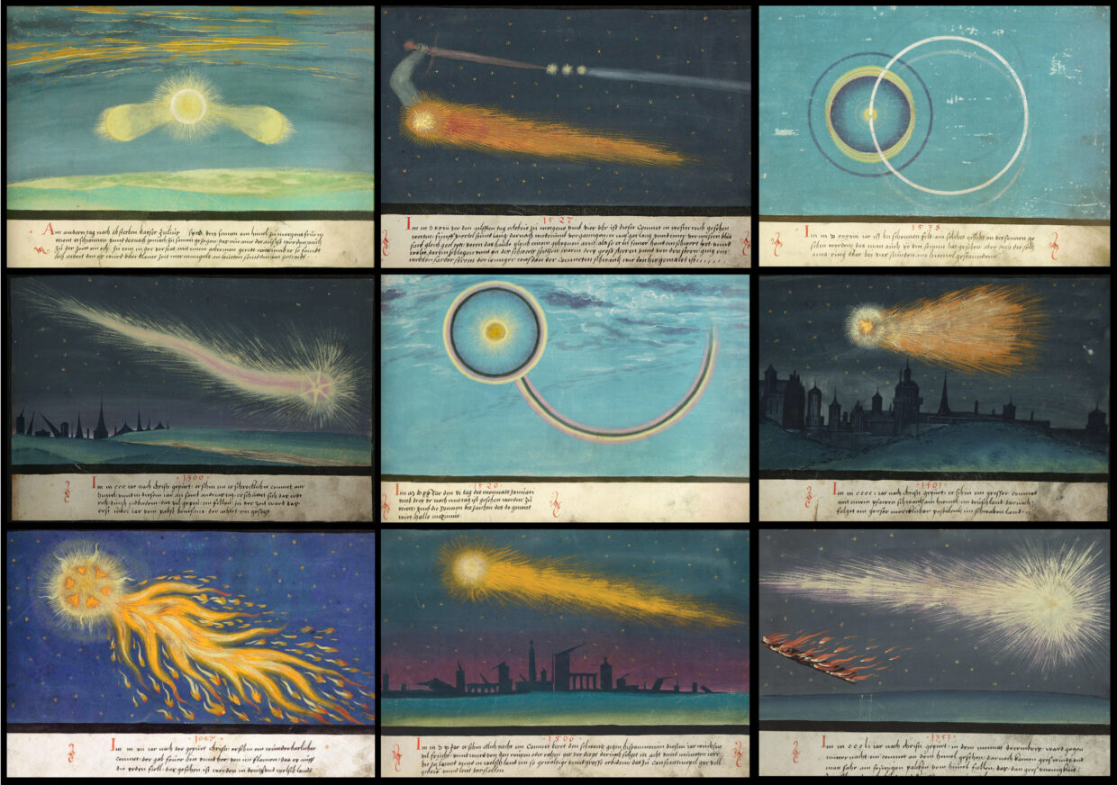 Pages from the 16th century illuminated manuscript, The Augsburg Book of Miracles
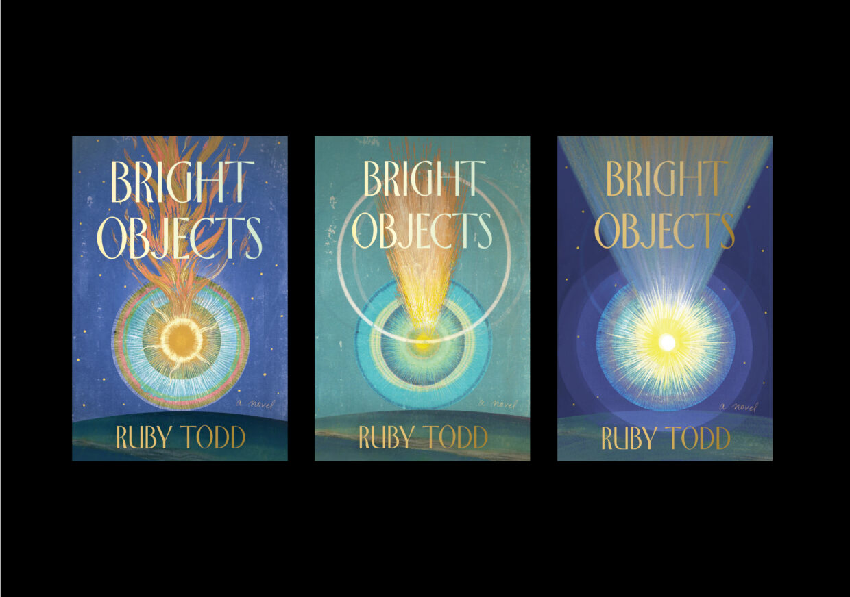
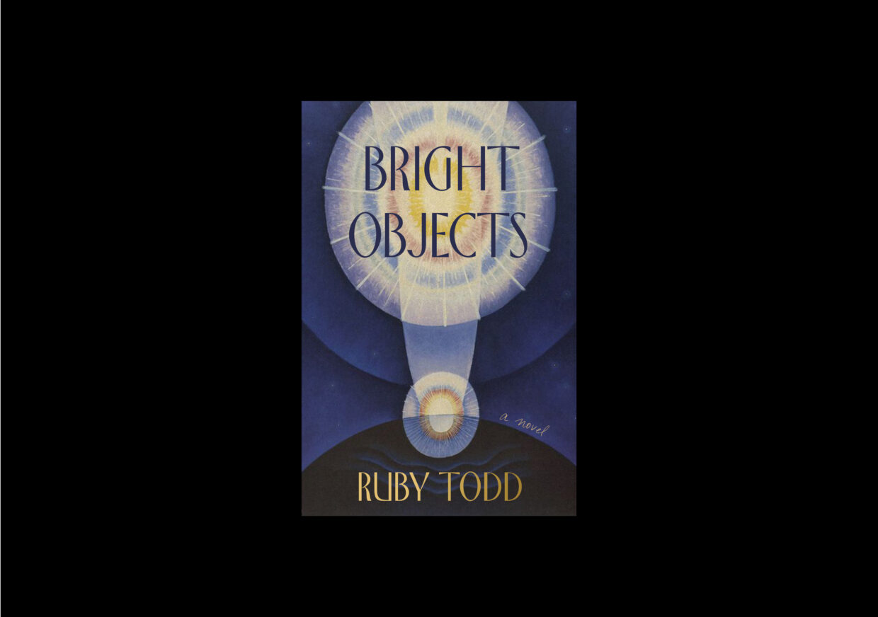
The reimagined covers had a fresh perspective that still resonated deeply with Ruby’s vision. She was thrilled, and felt that the new compositions perfectly captured the essence of Bisttram’s painting. The final cover, born from an unexpected detour and last-minute improvisation, was approved!
Only now do I realize how the twists and turns of the journey that led to the final design—the search through so many images and iterations, and Emma’s diligent detective work and subsequent shocking discovery—in fact have parallels to the novel and its themes. Perhaps the long quest was to be expected, and like the rare discovery of a Great Comet, it was never meant to be easy. But the effect, hopefully, is just as impactful.
Natalia Olbinski
Natalia Olbinski is a graphic designer and illustrator based in New York City, and is currently a Senior Designer at Simon & Schuster. She holds a BFA in Industrial Design from Carnegie Mellon University and an MFA from the Academy of Fine Arts in Warsaw, Poland.