The Trouble With Designing a Book When Its Author is in Jail
Janet Hansen on Creating the Cover for Nico Walker's Cherry
As a senior designer at Alfred A. Knopf, I feel incredibly lucky. Odds are, if I’m passed a manuscript to read, I will love it. And when I’m assigned a novel by a first-time author, an excited, anxiety-driven energy overcomes me. With no prior writing of the author’s to research, I must build from scratch. It’s sort of like learning someone’s deepest secrets the first time you meet them. There’s also the pressure to accurately visualize their voice while still pleasing numerous publishing factions: editors, agents, publishers, sales. Sometimes I wonder if it’s even possible.
Over the years, I have learned it is very easy to become pigeon-holed into designing certain types of books. For example, when I became engaged to my husband, I received a flood of freelance work for novels about women and their marriages. As a result, I now always try to navigate my work and choose subjects that grant me the opportunity to be more versatile.
Although I already design for a satisfying range of literary genres, last summer I asked my creative director if I could work on a book she wouldn’t normally think to give me. She was kind enough to entertain my request, and assigned me Nico Walker’s Cherry.
*
Nico has a blunt and unique voice. Between the gruesome war scenes, the agonizing PTSD, and the dark rabbit hole of drug addiction were fragmented moments of hilarity, love, and goodness. I was surprised at my empathy for this nameless character. He may have robbed multiple banks and held people at gun point, but he did so politely!
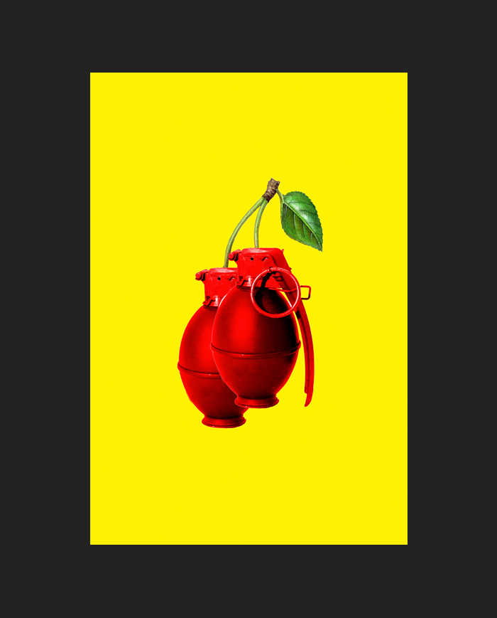
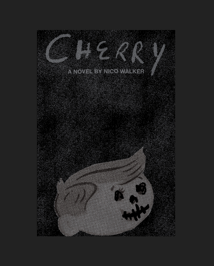
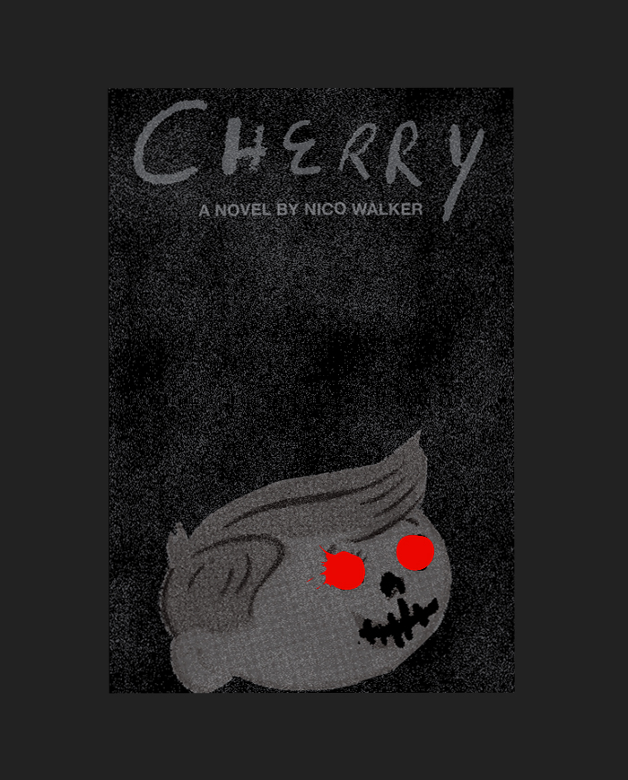
As a general rule, I think it’s best to try to embody the book as a whole, and I think this sketch illustration was a little too specific, addressing only one aspect of the book:
After more trial and error, the sketch below was well received. After a few tweaks, both the editor and publisher were on board:
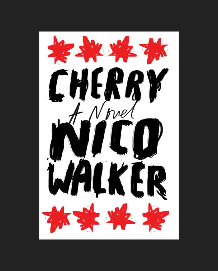
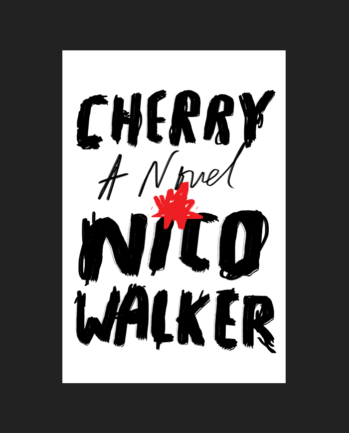
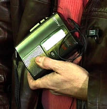
Nico wrote this novel on a typewriter in a federal prison. He’s currently finishing out his sentence with about one more year to go. He has limited access to text-only emails, and they must be sent through a portal and approved by authorities. It could take over a week for him to read a single message.
For the sake of saving time, the editor decided it was best to show Nico’s literary agent first. Not your typical agent, but the manager of the Mississippi-based independent record label Fat Possum Records. I eagerly waited to hear back.
*
Editor: “I’m sorry, he’s not thrilled. He wants to see more.”
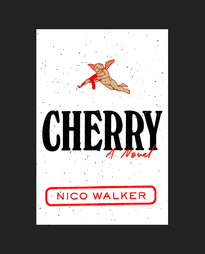
One thing that ties all the different aspects of the book together is the constant smoking. I thought a hint at cigarette packaging would be a good way to show grittiness:
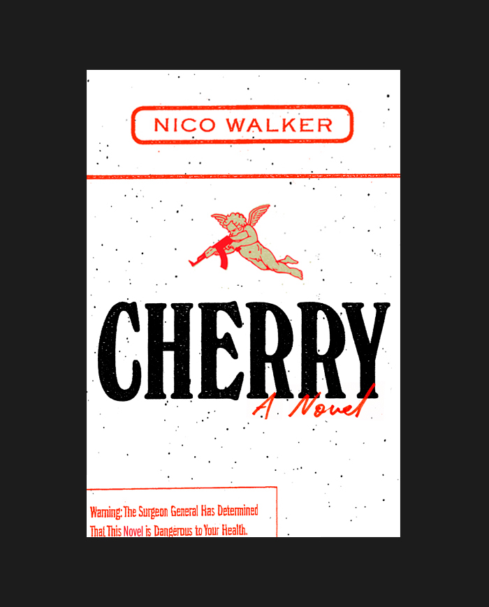
Publisher: “Lose the warning label and the red line.”
Good suggestions.
Editor: “Could you try one that plays off the caduceus?”
A caduceus is a symbol for army medical officers. I also incorporated heroin by adding a poppy to the top. And they were sent off to the agent:
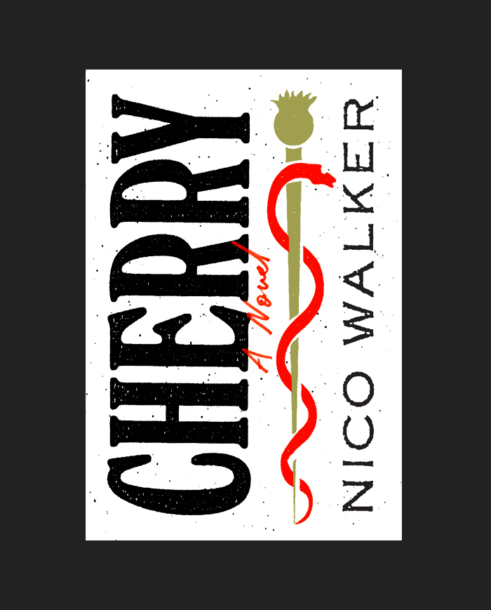
Agent: “This looks like it should be sold in Hot Topic.”
Ouch.
Editor: “Maybe we’re missing something with these—this book is a love story.”
A love story in that Natural Born Killers type of way. But a title like Cherry presented a dilemma. I thought showing love would elude to unfortunate sexual connotations.
I used an exercise, mocking up the work of some of my favorite artists, to help me better visualize a solution. While there was probably no way I would have been allowed to use any of the art below on a book jacket, I gave it a try—in hindsight probably mostly to amuse myself:
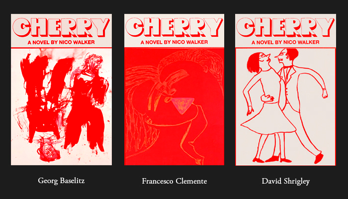
I still felt the idea of showing romance as the primary focus was misleading. I expressed this to the editor, and while he did like the type treatment of these, he agreed.
And so there were more . . .
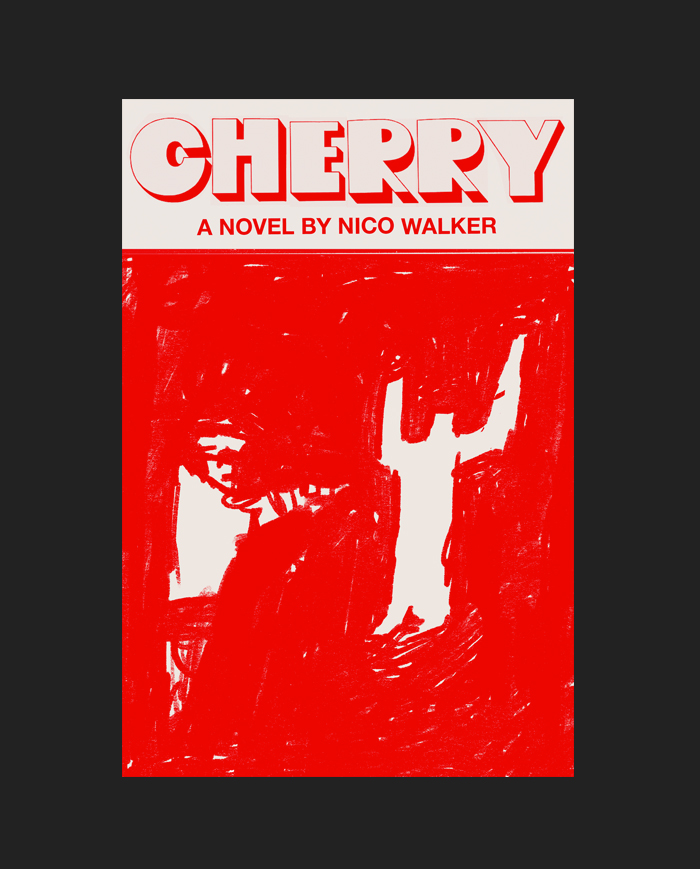
But they received little excitement.
Agent: “What about heroin bags?”
A compelling idea, but it felt too small.
Creative Director (with the warmest sympathies): “Would you like me to give it out to a freelancer?”
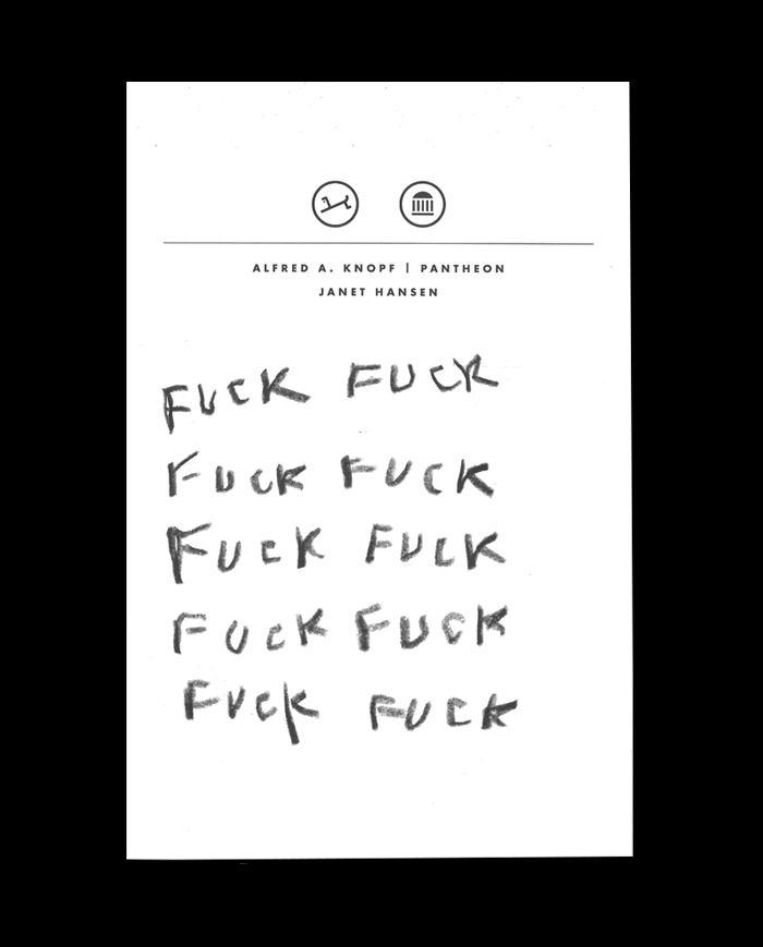
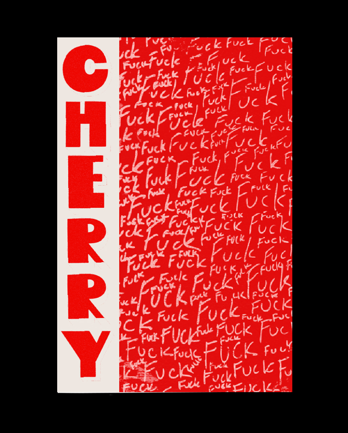
While I think the editor really enjoyed this, I’m pretty sure it didn’t make it past his desk.
I needed to clear my mind. I took another stab at the idea of using a cigarette, but this time with a visual pun:
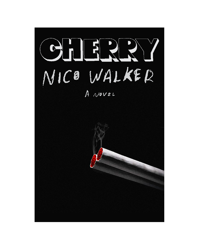
I quite liked it, as did everyone here at Knopf—the dual suggestion of the cherry of a cigarette and also a gun. I thought it would be good to present this with one more option.
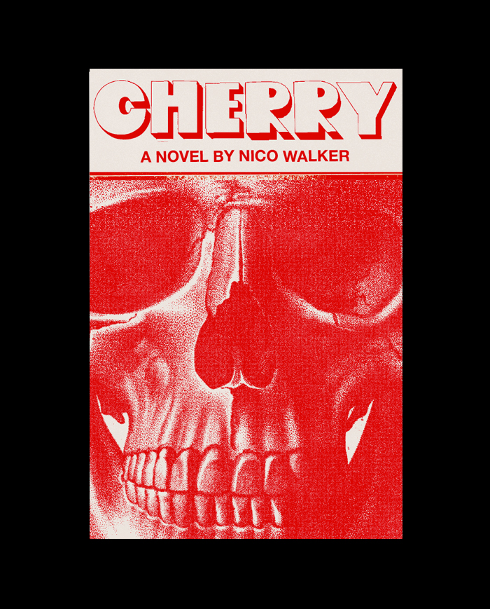
A skull is a good symbol for the book, but the first execution felt too predictable. This is when it dawned on me that there was an important aspect of the novel that I wasn’t including in any of these jackets: the fact that it is uniquely American. I tried adding an American element, with artwork by Daniel Bjugård:
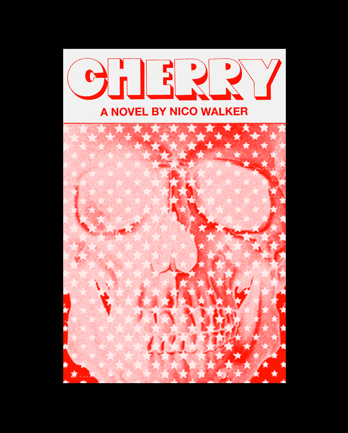
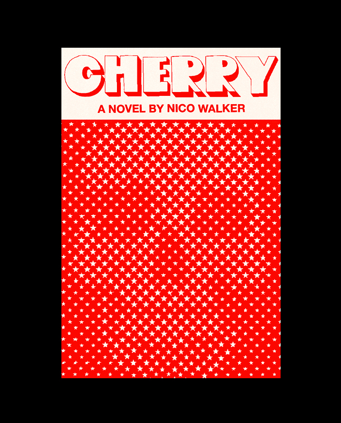
While the last one is too smiley, the surprise element of it being secondary to the stars felt appropriate. Almost like the skull (and all of the darkness in the novel) came about as some naïve mistake.
We sent this one, along with the cigarette option, to the agent and author:
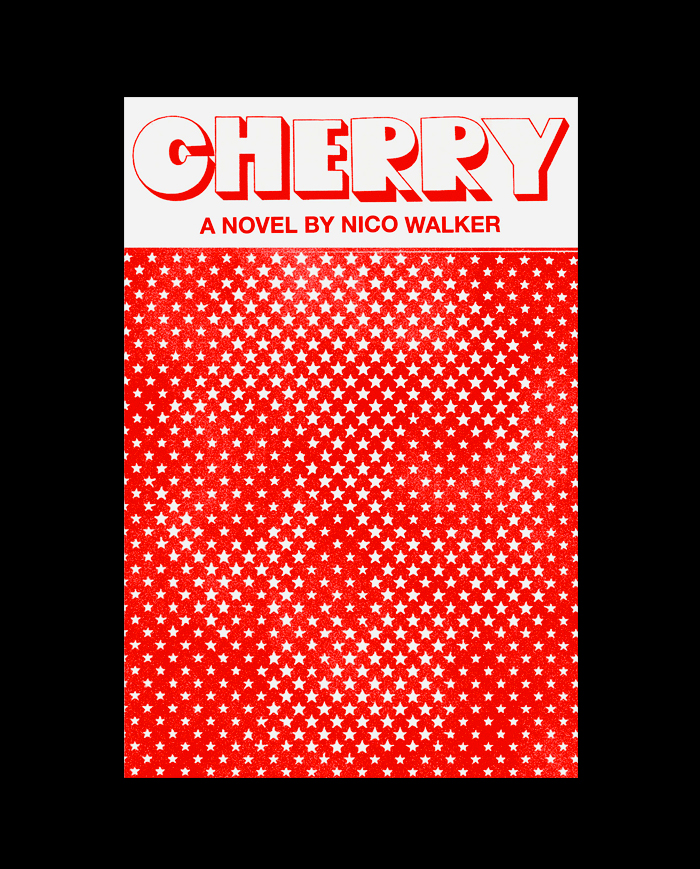
While I never heard their official response, it was finally approved. I was relieved.
Janet Hansen
Janet Hansen is a senior graphic designer at Alfred A. Knopf. Her work has been recognized by AIGA's 50/50, It's Nice That, Type Directors Club, and The New York Times. She currently lives in a little old house in Montclair, New Jersey with her husband and two whippets.
