
The Complexities of Designing a New Cover for an Old Classic
Kimberly Glyder on Reimagining Gone With the Wind
When I was in sixth grade, my English teacher offered up an extra credit assignment: would anyone be interested in reading Gone with the Wind and writing a book report about it? I was an obsessive reader and jumped at the challenge of a 1,000-plus page book. I raised my hand and took the assignment. A couple of months later, I was standing in front of my class, dressed in a makeshift outfit as Scarlett O’Hara (even more extra credit), delivering a presentation on the novel. I turned in my report and, as was my habit with all such assignments at the time, I had illustrated the front page, a precursor of my future vocation. Here is what it looked like. (I suppose I was already intrigued by typography and ornamentation).
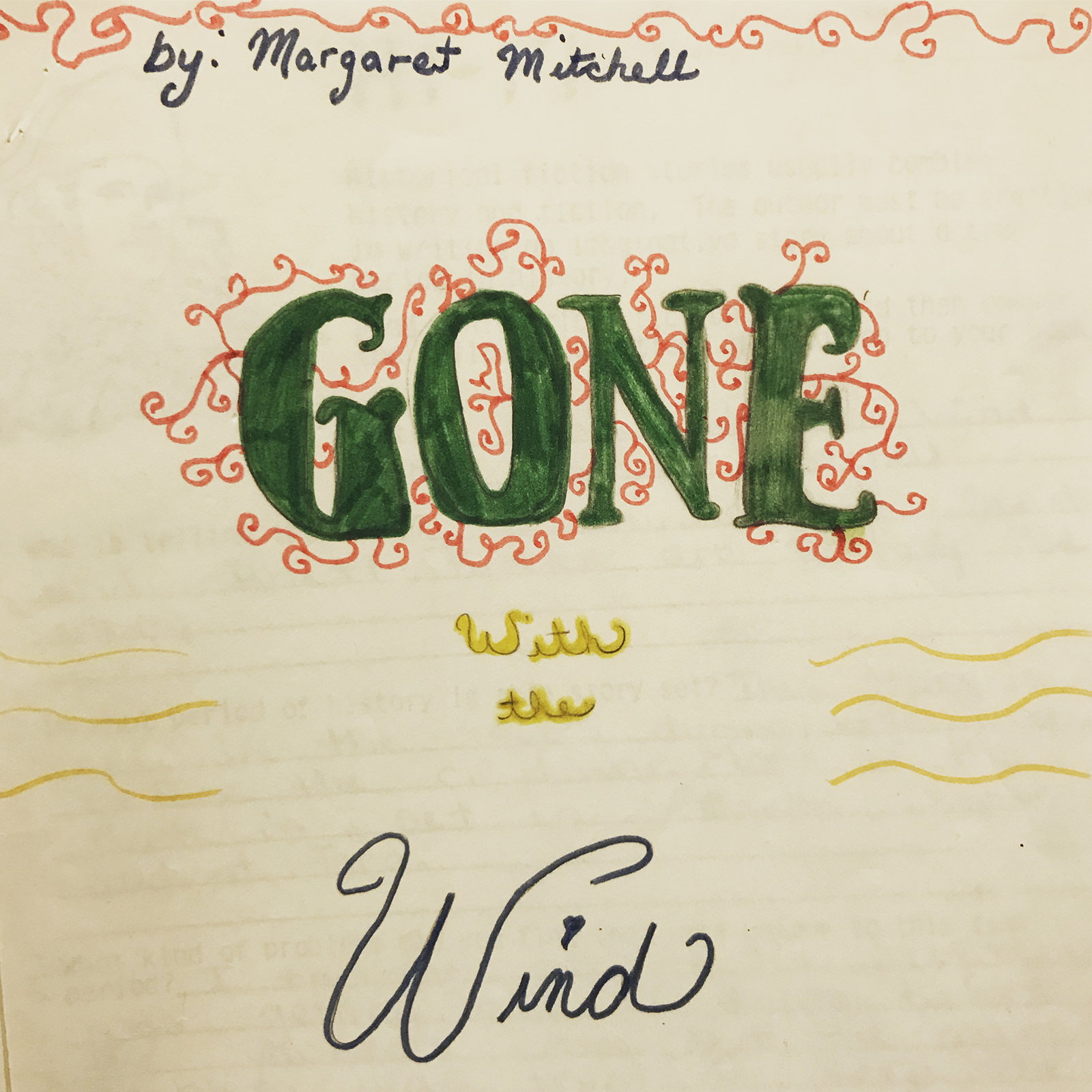
At 11 years old I’m not sure how aware I was of the complex issues in Gone with the Wind—of racism, the KKK, the war—but I do remember realizing that while I liked the book, the characters represented a side fighting a war that (thankfully) lost. Through it all, as much as I perceived Scarlett as initially petty and misdirected, I also appreciated a heroine who displayed perseverance. Scarlett’s grit was my lasting impression of the book.
Fast forward many years, many English lit classes later, as well as years of book cover design under my belt, Scarlett was once again back in my life. I had since gained a better sense of both the problems of race in the book and the perception many had of it. Gone With the Wind was first published in 1936 and has only been graced with a handful of cover redesigns since. Scribner was going for a fresh new look. In her initial email about the project, my art director, Jaya Miceli, referenced some personal drawings I had been posting to my Instagram account. The drawings were pattern-driven figures and clothing that I was creating daily and I was excited to find a way to expand upon them.
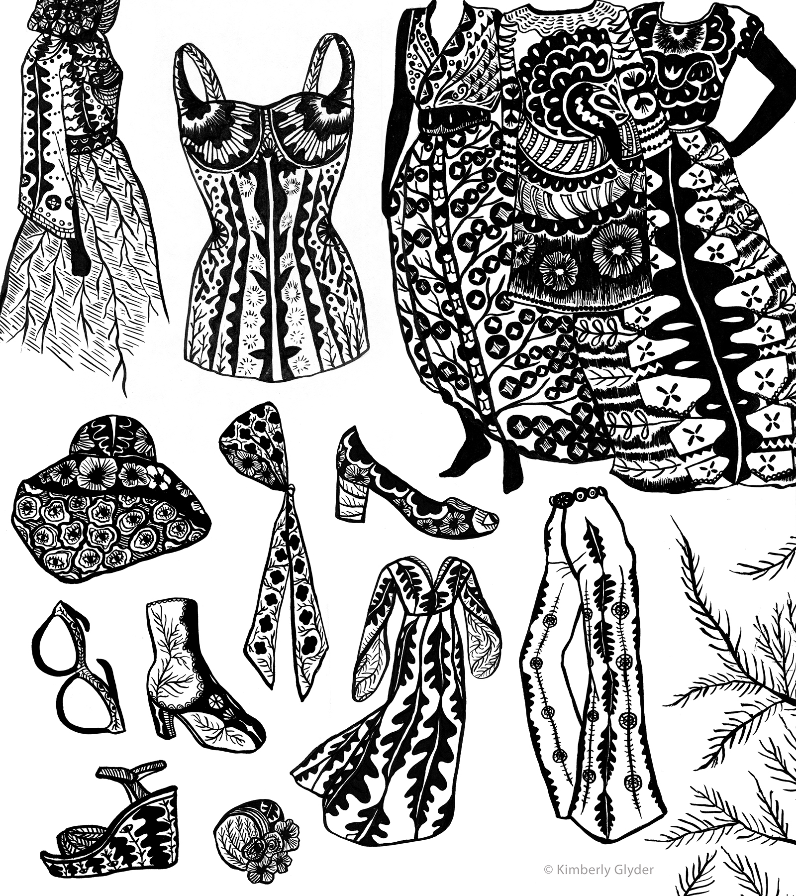
The challenge of this cover was the dual commission of designing and illustrating as well as reimagining a classic. Designing classics has its own unique set of pressures: on one hand, you want to create a design that is appealing and contemporary enough to bring in a new audience of readers; on the other hand, you don’t want to alienate those readers familiar with the original cover—one that they might be very fond of.
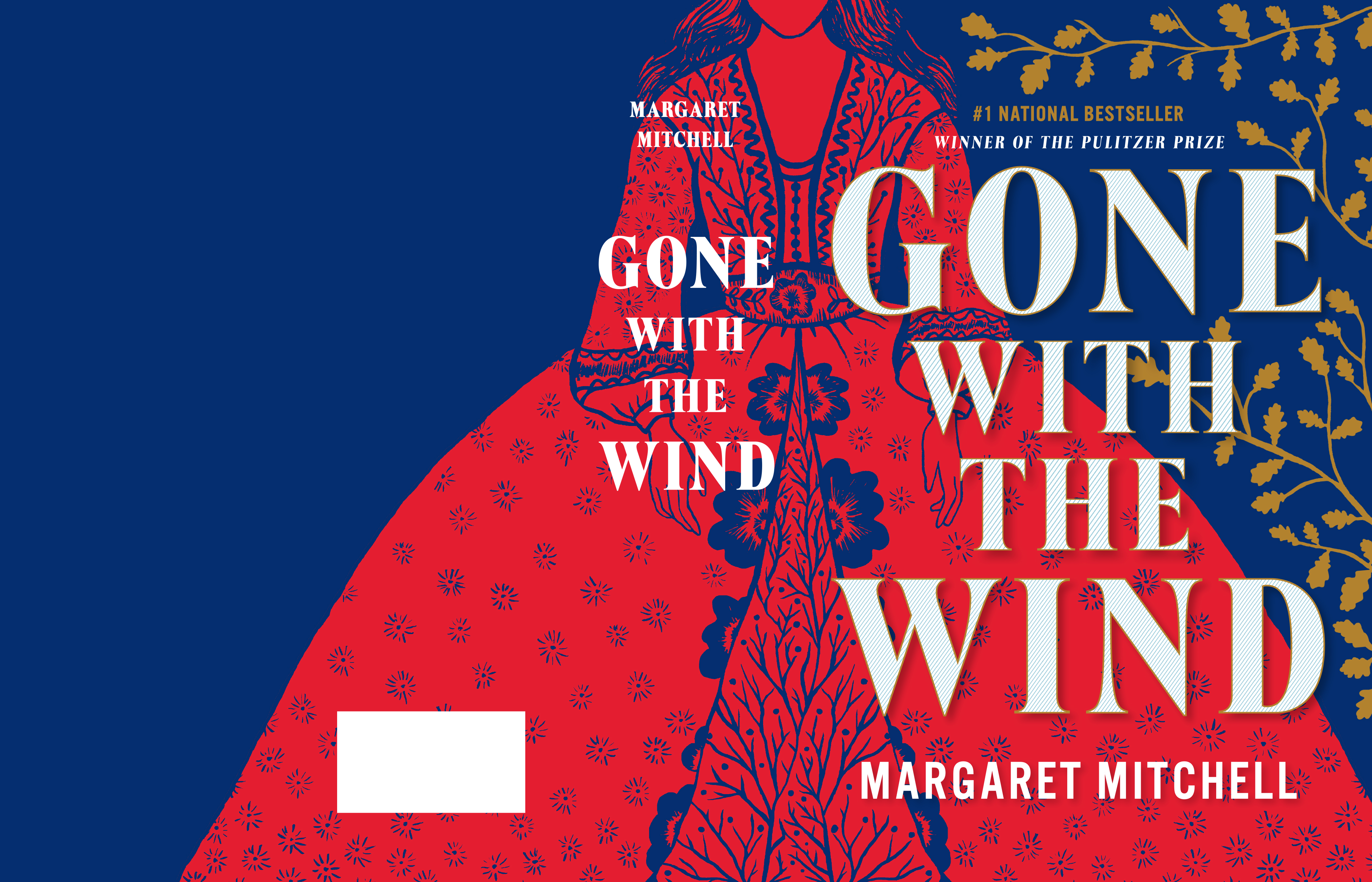
As a starting point, Jaya’s suggestion of using my drawings proved helpful. I researched women’s clothing from the Civil War, as well as costumes from the Gone With the Wind movie (1939) to create my illustrations. The palette was limited to blues, reds, cream, and metallic gold. I focused on Scarlett’s dress, loosely based on my research, creating intricate ink drawings and then scanning them and reworking the imagery in Photoshop. The vines and tree motif are a representation of strong family ties and the roots to the South. The other illustration is of Tara, the family plantation. Heavy vines intertwine and somewhat overpower the large type-driven design.
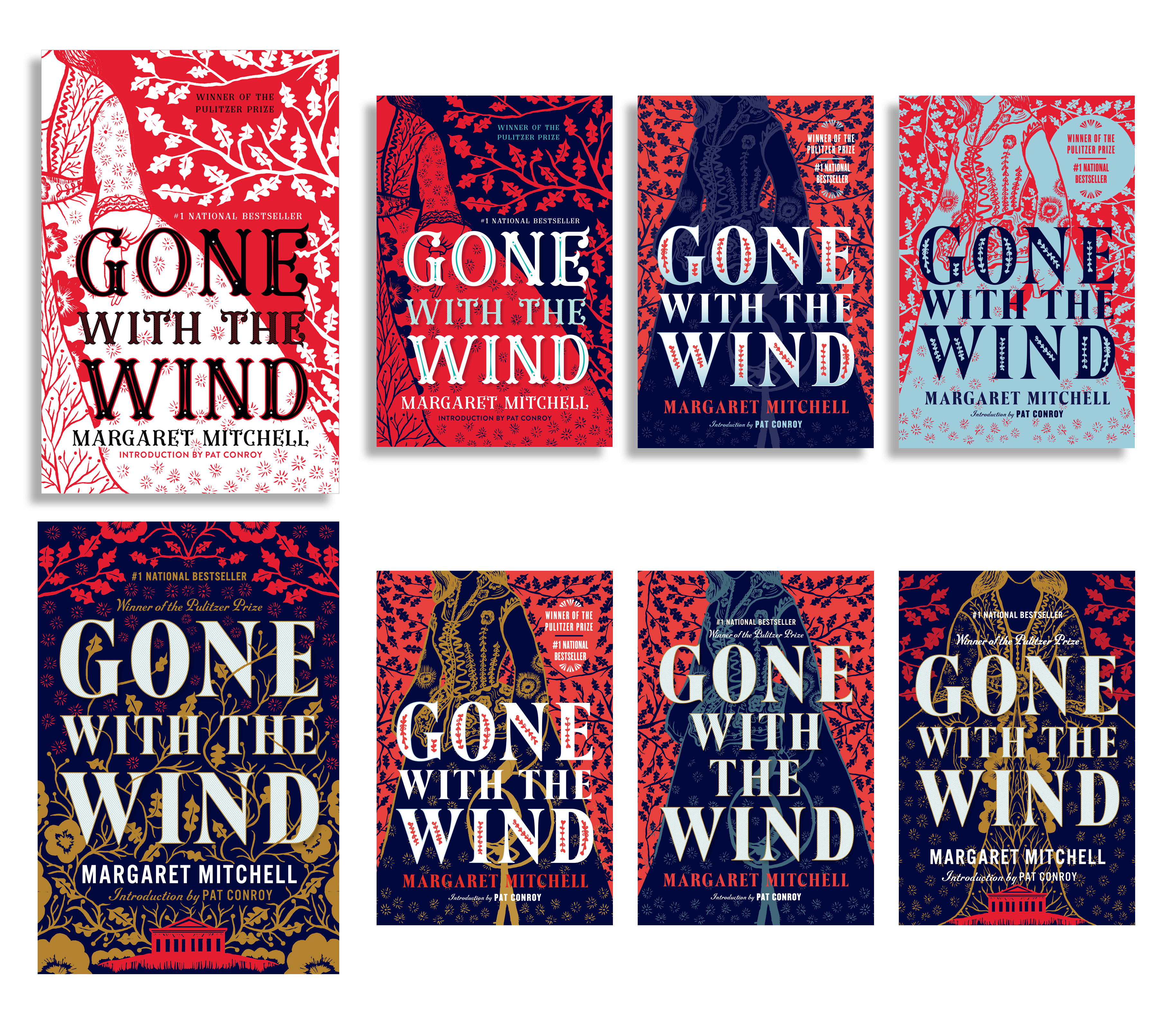
While the designs were well-received by my art director, they weren’t considered reflective of the time period by the in-house team. Quite a blow indeed, but I pressed on. In book cover design, there is never a shortage of rejection.
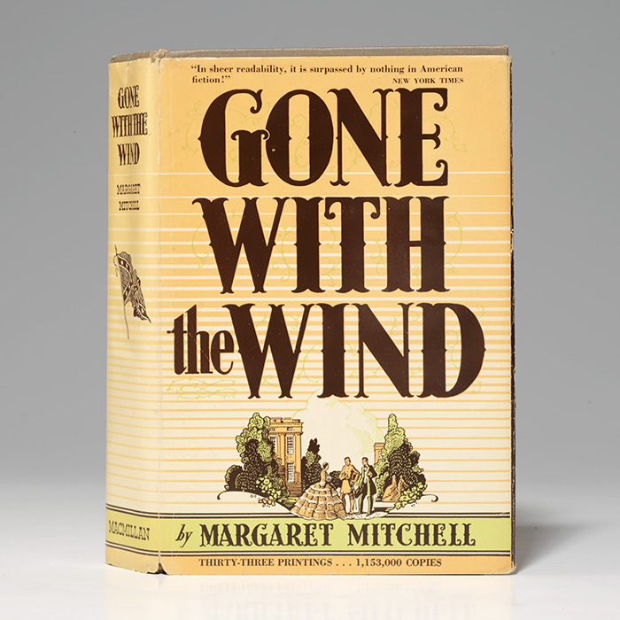 First edition of Gone With the Wind, Bauman Rare Books
Jaya asked me to return to the original book jacket art (a blast from the past as this was the same cover I held in my hand as a sixth grader), suggesting I redraw the small inset of Tara as well as try using the original art, and reimagine how the type might work with those elements.
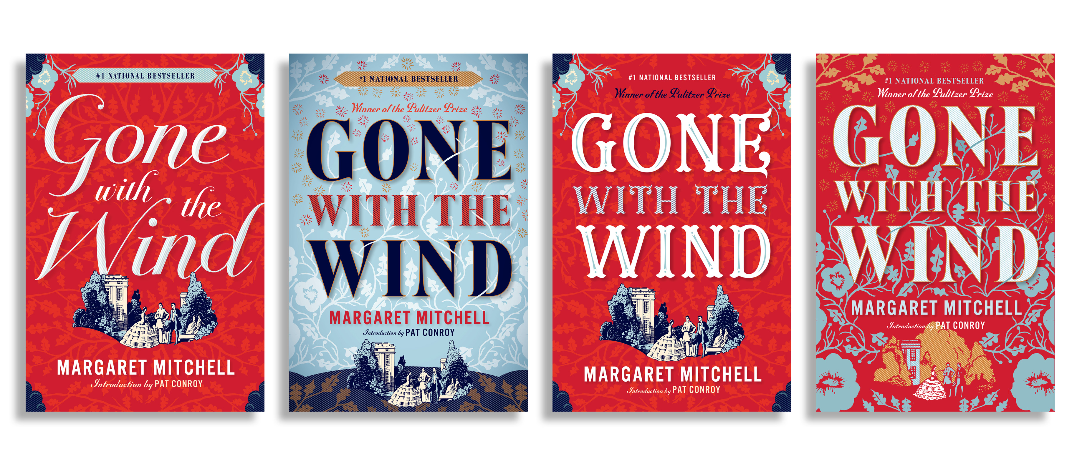
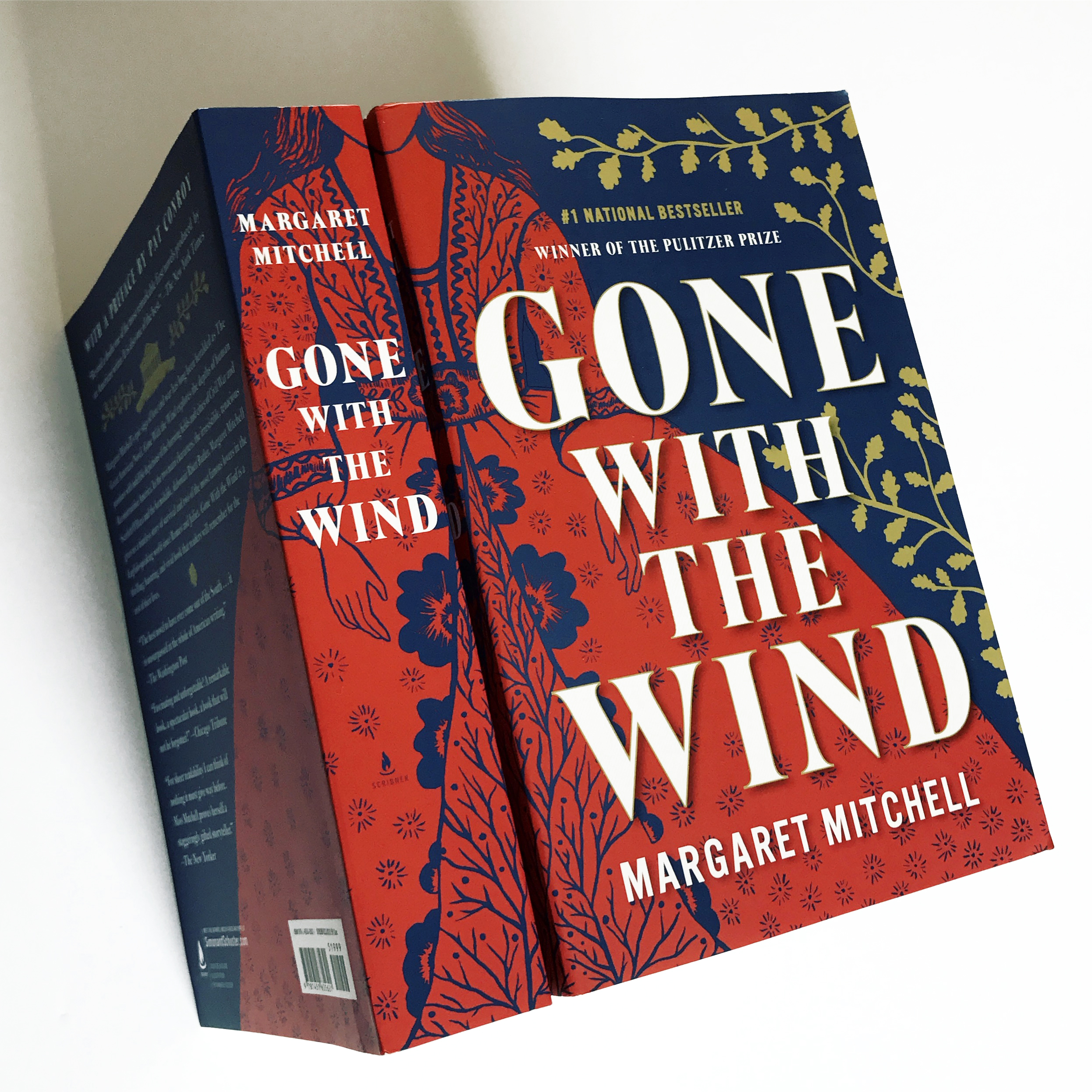
I sent in a new round using the original art and, after a couple revisions, was advised to strip the idea down to the essentials. Jaya returned to say that the team wasn’t happy with this direction either, at which point she had the wherewithal to reintroduce my original concepts in the meeting. Luckily, the in-house team now seemed to be more engaged with a couple of the comps they had initially dismissed. From there, we moved to refine the leaf shapes to oak leaves, unclutter the overall composition, and brighten the colors. As much as I would have loved the more ornamental typography, the in-house team preferred a cleaner, bolder type to contrast the detailed illustration. The team at Scribner approved the dress comp and I was asked to show the entire illustration wrapping to the spine and back cover. My cover cleared one final hurdle: approval from Margaret Mitchell’s estate (another part of the unique process of designing a classic book).
Throughout each of the developments of the GWTW cover, I was lucky to have an art director advocating for my work. As a freelancer it can feel a bit isolating, sending in work and not knowing how it will be received. Having spent years in-house, I’m well aware of how those cover meetings go, and I can tell a supportive AD from one who is disengaged from the process. There is something to be said for the way an AD filters both negative and positive feedback; Jaya was definitely helpful on both fronts.
This project carried a lot of weight for me: not only was I tasked with designing a familiar classic and invested in seeing the design come full circle, I was also working in a relatively new illustration style. When I received my final copies, one of my first thoughts was that my 11-year-old self would have been pretty happy with the printed book.
Kimberly Glyder
Kimberly Glyder’s award-winning design studio focuses on lettering, illustration and design primarily for the book publishing industry. She shares a studio space in South Philadelphia with other talented artists and illustrators, and also runs a home studio outside Philadelphia, where she lives with her husband and two children. When not working on book projects, Kimberly is happy to be working by hand, filling up sketchbooks with paintings and drawings.


