It may actually be mandatory at this point to begin any kind of 2020 roundup with an acknowledgement of how shit the year was, and how impossible it was to focus on the good parts, and how anything roundup-able seems a little beside the point, all things considered. So consider it acknowledged, and I’ll follow that with the customary: and yet. There were some stunning book covers created by some fantastic artists, and while they didn’t exactly solve the pandemic, they did make staying in my apartment all day long a little better. Or, as Janet Hansen wrote in the note accompanying her choices, “I must admit—book cover design was not much on my mind this year (!), but this was a great exercise to reflect on what we do and whose work we admire. As designers we have this little power to propose what visual goes with these great stories, and in our current climate that is both exciting and no easy feat. I’m so excited to see how cover design changes from the ripple effect that this monumental year has created.” Me too.
So for the fifth year in a row, I surveyed a group of professional book cover designers (this year it was 29 of them) about their favorite covers of the year. They came back with an astounding 89 different book covers that impressed, delighted, and inspired them, representing work by 54 designers for 44 different publishers. I have tallied their choices, including what they had to say about each cover, below, listing the covers in no particular order.
I also tallied the stats for you, and a few notes about that process: Only one “set” of books was mentioned, by two different designers: David Pearson’s Albert Camus reissues. To avoid weighting the results, I counted the three as a single book whenever it mattered. When counting publishers and imprints, I did my best to stick to how they defined themselves on the books at hand (so for instance, FSG, FSG Originals, MCD, and MCD x FSG were all counted separately, though they have obvious ties).
If you like stats, read on. If you only want to look at pretty book covers, just scroll down a bit. There’s something for everyone here.
The best of the best book covers:
First Place (Three-way tie : 5 mentions each)
Yu Miri, tr. Morgan Giles, Tokyo Ueno Station; cover design by Lauren Peters-Collaer (Riverhead, June)
Joyce Carol Oates, Night, Sleep, Death, the Stars; cover design by Jamie Keenan (4th Estate, June)
Lidia Yuknavitch, Verge; cover design by Rachel Willey (Riverhead, February)
*
Second Place (Five-way tie : 4 mentions each)
Lee Conell, The Party Upstairs; cover design by Stephanie Ross (Penguin Press, July)
Carlos Fonesca, tr. Megan McDowell, Natural History; cover design by Pablo Delcan (FSG, July)
Sarah Gerard, True Love; cover design by Joanne O’Neill (Harper, July)
Jane Hirshfield, Ledger; cover design by John Gall (Knopf, March)
Hiroko Oyamada, tr. David Boyd, The Hole; cover design by Janet Hansen (New Directions, October)
*
Third Place (Seven-way tie: 3 mentions each)
Brit Bennett, The Vanishing Half; cover design by Lauren Peters-Collaer (Riverhead, June)
Jean Kyoung Frazier, Pizza Girl; cover design by Emily Mahon (Doubleday, June)
Melissa Rivero, Los Falcón; cover design by Adalis Martinez (Vintage Espanol, April)
Adania Shibli, tr. Elisabeth Jaquette, Minor Detail; cover design by Oliver Munday (New Directions, May)
Dubravka Ugresic, tr. Ellen Elias-Bursac, The Age of Skin; cover design by Jack Smyth (Open Letter, November)
Wolf Wondratschek, Self Portrait with Russian Piano; cover design by Na Kim (FSG, September)
C Pam Zhang, How Much of these Hills is Gold; cover design by Grace Han (Riverhead, April)
•
The presses with the most covers on the list:
First Place: Knopf (10 covers)
Second Place: FSG (9 covers)
Third Place: W. W. Norton (7 covers)
•
The designers with the most mentions on the list:
First Place: Jamie Keenan (10 mentions)
Second Place: Na Kim (9 mentions)
Third Place: John Gall and Lauren Peters-Collaer (8 mentions each)
•
The designers with the most different covers on the list:
First Place: Na Kim (6 covers)
Second Place: Jamie Keenan and Jaya Miceli (4 covers each)
Third Place: Alex Merto, Thomas Colligan, John Gall, Tyler Comrie, and David Pearson (3 covers each)
•
The best month for book covers:
First Place: September (12 covers)
Second Place: February and July (11 covers each)
Third Place: January, May, and October (8 covers each)
•
The full list:
 Adania Shibli, tr. Elisabeth Jaquette, Minor Detail; cover design by Oliver Munday (New Directions, May)
I think this is incredibly beautiful. Lovely layers of depth and texture, and the monochrome palette fits beautifully with the monospaced font. It’s only when you see it quite small that you really notice the face, and I love a cover which makes you work.
The fuzzy, fractured torn imagery beautifully expresses a sense of loss.
Such a stunning cover that lets the artwork speak for itself. I love the minimalist type treatment, sparse imagery, and the monochromatic colors. The sense of depth and blurred graininess is evocative and beautiful.
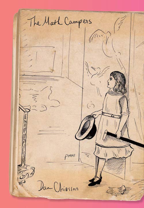 Dan Chiasson, The Math Campers; cover design by Kelly Blair (Knopf, September)
I love everything about this cover. The scale of the hand lettering preserves the dignity of the strange illustration (from the author’s private collection), and, on a pink background, the entire thing feels both fresh and comforting.
 Xander Miller, Zo; cover design by Janet Hansen (Knopf, August)
Such a striking jacket by Janet Hansen. I love that the title is huge and also nearly lost as a clever framing device for the gorgeous art.
 Chris Rush, The Light Years; cover design by Alex Merto (Picador, March)
I thought the hardcover of this was amazing and I’m even more enamored of the paperback. The image is so evocative and I love how it works with the stacked type containers.
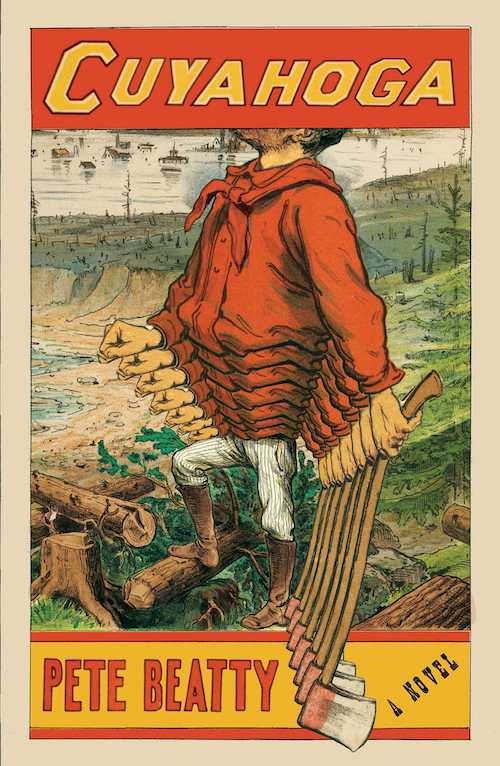 Pete Beatty, Cuyahoga; cover design by Matt Dorfman (Scribner, October 6)
Evoking Paul Bunyan in a mythological and humorous way, this is a fresh take on a classic style.
I love the American ephemera and the clever manipulation of the artwork.
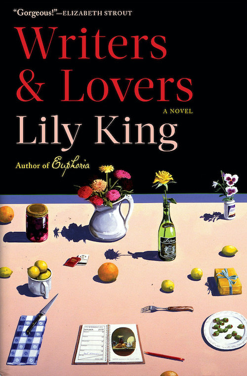 Lily King, Writers & Lovers; cover design by Kelly Winton (Grove, March)
I was immediately drawn to this cover due to the sharp contrast of the foreground of objects against this dark background. I’ve always been an admirer of Paul Wonner’s paintings and on this cover, seeing all these precious items dramatically lit, accompanied by the beautiful red-orange type makes this cover feel like a precious item itself.
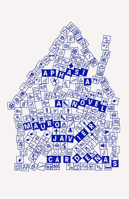 Javier Cárdenas, Aphasia; cover design by Thomas Colligan (FSG, November)
I love the complexity of the composition paired with the simplicity in execution and color choice. I also read that the inspiration was musical annotation which makes sense with how lyrical this cover is.
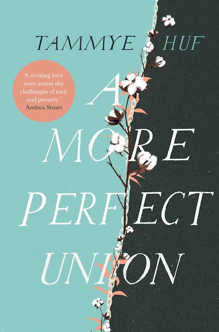 Tammye Huf, A More Perfect Union; cover design by Anna Morrison (Myriad Editions, October)
Anna Morrison is such a talented book designer who can create stellar designs for every genre. This cover balances a bold feel with a subtle fragility through its deft use of type and illustration. The subdued palette is a nice touch as well.
 Olivia Laing, Funny Weather; cover design by Kelly Winton (W. W. Norton, May)
I’ve really be enjoying this trend of box within a box covers. This one just pulls me in each time. The type so gets out of the way of this incredible photograph. The photo just feels like the sensation of gasping for air but is still so oddly calming.
 Fernanda Melchor, Hurricane Season; cover design by Jamie Keenan (New Directions, October)
Jamie Keenan tears his classic white type over black paper design apart with a lightning bolt paper split. It hurts me with how clean and beautiful this is.
 Sarah Gerard, True Love; cover design by Joanne O’Neill (Harper, July)
Such a bizarre image and paired uncomfortably but appropriately well with the words “true love.”
Absolutely stunning use of art and color.
[Also listed]
[Also listed]
 Rumaan Alam, Leave The World Behind; cover design by Sara Wood (Ecco, October)
The light peeking through the tree branches and the shadow cast by the diving board give this simple scene an unsettling quality. The differing type colors put an emphasis on the title.
An evocative cover, creating a moment captured in time. The perspective of the illustration paired with these beautiful blues draw in any bookstore wander to lean in closer, wanting to know more about this scene, this author, and this novel.
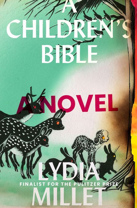 Lydia Millet, A Children’s Bible; cover design by David High (W. W. Norton, May)
This cover hits me like a strange hallucination: the vintage ingredients are so familiar, but the effects are wonderfully unsettling, as though we’ve weathered something profound.
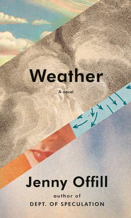 Jenny Offill, Weather; cover design by John Gall (Knopf, February)
What a striking collage. Love the color palette and the marriage of the images.
John has a way with combining images and textures that is so satisfying and somehow always fresh.
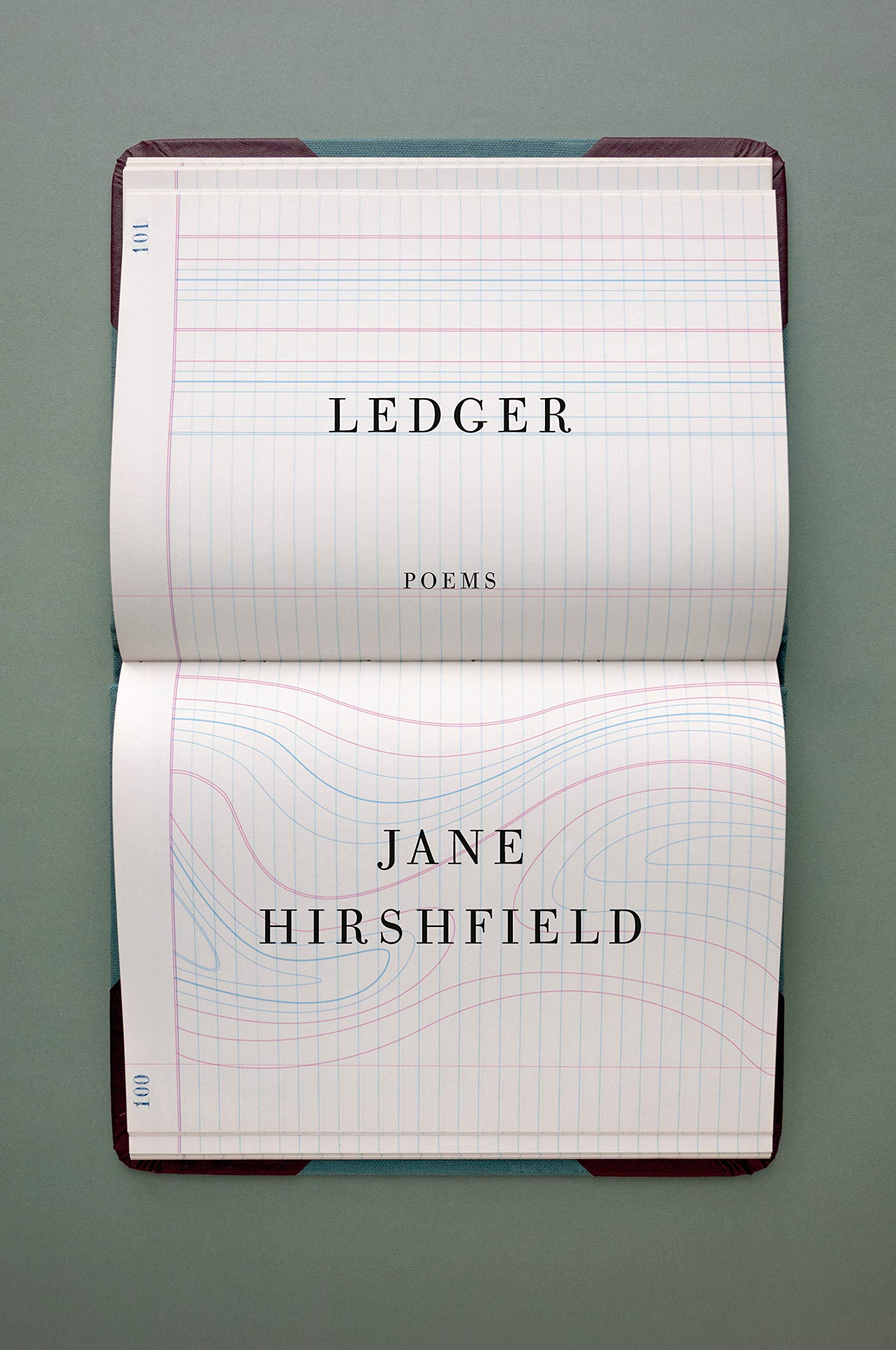 Jane Hirshfield, Ledger; cover design by John Gall (Knopf, March)
I am susceptible to book-on-book covers, and this one is a particularly elegant beauty. I love how the ledger lines become a sinuous topographical chart, whose motion is then echoed in the swell of the open pages.
John is a master of designing still-life oriented book covers (and all other book covers obviously!), and this cover seamlessly conveys the title and mood of this book of poems.
Captured by the subtle shift in the ledger. Just one, key, disruptive element.
[Also listed]
 Edward Hirsch, Stranger by Night; cover design by Tyler Comrie (Knopf, February)
Simple. Stunning. Refined. Tyler is so good at what he does.
Ethereal and precise at the same time.
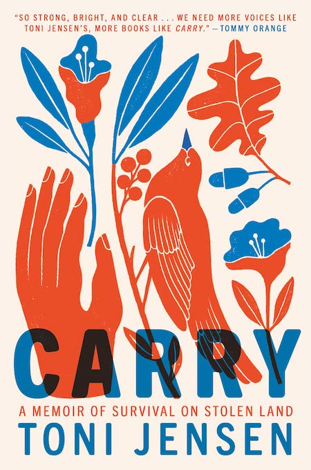 Toni Jensen, Carry; cover design by Emily Mahon, art by Carmi Grau (Ballantine Books, September)
I’m in love with the illustration, how it marries with the type so perfectly; I’d like to buy the book—and the poster!
The limited palette is executed so brilliantly on this beautiful, illustrative cover. The overall look is that of a screen print with the transparent type overlaying the lovely imagery.
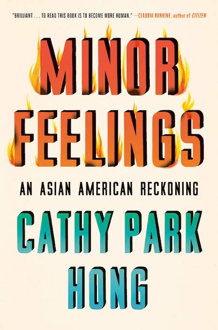 Cathy Park Hong, Minor Feelings; cover design by Na Kim (One World, February)
Beautifully done type showcasing a fantastic title that displays simply and beautifully all that this book is: fierce, vulnerable, humorous, provocative and more. A designer might use this design to show our teams that typography can be quite as emotive as images of faces, hands etc.
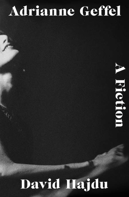 David Hajdu, Adrianne Geffel: A Fiction; cover design by Jaya Miceli (W. W. Norton, September)
Jaya Miceli’s brilliant use of negative space.
 Rejean Ducharme, tr. Madeleine Stratford, Swallowed; cover design by David Drummond (Esplanade Books, April)
I’ve admired David’s work for a very long time. His covers have taught me so much about type, image, and how to pair the two in a sophisticated way.
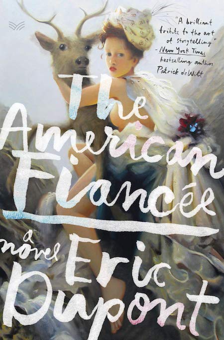 Eric Dupont, The American Fiancée; cover design by Stephen Brayda (HarperVia, February)
Stephen chose this incredibly dynamic and provocative painting by Kai McCall, and combined it with this hand lettering which is so beautifully executed.
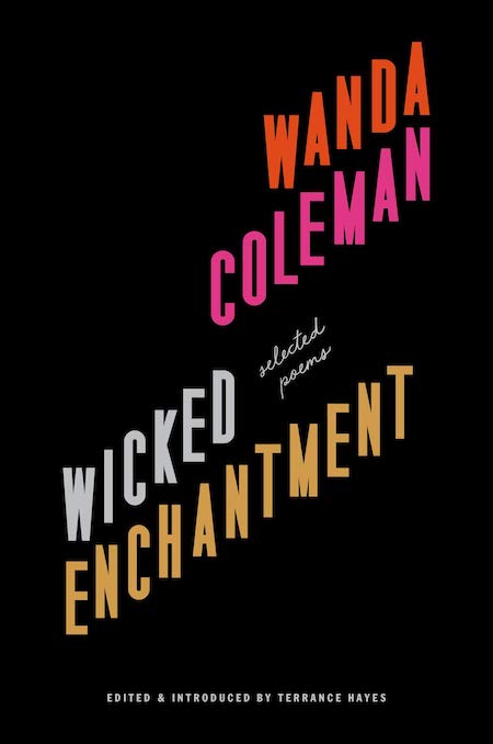 Wanda Coleman, Wicked Enchantment; cover design by Rachel Willey (Black Sparrow Press, April)
She’s done it again folks!
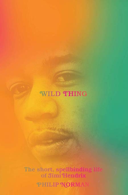 Philip Norman, Wild Thing; cover design by Brad Grandgennet (Liveright, September)
A beauty! This cover is both bright and nuanced. I love the juxtaposition between the warm gradient tones and stylistic font combined with the quiet photograph of Hendrix and the use of small type. It speaks to Hendrix’s artistry perfectly.
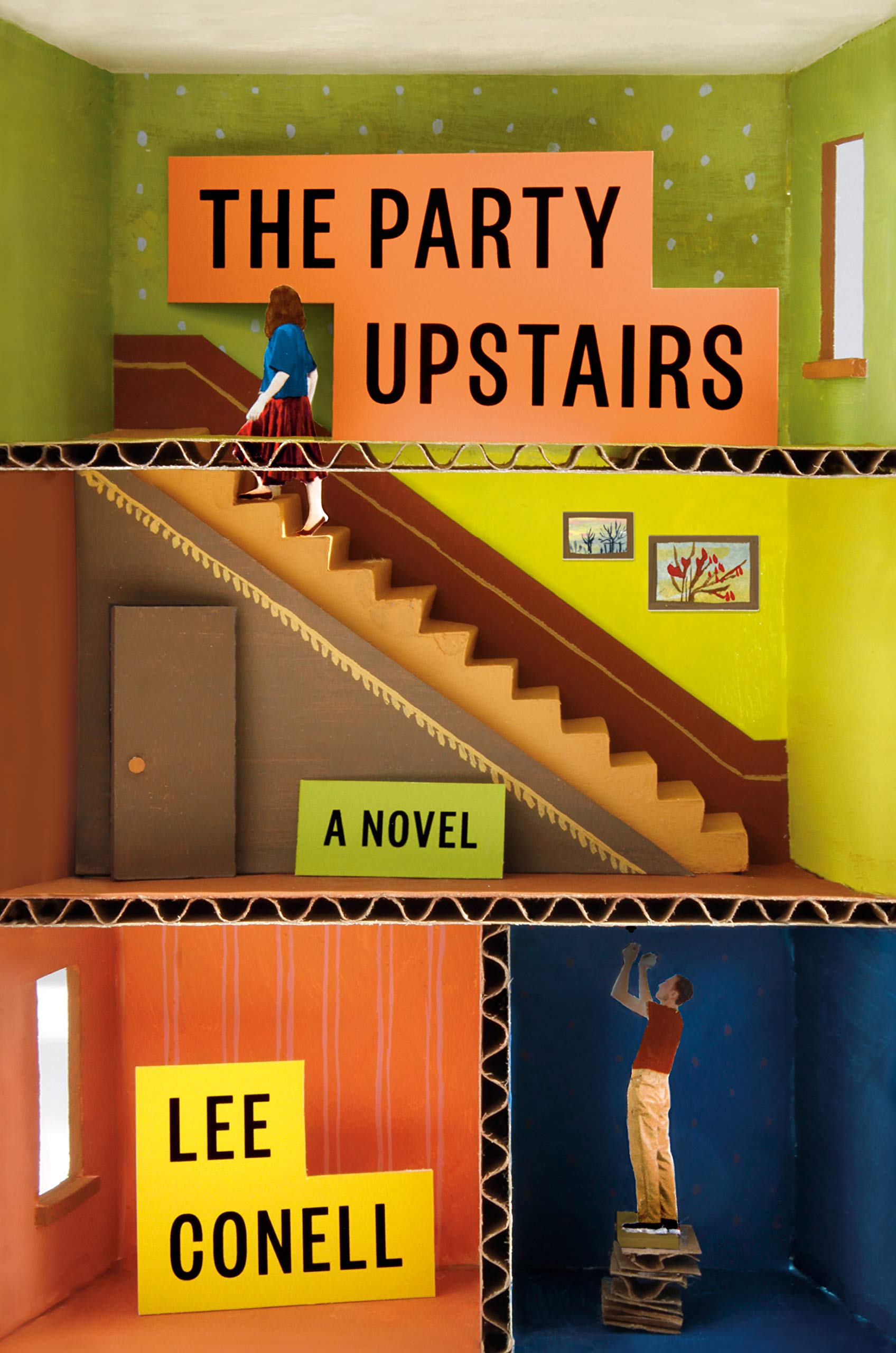 Lee Conell, The Party Upstairs; cover design by Stephanie Ross (Penguin Press, July)
I am an easy mark for a built book cover. Who didn’t love making dioramas in elementary school? Why haven’t any of us thought to do this for a cover before now?
Amazing cover by Stephanie Ross. It’s incredibly charming and I love that it was created by hand. The many wonderful details would have been lost if created digitally.
Really love the process that went into making this cover happen. I want to explore those rooms and know what’s behind that slightly opened second floor cardboard door.
Just love dioramas and this one is so simple, but so well made. I love that every part of it is in camera, or feels as though it is.
 Emily St. John Mandel, The Glass Hotel, cover design by Abby Weintraub (Knopf, March)
Elegant and ethereal, this enchanting cover arrived in March, just when we needed the escape.
 Phil Klay, Missionaries; cover design by Alex Merto (Penguin Press, October)
[Also listed]
 Hari Kunzru, Red Pill; cover design by John Gall (Knopf, September)
Love the gradient. Gives the image a whole different vibe. Most refreshing cover of the year.
Confident, demanding, and intriguing. I love the juxtaposition between the classical landscape and the futuristic gradients.
 Emerson Whitney, Heaven; cover design by Sunra Thompson (McSweeney’s, April)
I had so many questions when I first saw this cover, which seems to be the perfect solution for a book that raises so many questions.
 David Sedaris, The Best of Me; cover design by Jamie Keenan (Little, Brown, November)
What a treat to get to use all those quirky, ornate letters, in such a fun grab-bag of colors; it’d be too much for anyone but Sedaris. The tiny trophy is a nice little wink.
[Also listed]
 Rachel Vorona Cote, Too Much; cover design by Jenny Carrow (Grand Central Publishing, February 2020)
The image selection (and cropping) for this cover is so spot on. I absolutely love the woman’s expression paired with the hand lettering.
This cover made me smile. The expression perfectly embodies the title and I love the juxtaposition of the historical painting and modern lettering.
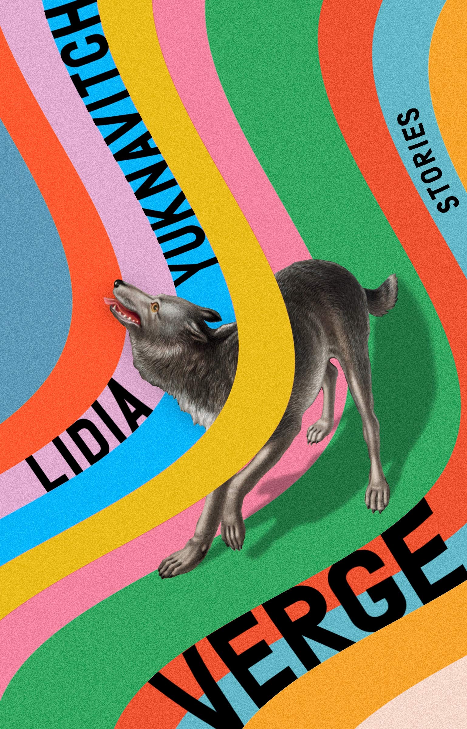 Lidia Yuknavitch, Verge; cover design by Rachel Willey (Riverhead, February)
LOVE the combination of a vintage-leaning illustration with a very striking, modern palette and inventive type treatment. Lots of movement. The wolf’s shadow and the way it intersects with the background are really clever, and they give the cover great depth.
Just another one of Rachel’s many covers I wish I had designed.
I love when vintage imagery is made contemporary with color. The shadow is a particularly nice touch.
Includes every color under the sun, and somehow doesn’t scream “rainbow.” Not cliche in the least. Has a sense of humor. A feat!
This design strikes a perfect balance: wacko-groovy, but rigorously constructed. Pure joy to behold!
 Kiese Laymon, How to Slowly Kill Yourself and Others in America; cover design by Jaya Miceli (Scribner, November)
This layout is incredible. I can read it perfectly and yet it’s turning our left-right-top-bottom reading expectation on its head, several times over.
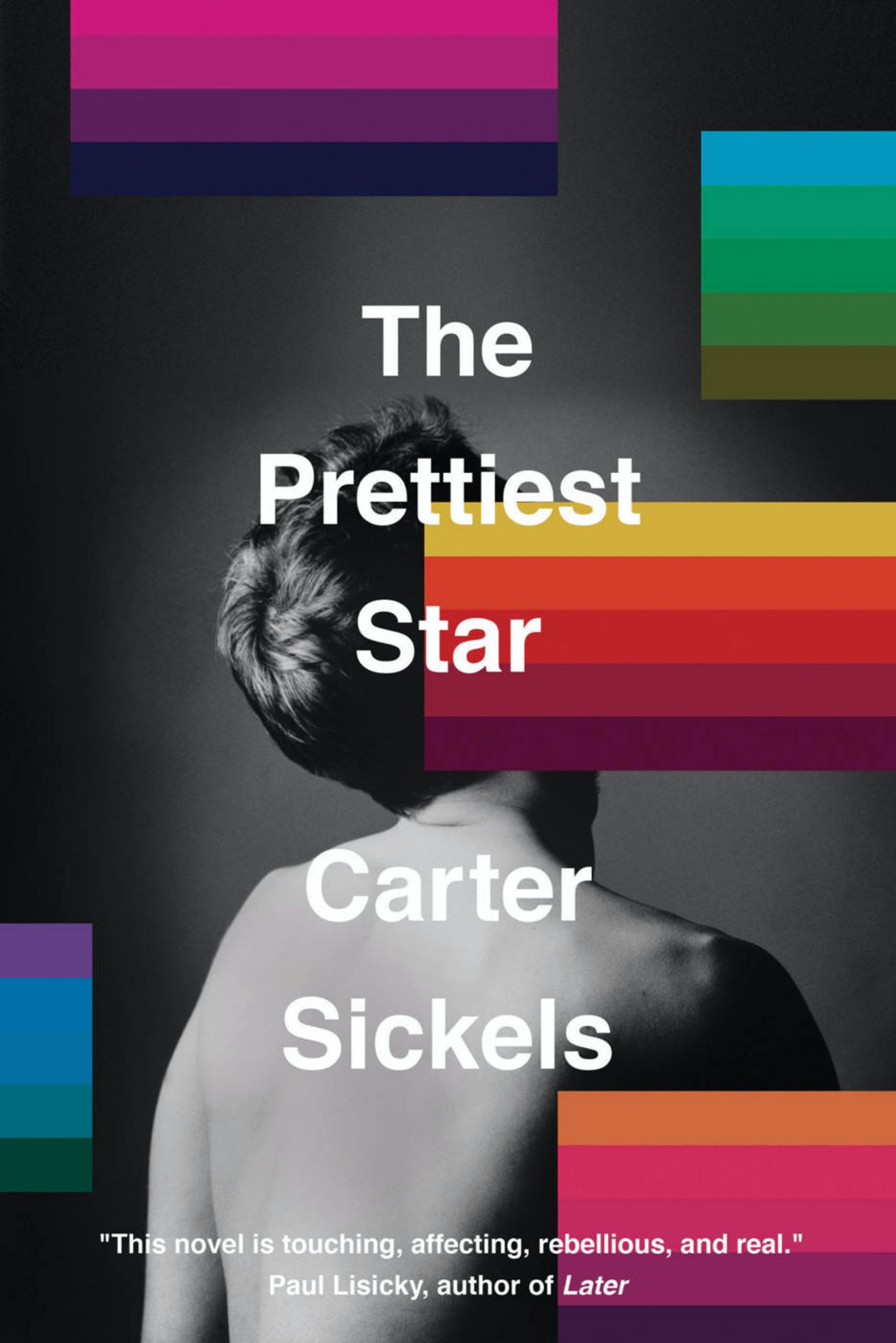 Carter Sickels, The Prettiest Star; cover design by Luke Bird (Hub City Press)
I love the modern sensibility of this cover. It’s direct but refined, and the photograph, color and type all work so well together.
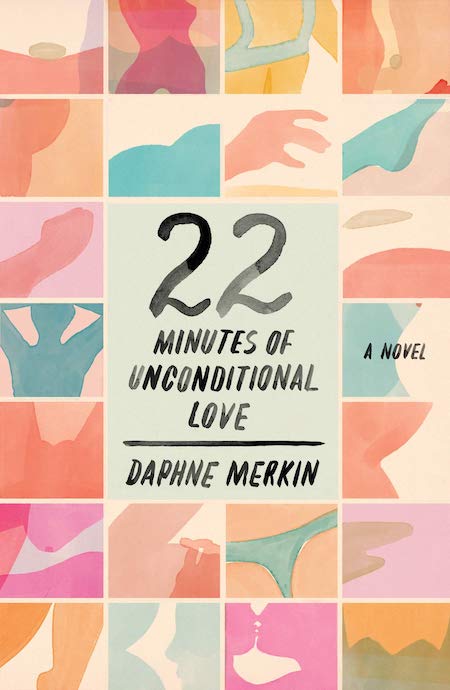 Daphne Merkin, 22 Minutes of Unconditional Love; cover design by Na Kim (FSG, July)
It was honestly difficult to pick a favorite from Na, who is consistently killing it in the book cover world. Though finally narrowed down to this grid of abstracted erotica. Such a lovely solution full of hidden surprises.
Such a lovely design that speaks so cleverly to the title. I love the grid, the warm abstract watercolors, and elegant hand lettering. It reminds me of Helen Frankenthaler and Etel Adnan.
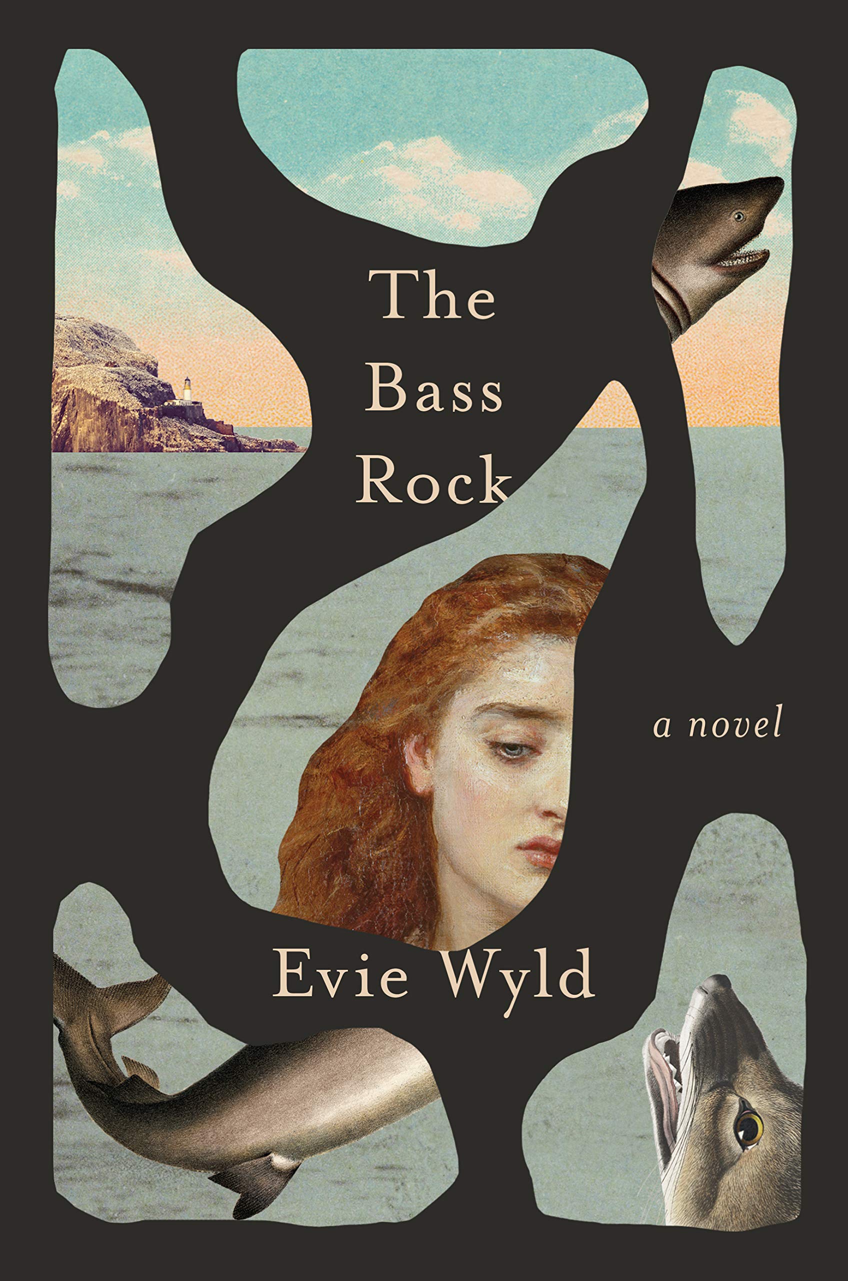 Evie Wyld, The Bass Rock, cover design by Joan Wong (Pantheon, September)
Who can resist an impossible puzzle? The more I look at it, the more I’m confounded by the positive and negative space (which is which?!) and delighted by the surreal oddness of it all.
 Wolf Wondratschek, Self Portrait with Russian Piano; cover design by Na Kim (FSG, September)
Every year, the requisite question is: which Na Kim cover is my favorite? This homage to graphic design legends Rodchenko and Sutnar (I think!) is my answer. The simple brilliance of repeating lines and planar tension—all contained within a diagonal strip—signals a level of control that reliably makes Na one of the best.
????????
Wow. This cover is so powerful. Simple black and white palette, the angles and perspective, use of both illustration and photography, and that period type!
 Leonard Mlodinow, Stephen Hawking; cover design by Rafael Nobre (Zahar, October)
Everyone is familiar with Stephen Hawking of course, but what draws me in is the beautiful abstract shapes with a stimulating color palette of contrasting blues and oranges, all set within a uniquely satisfying composition.
 Fernando Pessoa, tr. Margaret Jull Costa, The Complete Works of Alberto Caeiro; cover design by Peter Mendlesund (New Directions, July)
A very serious photograph is clearly the best canvas for a playful (yet sophisticated) graphic intervention. Peter is a master at this.
More brilliance from Peter Mendelsund.
 Joyce Carol Oates, Night, Sleep, Death, the Stars; cover design by Jamie Keenan (4th Estate, June)
The woven fields holding the type (which fit the title perfectly!), create a bold display of light and shadows—a succinct visual for the complexities of family dramas.
This cover manages to be completely maximalist and simple at the same time.
OK, this is pretty stellar. When the words in the title and author each coincidentally comprise five letters (with “The” artfully integrated, of course), this typographic solution feels inevitable. And yes, this author can surely get away with an all-type jacket.
I just want to reach out and touch it! So refreshing to see a cover that looks like it was meticulously created by hand. Love seeing the imperfections and this just leaps out at you from a sea of book covers.
It’s serendipity to receive a title/author cover copy that word breaks into lines of five letters each. Jamie Keenan created an alternating blue/red checkerboard grid to hold each stacking letter AND decided to take it to the next level by weaving strips of buckling construction paper for form and shadows. Even squeezing in the punctuations and vertically stacking “The” creates textured typographic interest to that individual square. So simple, so gorgeous, so bloody brilliant!
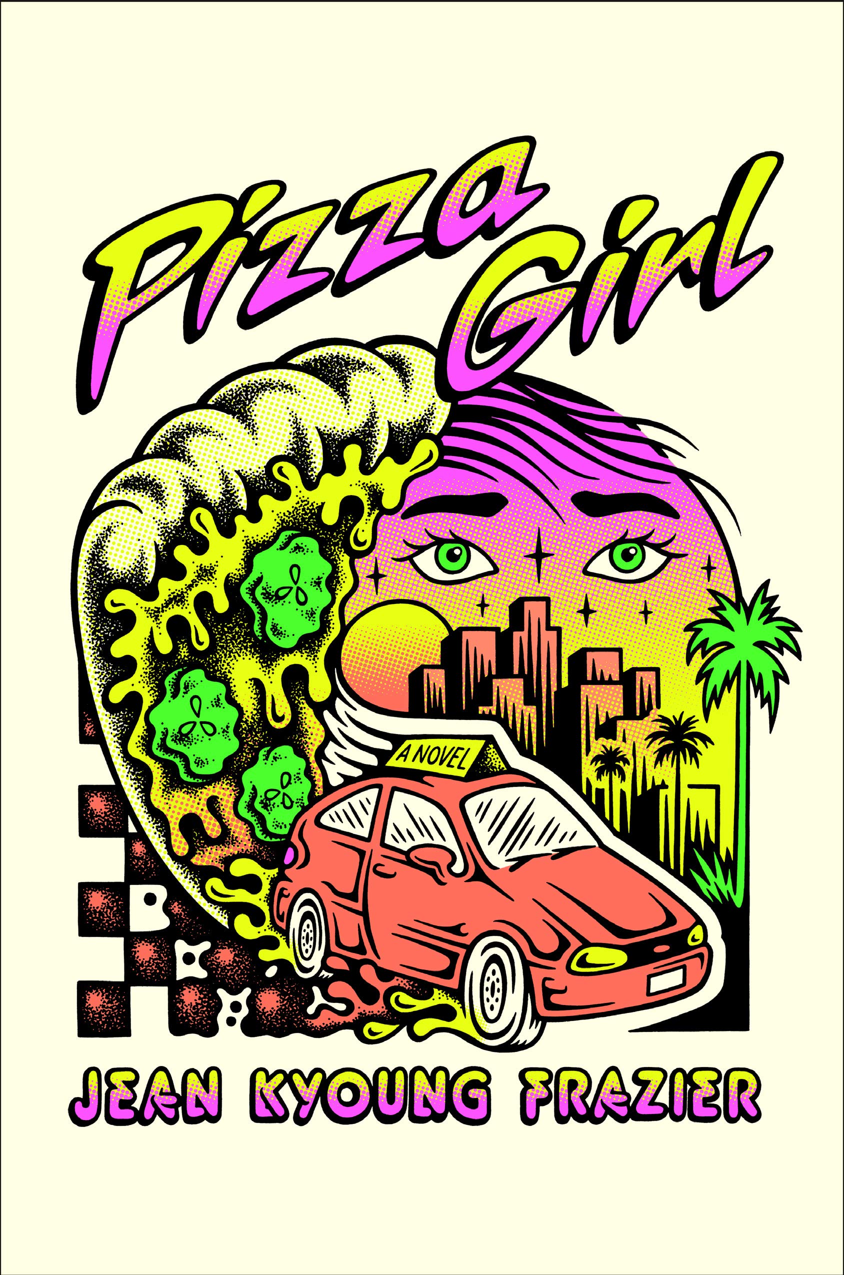 Jean Kyoung Frazier, Pizza Girl; cover design by Emily Mahon (Doubleday, June)
Love that Emily worked with Tallboy who made a pickle-covered pizza look weirdly appetizing.
Love Emily Mahon’s completely fresh choice of illustrator on this one.
Makes me happy just to look at, a truly joyful cover.
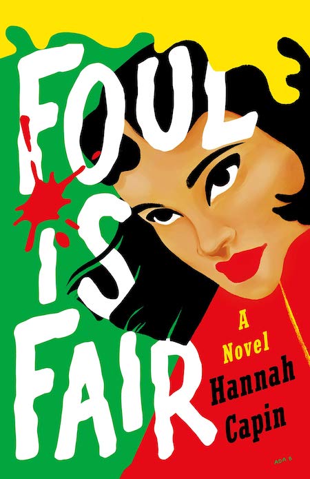 Hannah Capin, Foul is Fair; cover design by Olga Grlic (Wednesday Books, February)
I love this bold illustration, the bright and striking colors, and that huge title type which is so playful and fun! I want to blow this up into a poster.
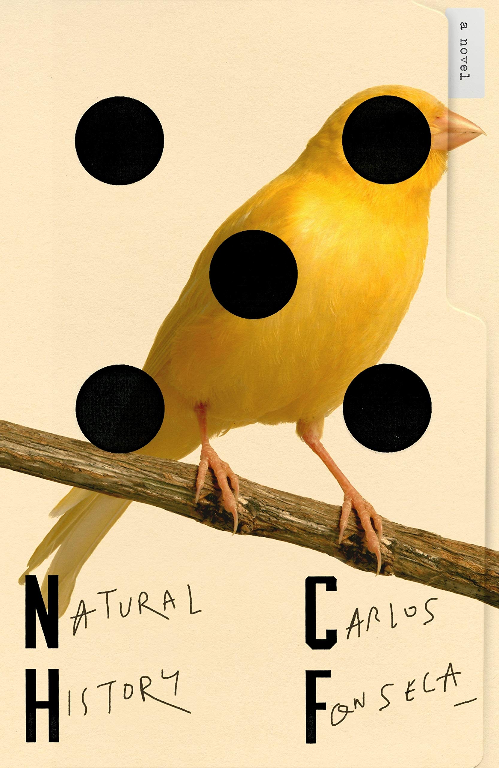 Carlos Fonesca, tr. Megan McDowell, Natural History; cover design by Pablo Delcan (FSG, July)
I love how bi-polar this design is—it juxtaposes really strong, clean geometric shapes and type with the organic shapes of nature and wobbly handwriting. That push and pull is what fuels this design’s irresistible energy.
Love Pablo Delcan’s overlapping combination dice graphics, bird image, manila folder edges, condensed fonts and handwriting in a clean confident composition.
So beautiful. Makes me feel like there is something important I need to uncover.
[Also listed]
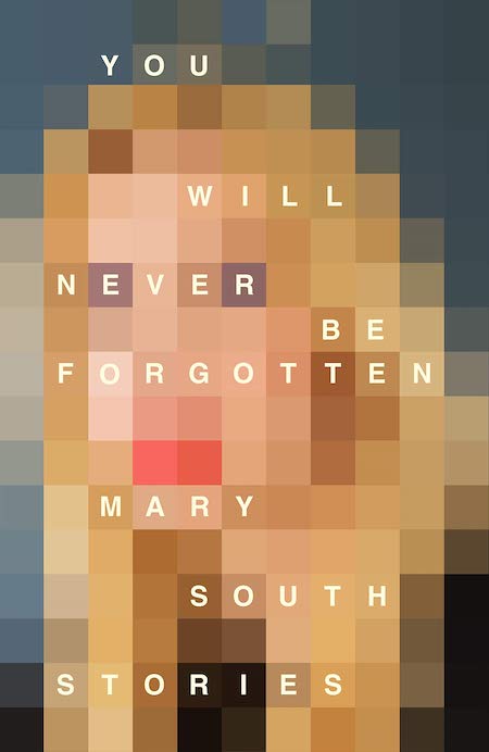 Mary South, You Will Never Be Forgotten; cover design by Jamie Keenan (Picador, August)
So abstract, and yet, you know this is a portrait of a woman (the author!). This is a clever and beautiful way to convey what forgetting looks like… a general picture that has been reduced to pixels of color.
I love the out of focus digital portrait.
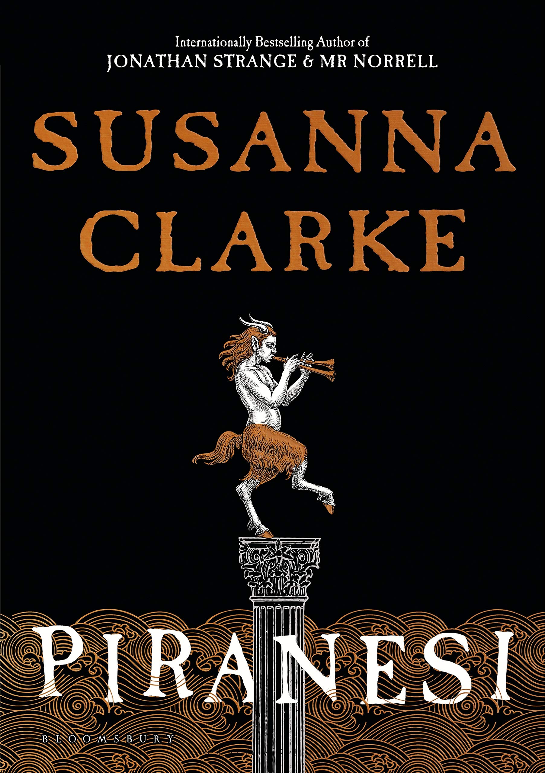 Susanna Clarke, Piranesi; cover design by David Mann (Bloomsbury, September)
This cover has the difficult task of being evocative while not giving away any hint of the twists and turns of this novel. The barcode is also “floating” in the waves on the back cover which is one of my favorite details.
 Roya Marsh, Daylight; cover design by Na Kim, art by Deborah Roberts (MCD x FSG, March)
[Also listed]
 Yaa Gyasi, Transcendent Kingdom; cover design by Kelly Blair (Knopf, September)
One of my all-time favorite color palettes . . . and the added touch of gold foil is so nice. I admire how stylized and simple the shapes and lettering are. This one jumps off the bookshelves!
 Molly Ball, Pelosi; cover design by Adalis Martinez (Henry Holt, May)
A unique and elegant design for a book that also reads and looks very different than most political books. I love how Adalis was able to communicate that here. I feel the strength of Nancy Pelosi and the sense that she was likely often the only woman in the room. The warm color palette also perfectly aligns with the story if her upbringing and familial details.
Adalis Martinez perfectly captured that bad ass moment of Nancy Pelosi in her red coat leaving the White House. Heartbroken that Adalis passed away this year at such a young age. She was a bright star, an incredible talent, and will be greatly missed.
 Amy Jo Burns, Shiner, cover design by Jaya Miceli (Riverhead, May)
I felt like crying when I saw this design—the imperfect lettering, the way it slopes down and interacts with the sad, spindly, embroidered flowers. This is such a simple design—there’s barely anything there—but it manages to convey more emotion than a photo ever could.
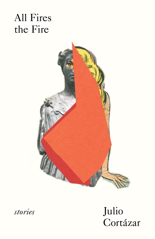 Julio Cortázar, All Fires the Fire; cover design by Matt Dorfman (New Directions, April)
Matt Dorfman does it again! The minimalist style of his work is so inspiring!
 Catherine Lacey, Pew; cover design by Thomas Colligan (FSG, July)
Such precious typography interrupted by startling shards of light—I don’t fully understand it, but that’s why it’s so compelling. Plus: The foil-stamped cloth over board is entirely gorgeous!
I think Thomas is having a banner year with his cover designs, and Pew is just so beautiful and exceptionally true to the book. I love everything about it.
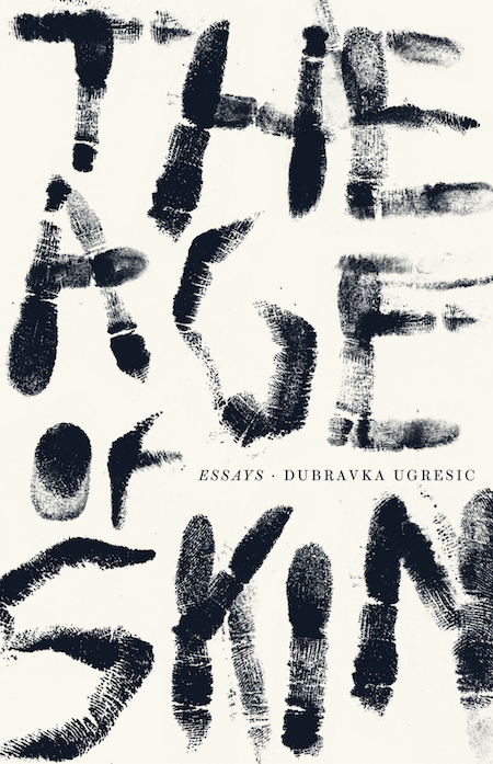 Dubravka Ugresic, tr. Ellen Elias-Bursac, The Age of Skin; cover design by Jack Smyth (Open Letter, November)
I love the contrast between the big, expressive, hand-printed title and the small, elegantly set author name. I imagine this cover was a lot of fun to make.
Striking, stylish, simple and extremely effective.
I love Jack’s expressive use of finger prints to create this bold type treatment.
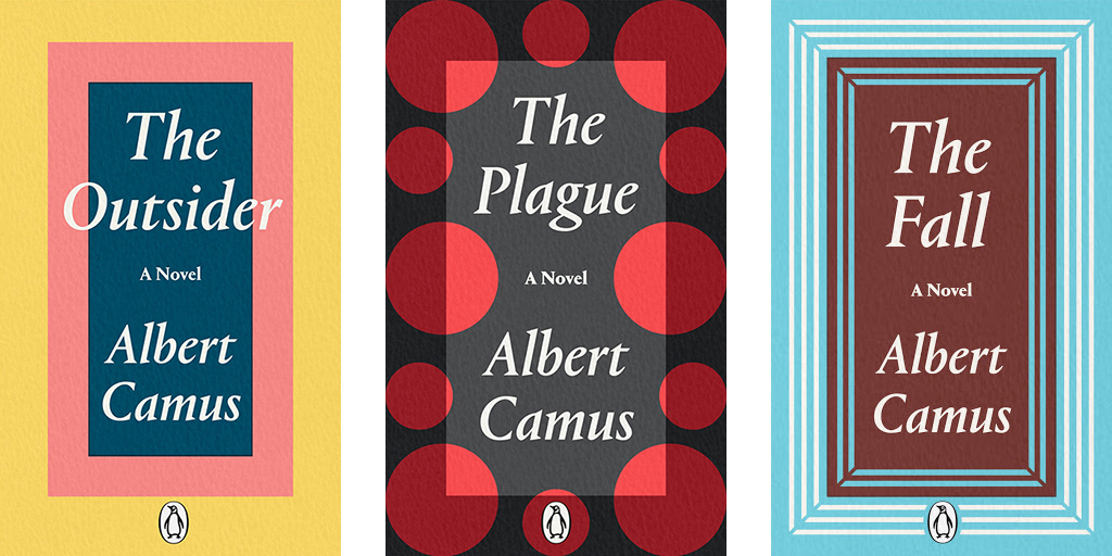 Albert Camus, The Plague, The Stranger, The Fall; cover designs by David Pearson (Penguin Classics, July)
This is so simple, but really striking. Really reminded me of my freshman year color theory class. It so effectively feels like there’s a light shining on the cover. The type starts to feel as though it’s being taken over by the dots and we’re all just now getting the glimpse of that happening.
Perfection—beautiful abstraction and playful color.
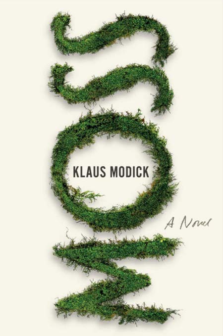 Klaus Modick, Moss; cover design by Alban Fischer (Bellevue Literary Press, August)
I’m always a sucker for custom made type with real objects. This cover does it so elegantly!
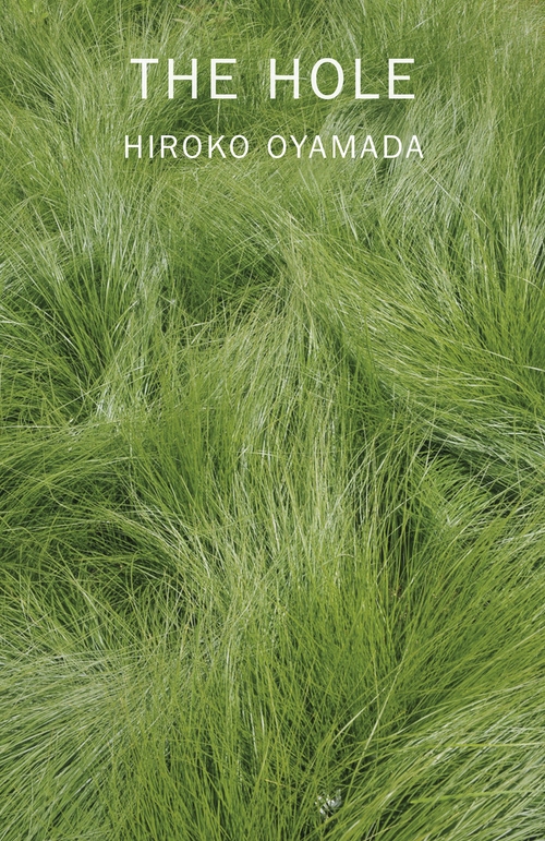 Hiroko Oyamada, tr. David Boyd, The Hole; cover design by Janet Hansen (New Directions, October)
This cover says so much with so little. The image is beautiful but somehow unsettling with what look like faint footsteps flattening portions of the grass. Where do they lead? I have to purchase the book to find out (success!). Plus, I want this object and The Factory, which is dressed similarly and is also designed by Janet, in my home on my shelf for the sheer unique and minimalist beauty of the designs.
The seemingly unspectacular bit of grass feels both comforting and also eerie, and sets the right vibe for the book. It feels like a postcard from a subliminal world.
Usually, when a photo has no typical focal point, it serves as a background image with the type doing the heavy-lifting front and center. Here, a plain patch of grass is presented as the main course. There’s nothing to see (how fitting, given the title); we are left with the unsettling, lonesome beauty of this grass.
Such a simple and provocative design. The photograph works so perfectly with the title, making you want to look more closely at the image. And the minimal type treatment adds another layer of mystery.
 Peter Cameron, What Happens at Night; cover design by Nicole Caputo (Catapult, August)
[Also listed]
 Héctor Tobar, The Last Great Road Bum; cover design by Rodrigo Corral (MCD, August)
I love how there are different elements in this cover, and they all work together seamlessly. The illustrated typography intertwines itself in and around the cover photograph creating the very road mentioned in the title. The fun and playful illustrations provide small windows into the text, highlighting key moments the reader will find along the way.
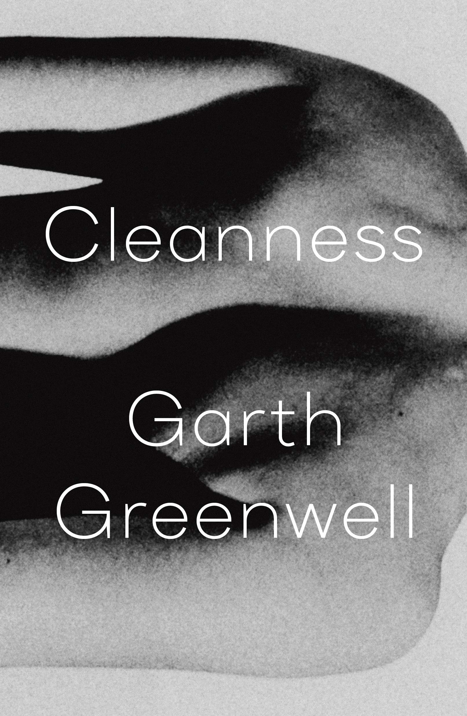 Garth Greenwell, Cleanness; cover design by Thomas Colligan (FSG, January)
I’m obsessed with this cover. The sideways orientation of the image; the image itself; the light, neat, androdgynous typography—it all has a quiet, unmistakable power.
Such a hauntingly beautiful image that plays tricks on your eyes. Combined with the clean, simple type, this cover is so mesmerizing.
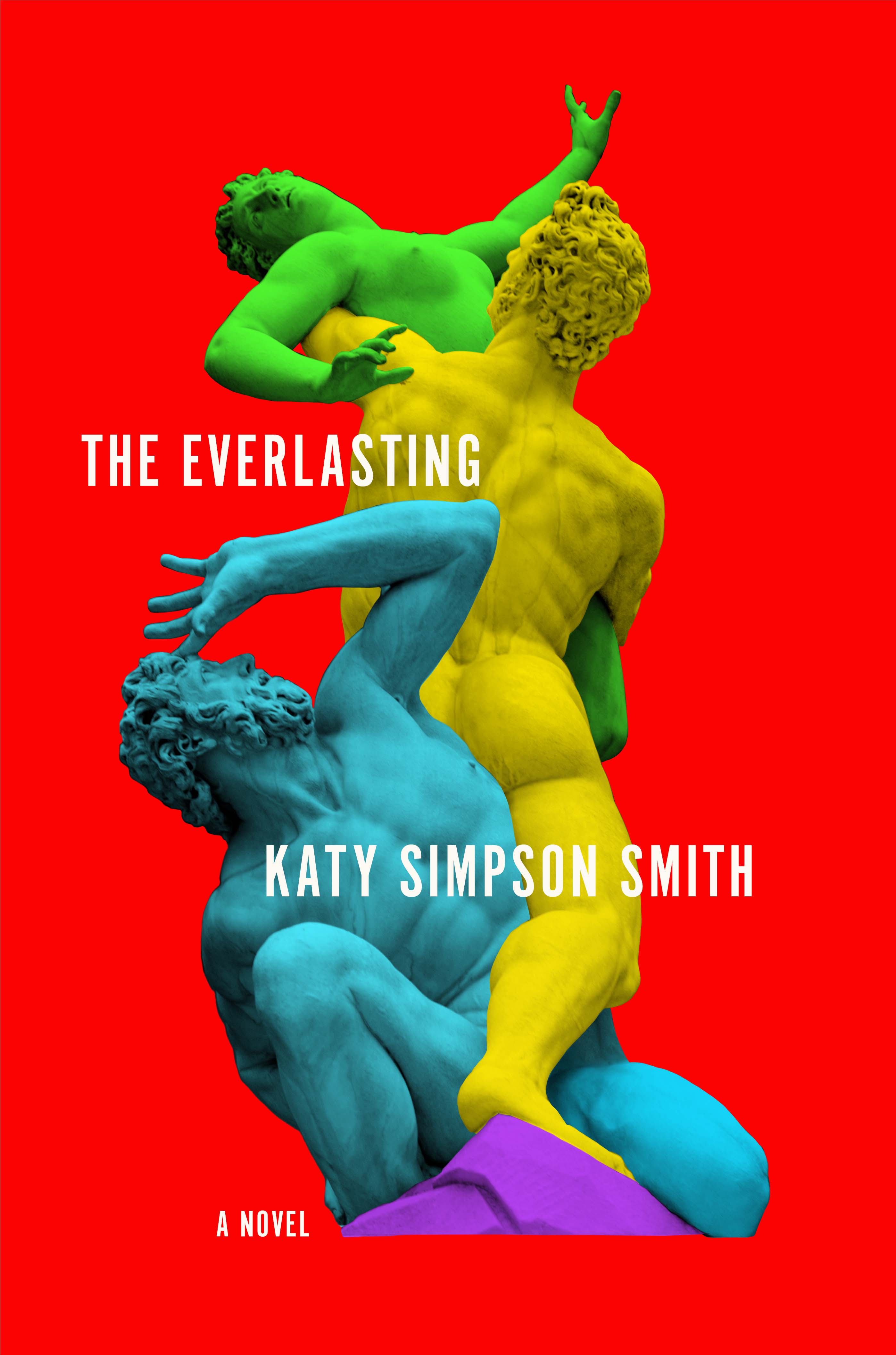 Katy Simpson Smith, The Everlasting; cover design by Robin Bilardello (Harper, March)
Continually impressed by Robin’s mastery of color. Classical form meets an electric palette.
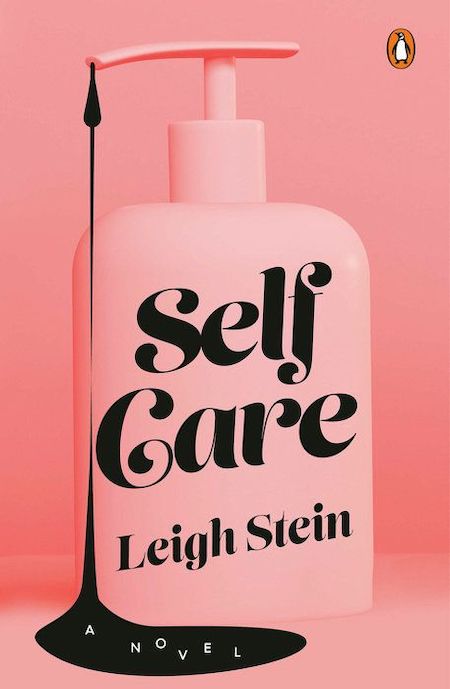 Leigh Stein, Self Care; cover design by Lynn Buckley (Penguin Books, June)
This cover is straightforward but incredibly effective with the overall sugary sweet pink punctuated with the rich black goop. The jostled “a novel” and the pink Penguin logo are perfect touches.
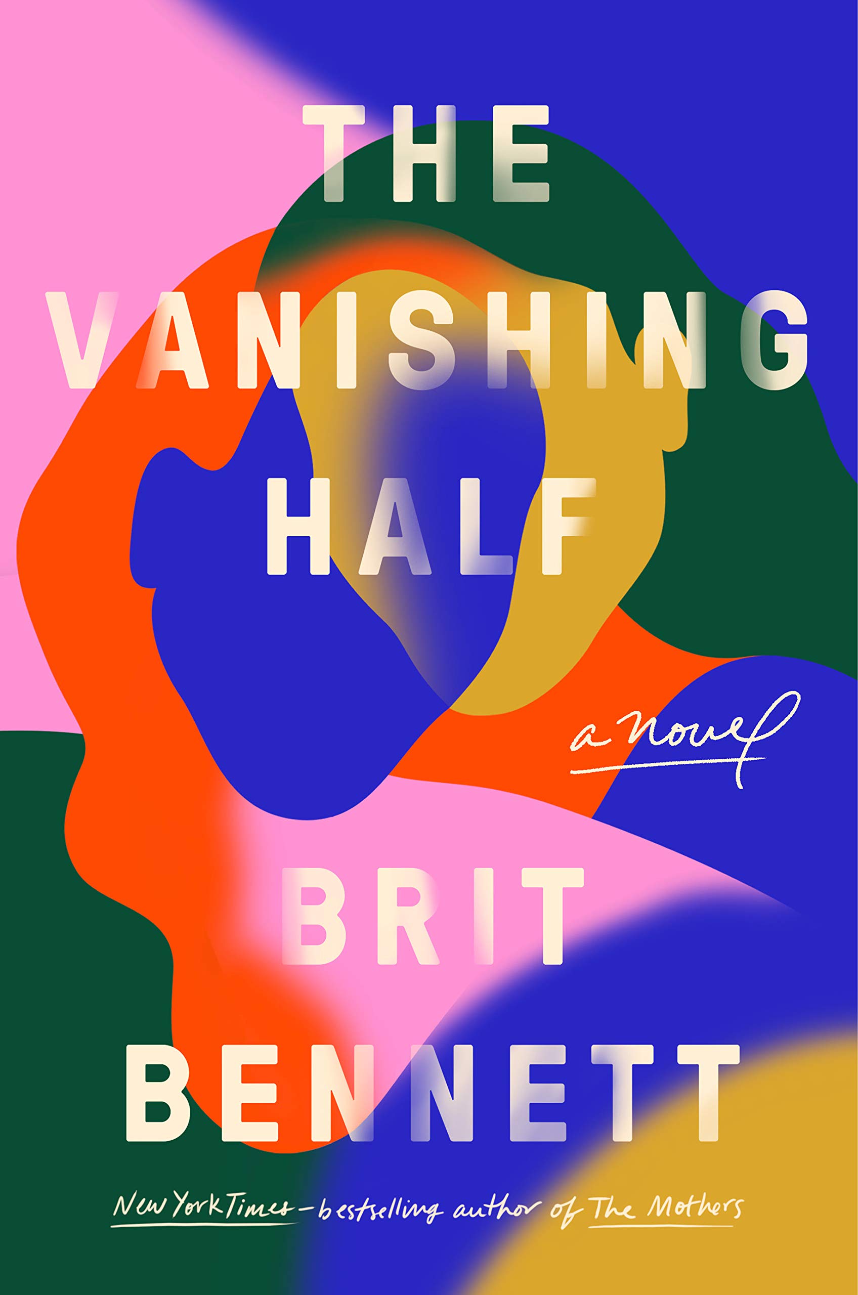 Brit Bennett, The Vanishing Half; cover design by Lauren Peters-Collaer (Riverhead, June)
Of my five cover selections, this is the only one whose book I’ve actually read. So while I admire the cover’s vibrant and unusual color scheme, balanced typography, and deft artistry, I can also say that it’s a beautiful and sophisticated representation of the book’s story.
The art in this is so effective in illustrating the title. I love how the shapes dissolve into each other in places and have a hard stop on other edges.
This cover is so iconic! The colors, the composition, and the blending of two silhouettes create a modern piece of art.
 Laura van den Berg, I Hold a Wolf by the Ears; cover design by Na Kim (FSG, July)
Strange and effective. The pastel type adds a sense of irony to the somewhat sinister image, but also draws out its melancholy somehow.
 Anna Weiner, Uncanny Valley, cover design by Rodrigo Corral (MCD, January)
There are so many familiar tropes used to communicate “tech” or “cyber,” but this jacket doesn’t fall back on any of them. Who doesn’t want to enter the dreamy, surrealist, slightly unsettling world this jacket promises? Having read the book recently, I can attest to how gorgeous this design is in person. It’s printed on pearlized paper which gives it a subtle metallic shimmer. It practically glows.
This cover is dreamy, and has a beyond the unknown feel to it with the hologram effect.
 K. J. Parker, Prosper’s Demon; design by Christine Foltzer, art by Sam Weber (Tor.com, January)
This cover well and truly got my attention. Boom . . .
 Melissa Rivero, Los Falcón; cover design by Adalis Martinez (Vintage Espanol, April)
Despite the bold, bright color palette, this cover manages to convey a pensive, serious mood. I love how the type is treated, changing color as it overlaps the art underneath.
The colors, the illustration, the type…it all feels cohesive and I love the mood that it creates.
We lost an amazing friend and colleague this year. This cover exemplifies Adalis’ beautiful mastery of design and illustration. She was not only incredibly gifted, but also just one of the kindest people I’ve ever met.
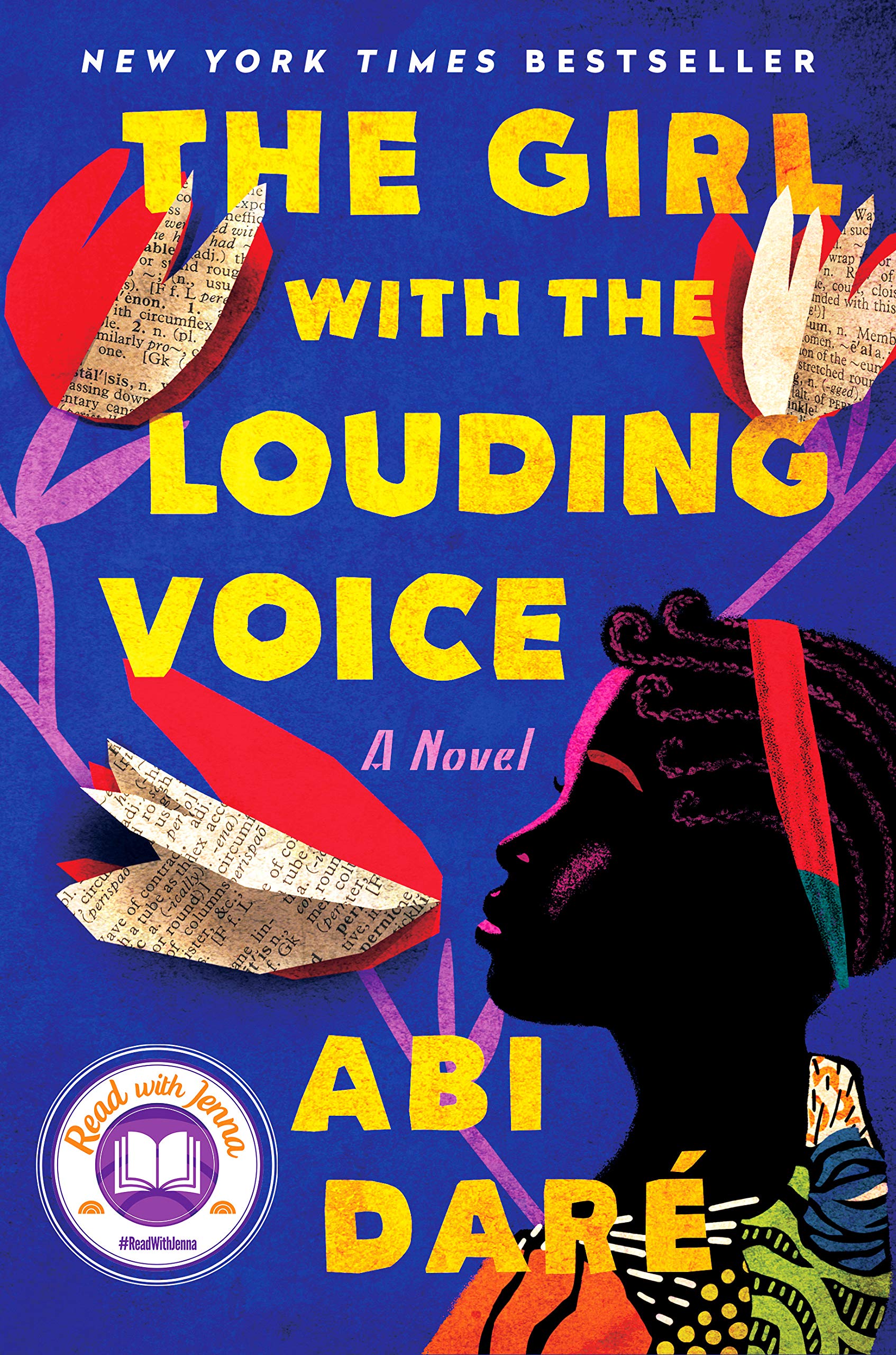 Abi Dare, The Girl with the Louding Voice; cover design by Christopher Lin, illustration by Vikki Chu, lettering by Jason Booher (Dutton, February)
So many beautiful details that work so harmoniously together in this artful but commercial design by Christopher Lin; from the palette and the lettering by Jason Booher, to the cut paper casting shadows that give depth to the layout, the patterns and that sublime shading in in the illustration by Vikki Chu. I feel the hope, spirit and determination of this Nigerian teenage girl. It ticks every box and then some.
 Patricio Pron, Don’t Shed Your Tears for Anyone Who Lives On These Streets; cover design by Tyler Comrie (Knopf, May)
[Also listed]
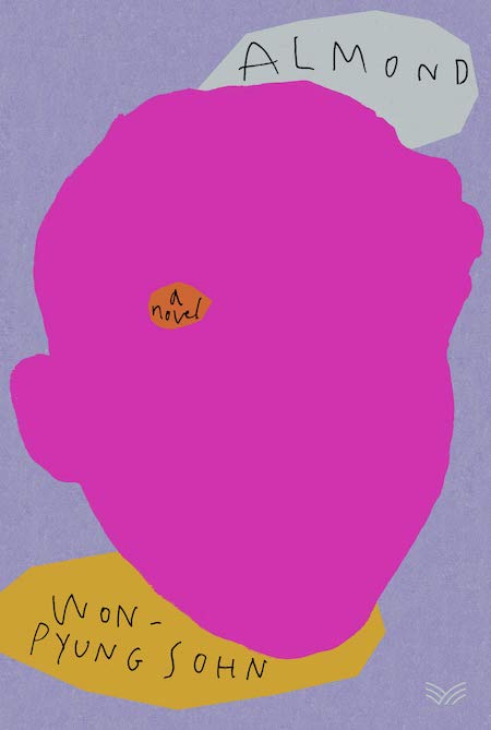 Won-Pyung Sohn, tr. Sandy Joosun Lee, Almond; cover design by Stephen Brayda (Harpervia, May)
This completely knocked my socks off. What’s not to love about one large, hot pink mass taking up the entire space? The critical orange patch enveloping “a novel”—hovering just above where the boy’s eye would be—activates and coheres the entire composition into a playful collage that I want to frame immediately.
This cover kind of blew my mind when I first saw it. It’s so bold and feels like it’s defying conventions in a totally effortless and nonchalant way.
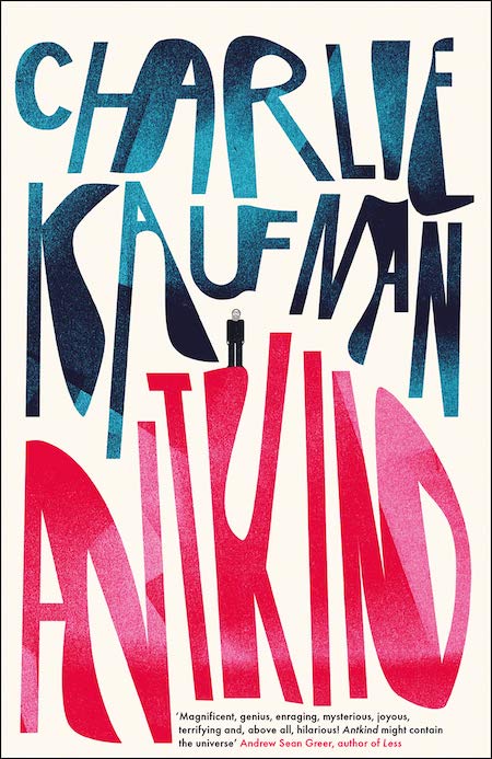 Charlie Kaufman, Antkind; cover design and lettering by Jack Smyth (4th Estate, January)
You can tell Jack had fun creating this expressive typography with letterforms blending into each other and showing off contrast and size.
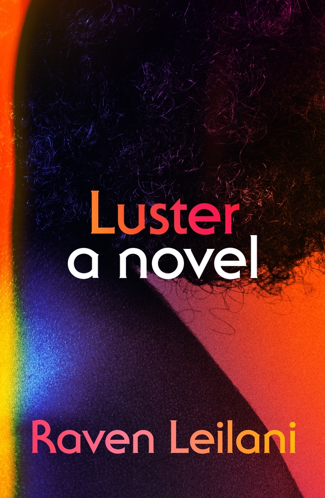 Raven Leilani, Luster; cover by Na Kim (FSG, August)
The retro typeface and light leaks give it a sensuous feeling which is heightened by printing on metallic. The effects allow the highlights and shadows on the photograph to shine.
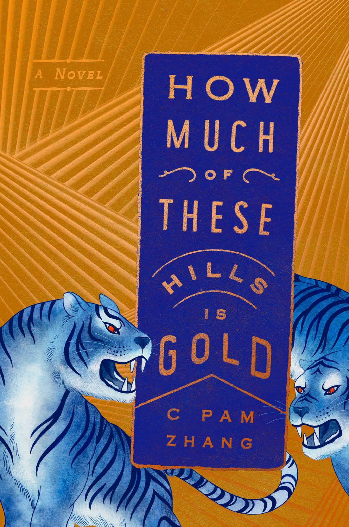 C Pam Zhang, How Much of these Hills is Gold; cover design by Grace Han (Riverhead, April)
I’m completely in awe of the artistry here. Every piece of this cover, each single line, feels extremely considered and hand placed.
I’ve never held a block of gold but imagine it would feel something like holding this. Everything about Grace’s design is intentional and inspired.
Grace is a master at perfectly pairing beautiful typography with beautiful art. I love how the background pattern can be both a visual of the shape of hills, and also a representation of gold rays of light. And then these ideas are reinforced in how she plays with the typography of the actual words “hills” and “gold” in the title.
 Yu Miri, tr. Morgan Giles, Tokyo Ueno Station; cover design by Lauren Peters-Collaer (Riverhead, June)
This design references everything it needs to without appearing overly beholden to any one thing. The intensely saturated palette is stunning—colors that should not work together are coexisting perfectly here. It’s a poster masquerading as a book jacket.
This artwork is so unique; the controlled line coupled with the vibrant color choice…the synergy between type treatment and illustration style.
It’s all about the poppy, unabashed use of color which is as inviting as a box of chocolates.
So playful! I love how everything comes together in this space.
Love the colors and compartmentalized elements.
 Stephen King, If It Bleeds; cover design by Wil Staehle (Scribner, April)
Wil Staehle kept the design simple. The author’s name large on top, the great shape of the black cat’s round head, the hand-lettered title below over a subtle textured background with no overlapping elements. All arranged so that there are no distractions to discover that the cat’s eyes and nose are created using a mouse’s head. Wil E. Staehle. Genius.
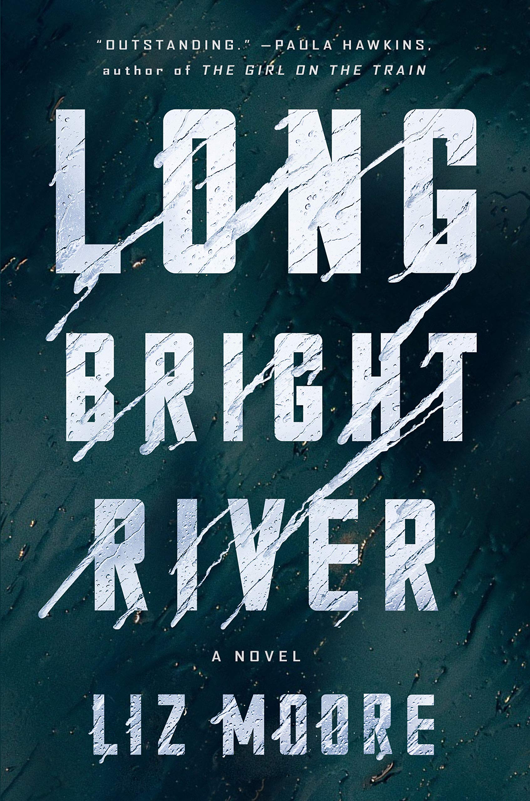 Liz Moore, Long Bright River; cover design by Gregg Kulick (Riverhead, January)
It’s always so refreshing to see type-driven designs. This cover evokes an ominous feeling with the forceful movement the letterforms create.
 Matt Haig; The Midnight Library; cover design by Sara Wood and Jim Tierney (Viking, September)
There are so many nuances to this cover! It tells a story while pulling the audience in to take a closer look. Are the “0’s” airplane windows? Are they zeros in a timestamp? Or are they portals to different worlds? So many intriguing things are happening and it makes me want to know more!
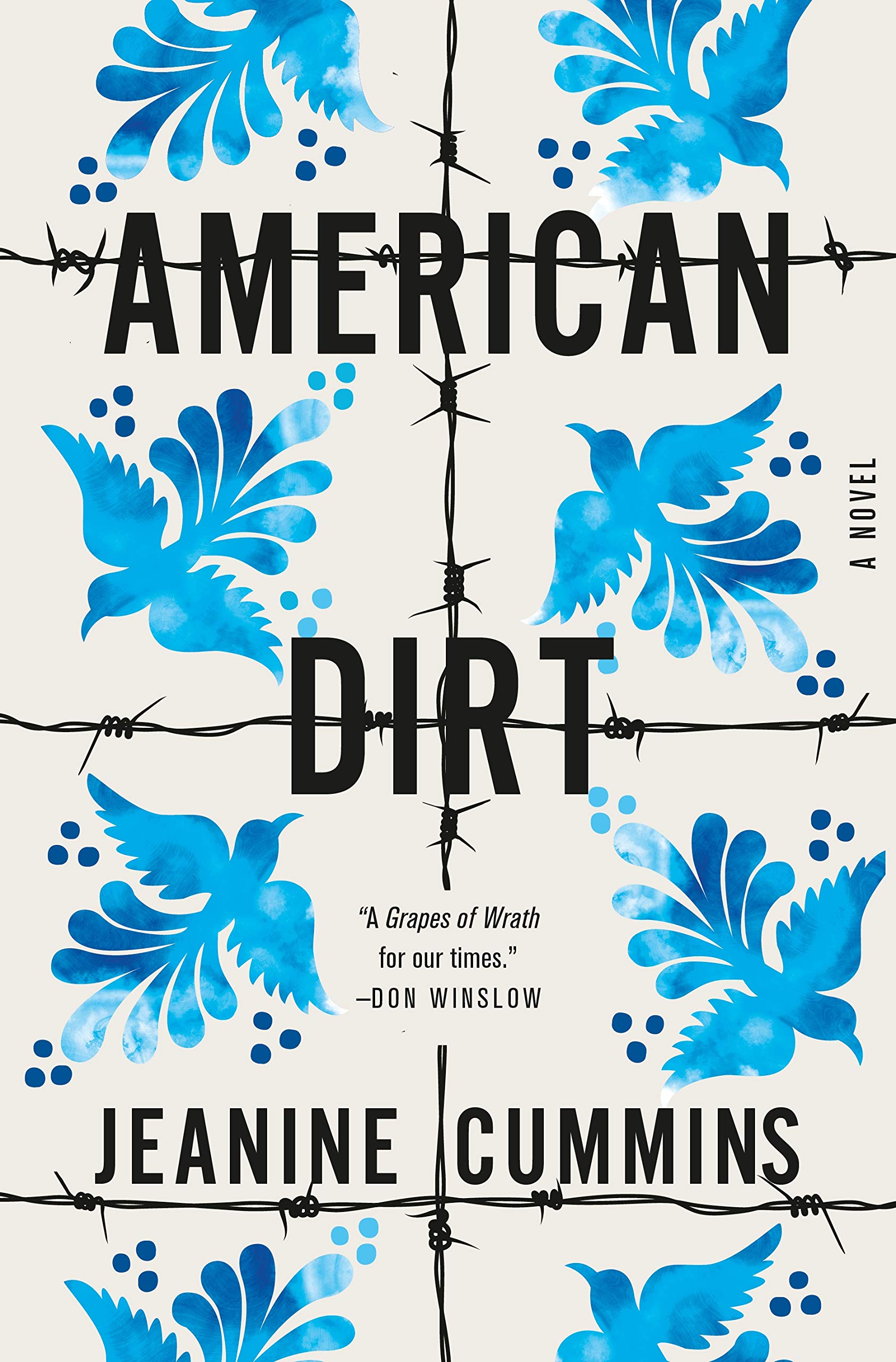 Jeanine Cummins, American Dirt; cover design by Julianna Lee (Flatiron, January)
Such a beautiful and clever design. It does a great job of having the “big book look” without being conventional.
 Guillermo Saccomanno, The Clerk; cover design by Alban Fischer (Open Letter, September)
Really stylish, inventive typography. Getting that beautiful type to work in harmony with the illustration takes real skill.
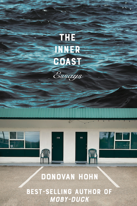 Donovan Hohn, The Inner Coast; cover design by Sarahmay Wilkinson (W. W. Norton, June)
This design has such a clever use of collage and composition that feels both menacing and playful. I like how the type treatment works in relation to the imagery, and how the cold blue/green tones and contrasted photography capture a sense of place.
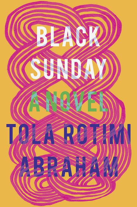 Tola Rotimi Abraham, Black Sunday; cover design by Nicole Caputo (Catapult, February)
Loving this energy, once again I am enticed by hand drawn texture and vibrant color.
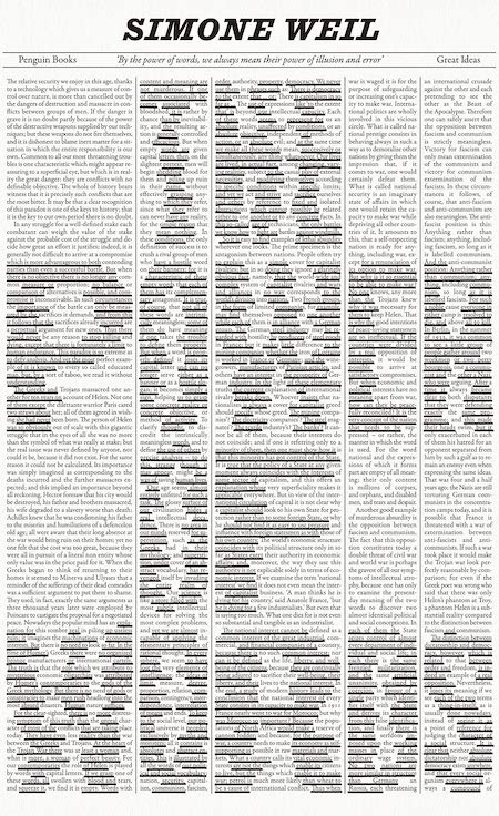 Simone Weil, The Power of Words; cover design by David Pearson (Penguin Classics, September)
In our hyper-designed, neatly packaged book world, there’s something charming about impenetrable block of text. This is a really simple, well executed idea, and it really doesn’t need much else.
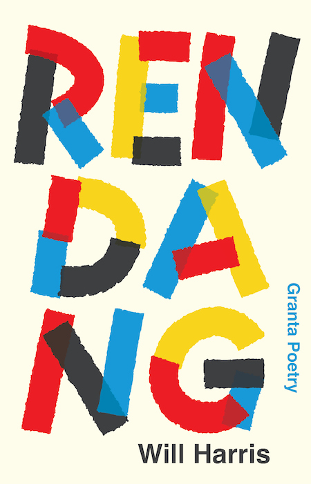 Will Harris, Rendang; cover design by David Pearson (Granta, February)
David is the master of these sorts of covers. Incredibly beautiful. Love the primary palette and playful layout. Sets the standard for modern poetry covers.
 Andrés Neuman, Fracture; cover design by June Park (FSG, May)
I love that this cover proves that you can have an (oft-shunned) brown book cover and that it can be absolutely BEAUTIFUL. An elegant use of physical effects, too.
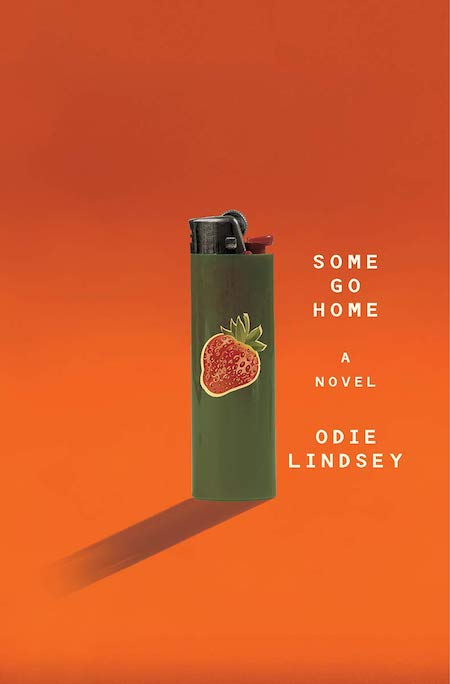 Odie Lindsey, Some Go Home; cover design by Sarahmay Wilkinson (W. W. Norton, July)
This is another one that stunned me when I first saw it. It’s so striking to have this small, unassuming lighter placed here surrounded by so much space. I love its long shadow and am intrigued by the juxtaposition between the lighter and innocent looking strawberry.
 Bela Barbosa and Edel Rodriguez, I Am!; cover design by Maria Elias (Rise x Penguin Workshop, October)
A perfectly chosen illustrator for this book which is beautiful inside and out. Bright, emotive illustrations that connect to the young (and old) readers alike, by Cuban American artist Edel Rodriguez with dynamic energetic type treatments. This book leaped out of the shop and onto my shelf in an instant. Incredible art direction and design by Maria Elias.
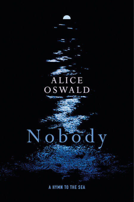 Alice Oswald, Nobody; cover design by Jared Oriel (W. W. Norton, July)
The design of this poetry cover is truly one of my favorites. I love the way the typography sits between the shimmering moments of water capturing the moonlight on a vast dark ocean. It really does create a beautiful flow to how one’s eye travels across this cover.
 Nicholas Fox Weber, iBauhaus; cover design by Tyler Comrie (Knopf, February)
By stripping an iPhone down to its essential shapes and layering them over the colors and geometric signifiers of Bauhaus design, this jacket communicates the book’s content in the simplest and clearest way possible. I haven’t seen this in person, but I hope the silver is foil-stamped—it’s crying out for it!
 Sun Tzu, tr. Michael Nylan, The Art of War; cover design by Jaya Miceli (W. W. Norton, January)
A contemporary take on an ancient text. The production of this small but mighty tome is spot on; overall foil adds a compelling glisten to the armour’s surface.
 Kyle Chayka, The Longing For Less; cover design by Tree Abraham (Bloomsbury, January)
This book looks like nothing else, notably missing the title and author which makes it feel more like an objet. Holding and playing with it often had me considering the consumerist relationship between the reader and packaging of ideas.
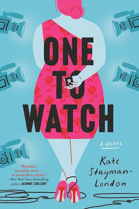 Kate Stayman-London, One to Watch; cover design and illustration by Sarah Horgan (Dial Press, July)
This cover takes one of my favorite trends, the illustrated romance cover, and elevates it. The pared down color palette help make this cover instantly recognizable.
 Becky Cooper, We Keep the Dead Close; cover design by Alex Merto (Grand Central Publishing, November)
[Also listed]