The 75 Best Book Covers of 2018
According to Book Cover Designers
 Nathaniel Rich, King Zeno, design by Na Kim and Alex Merto (MCD)
I love that this book cover can also hang on your wall.
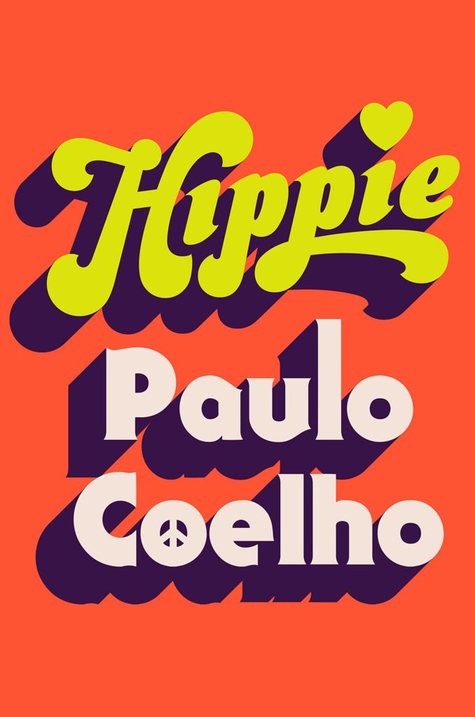 Paulo Coelho, Hippie, design by Tyler Comrie (Knopf)
My brain instantly went ahhhhhhh and ohhhhhhhh. The mood is set with just pure colour and type. I was instantly drawn in. This cover plays with the recent trend in the nostalgic big type and flat colour, this example just won me over and my brain just said yesssssss!!!!
Fun, effortless, and authentic. I’m in love with the printed edition and its neon inks, glossy paper, and sculpt emboss. Puts a smile on my face and feels like a time machine back to the 70s; so well done!
 William Carlos Williams, The Doctor Stories, design by Joan Wong (New Directions)
I want this cover hanging on my wall. The cherry that puts this over the top for me is the bold choice of setting the Introduction line on a curved path. So much movement, I’m just in love!
 Yoko Tawada, The Emissary, design by John Gall (New Directions)
The first book I ever bought for its cover was created by John Gall, and to no surprise the last book I bought for its cover was The Emissary. The cover embodies the balance of irony, tenderness, and doom that persist throughout the book.
There is an ineffability about this cover. Simultaneously playful and melancholy, the only word I can muster is mono no aware, a Japanese term that describes the deep wistfulness and transience of things. John has captured this very special feeling with the masterful use of negative space—the boy is literally out of reach and toppling off the page.
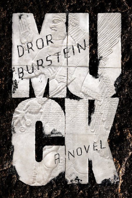 Dror Burstein, tr. Gabriel Levin, Muck, design by Na Kim (FSG)
I love that on first glance I really thought this was gummed up wet cut out napkins. But looking closer (online viewing here), it’s a beautiful marble relief. And the sense that it’s sort of been graffitied on really blends the old with the new. A humorous retelling of the book of Jeremiah set in modern times… what better than ancient art being tagged with a marker? The boldness of the lettering and breaking of the word is a favorite of mine. I try this so many times and tend to get it killed.
 Ahmed Bouanani, The Hospital, design by Oliver Munday (New Directions)
I love how this Oliver Munday cover manages to use bright, approachable colors to create a downright nightmarish image. It’s the kind of visual dissonance that draws you in and makes you flip straight to the book’s description—the ultimate mark of a successful cover design.
 Tommy Orange, There There (UK edition), design by Suzanne Dean, art by Bryn Perrott (Harvill Secker)
This cover makes a fearless statement. The red “teardrop” elements pour out over the cover, audaciously covering up the title, and yet legibility is no issue here. There is a chaotic beauty to it all, but somehow it forms to create a cover with big impact.
With this perfect overlap your eye is balanced between looking at the type and the art. Super hard to pull off, and super effective when you do. There’s also so much character given to the type without it veering into childish and it’s still beyond legible.
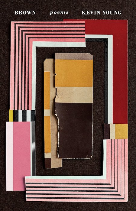 Kevin Young, Brown, design by Kelly Blair, collage by Jason Kernevich (Knopf)
What a beautiful object this book is. Small elegant typography crowns the top of the cover letting the tactile layered collage by Jason Kernevich draw me in from across a crowded shop. Uncoated stock gives a tactile feel complimenting the visual texture. The art selected works perfectly for this poetry collection about racial identity. Kelly and Jason have created a deeply meaningful piece of art for our shelves in book form.
 Ian Buruma, A Tokyo Romance, design by Oliver Munday (Penguin Press)
The circle elements are used really nicely, linking and unlinking and playing off the word ‘romance’, and I find the palette and overall elements to be just generally simple and pleasing.
A book cover that also acts as a beautiful wallpaper is an added bonus. It is a clean, retro design with a modern twist that is very inviting. So much is said about this design that intrigues me to figure out the story behind it. The shifts in between the three panels and type shows the fragments of time, and the contrast between the two colored circles overlapping each other as it drifts off the page shows tension.
 Catherine Lacey, Certain American States, design by Na Kim (FSG)
This cover tugs on my little heartstrings. It makes me feel the mundanity and magnificence of ordinary life balanced together.
 Lucia Berlin, Evening in Paradise, design by Na Kim (FSG)
This cover is the effortless cool girl of new releases, fitting for the content. Na Kim exhibits beautiful restraint and elegant typographic choices. The small refined details, like the way the author of line dips just under the ridge of the glass and how the white half circles resemble those painted sections on vintage ashtrays that will soon be chipped away, demonstrate a meticulousness and thoughtfulness that can take a design to the next level.
The sculptured emboss on this thing is out of this world.
This cover just makes me want to sit in the sun with a cigarette in hand
Ooooohhh this is so pretty. I just want it.
I don’t smoke, but this makes me want to have a cigarette. Love the idea of executing something related to a vice in such a polished and beautiful way. It helps too that the type is meticulously handled and the color is perfect . . .
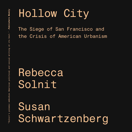 Rebecca Solnit and Susan Schwartzenberg, Hollow City, design by Cortney Cassidy (Verso)
Sometimes the simplest covers are the best.
With a title like When Katie Met Cassidy, the cover could be in danger of simply repeating what the audience already knows instead of adding to it, but this art expands the story. Plus having the word “met” over the kissing lips matches the playful energy of the writing.
 Jay Rubin, ed., The Penguin Book of Japanese Short Stories, design by Matthew Young (Penguin)
Story collections are my favorite travel reads, and I love how instantly transporting this Matthew Young cover (with artwork by Hiroyuki Izutsu) feels. As soon as I saw it I wanted to grab a copy and board a train from Tokyo to Kyoto.
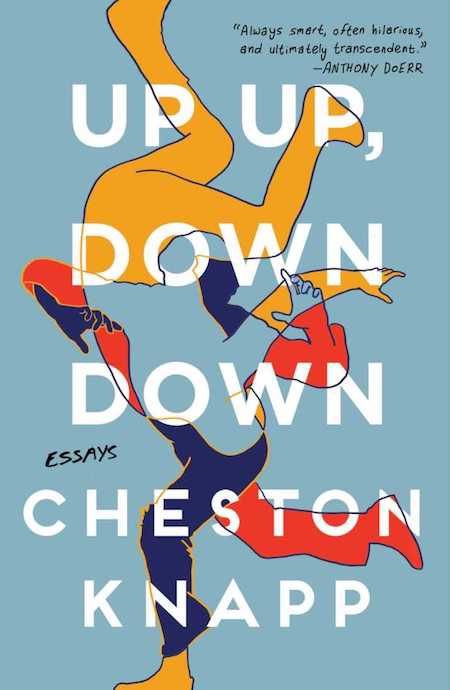 Cheston Knapp, Up Up, Down Down, design by Anna Laytham (Scribner)
The way the type is incorporated with the beautiful art is so elegant. And I love that this made it through. I can just hear a marketing person in-house making the comment that it’s just a little too hard to read. But it makes you work for it, and really not all that hard, let’s be honest. And that artwork speaks so clearing to the author seeking out his identity through these essays. Plus color choice is so fresh even though it’s primary colors.
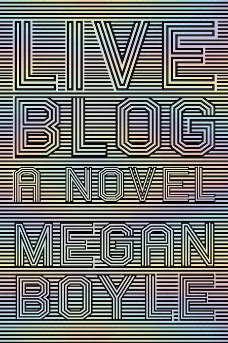
Talk about eye-catching! What I love most is its simplicity and symmetry—the lines and letter strokes are all just the right size for a perfectly balanced optical illusion, giving us a look that’s just on the edge of familiar yet completely fresh.
 Rawi Hage, Beirut Hellfire Society, design by Lisa Jager (Knopf International Edition)
The color palette caught my attention first on this cover. This seems to be the year of orange for book covers but the pops of violet-blue make all the difference and then the bright colors are nicely juxtaposed on the grey which is a color you don’t see large swaths of very often on covers.
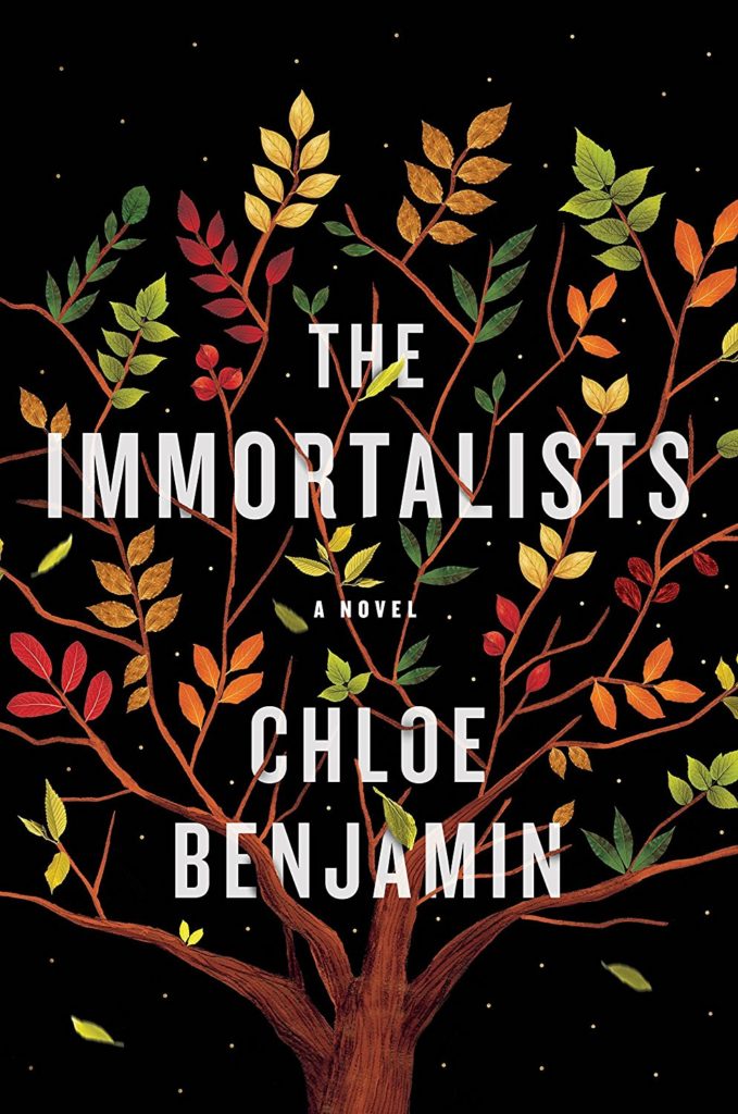 Chloe Benjamin, The Immortalists, design and illustration by Sandra Chiu (Putnam)
The delicate illustration of the tree with its falling leaves hints at just enough of a story to make the reader intrigued. While the artwork is soft, the type and black background keep the cover from becoming too saccharine.
 César Aira, 3 Novels, design by gray318 (Penguin Essentials)
This is a clever way to represent three different stories. Feels like something that’s going to be fun to read.
 Ben Marcus, Notes from the Fog, design by Peter Mendlesund (Knopf)
I mean…
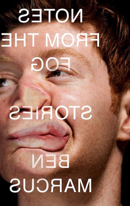 Ben Marcus, Notes from the Fog (UK cover), design by Jamie Keenan (Granta)
In college, one of my favorite artists was the British painter Jenny Saville, whose visceral depictions of all things corporeal completely transfixed me. It’s no surprise, then, that I’m drawn to this cover. The photo has a similar concept to one of Saville’s paintings, only more blasé (the guy looks pretty calm as he’s being shoved against the glass!) than plain brutal. I know it’s literally in-your-face, but the execution is so pure: the backwards type treatment does not compromise. Bravo to the publisher for taking a risk.
The only reason 2018 was an okay year is because this cover came out of it. Clever and exuding confidence—thank you Jamie for giving me hope in this dark world!
Jamie has the annoying knack of finding solutions you can’t believe you’d never thought of. Praise be also for the publisher’s bravery. The US cover by Lord Mendelsund is great too.
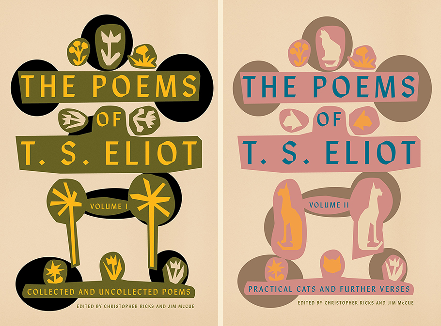 T. S. Eliot, The Poems of T. S. Eliot Vol I & II, design by Alex Merto (FSG)
There is something entirely eccentric and utterly charming about the artful balance of parts that make up the newly released jackets for Volumes I & II of The Poems of T. S. Eliot. These two beauties manage to be both quirky and spare. The only “method,” Eliot once wrote about his work, “is to be very intelligent.” Merto’s jacket designs are the visual equivalent, and we’ll take both for our bookshelves, pretty please.
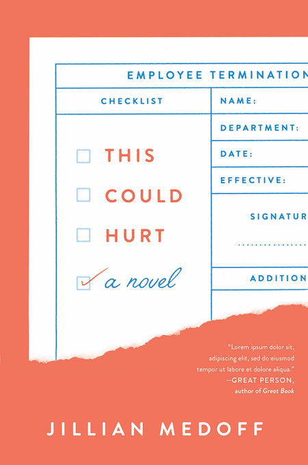 Jillian Medoff, This Could Hurt, design by Joanne O’Neill (HarperCollins)
I loooovvve this cover. Its retro, its fresh, it printed on uncoated stock and had great texture. Its subtle and poppy at the same time. a a pretty palette.
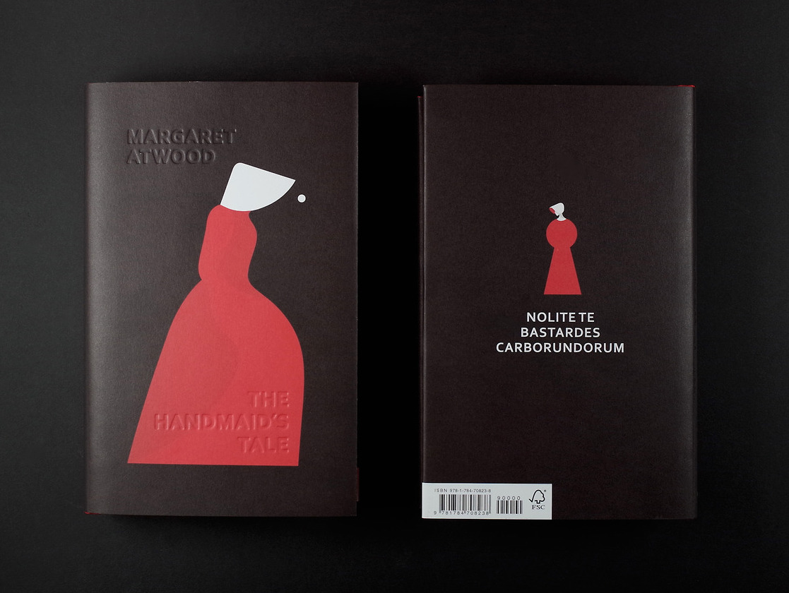 Margaret Atwood, The Handmaid’s Tale, illustration by Noma Bar, design by Suzanne Dean (Vintage UK)
I first came upon this UK edition cover on screen after it had won a design award in its category from ABCovereD. The blind debossed title and author name are barely noticeable on screen but the iconic and startling illustration by Noma Bar needs nothing to accompany it. The physical book is sumptuous with red painted edges, uncoated stock and a ribbon as well. A gorgeous cover that haunts and moved me to my core.
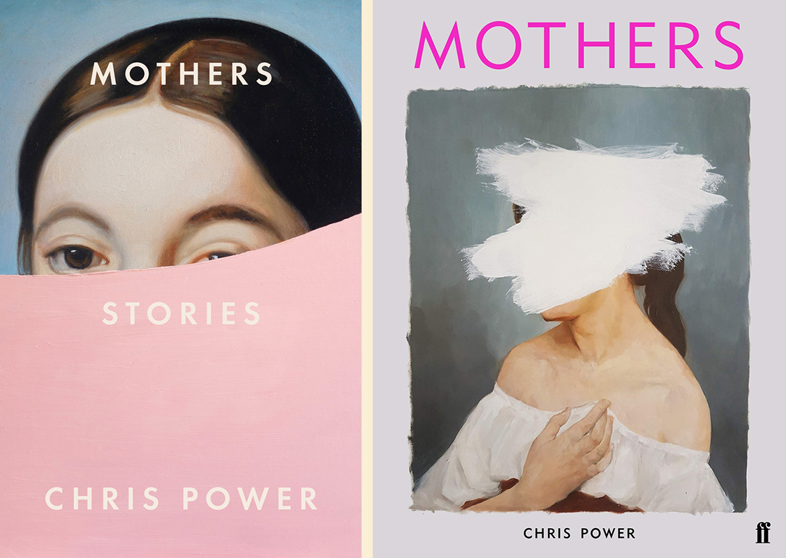 Chris Power, Mothers: US design by Grace Han (FSG); UK design by Eleanor Crow (Faber & Faber)
I don’t know which came first, the UK or the US cover. Both similar and great (Eleanor Crow designed the lovely UK cover). I love the colour and simplicity and the subtle paint line on this one.
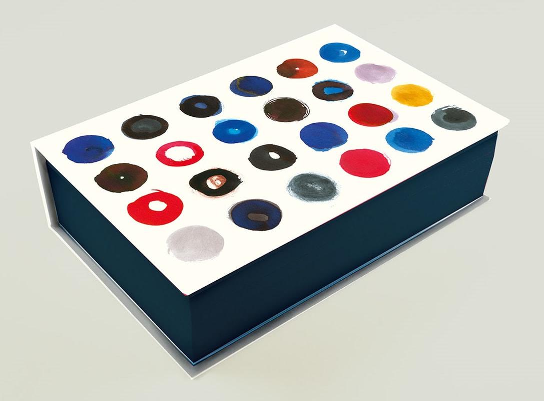 Haruki Murakami, Killing Commendatore (UK Special Edition), design by Suzanne Dean (Harvill Secker)
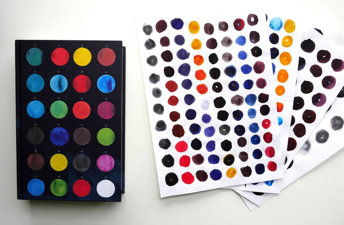 Haruki Murakami, Killing Commendatore (UK Special Edition), design by Suzanne Dean (Harvill Secker)
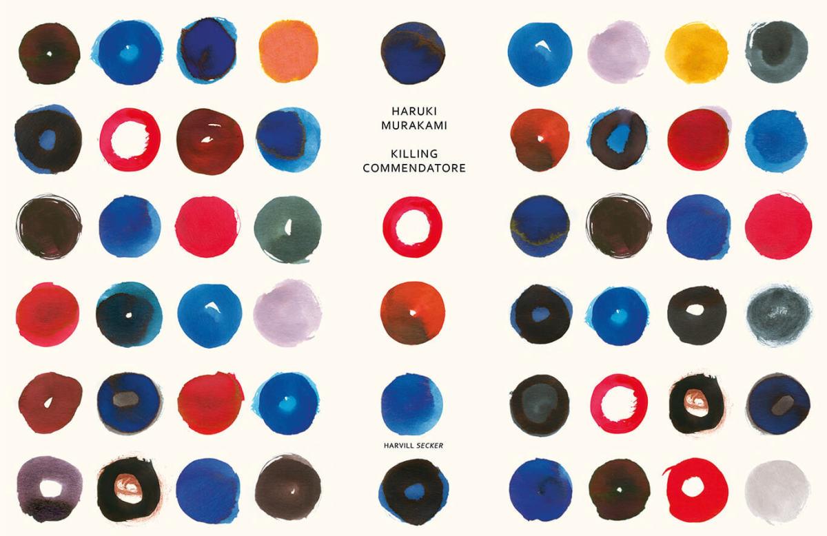 Haruki Murakami, Killing Commendatore (UK Special Edition), design by Suzanne Dean (Harvill Secker)
I find paint splodges and paint palettes completely intoxicating. I can look at them, and this cover, for hours on end.
Emily Temple
Emily Temple is the managing editor at Lit Hub. Her first novel, The Lightness, was published by William Morrow/HarperCollins in June 2020. You can buy it here.


