The 75 Best Book Covers of 2018
According to Book Cover Designers
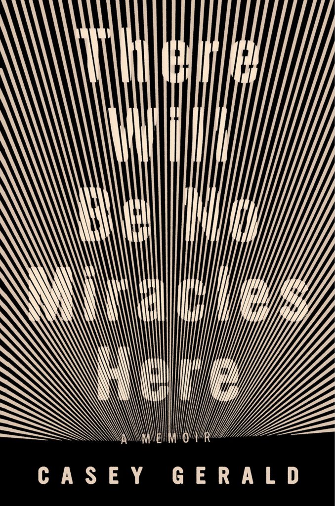 Casey Gerald, There Will Be No Miracles Here, design by Grace Han (Riverhead)
The perfect marriage of word and image, this cover is sublime! Those stark, radiating beams harken back to the Ecstasy of St. Teresa—pure and uninhibited. In person, they vibrate intensely, promising revelatory truth and transcendence—despite the title’s declaration. It’s as if we’re staring straight through the solar eclipse into the great beyond.
This is going to sound crazy BUT I love how this cover works online as a jpg. The type and line graphics vibrate like bananas, and for me that is a win.
The vibrations that radiate between the type and the image, as your eye moves down to the horizon line, make for a spectacular cover. It’s almost as though you’re looking at it through a zoetrope.
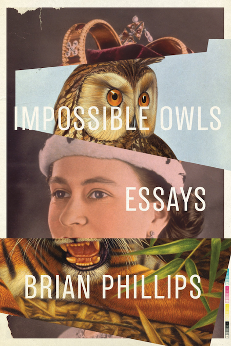 Brian Phillips, Impossible Owls, design by Jamie Keenan (FSG Originals)
I love when images are collaged to align just so and create something so unexpected, you keep coming back to see more.
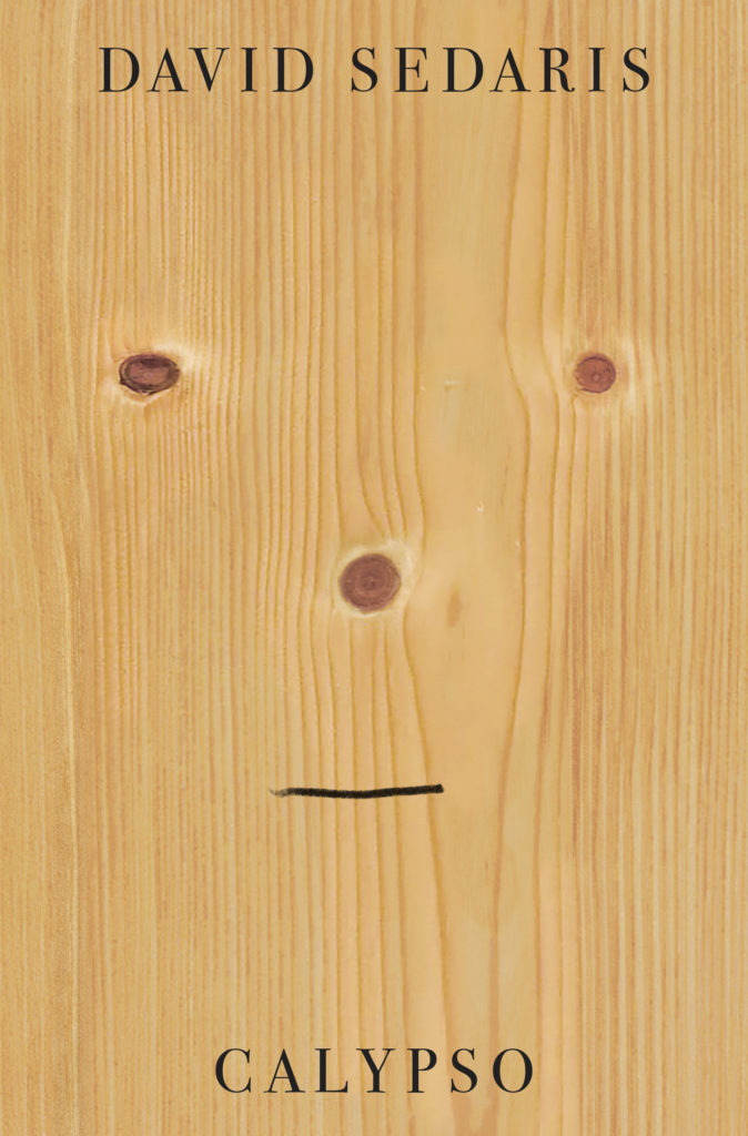 David Sedaris, Calypso, design by Peter Mendelsund (Little, Brown)
Another funny cover but in a completely different way. Wry, smart, a touch of sad, and perfectly Sedaris.
Funny, simple and refined. The is so good!!! Reminds me of everything in that graphic design bible, A Smile in the Mind. The perfect distillation of funny in one seemingly effortless stroke of the pen.
This cover is an unexpected one for David Sedaris: wildly bare, but of course filled with philosophical intrigue and wit in its content. Who knew a face in an inanimate object could feel so existential? Brilliant.
This cover is both sharp and humorous at the same time which is reflective of Sedaris’s writing. Something is compelling about it that keeps me from turning away. There is a good balance of simple forms of circles and lines that effortlessly form a face. It’s a work of art.
Clean, simple and humorous. Peter Mendelsund at his best. A lovely piece of production too.
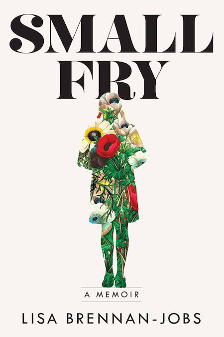 Lisa Brennan-Jobs, Small Fry, design by Alison Forner (Grove)
Alison’s work is consistently great and here is another example. Defying some of the clichés this cover could have fallen into as it relates to Steve Jobs’ daughter, the cover is instead illuminating. The floral elements add an organic nature that mirrors the author’s writing. The font is unexpected and bold and gives the viewer a sense of how unique the author’s story is, while the overall white background hints at the deeper connections to Jobs’ legacy.
I love the sensitivity of the silhouette with the large bold type. Creates a sense of longing…I wish I was filled with flowers.
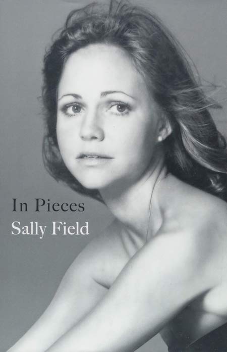 Sally Field, In Pieces, design by Anne Twomey, photograph by Harry Langdon Jr. (Grand Central)
Then-creative director of Grand Central publishing, Anne Twomey, created such a compelling and unforgettable design. The photo by Harry Langdon Jr., was taken in the 70s and captures Sally’s vulnerability which works perfectly with the title. With beautiful restraint and minimal well placed typography, Anne Twomey created a compelling design that I believe is irresistible to viewers on screen or across a crowded shop.
A beautiful photograph with simple and understated type that makes for an elegant cover.
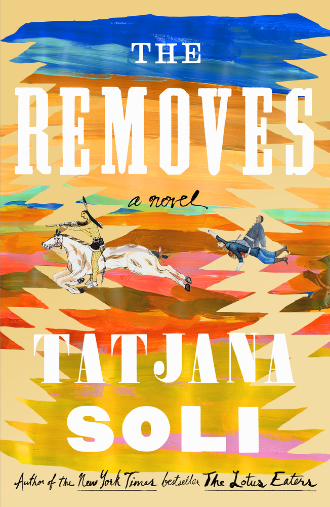 Tatjana Soli,The Removes, designed by Jaya Miceli (Sarah Crichton Books)
I love the painted strokes here as well as the figures which evoke almost the same feeling as Henry Darger’s work (who is an absolute genius as far as I’m concerned!). The colors are bright and fun and the type is unusual. I just want to pick this book up and hope the story is as fun and exciting as the cover!
When this showed up at FSG, I was like YES! The textile landscape is magic, the colors are delightful.
 Inger Christensen, The Condition of Secrecy, design by Joan Wong (New Directions)
I love the careful composition of cutout shapes framed within and over the image.
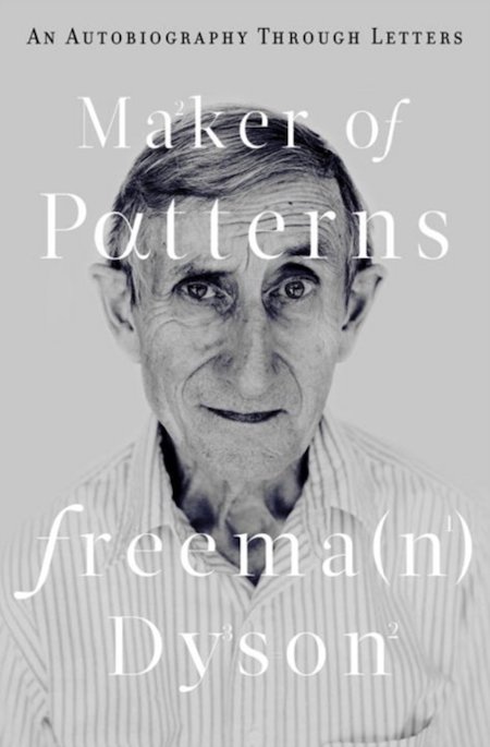 Freeman Dyson, Maker of Pattersn, design by Steve Attardo (W.W. Norton)
So simple. So smart.
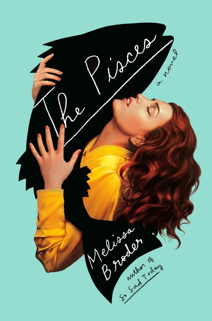 Melissa Broder, The Pisces, design by Rachel Willey, illustration by Tim O’Brien (Hogarth)
What is going on here!?! A big fish cuddle! I like the simple graphic fish silhouette combined with the realism of the illustration of the lady. This works so well, the taking two different graphic styles and fitting them together seamlessly.
I really admire this design. Rachel has taken the Romance illustration and completely changed it up.
It’s outrageous how evocative this cover is. Everything about it—the woman, her face, the strange fact that she is embracing a fish, the contrasting nature of the fish graphic, the color… everything!—captures and holds my attention.
I love how the image of the woman interacts with the silhouette. It evokes emotion in a quirky, clever way.
You could not miss this Rachel Willey cover from a mile away. It’s so fun and ecstatic and kind of wrong. And Tim O’Brien’s smooth-as-butter artwork is the ultimate sell for the cover’s punchline.
Another use of retro-styled imagery but contemporized in a very bold, striking design that is as attractive as it is intriguing. I don’t know what this book is about, yet I must know what this book is about.
This cover has received a lot of attention and deservedly so. The photorealistic illustration of the woman combined with cut out fish and the hand done type is perfectly weird and encapsulates the humor in this story.
When I first saw this design, it stopped me in my tracks. I thought to myself, “this appears to be a woman having an ecstatic, almost erotic, experience with a fish.” If that isn’t enough to make you pick up a book and take it home with you, I don’t know what is! Every element—the background color, the black fish silhouette, the illustration style, the handwriting—works in concert to make this one of my favorite jackets ever.
I love the pulpy execution of fantasy through realism here.
This is probably my favorite cover of 2018. It’s strange and beautiful and very true to the book. It’s unexpected and odd in a way that makes you want to pick it up to figure out what’s going on.
An amazing example of beautifully detailed illustration being disrupted by a stark graphic element, all while speaking perfectly to the title.
I haven’t read this book, but this cover is just so good. An epic embrace with a fish. The color palette is lovely too.
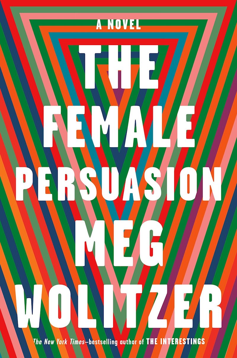 Meg Wolitzer, The Female Persuasion, designed by Ben Denzer, (Riverhead)
This iconic design by Ben Denzer is striking. It says “woman” in a clear, bold, conceptual way. The colors appeal, and it feels like a pop art poster that I could stare at for ages.
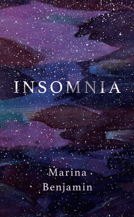 Marina Benjamin, Insomnia, design by Nicole Caputo (Catapult)
I love a solid paper over board solution, and this one is perfect. Really captures the strange loveliness of insomnia.
 Jorge Barón Biza, The Desert and Its Seed, Oliver Munday (New Directions)
Those lonely lips. You could imagine a whole face sitting in that space above them but the absence of any other features is so unsettling and visually arresting.
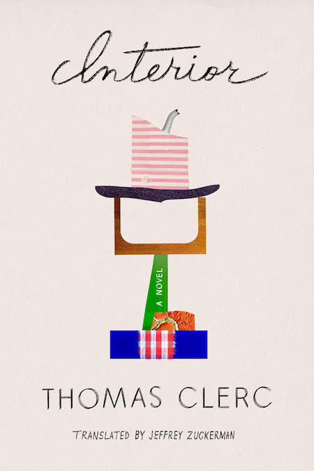 Thomas Clerc, Interior, design by Na Kim (FSG)
All of Na Kim’s covers are winners, but the delightful simplicity of this one—the way that the one-word title almost decodes the abstraction of the collaged imagery—particularly satisfies.
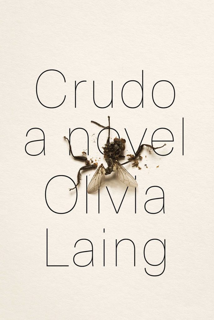 Olivia Laing, Crudo, designed by Devin Washburn at No Ideas (W. W. Norton)
I’m a sucker for anything trompe l’oeil, and this cover feels like a worthy successor to Charlotte Strick’s Varieties of Disturbance. I love how the designer offset the fly’s grisly demise with elegant, high-fashion type and uncoated paper stock—total attraction and repulsion!
This would not be out of place on a gallery wall. I’m not sure how a crushed fly could look so elegant, but here it is. And the stripped down, thin type interacts with it so beautifully.
Simple, but impactful. It is hard to make a dismembered insect look appealing, but I think this cover is successful in creating a sense of intrigue.
The contrast between elegant form and an unsavory image, perfectly integrated to make a this minimalist cover sing. Only wish I did it myself.
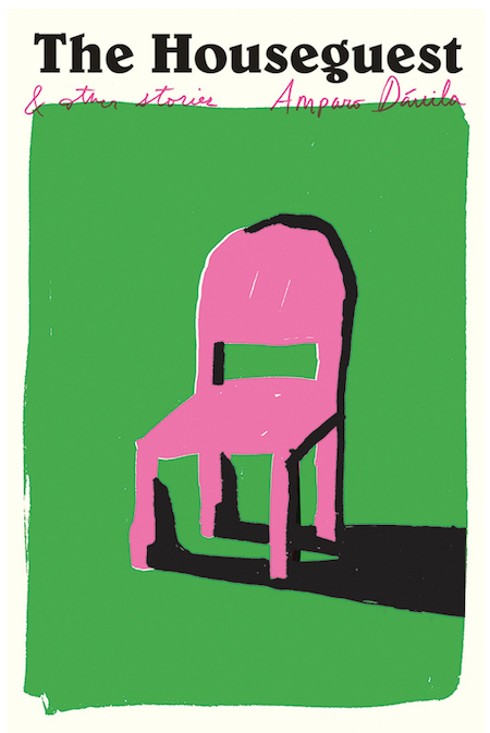 Amparo Dávila, The Houseguest, design by Oliver Munday (New Directions)
I love this combination of colors. I also like the typeface that the title is set in very much, especially the “g”. I was drawn to this cover because, aesthetically, I find it to be very appealing. I didn’t notice until I took the time to write this, but after looking at the cover closely, I see the shadow of the chair as a man, flat on his back, with his heals on the legs of the chair. I could be making this up, but I like covers with ideas hidden in them that you can discover later on, as you come back to it over and over again as you’re reading the book.
I love that the stand alone roughly drawn chair takes up the most part of the cover. Green and pink!
Oh, how we adore the hidden surprise of the figurative shadow in this charmingly rough-edged cover illustration. Who is this guest? And did they make it home alive? Equally puzzling is the stout, dazzlingly pink chair (an innocent bystander, perhaps?) at the center of it all. Reader, don’t be distracted by all of this intrigue and fail to miss that lowercase “g” in “Houseguest.” It will keep any self-respecting, type-loving designer up all night with it’s astonishing proportions.
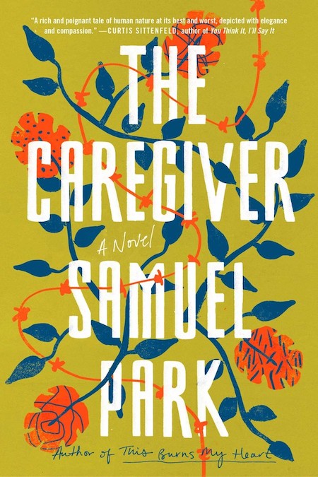 Samuel Park, The Caregiver, design by Lauren Peters-Collaer (Simon & Schuster)
My favorite part of this cover is the color palette. I don’t often see these colors on book covers (that yellow green!) and yet they are unexpectedly beautiful and jarring at the same time. The large type creates a bold juxtaposition against the organic shapes of flowers, vines and wire and helps move a viewer’s eye around the page.
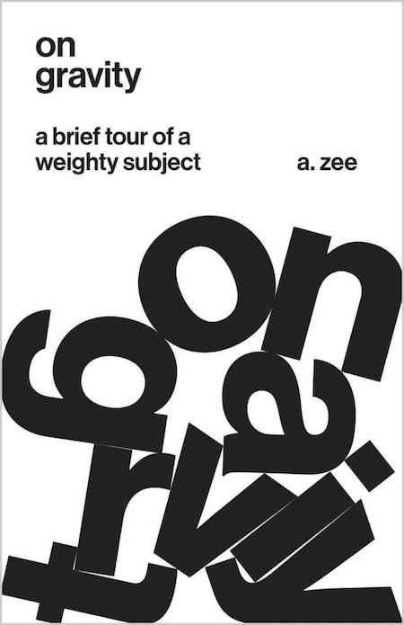 A. Zee, On Gravity, design by Jason Alejandro (Princeton University Press)
Ok, sucker for concept. . . And while this seems like an obvious idea, the starkness of it and the design of the lettering is such a knock out. It really feels like these letters fell naturally this way, and that’s not an easy task. Also, love the choice to set everything in lower case. The idea of gravity feels like it should be in all caps and heavy. But that subtle choice really makes this an elegant cover. I mean this really makes me want to read a book about gravity.
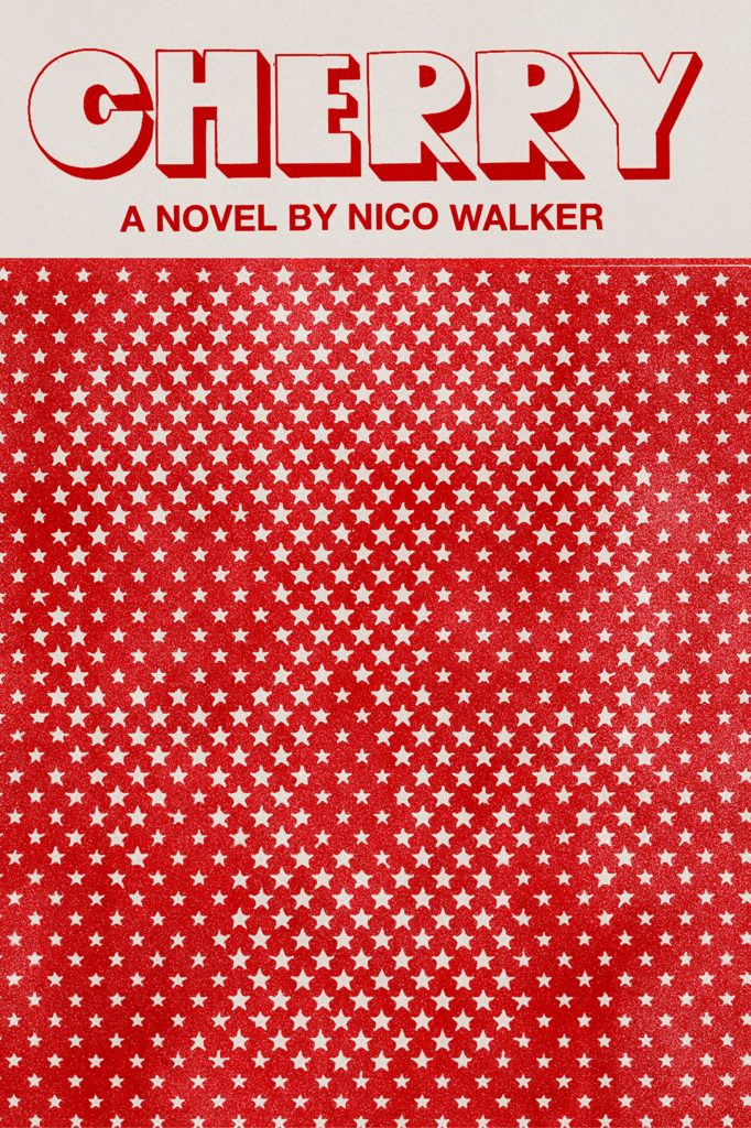 Nico Walker, Cherry, designed by Janet Hansen (Knopf)
Janet Hansen’s cover for Cherry is by far my favorite of 2018. The Magic Eye effect of the skull peeking through a screen of stars is just so captivating. Paired with the poppy type, I love how it all feels uniquely American. Janet also wrote a great Lit Hub piece about the design process, which is required reading and only made me love the cover more.
This clever and simple cover is just stunning. It’s amazing that this package is as dynamic as it is with just the use of one color. The title treatment is great. The skull is subtle but alludes to the intensity and directness of the writing.
Cherry, by Nico Walker, has a stark and enigmatic cover. The typography is a perfect balance of the handmade and the industrial. The density of stars which give birth to a skull is expertly handled. The juxtaposition of a symbol of death with the word, “cherry”, so often associated with youth and sexuality, is jarring. This cover is getting a lot of buzz, and we think it deserves it; we’re adding our voices to the chorus!
I just love this so much. Hansen also did a write-up about the process of making this cover that includes the rejected versions (which are also quite nice).
I have to remind myself every time I pick this book up in the store that I really don’t like reading books about war. It’s a visual magnet.
While I generally feel that skulls have been overused on book jackets in recent years, I love the almost Op Art aspect of this. The design introduces itself with an unsettling and imperfect type treatment, which leads you to the stars, and then finally to the skull hiding in plain sight. The jacket manages to convey “dark Americana” with the least expected combination of elements.
The unexpected combination of these two symbolic images (stars and skulls) piques my curiosity.
Another eye-catcher! Acid-trippy and completely in line with its subject matter but in the most elegant and refined way. An expression of intensity through restraint.
This vintage packaging is a sure collectable and a classic piece of this time. The quirky type works well in contrast to the hidden skull behind the stars. It’s illuminating.
How has Janet turned something grim into something utterly exquisite? She juxtaposes a mirthful title font with a skull composed of stars—a total pleasure once you spot it—to brilliant, sardonic effect. I can only imagine how laborious it must have been to tweak the dimensions of the stars to achieve the perfect read, but the result feels inevitable.
It draws you in from far and demands a closer look, the optical illusion and skull are the perfect combination and says exactly what needs to be said about this book.
Distinctive and bold, I find this to be a very memorable package. Happy to see such a unique and off-beat cover land on a book that’s getting so much attention and critical acclaim.
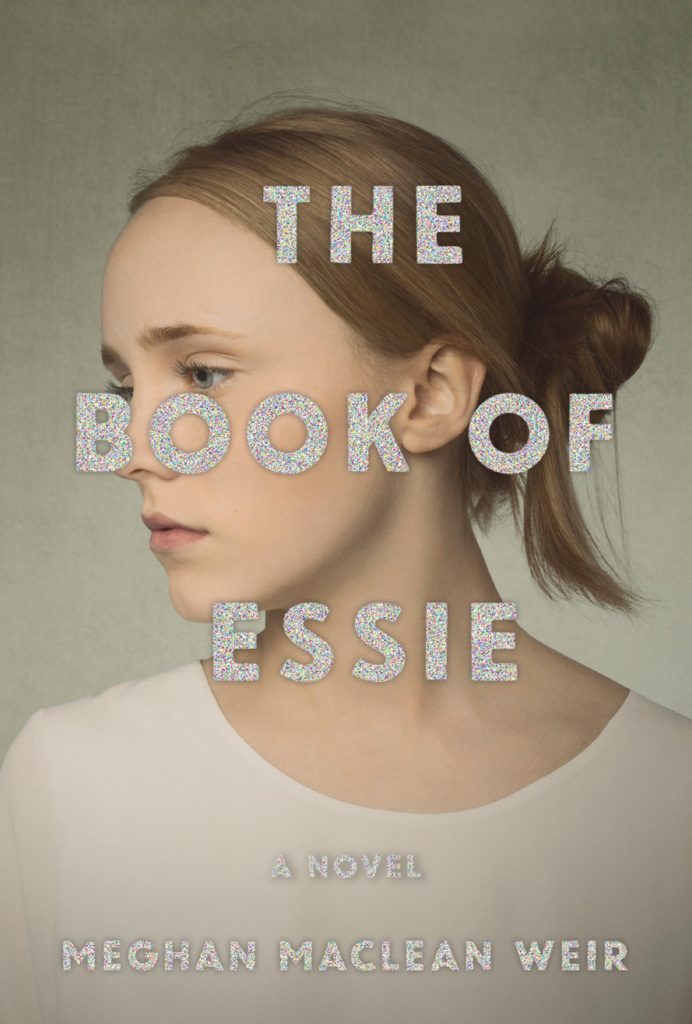 Meghan MacLean Weir, The Book of Essie, designed by Abby Weintraub (Knopf)
When on display at Word over the summer, this cover stopped me in my tracks time and time again. The startling mashup—soft, velvety portrait paired with brash, kitschy foil—alights a keen sense of rebellion. Who is Essie? The conflict between type and image begs resolution.
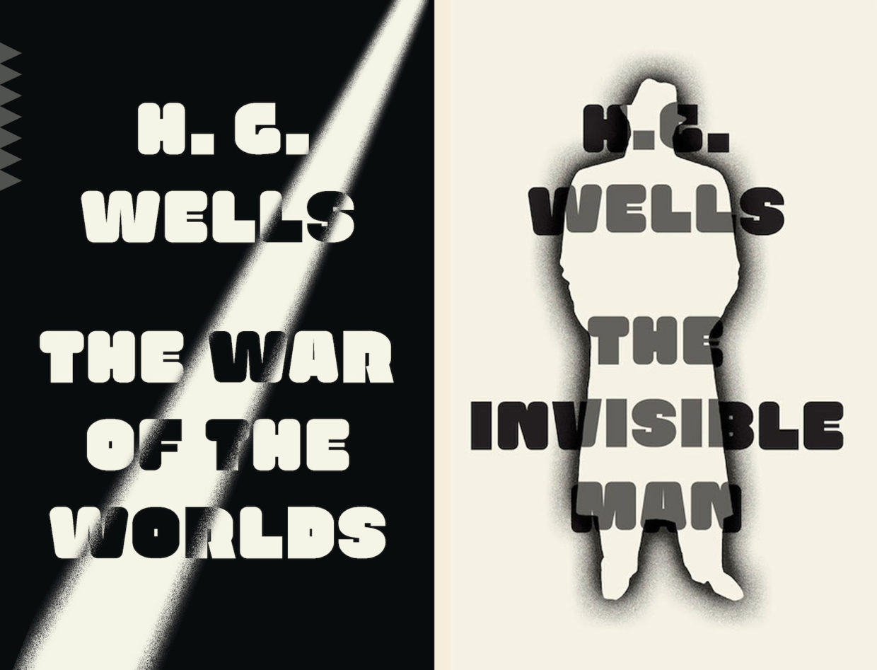 H. G. Wells, The War of the Worlds, and The Invisible Man, designed by Linda Huang (Vintage)
Linda Huang’s repackaging for The War of the Worlds (as well as The Invisible Man) is so fresh, yet it feels nostalgic. The use of just black and white, and the retro font, keeps the design strong and bold.
I love the simplicity and the stark contrast. It’s classy Sci-fi.
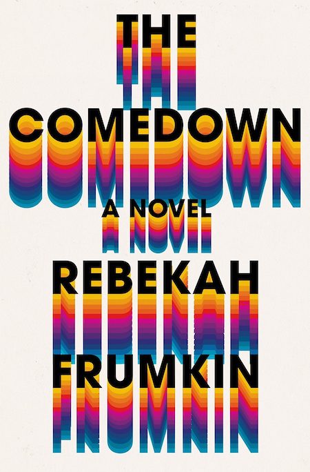 Rebekah Frumkin, The Comedown, design by Rachel Willey (Henry Holt)
A perfectly executed type direction—my favorite kind of cover. The type and color palette do all the heavy lifting here and the result is graphic and memorable.
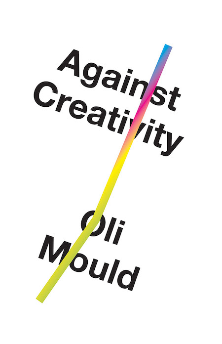 Oli Mould, Against Creativity, design by Matt Dorfman (Verso)
Stark white + Helvetica will never go out of style. Always feels fresh and bold and right.
Apparently, there’s an unused version of this cover which features the severed head of a unicorn, which I would love to see. Decapitated unicorns aside, this cover is lovely.
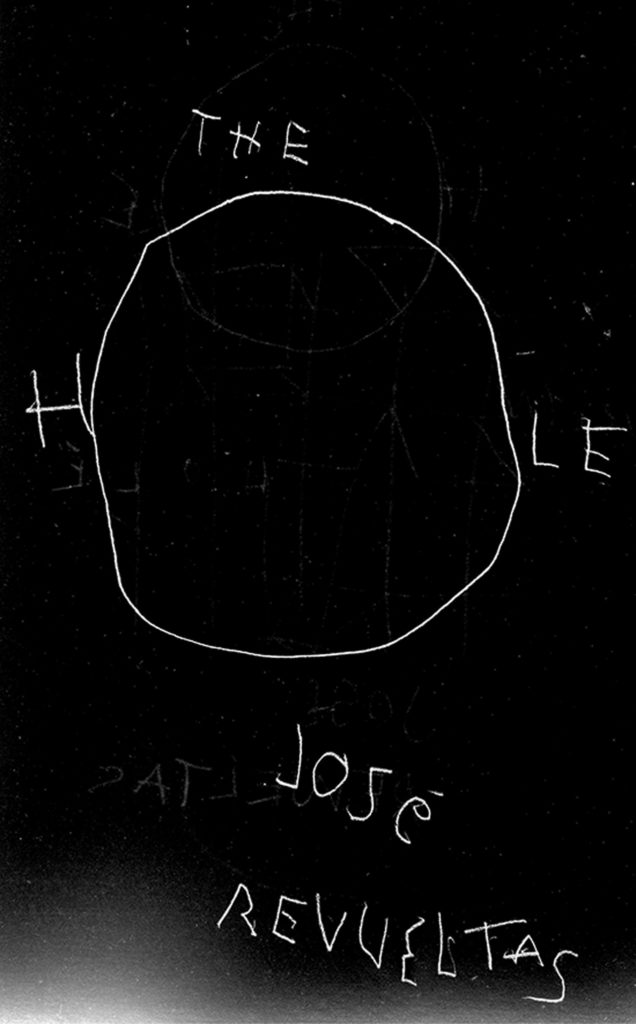 José Revueltas, The Hole, designed by John Gall (New Directions)
One of my design professors encouraged us to read our typography out loud – to assess the voice and volume of our letterforms. This cover doesn’t need to be read; it speaks alllll on its own. An urgent whisper, air rushing through that O, unmoors you. We’re looking up from a well, into a void, and onto a nightmare canvas simultaneously. I would hang this cover in a gallery or museum if I could!
So simple but it sets such a mood.
Ah man, John has been a design hero of mine since I was in college. And this cover is absolutely amazing! This is a repackage of a classic Mexican novella written in 1969. I admit, I haven’t read it, but the summery leaves this dark sense of dread which John’s lettering really drives home. The simplicity of the concept makes this one of those “man I wish I made that”. I tend to gravitate to a solid concept on a cover. And totally a sucker for hand lettering.
The economy of this cover is incredible. So much is articulated with so few elements.
Such a direct idea executed in an indirect way. It looks like Gall drew it once, flipped over, then drew it again. It’s perfectly sloppy. It also reminds me a bit of the poster for The Ring.
A reminder that John is the godfather of cover design and we should all bow down.
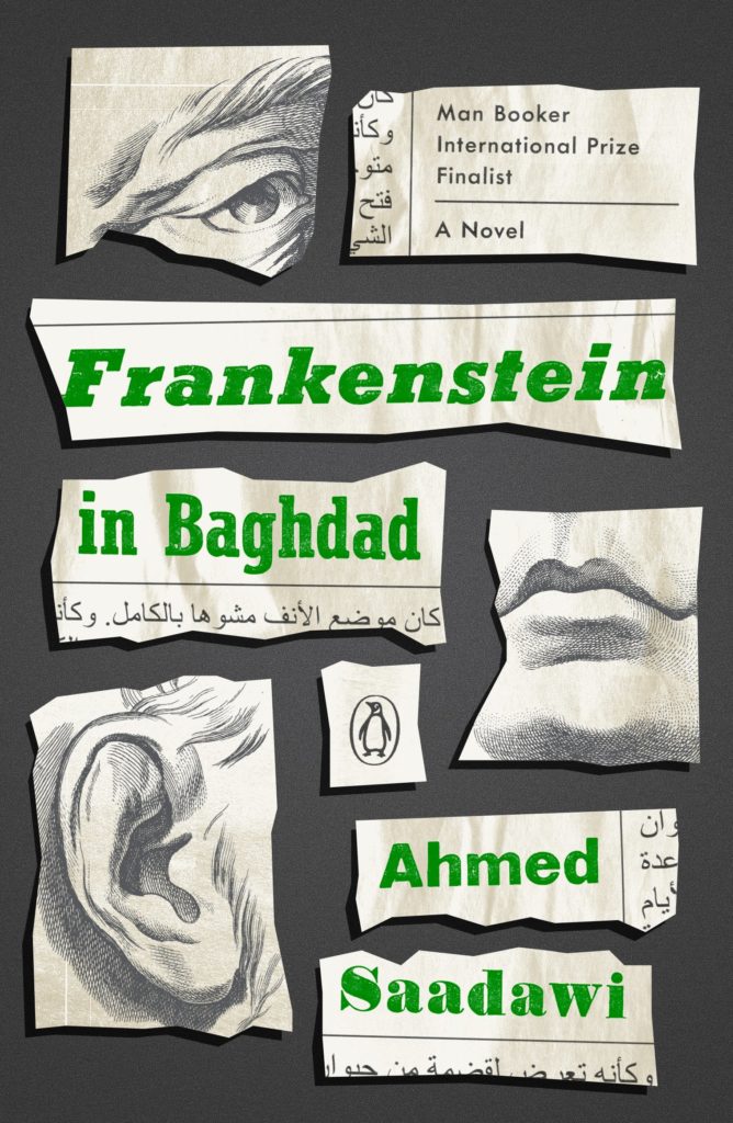 Ahmed Saadawi, Frankenstein in Baghdad, design by Jason Ramirez (Penguin)
I really like that the pieces of the illustrated parts are also illustrated. Love this.
Emily Temple
Emily Temple is the managing editor at Lit Hub. Her first novel, The Lightness, was published by William Morrow/HarperCollins in June 2020. You can buy it here.