The 60 Best and Worst International Covers of Lolita
On the 60th Anniversary of its American Publication
In 1958, Nabokov wrote to his new American publisher, Walter J. Minton at Putnam, about the cover for his forthcoming novel, Lolita. “What about the jacket?” he wrote.
After thinking it over, I would rather not involve butterflies. Do you think it could be possible to find today in New York an artist who would not be influenced in his work by the general cartoonesque and primitivist style jacket illustration? Who would be capable of creating a romantic, delicately drawn, non-Freudian and non-juvenile, picture for LOLITA (a dissolving remoteness, a soft American landscape, a nostalgic highway—that sort of thing)? There is one subject which I am emphatically opposed to: any kind of representation of a little girl.
Minton sent Nabokov some drafts. Nabokov rejected them all.
“I have just received the five designs and I quite agree with you that none of them is satisfactory,” he wrote. “I want pure colors, melting clouds, accurately drawn details, a sunburst above a receding road with the light reflected in furrows and ruts, after rain. And no girls. If we cannot find that kind of artistic and virile painting, let us settle for an immaculate white jacket (rough texture paper instead of the usual glossy kind), with LOLITA in bold black lettering.”
In the end, he sort of got that—with green instead of white, and he was satisfied well enough. As many have pointed out, Lolita is an exceptionally difficult book to design for. In the 60 years since its American publication (and 63 since its original appearance), many of tried, and almost all of them have failed. Certainly most of the below covers run contrary to Nabokov’s original wishes.
Below, you’ll find 60 cover treatments of Lolita from all over the world, organized into wide, baggy categories of “best” and “worst.” For my own personal taste I can make no excuses. All of these were actually published (there have been lots of casual redesigns and fan art over the years, but those are for another day). I found many of the covers using Nabokov scholar and translator Dieter E. Zimmer’s Covering Lolita, but others came from the deep reaches of the Internet. I’ve tried to be as accurate as possible with dates and publishing houses, but as I’m sure you know, the Internet can never be fully trusted on these things.
THE BEST:
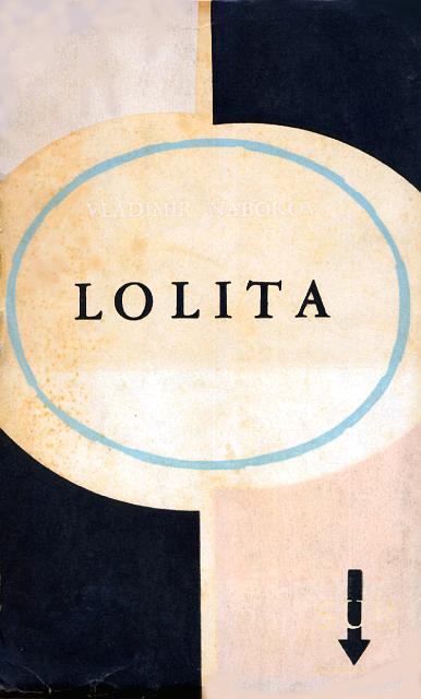
 Published by Olympia Press, Paris, 1955
I know that the first French edition of Lolita is famously boring and even famously ugly, but I’ve always sort of liked it. The color is a pleasing olive green and the cover as a whole looks erudite and understated—the latter of which contrasts nicely with the contents.
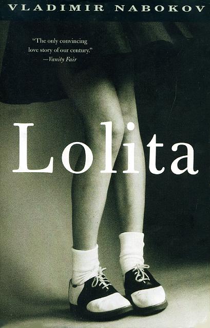
 Published by Putnam, New York, 1958
The original US edition isn’t anything special, especially by today’s standards. But it does the job, and it’s not hysterical or over-sexualized, and I don’t hate it. It announces the book as the high-class literary marvel that it is.
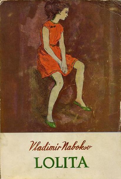
 Published by Sur, Buenos Aires, 1959
The color scheme and impressionistic treatment are surprisingly modern-looking, and I like the way Nabokov’s name fades into the background.
 Published by Oisterwijk, The Hague, 1958
This one is pretty elegant, despite what it depicts. Again, I like the color scheme, which references the original cover.
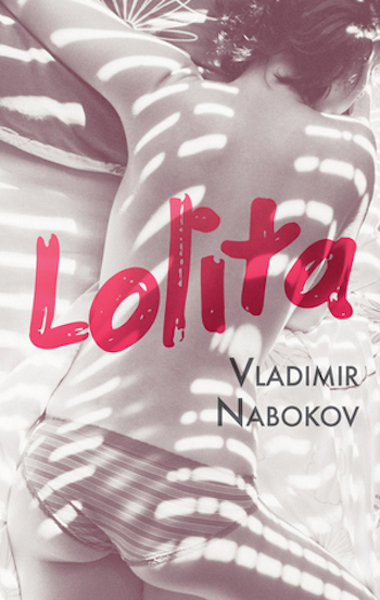
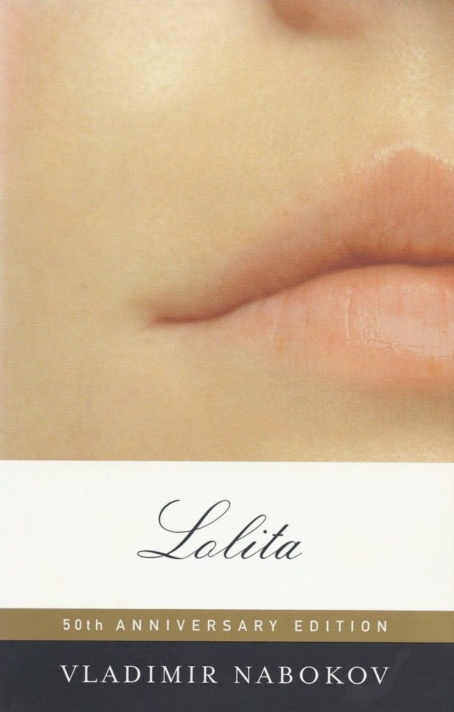 Published by Random House, 2005
This is the one I read first, so I may be a little biased, but I love the subtle suggestiveness in John Gall’s design. Especially when you consider that the original design looked like this.
 Published by Wahlstrom & Widstrand, Stockholm, 1957
It’s not alluring right off the bat, but there is something about it.
 Published by AxelSpringer (BamS-Edition), Hamburg, 2012
I like the minimalist nod to those now-iconic heart-shaped sunglasses from the film adaptation. Unlike many, many covers of Lolita, this one shows restraint.
 Published by Penguin UK, London, 2012
Again, I love the simplicity of this hardcover reissue, and that pretty, gentle blue.
 Published by Penguin (Modern Classics), London, 2010
Not particularly evocative of the novel, but at least interesting to look at.
 Published by Ma’ariv, Tel Aviv, 1959
I appreciate the sly design of this one: those triangles could be just about anything (or nothing), depending on how you squint.
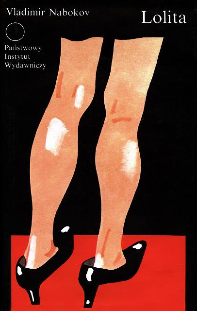 Published by Panstwowy Instytut Wydawniczy, Warsaw, 1991
It’s a bit goofy, but the image is striking, and those too-big shoes are perfectly subtle.
 Published by Dar Al-Adab, Beirut, 1988
I love this fairy tale-like illustration of Lolita’s wildness.
 Published by Bakur Sulakauri, Tbilisi, 2016
Gotta say I dig this one. The illustration of the man standing instead of a face is very cool.
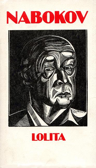 Published by CDE spa, Milan, 1983
The wood cut of Nabokov is appealing, primarily because it’s so different from all the others
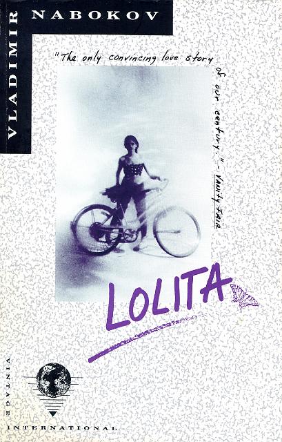 Published by Vintage International, New York, 1989
I don’t love the 90s layout with the image small in the middle, nor the little butterfly stamp and the schoolgirl scrawl of the title, but I do think the image itself is evocative. I keep wanting to look at it, which suggests it’s a better cover than I think it is.
 Published by MOKA, Minsk, 1991
Just visually appealing—it looks like an old newspaper photo.
 Published by Lighthouse Publishing, Thailand, 2015
I love that the Lo-Lee-Tah has been translated into Thai (but I wonder how well it really works—any Thai speakers out there who can clue us in?).
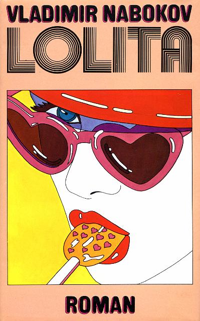
 Published by Transworld (Corgi Books), London, 1973
I have to admit that I like this one because of its abject silliness. That globular, lip-like font! That badly licked popsicle! That hat! I only hope that the designer was taking it as (un)seriously as I am.
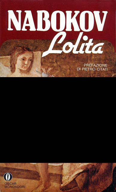
 Published by Mondadori (Gli Oscar), Milan, 1970
The colors are very groovy, man. Also it kind of makes me think that Lolita is going to stomp us all to death, Godzilla-style, and I approve of this alternative ending.
 Published by Europaische Bildungsgemeinschaft, Stuttgart, 1977
A fun 70s take on an iconic image.
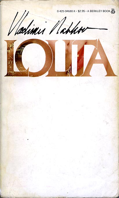 Published by Berkley, New York, 1986
The peek-a-boo effect works well here (and I’m slightly swayed because this matches one of my copies of Pale Fire).
 Anagrama, 2016
I’m not going to think too hard about what the strawberries signify and just continue to find them pretty.
 Published by Odeon, Prague, 1991
There’s something intriguing about that repeated title, a kind of anti-shadow. It looks like a different book than it is, but I do find it appealing.
 Published by Olympia Press, Paris, 1961
The butterfly is a nice touch.
 Published by New Moon, Tehran, 1955
Despite the fact that it’s an altered movie still, this one is actually really cool looking.
 Published by Random House (Vintage), New York, 1997
I want to dislike it, but I can’t deny that it works.
 Published by Sprīdītis, Latvia, 1992
This is a fairly restrained book cover for being published to close to the G-spot of Europe.
 Published by Lighthouse Publishing, Thailand, 2017
Not bad.
 Published by Guilde du Livre, Lausanne, 1966
Also not bad—anyone know the artist (or can read a signature that small)?
 Published by Biblioteca Visao, Linda-da-Velha, 2000
This one is fun.
 Published by Family Leisure Club, Ukraine, 2018
I’m really on the fence about this one, because on the one hand, it’s ludicrous, and on the other hand, it made me laugh out loud. The fingers do seem to suit Nabokov; these are counterbalanced by the rosy cheeks and exposed underwear. Ah well, we’ll put it here, on the edge of good and bad.
THE WORST:
 Published by Anagrama (Compactos), Barcelona, 1991
I’m just going to let this stand in for the many covers around the world to just slap on that same, now-iconic image from Stanley Kubrick’s 1962 film. I find this boring and lazy on principle, but this cover actually does it pretty well.
 Published by Gummerus, Helsinki, 2011
This cover isn’t offensive, like some of those below, but it also captures nothing about the book—it looks like one of those stereotypically girly (read: lazy), mass-market Pride and Prejudice covers.
 Published by Boa Leitura, Sao Paulo, 1962
It looks like an advertisement for dishwashing fluid.
 Published by Companhia das Letras, Sao Paulo, 1994
It’s just a little on the nose.
 Published by Greenwich House, New York, 1982
The look on her little face makes me laugh; it’s like a bad ’80s movie poster.
 Published by Altin Kitaplar, Istanbul, 1974
Woof. You’re not even trying.
 Published by Anagrama, Spain, 2018
The longer you look at it, the more violent it seems.
 Published by Dikura, Nepal
I think I know her from one of my D&D campaigns.
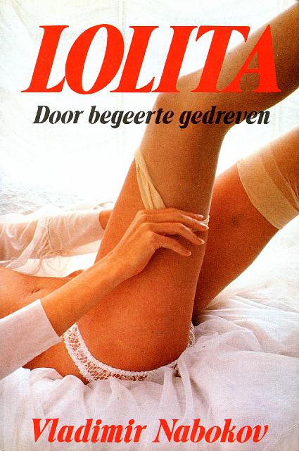
 Published by Omega Boek, Amsterdam & Bruna, Antwerp, 1978
On the one hand, this cover makes me uncomfortable, which is clearly what it was meant to do. On the other, it is still horrible, and what is going on with the coats?
 Published by De Bezige Bij, Amsterdam, 1995
I just don’t understand what a cool sun has to do with any of this.
 Published by Penguin Classics, 2008
This is another ubiquitous one in American classrooms, but I’ve always hated it. We should be able to think of a better cover for this novel than a young girl in an alluring position.
 Published by Penguin, London, 1995
Please stop.
 Published by Abril Cultural, Sao Paulo, 1981
Fire whoever did this doll’s make up.
 Published by Berkeley Medallion, 1971
There is a man growing out of this girl’s hair. Obviously she needs a haircut.
 Published by Quality Paperback Book Club, 1999
Are these meant to be a child’s drawings? If so, this cover is very bleak.
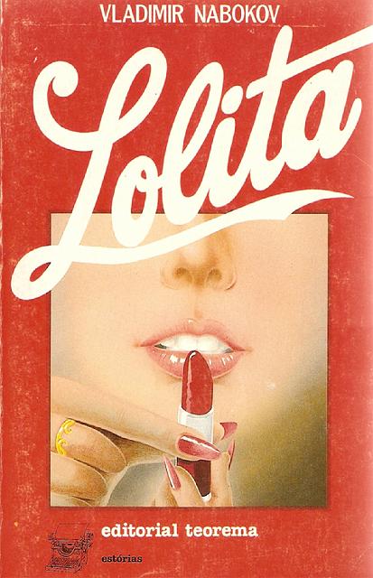 Published by Teorema, Lisbon, 1987
This one upsets me deeply for some reason, but I can’t quite put my finger on it. Oh, wait.
 Published by Rowohlt Taschenbuch,, Reinbek b. Hamburg, 1989
Something seems to have gone wrong with this woman’s shirt.
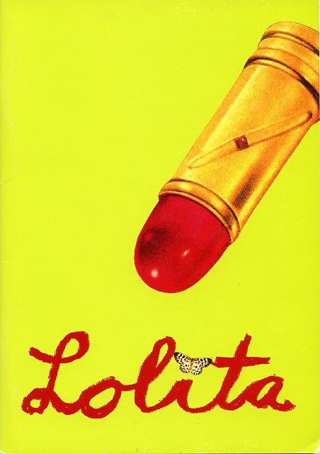
 Published by Gallimard (folio), Paris, 1990
More of this horrible lipstick motif.
 Published by Aydin Yayinevi, Istanbul, 1959
It’s not Revolutionary Road.
 Published by Gerolymbos, Athens, 1961
I just can’t say I understand it.
 Published by Omega, Amsterdam, 1970s
The compelling thing about Lolita, for Humbert Humbert, is that she is exactly not like this.
 Published by Gallimard (Livre de Poche), Paris, 1963
I truly hate this one. She looks like she’s going to murder us all in our beds later. Also why is she off-center? It’s very upsetting.
 Published by Weidenfeld & Nicolson, London, 1993
Nothing has ever been more ’90s.
 Published by Kungliga Teatern, Stockholm, 1994
I stand corrected.
 Published by Slovart, Bratislava, 2011
This just looks like a murder scene to me.
 Persian edition, 2013
Another murder situation.
 Published by EKSMO-Press, Moscow, 1999
It’s one thing to use a photograph from a film adaptation of a book, but it’s quite another to take the actors in question and turn them into the kind of illustration you might see airbrushed onto a very fancy trucker’s hat.
 Published by Bonniers, Stockholm, 2007
A fine bit of Photoshop work, but ultimately nonsensical.
 Published by Mondadori, Milan, 1980
This one is so bad I don’t even want to upload it unedited onto this website. If you must, you can see it in full here.
Emily Temple
Emily Temple is the managing editor at Lit Hub. Her first novel, The Lightness, was published by William Morrow/HarperCollins in June 2020. You can buy it here.