The 22 Best Book Covers of March
The colors are coming out.
Another month of books, another month of book covers. March has been one of the best months in recent memory for books—and the same is true for the covers. Here’s an unusually long list of favorites from the last few weeks:
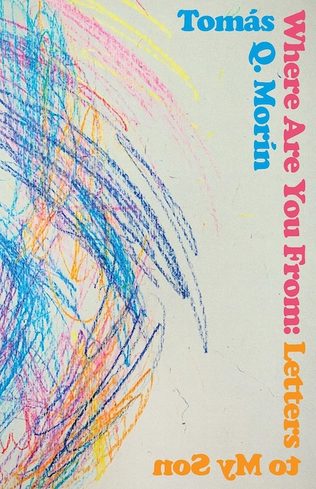 Tomás Q. Morín, Where Are You From: Letters to my Son; cover design by Bráulio Amado (University of Nebraska Press, March 1)
This is the third cover Bráulio Amado has designed for one of Morín’s books (his cover for Machete is another—very different!—favorite). The common thread is high energy, rich color, and a winking cleverness, that here is taken to the next level by that casually brilliant text treatment.
 Marina Yuszczuk, tr. Heather Cleary, Thirst; cover design by Kaitlin Kall (Dutton, March 5)
The bite marks and dripping blood are perfectly understated, and intensified by their juxtaposition to the marble (unbiteable, one imagines) flesh.
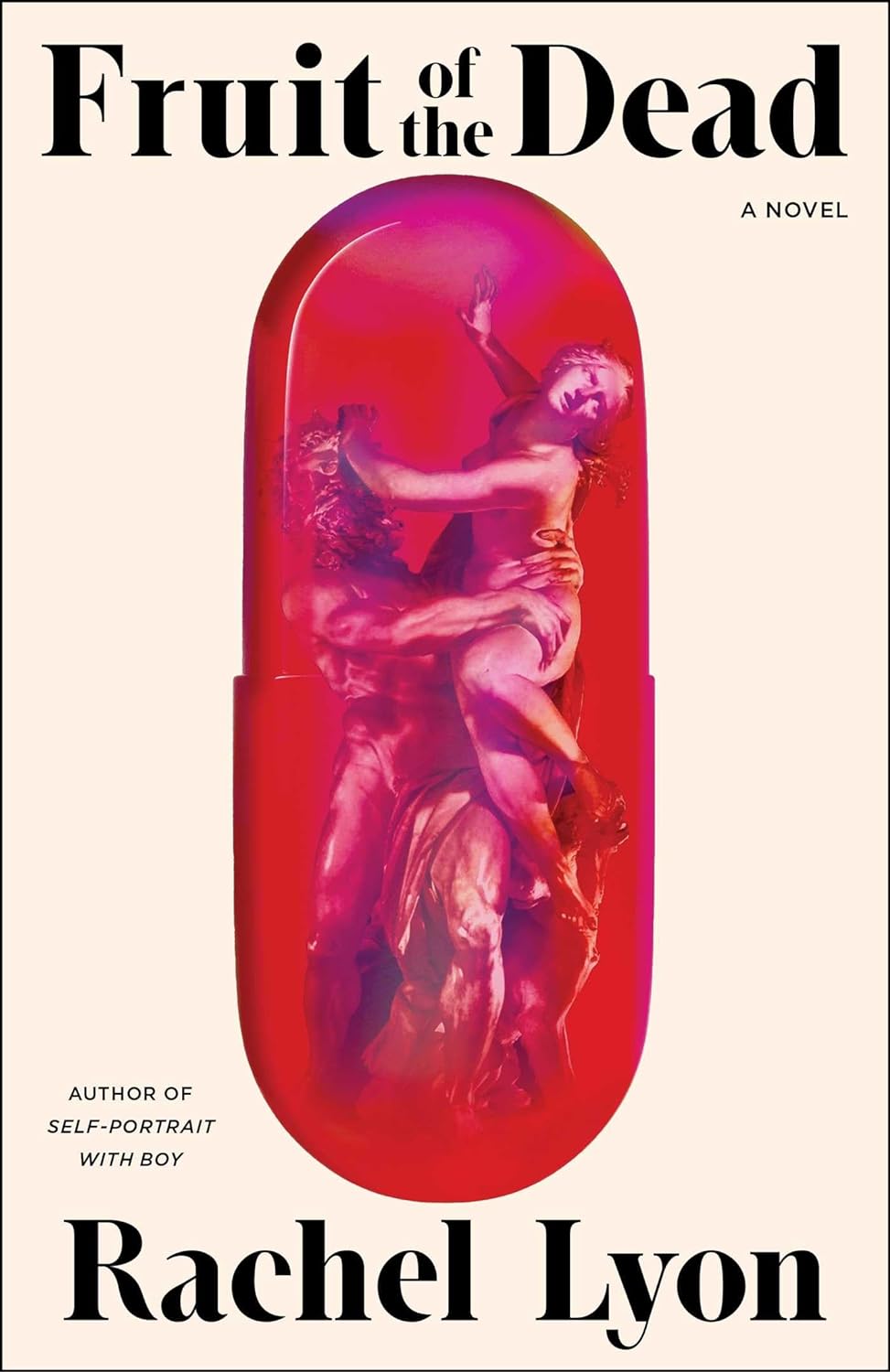 Rachel Lyon, Fruit of the Dead; cover design by Math Monahan, art direction by Jaya Miceli (Scribner, March 5)
Another juicy and irreverent use of classic sculpture, in a very striking composition.
 Jonathan Buckley, Tell; cover design by Janet Hansen (New Directions, March 5)
One of the best type-only covers I’ve ever seen—it almost leaps off the page.
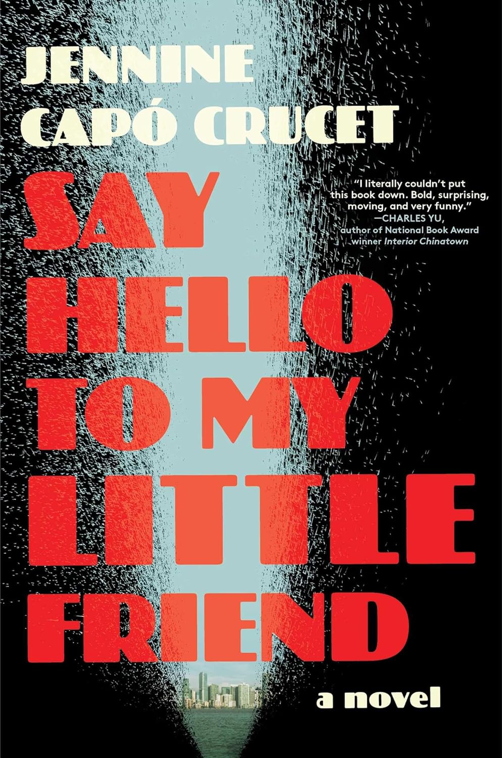 Jennine Capó Crucet, Say Hello to My Little Friend; cover design by Natalia Olbinski, art direction by Jackie Seow (Simon & Schuster, March 5)
Gotta love that font—and also the reverse image spray, which takes on a very dark and ambivalent tone when paired with this title.
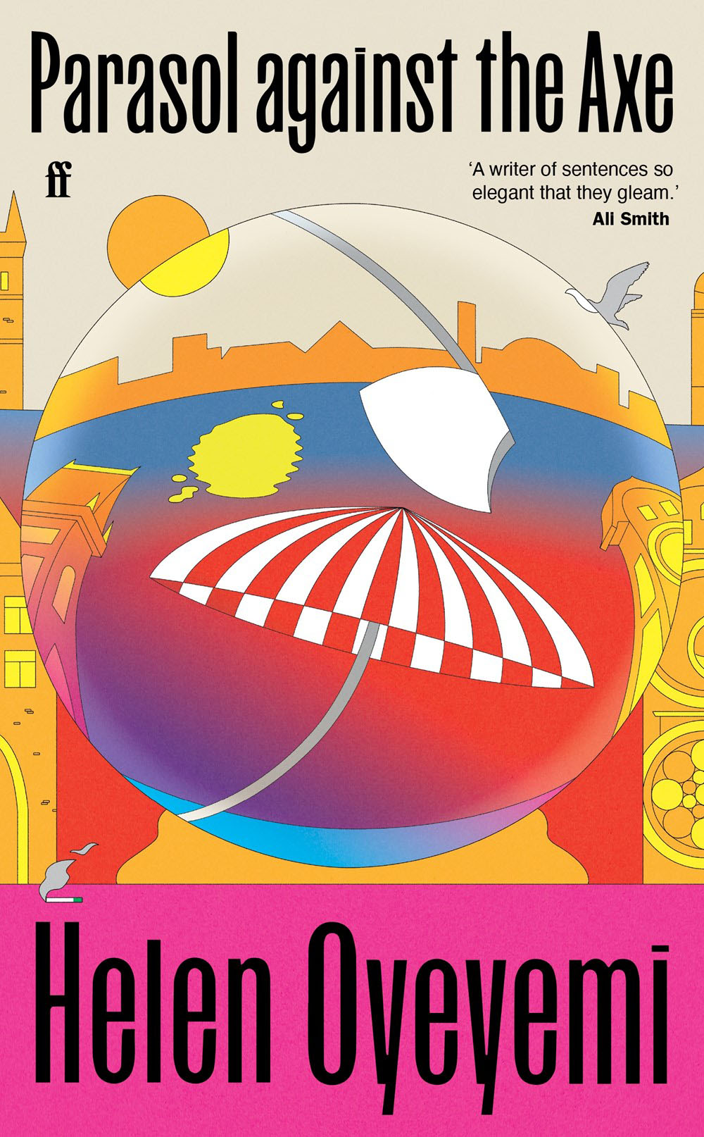
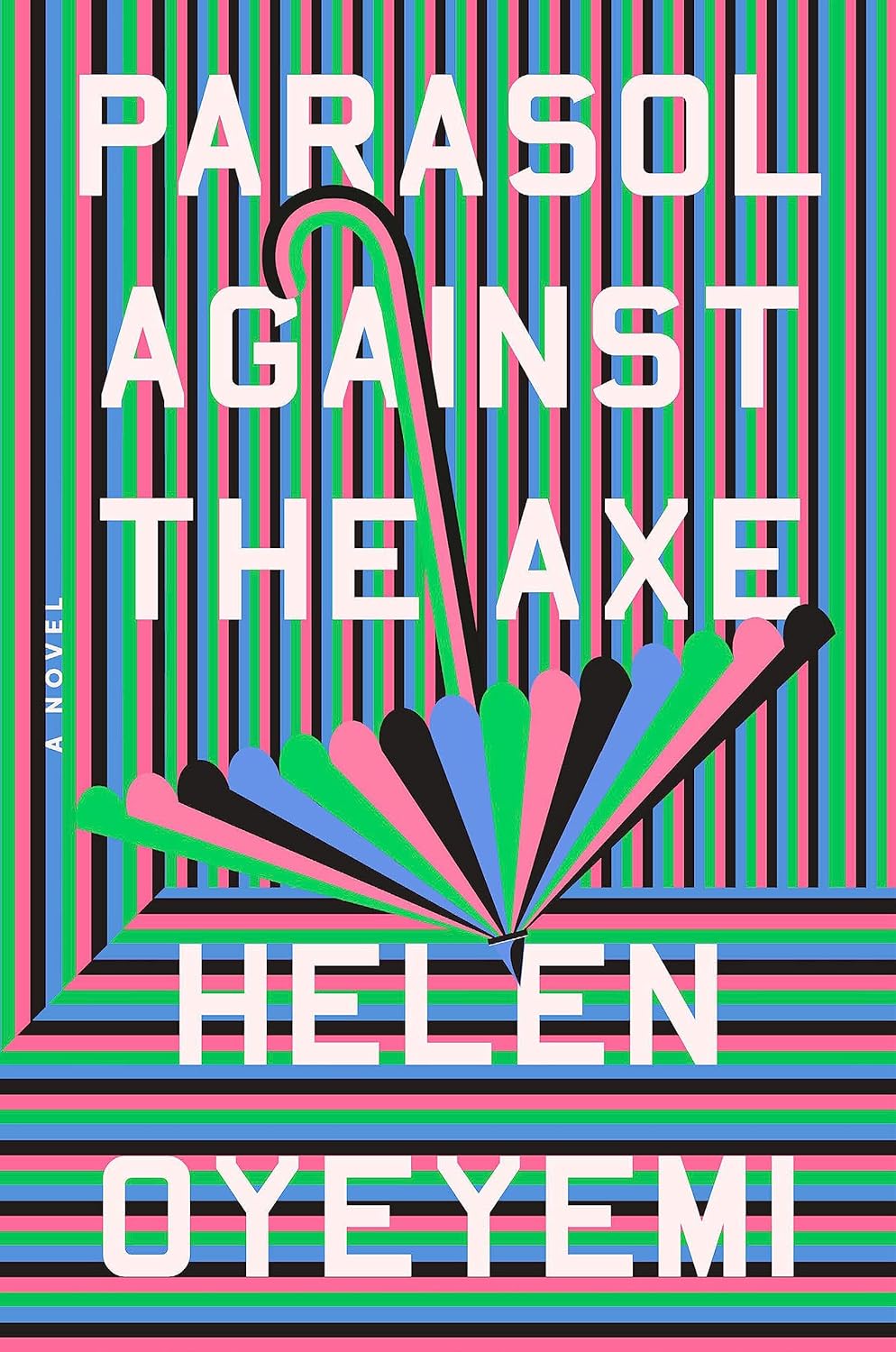 Helen Oyeyemi, Parasol Against the Axe; cover design by Grace Han (Riverhead, March 5)
It hurts my eyes, in the best possible way—a bonkers, irreverent cover for a bonkers, irreverent writer. The UK edition, designed by Kishan Rajani, is also great:
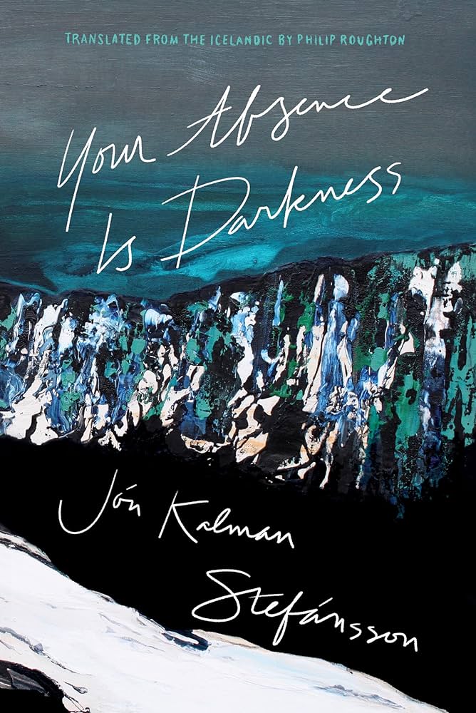 Jón Kalman Stefánsson, tr. Philip Roughton, Your Absence is Darkness; cover design by Jason Arias (Biblioasis, March 5)
I love the tactile, almost surrealist landscape here—which is earth, sky, snow, mountain?—and the way the handwritten text slides off in different directions.
 Paulette Kennedy, The Devil and Mrs. Davenport; cover design by Kimberly Glyder (Lake Union, March 5)
It almost looks like a boilerplate, middle-of-the road novel design—until you see the crack.
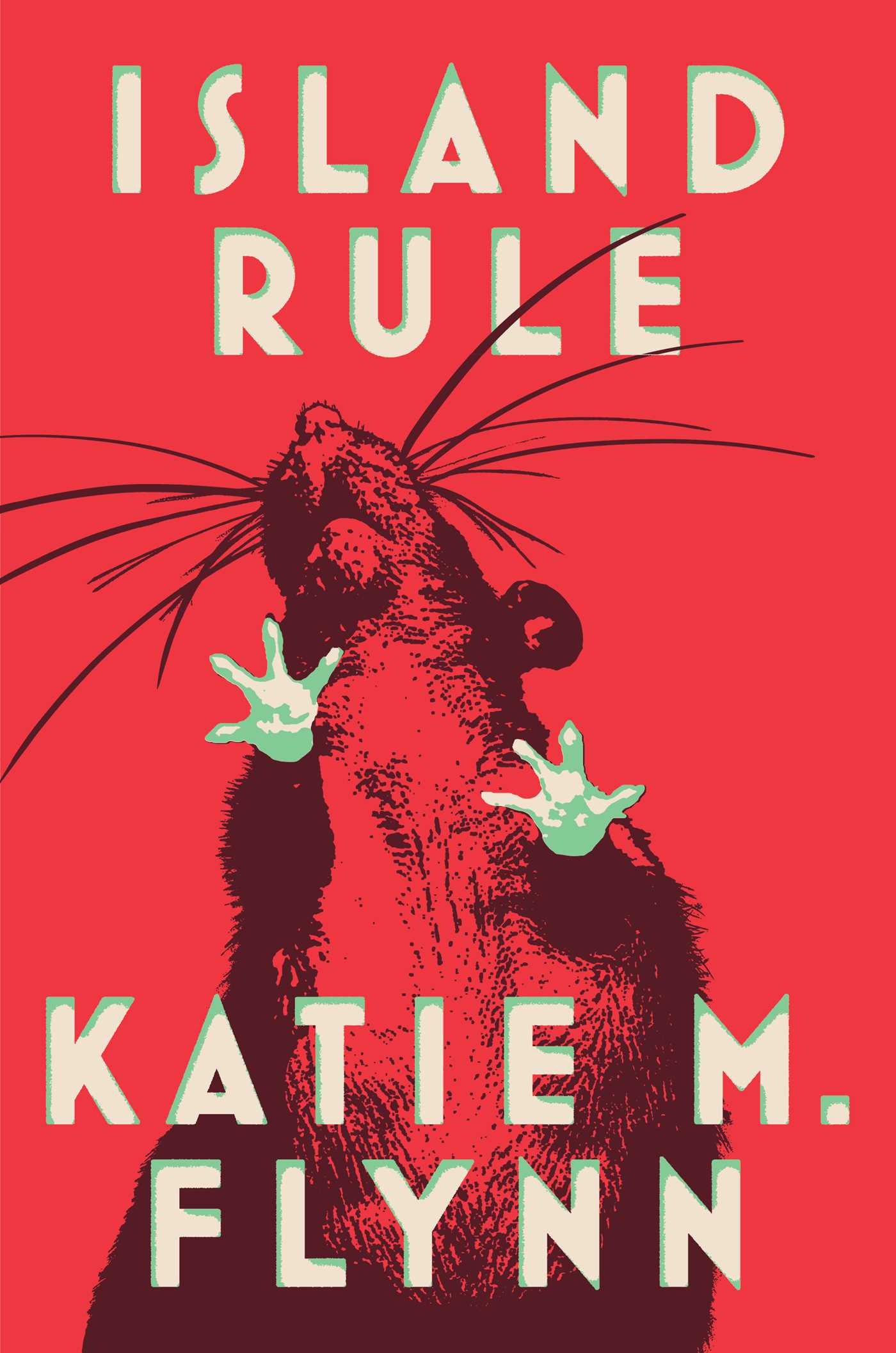 Katie M. Flynn, Island Rule; cover design by Adriana Tonello, art direction by Rodrigo Corral and Lisa Litwack (Scout Press, March 5)
Weirder than it appears at first glance. Those green paws!
 Pamela Prickett and Stefan Timmermans, The Unclaimed: Abandonment and Hope in the City of Angels; cover design by Anna Kochman (Crown, March 12)
A simple idea, executed beautifully. And that yellow!
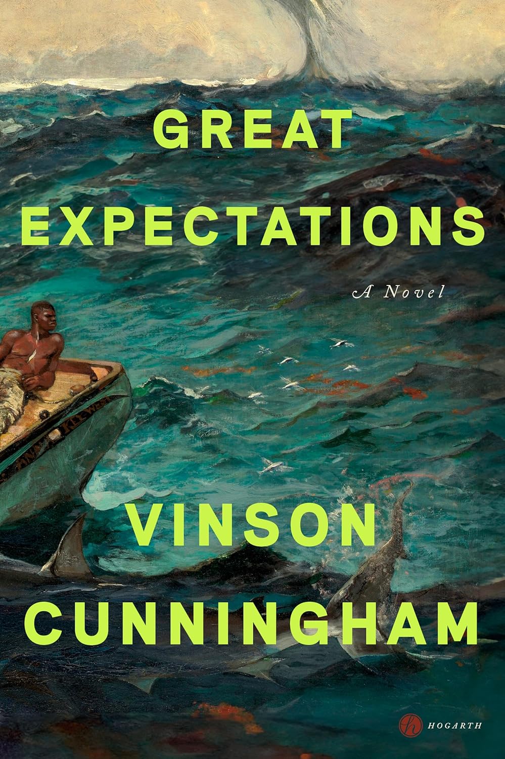 Vinson Cunningham, Great Expectations; cover design by Anna Kochman (Hogarth, March 12)
What to do with a title like Great Expectations? Give it big book energy with lush art and big, neon green text. The result is very compelling.
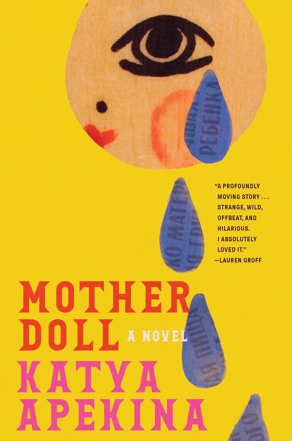 Katya Apekina, Mother Doll; cover design by Arsh Raziuddin (Abrams, March 12)
Very odd—the doll crying fat teardrops of language!—and very appealing.
 Armen Davoudian, The Palace of Forty Pillars: Poems; cover design by Beth Steidle (Tin House Books, March 19)
I love a good trompe-l’oeil cover, and this is a particularly lovely and delicate example, as if an old, crumpled-up page from a magazine had been rescued and flattened out, in an attempt to remember it.
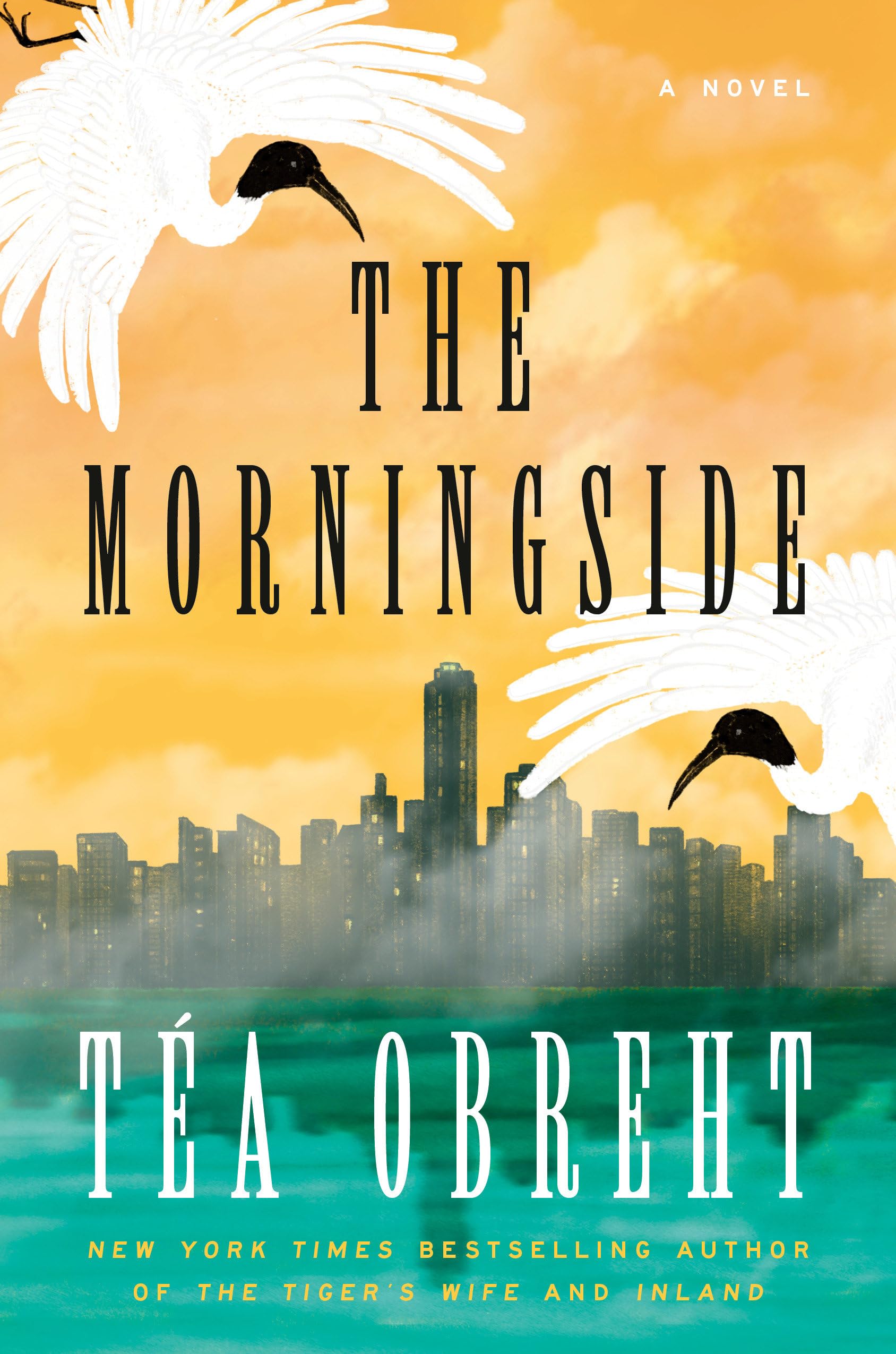 Téa Obreht, The Morningside; cover art by Nana An (Random House, March 19)
“I wanted to depict the city in a way that felt mythical and to emphasize nature taking over in bright, surreal colors that contrast to the foggy skyline,” An told Lit Hub. “It’s such a thrill to see the Island City that’s evolved in my imagination—hazy, sun-drenched, half-submerged, not-wholly-knowable—brought to life in such striking and vivid detail,” Obreht added.
 Cameron Russell, How to Make Herself Agreeable to Everyone: A Memoir; cover design by Arsh Raziuddin, art direction by Rachel Ake (Random House, March 19)
A cool collage that’s weirder than it looks at first glance, and a clever text treatment—you’d think that a title this long would be a challenge to fit onto a cover at all. So hey, why not include it three times?
 Heather McCalden, The Observable Universe, cover design by Arsh Raziuddin and Gaby Pesqueira, art direction by Donna Cheng (Hogarth, March 19)
Another collage cover with a warm, vintage mood—it’s fun to see how a designer’s sensibility translates from cover to cover.
 Marie Mutsuki Mockett, The Tree Doctor; cover design by Kimberly Glyder, illustration by Cory Feder (Graywolf, March 19)
I love the art, of course, but I’m particularly impressed by the way the wavy line almost changes the perceived shape of the book itself.
 Samir Chopra, Anxiety: A Philosophical Guide; cover design by Karl Spurzem (Princeton University Press, March 19)
It’s making me anxious just looking at it.
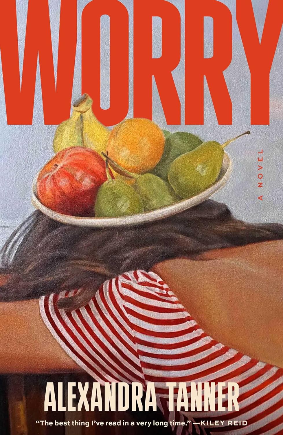 Alexandra Tanner, Worry; cover design by Alicia Tatone, art by Shannon Cartier Lucy (Scribner, March 26)
The perfect marriage of art and title.
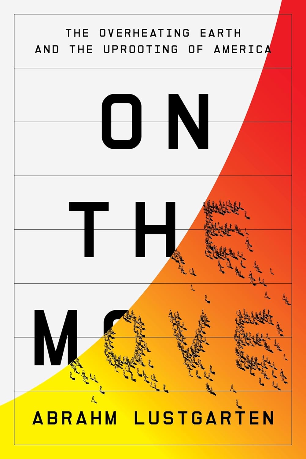 Abrahm Lustgarten, On the Move: The Overheating Earth and the Uprooting of America; cover design by Matt Chase (FSG, March 26)
A dynamic but controlled illustration of a complicated idea.
 Ferdia Lennon, Glorious Exploits; cover design by Gregg Kulick, art direction by Christopher Sergio (Henry Holt, March 26)
What can I even say?
Emily Temple
Emily Temple is the managing editor at Lit Hub. Her first novel, The Lightness, was published by William Morrow/HarperCollins in June 2020. You can buy it here.


