The 19 Best Book Covers of March
Humor is back, baby.
Another month of books, another month of book covers. But you know, it’s not just another month. It’s finally spring. The sun is out. The vaccines are coming. Things—dare I say it—are looking up. And so are the books. This month, my list of favorites incorporates quite a bit more fun than usual. Maybe it’s the season. Maybe it’s my mood. Either way, these will all look very good next to you on a park bench.
 Sara Davis, The Scapegoat, FSG; cover design by June Park (March 2)
Moody, mysterious, and kind of funny in the bleakest possible way: just like the novel it covers.
 Elly Griffiths, The PostScript Murders, HMH; cover design by Martha Kennedy (March 2)
Another cover with a sense of humor, though despite the fact that it’s a crime novel, the tone is much lighter than the above—in fact, it’s almost silly. After a long, hard winter, I can’t help but find that refreshing.
 Kazuo Ishiguro, Klara and the Sun, Knopf; cover design by John Gall (March 2)
The US cover for Ishiguro’s latest is simple and striking. I thought it couldn’t get much better until I saw the UK version . . .
 Kazuo Ishiguro, Klara and the Sun, Faber & Faber; cover design by Pete Adlington (UK)
. . . and now I’m torn. The colorway and structure are similar, but Adlington has gone even simpler, while incorporating texture to good effect. I like them both very much, but if forced to make a distinction, I would say that the US cover captures the tone of the book a bit better, while the UK version is more appealing as a work of art.
 Derek DelGaudio, Amoralman; cover design by John Gall (Knopf, March 2)
This just screams John Gall to me, in the best way. Brilliant.
 Viet Thanh Nguyen, The Committed, Grove Press; cover design by Christopher Moisan (March 2)
It’s always interesting to see new covers that are designed to fit alongside the author’s previous books—in this case, the cover sort of splits the difference between Nguyen’s The Refugees and The Sympathizer. It would be striking on its own, but it fits in nicely, and the combination of the yellow and the illustration gives this cover a lighter, more humorous feel than the other two. Perfect for spring.
 Joshua Mohr, Model Citizen, MCD (March 9)
Well, I always give extra points for insanity.
 Kevin Brockmeier, The Ghost Variations, Pantheon; cover design by Kelly Blair (March 9)
As a professional list-maker, it is impossible for me not to love something this orderly—and this clever. Plus, um, they snuck a pair of breasts onto this cover! Gotta admire it.
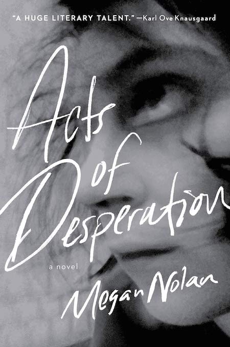 Megan Nolan, Acts of Desperation, Little, Brown (March 9)
The sense of movement in this cover is disorienting—in a good way. It feels as frantic and flailing as the novel itself. The way that eye stretches is so bizarre: once you notice, you can’t stop looking at it. Also, unlike the Ishiguro, it is miles better than the UK version, which I will let you Google yourself.
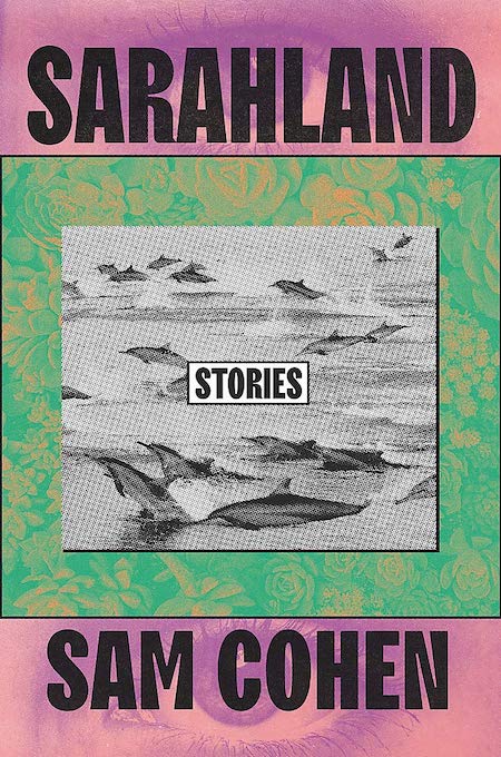 Sam Cohen, Sarahland, Grand Central; cover design by Tree Abraham (March 9)
It looks like the coolest zine you ever did see, and friends, I am here for it.
 Michelle Nijhuis, Beloved Beasts, W. W. Norton; cover design by Gregg Kulick, art direction by Sarahmay Wilkinson (March 9)
I like the way these illustrations, which looked ripped straight from a vintage bestiary, become their own graphic shape, perfectly integrated with title and subtitle.
 Thomas Grattan, The Recent East, MCD; cover design by Alex Merto (March 9)
I’m a sucker for neon, but this cover is particularly good—it reminds me of Jung Lee’s fantastic neon typography installations.
 Thomas Dyja, New York, New York, New York, Simon & Schuster (March 16)
As appealing, classy, extra, overflowing, and mysterious as the city herself.
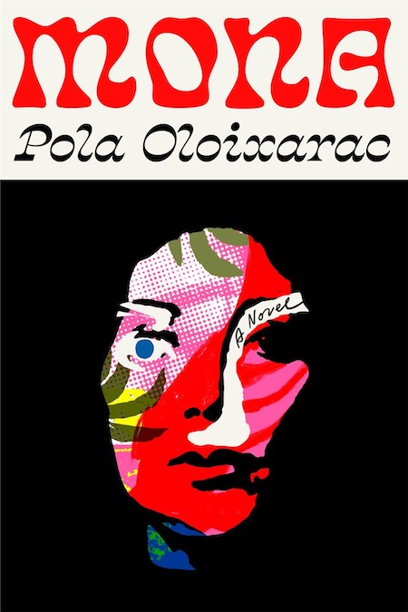 Pola Oloixarac, tr. Adam Morris, Mona, FSG; cover design by Thomas Colligan (March 16)
A striking work of art and my ’70s daydream to boot.
 Alec MacGillis, Fulfillment, FSG (March 16)
The use of the automated mailing label is clever, but what really makes this cover work is the overall tone. It reads like loneliness, loud and clear.
 Nona Fernández, tr. Natasha Wimmer, The Twilight Zone, Graywolf Press (March 16)
Literally hypnotic, and detailed in the perfect shade of green.
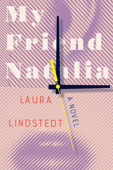 Laura Lindstedt, tr. David Hackston, My Friend Natalia, Liveright; cover design by Sarahmay Wilkinson, art direction by Steve Attardo (March 23)
This is a very unusual cover, with almost a ’90s tech vibe, but it invites contemplation—the horizontal mouth and the vertical eye!—and turns out to be just perfect for the time-obsessed novel inside.
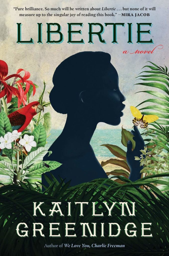 Kaitlyn Greenidge, Libertie, Algonquin; cover design by Laurino Feliciano, art direction by Christopher Moisan (March 30)
It doesn’t get much lusher than this. “I knew I was writing Libertie into a time and place—1870s Jacmel, Haiti—that I did not have a lot of visual references for,” Greenidge wrote. “I could find a lot of romantic reimaginings of the Haitian Revolution, but not many of the country in the seventy years after, pre-US occupation. So, I latched on to simple, everyday images—light on water, the types of flowers and plants native to the region—to help me understand this place I was imagining. Laurino Feliciano’s stunning cover—especially that bright blue, the blue of a wide open, free sky, but also a blue that references heaven and the cosmology of spirits of the African diaspora—is a perfect conceptualization of these imaginings.”
 Siegfried Lenz, The German Lesson, New Directions (March 30)
This cover is beautifully balanced in form and color, but of course, the thing that’s most transgressive is its humor—it makes a terrifying gesture foolish.
Emily Temple
Emily Temple is the managing editor at Lit Hub. Her first novel, The Lightness, was published by William Morrow/HarperCollins in June 2020. You can buy it here.