The 173 Best Book Covers of 2025
According to 52 Book Cover Designers
Per Literary Hub tradition, I am pleased to present the best book covers of the year—as chosen by some of the industry’s best book cover designers.
This year, I asked 52 designers to share their favorite covers of the year, and they came back with a grand total of 173 covers (NB: for the purposes of this list, series concepts are counted as single covers), representing work by 108 different designers for 85 different imprints at home and abroad.
Last year, I noticed there had been less consensus than usual, and this year, the opinions were even more diffuse: only 48 covers were mentioned by more than one designer, leaving a full 125 single selects. (We also had more UK covers on the list than usual this year, including, for the first time, the winner.) So there may be no Actual Answers, but it’s exciting to have a lot of differing viewpoints on what makes a book cover great, and best of all, you, dear reader, get to draw your own conclusions. All of the designers’ choices, and their comments, are below.
But first . . . the stats.
*
THE STATS:
The best of the best book covers:
First place (8 mentions):
Joe Brainard, I Remember; cover design by David Pearson (Daunt Books, July)
Second place (tie, 6 mentions):
Rose Keating, Oddbody; cover design by Math Monahan (Simon & Schuster, July)
&
Caren Beilin, Sea, Poison; cover design by Jamie Keenan (New Directions, October)
Third place (three-way tie, 5 mentions):
Lucas Schaefer, The Slip; cover design by Jack Smyth (Simon & Schuster, June)
&
Michael Clune, Pan; cover design by Janet Hansen (Penguin Press, July)
&
Katie Kitamura, Audition; cover design by Lauren Peters-Collaer (Riverhead, April)
*
The presses with the most covers on the list:
First place (14 books):
FSG
Second place (12 books):
Knopf
Third place (10 books):
Simon & Schuster
*
The designers with the most different covers on the list:
First place (8 books):
Jack Smyth
Second place (tie, 7 books):
Na Kim & Lauren Peters-Collaer
Third place (5 books):
Alex Merto
Special Mention (10 covers in total, featuring work by 5 named designers):
Rodrigo Corral Studio
*
The best month for book covers:
First place (tie, 23 books):
October & August
Second place (21 books):
September
Third place (18 books):
April
*
THE FULL LIST:
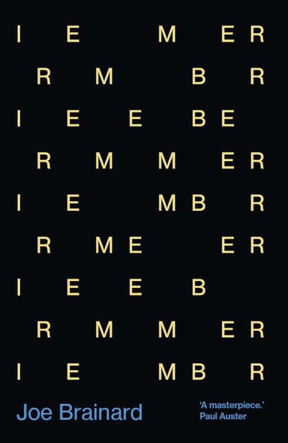 Joe Brainard, I Remember; cover design by David Pearson (Daunt Books, July)
An instant classic.
An adamant refusal to divulge its title somehow reveals precisely what it’s about.
So smart yet simple. Brilliant design.
Perfection.
A perfect type only cover.
What a perfect visualization of remembering.
I love how the scattered type evokes fragments of memories, illustrating the title.
Beautiful.
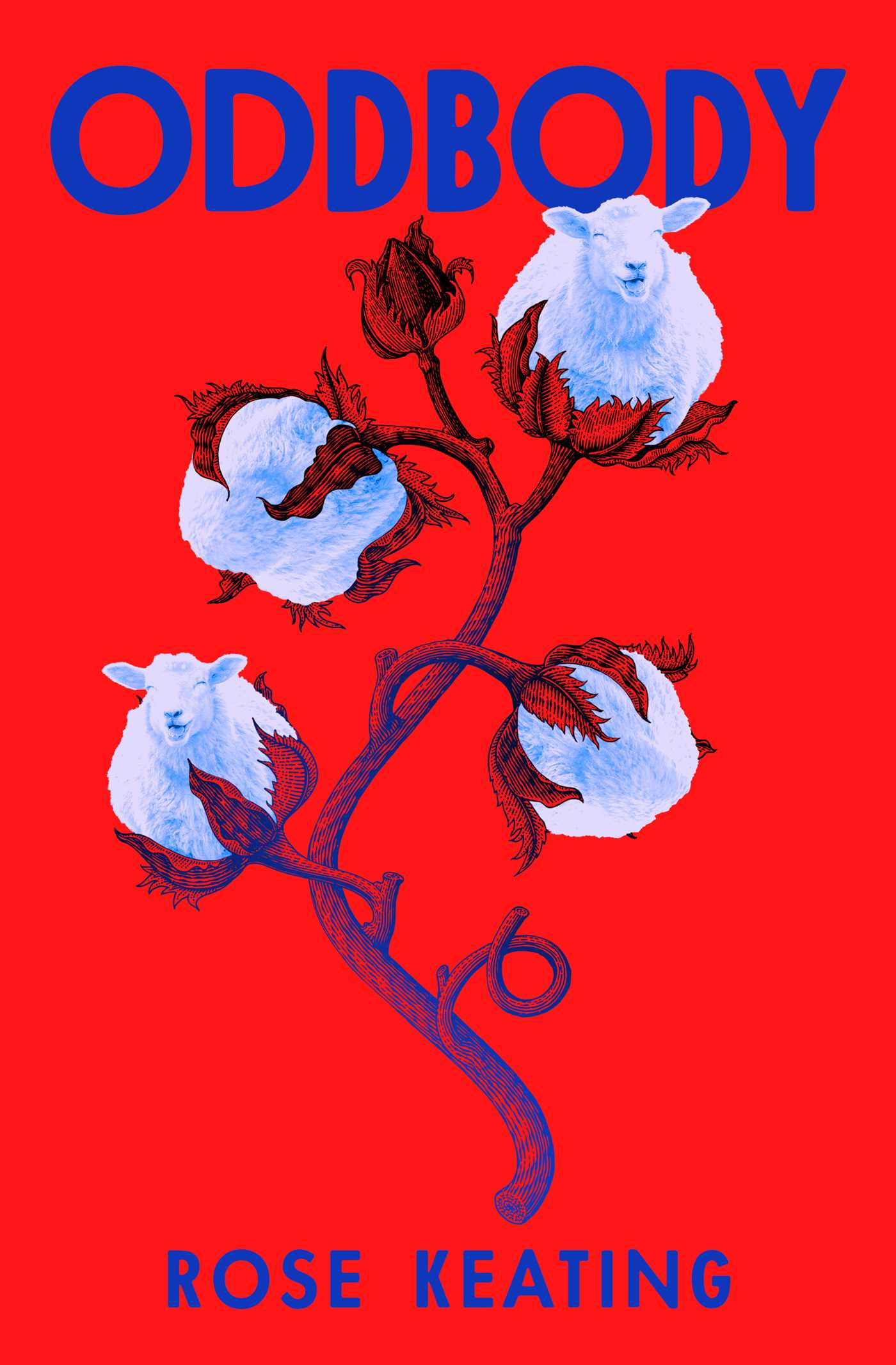 Rose Keating, Oddbody; cover design by Math Monahan (Simon & Schuster, July)
The joyful expressions on these puff ball sheep make me smile. Terrific color palette.
Sheep as balls of cotton is perfectly bizarre and intriguing!
At first look you see the vibrant, vibrating colors, the beautiful image and unique type, but then…you see the sheep. I personally think this book cover is too well done.
The collage is so weird and cool, makes me so curious to read the book. I just love it.
The little cotton ball sheep are so fun and the colors punch you in the face.
Funny and whimsical. Genius idea to combine these two objects and perfect execution. And I love a slightly vibrating palette to set an unsettled tone.
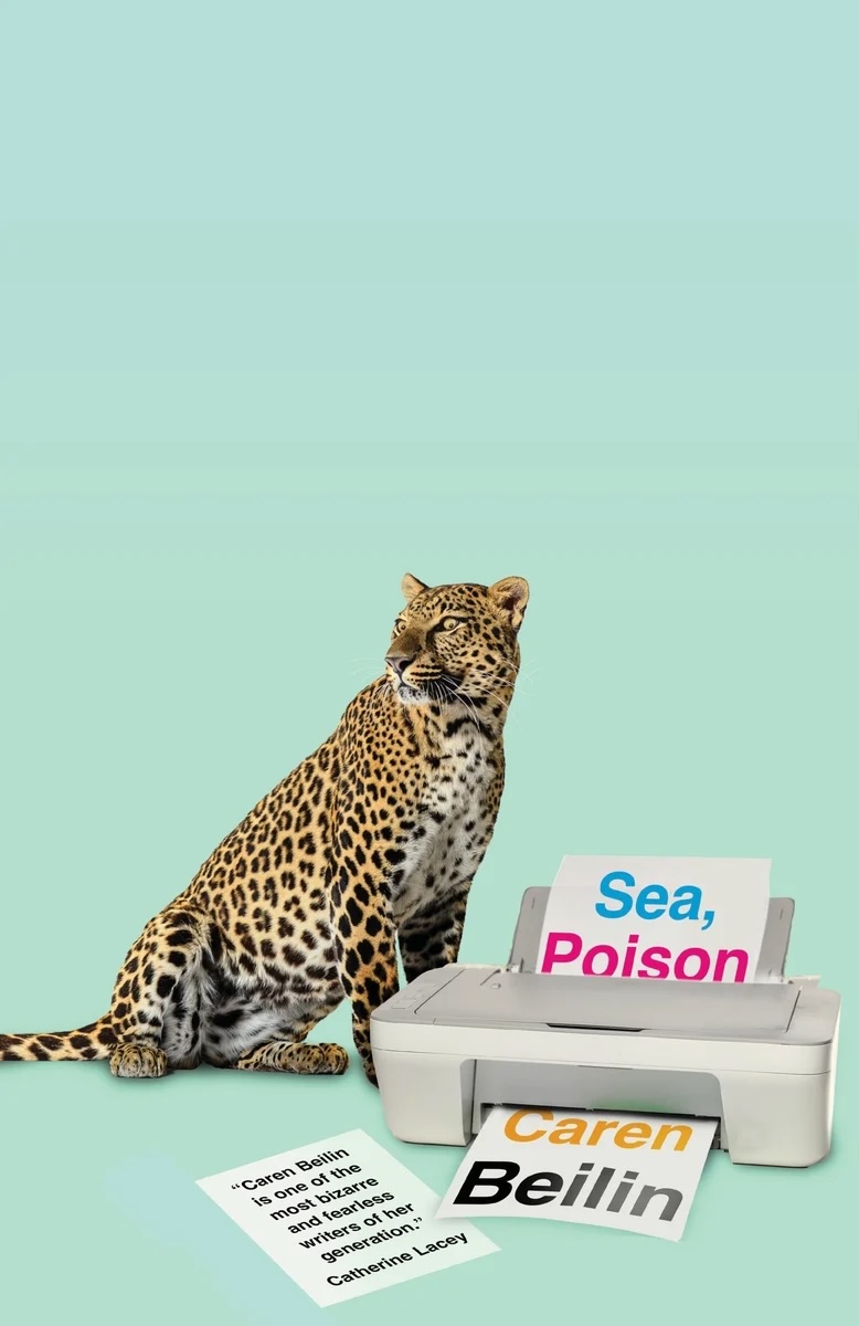 Caren Beilin, Sea, Poison; cover design by Jamie Keenan (New Directions, October)
All about the eyes, in more ways than one.
Makes you question why leopards and color printers aren’t used more often on book covers.
Love how the title and author name is seamlessly integrated into this unexpected assemblage. The expression on the leopard’s face is the cherry on top.
Sea Poison, designed by Jamie Keenan, is so brilliant in the way it throws the rulebook out the window. His design is confident in its use of whitespace and hierarchy of information, and it feels unapologetically unlike a “book cover,” in the best possible way.
Keenan’s off-the-wall juxtapositions never disappoint: hospital-scrubs hue + leash-less leopard + lone laser printer + CMYK title x author name placement all in the lower third = inventive eye candy. I have no idea what this cover will taste like, but I’m turning the page, quick.
I am enamored by how lightly bonkers this is.
 Lucas Schaefer, The Slip; cover design by Jack Smyth (Simon & Schuster, June)
I love the way everything on the cover bobs and weaves; the boxer of course, but also the title slipping, the author’s name and “a novel”.
The silhouette effect here is so powerful. Every detail feels purposeful, from the strong contrasts to the lettering choices. The result is incredibly striking.
The double silhouette, the slanted title and jagged baseline of the author and subtitle add so much life and movement to this cover.
Everything on this cover feels so tactile and bold. Loved it!
A really clever, eye-catching visual treatment that feels nicely relevant to the title.
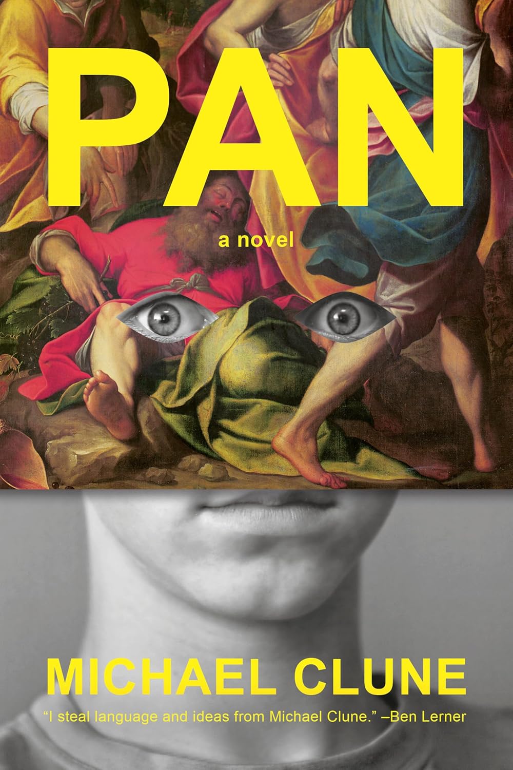 Michael Clune, Pan; cover design by Janet Hansen (Penguin Press, July)
This cover pushes book cover layout to uncharted territory. So bold! A perfect execution.
The way that painting has been placed over that face is so perfect and then you have those expressive eyes that make this a standout!
It’s kind of unsettling but also kind of funny? I love when a cover kicks up conflicting feelings. And it’s so pleasantly weird. Hard to get this one out of my head!
Such a striking cover! I love the contrast between the bright yellow of the titles and the boldness of the painting against the black-and-white photo of the boy. His stare is so arresting through the cutouts. It’s a great, effective way to show what’s going on in this boy’s mind.
I did a double take the first time I saw it—so weird and so good!
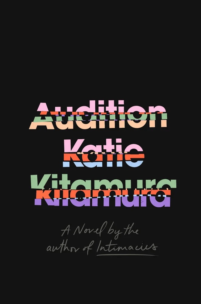 Katie Kitamura, Audition; cover design by Lauren Peters-Collaer (Riverhead, April)
Best type treatment of the year!
It’s really cool when you can convey so much with so little, and Lauren does it effortlessly. I’ve been thinking about this cover since it was revealed last year.
Love the brilliant disassembly and assembly.
So simple. It’s just perfect.
Like the Oscars, it’s easy to forget the book covers/films that debut in January. This one, though, has had staying power throughout the year. It’s so damn handsome—colors glowing in an ocean of black. The sliced-up typography produces a sort of graphic static; readers know to expect a major disruption to the everyday-ness of life.
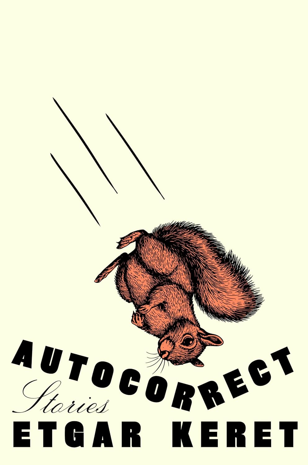 Etgar Keret, tr. Jessica Cohen and Sondra Silverston, Autocorrect; cover design by Lauren Peters-Collaer (Riverhead, May)
You can almost hear the cartoon sound effects. LPC’s covers are always the coolest on the shelf.
So fun and smart! How can you not smile looking at this!
Delightfully absurd!
I love the contrast between the static (resigned?) squirrel and the lines giving it energy. Lauren is So Good at putting old illustrations of animals on covers.
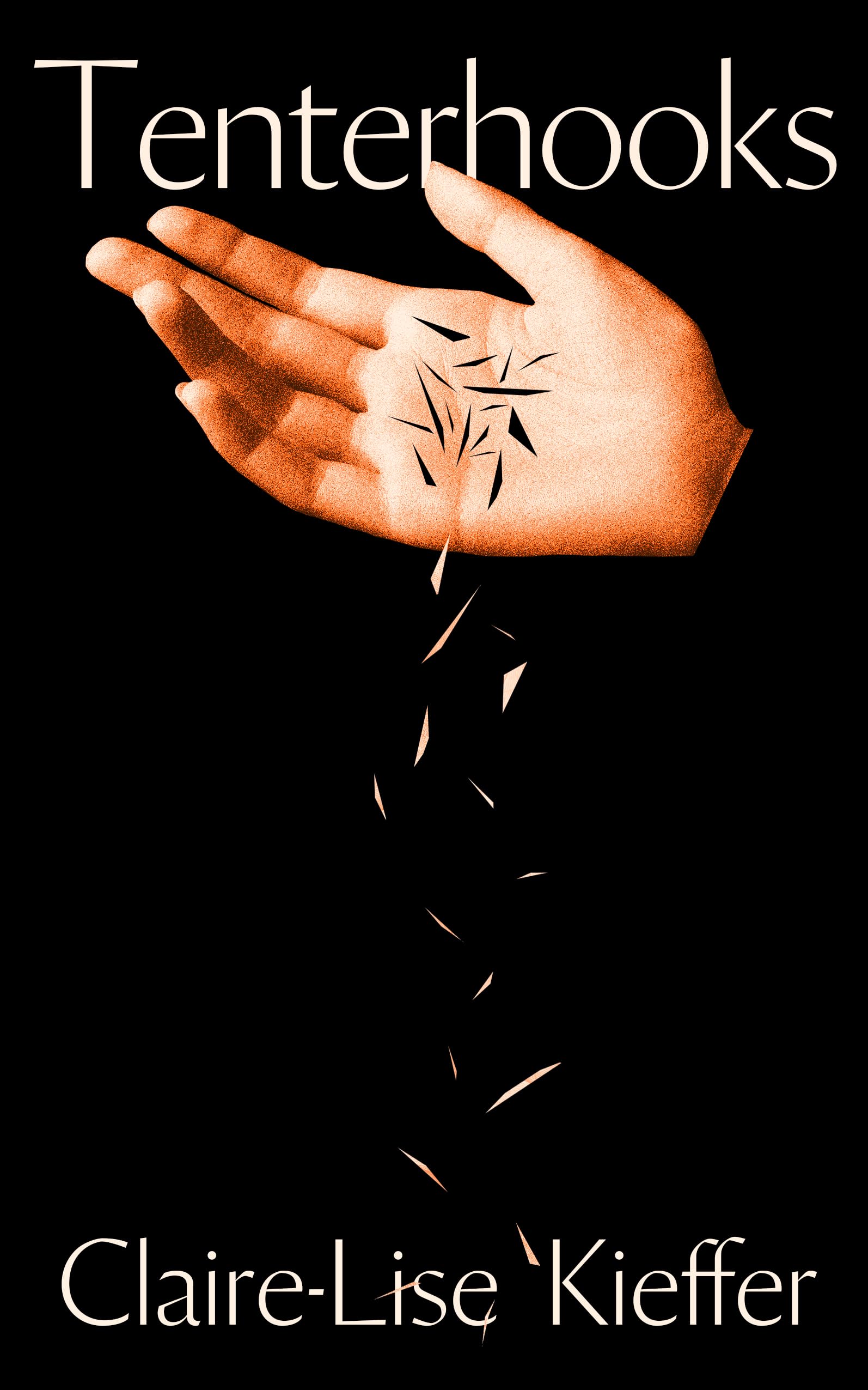 Claire-Lise Kieffer, Tenterhooks; cover design by Jack Smyth (Banshee Press, February)
I love how the things falling from the hand are parts of the hand.
Gorgeous and unsettling. The hand and shards instantly suggest a Christian martyrology, and paired with that title give this cover a peaceful unease.
Gorgeously simple and evocative—it almost feels like the image is in motion and the slivers are falling in real time.
The motion created from a single image is excellent—that one small shard that overlaps with the hand is the best part.
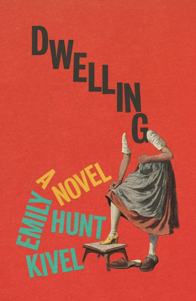 Emily Hunt Kivel, Dwelling; cover design by Matt Dorfman (FSG, August)
Love the fun movement of type with an intriguing partial figure.
Wonderfully weird and off-kilter. The disruption of the type brilliantly echoes the predicament of the novel’s characters. Keep an eye on that shoe!
Where the head and torso fail to dwell, typography thrives.
I like how that G tucks into her shoulder.
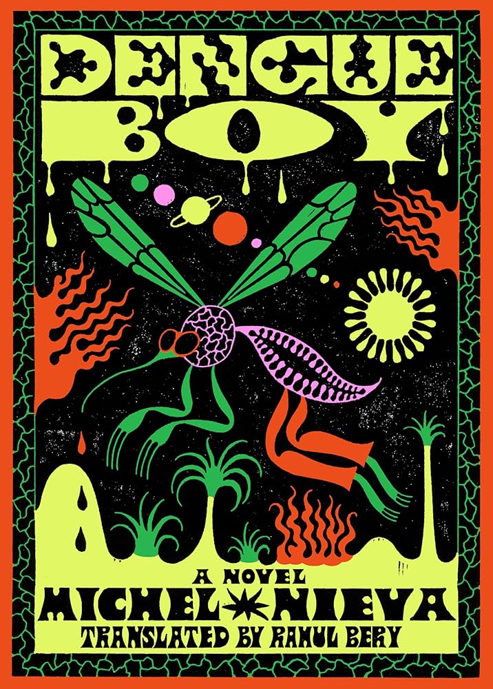 Michel Nieva, tr. Rahul Bery, Dengue Boy; cover design by Rodrigo Corral Studio / Adriana Tonello and Frances DiGiovanni, illustration by Sophy Hollington (Astra House, February)
Electric, chaotic, a fever dream come to life. I fell in love with it the moment I saw it! It demands you open the book.
I love everything about this beautiful weirdo—the fevered, hand-lettered type and how it interacts with the illustration, the mirroring of the insect pattern in the border treatment, the dense composition, and vibrating colors. I wish it came with a signature fragrance that mutates.
I’m a confirmed fan of Hollington’s inventive lettering and noisy color pallets. For Dengue Boy she managed to make the killer mosquito-guy downright groovy, fork-y fingers, et al! I’m squealing with delight through my queasiness.
“If gloriously graphic depictions of death-by-giant-mosquito, or of grotesquely (if virtually) rendered scenes of murder and bizarre tentacle-sex don’t sound like your thing, this might not be the book for you.” 👍
 Marcy Dermansky, Hot Air; cover design by Janet Hansen (Knopf, March)
What’s not to love about a cover whose basic demand seems to be: “I dare you to squeeze me”?
Such a fun take on the title. Tactile and beautifully executed. Feels like it could start floating.
So tactile! I always want to pick this book up.
Queen of minimalism, Janet has essentially just set type in panels—but the way the background sags like a deflating hot-air balloon, with the type recessed into it, is so wry and brilliant.
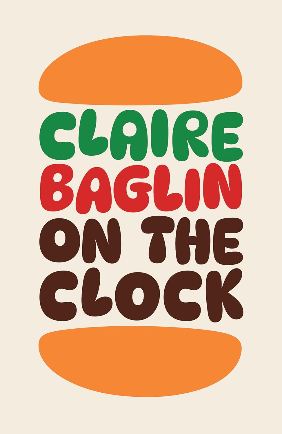
 Claire Baglin, On the Clock; cover design by Jack Smyth (Daunt Books Originals, March)
Stark and simple, yet taut with tension—its minimalist layout and precise typography immediately arrest the eye.
I love the way the placement of the illustration adds to the feeling of slipping into the abyss.
On the Clock is such a lovely design—Jack has distilled the essence of the book on that cover brilliantly. I love the confident whitespace and the black-and-white treatment.
Both the US and UK covers are iconic. While the US cover crackles with manic energy, the UK cover captures a particular brand of ennui that hits hard. The stark, tightly kerned type sits beautifully at the top, giving the cover abundant negative space—always appreciated!
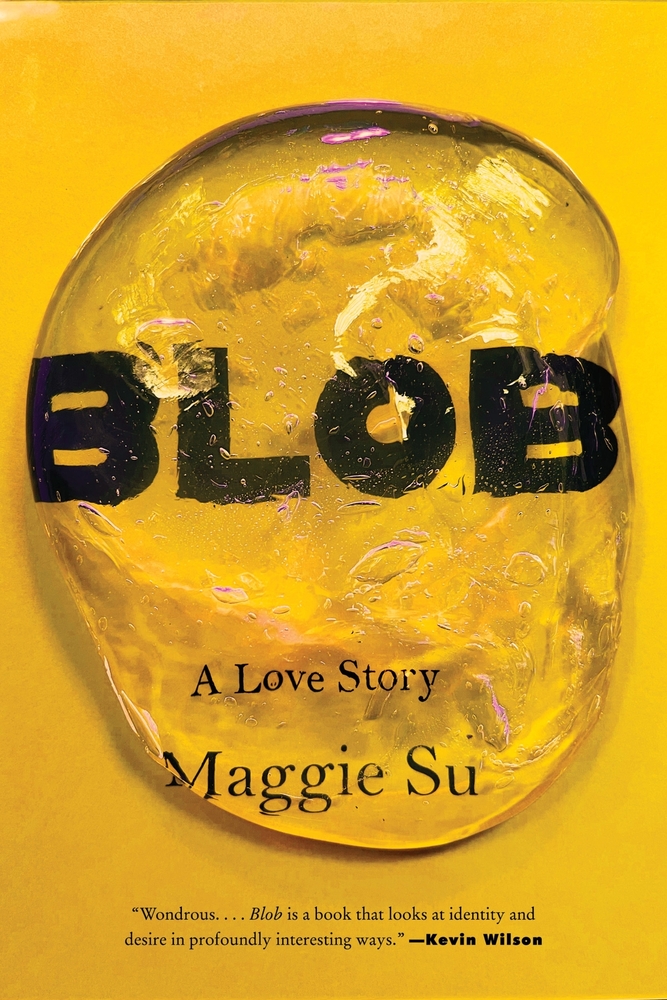 Maggie Su, Blob: A Love Story; cover design by Robin Bilardello (Harper, January)
If there’s a lesson in here for every designer, it’s this: Show, don’t tell.
I like the illusion of texture and stickiness on a flat surface.
I could see a hundred horrible ways to put a blob on a BLOB cover but this is perfect, simple and striking, and makes me care so deeply for this gelatin mass.
Simple and impactful. Who can resist a blob?
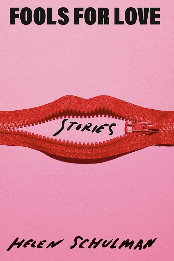 Helen Schulman, Fools for Love: Stories; cover design by Janet Hansen (Knopf, July)
The zipper mouth! Pink and red! The urgent handwritten author name and “stories”!
Looks like something from the big book of amazing magazine covers.
Bold, funny, and incredibly clever—the perfect encapsulation of Schulman’s writing.
So smart and playful!
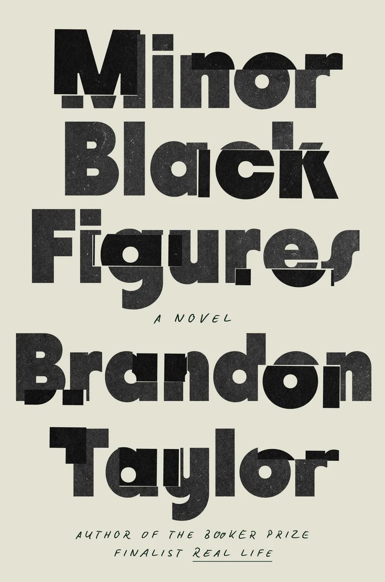 Brandon Taylor, Minor Black Figures; cover design by Grace Han (Riverhead, October)
A striking type-driven cover. Though minimalist in design, there is great care given to the collage-effect of the spliced lettering, which moves your eye around the cover and evokes shifting perspectives.
Another great example of achieving so much with so little. It’s simply beautiful.
I love this dynamic, fractured type.
A cover that feels so simple and gathers depth the longer you look.
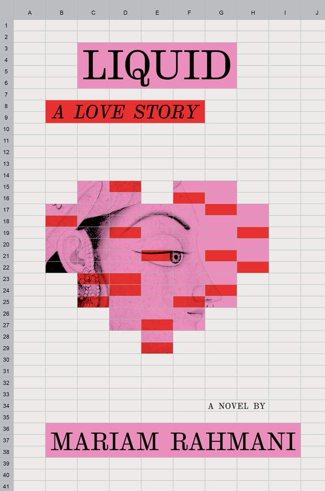 Mariam Rahmani, Liquid: A Love Story; cover design by Sharanya Durvasala (Algonquin Books, March)
The spreadsheet is used in such a smart way and it makes me so curious about the book’s content.
I don’t think I’ve ever seen a cover design using a spreadsheet as a medium, so this immediately caught my attention. The elegant serif, understated composition, contrasting historical illustration, pairing of pink and red—it’s all so satisfying.
Summons the pagan sprit of Excel art.
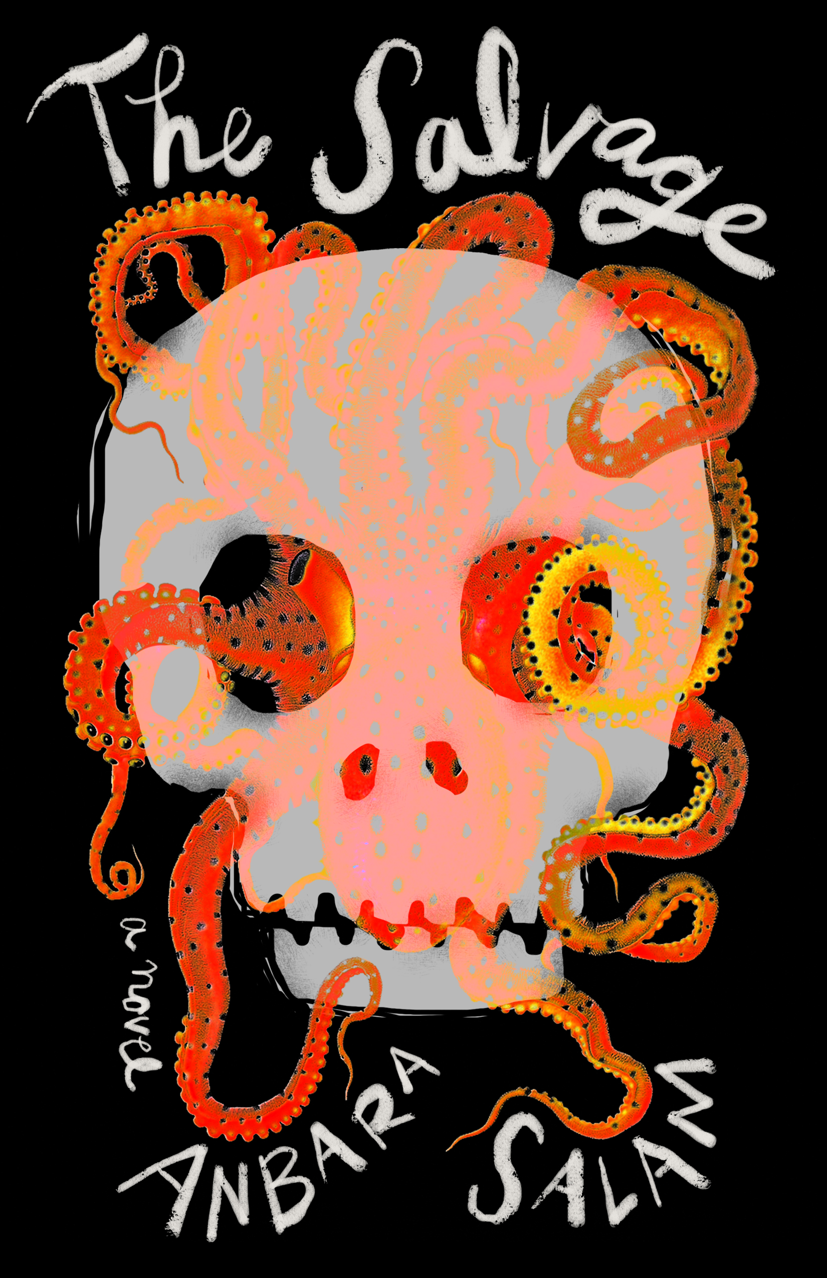 Anbara Salam, The Salvage; cover design by Beth Steidle (Tin House, October)
Love the colors and those swirly tentacles.
The brush lettering, creepy illustration and the way the two interact is lovely! Can tentacles and skulls be lovely?
Given the number of genre titles we’ve published at Bindery Books, I encounter a fair number of skull illustrations in my day-to-day! This one held my gaze. I adore the painterly octo-limbs, curling out in every direction and how those coils relate to the hand-lettering. Through the milky bone we spy the clever deep sea operative, making use of the skull’s twin spy glasses for this Victorian shipwreck mystery.
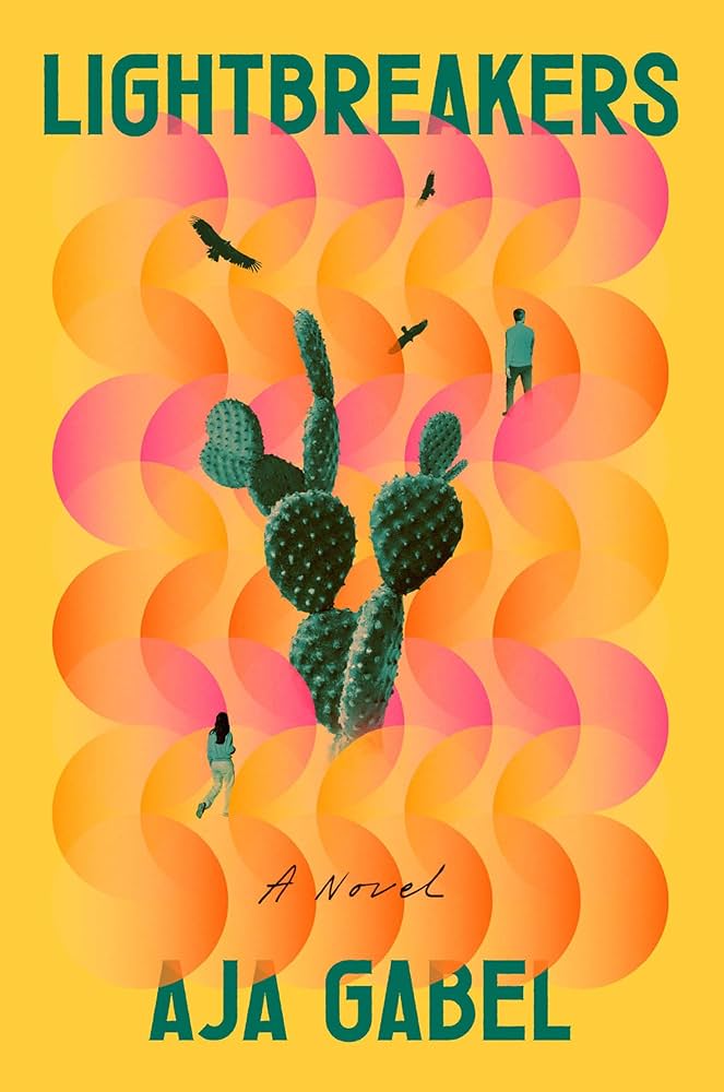 Aja Gabel, Lightbreakers; cover design by Sara Wood (Riverhead, November)
This one lived in my mind for such a long while, I love the broken symmetry of the image treatment and the beautiful color palette.
The colors and trippy feel of this cover make me smile.
Quantum physics, art, the desert, mystery: you see all of that at first glance in this beautifully executed design from Sara.
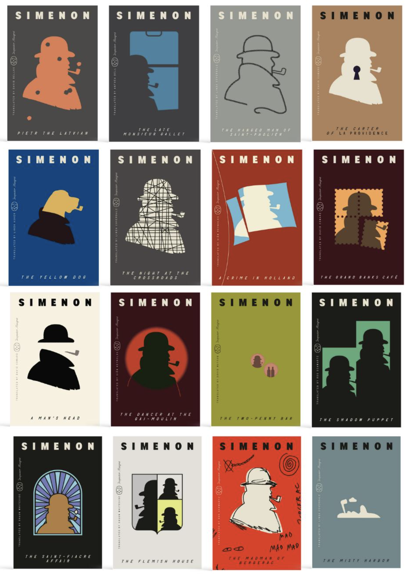 George Simenon backlist; cover designs by Alex Merto (Picador, May, June, July)
He’s having too much fun with these backlists, and it’s a problem for me because I want them all :/
Alex Merto conquers another series redesign! I’ve loved seeing these covers pop up on my feed throughout the year.
My list could be all Alex Merto designs.
 Edward McPherson, Look Out; cover design by Arsh Raziuddin (Astra House, October)
Such disparate elements that shouldn’t work together as well as they do, but somehow they are elevated into something more beautiful.
Look out there’s a B-29 Superfortress outer space perpendicular color bomb horizon line!!!
There’s a lot happening here—the shifting perspectives, the gradient splashes—but Arsh somehow orchestrates real beauty within the chaos. It feels almost like a Metahaven piece, if they were to design for a trade publisher.
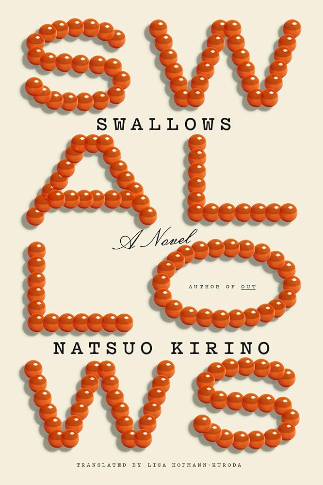 Natsuo Kirino, tr. Lisa Hofmann-Kuroda, Swallows; cover design by Tyler Comrie (Knopf, September)
Such a beautiful and intriguing construction of the title here.
The simplicity is genius, I loved this cover as soon as I saw it.
Genius concept, exquisitely executed. That salmon-roe “O” is so gorgeous I’d wear it as a bracelet.
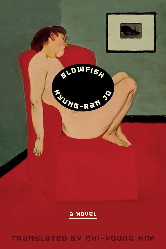 Kyung-Ran Jo, tr. Chi-Young Kim, Blowfish; cover design by Giacomo Girardi/Rodrigo Corral Studio, based on the Korean edition (Astra House, July)
This cover is absurd and delightful. The painting, the type, the placement of the type container. So good.
I love the way the title and author seem to be expanding and pushing apart their container. Tense and interesting.
The small sticker-like oval holding the title and author’s name feels unexpected and odd, but it’s exactly where it needs to be.
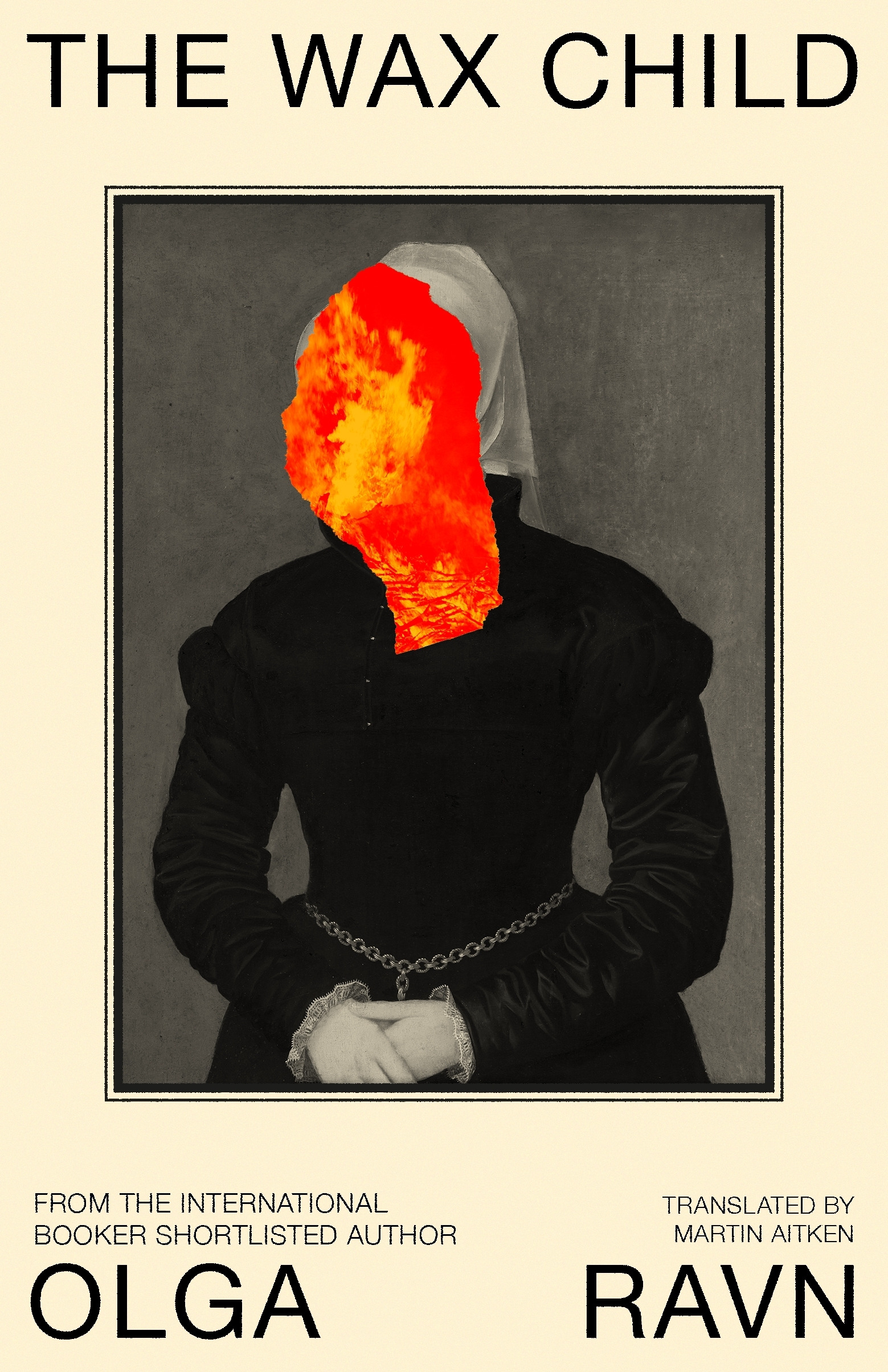
 Olga Ravn, tr. Martin Aitken, The Wax Child; cover design by Paul Sahre (New Directions, September)
A haunting, sorrowful concept.
Striking in its simplicity.
I’m scared just thinking about the wax child (or lack thereof) in that smoking crib.
 Omar El Akkad, One Day, Everyone Will Have Always Been Against This; cover design by Janet Hansen, illustration by Ahmad Sabbagh (Knopf, February)
Everything about this is haunting. The blood orange is striking and rich. The illustration is subtle but evocative. Even the title (and its placement) is weighty and stirring. The image resonated with me all week.
Incredibly powerful and resonant.
A cover that stops you in your tracks.
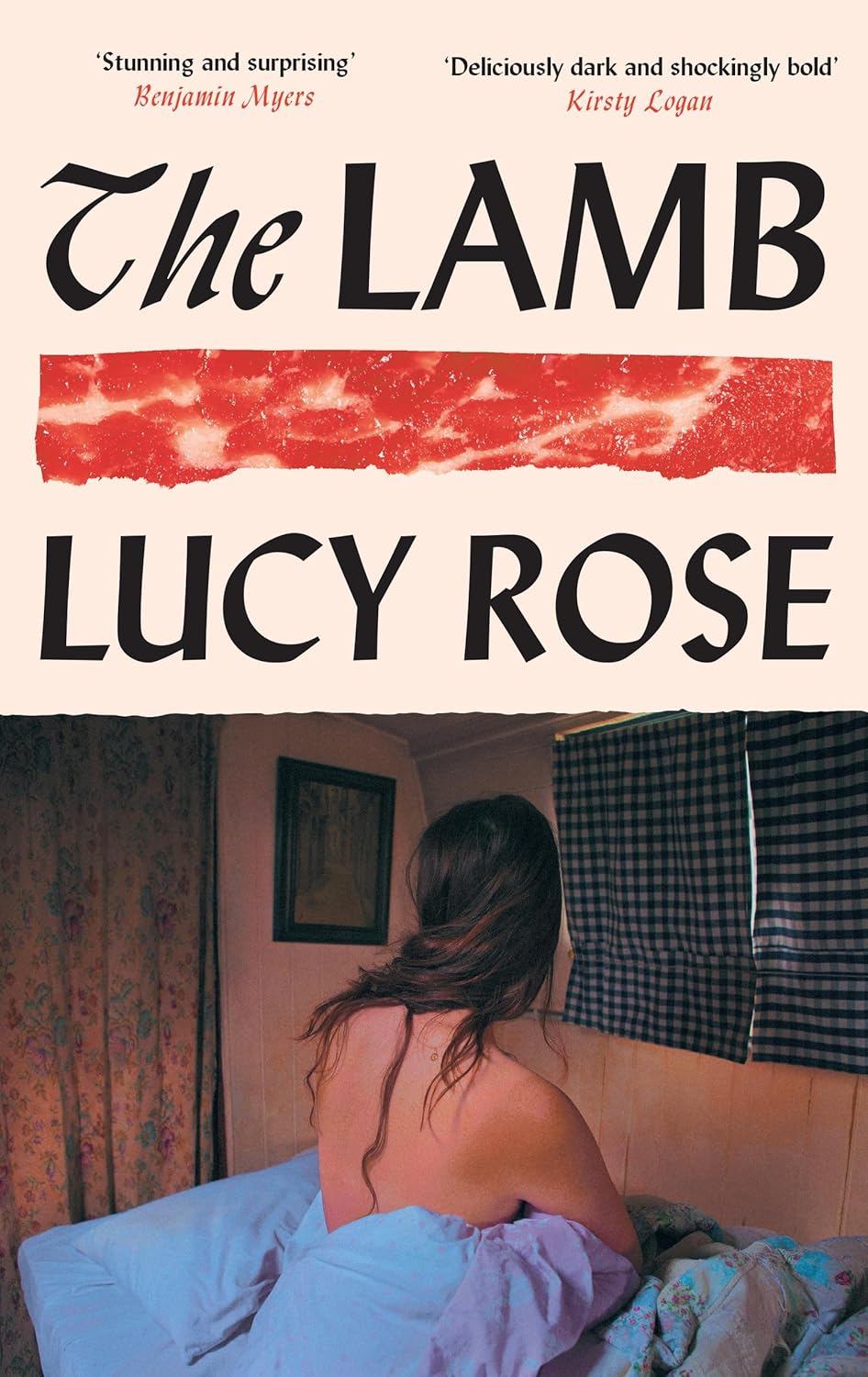
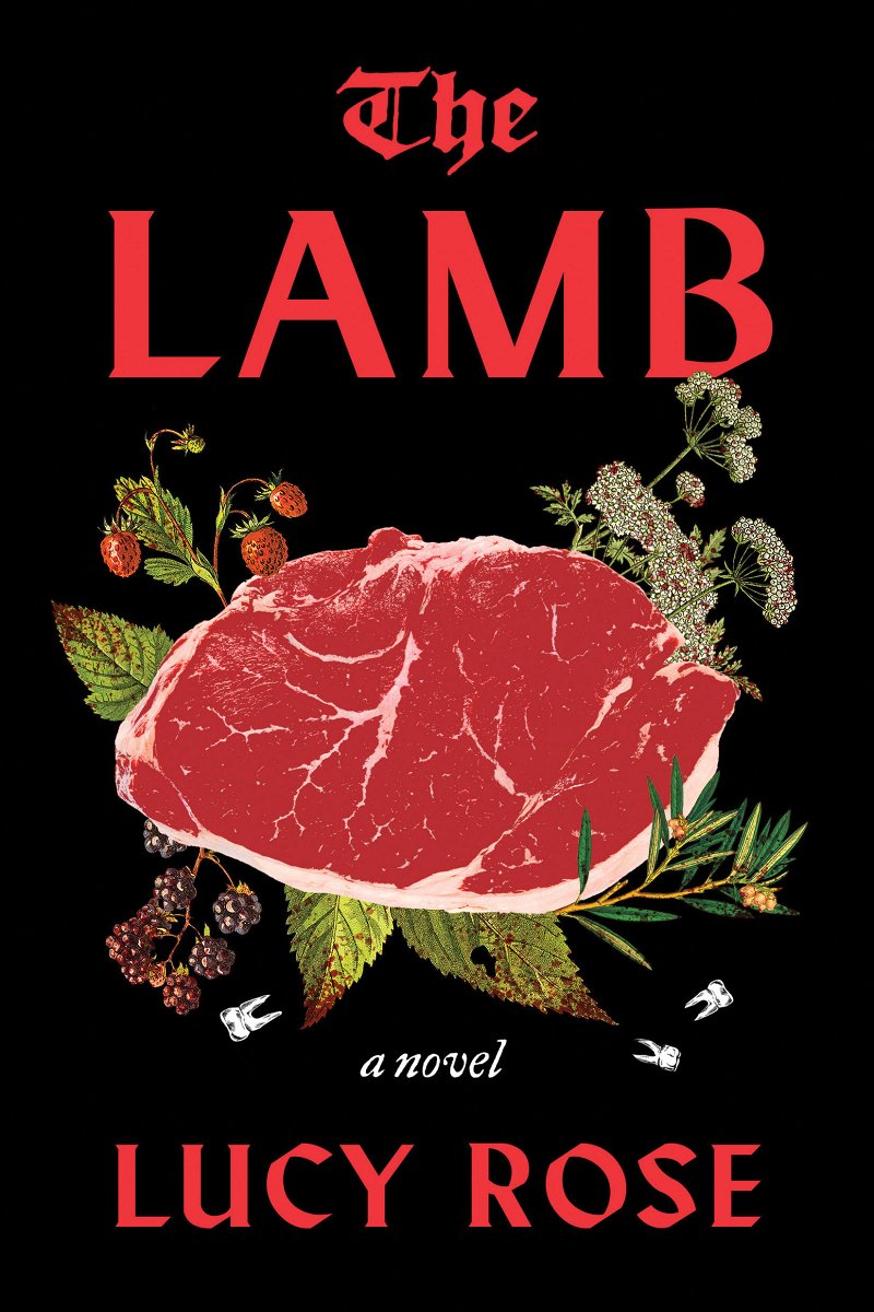 Lucy Rose, The Lamb; cover design by Joanne O’Neill (Harper, February)
Never thought a piece of meat could look so pretty. Image and type work so beautifully together.
Everything about this cover feels elegant. The softness of the photo contrasts so beautifully with the red bacon strip. I love that it hints at horror so tastefully and subtly.
The more you look at this cover, the more unsettling it becomes… what are those teeth doing there?! The type treatment is just fantastic.
 Olivia Laing, The Silver Book; cover design by Na Kim (FSG, November)
Beautiful image with elegant, restrained type—and then that otherworldly light streak cutting through it all really makes this one resonate and stand out among other historically set novels.
This silvery, dreamy cover looks even more stunning IRL.
Shimmering, elegant, and haunting—with a hint of menace from the razor-edged typeface.
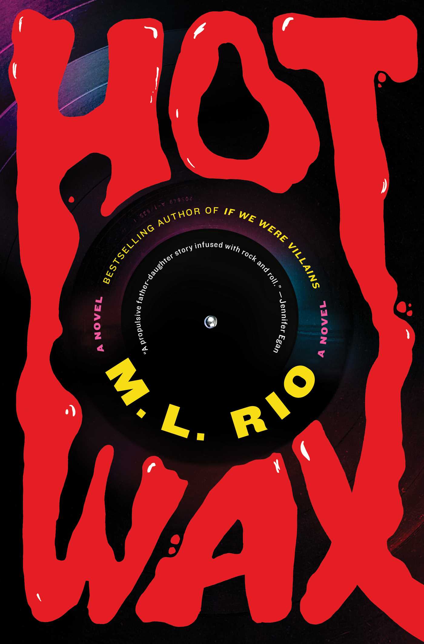 M. L. Rio, Hot Wax; cover design by Ella Laytham (Simon & Schuster, September)
The melty title is the star! But also using the center of the record for such an unconventional layout for the blurb—Wow.
Glossy, melted lettering won me over.
I love how animated this feels and how clever this cover is. Everytime I see this online or in the store I can’t stop looking at it.
 Vauhini Vara, Searches; cover design by Andrew LeClair and Linda Huang (Pantheon, April)
Strays from the typical visual norms of book covers. I love the unconventional approach here.
I like how a block of text is used as a graphic element here. It feels like we are already inside the book.
The smartest use of AI for a book cover design to date.
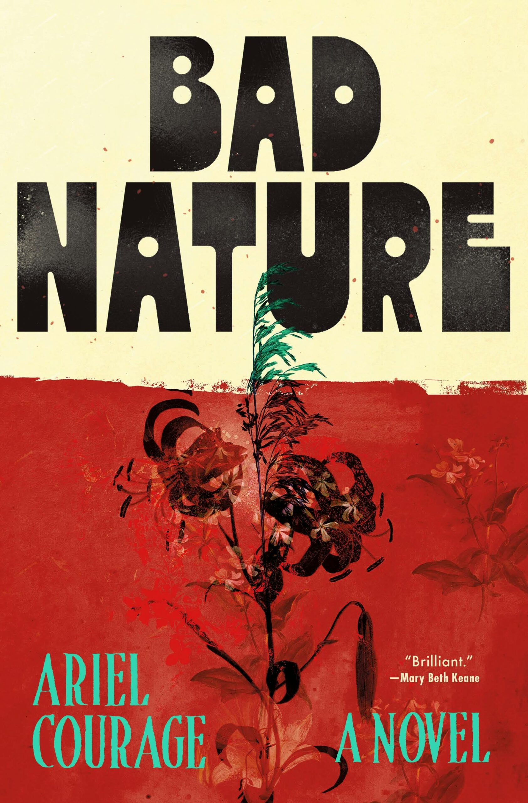 Ariel Courage, Bad Nature; cover design by Emily Mahar (Henry Holt, April)
I love the chunky font and the deep red.
The combination of fonts and colors balance in the most unexpected and pleasing way.
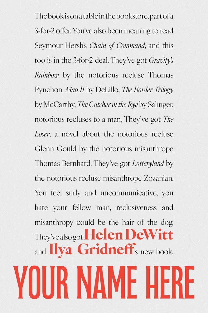 Helen DeWitt and Ilya Gridneff, Your Name Here; cover design by David Wojciechowski (Dalkey Archive Press, October)
For so long, it seems like a simple image and large type have hegemonized the cover world (better for Amazon). But I’ve been enjoying the recent trend toward a maximalist text paragraph. (See also Heart Lamp by Banu Mushtaq and the rest of the And Other Stories catalogue.) It’s a welcome challenge to pick up something without flash. Feels very John Berger to me!
Cannot resist. Special mention: another comp of this title, over at David’s site.
 Martha Barnette, Friends with Words; cover design by Ben Denzer (Harry N. Abrams, August)
Another super simple cover with a lovely palette. Brilliant in its exectution of the different personalities. We’ve all seen faces made of glyphs, but these are fresh and fun.
You know about the primogenial use of emoticons in an issue of Puck magazine in 1881, nestled in a little aside about typographic art? This cover continues that grand delicious tradition.
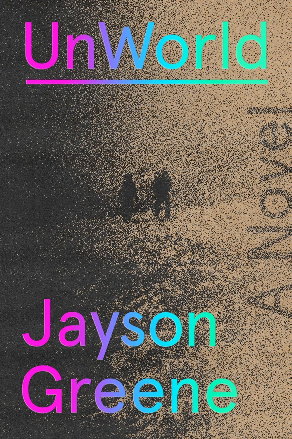 Jayson Greene, UnWorld; cover design by Tyler Comrie (Knopf, June)
Dark, yet vibrant. Textured, yet clean. Neutral, yet colorful. There’s a mystery to this that I can’t help but be drawn toward.
I’m a sucker for black and white covers that should come with a seizure warning. This one is literally and figuratively so sharp, love everything about it!
 Adam Ross, Playworld; cover design by Oliver Munday (Knopf, January)
A gorgeous balance of photography, color and type.
Playworld gets my vote for the most pitch-perfect-inverted-bellyband-cover composition of 2025! Were music routinely paired with book jackets, this one would sound like a single note held by a mezzo-soprano; if the vocalist dared pause to catch a breath, the hidden world of this young man could shatter in our hands.
 Jonas Hassen Khemiri, The Sisters; cover design by Rodrigo Corral Studios (FSG, June)
Too good! This cover stops me in my tracks every time I see it. The halftone pattern is the cherry on top.
The overlapping of the faces directs my focus to the centrally placed lips which is a perfect way of depicting a story that is described by the NY Times as being told in “increments of time that grow increasingly briefer, ending on one minute in the future that offers long-awaited grace.” It grabbed my attention at every book shop and online mention.
 Clarice Lispector, tr. Katrina Dodson, Covert Joy: Selected Stories; cover design by Paul Sahre (New Directions, April)
How do you do that?
Paul’s work is always brilliant and thoughtful. I love that the title is covert here and the luminosity and vibrancy of the author’s writing is reflected within the single image. Without having read the book, this passage combined with this cover is quite a marriage:
“Joy would always be covert for me… Sometimes I’d sit in the hammock, swinging with the book open on my lap, not touching it, in the purest ecstasy. I was no longer a girl with a book: I was a woman with her lover.”
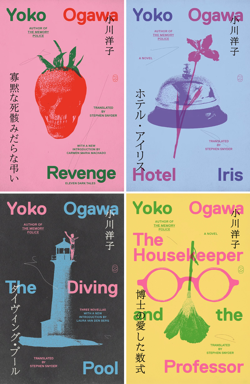 Yoko Ogawa, tr. Stephen Snyder, four backlist redesigns; cover design by Tyler Comrie (Picador, July/September)
These are fantastic—the colors, the carefully constructed balance of so many elements, the quirky, grainy collages—how do I choose just one?
Such a wonderful use of color, type placement, and overprinting. I’m excited to see the rest of the titles in this series.
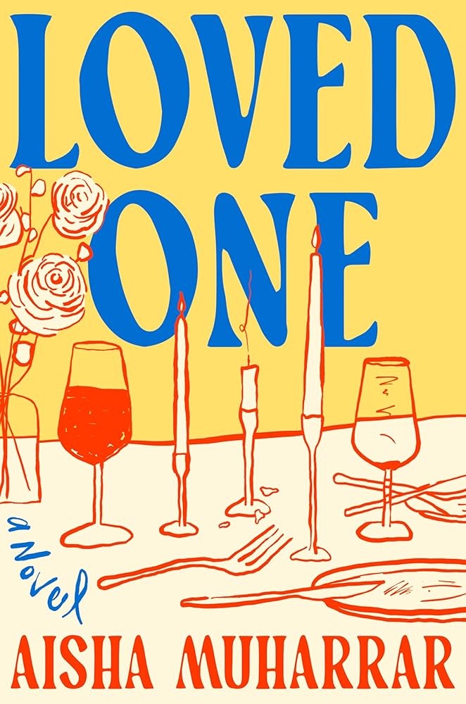 Aisha Muharrar, Loved One; cover design and illustration by Elizabeth Yaffe (Viking, August)
The illustration paired with the type is so charming!
Love this nostalgic mix of type, colors and illustration, this cover makes me so happy!
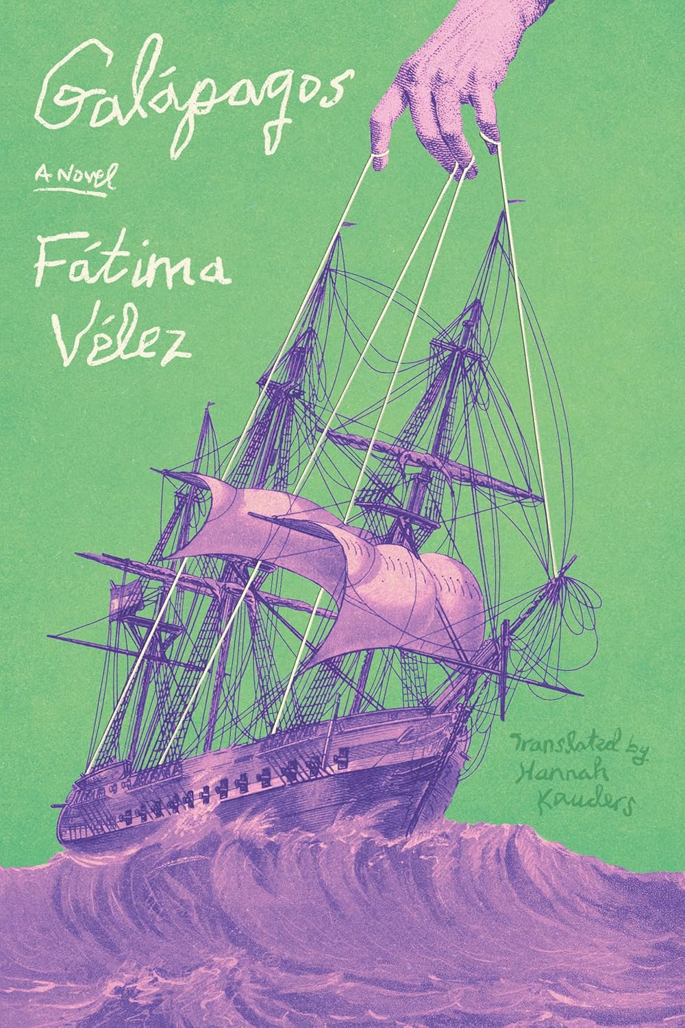 Fátima Vélez, tr. Hannah Kauders, Galapagos; cover design by Frances DiGiovanni / Rodrigo Corral Studio (Astra House, December)
I love how the hand sets the entire design in motion. It’s almost like the hand-lettering is a response to the strings being pulled.
I mean how? I’m going to marry this book cover. I’ve set up our bridal registry at Crate of Implacable Envy & Barrel of Hysterical Genuflection.
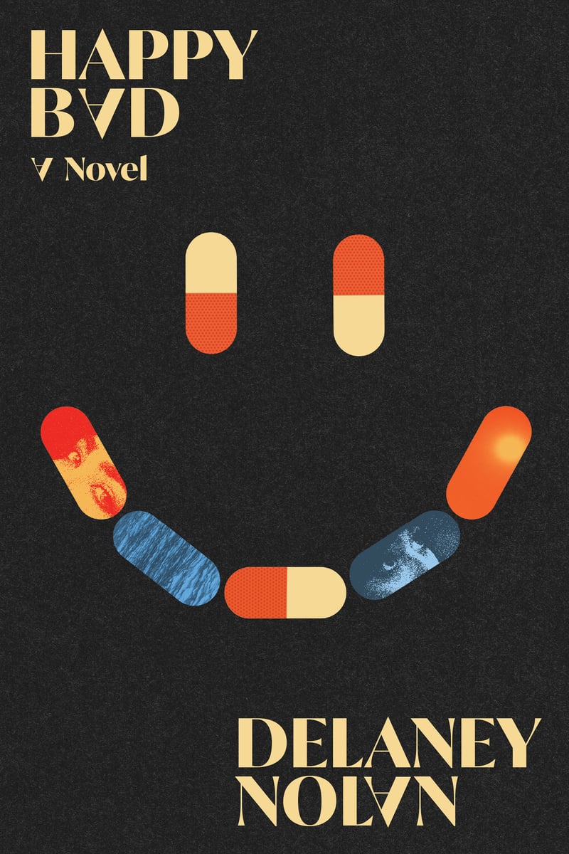 Delaney Nolan, Happy Bad; cover design by Adriana Tonello and Rodrigo Corral Studio (Astra House, October)
Bright pill shapes set against a dark field give the cover a cinematic, almost ominous energy—light and dangerous at once.
Deceptively simple until you get into all the details in the type and images embedded
into the smile-pills.
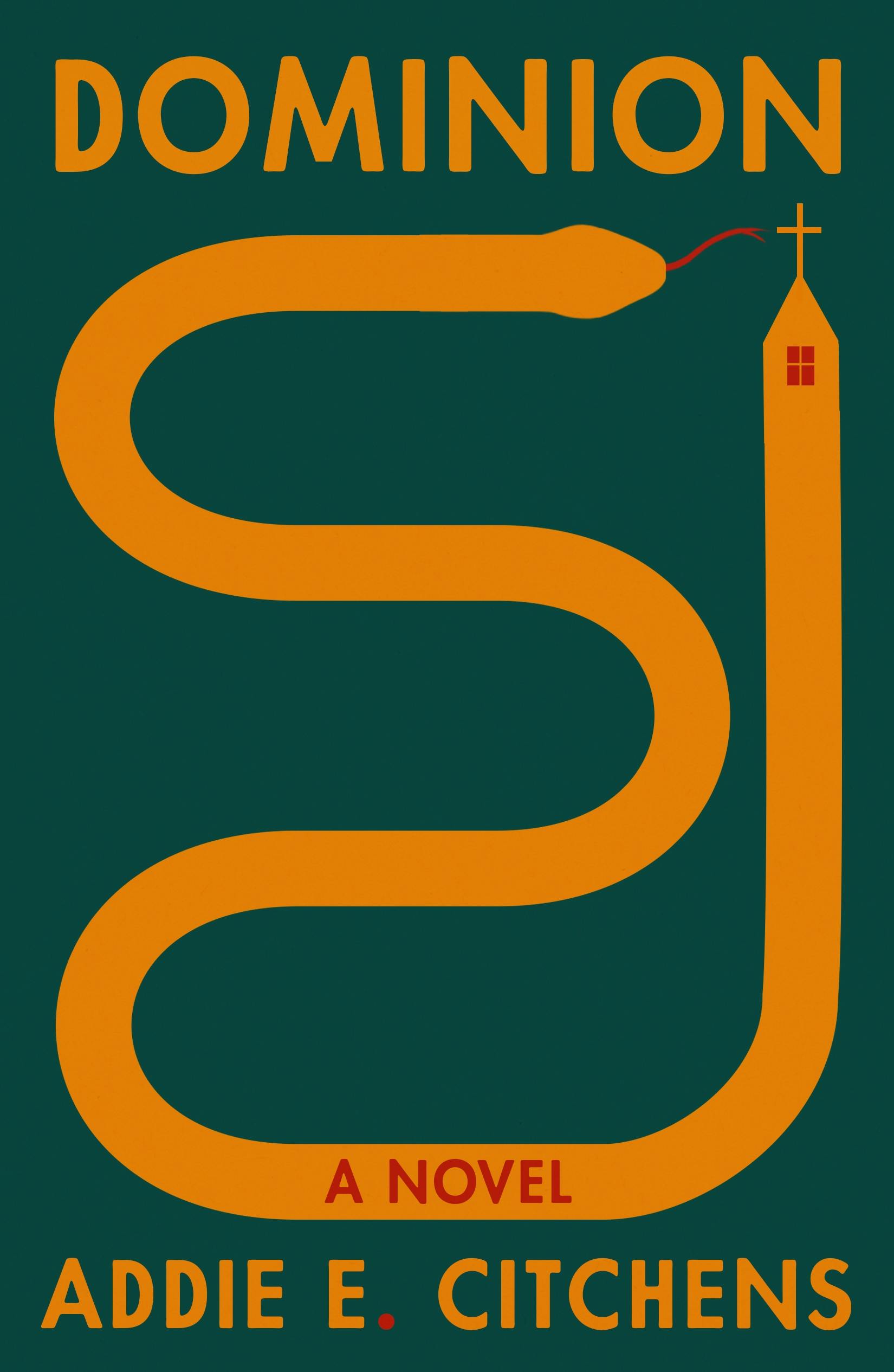 Addie E. Citchens, Dominion; cover design by Na Kim (FSG, August)
Such a captivating and mysterious illustration. It calls me to pick up the book.
I’m a sucker for simple covers that get the message across quickly, and this does just
that. The color palette is surprising, yet vibrant.
 Hu Anyan, tr. Jack Hargreaves, I Deliver Parcels in Beijing; cover design by Rodrigo Corral; illustration by Klaus Kremmerz (Astra House, October)
Love love love love love love. Such gorgeous illustration work—and it carries over onto the back panel. Wonderful.
This is just so nice to look at. Everything is so clean and lined up and the blue tint of the glass just finishes it all off.
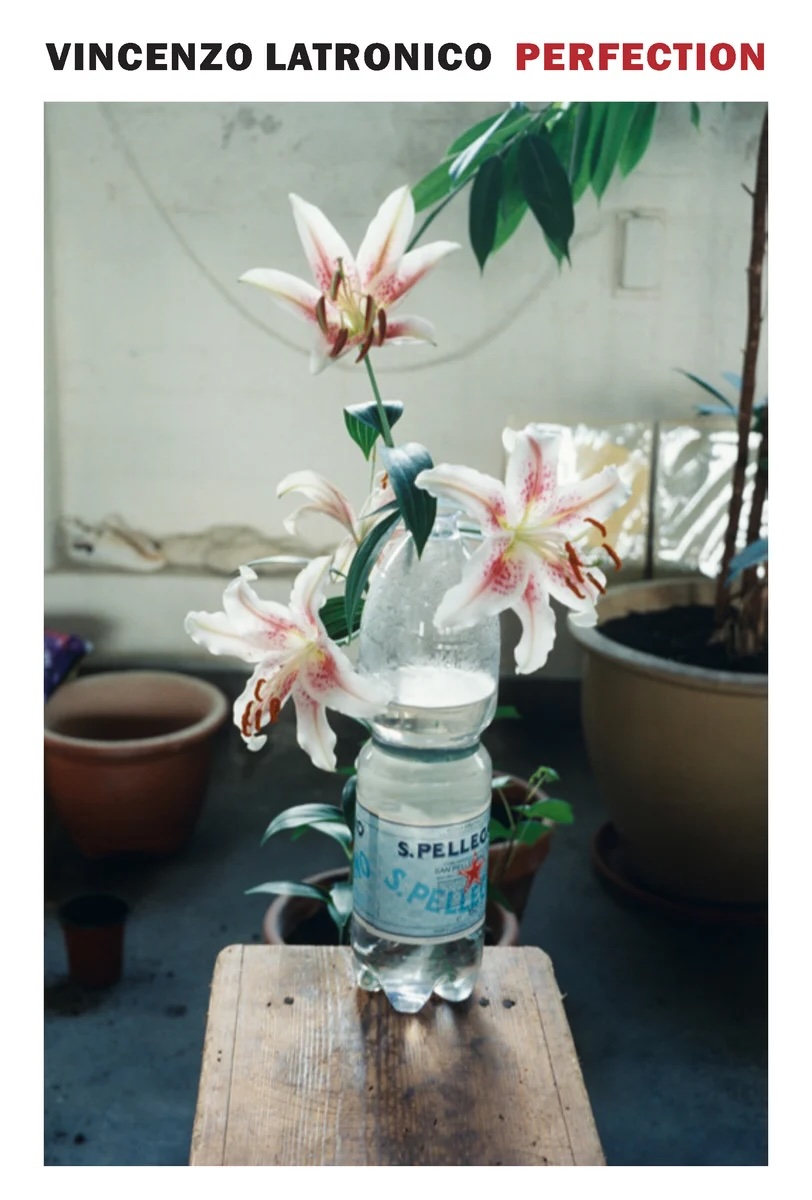 Vincenzo Latronico, tr. Sophie Hughes, Perfection; cover design by Katy Homans, image by Wolfgang Tillmans (NYRB, March)
The photograph really feels like a still plucked from the book, that’s rare. It’s mundane but fruits a peculiar but memorable feeling.
An excellent use of Wolfgang Tillmans.
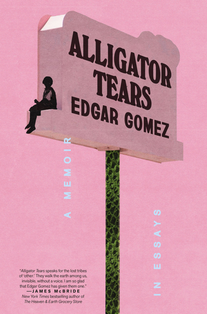 Edgar Gomez, Alligator Tears; cover design by Arsh Raziuddin (Crown, February)
The details are so considered—from the alligator skin pole to the vertical copy going down teardrop-style, every element works together so well.
I was immediately charmed by the subtle texture and the gentle typesetting of “A memoir in essays.”
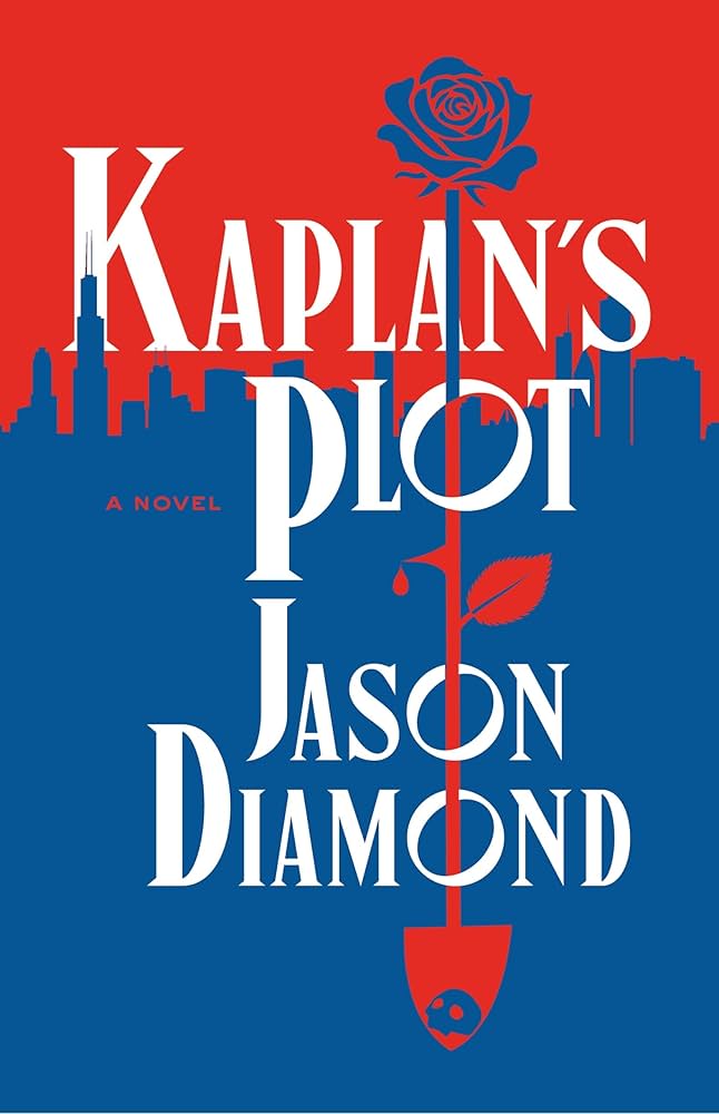 Jason Diamond, Kaplan’s Plot; cover design by Jonathan Bush (Flatiron, September)
Love the limited color palette, flat graphic style, and clever use of imagery piercing though the type.
This cover is so simple, yet packs so much information: love and death, a city with a mystery…
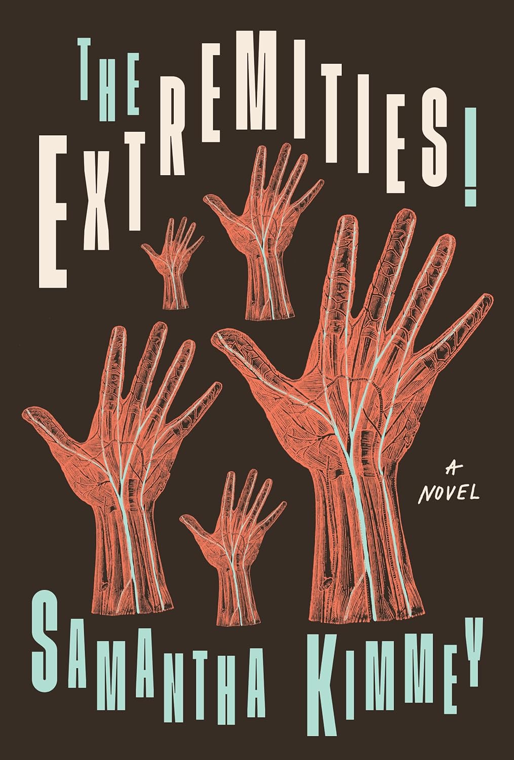 Samantha Kimmey, The Extremities!; cover design by Kimberly Glyder (University of Iowa Press, October)
I love the zany energy of these staid anatomical hands with that type.
I’m all about playful covers for serious topics and I love off-kilter type because it’s so incredibly time-consuming and hard to pull off. Kimberly pulls it off with perfect balance. Bonus points for reminding me of “All Bodies” by Between the Buried and Me (tell me this cover wasn’t made for this song?!)
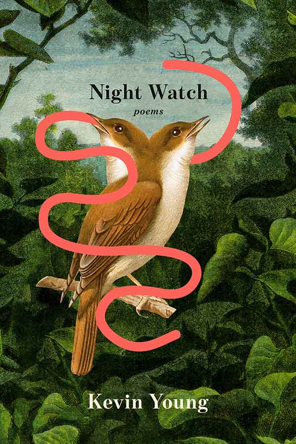 Kevin Young, Night Watch; cover design by Kelly Blair (Knopf, September)
I don’t know what’s going on with this two-headed bird eating the world’s longest worm, but I LOVE IT and it makes me want to stop and read more. Exactly what a book cover should do.
Not only the only two-headed bird design this year! (Both are very good.) Wormed its way into my heart.
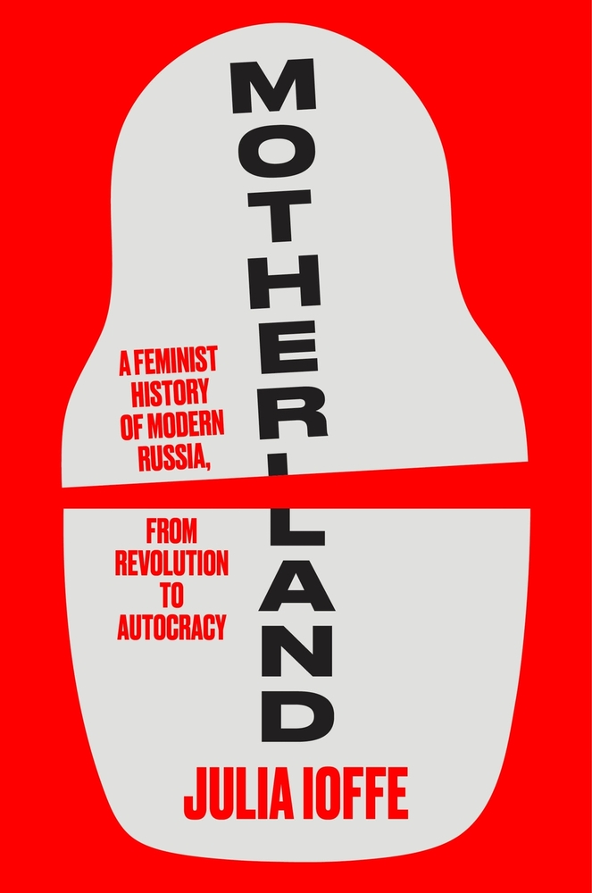 Julia Ioffe, Motherland; cover design by Jenny Volvovski (Ecco, October)
Clever and poignant use of a Matryoshka doll icon to show a fractured Russia.
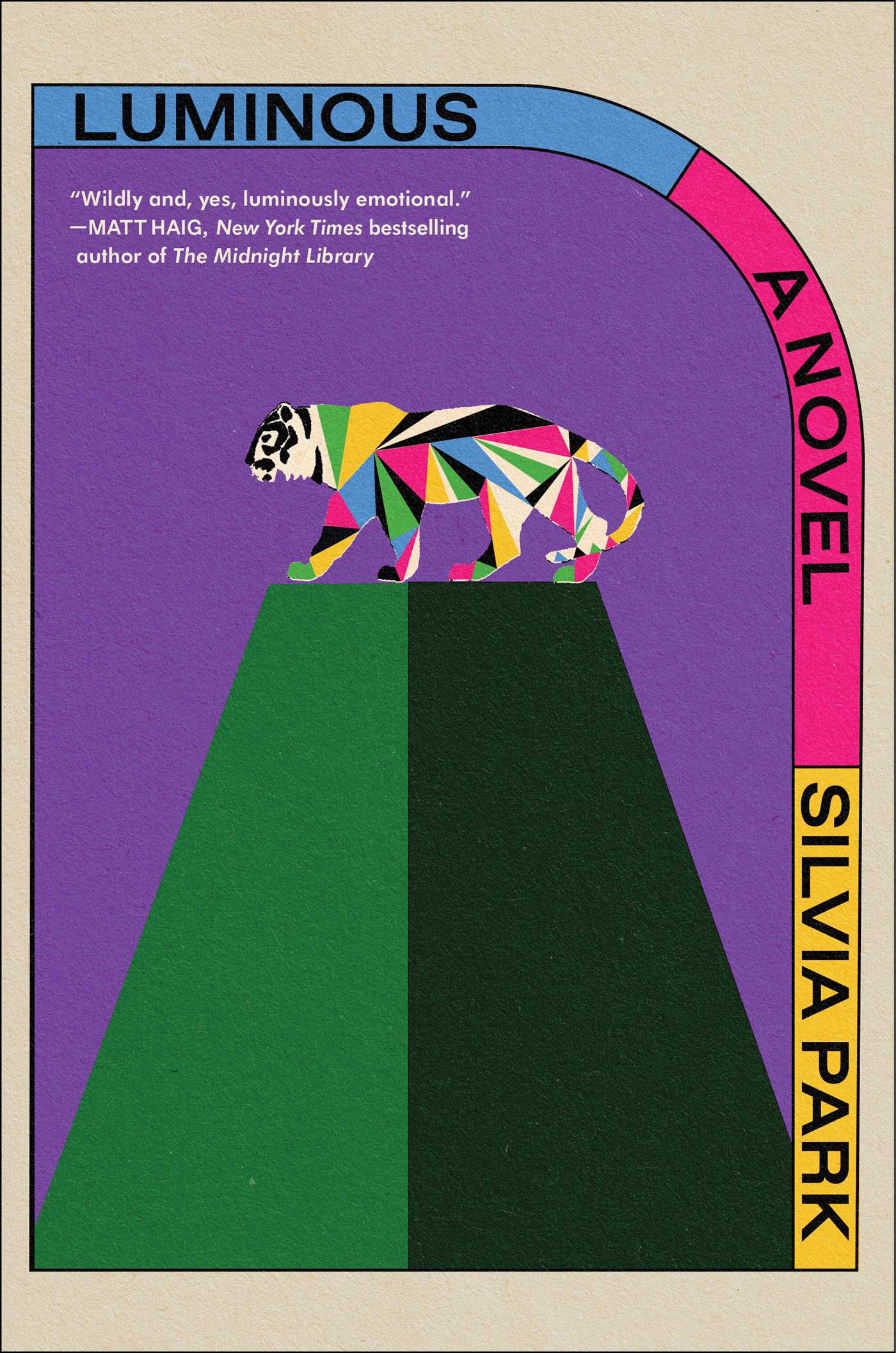 Silvia Park, Luminous; cover design by Alex Merto (Simon & Schuster, March)
I could look at this cover all day. The geometric tiger illustration, the colors, the type layout…it just ticks all the boxes for me.
Is it cheating to feature two designs for the same book!?
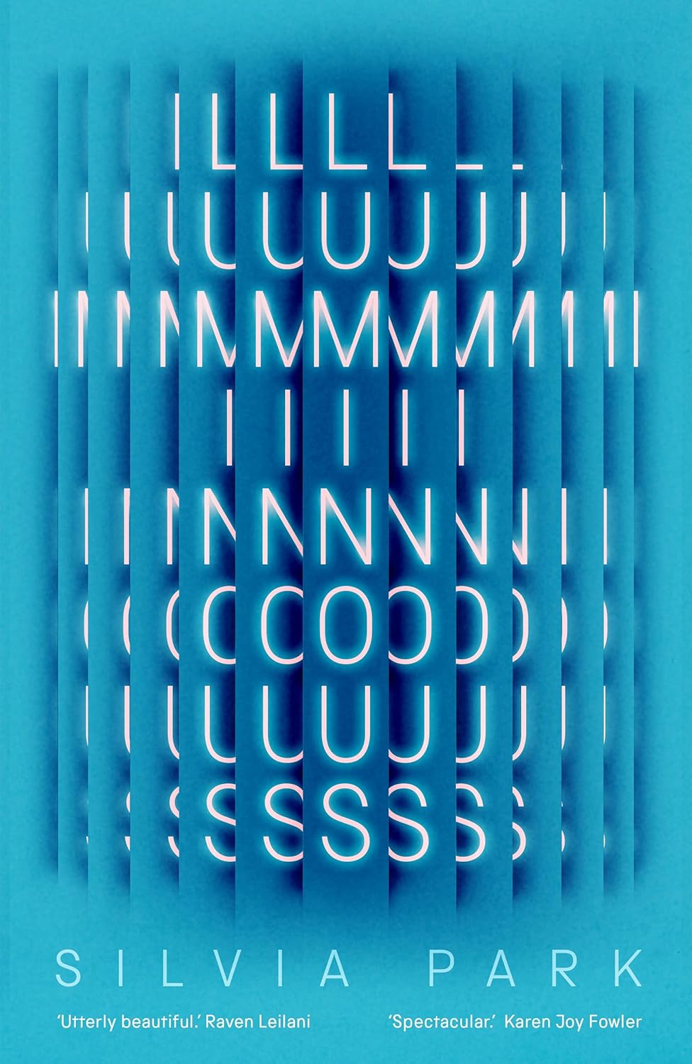 Silvia Park, Luminous; cover design by Jack Smyth (Magpie, March)
Amazing how different the U.S. and U.K. covers are, and both excellent.
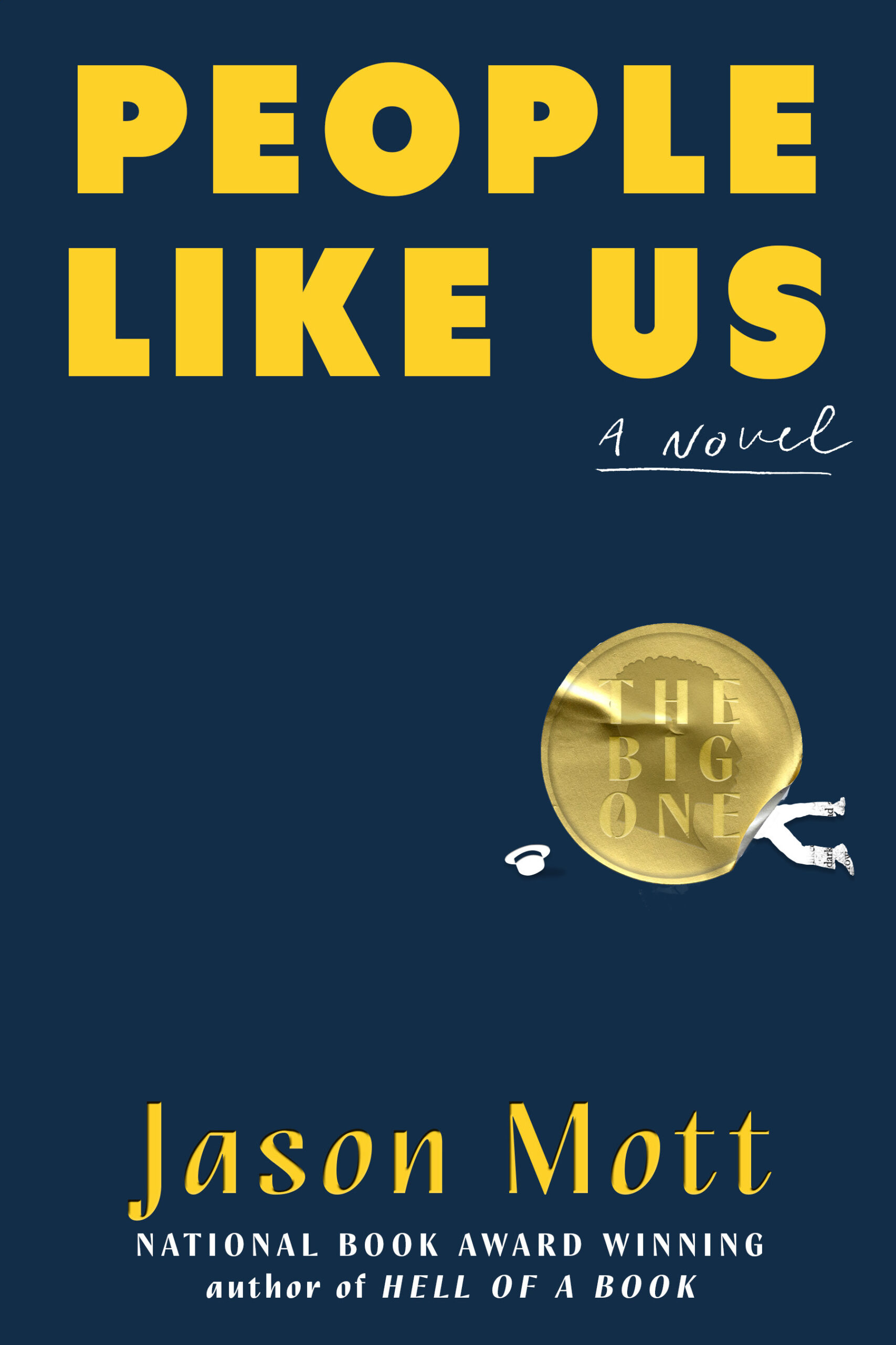 Jason Mott, People Like Us; cover design by Dominique Jones (Dutton, August)
So smart to have the art interacting with a burst. It’s genius!
 Dave Randall, Sound System; cover design by Jack Smyth (Pluto Press, August)
This one goes to 11.
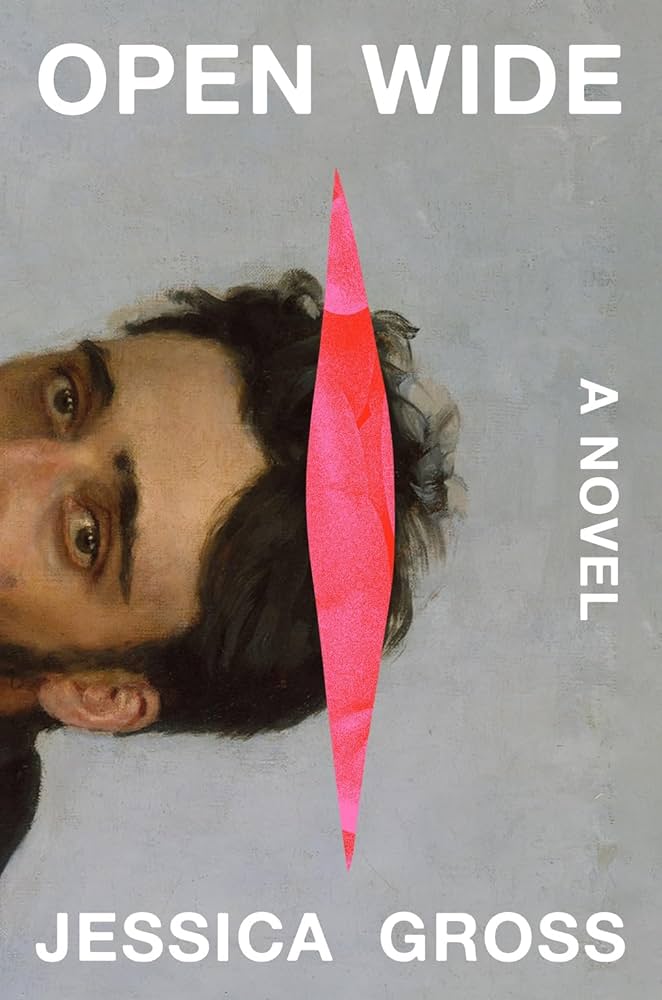 Jessica Gross, Open Wide; cover design by Eli Mock (Abrams, August)
Strikes the perfect balance between desire and revulsion. I’m often drawn to covers that present a mystery for the reader to decipher, and this one is hard to resist.
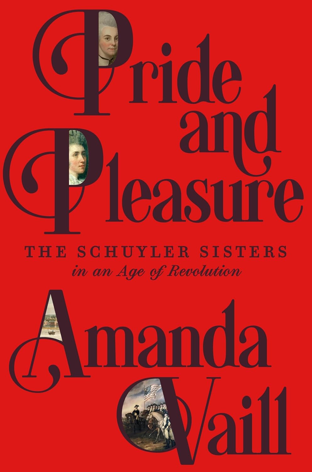 Amanda Vaill, Pride and Pleasure; cover design by Alex Merto (FSG, October)
I love how the images are held inside the capital letters. Such an unusual and fun move.
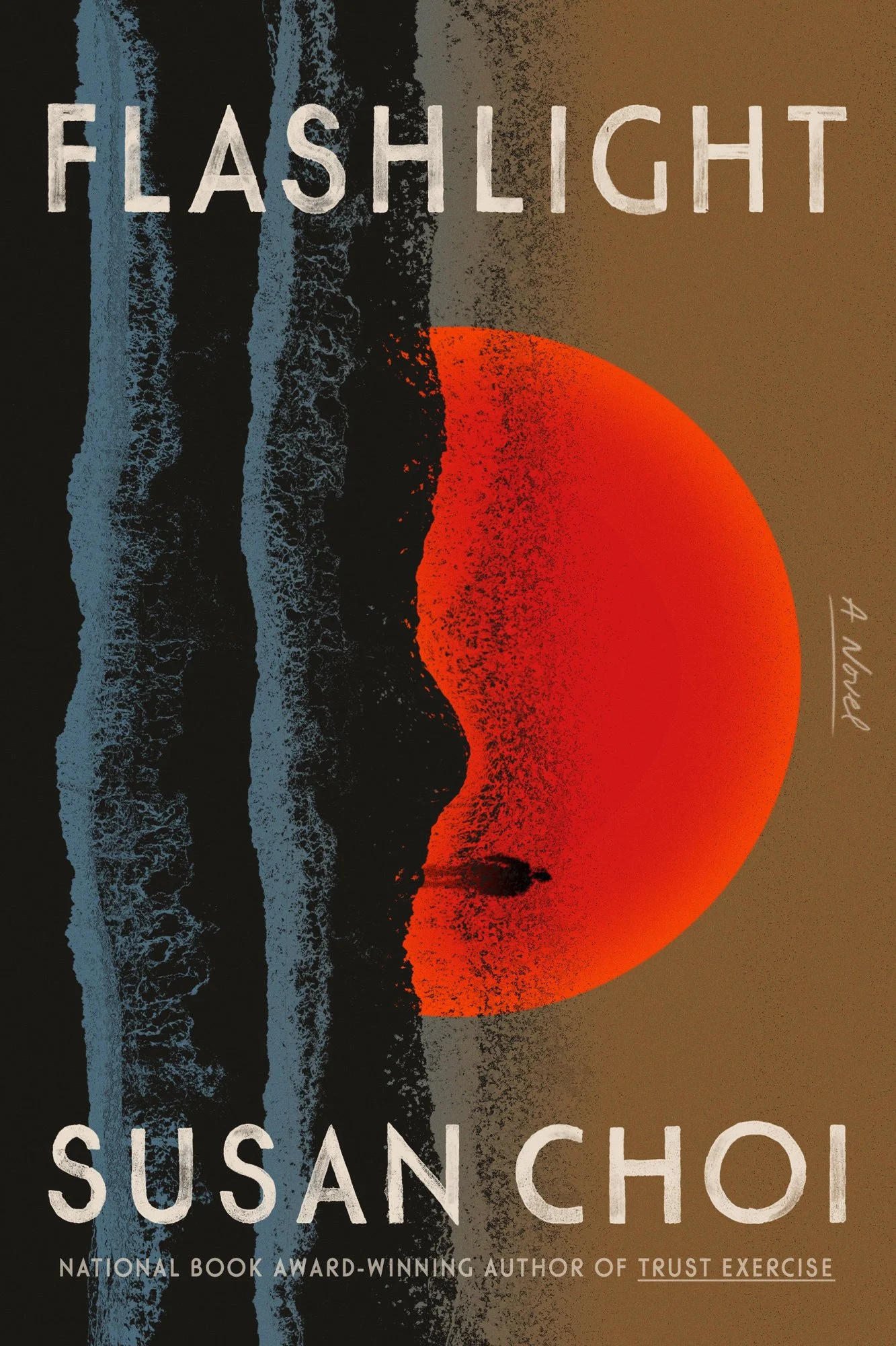 Susan Choi, Flashlight; cover design by June Park (FSG, June)
The artwork is gorgeous and I love the texture in the type. The kind of cover you want to hang on your wall, beautifully executed.
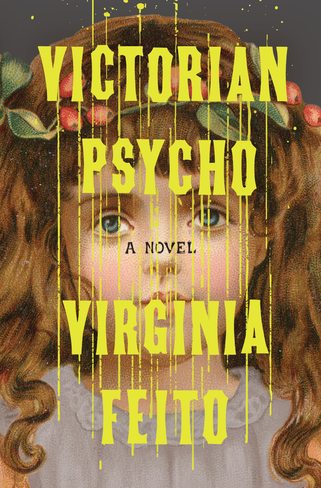 Virginia Feito, Victorian Psycho; cover design by Jaya Miceli (Liveright, February)
This design makes Victorian psychos seem both fun and demonic—count me in!
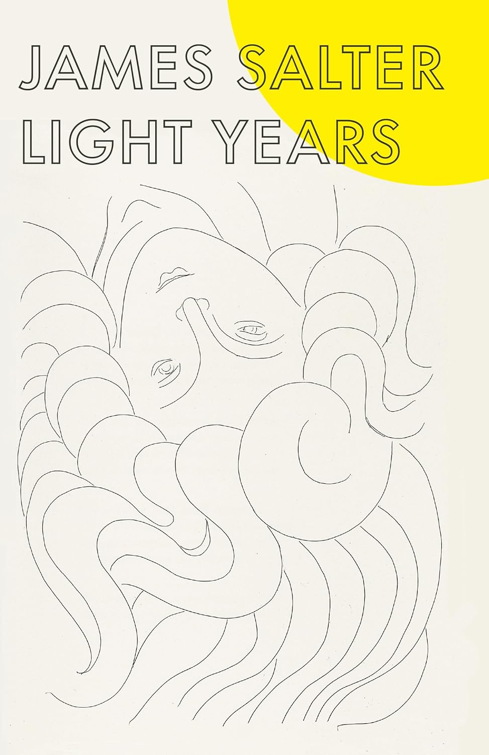 James Salter, Light Years; cover design by Megan Wilson; art from Poésies de Stéphane Mallarmé, 1932, Henri Matisse (Vintage, June)
One of many beautifully designed back list titles that Megan has designed throughout her career.
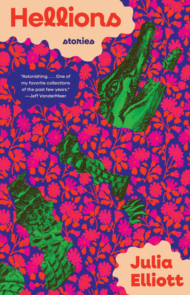 Julia Elliott, Hellions; cover design by Beth Steidle (Tin House Books, April)
The colors here do funny things to my vision and I will keep staring for as long as I please, you can’t stop me! Really stunning.
The transparent red blob sitting just out of frame transforms this quietly beautiful cover into something truly arresting.
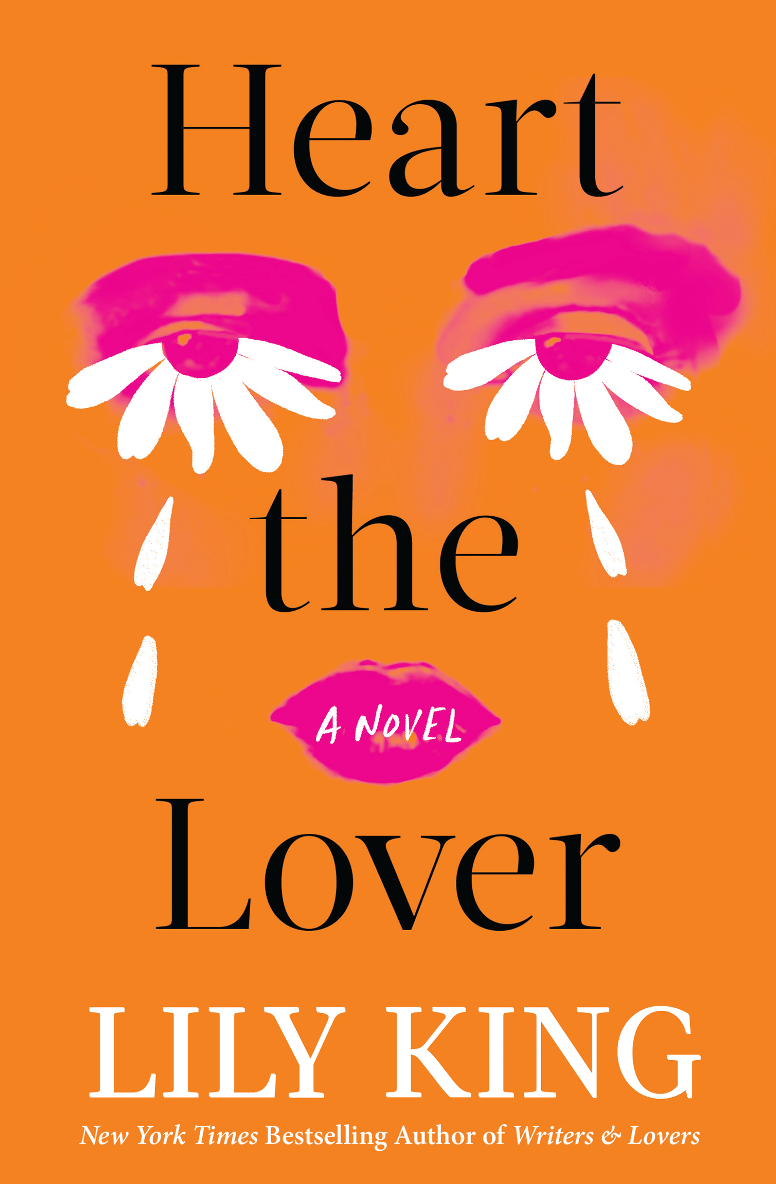 Lily King, Heart the Lover; cover art by Amanda Hudson (Grove Press, September)
Perfectly arresting!
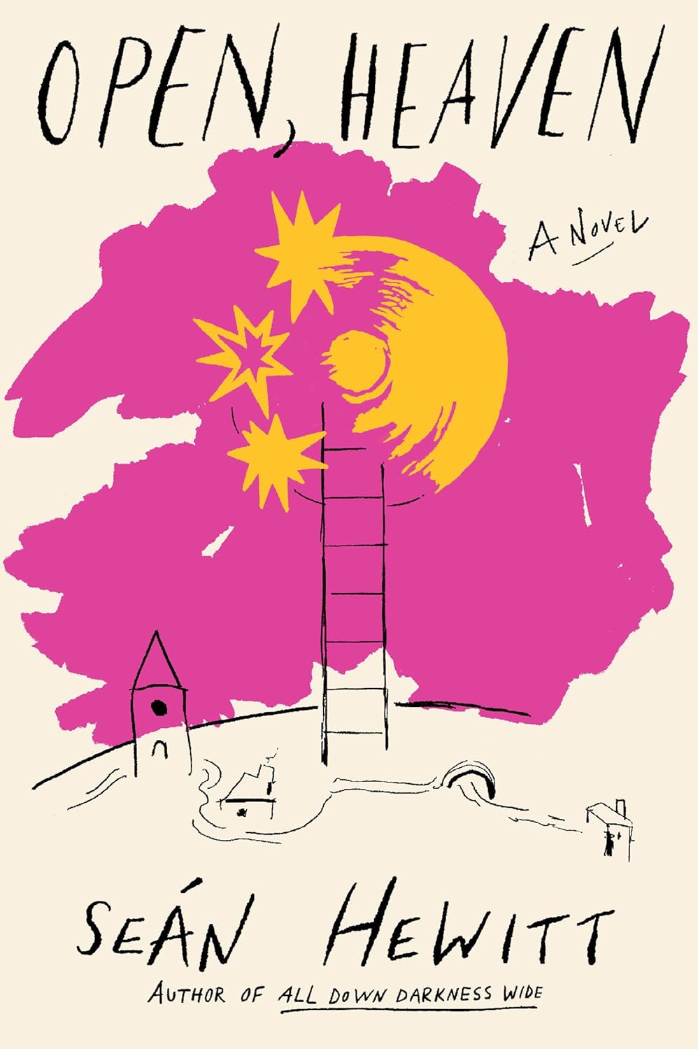 Seán Hewitt, Open Heaven; cover design by Sarah Schulte (Knopf, April)
This illustration is everything. Kind of like a whimsical hybrid of Matisse and The Little Prince but of course it’s entirely Sarah’s, and I love it.
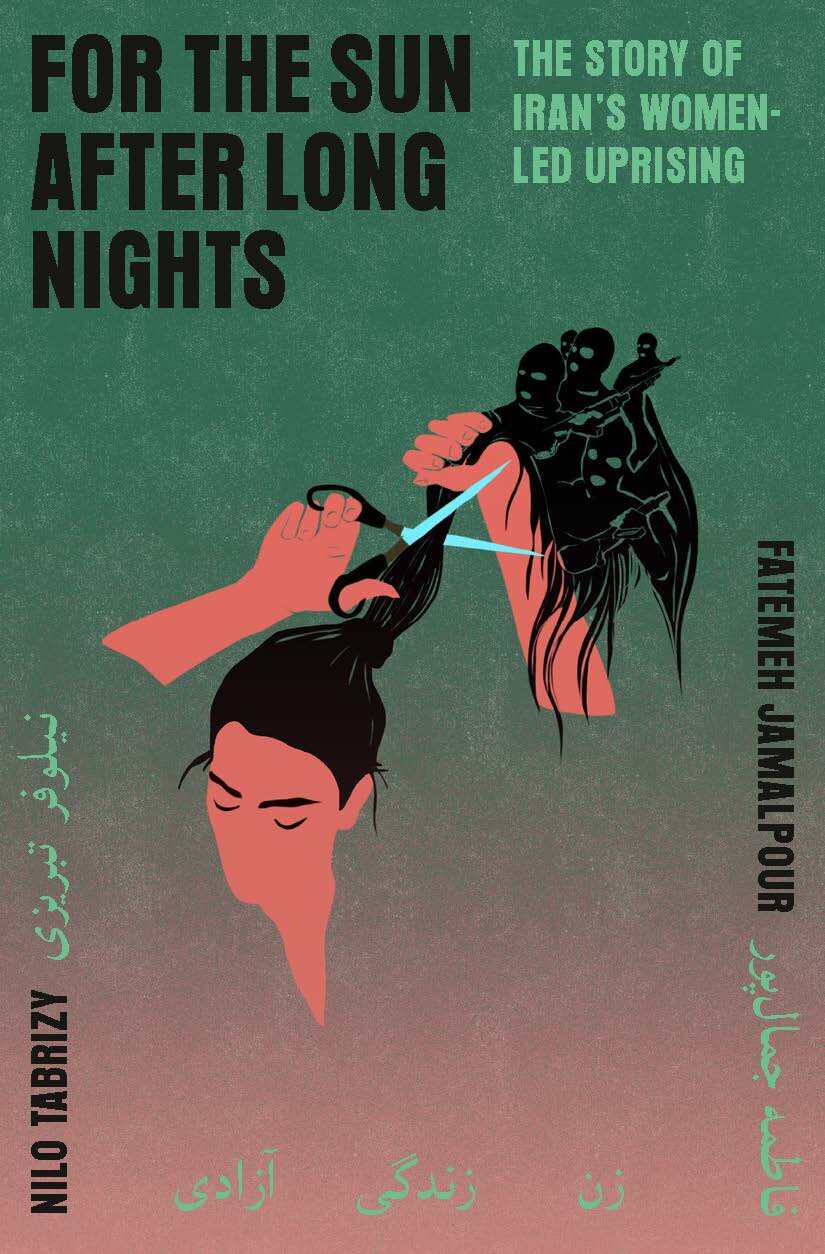 Fatemeh Jamalpour and Nilo Tabrizy, For the Sun After Long Nights: The Story of Iran’s Women-Led Uprising; cover design by Linda Huang; illustration by Laura Acquaviva (Pantheon, September)
The illustration is just so striking, and the type and colors work so harmoniously with it.
 Patricia Lockwood, Will There Ever Be Another You; cover design by Lauren Peters-Collaer (Riverhead, September)
A rainbow cat? I feel like this one is self explanatory.
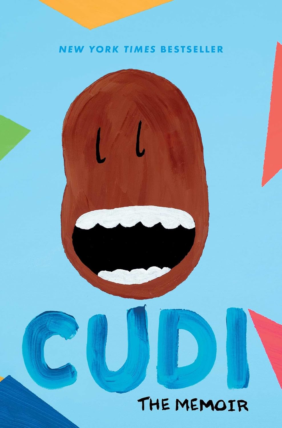 Scott Mescudi, Cudi; cover design by Scott Mescudi (Simon & Schuster, August)
Kid Cudi pursued happiness with this cover and succeeded.
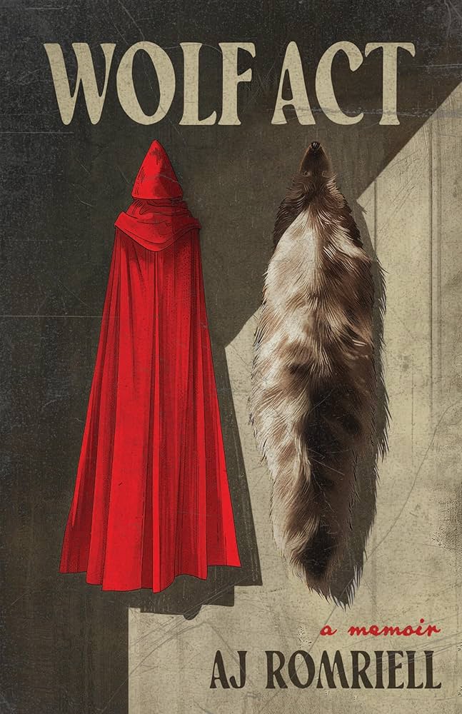 AJ Romriell, Wolf Act; cover design by Jeremy John Parker (University of Wisconsin Press, February)
Perfect imagery and I love an almost-symmetrical composition.
 Aisling Rawle, The Compound; cover design by Greg Mollica and Sarah Horgan (Random House, June)
I love the imagery of this cover. You see the jarring edge of the pool against the desert beyond, and it makes me want to know more. I also love that the fire is burning the type!
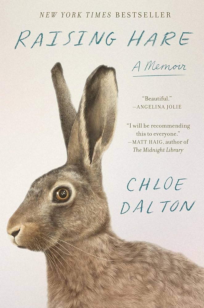 Chloe Dalton, Raising Hare; cover design by Jenny Carrow, illustration by Denise Nestor (Pantheon, March)
Raising Hare is my favorite read of 2025 and has sat front-facing on my bookshelf all year. The intricate cover illustration is almost meditative and serves as a daily reminder to remain both soft and tender.
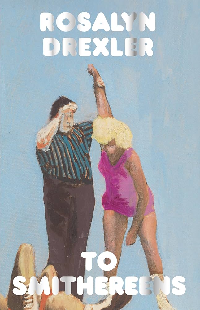 Rosalyn Drexler, To Smithereens; art direction by Claire Hungerford, art by Roasalyn Drexler (Hagfish, May)
My favourite cover this year….I love the washed out, forlorn sexiness of the image…and the puffy Frankfurter letters…The soft curves create an overwhelming impression of vulnerability and oddness that matches the author’s strange biography.
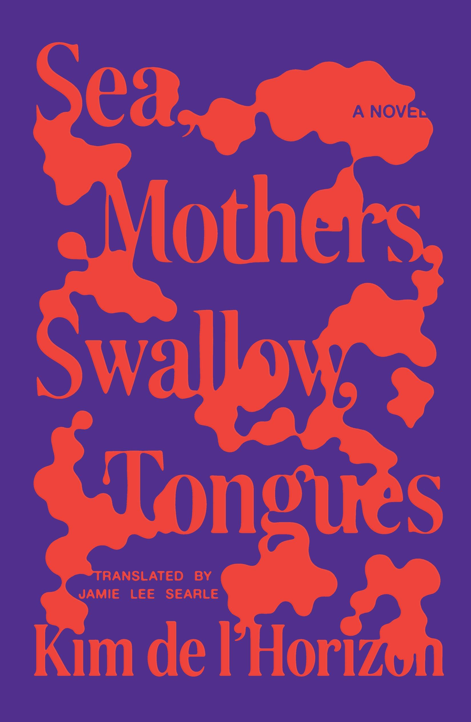 Kim de l’Horizon, tr. Jamie Lee Searle, Sea, Mothers, Swallow, Tongues; cover design by Thomas Colligan (FSG, August)
I immediately gravitated to the bright, limited palette of this cover, not knowing it was about dementia. The way the amorphic shapes interact with the type is such a smart and evocative way of tying into the subject matter.
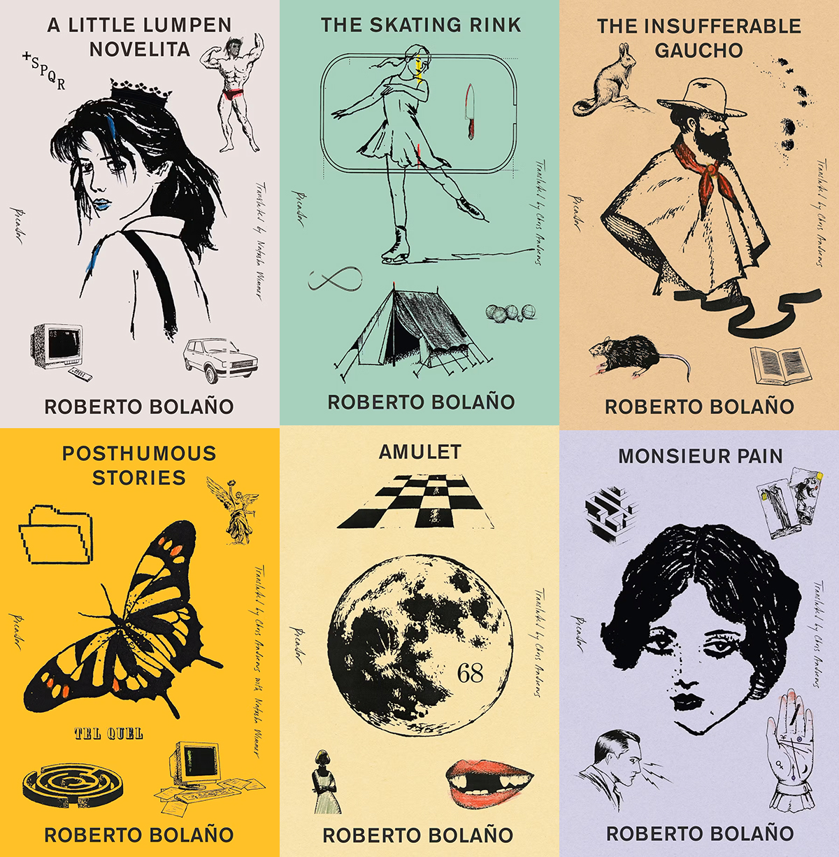 Roberto Bolaño backlist reissues; cover designs by Alex Merto (Picador, January & December)
There’s something irresistible about this tableau of mismatched illustrations—the disparate drawing styles somehow find a perfect rhythm together.
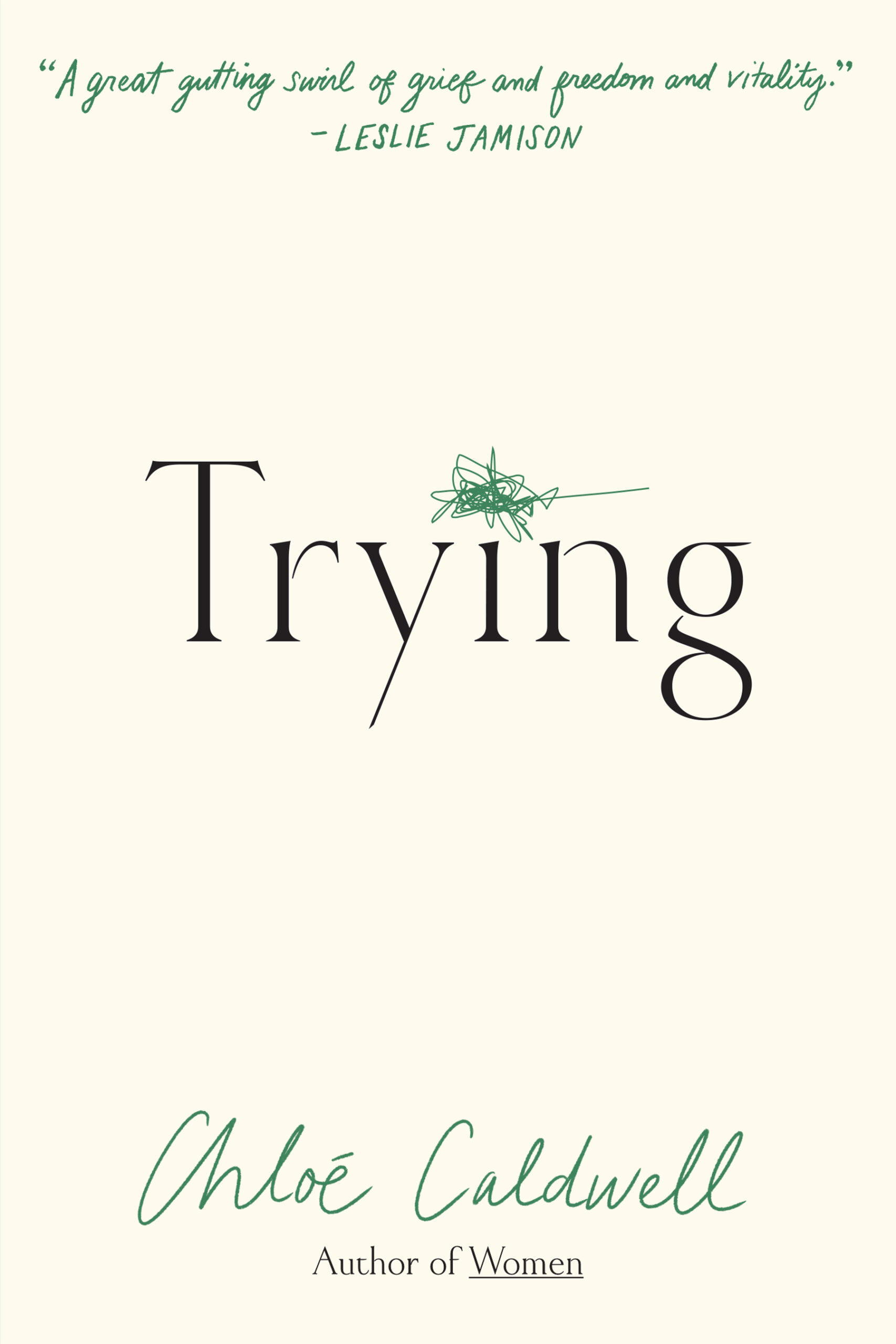 Chloe Caldwell, Trying; cover design by Kimberly Glyder (Graywolf, August)
Gorgeous title font and energy in that single scribble.
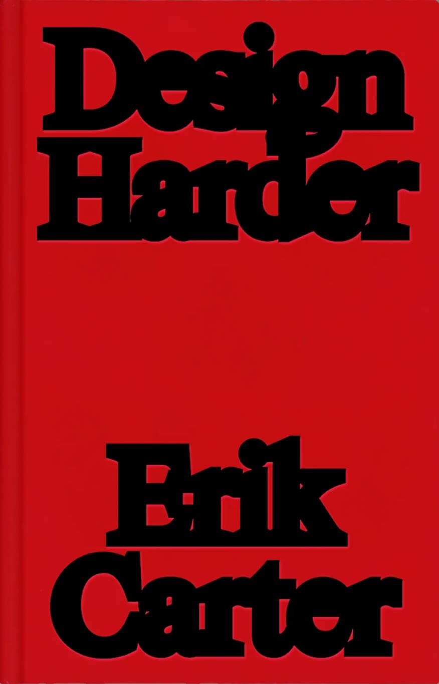
 Ariana Harwicz, tr. Jessie Mendez Sayer, Unfit; cover design by Erik Carter (New Directions, October 14)
Madness, I love it.
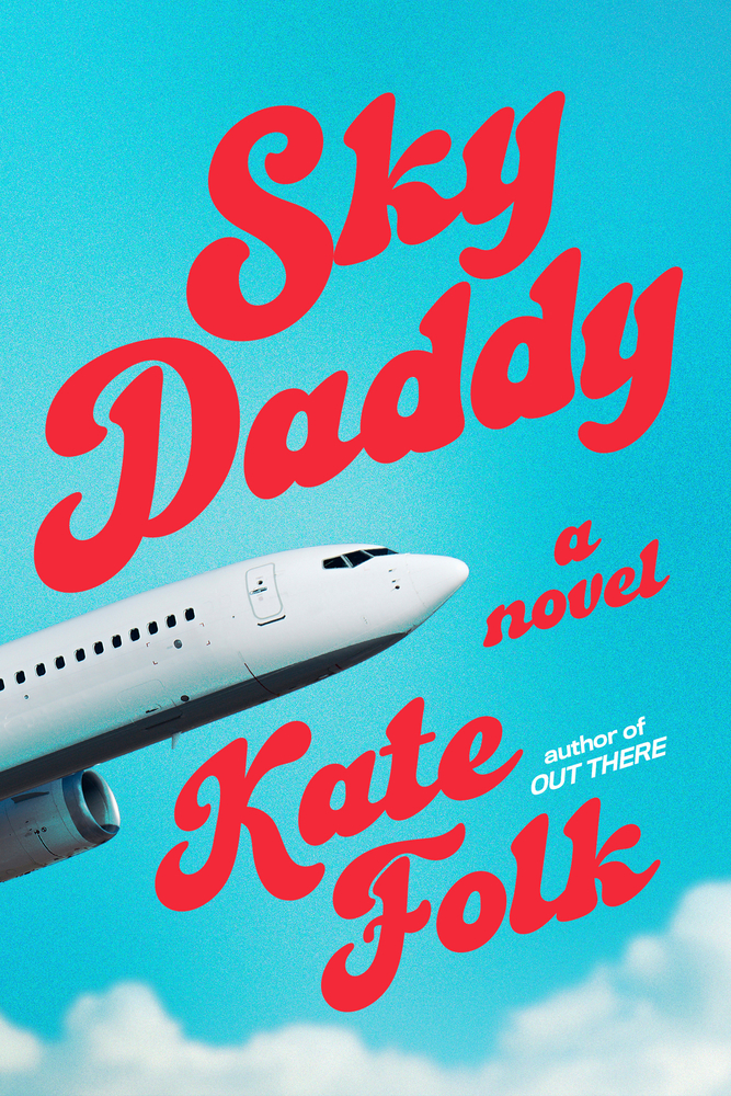 Kate Folk, Sky Daddy; cover design by Sarah Horgan (Random House, April)
The funniest and boldest cover I saw this year.
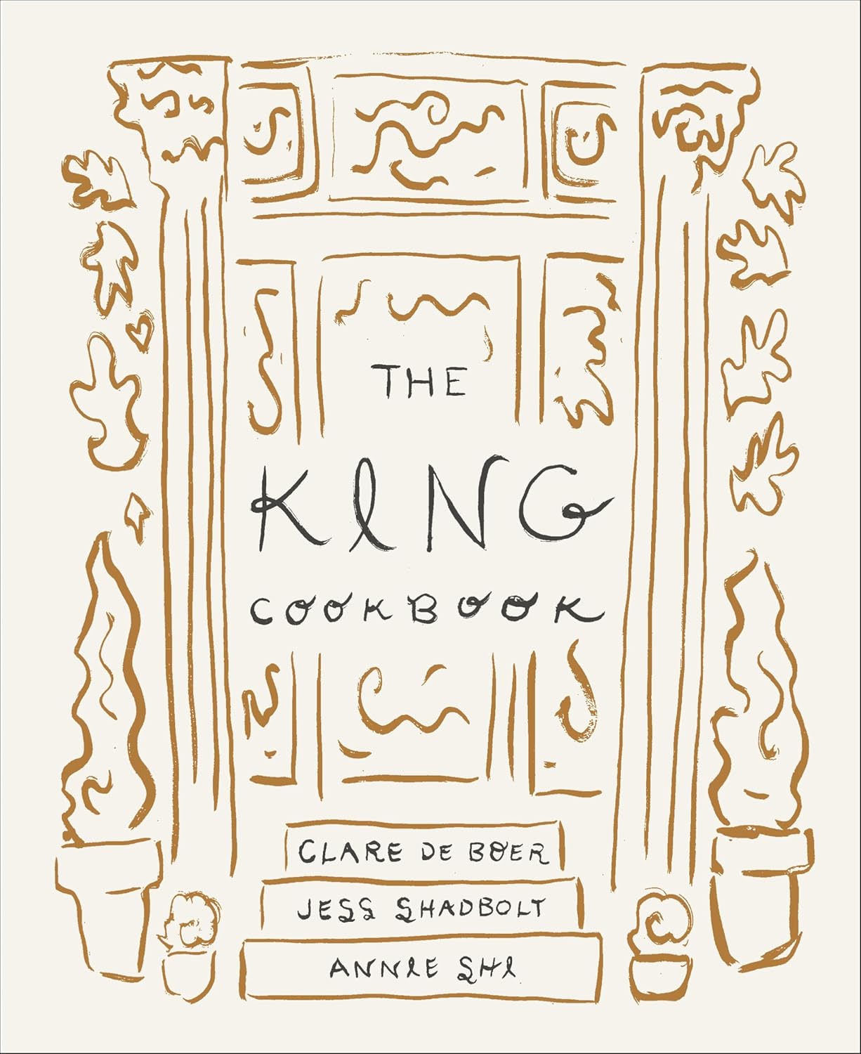 Annie Shi, Clare de Boer, Jess Shadbolt, The King Cookbook; cover design by RF Alvarez (Flatiron, November)
The most beautiful and original cookbook I’ve ever seen.
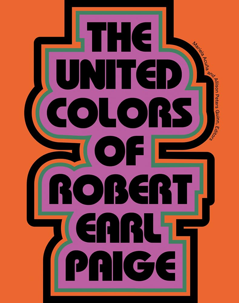 Mariela Acuña and Allison Peters Quinn, The United Colors of Robert Earl Paige; cover design by Ashley King (Green Lantern Press, May)
Stylish, joyful, and taking up space. I love how the title becomes a door, inviting us in.
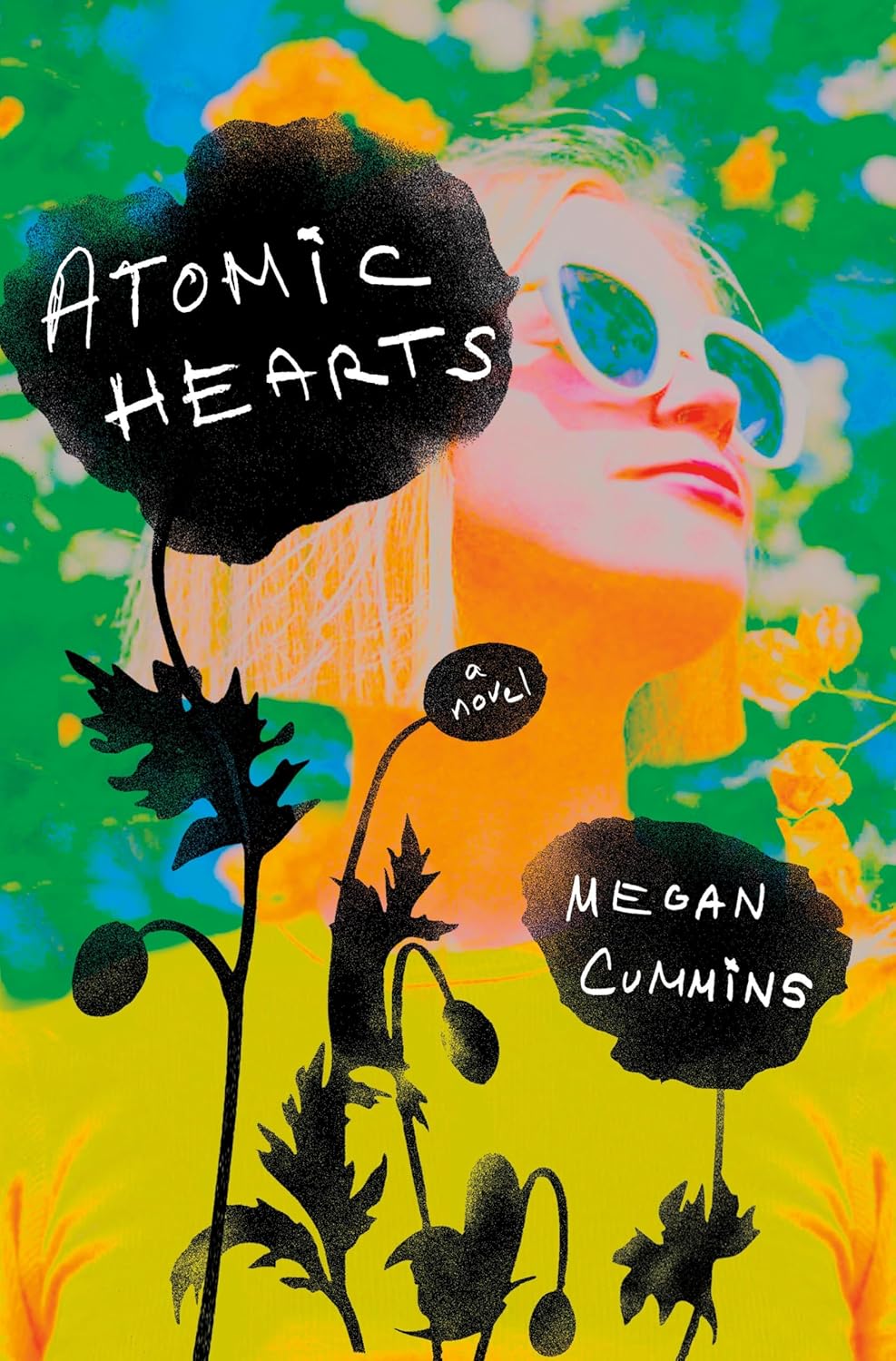 Megan Cummins, Atomic Hearts; cover design by Elena Giavaldi (Ballantine, August)
Although I’m sure this cover was created with photographs, it feels so artful and watercolory in the layering of colors and textures.
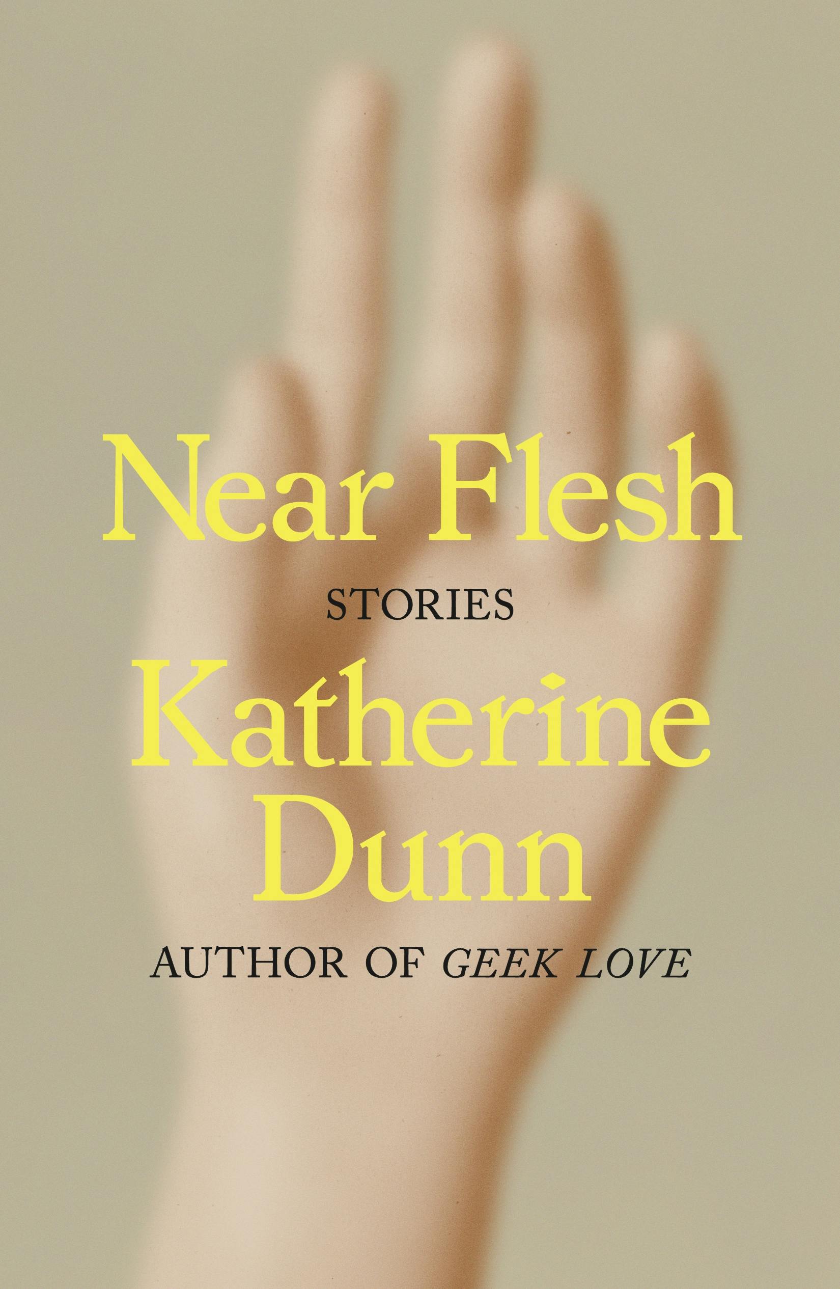 Katherine Dunn, Near Flesh: Stories; cover design by Thomas Colligan (MCD, October)
The subtle mix of typefaces, the beautiful and almost goofy image… Such a lovely cover, and so different from what we’ve seen for Dunn’s previous books.
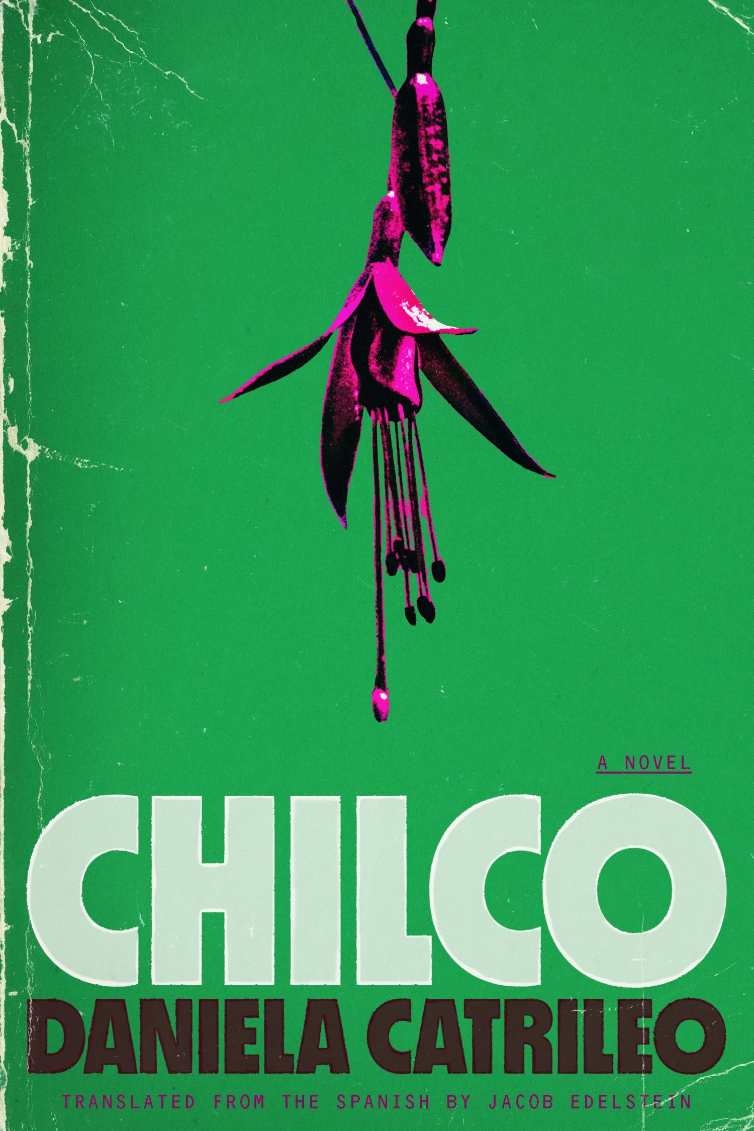 Daniela Catrileo, tr. Jacob Edelstein, Chilco; cover design by Charlotte Grimm (FSG Originals, July)
I want it as a A1 poster.
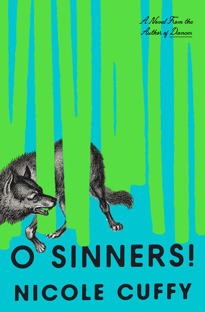 Nicole Cuffy, O Sinners!; cover design by Grace Han (One World, March)
The bold colors! The chunky type! The wolf weaving in and out of the implied trees. I love it! (I also want to know how Grace felt when editorial insisted on a super-long blurb being added. Let’s manifest a No-Blurb 2026!™)
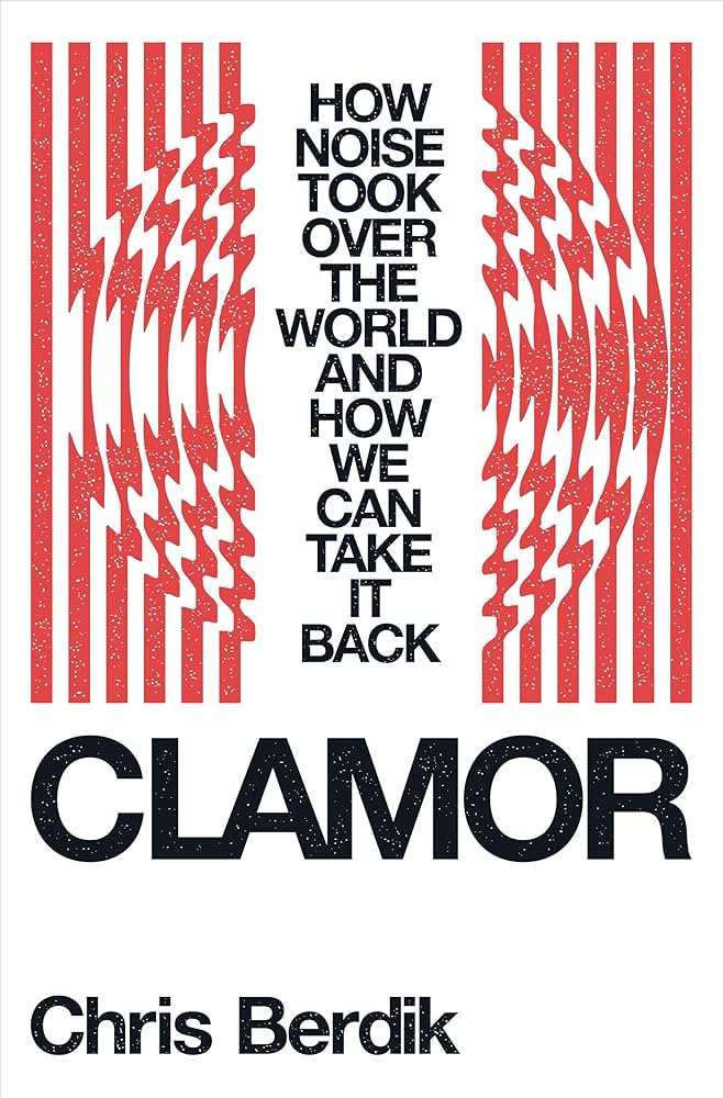 Chris Berdik, Clamor; cover design by Kevin Moore (Norton, May)
This cover is so clean and smart, but balances a retro and classic look with a modern feel perfectly.
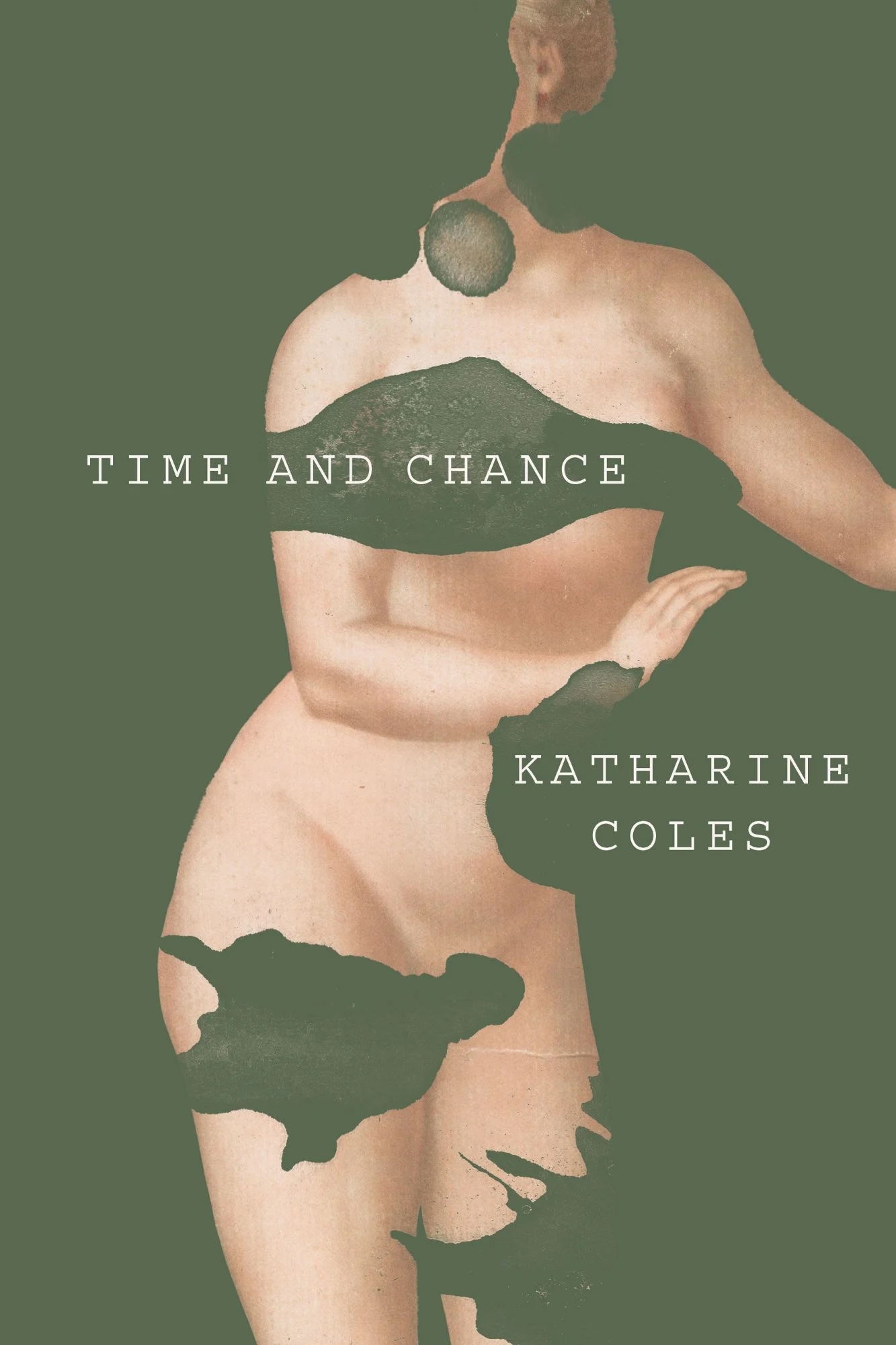 Katharine Coles, Time and Chance; cover design by Joan Wong (Turtle Point Press, April)
Elegant with beautiful, subtle textures. Joan has a way of creating the dreamiest collages.
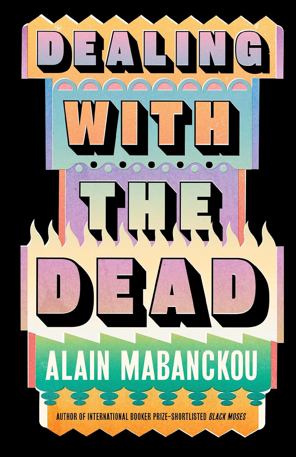 Alain Mabanckou, Dealing With the Dead; cover design by Jack Smyth (New Press, September)
How do all of these colors work so well together?! An otherwise simple composition sings to life with a few lively border treatments and a sumptuous palette. Jack’s alchemy here makes me wish it was a series.
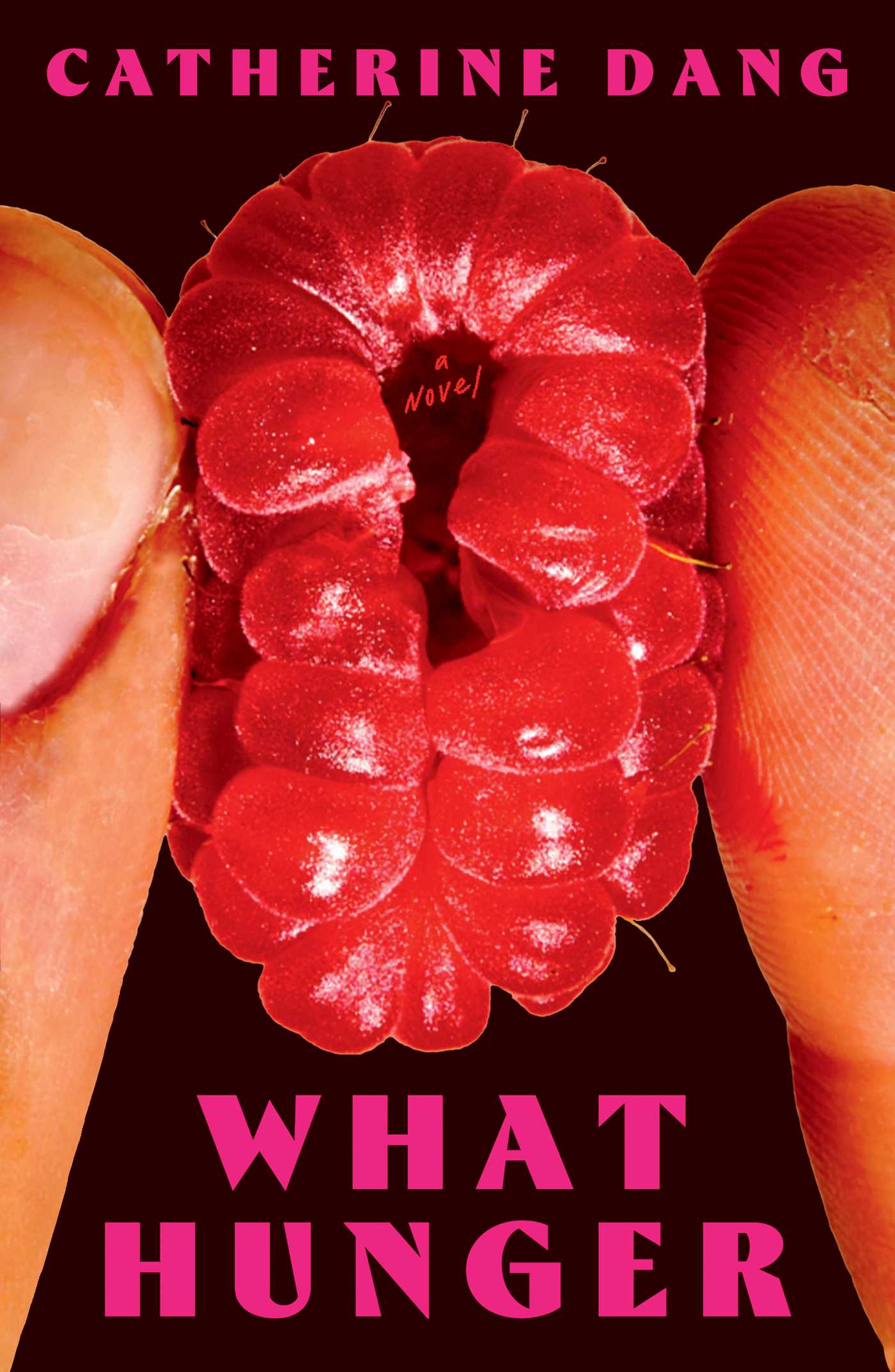 Catherine Dang, What Hunger; cover design by Maddy Angstreich; photograph by Bobby Doherty (Simon & Schuster, August)
Visceral and tactile, this oversized cover pulls you in with almost carnal intensity.
 Erik Carter, Design Harder; cover design by No Ideas Studio (Book Ideas, October)
Maybe intentionally, I find the case material off-putting and unpleasant to hold, but Wei Hung’s Common Serif stroked until it almost loses legibility, the filled-in counters and glyphs running into each other, amplified by the debossed stamped matte black pigment is beautiful.
 Olga Ravn, tr. Martin Aitken, The Wax Child; cover design by Dan Jackson (Viking UK, November)
I love all of Olga Ravn’s covers and can’t pick between the US and UK covers for this book. They are both so good. I love the solemn engraving here. And the decision to use only one pop of colour.
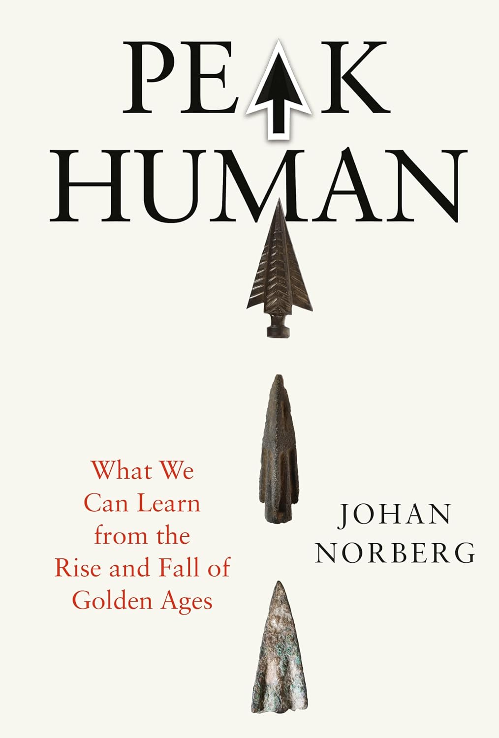 Johan Norberg, Peak Human; cover design by Steve Leard (Atlantic Books, September)
Perfect combination of title and art. Simple and to the point.
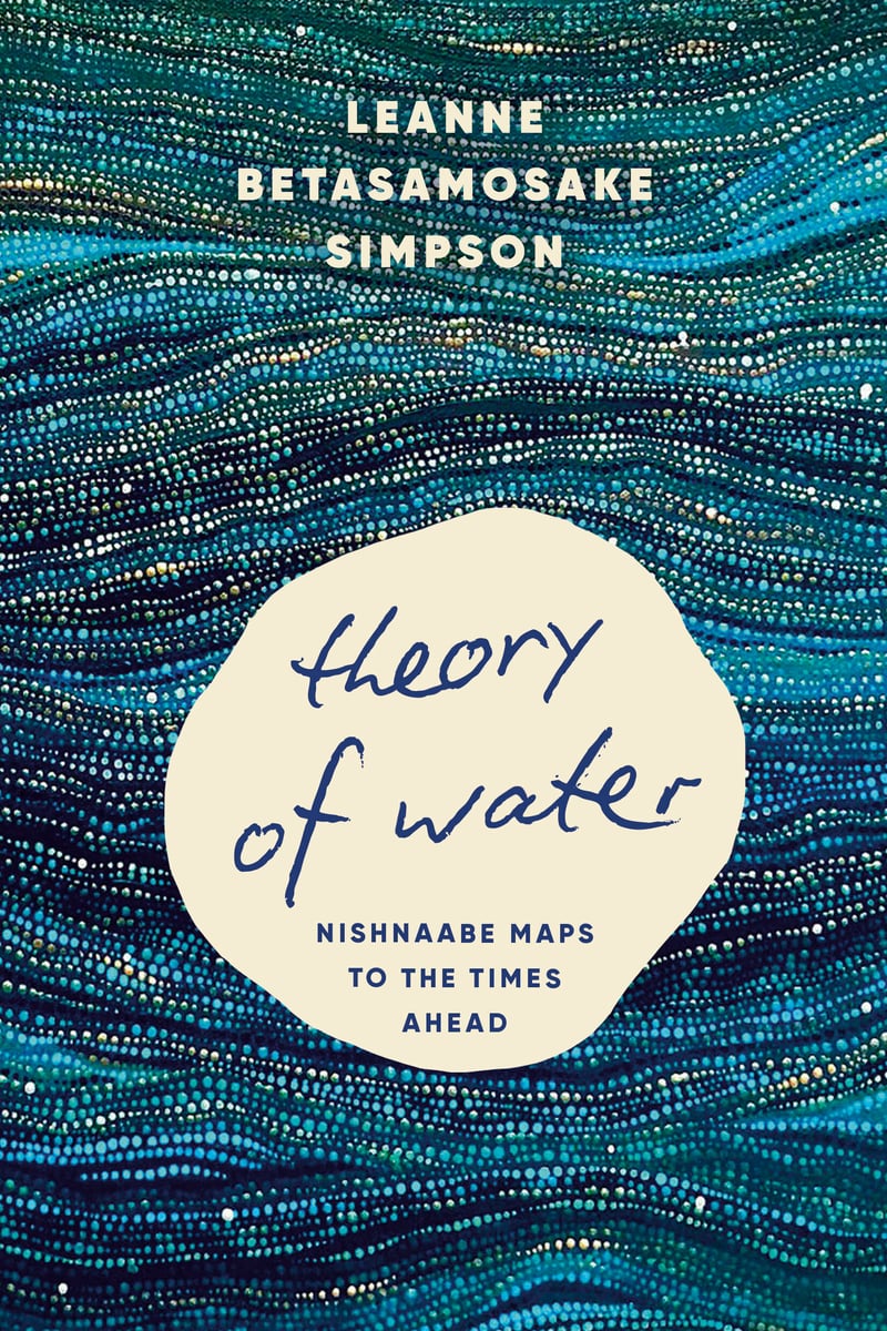 Leanne Betasamosake Simpson, Theory of Water; cover design by Kelly Hill (Haymarket, April)
Gorgeous texture and movement that so effortlessly reflects the writing within.
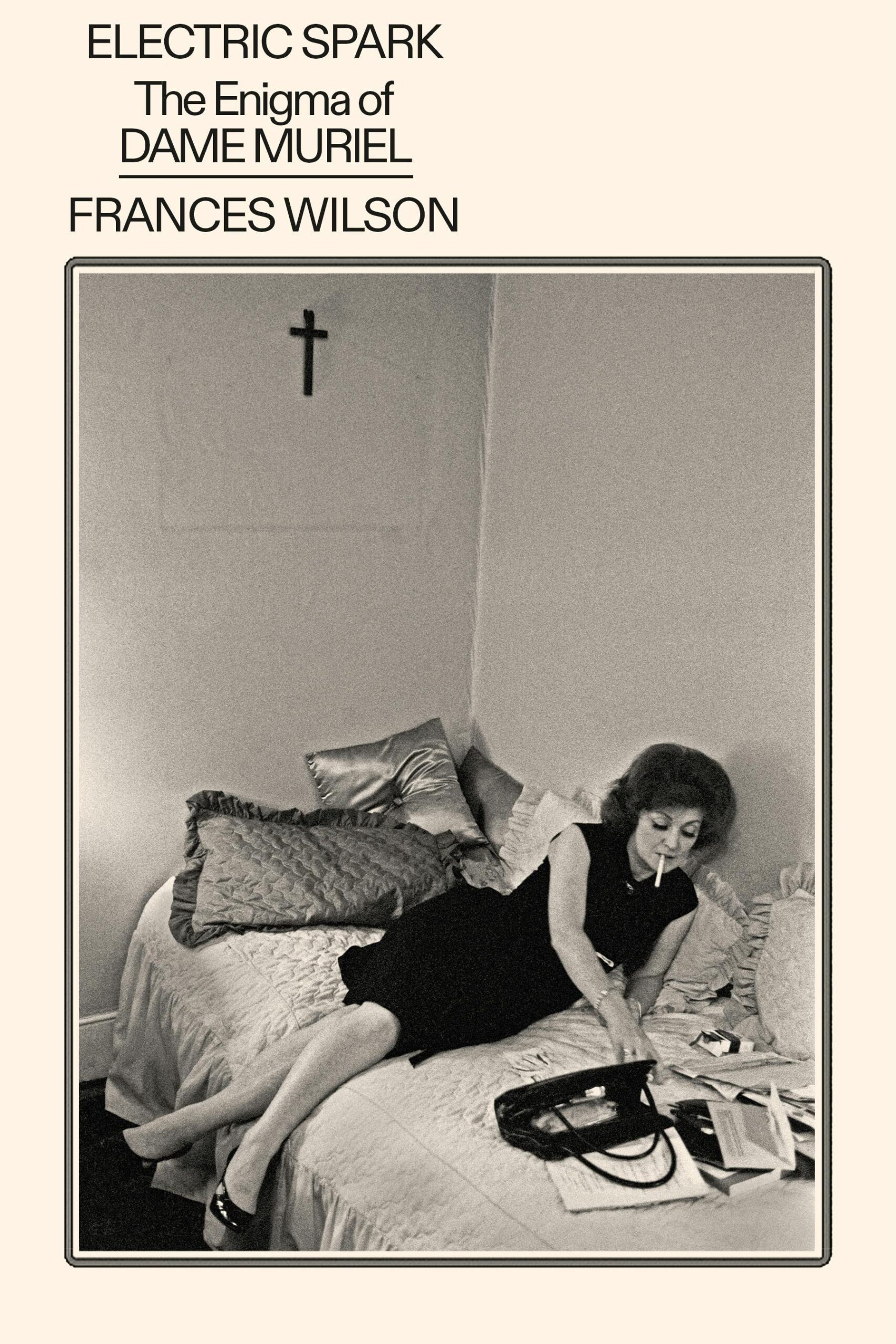 Frances Wilson, Electric Spark; cover design by Rodrigo Corral (FSG, September)
Only Rodrigo Corral could create something this spare and somehow also serve a level of sophisticated allure none of the rest of us knew existed.
 Fernando A. Flores, Brother Brontë; cover design and art by Na Kim (MCD, February)
Na’s illustrations are often the stars of her cover designs but I really enjoyed the bolder paintings she incorporated into her work this year including this one, which feels rightfully dystopian and tactile with the thicker paint strokes, inviting eyes and each element providing so much depth to the composition.
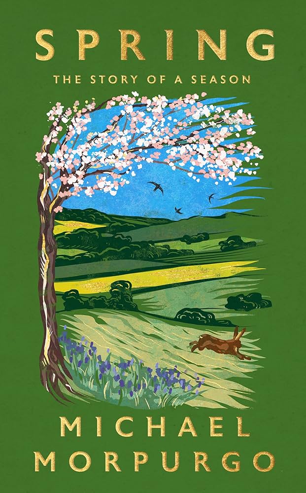 Michael Morpurgo, Spring; cover design by Holly Ovenden (Hodder Press, March)
When I saw this book in person, I was struck by its beauty. The vibrant green, gold foil, and luscious illustration is so lovely.
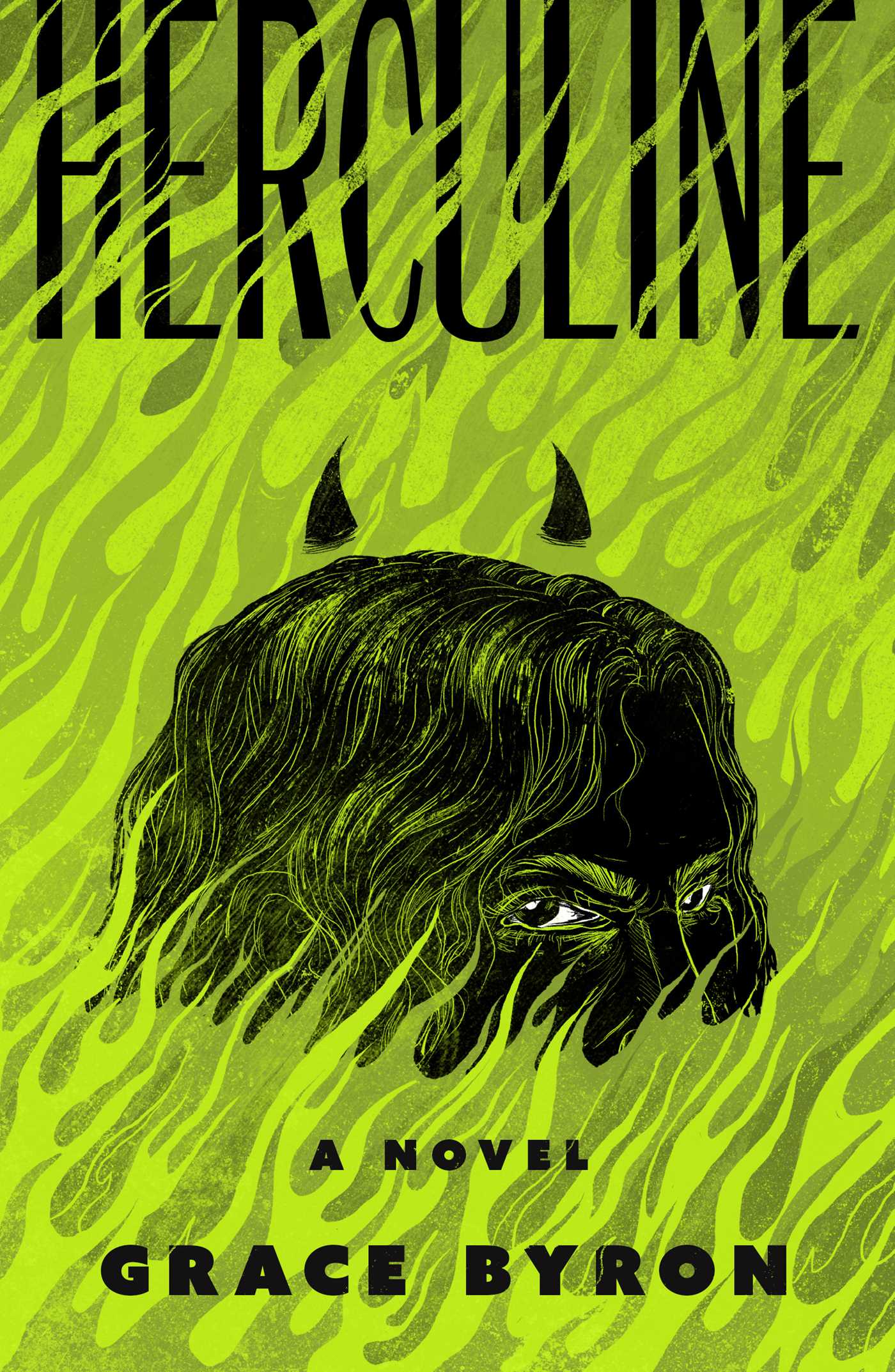 Grace Byron, Herculine; cover design by Ella Laytham; illustration by Evangeline Gallagher (S&S/Saga Press, October)
I almost never read horror but this cover might convince me to! It’s so fun.
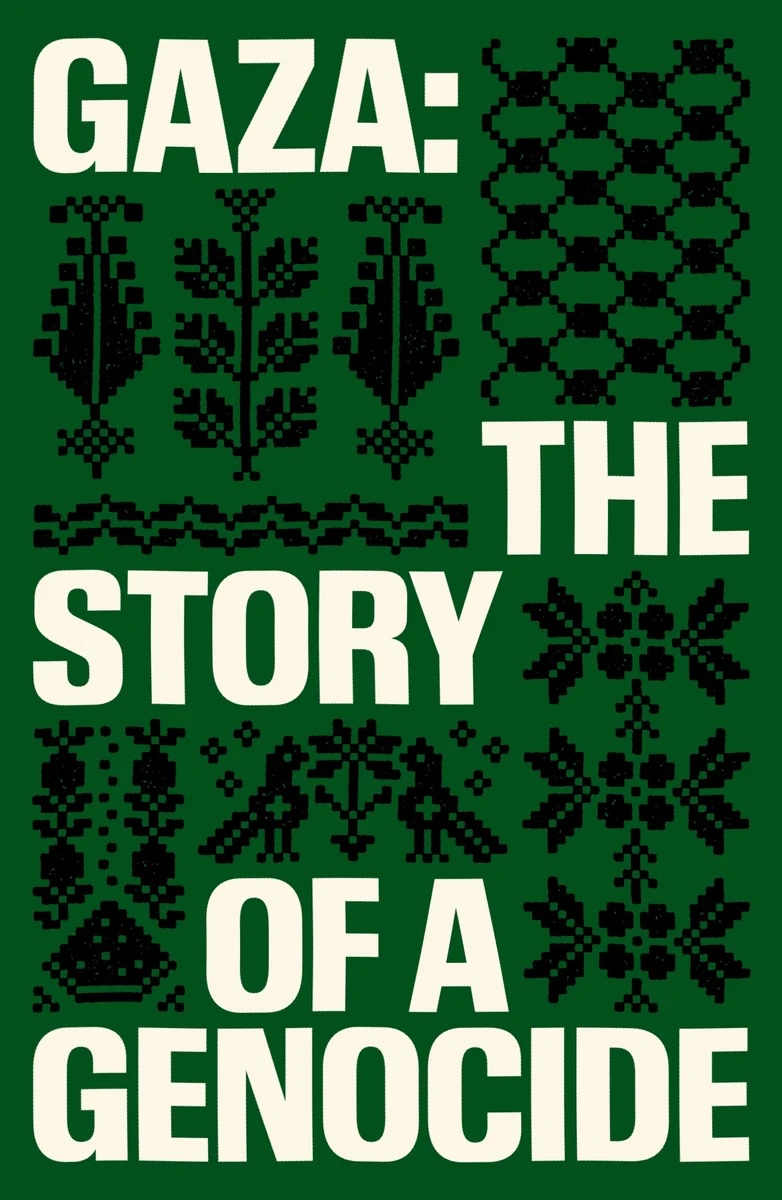 Fatima Bhutto and Sonia Faleiro, eds., Gaza: The Story of a Genocide; cover design by Chantal Jahchan (Verso, October)
A perfect cover. Free Palestine.
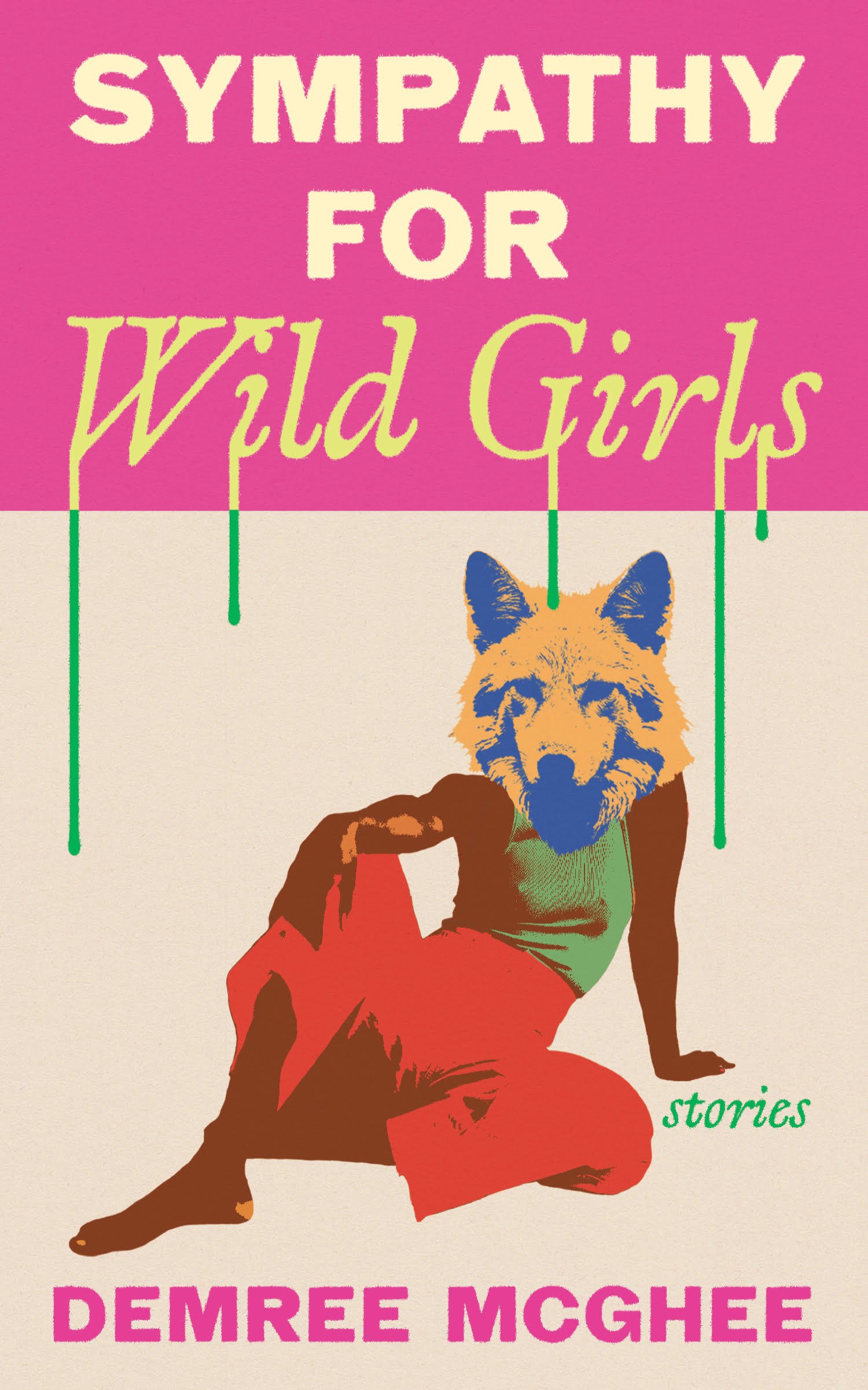 Demree McGhee, Sympathy for Wild Girls; cover design by Dana Li (Feminist Press, May)
Love the simplicity and busyness.
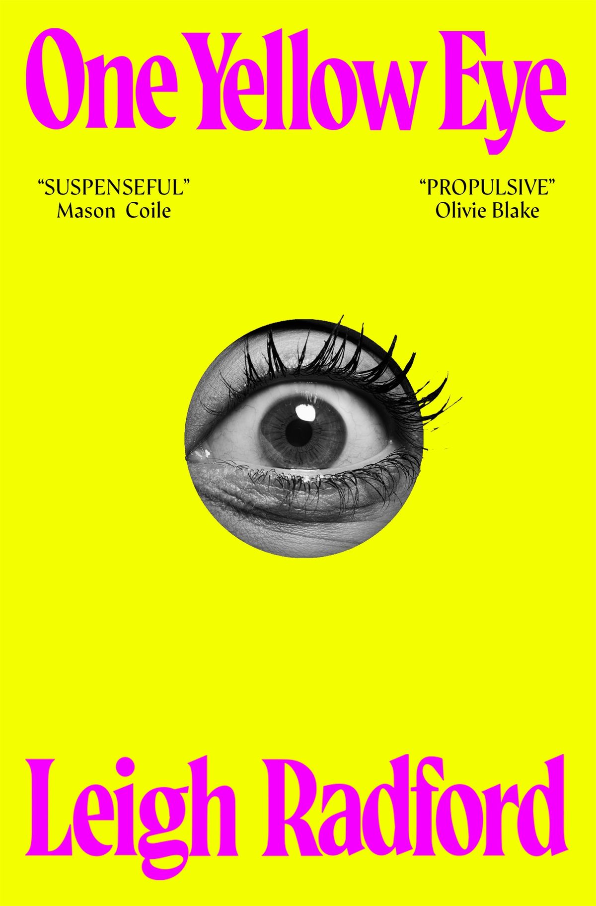 Leigh Radford, One Yellow Eye; cover design by Kieryn Tyler (Tor Nightfire, July)
The cover world is full of botched attempts to visualize a book’s title in such starkly literal terms. Kieryn’s succeeds where many have not.
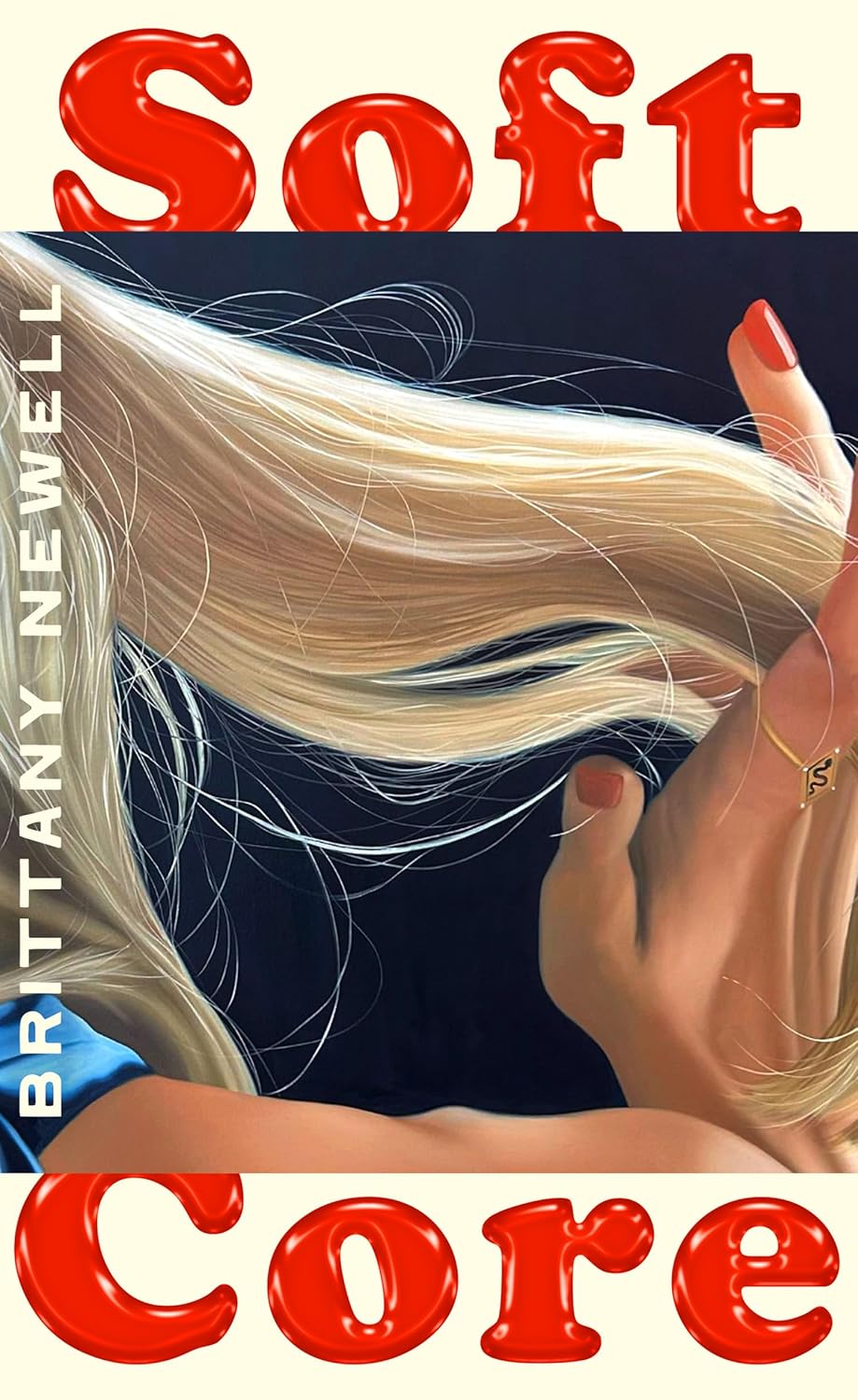 Brittany Newell, Soft Core; cover design by Jo Thompson, illustration by Kelly Vance (Fourth Estate, February)
Jo’s cover design for Soft Core is cunty, luxe and so stylish—I love it.
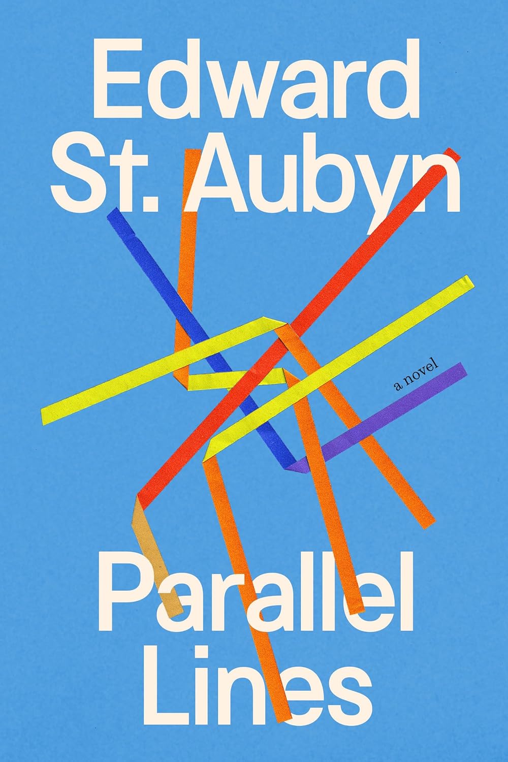 Edward St. Aubyn, Parallel Lines; cover design by Jack Smyth (Knopf, June)
A dynamic and irreverent interplay of gorgeous type, geometry, and color—bursting with motion and vitality.
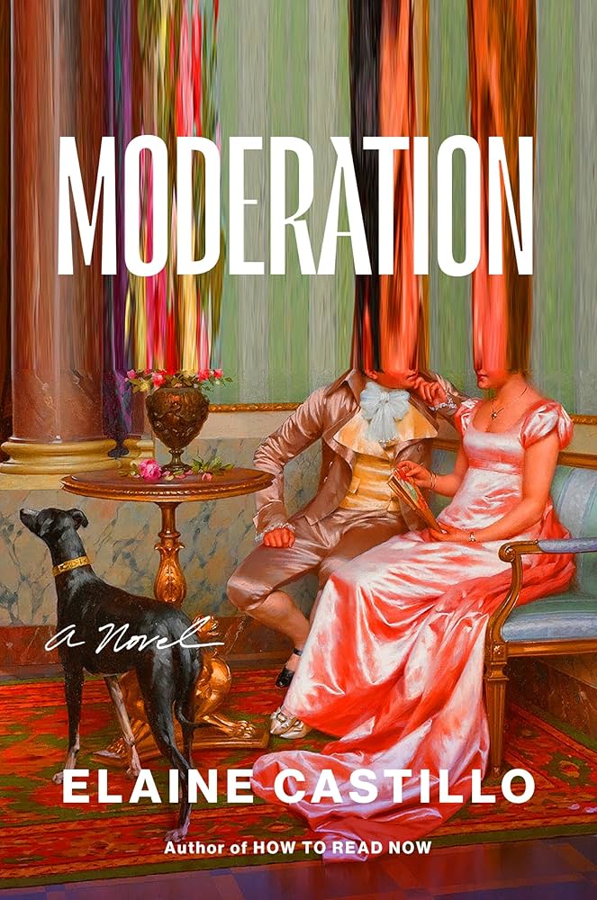 Elaine Castillo, Moderation; cover design by Lynn Buckley; art by Vittoria Reggianni (Viking, August)
Vibrant and surreal.
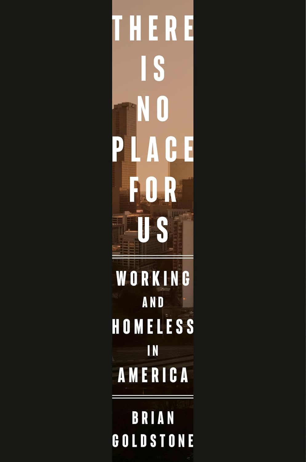 Brian Goldstone, There is No Place for Us: Working and Homeless in America; cover design by Anna Kochman (Crown, March 25)
Striking. The minimalism is so impactful, the perfect cover for this book.
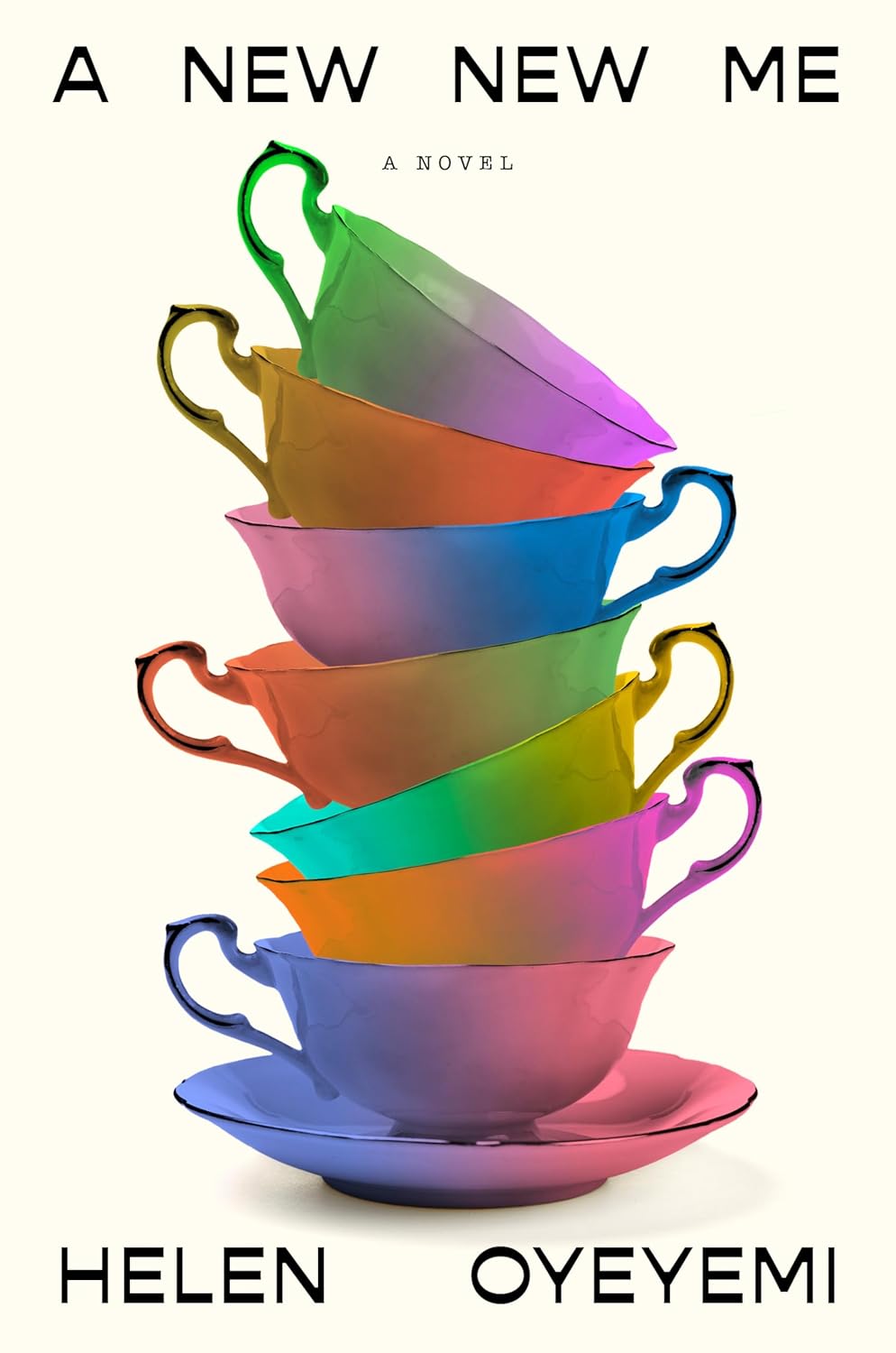 Helen Oyeyemi, A New New Me; cover design by Lauren Peters-Collaer (Riverhead, August)
Given the protagonist’s multiple personality disorder, a fine china cup stack is a perfect metaphor for an extreme case of imposter syndrome. I love the tension of Peters-Collaer’s type pairing and the choice to bathe the tea party in technicolor; it gives cyber-gentile vibes.
 Jacqueline Harpman, tr. Ros Schwartz , I Who Have Never Known Men (Collector’s Edition); cover design by Justin Carder (Transit Books, September)
I might be partial to this book as I picked it up due to the 2022 cover, and loved it. An ethereal and minimal design, which the 2025 Collector’s Edition repurposes, titlelessly (on the front) and even more minimally, along with a snippet of the text, debossed in silver foil on the case. Neat.
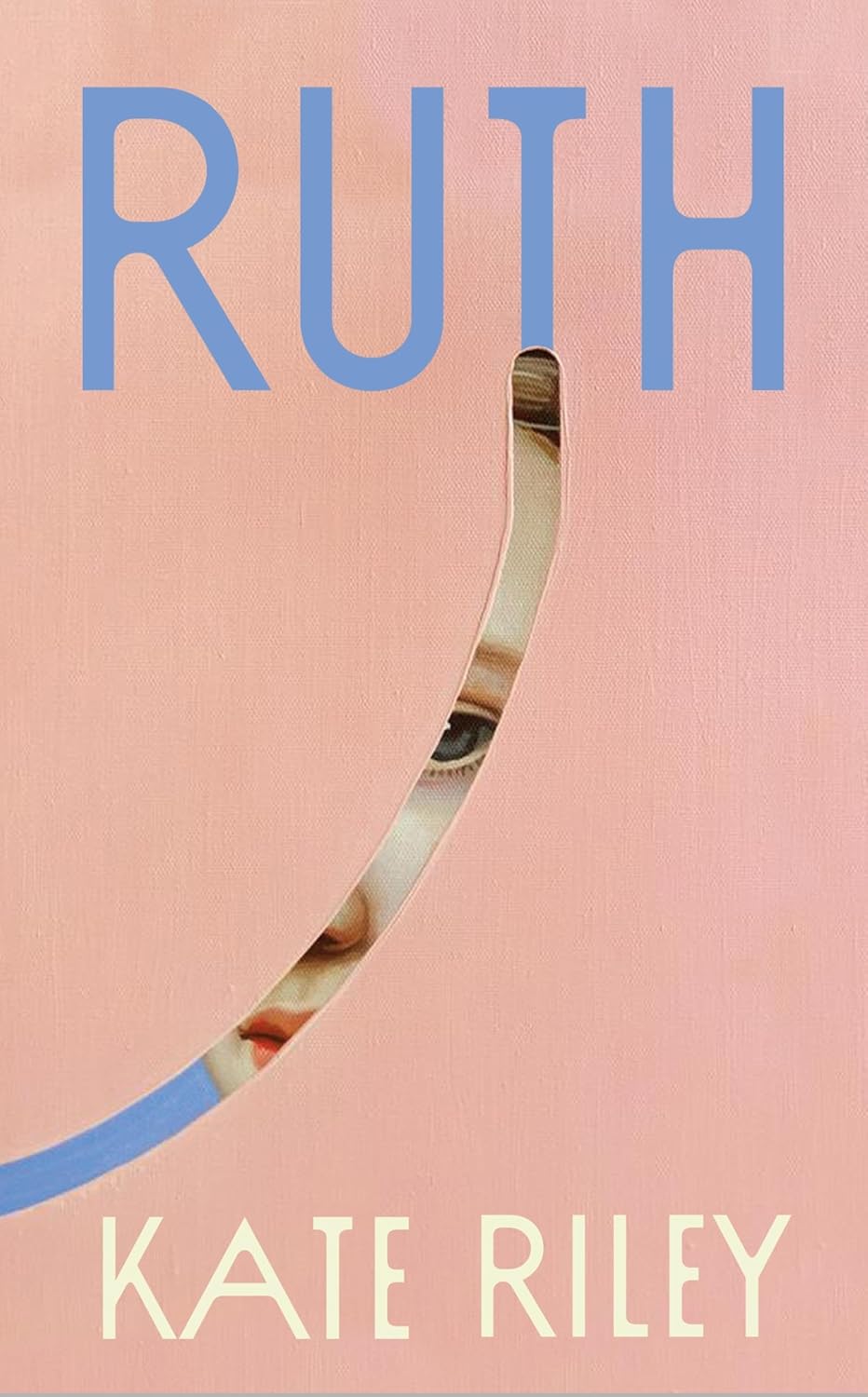
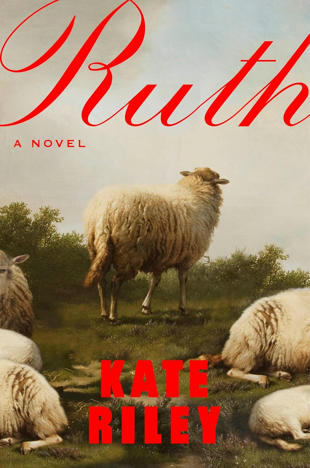 Kate Riley, Ruth; cover design by Lauren Peters-Collaer; art by Eugène Joseph Verboeckhoven (Riverhead, August)
This crop is magnificent (both image and title). It draws you right in.
 Kate Riley, Ruth; cover design by Emma Ewbank (Doubleday UK, August)
Simple, elegant and tactile.
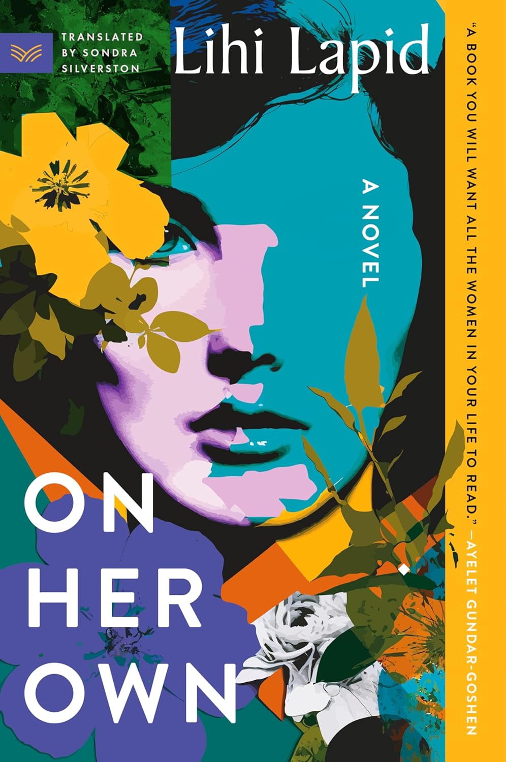 Lihi Lapid, On Her Own (paperback); cover design by Olga Grlic (HarperVia, April)
Lush and beautiful Warhol vibes.
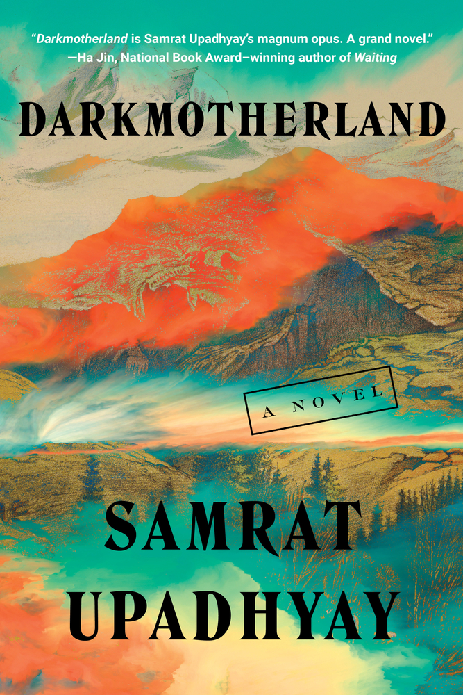 Samrat Upadhyay, Darkmotherland; cover design by Lauren Peters-Collaer (Soho Press, January)
Such a gorgeous color palette that stopped me in my tracks in the bookstore. The wispy layers and pop of fiery orange hint at danger and unease. Would hang this on my wall!
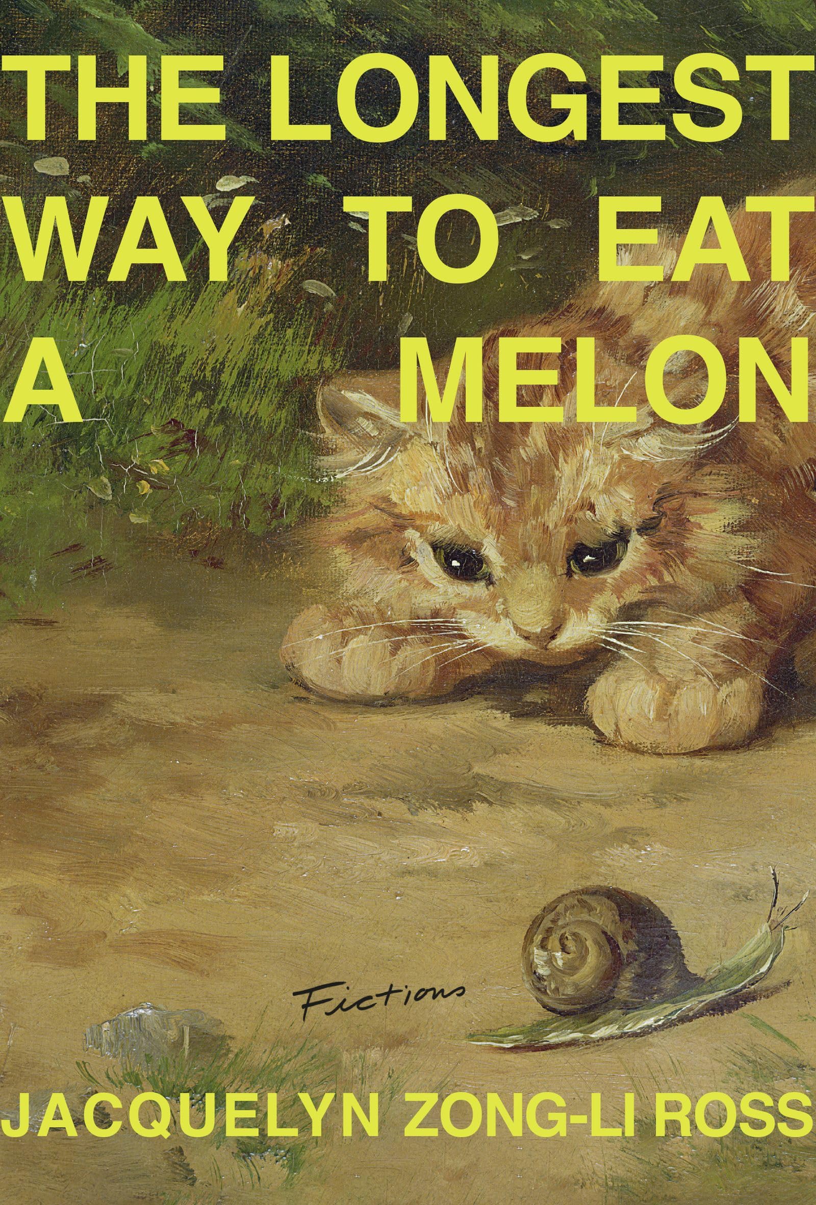 Jacquelyn Zong-Li Ross, The Longest Way to Eat a Melon; cover design by Emily Mahon (Sarabande, June)
I love this treatment for a long title. And more books should have kittens and/or snails on them.
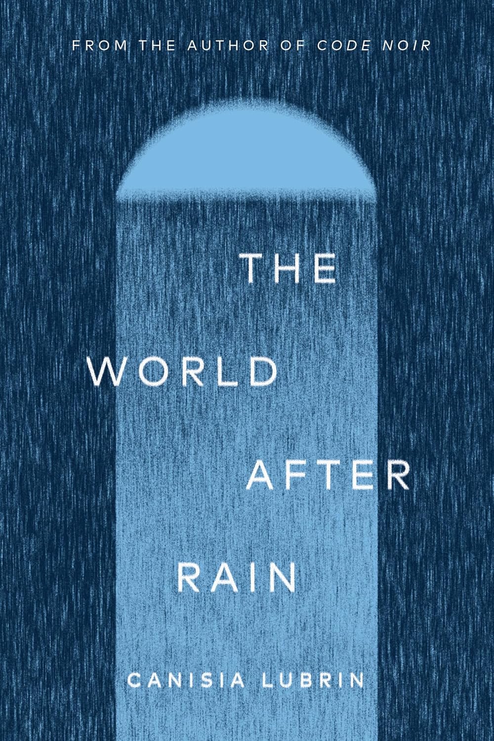 Canisia Lubrin, The World After Rain; cover design by Jennifer Griffiths (McClelland & Stewart, October)
Layered blues and falling textures shift in the light, creating a quiet yet enveloping mood that lingers.
 Chris Kraus, The Four Spent the Day Together; cover design by Alicia Tatone (Scribner, October)
I really like the use of this turquoise spot color in contrast to the flood of neon green of the past couple years. The use of negative space is striking, as is the way these faces are warped and blended together.
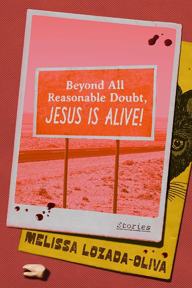 Melissa Lozada-Oliva, Beyond All Reasonable Doubt, Jesus is Alive!; cover design by Luísa Dias (Astra House, September)
Every time I see this, I see something new.
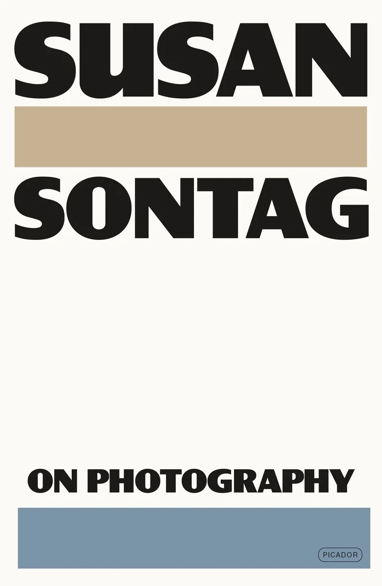 Susan Sontag, On Photography; cover design by Alex Merto (Picador, April)
The type is so subtly of the era of the book, it’s a beautifully spare and elegant cover. It reminds me of negative canisters.
 Harris Lahti, Foreclosure Gothic; cover design by Adriana Tonello / Rodrigo Corral Studio (Astra House, June)
Deftly brings a sense of unease to an image of American life so mundane it ordinarily passes beneath our notice.
 Erin Somers, The Ten Year Affair; cover design by Emily Mahon; cover art by Shannon Cartier Lucy (Simon & Schuster, October)
I am so intrigued by this cover’s sexy tension in both painting and type!!
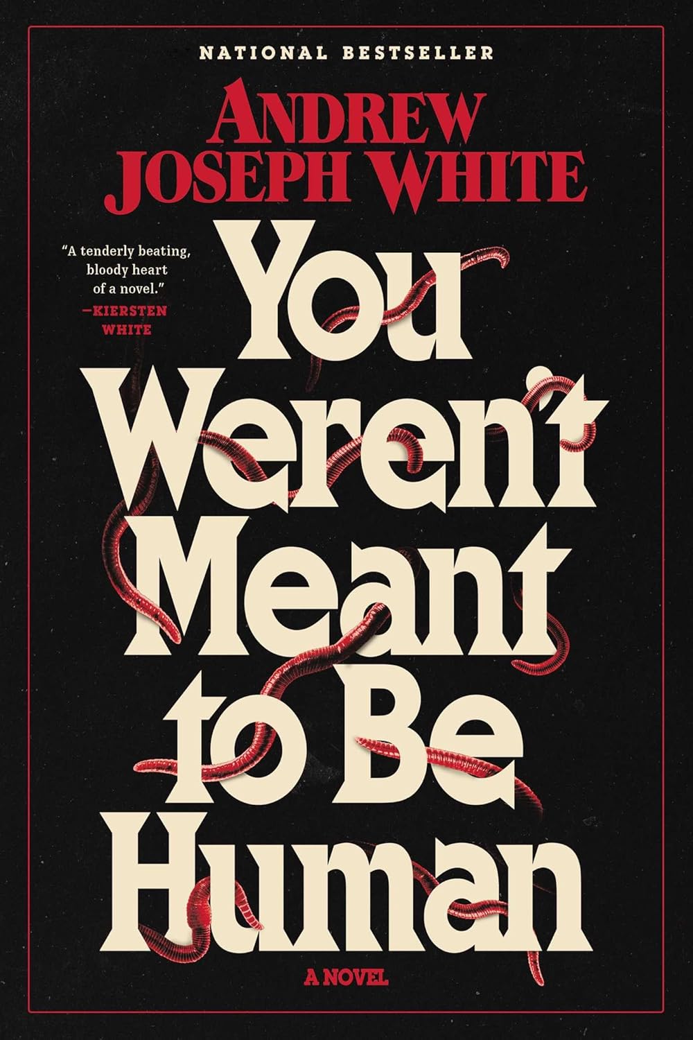 Andrew Joseph White, You Weren’t Meant to Be Human; cover design by Drusilla Adeline (S&S/Saga Press, September)
So creepy in such a great way, obsessed with the typography and vintage vibes this cover signals.
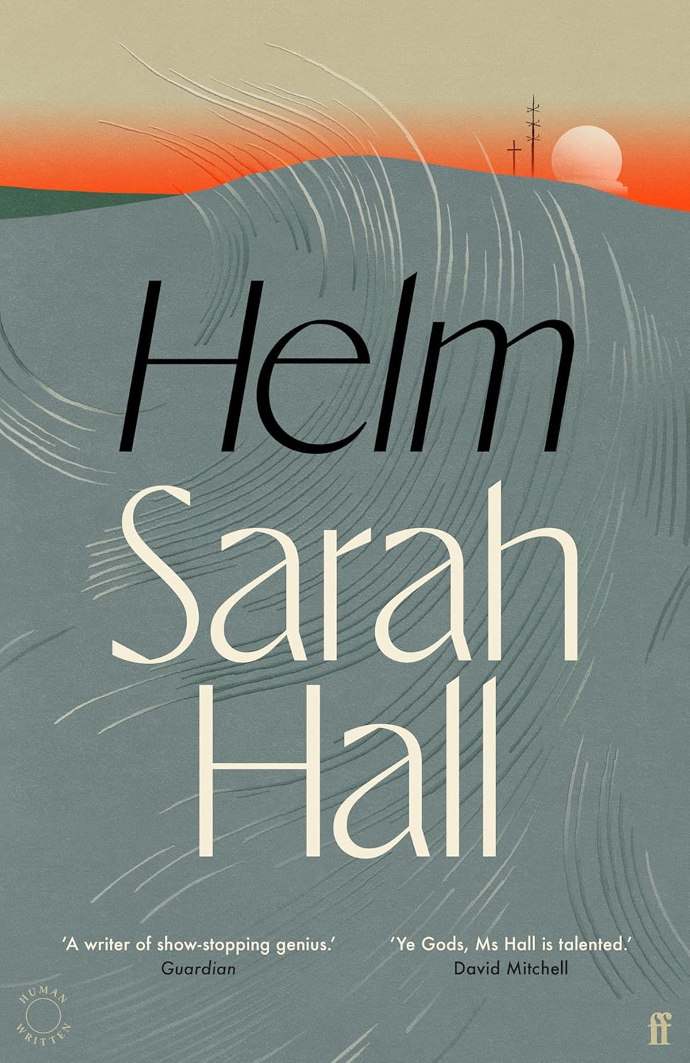 Sarah Hall, Helm; cover design by Henry Petrides (Faber & Faber, August)
Henry’s cover design for Helm is simple, understated, confident and super evocative. I can really imagine the sensation of the wind on that cover!
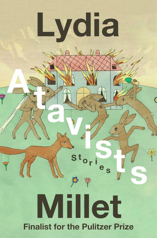 Lydia Millet, Atavists: Stories; cover design by Steve Attardo (Norton, April)
Title type dances with art that splits the author’s name! Appreciate all the bold design choices.
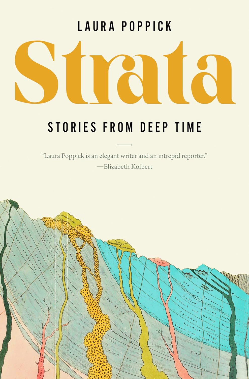 Laura Poppick, Strata: Stories from Deep Time; cover design by Steve Attardo (Norton, July)
This cover is smart, elegant, and breathes with the perfect amount of white space. The title font, with its subtle slant, pairs perfectly with the slant of the colorful image below.
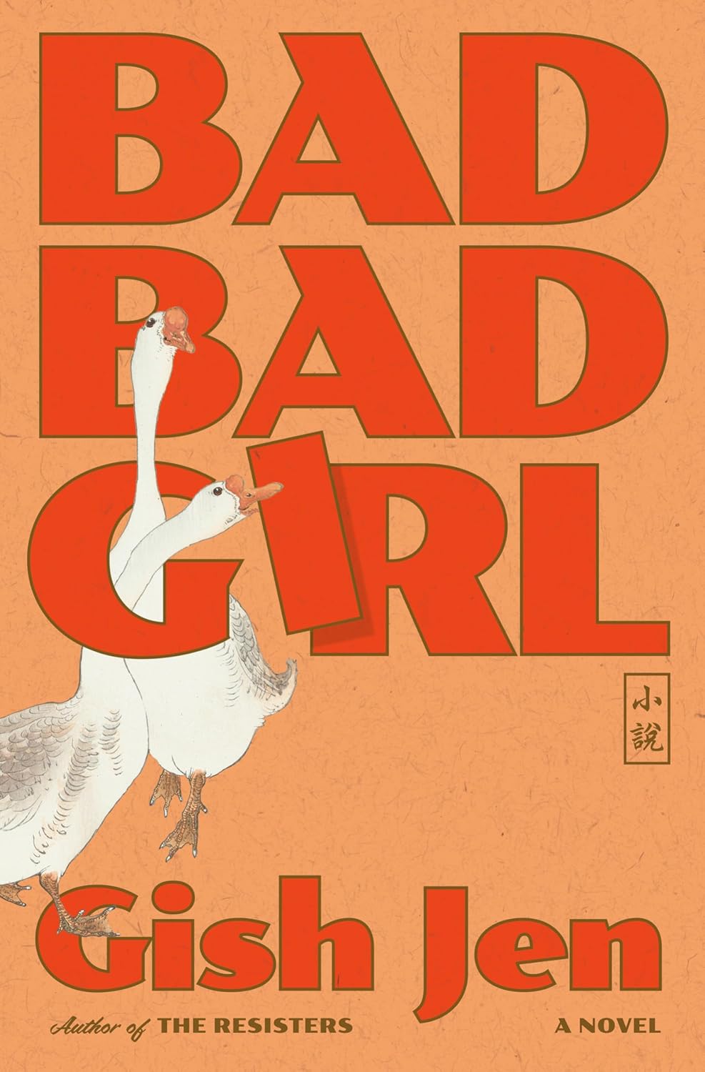 Gish Jen, Bad Bad Girl; cover design by Linda Huang (Knopf, October)
If you look at Linda’s body of work, there is a subtle thread of wit. This cover reflects that as well. It makes me smile.
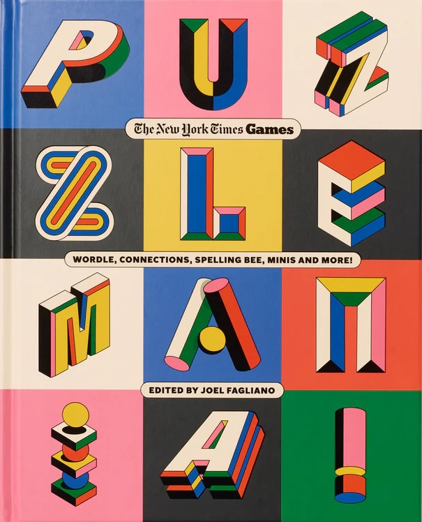 The New York Times Games and Joel Fagliano, Puzzle Mania!; cover design by Andrew Footit (Authors Equity, October)
The type, the colors, the puzzles inside! This cover makes me so happy.
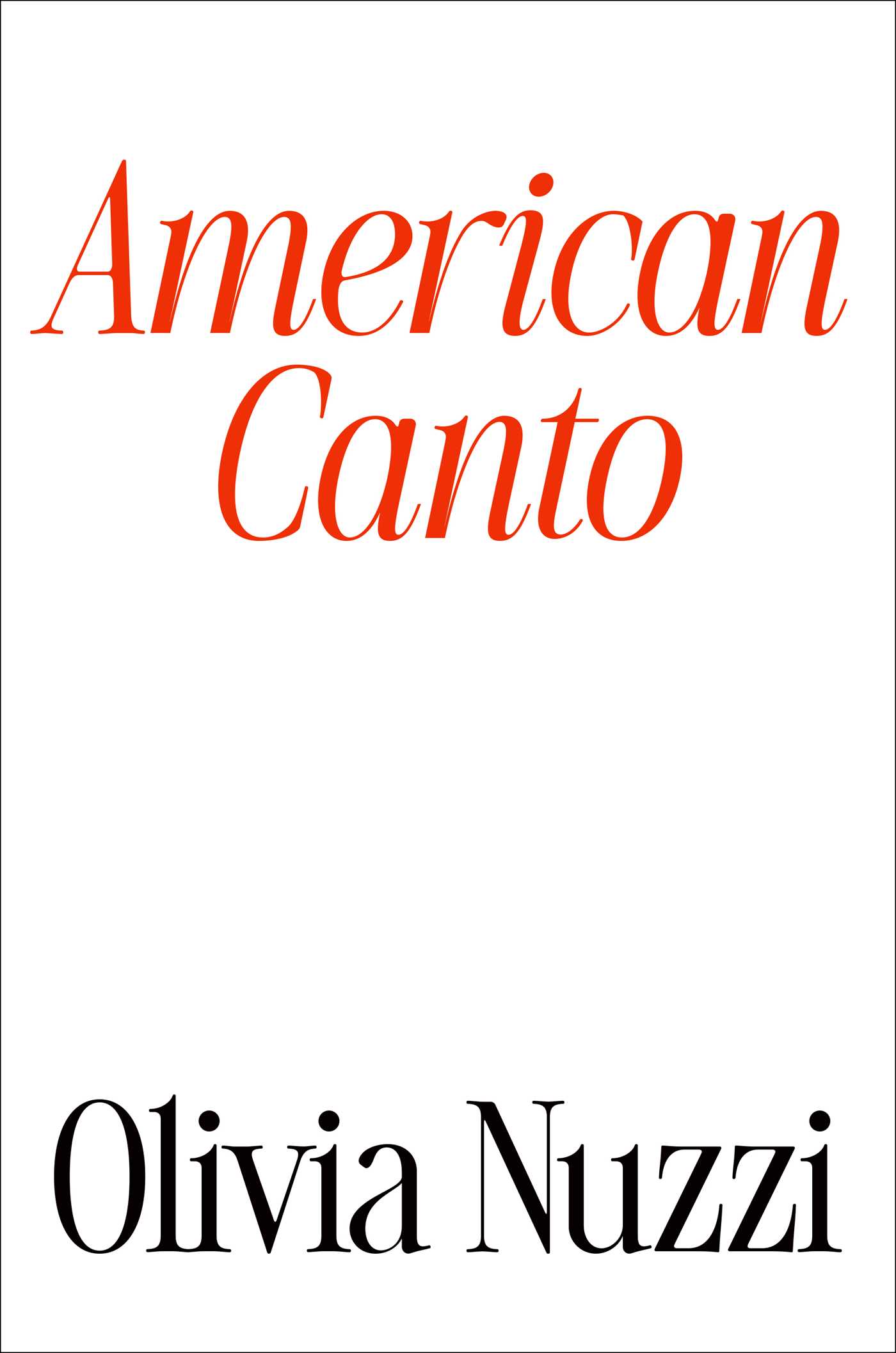 Olivia Nuzzi, American Canto; cover design by Alison Forner (Avid Reader Press, December)
Love a clean all type cover.
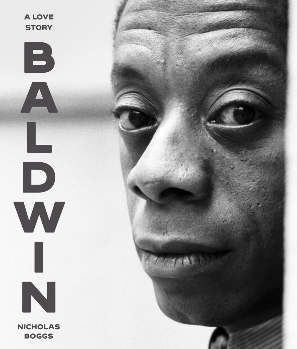 Nicholas Boggs, Baldwin: A Love Story; cover design by by Rodrigo Corral, photo by David Gahr (FSG, August)
This macro close-up ultra detailed portrait is a simple and perfect way to show the reader we will be diving into an intimate and honest portrayal that reveals how profoundly James Baldwin’s personal relationships shaped his life and work.
 Marlen Haushofer, tr. Shaun Whiteside, Killing Stella; cover design by Matt Dorfman (New Directions, July)
It must have been difficult to build on the visual language of a cover as stunning as The Wall. What a beautiful shade of yellow.
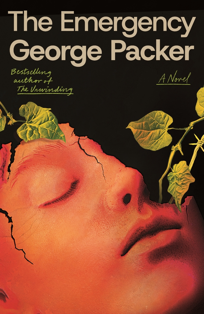 George Packer, The Emergency; cover design by Giacomo Girardi (FSG, November)
I really love the design work here. It’s haunting and beautiful, with the face cracking and the vines slowly creeping in.
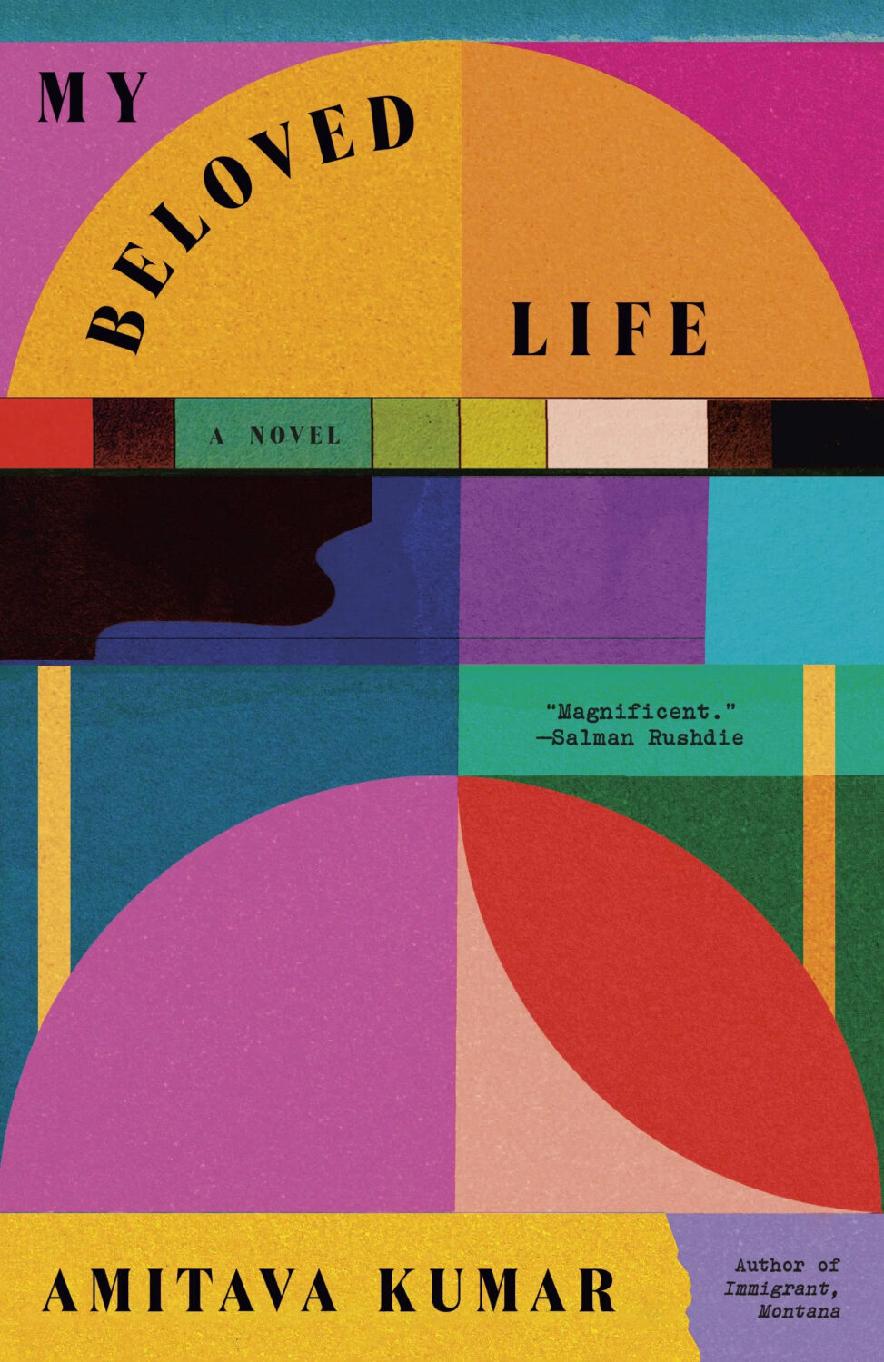 Amitava Kumar, My Beloved Life (paperback); cover design by Tom Etherington (Vintage, January)
The right amount of everything.
 Yiyun Li, Things in Nature Merely Grow; cover design by Na Kim (FSG, May)
A simple idea beautifully made.
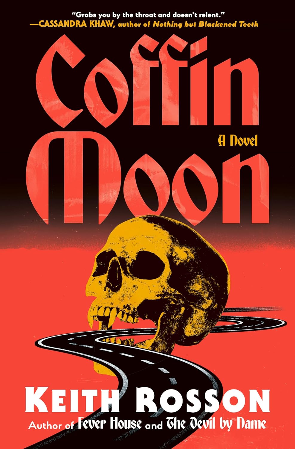 Keith Rosson, Coffin Moon; cover design by Aarushi Menon (Random House, September)
Aarushi pulled off a multi-designer hat trick for author, Keith Rosson, with this cover! Ella Laytham scored the first two goals with the ICONIC covers for Fever House and The Devil By Name.
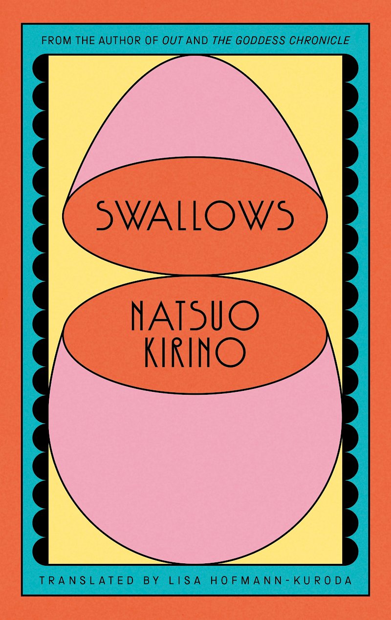 Natsuo Kirino, tr. Lisa Hofmann-Kuroda, Swallows; cover design by Jack Smyth (Canongate, August)
The opening egg, the type, the color situation, the minimal ornamentation…it’s just perfect.
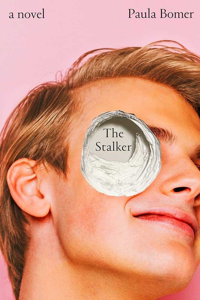 Paula Bomer, The Stalker; cover design by Kate Sinclair (Soho Press, May )
I love the pastels shades, pretty boy, nice smile and pleasant typeface and how they contrast with the Terminator 2 hole.
 Haruki Murakami, Super-Frog Saves Tokyo; cover design by Suzanne Dean (Vintage UK, October)
Bright green, delightfully odd, and utterly Murakami.
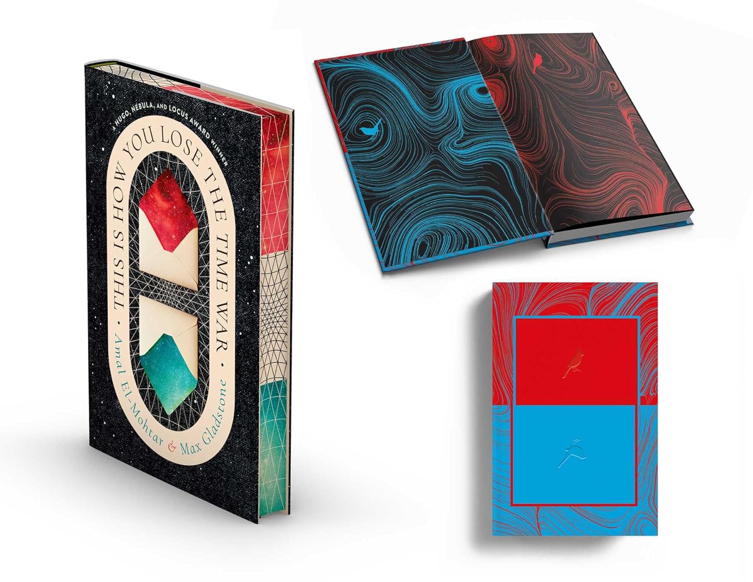 Amal El-Mohtar & Max Gladstone, This is How You Lose the Time War deluxe edition; cover design by Amanda Hudson (S&S/Saga Press, November)
Masterful elegance for such a long title and two authors! Stunning package!
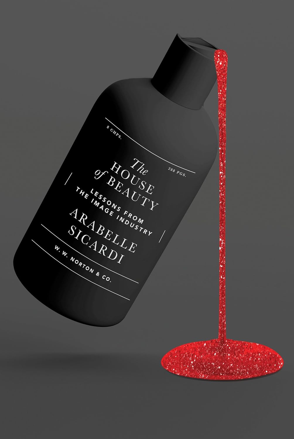 Arabelle Sicardi, The House of Beauty; cover design by Sarahmay Wilkinson (W. W. Norton, October)
I love when a printing effect both looks cool AND signals a deeper meaning. The glittery red says both pretty and sparkly but also hints at a sinister feeling of blood, perfectly illustrating the light and dark sides of the beauty industry.
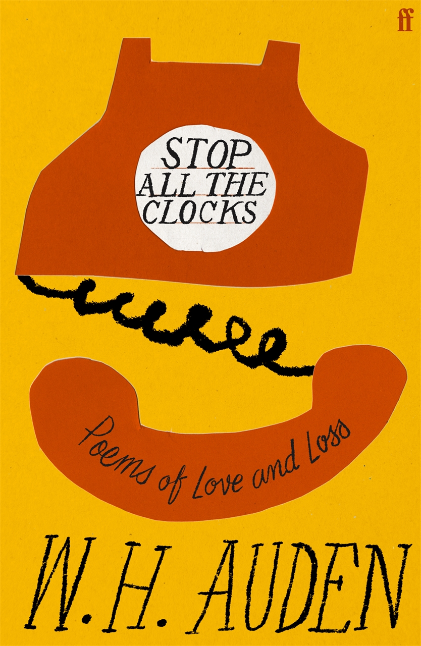 W.H. Auden, Stop All the Clocks; cover design by Pete Adlington (Faber, November)
This one is giving all of the right vintage vibes. I love the 70s color palette and scratchy hand-lettering.
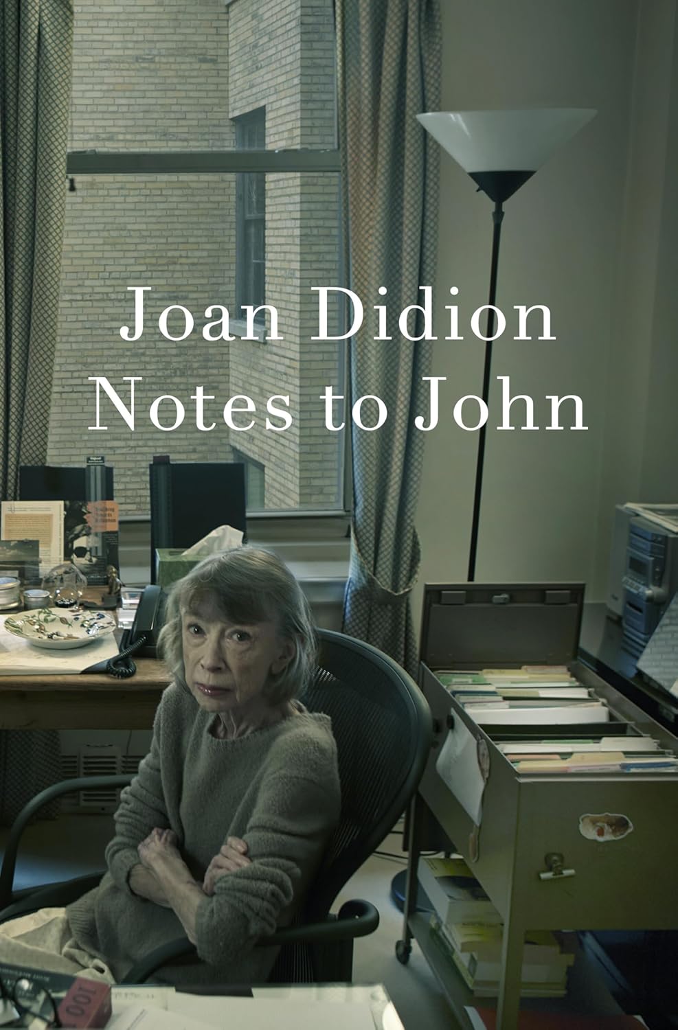 Joan Didion, Notes to John; cover design by John Gall, photograph by Annie Lebowitz (Knopf, April)
The intimacy of this photo is uncomfortable; Didion, not even the focal point, staring at you intensely like the matriarch in your own family who doesn’t want to be photographed. The title and author are set large in a text weight of Didot, echoing the candidness of the photo and the material. It is hard not to consider the meta textual nature of a posthumous work, maybe she is judging us for even picking it up.
 Mark Hoppus, Fahrenheit-182; cover design by Joanne O’Neill (Dey Street Books, April)
My favorite memoir cover this year, I love how the colors and textures are so playful and make it look like a band poster!
 Nathan Harris, Amity; cover design by June Park (Little, Brown, September)
It looks BIG but the type takes up less than half the jacket, which is a real feat. And the colors!
 Claire Baglin, On the Clock; cover design by Erik Carter (New Directions, March)
Super-sized and super fun.
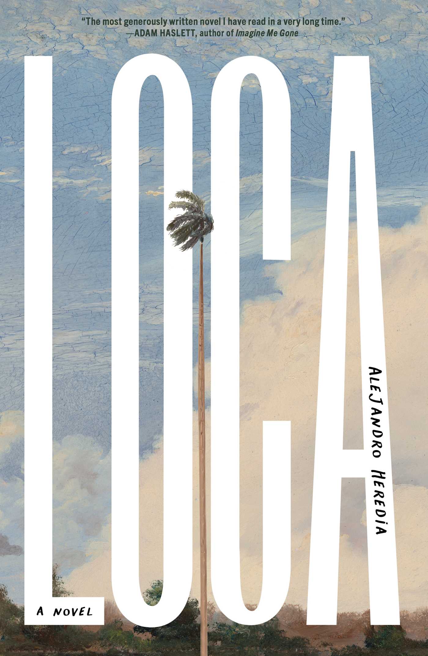 Alejandro Heredia, Loca; cover design by Matt Roeser (Simon & Schuster, February)
Who doesn’t love a short title that you can exaggerate and make massive on the cover. The pairing of the tall title with the tall tree makes this so…tall.
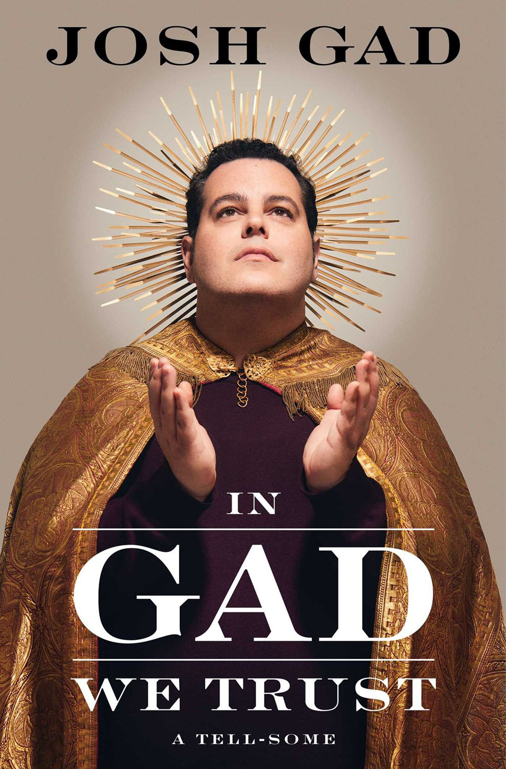 Josh Gad, In Gad We Trust; cover design by John Vairo Jr. (Gallery Books, January)
Designing a cover that involves a full custom photoshoot is a whole different ballgame, and no one does it better than John. Concept, costumes, photographer, posing, execution… it’s a ton of work, and this one came out so great.
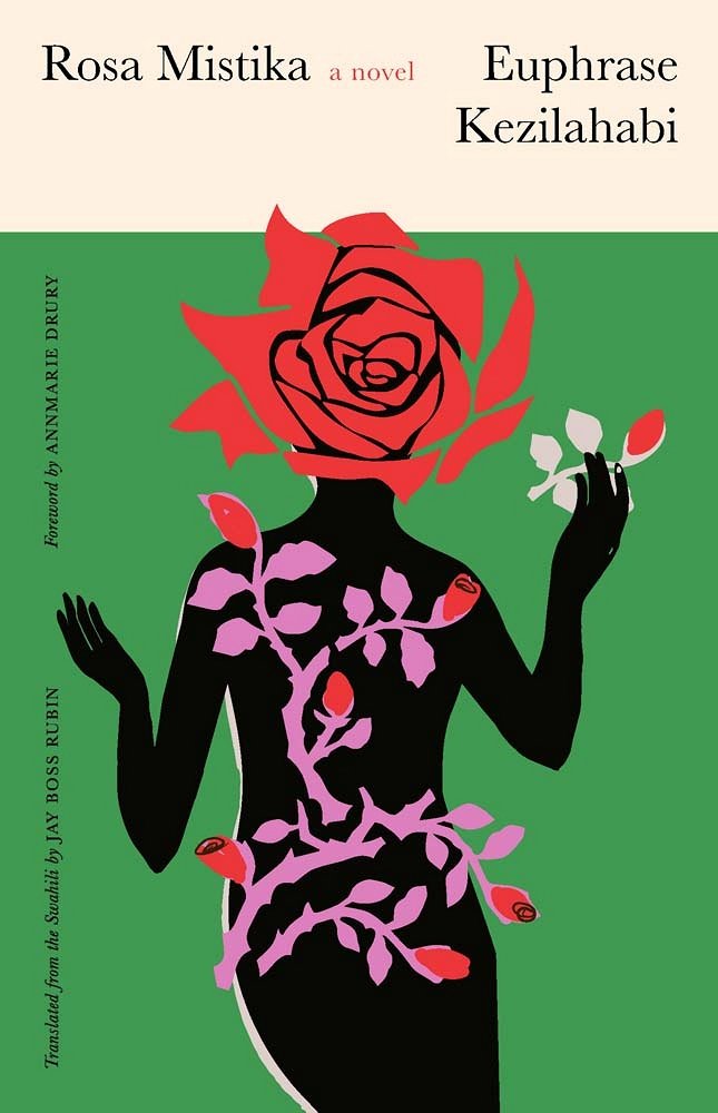 Euphrase Kezilahabi, tr. Jay Boss Rubin, Rosa Mistika; cover design by Sarah Schulte (Yale University Press, June)
I just love this illustration and the type layout. It feels fresh and timeless all at once.
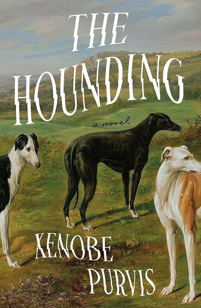 Xenobe Purvis, The Hounding; art by Benjamin Cam Norton; cover design by Nicolette Seeback Ruggiero (Henry Holt, August)
Subtly disorienting. And who could pass by such a good crew of dogs.
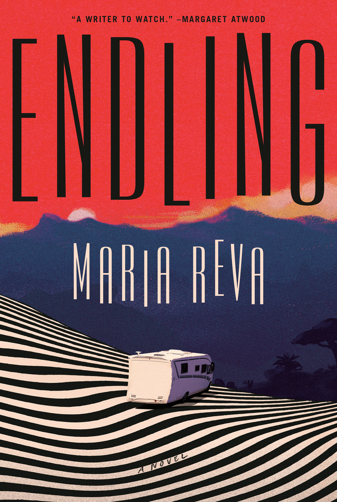 Maria Reva, Endling; cover design by Emily Mahon, jacket art by Valentin Pavageau (Doubleday, June)
Great combination of dancing type and trippy landscape.
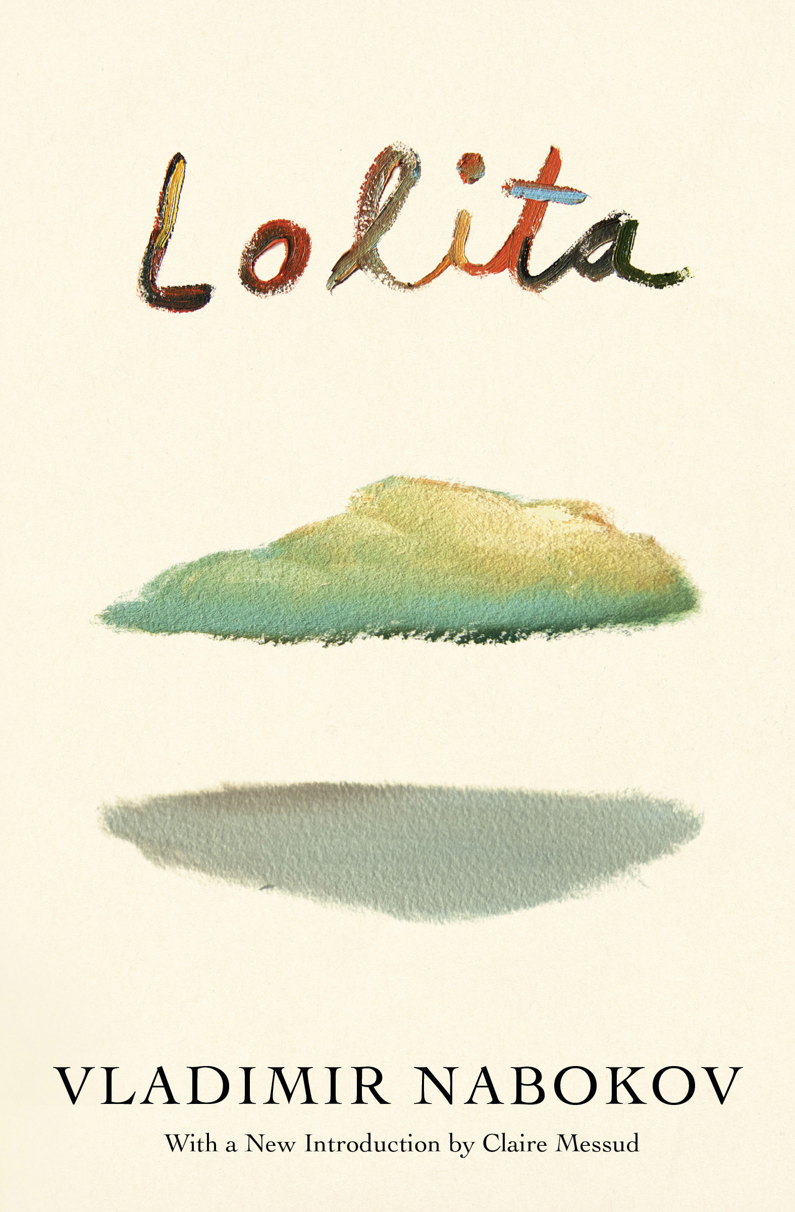 Vladimir Nabokov, Lolita; cover design by Na Kim (Vintage, June)
Damn. So simple but so evocative—it does a lot with very little.
 Yume Katasei, Saltcrop; cover design by Jonathan Bush (Flatiron, September)
So very beautiful and ominously calm!!!
 Andrea Long Chu, Authority; cover design by Thomas Colligan (FSG, April)
This stunner is exercise in restraint. A win for the less is more crowd. And, a gamble for any book publisher skittish about the fine ornamental lines disappearing when reduced to postage stamp size online. I hope the sales figures for Authority made this elegant jacket solution a success in all ways.
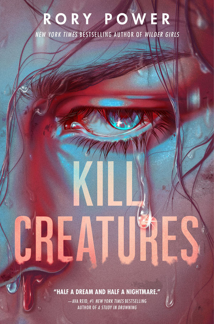 Rory Power, Kill Creatures, cover design by Liz Dresner; illustration by Kei-Ella Loewe (Delacorte, June)
I just love this incredibly detailed illustration—ever so lovingly created by a human artist (not AI!)
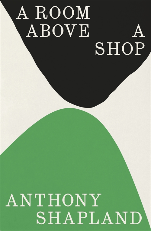 Anthony Shapland, A Room Above a Shop; cover design by Tom Etherington (Granta Books, March)
I want to frame this cover and hang it on my wall. The delicate tension between the shapes and that particular shade of green are so pleasing to look at.
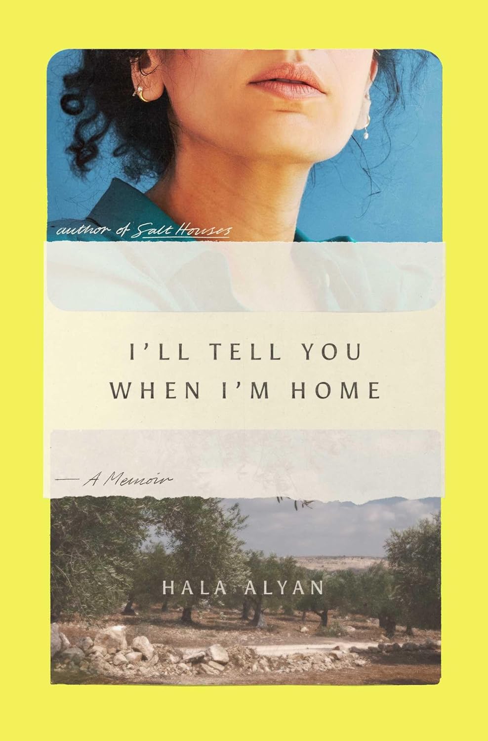 Hala Alyan, I’ll Tell You When I’m Home; cover design by Zak Tebbal (Avid Reader Press, June)
The plays on scale and proportion here just work so well. It is a book designed to be held in the hand.
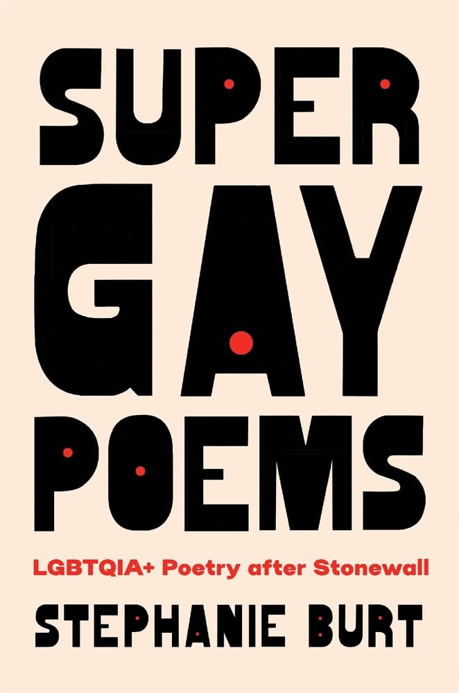 Stephanie Burt, Super Gay Poems; cover design by Jaya Miceli (Belknap Press, April)
Great mix of humor and type. Very memorable.
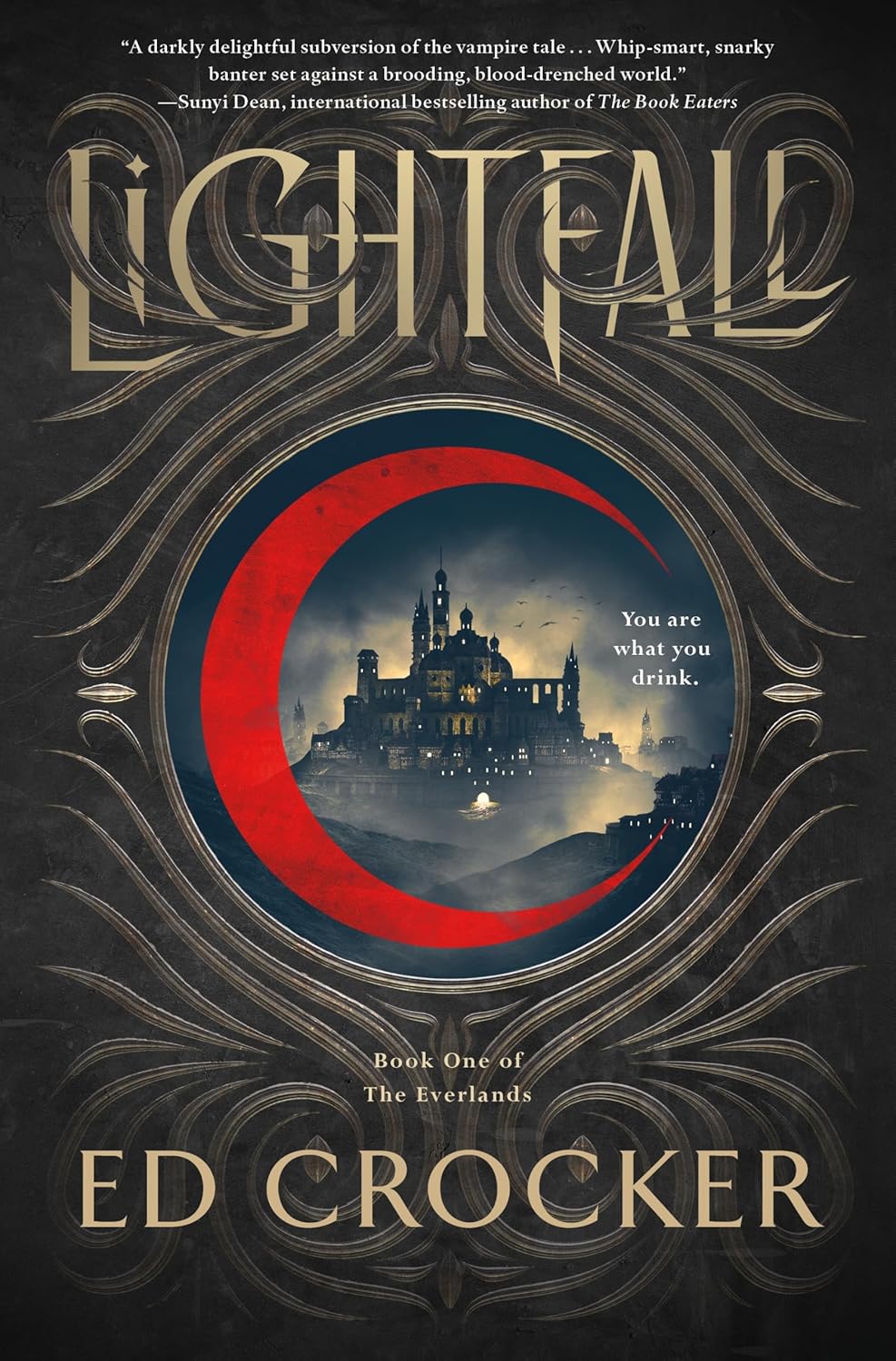 Ed Crocker, Lightfall; cover design by Ervin Serrano (St. Martin’s, January)
I love the interaction of typography with the flourishes. The red vibrates off the page in such a pleasing way.
 Andrew Lipstein, Something Rotten; cover design by Na Kim FSG, January)
I’m scared to have kids.
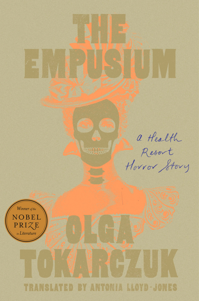 Olga Tokarczuk, tr. Antonia Lloyd-Jones, The Empusium; cover design by Lauren Peters-Collaer (Riverhead, September)
I’m a big fan of startling colors this year. Voting for the most off kilter palettes in 2025!
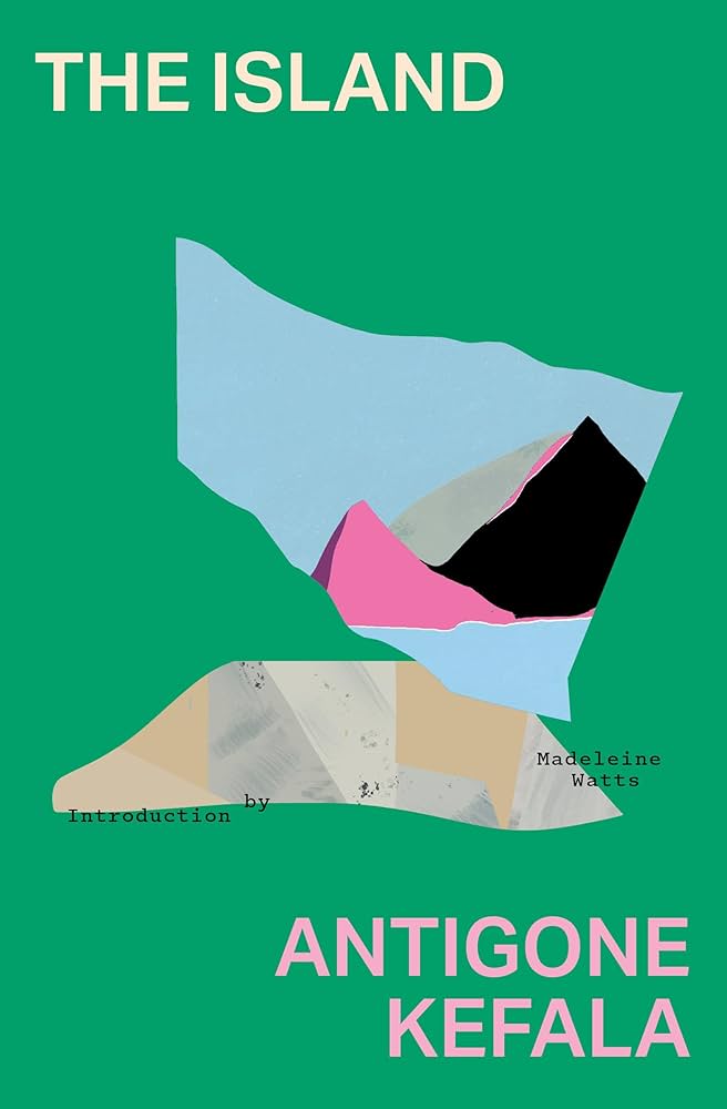 Antigone Kefala, tr. Madeleine Watts, The Island; cover design by Sarah Schulte (Transit Books, June)
It reminds me of Mario Degrada’s series of covers for Rizzoli in the 70s.
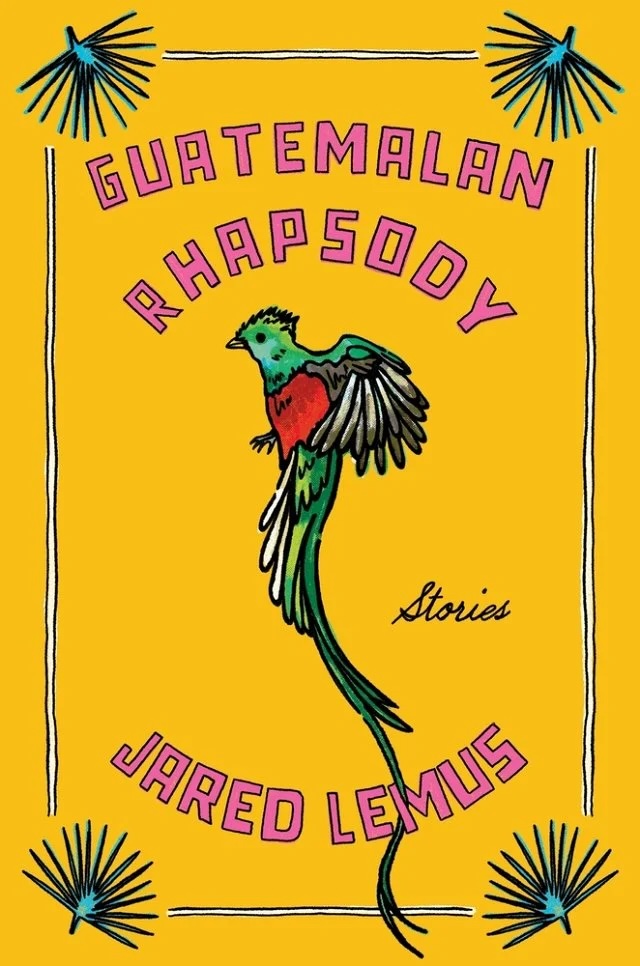 Jared Lemus, Guatemalan Rhapsody; cover design and illustration by Vivian Lopez Rowe (Ecco, March)
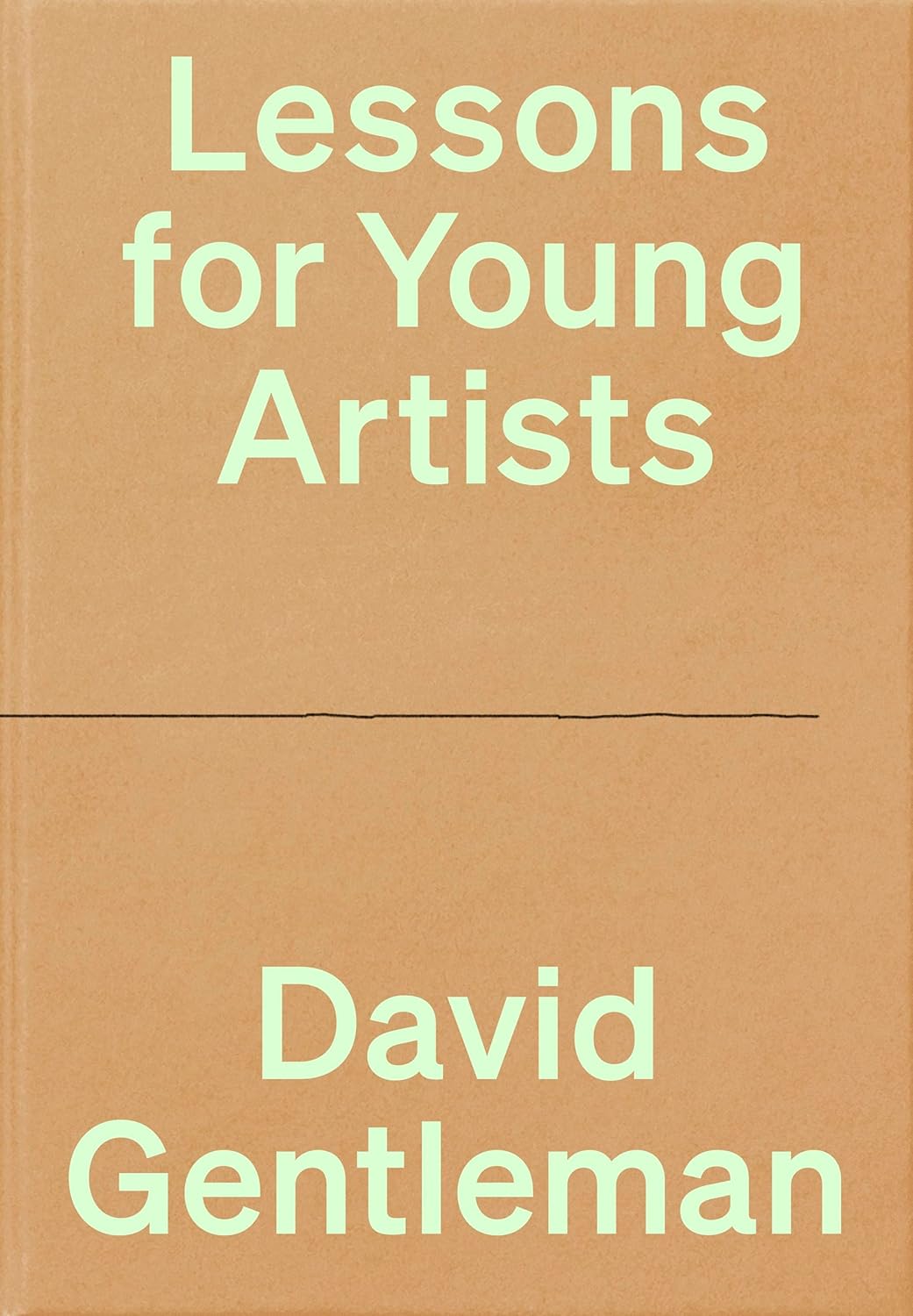 David Gentleman, Lessons for Young Artists; cover design by Tom Etherington (Particular Books, July)
A forceful reminder that there’s nowhere to start but at the beginning.
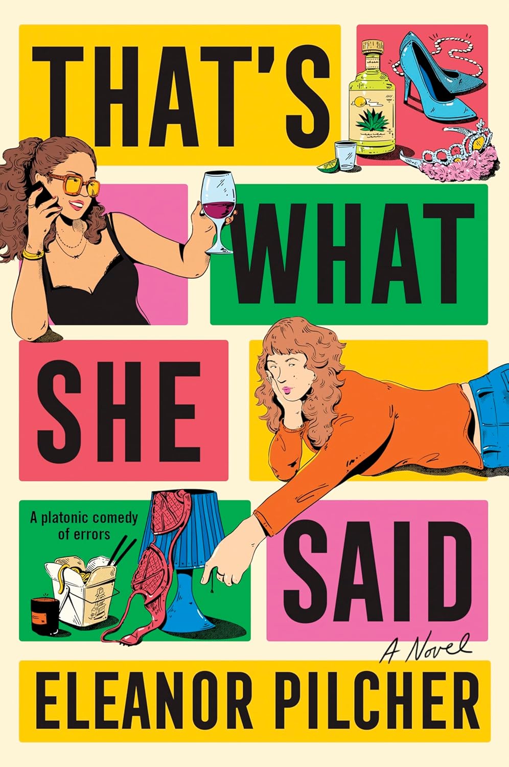 Eleanor Pilcher, That’s What She Said; cover design by Paul Miele-Herndon (Avon, April)
In a year where we were spoiled with tons of great “Bento Book” style covers, this one really nails the look.
 Sophie Kemp, Paradise Logic; art direction by Martha Kennedy (Simon & Schuster, March)
Look, it’s ludicrous but it’s fun!!! And knows how to playfully call its audience.
 Stephanie Wambugu, Lonely Crowds; cover design by Gregg Kulick (Little, Brown, July)
Stunning. Beautiful use of a restrained layout to highlight this incredible photograph.
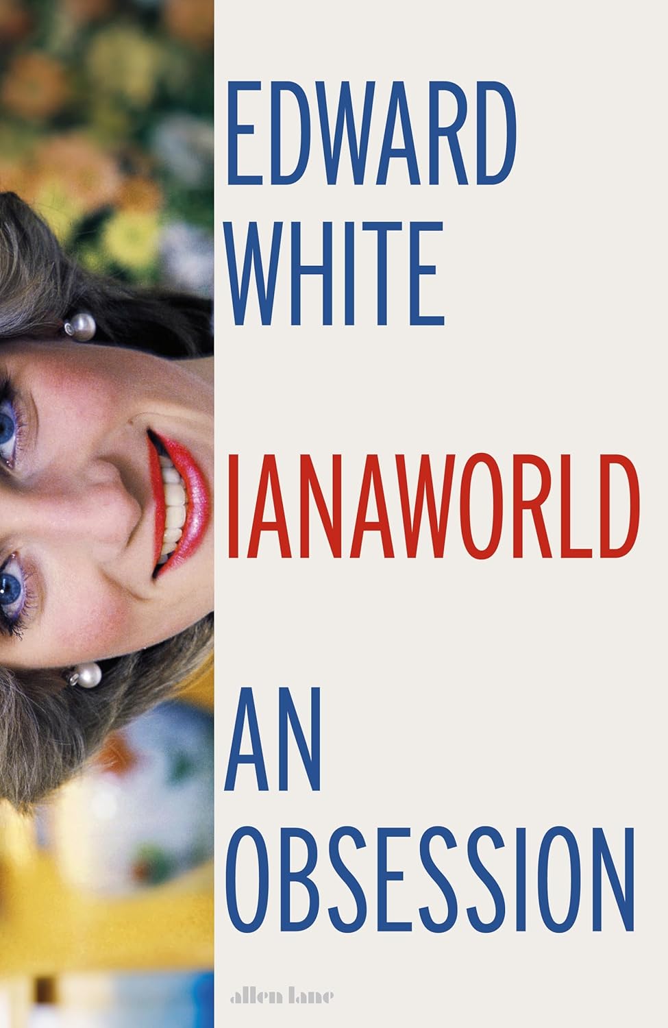 Edward White, Dianaworld; cover design by Jamie Keenan (Allen Lane, May)
So clever.
 Alla Gorbunova, tr. Elina Alter, (Th)ings and (Th)oughts; cover design by Sarah Schulte (Deep Vellum, November)
Beautiful illustration and pairing of type.
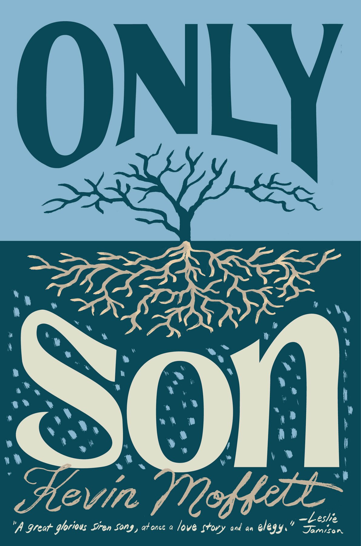 Kevin Moffett, Only Son; cover design by Sunra Thompson (McSweeney’s, November)
The hand drawn illustration and lettering give the cover a warmth that contrasts with the cool tones of the color palette. A high contrast, impactful design.
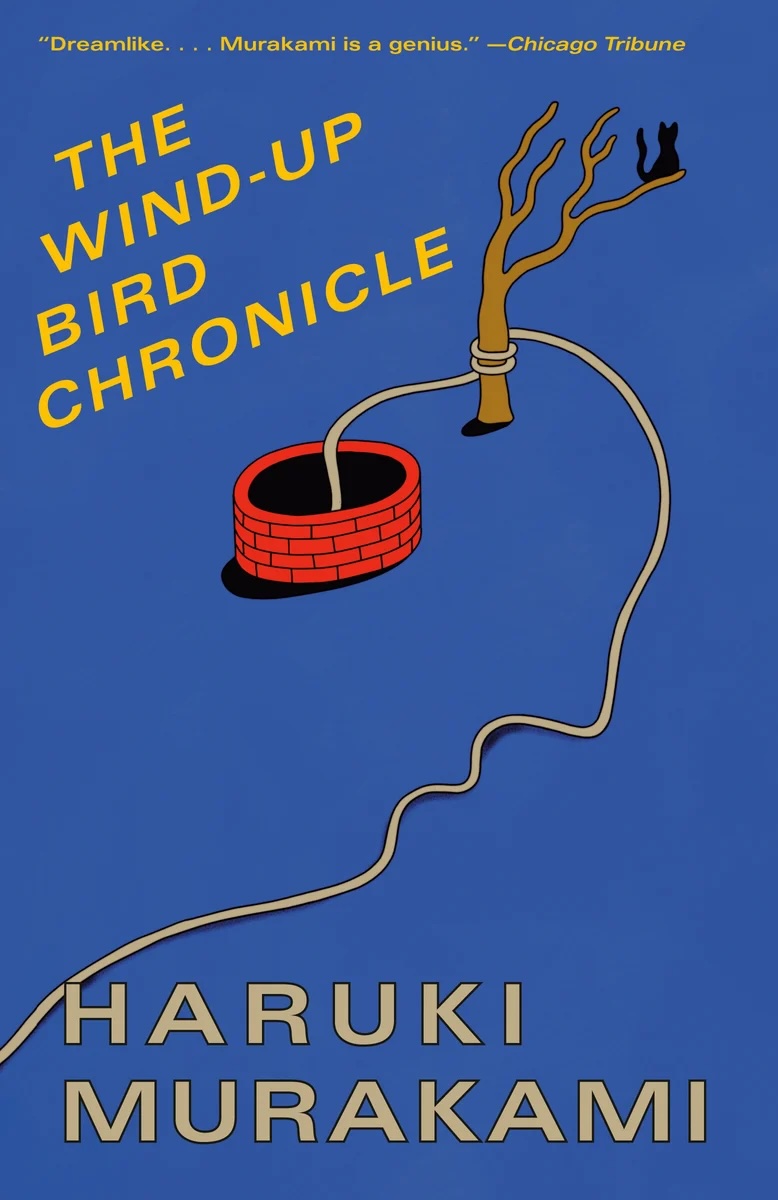 Haruki Murakami, The Wind Up Bird Chronicle, cover design by Henri Campeā; art directed by Megan Wilson (Vintage, August)
Henri Campeā’s illustrations for these new Murakami designs are pure pleasure.
 Lucy Rose, The Lamb, cover design by Dan Jackson (W&N, January)
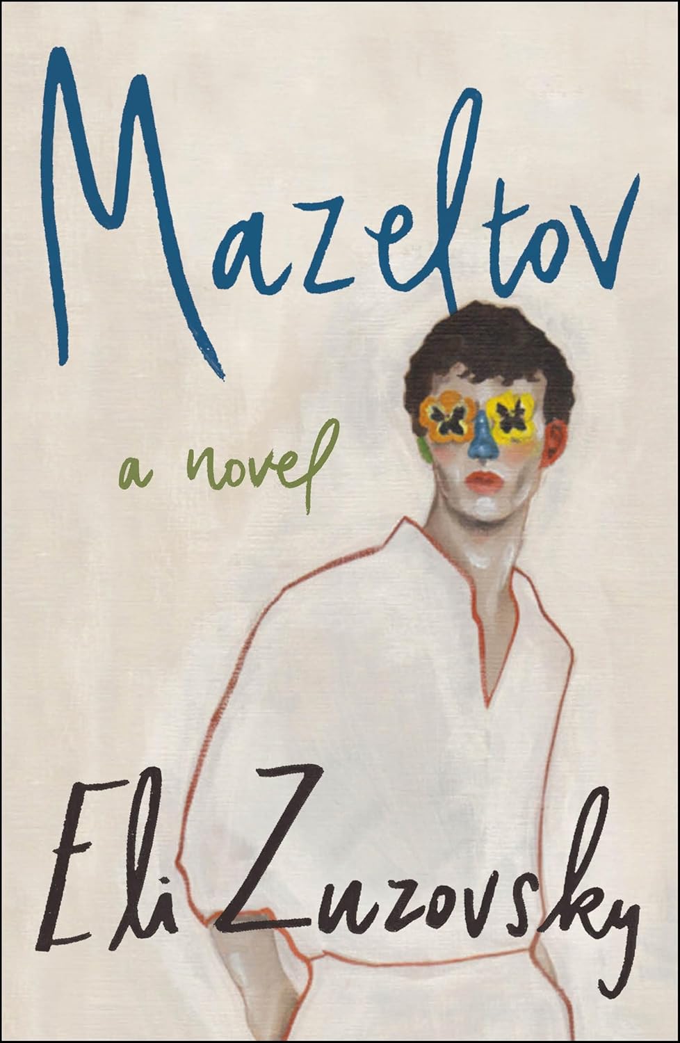 Eli Zuzovsky, Mazeltov; cover design by Emily Mahar (Henry Holt, February)
Who is this beautiful boy with the blue nose and flower eyes?? This design makes the book feel both literary and commercially viable, which is extraordinarily difficult to pull off.
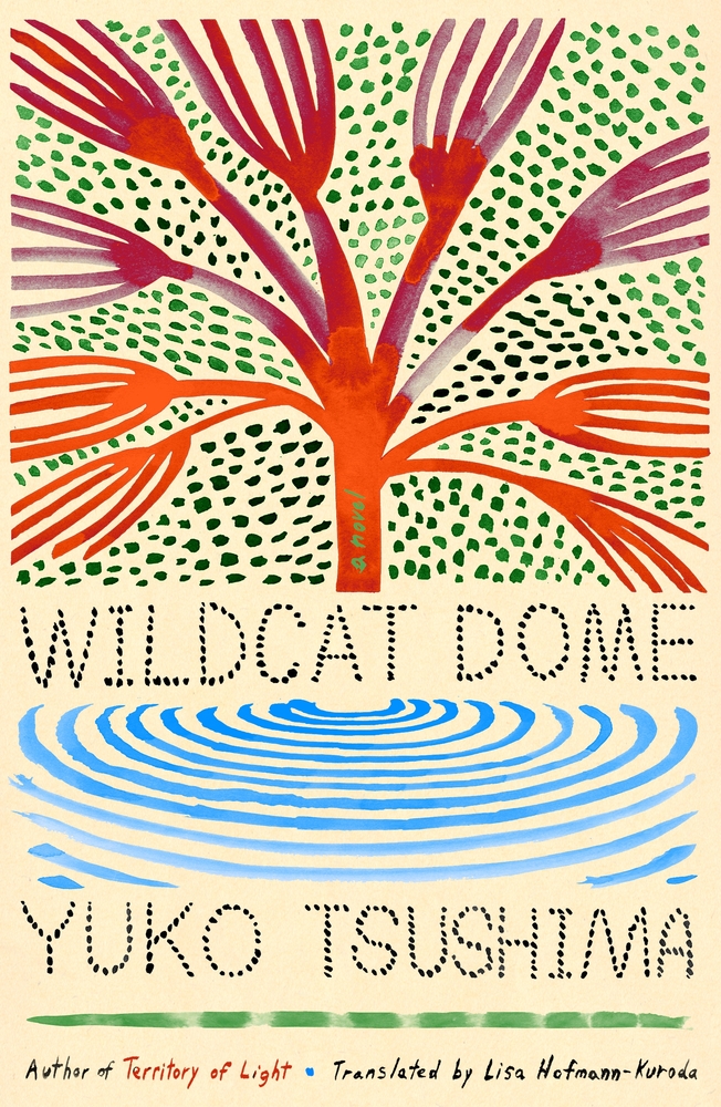 Yuko Tsushima, tr. Lisa Hofmann-Kuroda, Wildcat Dome; cover design by Na Kim (FSG, March 18)
I love Na Kim’s paintings. The type and art work so harmoniously here.
 Seyda Kurt, Hate; cover design by Keith Dodds (Verso, November)
Love that they didn’t use red or black!
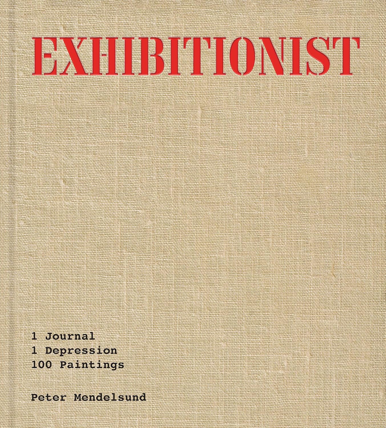 Peter Mendelsund, Exhibitionist; cover design by Peter Mendelsund (Catapult, June)
Sometimes the best design is the space between, what isn’t there, the stencil font, the blank canvas, you get it.
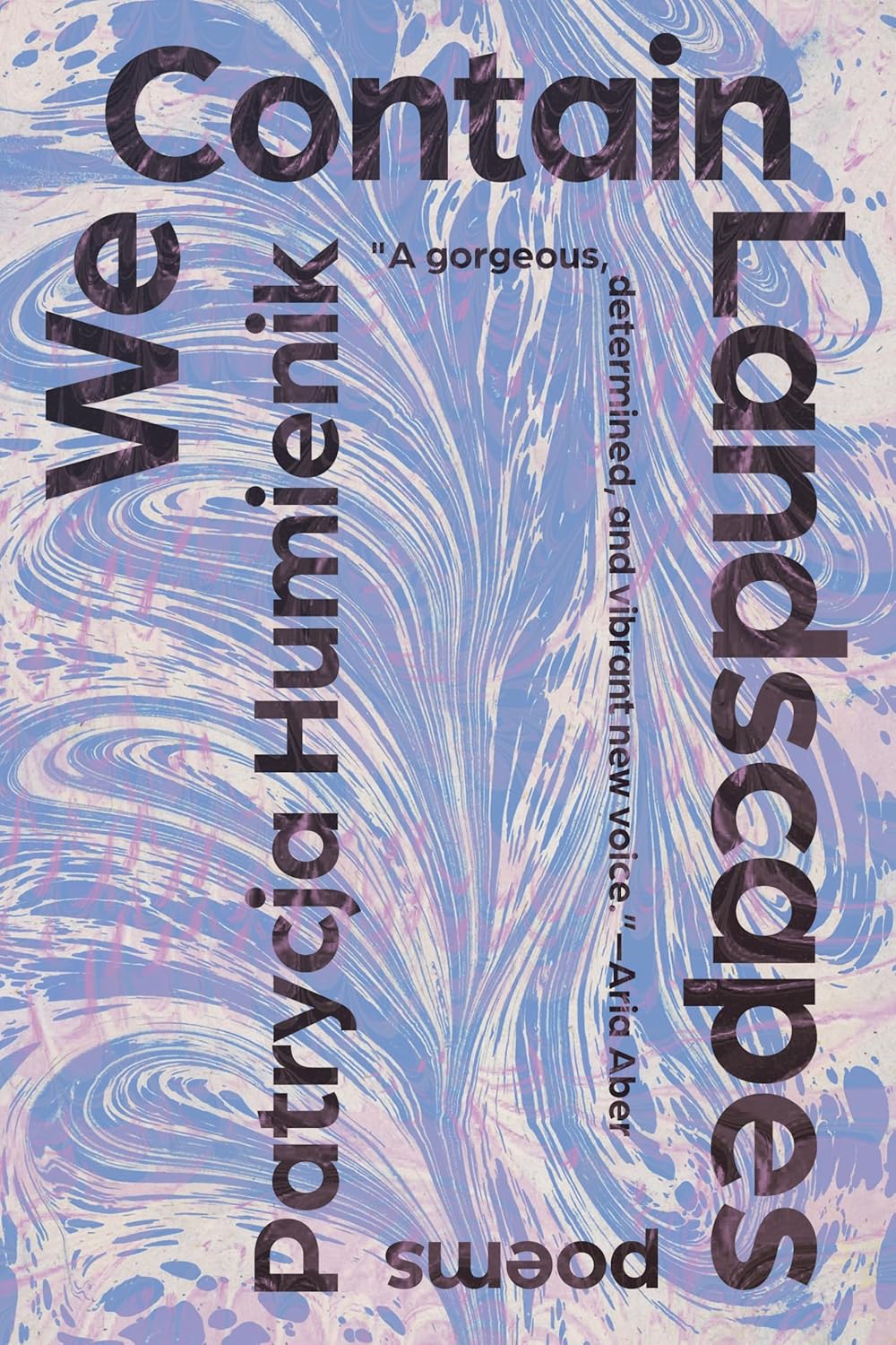 Patrycja Humienik, We Contain Landscapes; cover design by Beth Steidle (Tin House, March)
I like the way the type brackets the cover, breaking the marbled paper into concentric rectangles. Each rectangle is a new frame, a new landscape, a new poem.
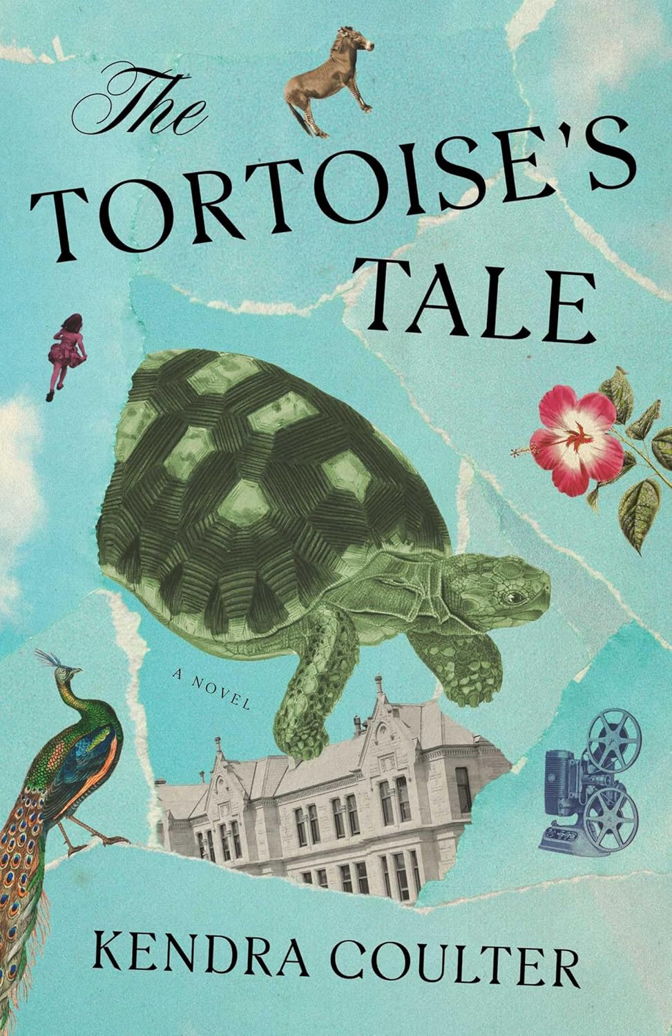 Kendra Coulter, The Tortoise’s Tale; cover design by Alicia Tatone (Simon & Schuster, November)
Gorgeous use of collage.
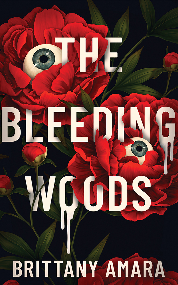 Brittany Amara, The Bleeding Woods; cover design by Caroline Teagle Johnson (47north, October)
Upends the clichéd fonts and imagery we typically associate with horror covers. Hauntingly beautiful and creepy at the same time.
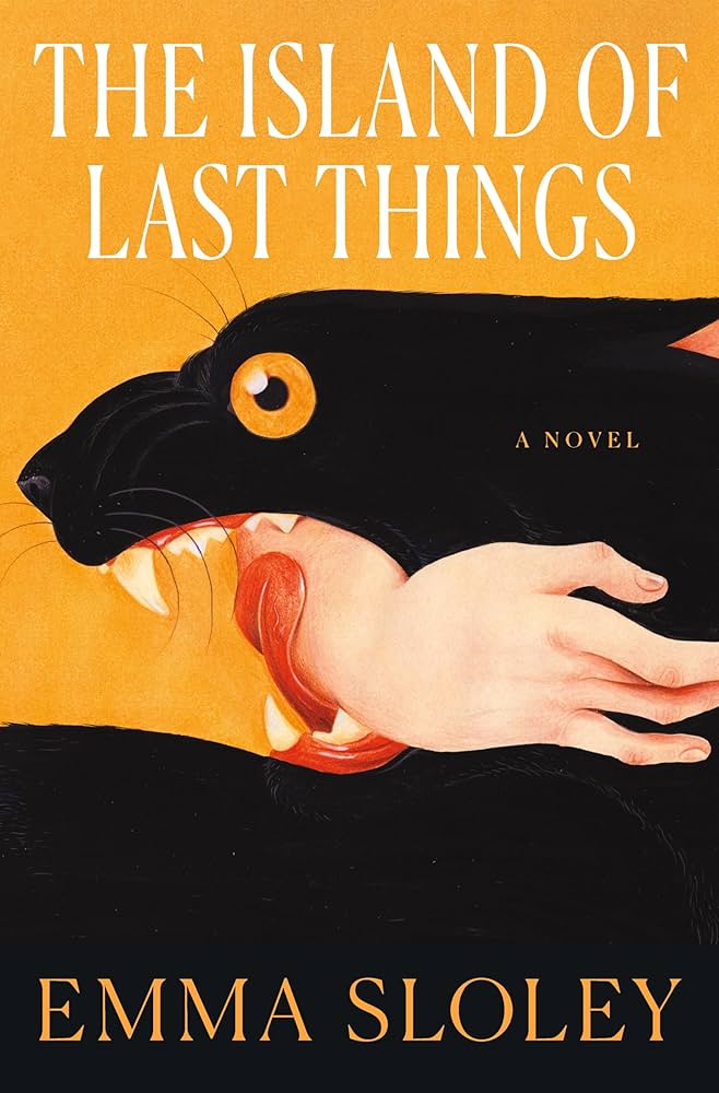 Emma Sloley, The Island of Last Things; cover design by Keith Hayes; art by Jose David Morales (Flatiron, August)
Another one that immediately stopped me in the bookstore. The bold, graphic halves of color, those teeth, the tongue! All ready to rip this arm off? Or is it a loving embrace? (My dog does this with my ankles!) I had to know!
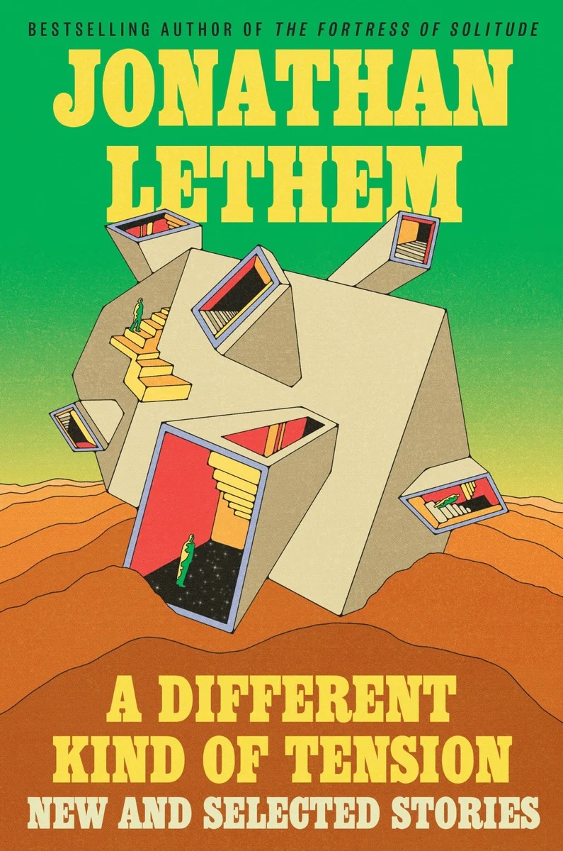 Jonathan Lethem, A Different Kind of Tension; cover design and illustration by Kate Dehler (Ecco, September)
 Jacek Dukaj, tr. Ursula Phillips, Ice (ebook edition); cover design by Yehrin Tong (Head of Zeus/AdAstra, November)
I’m a sucker for black and white covers that should come with a seizure warning. This one is literally and figuratively so sharp, love everything about it!
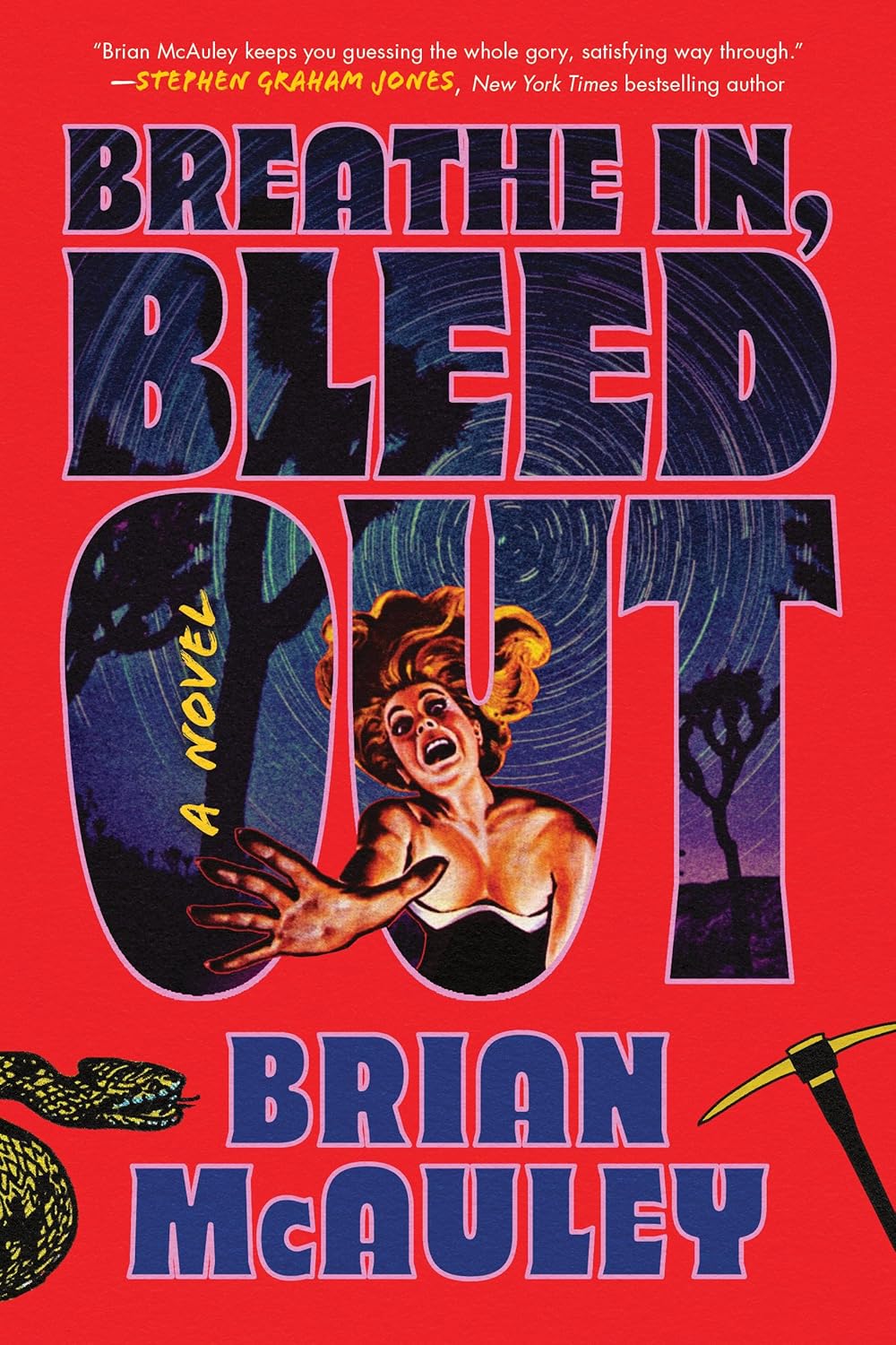 Brian McAuley, Breathe In, Bleed Out; cover design by Caitlin Sacks (Poisoned Pen Press, September)
 Nell Zink, Sister Europe; cover design and illustration by Josie Staveley Taylor (Viking UK, April)
Josie’s design of Sister Europe is rich, playful and stylish—the magpie in me is super drawn to her glimmering illustration and colour choices. It’s a super satisfying cover to look at.
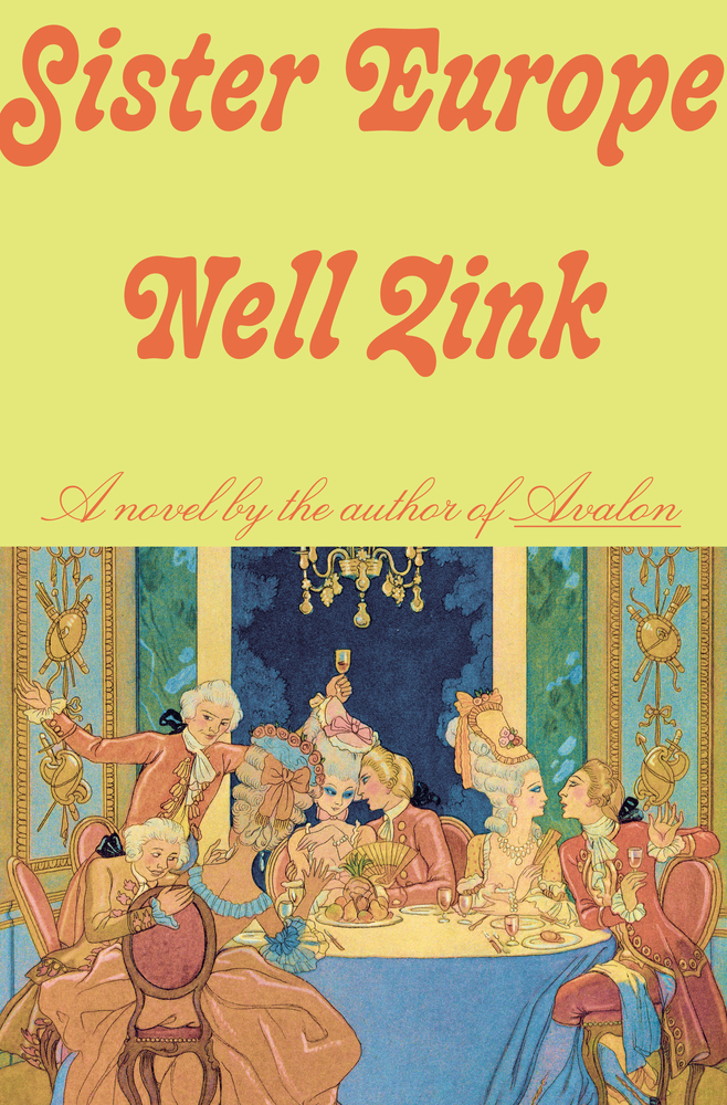 Nell Zink, Sister Europe; cover design by Linda Huang (Knopf, March 25)
Great art paired with amazing type!
 An Yu, Sunbirth; cover design by Suzanne Dean (Grove, August)
This is instantly eye-catching. The composition and color palette are striking.
Emily Temple
Emily Temple is the managing editor at Lit Hub. Her first novel, The Lightness, was published by William Morrow/HarperCollins in June 2020. You can buy it here.