The 17 Best Book Covers of March
Textures, Colors . . . Black and White Photographs?
Another month of books, another month of book covers. This month, I saw a whole lot of texture—from trompe d’oeils to overlays to actual, you know, physical texture—as well as fun colors (look at that chartreuse!) and an unusual number of desaturated photographs, which brought some gravitas to the whole affair. To kick off your spring reading (or just your spring book-admiring, I don’t judge), here are a few of my favorite book covers of the month. Enjoy, and as always, feel free to add any favorites you don’t see here to the list in the comments.
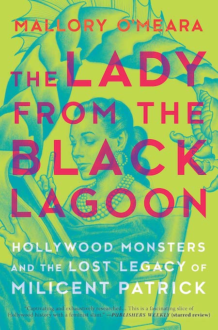 Mallory O’Meara, The Lady from the Black Lagoon: Hollywood Monsters and the Lost Legacy of Milicent Patrick, Hanover Square Press; illustration by Matt Buck (March 5, 2019)
Is the monster tail coming out of her sketchbook—or out of her dress? Either way, we’ve got great, unusual colors, a fun illustration, and bold overlaid text treatment: I’m sold.
 David Means, Instructions for a Funeral, FSG; design by Alex Merto (March 5, 2019)
Again with the unexpected colors pulling more than their weight here—and I’ve never seen a mailing envelope in the shape of a coffin before.
 Frederic Tuten, My Young Life, Simon & Schuster; design by Alison Forner (March 5, 2019)
This is a fresh take on the typical old-photo-of-the-author-style memoir cover. I like the way it suggests a scattering of old photographs, but still manages to be stark and compelling. Even the white against the aged beige is unexpected and very pleasing.
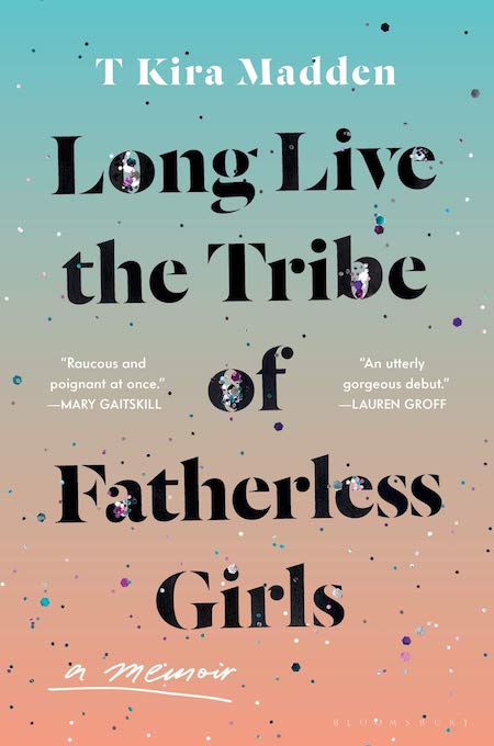 T Kira Madden, Long Live the Tribe of Fatherless Girls, Bloomsbury; design by Tree Abraham (March 5, 2019)
Let me tell you: in real life, it glitters. Read more about Abraham’s process designing the cover here.
 Mitchell S. Jackson, Survival Math: Notes on an All-American Family, Scribner; design by Lauren Peters-Collaer, jacket photographs of Jackson’s family members taken by the author (March 5, 2019)
These are all members of Jackson’s family—the effect is quite moving. And it makes me want to hear their stories.
 Victoria Shorr, Midnight, W. W. Norton & Company; design by Sarahmay Wilkinson (March 12, 2019)
I love the suggestion of the moon made by the D in this dissected “midnight,” and the fact that this cover has been constructed completely out of shades of blue.
 Suzannah Lessard, The Absent Hand: Reimagining our American Landscape, Counterpoint; design by Jenny Carrow (March 12, 2019)
Wow, do I love this cover—the ripped-off stack of photos (roll of photos?) that becomes a landscape is just gorgeous.
 Takis Würger, tr. Charlotte Collin, The Club, Grove Press; design by Daniel Rembert (March 12, 2019)
I’ve seen covers like this before—the headless torso, the handwriting—but there’s something about the diffuse light at the edges and the soft colors that make it more intriguing than most.
 Simon Garfield, In Miniature: How Small Things Illuminate the World, Atria; design by Peter Adlington (March 12, 2019)
You can’t quite tell from the image, but only the bottom half (the matchbook part) of this trompe-d’oeil jacket is the slipcover—the matches are on the book itself (and are revealed in full when you slide back the slipcover. It is glorious.
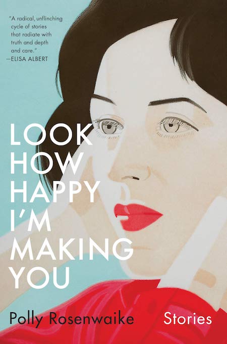 Polly Rosenwaike, Look How Happy I’m Making You, Doubleday; design by Emily Mahon (March 19, 2019)
I love the weird, doll-like treatment of the figure on this cover—those lashes—and, yet again, the colors.
 Bryan Washington, Lot, Riverhead; design by Alex Merto (March 19, 2019)
The best part of this cover is the way the rainbow spray coming from the fire hydrant is tagging the title, just the tiniest bit.
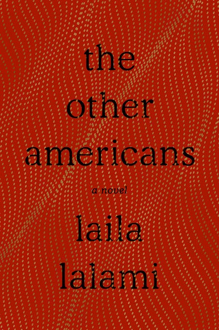 Laila Lalami, The Other Americans, Pantheon; design by Janet Hansen (March 26, 2019)
A luxurious, textural design; the book almost looks like fine cloth, except when you stop to examine the way the text treatment interacts with the strings of gold.
 Leanne Shapton, Guest Book, Riverhead; cover art: drawing of iceberg by Titanic survivor George Rheims, presented in his deposition in Titanic liability hearings, November 14, 1913; design by Leanne Shapton, Teddy Blanks, and Helen Yentus (March 26, 2019)
You really have to see this book in person to appreciate it: the phrase “ghost stories” is recessed into the hardcover book, and the colors are richer than they look here. In any case, it’s wonderful.
 Brad Leithauser, The Promise of Elsewhere, Knopf; design by Jenny Carrow (March 26, 2019)
This one isn’t necessarily beautiful—it looks a little bit odd, the collage jarring—but I suppose that’s why it caught my eye. It’s not afraid to be weird.
 Yuval Taylor, Zora and Langston: A Story of Friendship and Betrayal, W. W. Norton; design by Steve Attardo, art by Juan Fuentes (March 26, 2019)
A striking woodcut effect and bold colorways make this one pop off the shelf.
 Édouard Louis, tr. Lorin Stein, Who Killed My Father, New Directions; design by Erik Rieselbach, photo by Arne Svenson (March 26, 2019)
A perfect marriage of image and text, this cover creates a mood.
 Halle Butler, The New Me, Penguin Books; design by Rachel Willey, image: Breck Girls Collection, Archives Center, National Museum of American History, Smithsonian Institution (March 5, 2019)
I might still love this cover if it were just the slightly blurry colored pencil image of the girl’s head quadrant—I love a dislocated eye on a book cover—but in addition to all that, there’s the fly.
Emily Temple
Emily Temple is the managing editor at Lit Hub. Her first novel, The Lightness, was published by William Morrow/HarperCollins in June 2020. You can buy it here.


