The 16 Best Book Covers of May
Wet, Wild, & Weird
Another month of books, another month of book covers. This month, I found a lot to celebrate in the world of cover art: the brilliantly simple and the brilliantly baroque, the ducks (er, parrots) and the swans, the funny and the clever, the totally dry and the . . . not totally dry. (This form has really run its course, huh?) All perfect for toting along with you into the newly opening world, or for feathering your nest a little longer, if that’s your thing. Here are my favorite book covers of May—and as always, feel free to nominate any great ones I’ve missed in the comments.
 Michael Palmer, Little Elegies for Sister Satan, cover art by Sarah Palmer; New Directions (May 4)
Listen, anything this weird is going to make the list, every time. This looks like the beginning of an artist’s conspiracy board, and I want to find out who the murderer is.
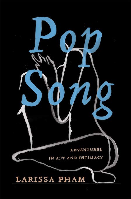 Larissa Pham, Pop Song: Adventures in Art & Intimacy, cover design by Nicole Caputo; Catapult (May 4)
The evocative flexibility of this line does so much work here, managing to be both figurative and abstract, depending on how and when you’re looking—and the hand-painted lettering doesn’t hurt either.
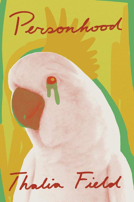 Thalia Field, Personhood, cover design by Joan Wong; New Directions (May 4)
An undeniably charming—and deceptively complicated—cover. The green tears! (I should say that this other cover—an alternate? digital? UK? I can’t tell—is also incredible, and even weirder, and possibly even better.)
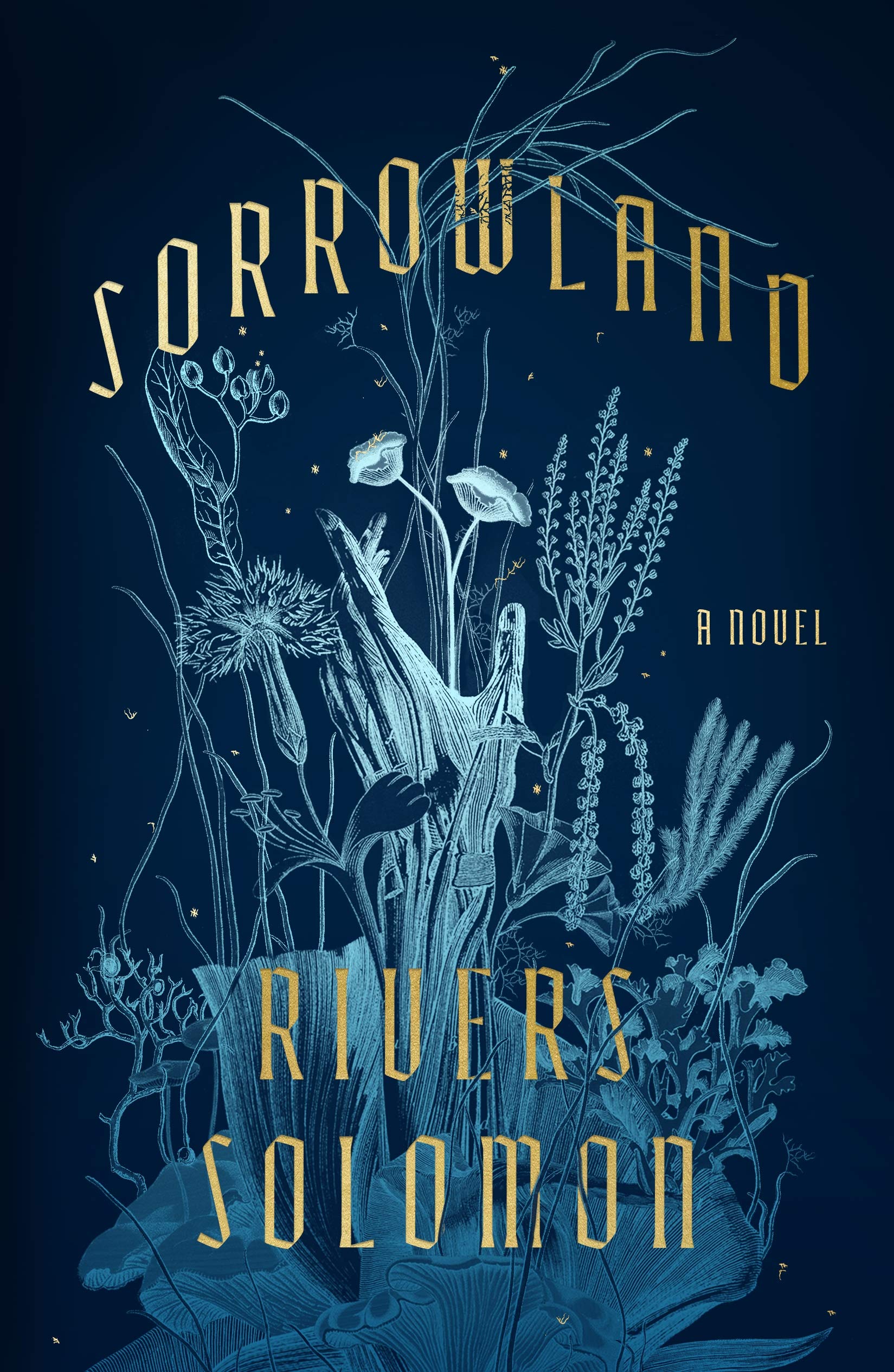 Rivers Solomon, Sorrowland, cover design by Na Kim; MCD (May 4)
Does anyone else remember those blue SunPrint papers? If you were a child of the 80s, you may have used them to create some Cool Nature Designs. This is a much spookier (and perfectly gold-flecked) version of that—it takes a while to see the hand, but once you do, you can’t unsee it.
 Michael Lewis, The Premonition, cover design by Steve Attardo; Norton (May 4)
Brilliant (and terrifying) in its simplicity.
 Jean Hanff Korelitz, The Plot, cover design by Anne Twomey; Celadon Books (May 11)
I’m always here for a book on a book.
 Virginie Despentes, tr. Frank Wynne, Vernon Subutex 3, cover design by Alex Merto; FSG Originals (May 11)
The third in the series, all playfully and colorfully designed by Merto.
 Rachel Eisendrath, Gallery of Clouds, cover design by Katy Homans; New York Review of Books (May 11)
There’s nothing particularly revolutionary about this cover—it’s simply beautiful. Nothing wrong with that.
 Gloria Naylor, The Women of Brewster Place, cover design by Paul Buckley; Penguin (May 11)
A great typographic cover is always the hardest to pull off—but I’m loving the colors and 70s vibe (not to mention the rotated text treatment) of this Gloria Naylor reissue, redesigned by Paul Buckley as part of the Penguin Vitae series.
 Lina Meruane, tr. Megan McDowell, Nervous System, cover design by Kimberly Glyder; Graywolf Press (May 18)
The white dots are not only a clever solution for putting a bunch of text on a not-entirely-black cover, they also wind up feeling like close-ups of stars. Very smart, and not hard to look at either.
 Alex McElroy, The Atmospherians, cover design by Laywan Kwan; Atria (May 18)
This cover would have been brilliant if it were just an Instagram dupe—but the trompe-l’oeil water droplets elevate it past even that. It’s so fun; and like the best book covers, it would have made me want to pick up the book even if I had no idea what it was about. Just to see, you know?
 Sam Riviere, Dead Souls, cover design by Na Kim; Catapult (May 18)
Apologies, I am simply a sucker for old images repurposed for insane modern book covers, especially when they’re this funny. The pink! The faces! The clashing red weapons. All of it should be too stark on this plain field, but somehow it works.
 Jacqueline Rose, On Violence on Violence Against Women, cover design by Rachel Willey; FSG (May 18)
Simple and evocative: an argument for editing if I’ve ever seen one.
 Barrett Swanson, Lost in Summerland, cover design by Alison Forner; Counterpoint (May 18)
Maybe these big serif fonts are coming back—I am for it, if so. I always think they add a touch of class and distinction to a book cover. But of course, the real brilliance here is that cracked blue sky—it’s surprising and visually appealing at the same time. Plus, I don’t think I’ve ever seen it done quite this way, which is saying something.
 Ailsa McFarlane, Highway Blue, Hogarth (May 18)
A book cover so cool I want to be friends with it. (Also: feeling Flamethrowers vibes here, which is never a bad thing in my book.)
 Samantha Silva, Love and Fury, Flatiron (May 25)
I love the combination of old-world image and sharp, contemporary blocking here; the frame within a frame is elegant and perfect.
Emily Temple
Emily Temple is the managing editor at Lit Hub. Her first novel, The Lightness, was published by William Morrow/HarperCollins in June 2020. You can buy it here.


