The 16 Best Book Covers of February
To Beat Back the Winter Doldrums
Okay winter. We get it. You’re cold. You’re wet. You’re still around. Can we just pump the brakes a little here? Peep a daffodil or two? It’s almost March, you know. Sigh. Well, in the meantime, to remind you that not all is black and white and gray and slushy, here is a selection of the month’s best book covers, from the bold to the odd to the beautiful. (This first pick alone could double as a light therapy box.)
 Amy Bonnaffons, The Regrets; design by Julianna Lee, illustration by Mio Im (Little, Brown, February 4)
I love everything about this cover: the unusual serif font, the arresting marigold color, the black and white illustration, the fact that the ghost has shoes and a sheet on but no legs, which begs the question, why the sheet at all, never mind the shoes. It kind of looks like a handmade poster for the coolest indie rock band you’ve never heard of, and I am here for it.
 Stefan Hertmans, tr. David McKay, The Convert; design by Jenny Carrow, image by Hans Memling (Pantheon, February 4)
The sheer scale of the face on this cover is striking; the impact is intensified by the visible cracks that mark it as centuries old. I also think the placement of the type is quite good, almost like a tear running down the woman’s face, and at the very least unexpected in a field where so many covers center their titles and author names. But the real perplexing genius is in the strip of photographed sky and landscape to the left—visually, it breaks up what might have been an overwhelming face and a 15th-century feel, and creates a sense of intrigue and interest in the simplest possible way. Masterful.
 Michael Zapata, The Lost Book of Adana Moreau; design by John Gall (Hanover Square, February 4)
There’s that yellow again (or almost). But more importantly, it’s a book cover on a book cover: my favorite.
 Riku Onda, tr. Alison Watts, The Aosawa Murders; design by Eleanor Rose (Bitter Lemon Press, February 9)
I love the cheekiness of this cover—the sly repetition of the pattern on dress and background, the pink of the flower held behind the back, the fact that the woman’s hair contains multitudes, or at least the entirety of the book’s title and the author’s name. Also, not for nothing: it looks like spring, for which, as you may have been able to tell from the introduction to this article, I am quite impatient.
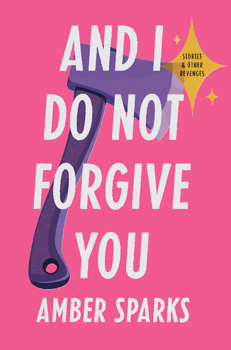 Amber Sparks, And I Do Not Forgive You; design by Zoe Norvell, art direction by Steve Attardo (Norton, February 11)
Simple but eye-catching, and with a sense of humor—this book makes me smile. After all, a purple hatchet? The sparkling “Stories & Other Revenges”? That aggressive hot pink? You just know there’s going to be good stuff inside.
 Jenny Offill, Weather; design by John Gall (Knopf, February 11)
I love a good collage, especially when it was made by John Gall, one of the best book designers in the business. This cover in particular is a stellar match for Offill’s fragmented, hyper-intelligent work of climate change anxiety and human relationships. The only way in which the cover isn’t representative of the novel is in its chill, relaxing color-way. It’s more about the clouds in the middle.
 Amina Cain, Indelicacy; design by June Park (FSG, February 11)
The use of the faux exhibition card here—especially for a novel like this—is actually brilliant.
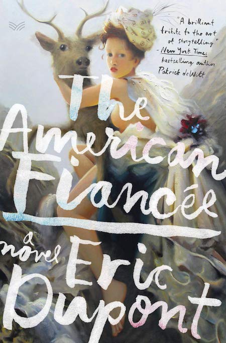 Eric Dupont, The American Fiancée; design by Stephen Brayda, art by Kai McCall (HarperVia, February 11)
There’s something so lush and over-the-top about the combination of soft-touch painting and exuberant text treatment here. The book looks like an elaborate, enormous confection that I want to eat—until I get to the eyes of the woman and the stag, which add a little bit of creepiness to all the fluffy beauty. I’m not saying I won’t eat it anyway, I’m just saying I might shake it a little first to make sure there’s nothing unexpected inside.
 Peter Kispert, I Know You Know Who I Am; design by John Gall (Penguin Books, February 11)
I love covers in which the type becomes the image; this is a fantastic example of a book cover that might have been simple and straightforward, but which takes risks instead. The result is elegant and absurdist at the same time.
 Major Jackson, The Absurd Man; design by Sarahmay Wilkinson (Norton, February 11)
Speaking of absurdist: here’s another stunner of a collage cover, this one with an entirely different, though just as successful, approach. The pink and yellow are perfect against the grayscale, and the whole thing makes me smile—and makes me want to investigate the poems that inspired this visual madness.
 Patrick Boucheron, Machiavelli; design by Oliver Munday (Other Press, February 11)
Trust Oliver Munday to bring us this irreverent take on the traditional historical biography cover. The horns are particularly good.
 Julian Barnes, The Man in the Red Coat; design by John Gall, cover image by John Singer Sargent (Knopf, February 18)
Here’s another cover that plays with centuries-old art, putting an irreverent modern spin on it for a book cover. Who is this headless, dainty-fingered man in the red coat? A ghost? A demon? You’ll have to read to find out (though spoiler alert it’s Samuel Pozzi).
 Anna Burns, Little Constructions; design by Kapo Ng (Graywolf, February 18)
This actually isn’t the type of cover I usually like—it’s a bit on the pulpy side—but the more I look at it, the more I want to look at it. The way the images are laid together is so odd and ingenious, each cutout its own island, but the three coming together to create a story against that red background (of blood?). It kind of makes my eyes cross, but I love it anyway.
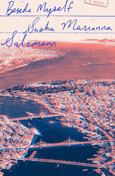 Sasha Marianna Salzmann, tr. Imogen Taylor, Beside Myself; design by Oliver Munday (Other Press, February 18)
This book cover looks like an exercise in dissonance to me: the exact kind of dissonance you feel when you’re at loose ends in a strange city, as Ali is in this novel. And again, I love the text treatment, which instantly evokes a kind of nostalgic European traveling sensibility (now somewhat eclipsed by those machines at customs—at least in some places).
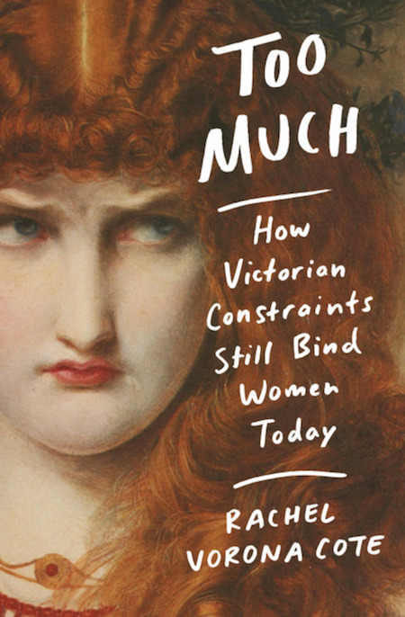 Rachel Vorona Cote, Too Much; design by Jenny Carrow, painting by Anthony Frederick Sandys (Grand Central, February 25)
A face to which we can all relate. This is a great cover, but I admit it’s mostly on the list because of the degree to which it reminds me of Daniel Mallory Ortberg’s now-defunct but forever-brilliant Western Art History series.
 Jean Rhys, After Leaving Mr. Mackenzie; design by Kelly Winton, art direction by Steve Attardo (Norton, February 25)
Aside from the gorgeous silvery photograph, the sense of perspective in this cover is striking—and a little menacing. The fact that you almost miss the observer (or at least I did, so fast did my eyes zip to the black x of the woman’s dress) only adds to the cover’s success.
Emily Temple
Emily Temple is the managing editor at Lit Hub. Her first novel, The Lightness, was published by William Morrow/HarperCollins in June 2020. You can buy it here.


