The 16 Best Book Covers of February
Yellow is Having a Moment. Also Black (But When Isn't It?)
Another month of books, another month of book covers. I once heard someone say that you should never make any decisions after two in the morning, or in February. This is only to say that it’s a particularly difficult month, and so it’s not surprising to me that this year, many of its best book covers are either bright, cheery yellow (fighting the feeling) or dramatic, busy black (giving into it). Whichever coping mechanism speaks to you, there were plenty of great covers this month; some of my favorites are below.
 Jessica Chiccehitto Hindman, Sounds Like Titanic, W. W. Norton & Company; design by Richard Lejoenes (February 12, 2019)
Any book cover that looks like it’s just been captioned by Daniel Mallory Ortberg is a success in my eyes. (And the framing of this one is particularly good.)
 Rachel Ingalls, Binstead’s Safari, New Directions; design by Erik Carter (February 26, 2019)
I love the color combination here, and the fact that you get almost every part of the lion—except its face.
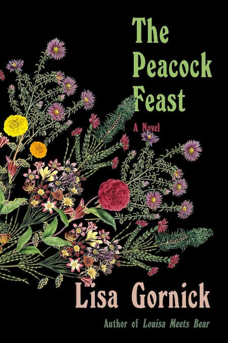 Lisa Gornick, The Peacock Feast, FSG; design by Na Kim (February 5, 2019)
A black floral is always in fashion. But what’s compelling about this book cover is how un-bookish it looks. It almost looks outdated, which ironically separates it from the hyper-slick pack and doubles its impact.
 Christie Aschwanden, Good to Go: What the Athlete in All of Us Can Learn from the Strange Science of Recovery, W. W. Norton & Company; design by Steve Attardo (February 5, 2019)
A striking image that conjures speed despite its static nature.
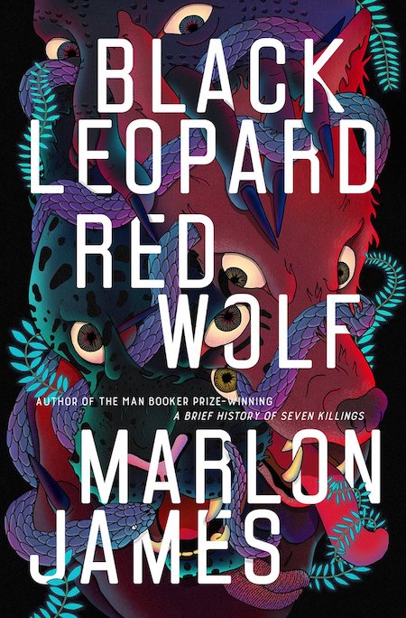 Marlon James, Black Leopard, Red Wolf, Riverhead Books; cover illustration by Pablo Gerardo Camacho (February 5, 2019)
The belle of the design ball this month, bar none, thanks to the hallucinogenic art by Venezuelan artist Pablo Gerardo Camacho.
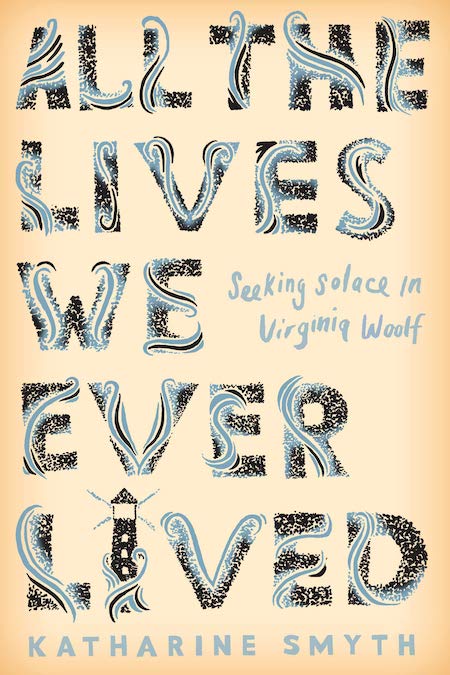 Katharine Smyth, All the Lives We Ever Lived: Seeking Solace in Virginia Woolf, Crown; design by Michael Morris (February 29, 2019)
Any reference to classic Virginia Woolf covers is sure to catch my eye.
 Andrea Bartz, The Lost Night, Crown; design by Elena Giavaldi (February 26, 2019)
With this text treatment, Giavaldi has managed to evoke that bleary-eyed, too-drunk-in-a-city feeling remarkably well. Even before knowing anything else about the book, it immediately makes me ask: what happened?
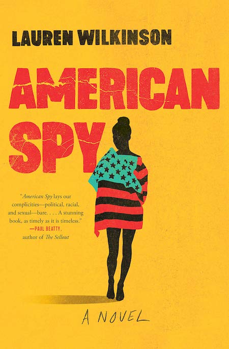 Lauren Wilkinson, American Spy, Random House; design by Caroline Teagle Johnson, based on an image © Hayden Verry/plainpicture (February 12, 2019)
There’s that yellow again, this time in a warmer tone, and textured for visual interest and suggestions of destruction.
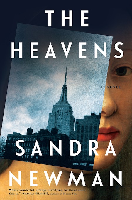 Sandra Newman, The Heavens, Grove Press; design by Gretchen Mergenthaler (February 12, 2019)
I can personally attest that I snapped up this book wholly on the basis of its cover—and then I read it and loved it. The collage aspect is gorgeous, and perfect for the novel at hand, about a woman in a more-or-less contemporary New York City who dreams of the past, and that ghostly eye peeking through the otherwise opaque overlay is just genius.
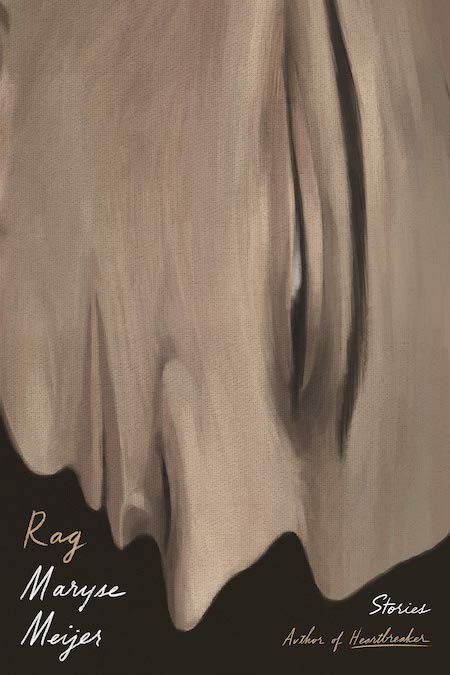 Maryse Meijer, Rag, FSG Originals; design by Na Kim (February 12, 2019)
Another creepy-but-compulsory cover that makes me want to find out just what, exactly, might be inside.
 David Wallace-Wells, The Uninhabitable Earth, Tim Duggan Books; design by Richard Green (February 19, 2019)
It’s simple, it’s evocative, it’s terrifying.
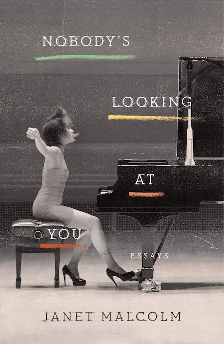 Janet Malcolm, Nobody’s Looking At You, FSG; design by Adalis Martinez (February 19, 2019)
Starting with such a striking image helps, of course, but I also love the colored underlining and the weathering of the text. It feels both confrontational and voyeuristic at the same time.
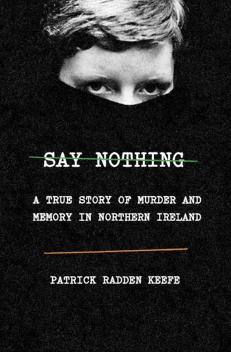 Patrick Radden Keefe, Say Nothing, Doubleday; Oliver Munday (February 26, 2019)
Clearly, that text treatment with colored lines on black is in! It works just as well here, and to somewhat different effect against that dramatic image.
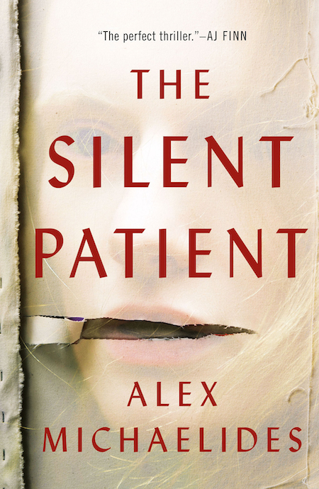 Alex Michaelides, The Silent Patient, Celadon Books; design by Anne Twomey (February 5, 2019)
I actually really hate this cover, which is why it’s so good: it’s deeply affecting and creepy. “This particular photo of a woman, which came with my third round of photo research, really caught my eye,” Anne Twomey said in an interview about the design process behind the cover.
It was a little haunting and seemed to really capture the protagonist. With a little Photoshop magic, I was able to ghost her back on the canvas as a secondary or tertiary read. When I thought I had the right placement of the rip over the mouth, I took a pause. I had a few doubts — one being that it was a light cover, which is not always embraced by the sales team for a thriller. Fortunately, our publisher, Jamie Raab, said, “I’m not concerned about a light thriller cover. We’ve had successes with light thriller covers it the past.”
From where I’m sitting, it does the job and then some.
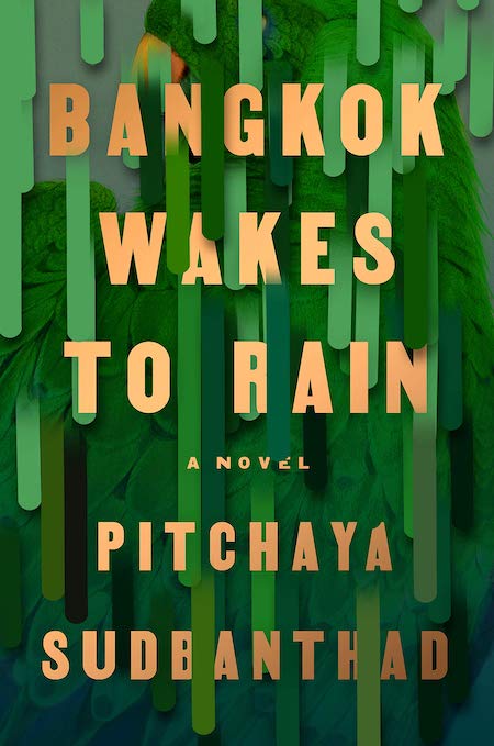 Pitchaya Sudbanthad, Bangkok Wakes to Rain, Riverhead; design by Grace Han (February 19, 2019)
The best thing about this cover is the sense of depth and physicality, which makes me want to reach out and touch this book—even though I know it will be flat. The green and gold combination is a winner too.
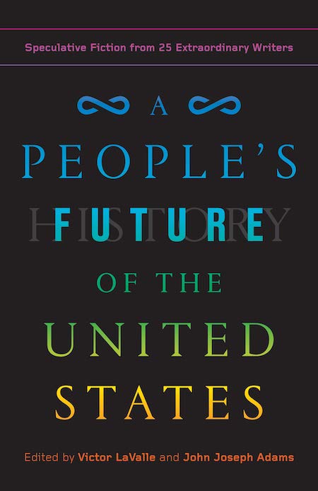 Victor LaValle, and John Joseph Adams eds., A People’s Future of the United States: Speculative Fiction from 25 Extraordinary Writers, One World; design by Anna Kochman and Greg Mollica (February 5, 2019)
I love this cheeky take on the classic Howard Zinn cover—you know, the one we all had to stare at mournfully for hours in high school. Here, the designers turn the staid American red, white, and blue to the rainbow it really should be.
Emily Temple
Emily Temple is the managing editor at Lit Hub. Her first novel, The Lightness, was published by William Morrow/HarperCollins in June 2020. You can buy it here.