The 16 Best Book Covers of April
All The Trompe L'oeil You Can Handle
Another month of books, another month of book covers. In this edition, you’ll find some great colors (as usual), some great collages (also as usual) primarily featuring vintage-style men (maybe less usual), and lots of trompe l’oeil, because trompe l’oeil is the best. We have bold covers and subdued ones, fiction, nonfiction, and poetry, funny art and serious art—basically, everything you could hope for in a month of book art. So choose your favorite and settle onto a park bench as the birds sing around you and the sun beams down and the landscape switches into a hallucination. What? Oh, you’ll see.
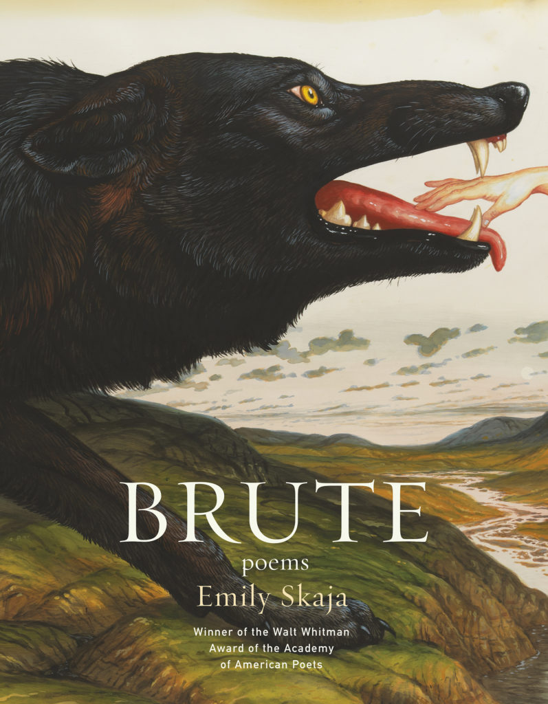 Emily Skaja, Brute, Graywolf; design by Mary Austin Speaker, art: Walton Ford, Gleipnir (April 2, 2019)
“Wolf-girls simply alarm,” Kate Bernheimer once wrote. And so does this cover, in the best of ways. The scale is perfect. Ford’s art is so lush as to appear touchable, its colors expertly calibrated (the eye!), and the way the hand reaches in from oblivion—I love every bit of its violent fairy-tale majesty. The only thing more riveting than the cover is the poetry inside.
 Eugene Burdick, William J. Lederer, The Ugly American, W. W. Norton; design by Jake Nicolella (April 2, 2019)
I love a good collage on a book cover, and this one is particularly striking—not least because of that black bar, which does not strike out the subject’s eyes, as is customary, but rather his mouth. It’s a slight twist on a familiar tactic whose meaning is instantly comprehendible: shut up, loud Americans!!!
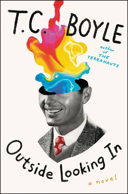 T. C Boyle, Outside Looking In, Ecco; design by Jim Tierney (April 2, 2019)
Here’s another collage (of sorts), and another use of a smiling man who may or may not have ben cut out of a 1950s advertisement—but in this case, instead of having his mouth blacked out, he has the top half of his head cut off, with something much more colorful than his face . . . spilling out? floating up? emerging? In any case, it’s a book cover that makes me want to find out more about the book.
 Chris Rush, The Light Years, FSG; design by Alex Merto (April 2, 2019)
A stunning trompe l’oeil that rips through a fairly conventional cover—a nice desert scene at the edge of sunset—to reveal the acid-soaked, psychedelic alternative (or truth) beneath.
 Jane Alison, Meander, Spiral, Explode, Catapult; design by Sarahmay Wilkinson (April 2, 2019)
Another trompe l’oeil cover, but to much subtler effect—this textured, mosaic-like treatment is perfect for Alison’s brilliant book about alternative patterns in narrative. I especially appreciate the gradation of color from top to bottom, and the restraint shown by the text, which lets the patterning of the cover speak for itself.
 Ann Beattie, A Wonderful Stroke of Luck, Viking; design by Kaitlin Kall (April 2, 2019)
Sorry not sorry for this third trompe l’oeil in a row. This one is the funniest of the three, with the cover approximating the bottom right corner of a baroque, framed painting of stylized animals, onto which three notes have been (ouch) taped, each one in a different style—and each perhaps with a different author, considering handwriting and paper choices—and each augmenting the one that came before.
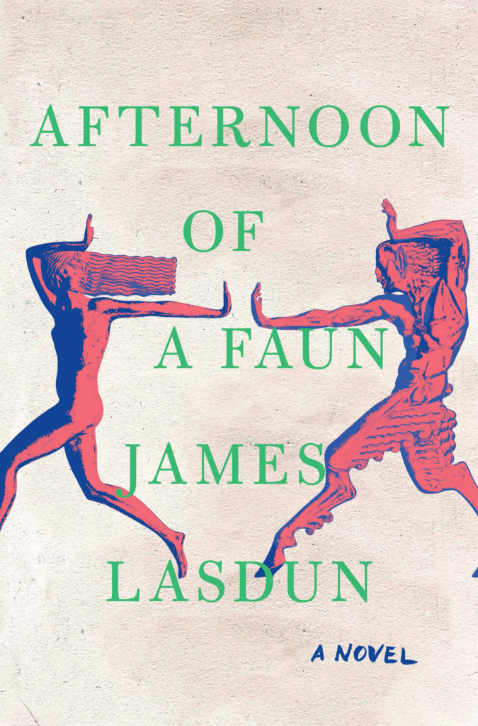 James Lasdun, Afternoon of a Faun, W. W. Norton; design by Jaya Miceli, art direction by Ingsu Liu (April 9, 2019)
It’s all about the colors here—that green particularly, but really how the three work together—and a little bit about the ancient iconography. Okay, and a little bit about that swift brushed “a novel” at the bottom. Chef’s kiss emoji.
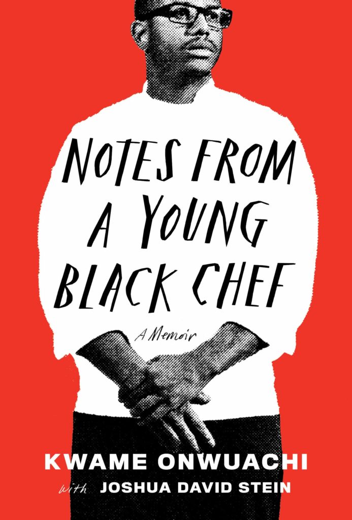 Kwame Onwuachi with Joshua David Stein, Notes from a Young Black Chef, Knopf; design by Stephanie Ross; photograph by Matt McClain (April 9, 2019)
This is a portrait cover—these are usually boring, the visual equivalent of talking heads, but this one manages to look appealingly graphic and almost collage-like.
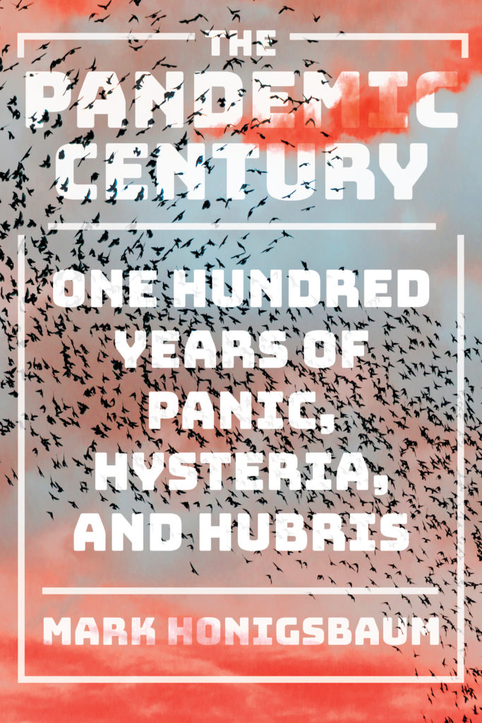 Mark Honigsbaum, The Pandemic Century: One Hundred Years of Panic, Hysteria, and Hubris, W. W. Norton; design by Sarahmay Wilkinson (April 9, 2019)
Great, terrifying colors here, and the spiky swarm—birds? bats? something more sinister?—makes a great textural counterpoint with the noxious-looking but soft clouds. I also appreciate the way the title of the book is semi-obscured by the aforementioned textures, while the subtitle isn’t—I wonder if that choice only revealed itself in the drafting.
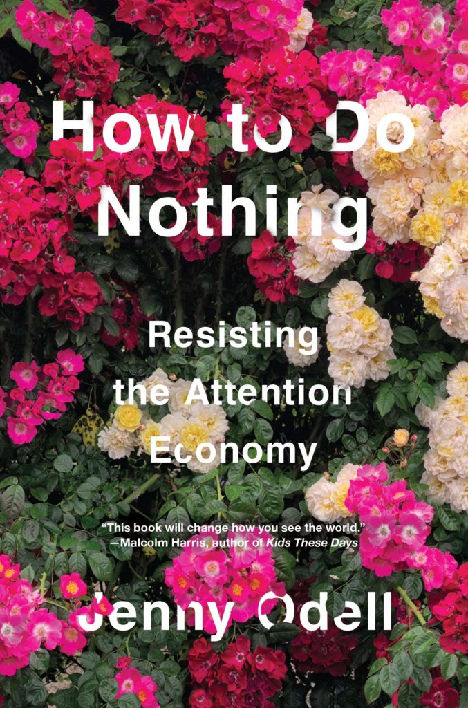 Jenny Odell, How to Do Nothing, Melville House; design by Marina Drukman (April 9, 2019)
Listen: you can’t beat a dark floral for style. The texture of this cover sings, and the way the text treatment is incorporated makes me want to touch it (and sign offline so I can read for a while).
 Nathaniel Rich, Losing Earth: A Recent History, MCD; design by Rodrigo Corral (April 9, 2019)
Simple, elegant, and almost certainly organized to tug at my heartstrings by recalling the Whole Earth Catalog. (RIP)
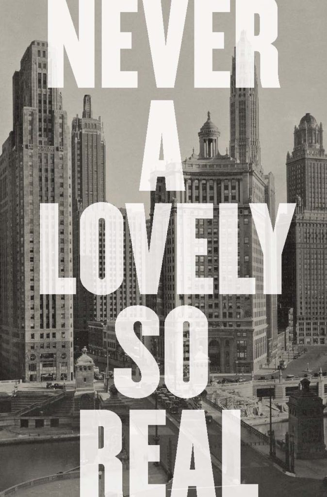 Colin Asher, Never a Lovely So Real, W. W. Norton; design by Jonathan Bush, art direction by Steve Attardo (April 15, 2019)
Here’s a bold move: not to include the author’s name, nor the explanatory subtitle (“The Life and Work of Nelson Algren”) on the front cover. The result is a gorgeous, graphic piece of contemporary art.
 Anne Harrington, Mind Fixers, W. W. Norton; design by Matt Dorfman, art direction by Sarahmay Wilkinson (April 15, 2019)
Everything is going along fine. Everything is normal, orderly, clean. The threads are even. And then suddenly: a snag. One snag disrupts the pattern, ripples outward, the threads waver, and twist, and suddenly nothing is normal, or orderly, or fine anymore. Brilliant.
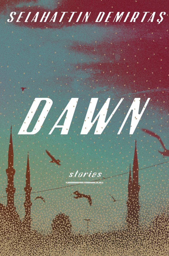 Selahattin Demirtas, Dawn, SJP; design by Christopher Brand (April 23, 2019)
IRL, those flakes collecting at the bottom of the book are a muted gilded gold, which gives this cover an eerie, magical feeling.
 Clarice Lispector, tr. Johnny Lorenz, The Besieged City, New Directions; design by Paul Sahre (April 30, 2019)
Another daring text treatment here—not because the title is bold, but because it isn’t. The title and author look nearly tacked on, throwaway, though of course they are not, subtly separated as they are, offset by the colored lights against the black and white portrait of Lispector.
 Yukio Mishima, tr. Sam Bett, Star, New Directions; design by Jamie Keenan (April 30, 2019)
I’ve seen broken glass book covers before, but I love the subtle mirroring (yes, yes, I see it) of the title in the shape of the wound here, as well as the fact that said title is itself partially obscured.
Emily Temple
Emily Temple is the managing editor at Lit Hub. Her first novel, The Lightness, was published by William Morrow/HarperCollins in June 2020. You can buy it here.