
The 15 Best Book Covers of June
It's Mustard Season
Another month of books, another month of book covers. We’re past the solstice, and appropriately enough many of these covers feel like summer, with vibrant, unexpected colors, bold gestures, a sense of heat, a sense of play. Enjoy, if possible, from the comfort of your air conditioning.
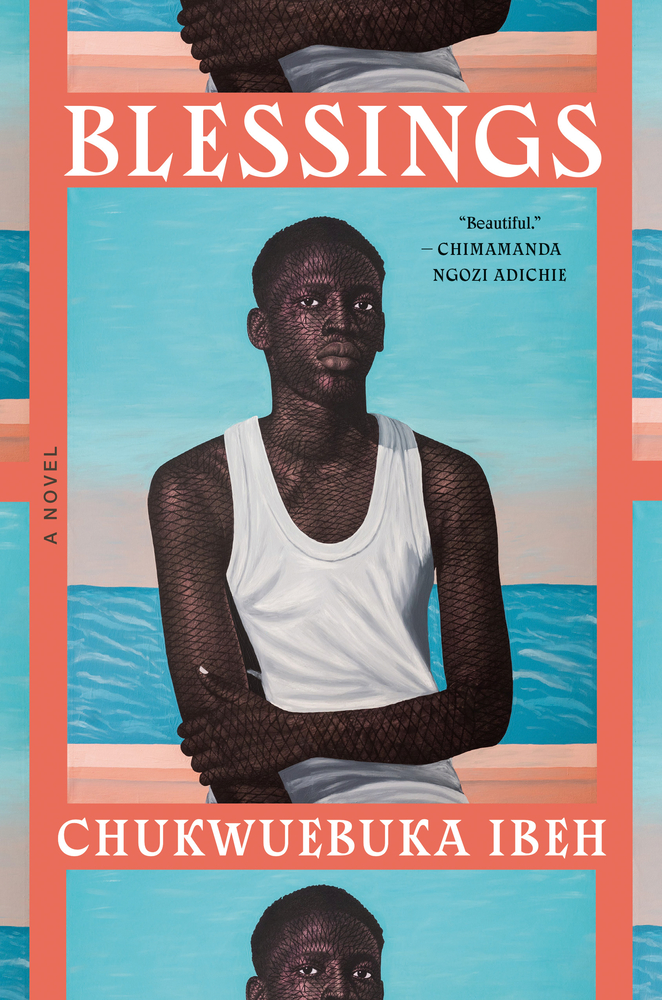 Chukwuebuka Ibeh, Blessings; cover design by John Fontana; artwork by Tosin Olusegun Kalejaye (Doubleday, June 4)
The gorgeous painting (and related color story) does plenty of work here, but the cover is made even more striking by the tiling/photo strip effect.
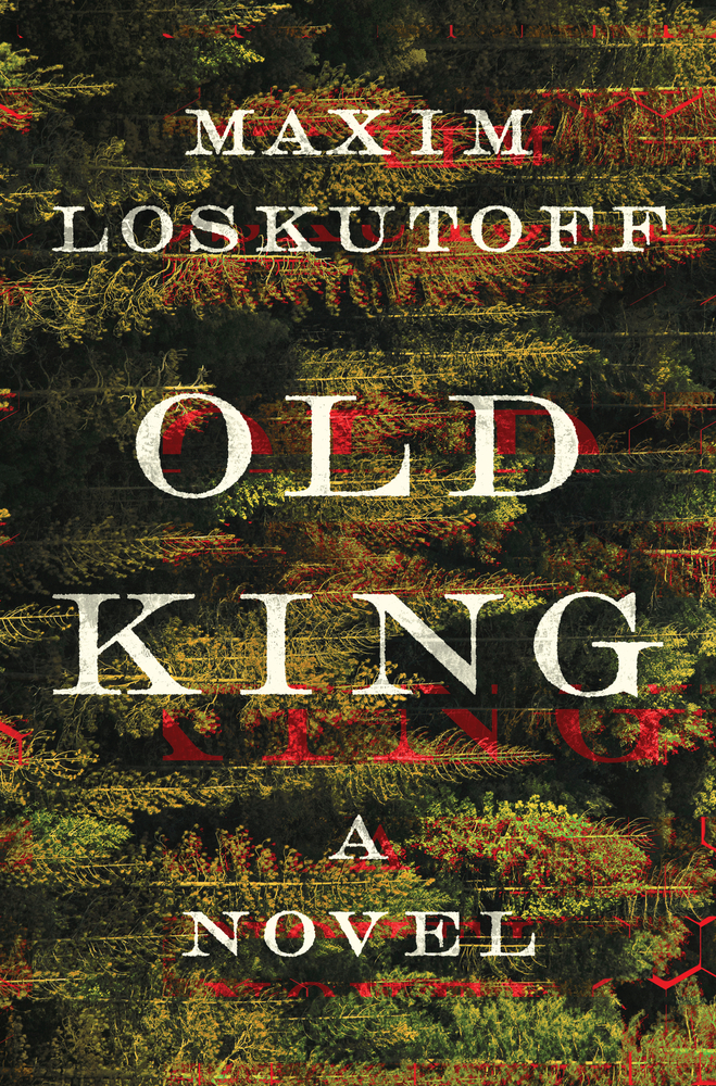 Maxim Loskutoff, Old King; cover design by Derek Thornton (Norton, June 4)
It’s difficult to mix the digital and the natural, the new and the old, in a way that feels cohesive and functional, but this cover does it very well—creating a sense of danger and uncertainty and drift.
 Conor Kerr, Prairie Edge; cover design by Kate Sinclair (University of Minnesota Press, June 4)
I like a good frame-within-a-frame, but more importantly, this is a cover that doesn’t really look like every other cover out there. It is cool and slick and slightly mysterious, and does the job of making the reader (at least this reader) want to pick up the book.
 Morgan Talty, Fire Exit; cover design by Beth Steidle (Tin House, June 4)
“Because Fire Exit is Morgan Talty’s debut novel, following his bestselling short story collection Night of the Living Rez, we wanted this cover to have a big literary look—bold and unmistakable, leaping off the shelf,” Steidle told Lit Hub. I think it’s fair to say it worked—and the flowers integrated into the flames is a nice touch.
 Porochista Khakpour, Tehrangeles; cover design by Philip Pascuzzo (Pantheon, June 11)
A big exuberant cover, that literally glitters? You simply have to love it, especially These Days. This is a book in part about excess, and the cover traffics in excess too, except that the balance is exactly right, in this case: not too much, and definitely not too little. Most importantly, I smile every time I look at it. That cat!
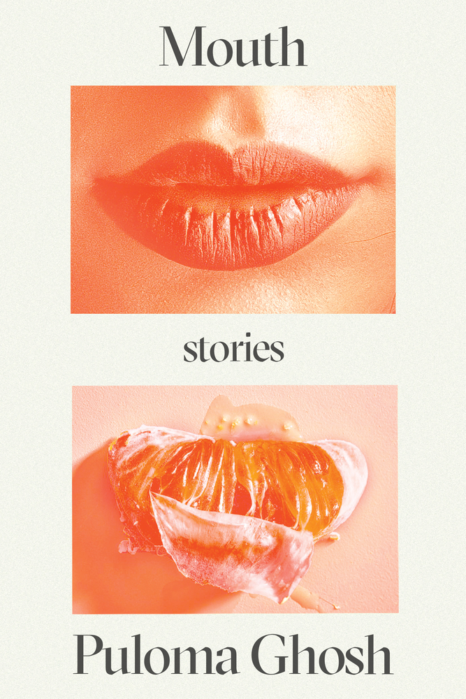 Puloma Ghosh, Mouth; cover design by Adriana Tonello (Astra House, June 11)
The power of juxtaposition—not to mention color, which is also doing a lot of work here. I am reminded of John Gall’s classic cover for Lolita, of course, but also, for some reason, the UK cover of Alissa Nutting’s Tampa. Though here, the suggestion is not just sexy, but also terrifying.
 Adam Ehrlich Sachs, Gretel and the Great War; cover design by Alex Merto (FSG Originals, June 11)
A cover that’s just as much fun as the book (that is: lots).
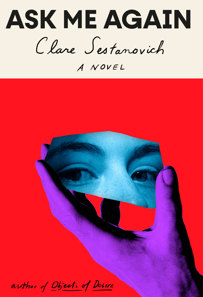 Clare Sestanovich, Ask Me Again; cover design by Janet Hansen (Knopf, June 11)
The intensity of the colors is almost shocking, in a good way. The weirdness of the collage doesn’t hurt either; this is a very cool cover.
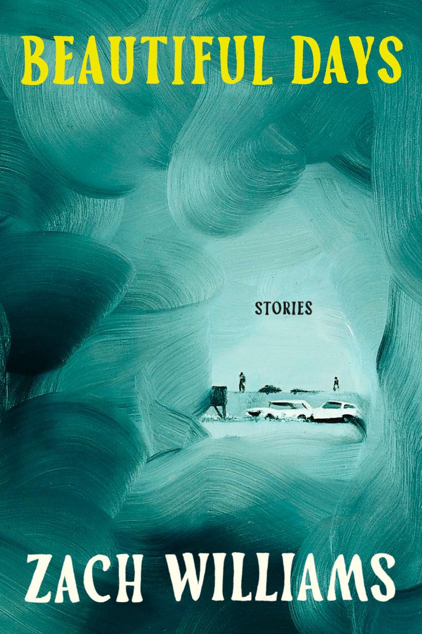 Zach Williams, Beautiful Days: Stories; cover design by Emily Mahon; artwork by Wilhelm Sasnal (Doubleday, June 11)
Brilliant crop and choice of art here—Sasnal’s swirling brushstrokes making way for the tiny, tonal, and ambiguous scene. The pop of yellow in the title does wonders too.
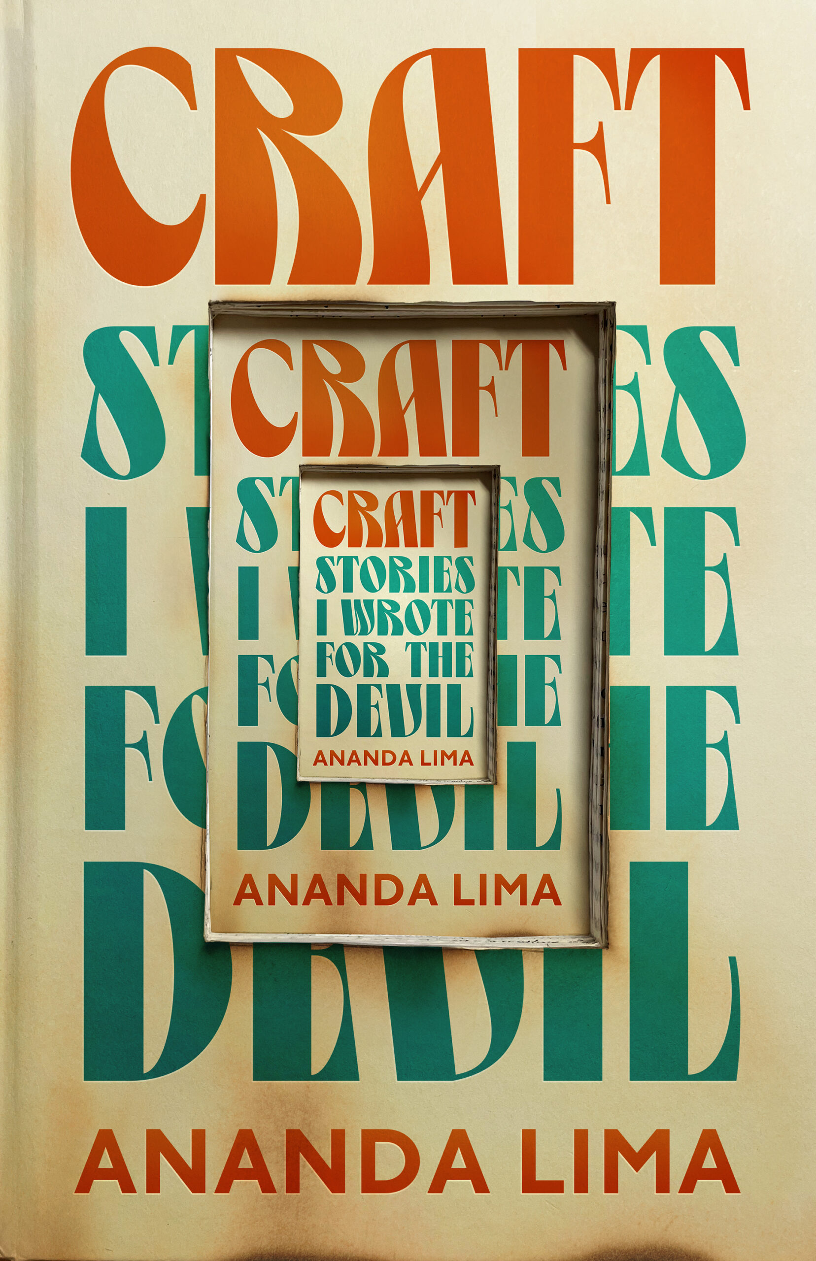 Ananda Lima, Craft: Stories I Wrote for the Devil; cover design by Jamie Stafford-Hill (Tor Books, June 18)
“The original seed for the cover came from the team’s desire to see something that captured the layered, meta-textual nature of the book, in which a writer writes about a writer writing stories about writers,” Stafford-Hill told Lit Hub. “I kept coming back to the idea of a book recursively nested within itself, which appealed to me for being both literal and surreal at the same time.” Again—it works. See some behind-the-scenes images of the cover’s creation here.
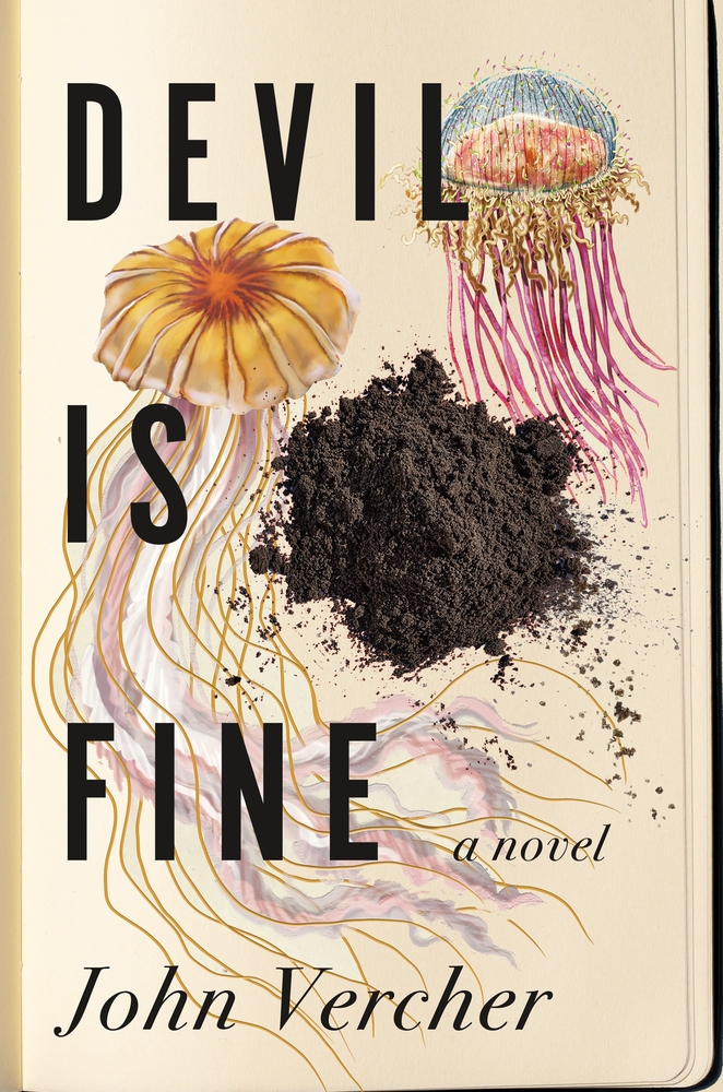 John Vercher, Devil Is Fine; cover design by Anne Twomey (Celadon Books, June 18)
It’s the pile of dirt for me!
 Joseph Earl Thomas, God Bless You, Otis Spunkmeyer; cover design and illustration by Dana Li (Grand Central Publishing, June 18)
I love to see book covers that could be works of fine art on their own; this is one. Its energy is undeniable, and then there’s that very specific acidic mustard color…
 Priyanka Mattoo, Bird Milk & Mosquito Bones: A Memoir; cover design by Linda Huang; illustration by Noémie Cédille (Knopf, June 18)
…which weirdly turns up in yet another of my favorite covers this month, albeit one with a completely different final effect.
 Matt Young, End of Active Service; cover design by Ben Denzer (Bloomsbury, June 18)
The last two covers on this list are also linked, not by color, but instead by rocks…
 Tracy O’Neill, Woman of Interest: A Memoir; cover design by Tree Abraham (HarperOne, June 25)
…and not just rocks, but also the strength of a disarming and weird photographic composition, not to mention a strong sense of humor, which in my view is the very best thing a cover can have.
Emily Temple
Emily Temple is the managing editor at Lit Hub. Her first novel, The Lightness, was published by William Morrow/HarperCollins in June 2020. You can buy it here.


