The 15 Best Book Covers
of February
So Many Covers, So Little Time
Another month of books, another month of book covers. February may be the shortest month, but it still has four Tuesdays, and all of them are blessed with some very exciting books—and some very exciting book covers to match. In fact, this installment of my list is slightly longer than usual, because look, short month or not, somehow it’s still February, and the pandemic has been going on for a year, and snow is everywhere, and we need this. So while you’re waiting for spring and your vaccine, might as well feast your eyes.
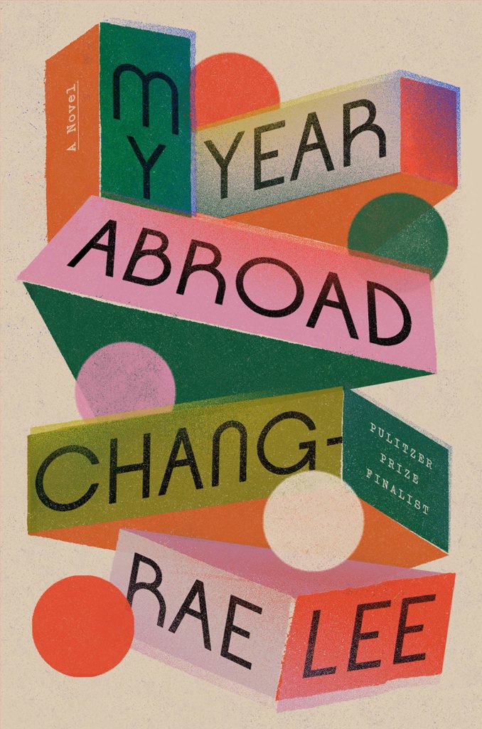 Chang-Rae Lee, My Year Abroad; cover design by Grace Han (Riverhead, February 2)
This is an update on the text-and-pattern covers that we have seen quite a bit over the last couple of years, but what really draws me in is its tactual appeal and layered stamping.
 Sarah Langan, Good Neighbors (Atria, February 2)
This cover made me look twice: at first glance it seems like a pretty standard suburban landscape, but then you see that the blue sky is a dripping paint job layered over the cookie cutter houses. It’s strangely menacing, which seems perfect for this book.
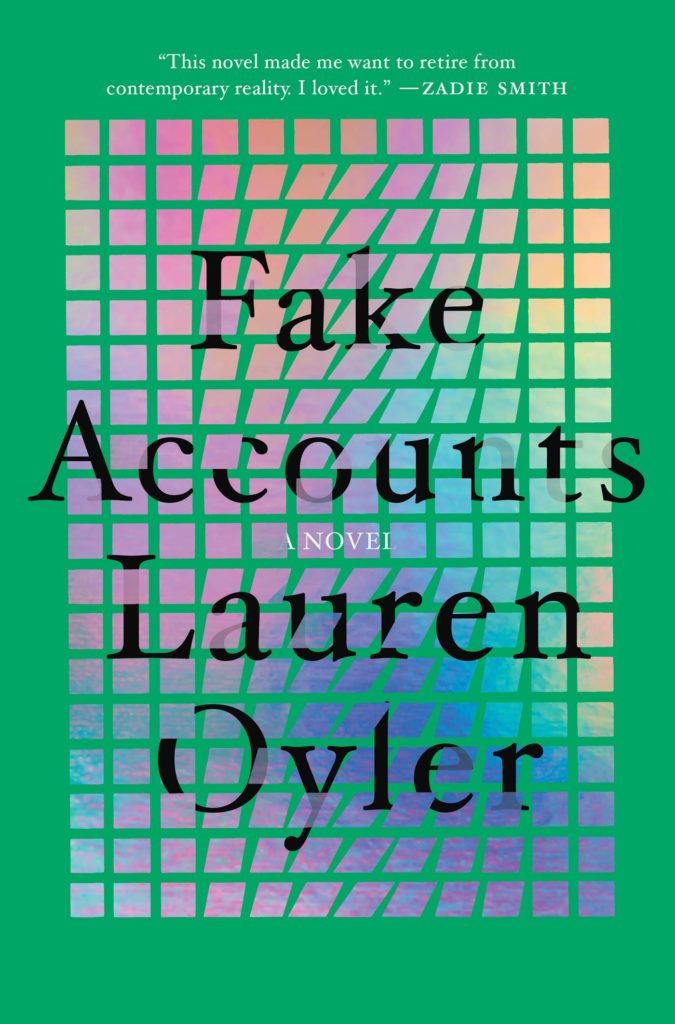 Lauren Oyler, Fake Accounts; cover design by Nicole Caputo (Catapult, February 2)
You really have to see it IRL to appreciate it fully, but I love both this slightly milky green and the militia of little rainbow screens that make up this cover.
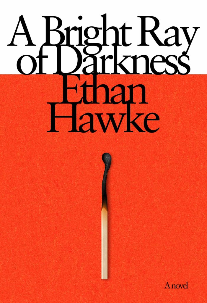 Ethan Hawke, A Bright Ray of Darkness; cover design by John Gall (Knopf, February 2)
What can I say, I love it: the simplicity, the subtle visual callback to a cigarette pack, the crowded type that approximates smoke from the burned out match, the tiny “A novel” in the corner. It is expertly balanced, tonally perfect, and just striking. I expect nothing less from John Gall!
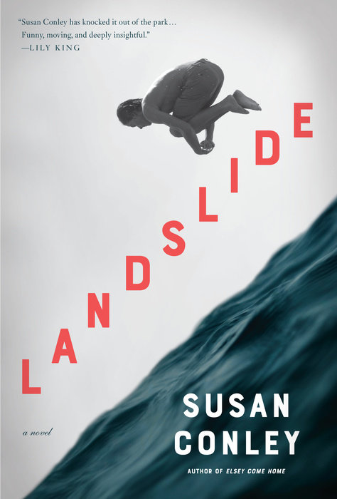 Susan Conley, Landslide; cover design by Kelly Blair (Knopf, February 2)
The sense of movement in this cover is almost dizzying. Is it going up or going down? Either way, I love it.
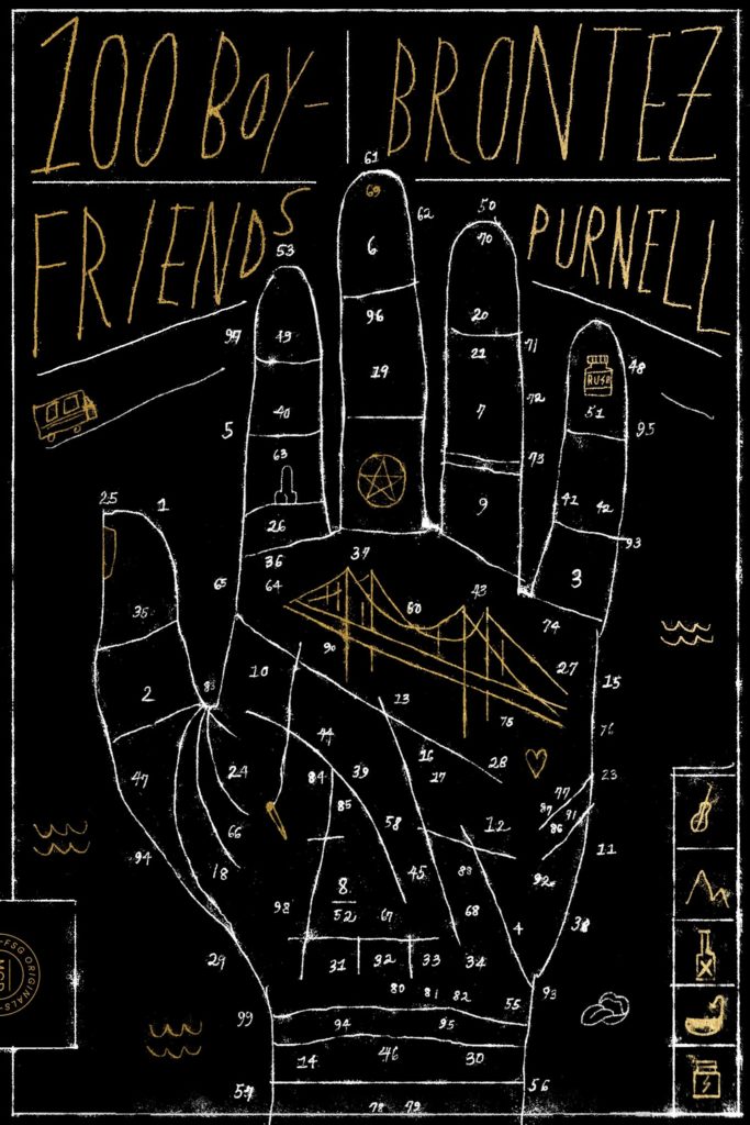 Brontez Purnell, 100 Boyfriends; cover design and art by Na Kim (MCD x FSG Originals, February 2)
It’s cool, it’s moody, it’s frantic, it’s mystical—it’s perfect for this book.
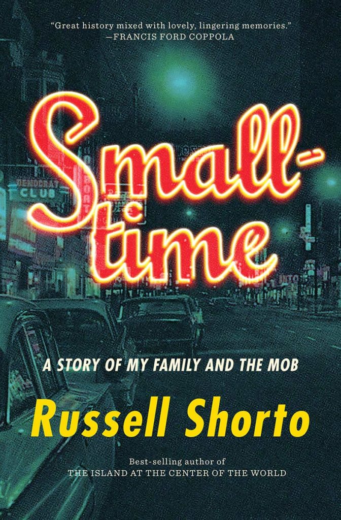 Russell Shorto, Smalltime; cover design by David Gee, art direction by Steve Attardo (W.W. Norton, February 2)
I’m a sucker for a neon effect.
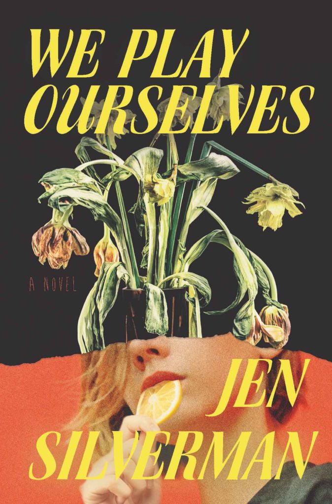 Jen Silverman, We Play Ourselves (Random House, February 9)
These half-face collage covers have been in vogue lately, and while I am clearly biased, I always love them. This one stands out for its 70s text treatment and color story—not to mention the odd combination of dead plants and . . . person biting a lemon slice? Color me intrigued.
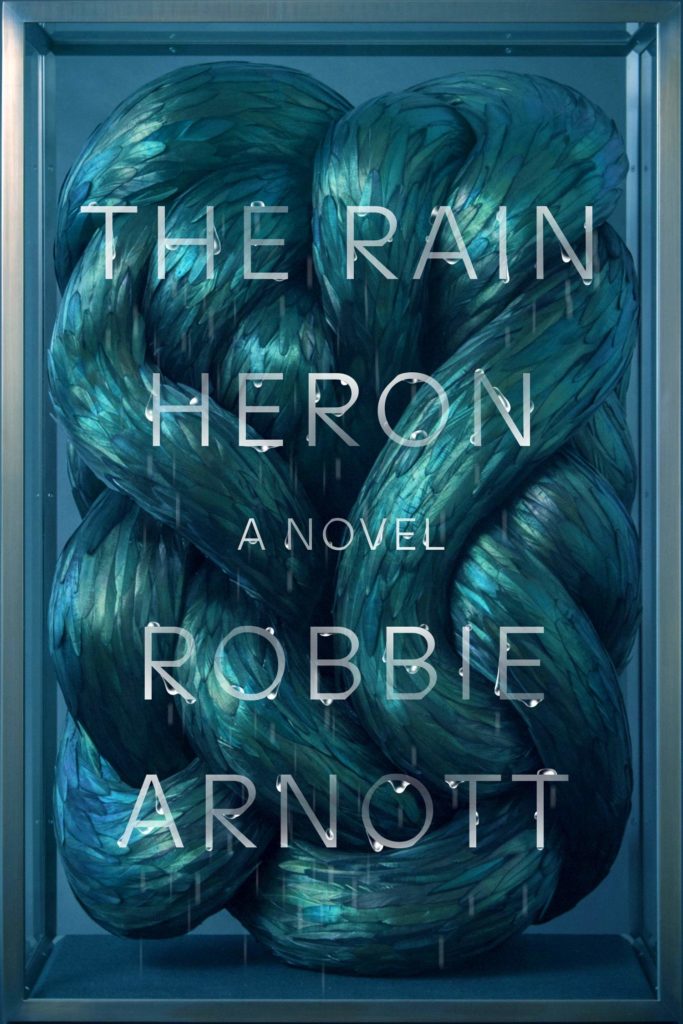 Robbie Arnott, The Rain Heron; cover design by Na Kim, art by Kate MccGwire (FSG Originals, February 9)
It’s rare that book covers acknowledge that they are, essentially, display boxes. Here, Kim makes excellent, succulent use of MccGwire’s sculpture, itself displayed in a bespoke glass cabinet, by keeping its form but raining on it a little. It looks so strange, and I want to touch it.
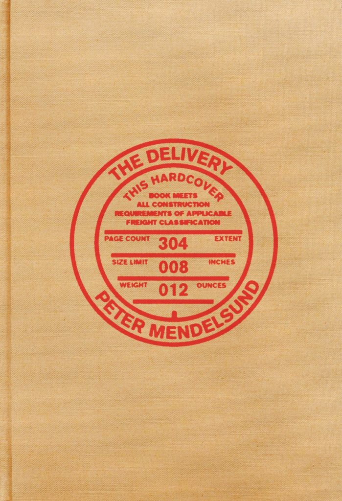 Peter Mendelsund, The Delivery; cover design by Alex Merto (FSG, February 9)
You see, it’s like a package wrapped in brown paper. (This one’s much better in person—there’s no slipcover, and the feel of the book adds something here—so if you don’t have a copy, you’ll have to take my word for it.
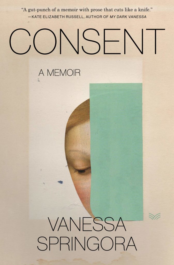 Vanessa Spingora, tr. Natasha Lehrer, Consent; cover design by Stephen Brayda, art by Rozenn Le Gall (HarperVia, February 16)
It’s another half-face collage, although a much subtler one—this feels much more like an impressionist painting, or the kind of thing you find lying around an artist’s studio and tuck into your pocket.
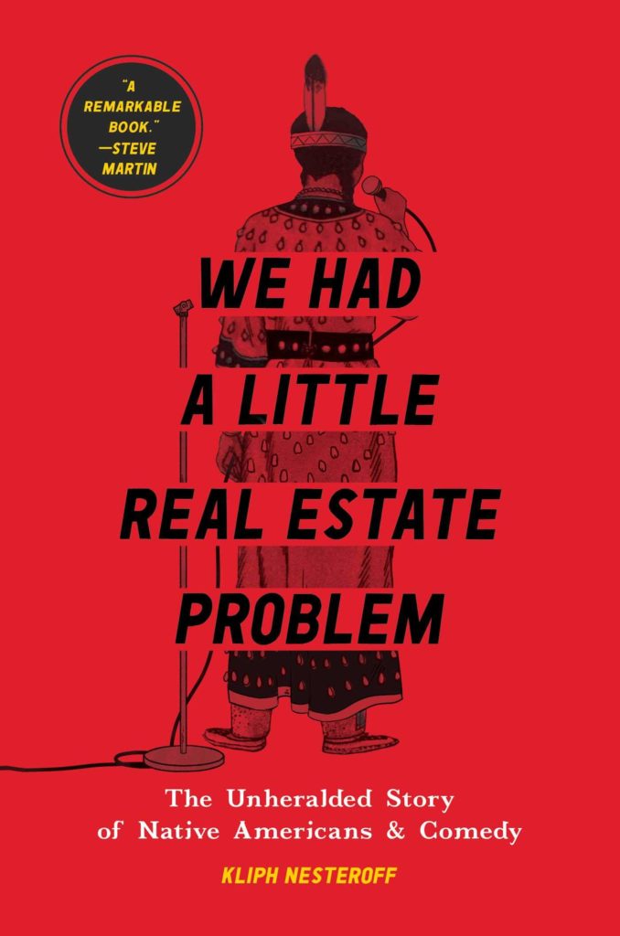 Kliph Nesteroff, We Had a Little Real Estate Problem ; design by Thomas Ryan RedCorn of Buffalo Nickel Creative (Simon & Schuster, February 16)
The title is doing a lot of work here—and the cover designer knows it. This is perfect in its humor and simplicity.
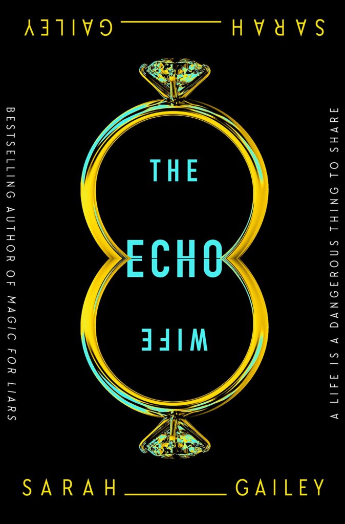 Sarah Gailey, The Echo Wife; cover art and design by Will Staehle (Tor Books, February 16)
I love how Staehle pushed the concept of the echo (and the hinge in the “echo”) to its logical conclusion—reflecting “wife” (though it’s still totally readable!) and even doubling the author’s name. It is a symmetrical treat for the eyes.
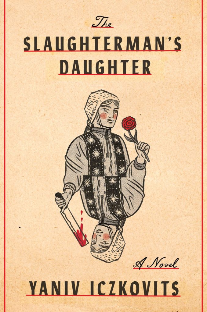 Yaniv Iczkovitz, tr. Orr Schar, The Slaughterman’s Daughter; cover design by Janet Hansen, illustration by The High Road Design (Schocken, February 23)
And here’s a totally different take on the echo—this one calling up nothing so much as a playing card, and not so much studied repetition as a sudden reversal in fortunes.
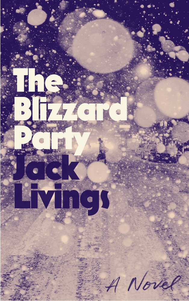 Jack Livings, The Blizzard Party (FSG, February 23)
I’ve never seen a cover quite like this one before—I like the quirky type treatment, but the sense of depth is what really caught me. Plus, the photograph manages to capture both “blizzard” and “party” in one layered shot. Very good.
Emily Temple
Emily Temple is the managing editor at Lit Hub. Her first novel, The Lightness, was published by William Morrow/HarperCollins in June 2020. You can buy it here.