The 14 Best Book Covers
of March
Yellow Rules!
Another month of books, another month of book covers. Except that this month has been different: since our last installment, the coronavirus pandemic has spread across the world, disrupting life at every level. But books were still published in March, and we still need beauty (and creativity and wit and challenge) in our lives. So with that in mind, here despite it all are my favorite book covers of the month: a clever bunch in a strange time.
 Jessi Jezewska Stevens, The Exhibition of Persephone Q; cover design by Ho Seok Lee, art by Dante Gabriel Charles Rossetti (FSG, March 3)
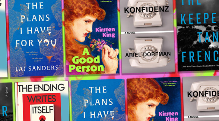
Honestly, I love everything about this cover: the slightly washed out rendering of Rossetti’s Proserpine, the hysterical yellow, the spray can and stencil treatment, the placing of the pomegranate. It doesn’t look quite like any other book cover I’ve ever seen—and most importantly, it made me instantly add this novel to my to-read pile.
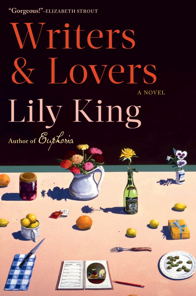 Lily King, Writers & Lovers; cover design by Kelly Winton, art by Paul Wonner (Grove, March 3)
I admit that this cover didn’t immediately jump out at me. It’s a quiet cover, not bombastic. But as I read this novel this month, I kept looking at the book lying around my apartment, and it began to grow on me: that pale pink, the way the text above balances the busy art below, the harsh delicacy of the shadows, the detail. Maybe it’s just perfect for the book at hand, which I loved, but either way, I’m a convert.
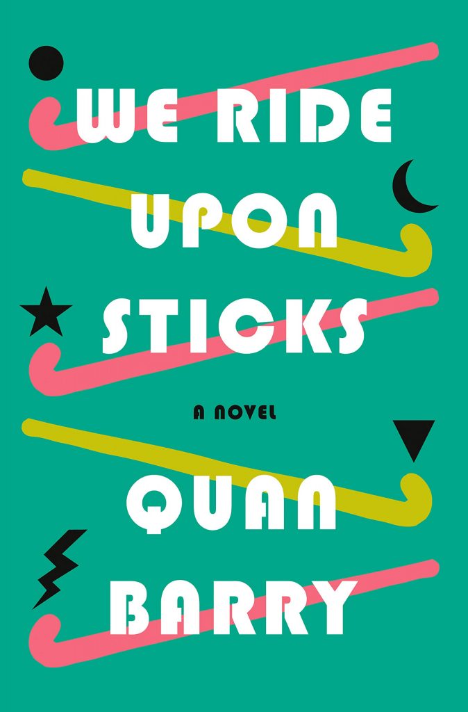 Quan Barry, We Ride Upon Sticks; cover design by Kelly Blair (Pantheon, March 3)
Here’s another one of my favorite books of the month, and another one of my favorite covers, on account of its madly 80s vibe. I mean, it’s almost ugly (those colors) and almost silly (the little icons) but somehow deeply appealing. Which, again—it’s just like the 80s.
 Kimiko Hahn, Foreign Bodies; cover design by Yang Kim, art direction by Ingsu Liu (W. W. Norton, March 3)
I love the delicacy of this cover, and what it suggests about what’s inside: tiny, beautiful things, coded and catalogued. It’s just how I like to think about books of poems: each one in its own special box of meaning, but connected to the whole.
 Hilary Leichter, Temporary; cover art and design by Sarah Evenson (Coffee House, March 3)
This cover is so deliciously weird. First off, that yellow is almost alarming, especially against the pink of the girl’s face, but also: the expertly childlike drawing, the bizarre mask, the scribble of the cheeks, the two tiny little eyelashes on each eye! It’s a cover I want to keep marveling at.
 K. M. Szpara, Docile; cover design by Jamie Stafford-Hill (Tor.com, March 3)
Despite the fact that it’s not exactly a new idea, I’m a sucker for an artfully obscured face on a jacket. Add that to the fresh color story and Vogue-esque type treatment and you have a very compelling cover.
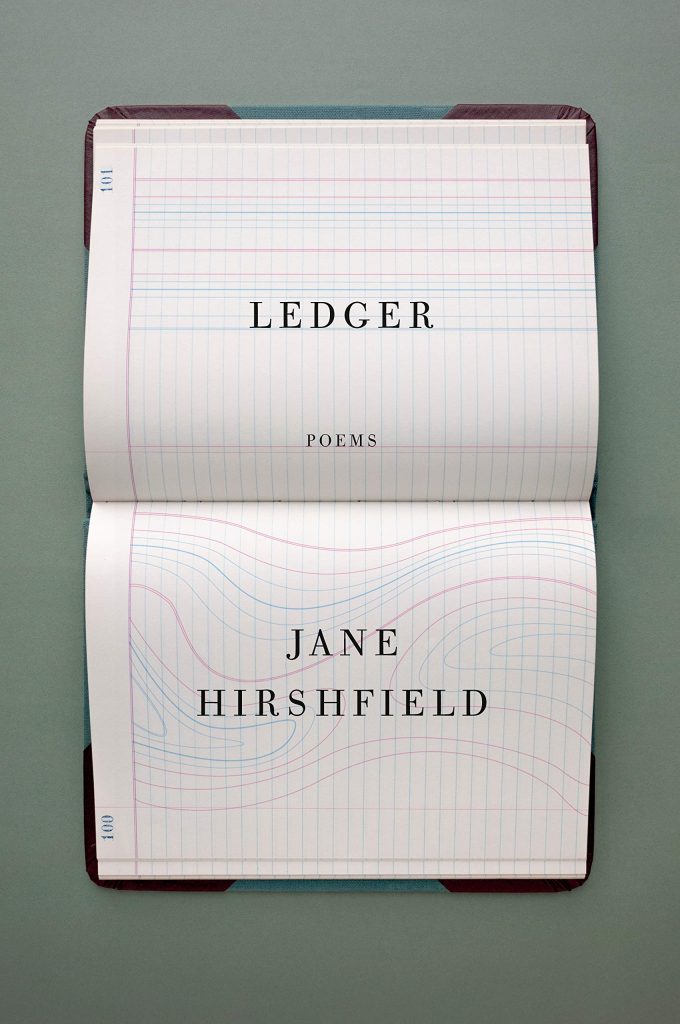 Jane Hirshfield, Ledger; cover design by John Gall (Knopf, March 10)
Just restrained and gorgeous in every way.
 Mary South, You Will Never Be Forgotten; cover design by Alex Merto, embroidery by Alex Stikeleather (FSG Originals, March 10)
I love texture on a book cover, a usually flat form, and this fabric and stitch version is very satisfying. Plus, who would ever think of embroidering emojis? Genius.
 Honor Moore, Our Revolution; cover design by Robin Bilardello, art direction by Sarahmay Wilkinson (W. W. Norton, March 10)
I love the bright 60s collage style of this cover, which fits perfectly with its subject. Often covers with this many elements—cut out lettering, photographs, overlaid color gels, scribbles—can get busy, but this one strikes the perfect balance.
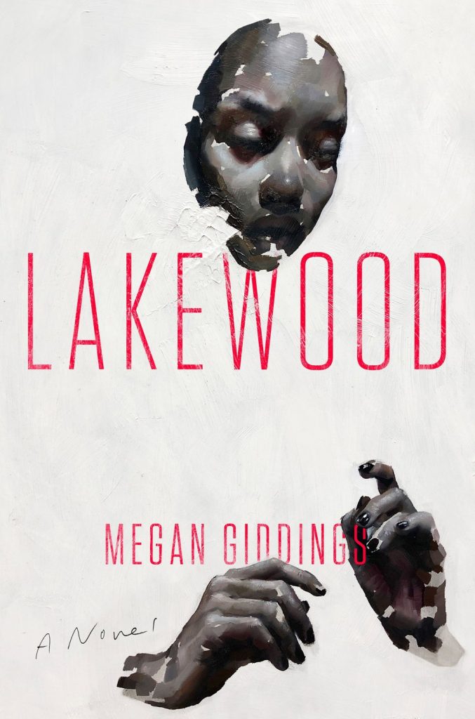 Megan Giddings, Lakewood; cover design by Stephen Brayda, art by Yulia Bas (Amistad, March 24)
Evocative and compelling—another cover that makes me want to read the book at hand—and I love the way the text interacts with the texture of the painting.
 Katy Simpson Smith, The Everlasting; cover design by Robin Bilardello (Harper, March 24)
What a cool cover. I love the boldness of the color choices, especially against the statue forms.
 Rebecca Dinerstein Knight, Hex; cover design by Jason Ramirez, hand lettering by Grace Han (Viking, March 31)
Well, sure, a skull made out of illustrated roses, you know that’s going to make it onto this list.
 Rob Doyle, Threshold; cover design by Ghprta (Bloomsbury, March 31)
This cover is a whole mood—it sort of looks like a cheeky version of art you’d find at Urban Outfitters, except for the fact that I actually want it on my wall.
 Fernanda Melchor, tr. Sophie Hughes, Hurricane Season; cover design by Jamie Keenan (New Directions, March 31)
A perfect trompe l’oeil that adds interest to a simple cover and reflects its contents. Brilliant.
Emily Temple
Emily Temple is the managing editor at Lit Hub. Her first novel, The Lightness, was published by William Morrow/HarperCollins in June 2020. You can buy it here.
