The 14 Best Book Covers of August
Leading with Art
Another month of books, another month of book covers. August’s covers were all about paintings, paintings, paintings. And attendant text treatments! Plus some other fun stuff. Here are my favorites from the end of summer:
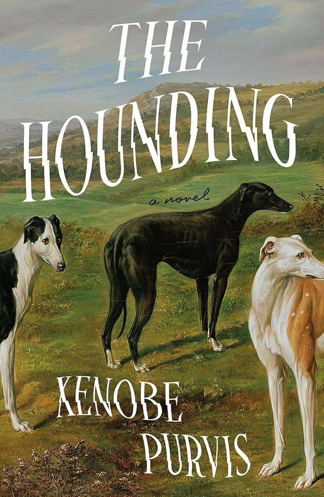 Xenobe Purvis, The Hounding; cover design by Nicolette Seeback Ruggiero; art by Benjamin Cam Norton (Henry Holt, August 5)
The first of several solid art choices this month, enhanced by the unusual split text—I particularly like the way the title follows the landscape here.
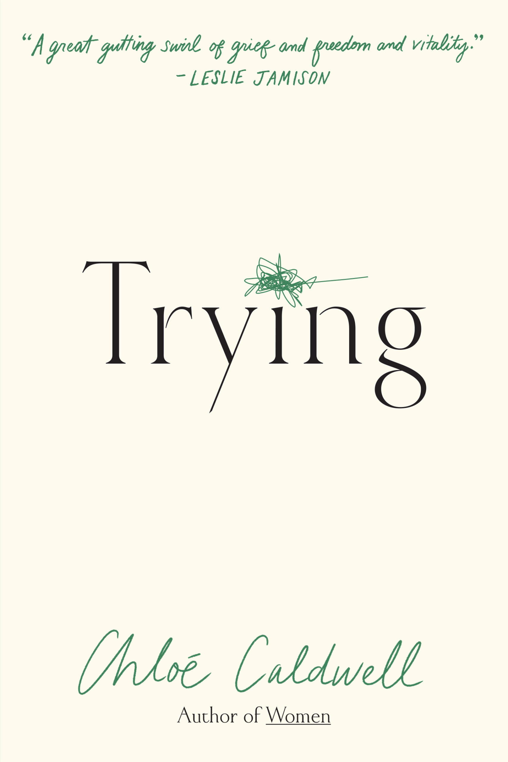 Chloe Caldwell, Trying; cover design by Kimberly Glyder (Graywolf, August 5)
Simple and emotional.
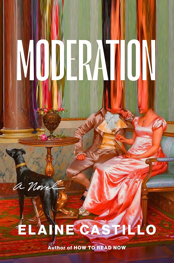 Elaine Castillo, Moderation; cover design by Lynn Buckley; art by Vittoria Reggianni (Viking, August 5)
Another piece of dog art (also a greyhound? I’m not an expert) with the saturation turned way up. And oh yes, the top half stretched to oblivion. Immoderate and delightful.
 Joshua Sharpe, The Man No One Believed; cover design by Derek Thornton (Norton, August 5)
Cleverly done; the church cross in the O is a nice touch.
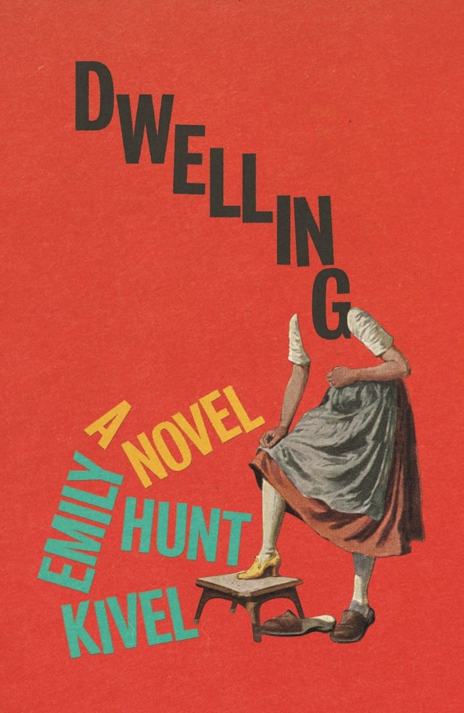 Emily Hunt Kivel, Dwelling; cover design by Matt Dorfman (FSG, August 5)
I’m not sure I’ve ever seen the title of a book collaged to look like the head and neck of a woman (Cinderella?). There’s something a little lewd about it, and definitely deranged, and fortunately these are both things I like in book covers.
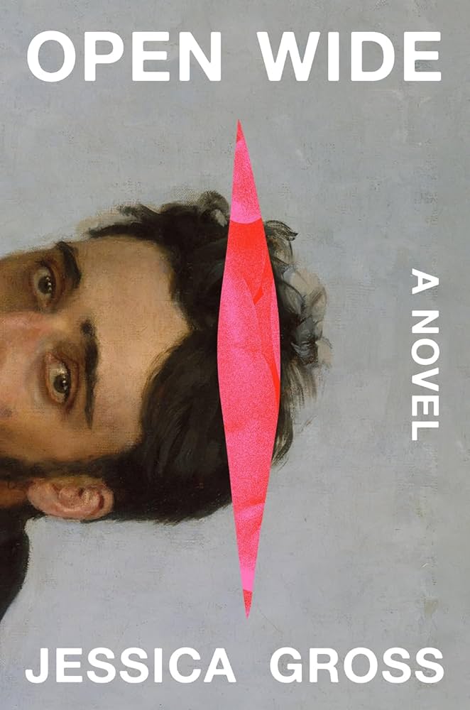 Jessica Gross, Open Wide; cover design by Eli Mock, art by Illia Repin (Abrams, August 5)
I’m a nerd, so the gentleman on this book cover is instantly legible to me as Oblomov (in Gross’s novel, the protagonist has a crush on the painting that serves as the basis for both covers, and Reader, I get it), but Mock’s adjustments make it sing here. The crop and rotation, of course, but also the perfect pink slit, with only the barest suggestion of—something I will not disclose to those who have not read the book.
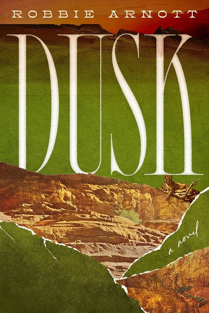 Robbie Arnott, Dusk; cover design by Alicia Tatone (Astra House, August 5)
Unusual and arresting.
 An Yu, Sunbirth; cover design by Suzanne Dean (Grove, August 5)
I could take or leave the 70s font but I’m a sucker for a trompe l’oeil burn hole.
 Emily Adrian, Seduction Theory; cover design by Juliana Lee, art by Jean-Honoré Fragonard (Little, Brown, August 12)
Very funny use of Fragonard, honestly.
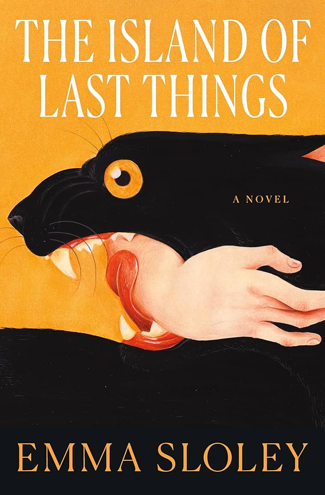 Emma Sloley, The Island of Last Things; cover design by Keith Hayes; art by Jose David Morales (Flatiron, August 12)
Sometimes an image is arresting enough that you could do almost anything to it (though Hayes does not err).
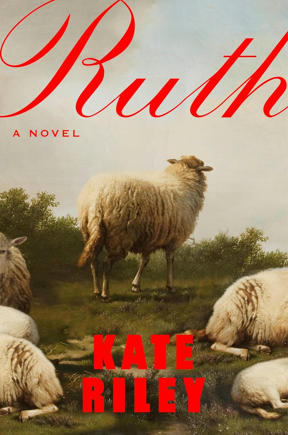 Kate Riley, Ruth; cover design by Lauren Peters-Collaer; art by Eugène Joseph Verboeckhoven (Riverhead, August 19)
The red makes very slight twist on the neon-text-over-classic-paintings trope, but I’m fond of the crop, and also the way the title bleeds.
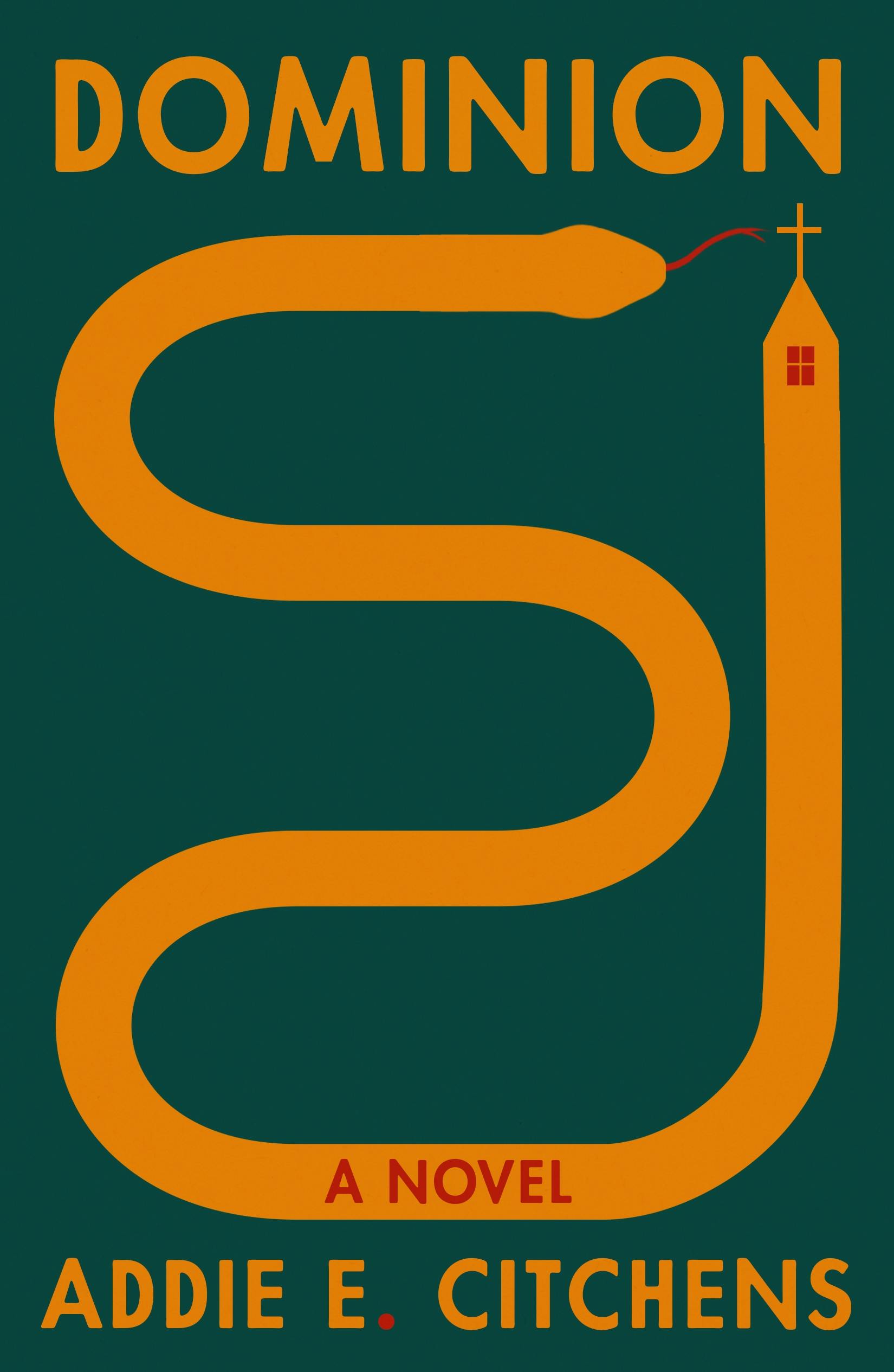 Addie E. Citchens, Dominion; cover design by Na Kim (FSG, August 19)
Another clever cross placement, and a cover that makes you wonder.
 Miriam Toews, A Truce That is Not Peace; cover design by Patti Ratchford (Bloomsbury, August 26)
The hipster in me can’t pass up a noisy cloudscape, but the text placement is also extremely pleasing.
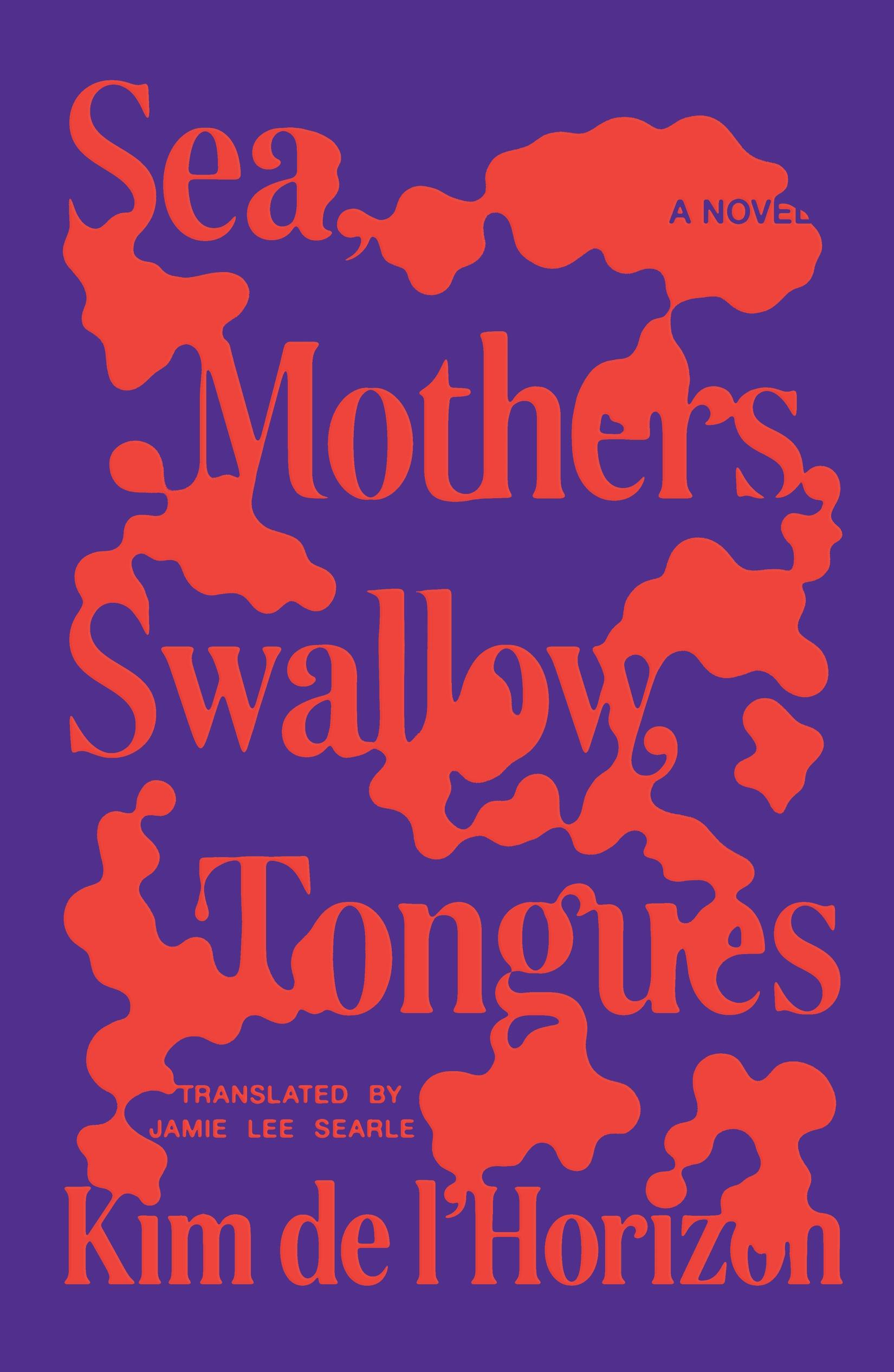 Kim de l’Horizon, tr. Jamie Lee Searle, Sea, Mothers, Swallow, Tongues; cover design by Thomas Colligan (FSG, August 26)
Vibrant and weird, in the best way.
Emily Temple
Emily Temple is the managing editor at Lit Hub. Her first novel, The Lightness, was published by William Morrow/HarperCollins in June 2020. You can buy it here.


