The 13 Best Book Covers of May
We Still Have Some Nice Things
As I write this, I am staring out my window onto a beautiful New York spring day. I may not be able to enjoy it the way I want to, but it’s still there. Which is to say: it hasn’t been the easiest spring, for lots of reasons, but there’s still some good to be had. You’ll find a little bit more of that good below—as I do every month, I’ve collected a few of my favorite new book covers, from the weird and wily to the simple and serene. And as always, if I’ve missed your favorite, point me towards it in the comments below.
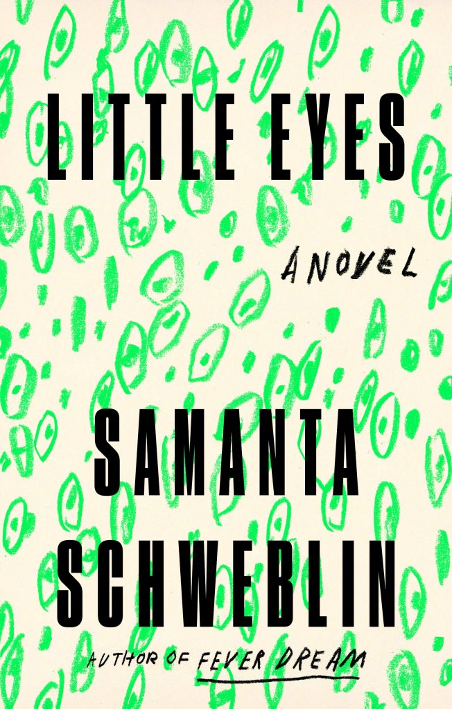 Samanta Schweblin, tr. Megan McDowell, Little Eyes; cover design by Na Kim (Riverhead, May 5)
All hail Na Kim, whose work is always slightly off-kilter and perfectly on point. Her neon green eye pattern makes this book stand out, just like it was always meant to.
 Eimear McBride, Strange Hotel; cover design by Rodrigo Corral, photograph by Franck Juery (FSG, May 5)
It’s rare to see a book cover evoke a mood quite so precisely. This one—loneliness in a foreign place—comes courtesy of a well-chosen photograph and a matching text treatment.
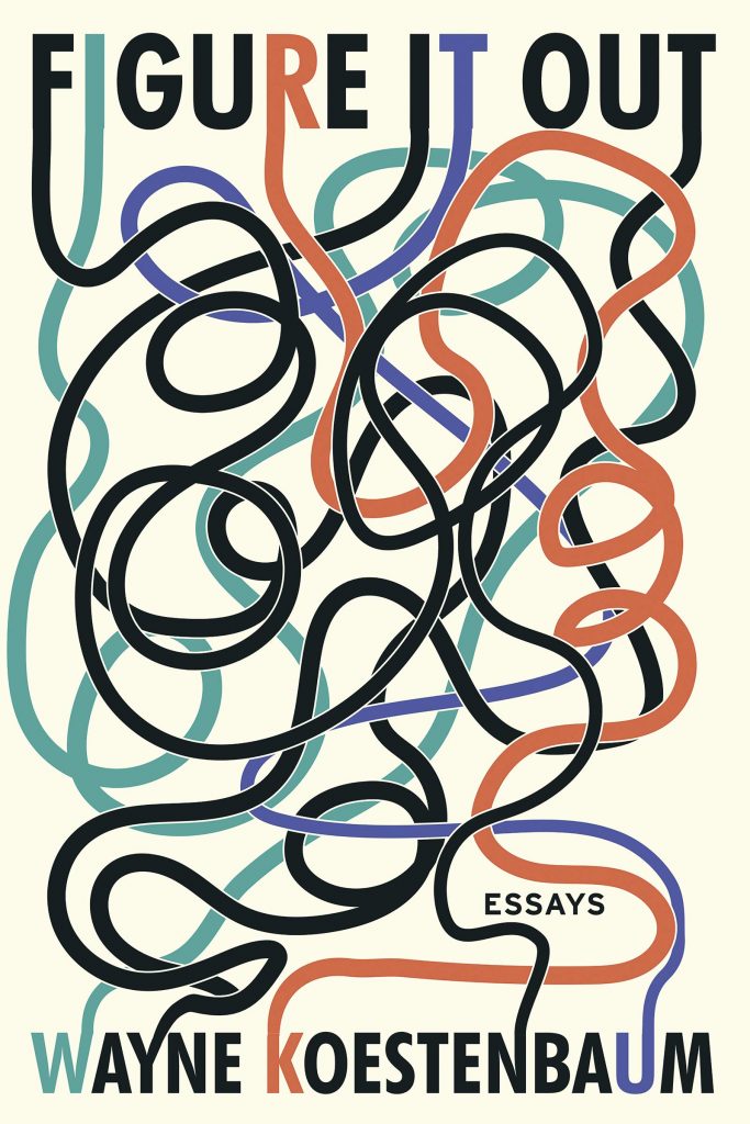 Wayne Koestenbaum, Figure It Out; cover design by Salu.io (Soft Skull, May 5)
I love the muted colors here, which match the callback to those “puzzles” where you had to use your finger to trace your way from one side of the page to the other. Though the concept itself is relatively simple, it hangs onto the eye longer than you’d think.
 Olivia Laing, Funny Weather: Art in an Emergency; cover design by Kelly Winton, art direction by Sarahmay Wilkinson (W. W. Norton, May 12)
That pink! And also: what? It’s glorious. One of those covers that makes you desperate to know what’s inside.
 Samantha Harvey, The Shapeless Unease; cover design by Suzanne Dea (Grove Press, May 12)
Simplicity sings on this cover—especially because it’s paired with this discordant, semi-surreal tiger, who is coming and going at the same time.
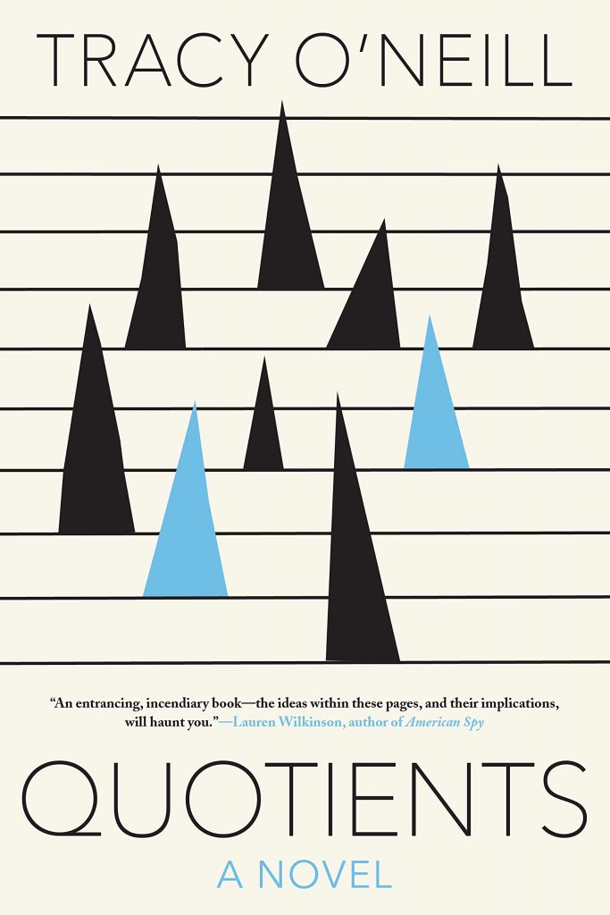 Tracy O’Neill, Quotients; cover design by Jason Booher (Soho Press, May 12)
Book covers tend to follow certain patterns, fall into certain groups, and I’m always delighted when I see one that simply doesn’t conform to any of my expectations. That’s why I love this one—spiky, icy, and perfect for a novel of ideas like O’Neill’s.
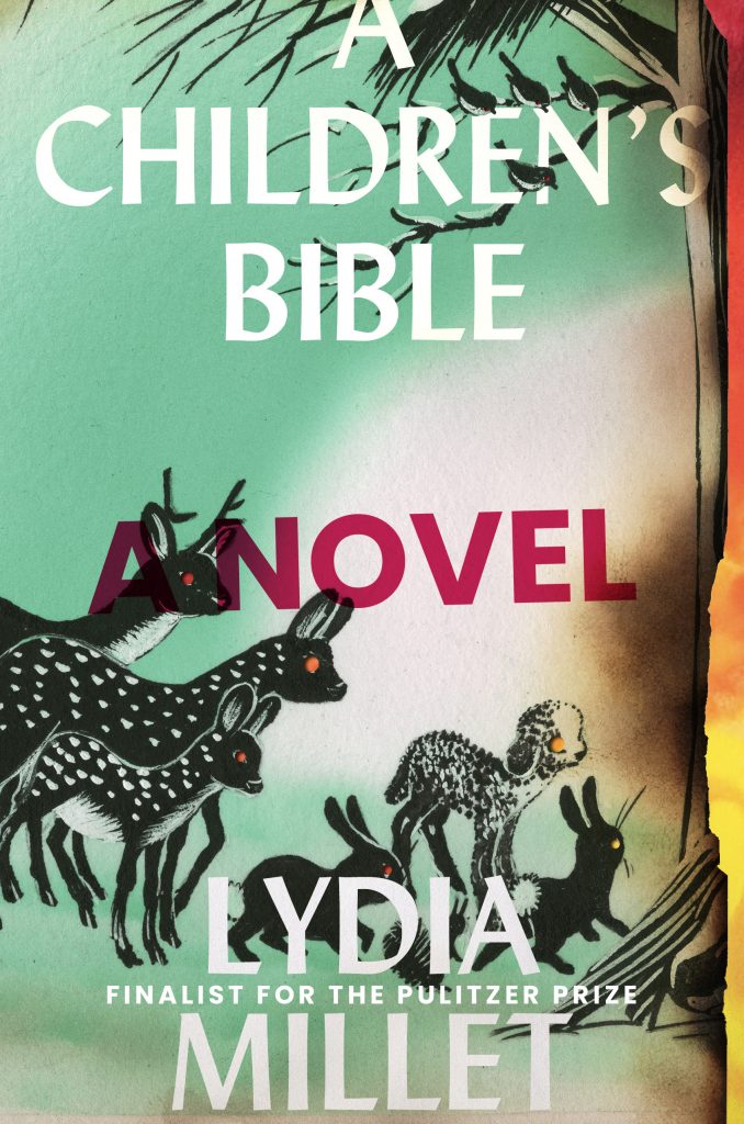 Lydia Millet, A Children’s Bible; design by David High, art direction by Ingsu Liu (W. W. Norton, May 12)
I love everything about this: the color story, the vintage-style illustrations, the text treatment, and especially the burned edge. Absolutely brilliant.
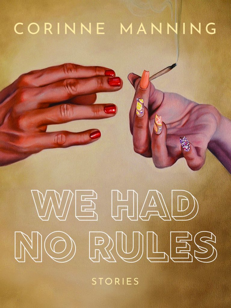 Corinne Manning, We Had No Rules; cover design by Jazmin Welch, art by Amanda Kirkhuff (Arsenal Pulp Press, May 12)
I just can’t stop looking at these hands.
 Jenny Zhang, My Baby First Birthday; cover design by Jakob Vala, cover art by Li Shixiong (Tin House, May 12)
Another one where the brilliance comes from the designer’s chosen art: a weird, surrealist image that you are almost required to keep staring at until someone shoos you along.
 Merlin Sheldrake, Entangled Life; cover design by Lucas Heinrich, cover illustration by Tim O’Brien (Random House, May 12)
Well sure, you slap a bunch of gorgeous vintage-style illustrations of fungi on there and I’m yours.
 Kate Zambreno, Drifts; cover design by Lauren Peters-Collaer (Riverhead, May 19)
Here’s another one that I admire for its verve and refusal to adhere to the normal book cover tropes. The black water is so striking against the yellow, and the feeling is almost aggressive—in a good way.
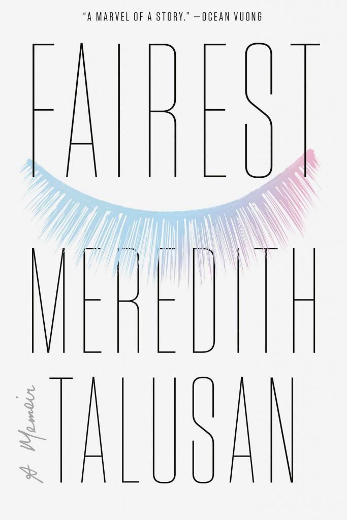 Meredith Talusan, Fairest; cover design by Nayon Cho (Viking, May 26)
I love the way the elongated text almost becomes a pattern on this white book cover—or maybe one half of a face, with its eye demurely closed. It’s elegant and curious and plain beautiful.
 Adania Shibli tr. Elisabeth Jaquette, Minor Detail; cover design by Oliver Munday (New Directions, May 26)
It’s already a trompe l’oeil, and if you read this column with any regularity, you I love those. But then there’s the monochrome palate (a real risk on a book cover) and the sense of depth. And finally, you may not see it right away—but the longer you look at this cover, the more the face begins to fade into view. Magic.
Emily Temple
Emily Temple is the managing editor at Lit Hub. Her first novel, The Lightness, was published by William Morrow/HarperCollins in June 2020. You can buy it here.


