The 13 Best Book Covers of March
The Fonts Are Out!
Another month of books, another month of book covers, another month of our semi-legitimate leaders trying to kill us. Here are my favorite jacket designs from March:
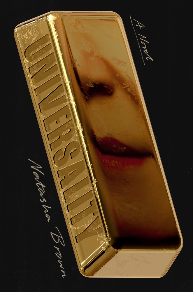 Natasha Brown, Universality; cover design by Zak Tebbal (Random House, March 4)
I love everything about this cover: the reflection, the almost-invisible title, the handwritten text. It’s evidence of commitment to a concept, and it really works.
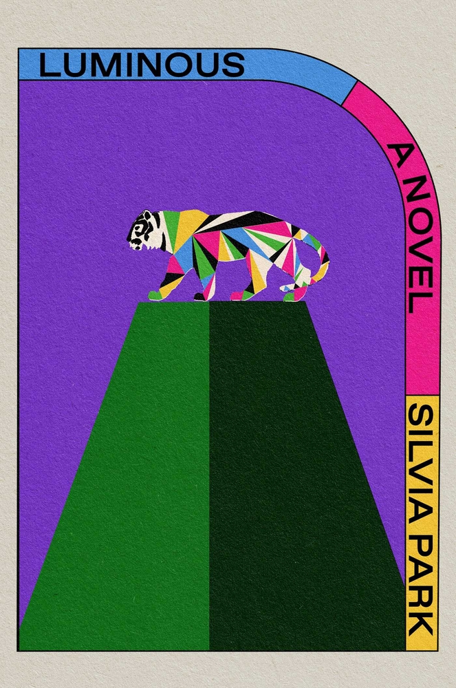 Silvia Park, Luminous; cover design by Alex Merto (Simon & Schuster, March 11)
You can see the rich colors and texture even through the computer screen, and it looks like its own piece of fine art, but even more importantly, it’s just Not Like Other Covers. That cut-off corner is so distinctive! (I also love the UK version.)
 Will Rees, Hypochondria; cover design by Luke Bird, image by Sean Benesh on Unsplash (Coach House Books, March 11)
The perfect balance (sorry) of text and image.
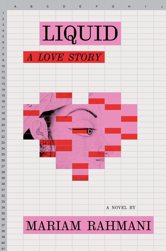 Mariam Rahmani, Liquid: A Love Story; cover design by Sharanya Durvasala (Algonquin Books, March 11)
Another one that impresses with its freshness: an Excel sheet as the basis for a book cover? Just weird enough to work.
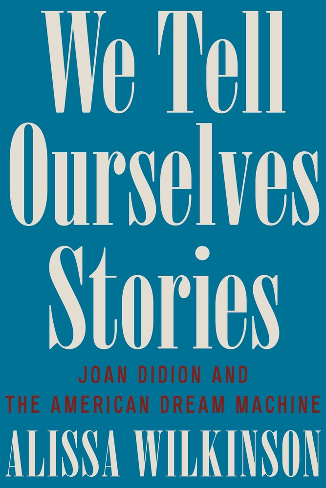 Alissa Wilkinson, We Tell Ourselves Stories: Joan Didion and the American Dream Machine; cover design by Sarahmay Wilkinson (Liveright, March 11)
Incredible the sense memories that can be instantly evoked with a little off-white serif font.
 Marcy Dermansky, Hot Air; cover design by Janet Hansen (Knopf, March 18)
The texture is palpable.
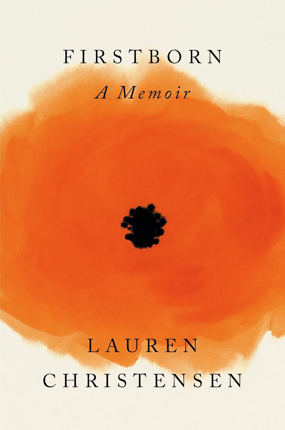 Lauren Christensen, Firstborn; cover design by Darren Haggar, illustration by Cecilia Carlstedt (Penguin Press, March 18)
Flowers are everywhere on book covers, but this one takes on meaning after meaning the longer you look at it.
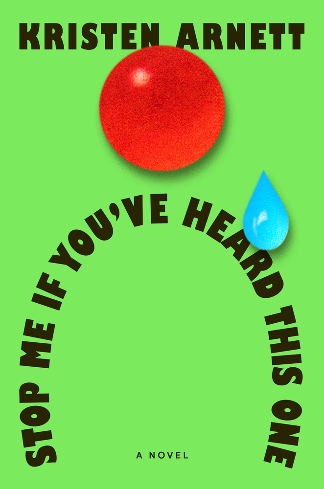 Kristen Arnett, Stop Me If You’ve Heard This One; cover design by Grace Han (Riverhead, March 18)
It’s patently ridiculous, which is, of course, the point.
 Yuko Tsushima, tr. Lisa Hofmann-Kuroda, Wildcat Dome; cover design by Na Kim (FSG, March 18)
A beautiful and surprising work of art—I especially love the text treatment.
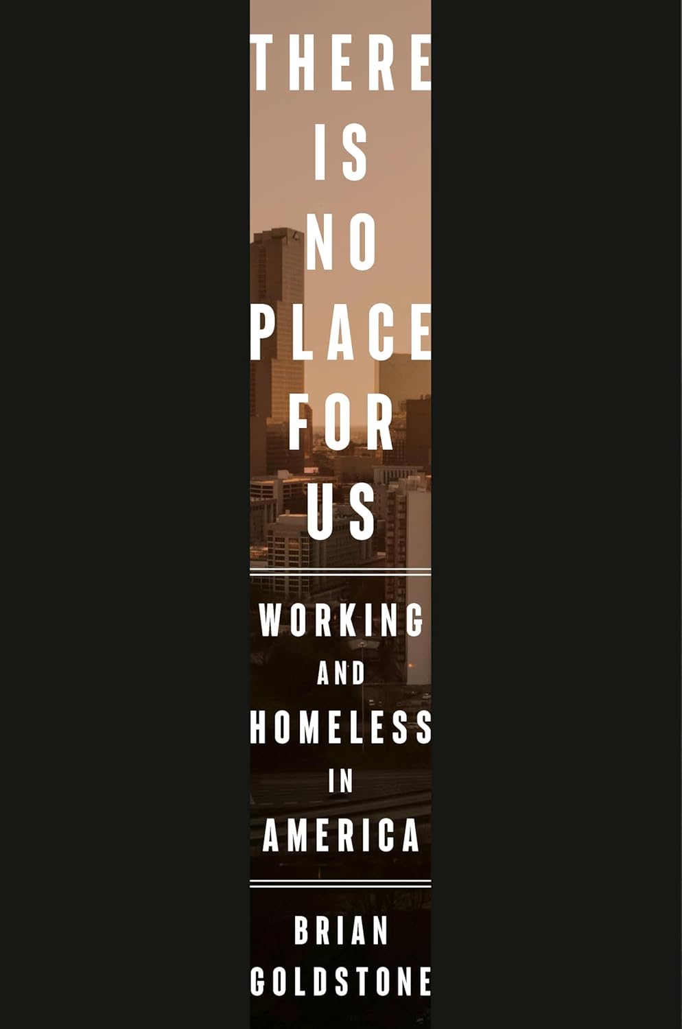 Brian Goldstone, There is No Place for Us: Working and Homeless in America; cover design by Anna Kochman (Crown, March 25)
Perfectly evocative and quite daring.
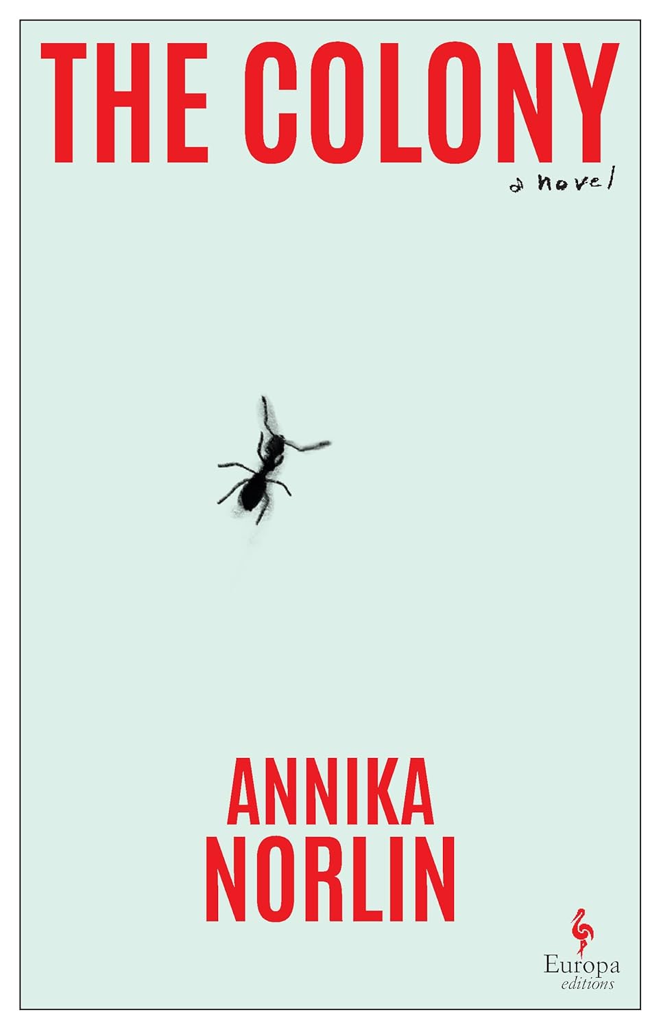 Annika Norlin, tr. Alice E. Olsson, The Colony; cover design by Ginevra Rapisardi (Europa, March 25)
The contrast between title and image makes me shiver. (I also love Luke Bird’s cover for the UK edition.)
 Joni Murphy, Barbara; cover design by Frances DiGiovanni and Rodrigo Corral (Astra House, March 25)
Flight paths that also make a bull’s-eye—consider me drawn in.
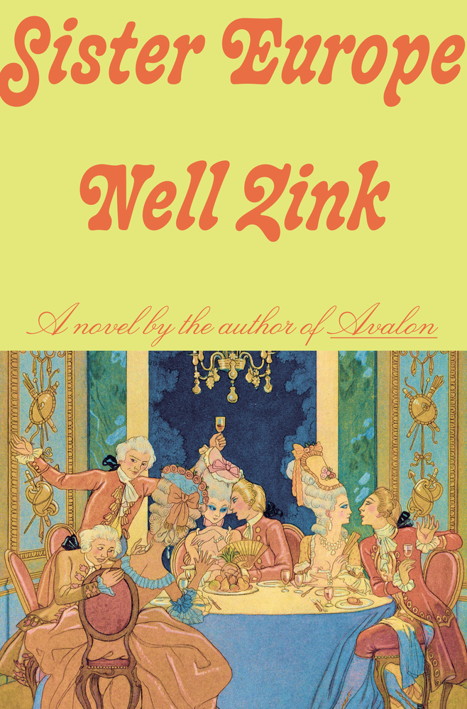 Nell Zink, Sister Europe; cover design by Linda Huang, illustration by Georges Barbier (Knopf, March 25)
The fonts are doing a lot of work here—they’re making me almost believe that if I were to pick up this book, I might just find myself sitting at that table. Anyway, I’m buying it.
Emily Temple
Emily Temple is the managing editor at Lit Hub. Her first novel, The Lightness, was published by William Morrow/HarperCollins in June 2020. You can buy it here.