The 13 Best Book Covers of June
Hot Hot Heat
Another month of books, another month of book covers. In June, I was impressed by humor and subtlety, that poppy red, and some very good patterns. Here are my favorites:
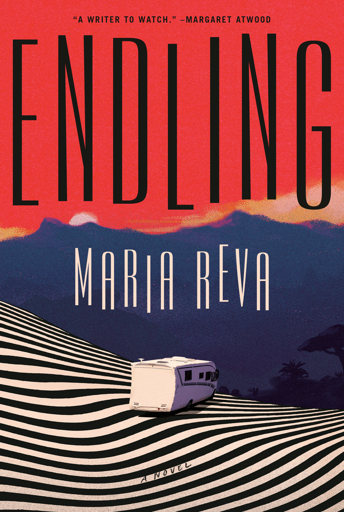 Maria Reva, Endling; cover design by Emily Mahon, jacket art by Valentin Pavageau (Doubleday, June 3)
The balance between the vertical lines of the text and the (semi-) horizontal lines of the ground is just right.
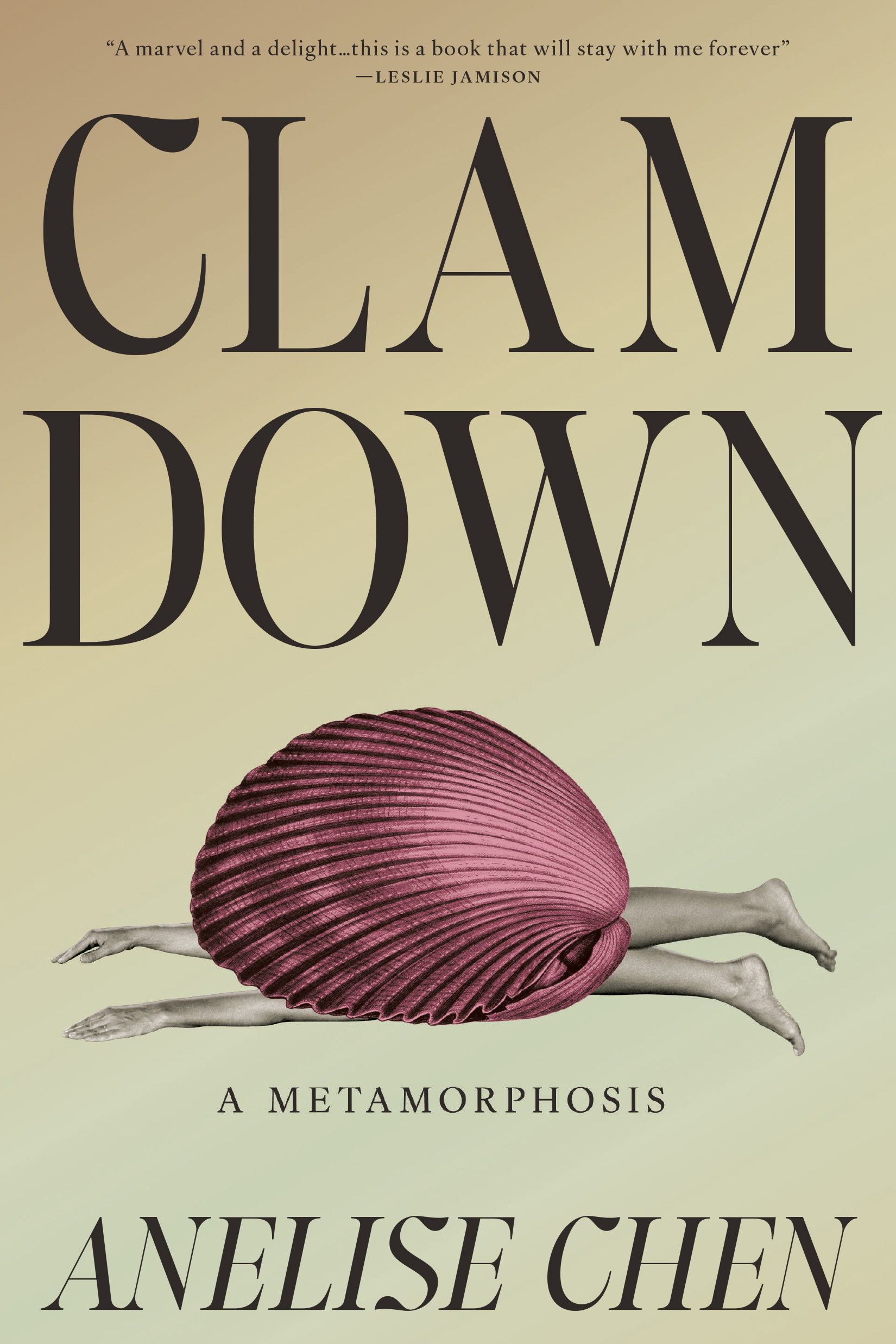 Anelise Chen, Clam Down; cover design by Tree Abraham (One World, June 3)
This is even funnier for being so perfectly restrained.
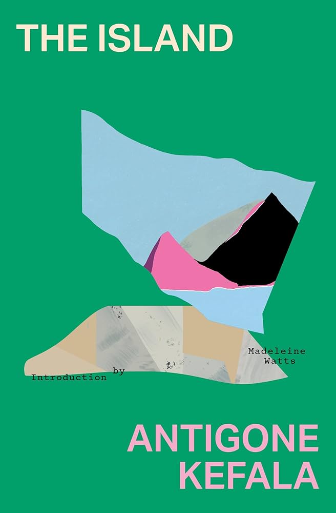 Antigone Kefala, tr. Madeleine Watts, The Island; cover design by Sarah Schulte (Transit Books, June 3)
One of those covers you’d really like to hang on the wall.
 Yrsa Daley-Ward, The Catch; cover design by Sarahmay Wilkinson (Liveright, June 3)
The way the photograph has been manipulated into an ephemeral pattern is so engrossing here.
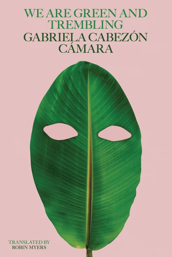 Gabriela Cabezón Cámara, tr. Robin Myers, We Are Green and Trembling; cover design by Oliver Munday (New Directions, June 3)
Another funny one.
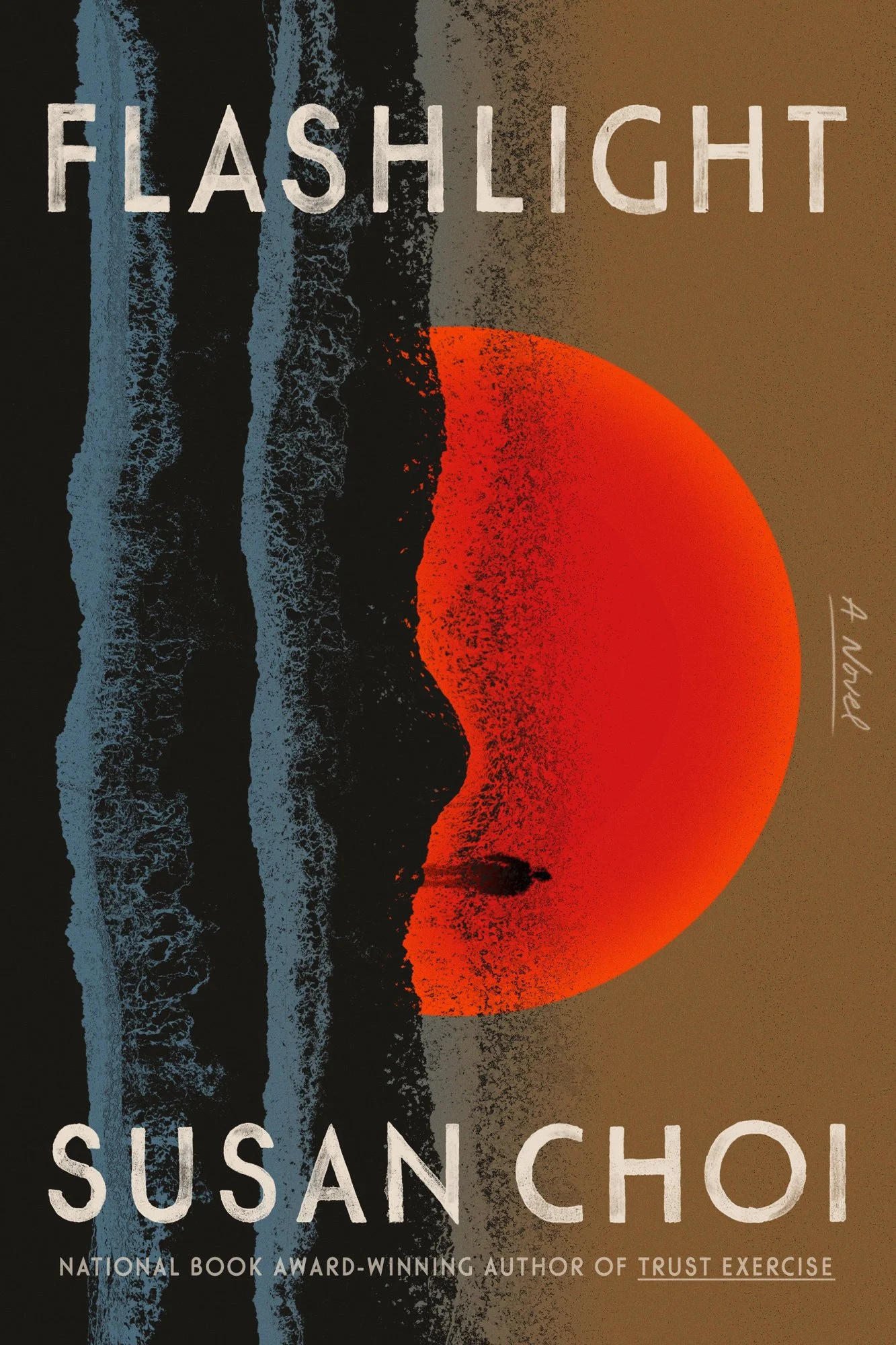 Susan Choi, Flashlight; cover design by June Park (FSG, June 3)
I always appreciate covers that manage to feel both representative and impressionistic at once, and June Park particularly excels at them. I also love the color story and sense of texture here, both of which are, funnily enough, echoed in my next pick…
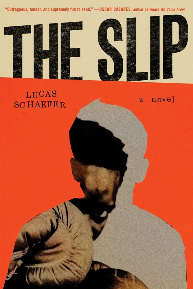 Lucas Schaefer, The Slip; cover design by Jack Smyth (Simon & Schuster, June 3)
Very similar palette and texture choices (the distressed lettering!) here, with a completely different mood achieved. I love the cleverness of the main image—the boxer ducking out of his own frame—and the way the destabilization is carried through to the uneven text. Even the title “slips” beneath the color block. Genius!
 Harris Lahti, Foreclosure Gothic; cover design by Rodrigo Corral Studio (Astra House, June 10)
I particularly like the daring of splitting the frame here, making the book less book-shaped. The perfect expression of modern horror.
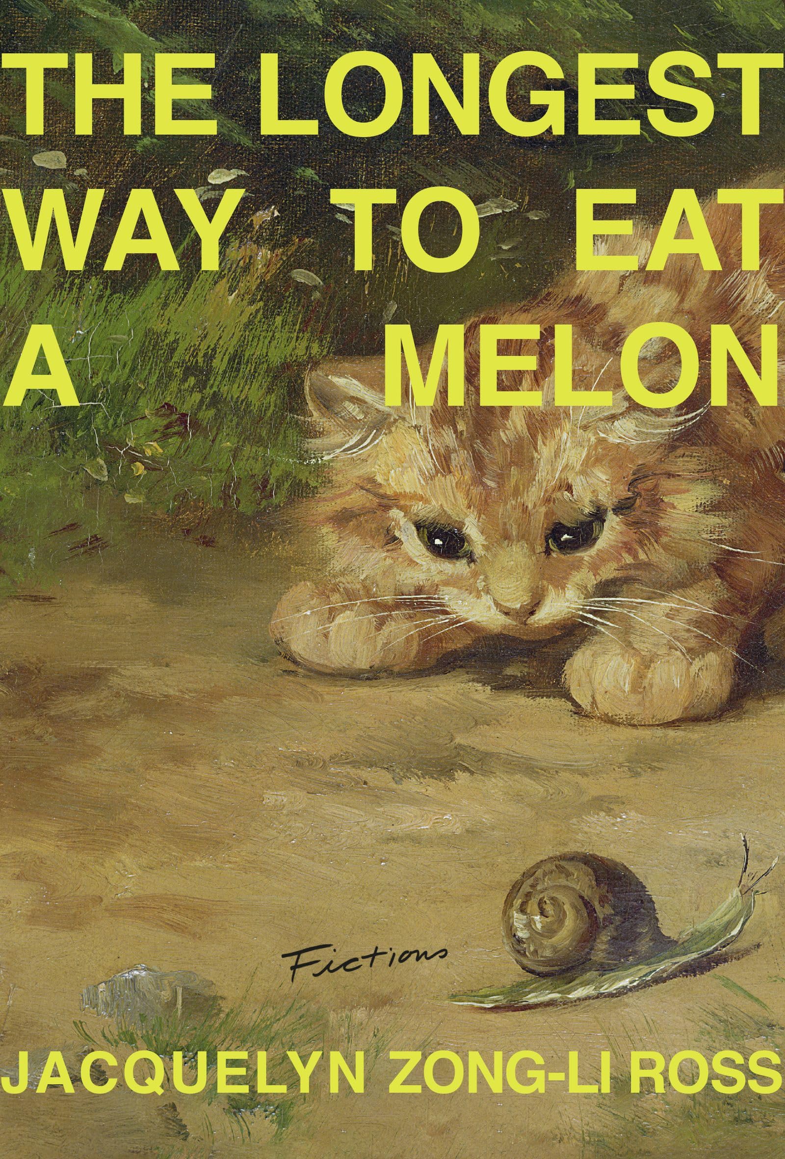 Jacquelyn Zong-Li Ross, The Longest Way to Eat a Melon; cover design by Emily Mahon (Sarabande, June 10)
As soon as The New York Times identifies a book cover trend, you know it’s getting tired—but it’s not the neon type/classic painting combo that’s getting me here, but rather, well, the spacing. The distance between “A” and “MELON” just delights me.
 Sarah Landenwich, The Fire Concerto; cover design by Jared Oriel (Union Square, June 10)
A clever play on a familiar image.
 Jonas Hassen Khemiri, The Sisters; cover design by Rodrigo Corral Studios (FSG, June 17)
I love this version of “women’s faces abstracted on a book cover”—the way the text is relegated to the edges makes the the image almost overwhelming, in the best of ways.
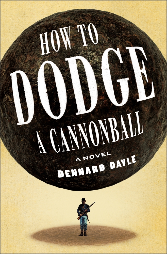 Dennard Dayle, How to Dodge a Cannonball; cover design by Christopher Sergio (Henry Holt, June 17)
It just couldn’t have looked like anything else.
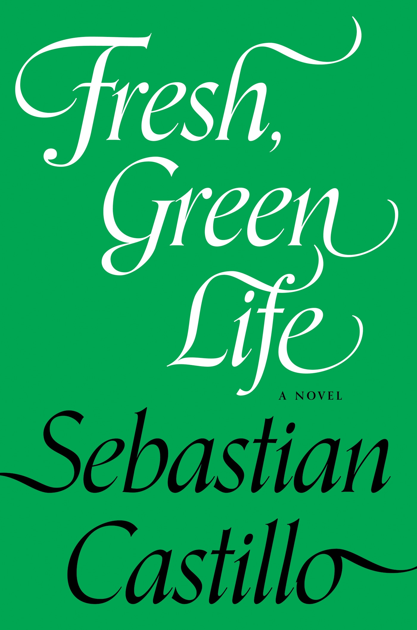 Sebastian Castillo, Fresh, Green Life; cover design by Kit Schluter (Soft Skull, June 24)
Fresh green cover!
Emily Temple
Emily Temple is the managing editor at Lit Hub. Her first novel, The Lightness, was published by William Morrow/HarperCollins in June 2020. You can buy it here.