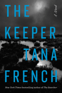
The 13 Best Book Covers of June
Gone With a Splash
Another month of books, another month of book covers. This June’s jackets were all about juicy colors, subtle humor, and um, human-shaped cutouts . . . which just happen to be three of my favorite things. Please, don’t ask me to explain. Instead, just enjoy these very good book covers from the past month, and feel free to add any of your own favorites I’ve missed here to the list in the comments. Happy ongoing summer reading (and summer jacket-ogling).
 Joss Lake, Future Feeling; cover design by Michael Salu (Soft Skull, June 1)
This may not have been the intention, but to me this strongly evokes a deconstructed Blow Pop, and it looks so viscerally good and juicy (those colors!) that I want to pop it right off the page and eat it. Or, you know, read it.
 Kristen Arnett, With Teeth (Riverhead, June 1)
Again: the colors! That unusual green is to die for. But of course, the real standout feature of this book cover is . . . the big mouth and the text treatment that turns the title into teeth. Oh, you noticed that, did you? It’s a weirdy and a goody, folks.
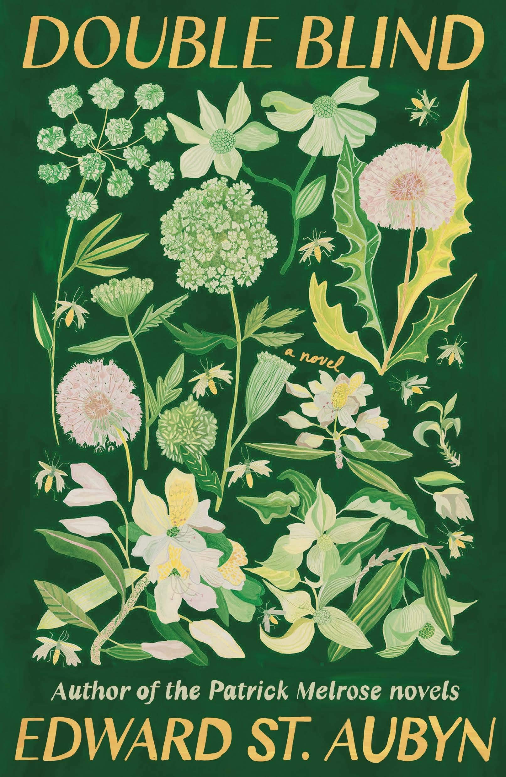 Edward St. Aubyn, Double Blind (FSG, June 1)
The full painted effect is working well here, and I love the way the title and author are sequestered at top and bottom, leaving the main swath of the cover to the botanical artwork. (Plus the sneaky little “a novel.”)
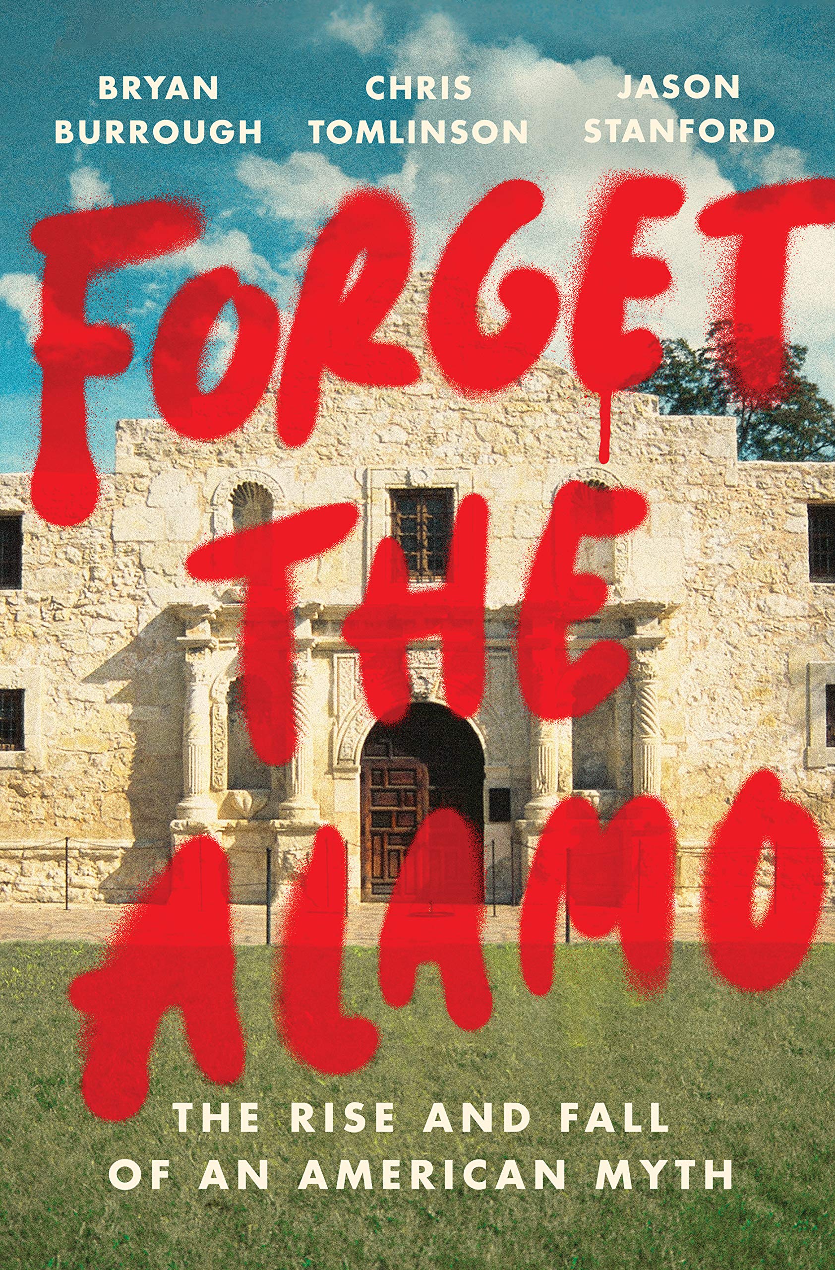 Bryan Burrough, Chris Tomlinson, & Jason Stanford, Forget the Alamo: The Rise and Fall of an American Myth; cover design by Tyler Comrie (Penguin Press, June 8)
You really have to zoom to the fine texture of the paint here, but the vintage colors and bright allusion to graffiti are a perfect match.
 Claire Boyles, Site Fidelity; cover design by Sarahmay Wilkinson (W.W. Norton, June 15)
The colors here are much more muted than on a lot of the other covers on this list, but in this case, it’s why I like them: they’re unusual, not exactly what you’d expect for a book cover. It has texture and depth and more than a dab of whimsy—my favorite.
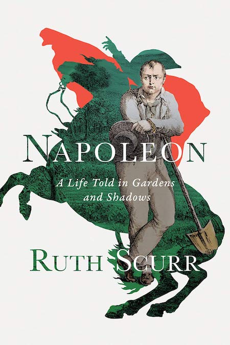 Ruth Scurr, Napoleon: A Life Told in Gardens and Shadows; cover design by Eric W. Wilder (Liveright, June 15)
First off, this cover made me smile—there’s a Napoleon you don’t get to see very often! But more importantly: the way the figure and the iconic cutout (with red cape!) are layered is absolutely masterful. This is one of those that gets better the longer you look at it. (Also, reading about Wilder’s journey to get to this final cover only made it more delightful.)
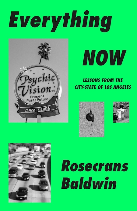 Rosecrans Baldwin, Everything Now: Lessons from the City-State of Los Angeles (MCD, June 15)
It’s very LA, and very funny without trying too hard. Even the green is funny. What is it with green this month?
 P.J. Vernon, Bath Haus; cover design by John Fontana (Doubleday, June 15)
This design makes me cringe and clutch my neck, which is how you know it’s really working.
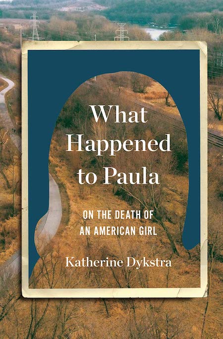 Katherine Dykstra, What Happened to Paula: On the Death of an American Girl; cover design by Yang Kim (W.W. Norton, June 15)
Now we are entering a very interesting vein—an accidental trend of cutouts, if you will, though each of them would have also made this list in a vacuum. First is this cover, in which the double frame is doing a ton of work—you almost don’t see that the inner photo was a girl, now cut away, until you do. The color story evokes the 70s so precisely, but it’s really that haunting non-photograph, down to its creased edges, that makes this a brilliant cover.
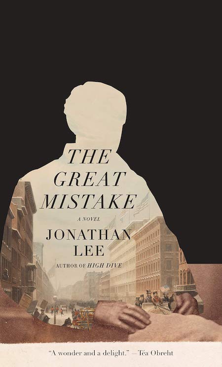 Jonathan Lee, The Great Mistake; cover design by John Gall (Knopf, June 15)
And here we have another cutout human figure, on the cover of a much different book and evoking a much different mood. Here, the contrast between the black background (which feels fresh and even daring to me, so much plain, uninterrupted black on a book cover) and the interior of the human cutout, a stylized illustration of old New York, creates a sense that the character is unknown, filled up and obscured by his city, rather than lost, as in the above cover. Also . . . the hands. I can’t stop looking at the hands!
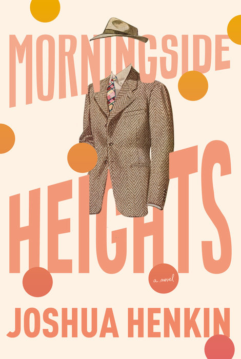 Joshua Henkin, Morningside Heights; cover design by Kelly Blair (Pantheon, June 15)
Here’s a cutout of a different color. I love the entrenched surrealism of this floating headless, bodiless figure (this time there are no hands), and the way the coat and hat interact with the text treatment, which itself is less surreal than exuberant and big-bookish. This cover feels extremely fresh and fun even as it leans on vintage iconography and color. A feat!
 Remigiusz Ryzinski, tr. Sean Gasper Bye Foucault in Warsaw (Open Letter, June 29)
And here is our final and strangest human cutout. Like the cutout on The Great Mistake, there is a stylized city (Warsaw, one assumes) reflected inside the figure, but here it’s upside down, which almost entirely transforms it from cityscape to textural pattern. And then, of course, there are the eyes. The eyes! I almost can’t look away from this one.
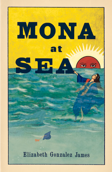 Elizabeth Gonzalez James, Mona at Sea; cover illustration by Cynthia Warren (Santa Fe Writer’s Project, June 30)
It’s humorous and gorgeous and it doesn’t look like any other book cover I’ve seen in recent memory, which is certainly saying something.
Emily Temple
Emily Temple is the managing editor at Lit Hub. Her first novel, The Lightness, was published by William Morrow/HarperCollins in June 2020. You can buy it here.


