
The 13 Best Book Covers
of April
The Gold Standard(s)
Let’s face it: for most of us, April hasn’t been great. But for those of us stuck at home, there are still nice things and small pleasures to be had, and some of them come to us in the form of book covers. Here’s a baker’s dozen of my favorites for the month.
 Chelsea Bieker, Godshot; cover design by Nicole Caputo (Catapult, March 31)
I mean, look at it. It is covered in gold glitter. You can’t tell me that’s not extremely fun. It absolutely leaps off the shelf, not to mention the screen. This is a great example of taking one concept and pushing it to the limit. (It’s also . . . a little dirty? If you don’t see what I mean, I’ll just take myself back to the gutter and we don’t have to talk about it anymore.)
 Megan Campisi, Sin Eater; cover design by Laywan Kwan, illustration by Alan Dingman (Atria, April 7)
Classically enticing.
 C Pam Zhang, How Much of These Hills is Gold; cover design by Grace Han (Riverhead, April 7)
Another glorious gold cover this month, but with an entirely different attitude. This is specific, striking, and unlike any other cover I’ve seen.
 Andrés Barba, tr, Lisa Dillman, A Luminous Republic; cover design by Mark R. Robinson, illustration by Carly Miller (Mariner Books, April 14)
Striking and engaging without being exactly beautiful.

Emerson Whitney, Heaven; cover design by Sunra Thompson (McSweeney’s, April 14)
I love the use of space in this collage, and the elements of hand-crafted diagramming.
 George Zaidan, Ingredients; cover design by Kaitlin Kall (Dutton, April 14)
Um, hello, this is an enormous Cheeto. (Or as Zaidan puts it in the book’s acknowledgements, a “gigantic Cheetophallus.”) Chef’s kiss emoji.
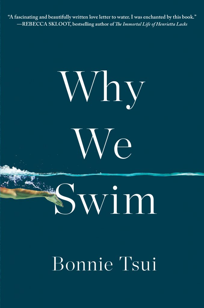 Bonnie Tsui, Why We Swim; cover design by Jason Heuer (Algonquin, April 14)
This is one of those covers that almost seems to change before your eyes: at first glance it’s a pleasing, simple cover with a graphic element, but then, as you look closer, that graphic element transforms into a specific gesture. The sense is of motion, perfect for this book.
 Cho Nam-Joo, Kim Jiyoung, Born 1982; cover design by Yang Kim, illustration by Mariko Enomoto, art direction by Steve Attardo (Liveright, April 14)
It’s all about the weird beauty of the illustration here—though the red of the title picks up the collar detail nicely.
 Carmen Boullosa, tr. Samantha Schnee, The Book of Anna; design by Tree Abraham, cover photographs from early twentieth-century Russia, public domain (Coffee House, April 14)
I love the juxtaposition of images here, as well as that fresh magenta, which gives the cover a modern, but still eerie, cast.
 Nina Renata Aron, Good Morning, Destroyer of Men’s Souls; cover design by Anna Kochman (Crown, April 21)
I love the stripped-down night sky, the way the text fills up all the space on the cover, and the sweet little flowers juxtaposed with the amazing title. It’s pretty and menacing at once.
 Michael Rips, The Golden Flea; cover design by Steve Attardo (W. W. Norton, April 21)
Continuing with our gold theme this month: this simple, playful cover featuring a gorgeous color balance and an alluring patina. As someone who has decorated many an apartment with artfully hung empty frames, I am on board.
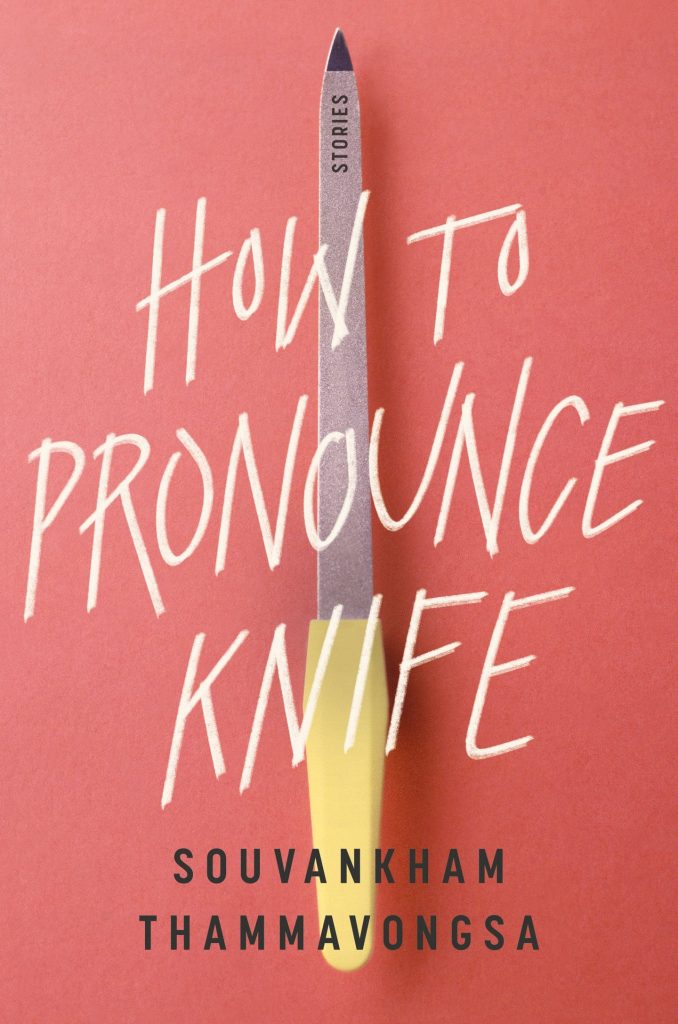 Souvankham Thammavongsa, How to Pronounce Knife; cover design by Lauren Harms (Little, Brown, April 21)
The balance of the image and text here is masterful, and I love the placement of “stories,” but I think my favorite part about this cover is that you read “knife” and you expect “knife” and on first glance you even see “knife,” but . . . that’s a nail file.
 Julio Cortázar, All Fires the Fire; cover design by Matt Dorfman (New Directions, April 28)
If you read this space with any regularity, you know that collaged book covers almost always get me, but this one is particularly good: balanced, weird, and alluring—that eye! That roughly cut-out hand!
Emily Temple
Emily Temple is the managing editor at Lit Hub. Her first novel, The Lightness, was published by William Morrow/HarperCollins in June 2020. You can buy it here.
